
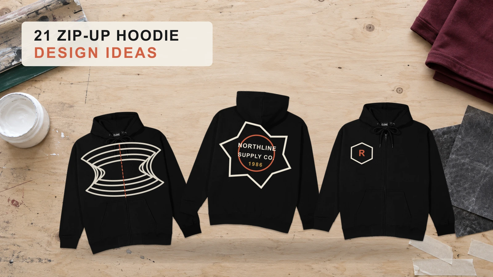
Zip-up hoodie design ideas include continuous front prints, chest logos, large back graphics, oversized typography, sleeve names, cuff initials, Roman numerals, varsity graphics, asymmetric zipper artwork, all-over prints, vintage emblems, raglan sleeve designs, and embroidery. Each concept combines artwork, graphic scale, typography, color, and placement while accounting for the center zipper and divided front panels. These 21 zip-up hoodie design ideas suit brands, businesses, creators, teams, clubs, events, merchandise, and personalized apparel.
Choosing and creating a zip-up hoodie design involves matching the concept to the hoodie fit, fabric, artwork, color contrast, graphic size, placement, and decoration method. Full-zip, oversized, cropped, boxy, French terry, and athletic hoodies provide different design areas, while the chest, back, sleeves, hood, cuffs, pockets, and split front support different artwork types. Consider zipper hardware, seams, hood coverage, fabric texture, and pocket boundaries. Preview the finished hoodie zipped and unzipped to check scale, alignment, readability, contrast, placement, and overall visual balance before production.
21 Zip-Up Hoodie Design Ideas are:
- Continuous Front Print Zip Up Hoodie Design
- Left-Chest Logo Zip Up Hoodie Design
- Front Logo and Large Back Print Zip Up Hoodie Design
- Front and Back Logo Zip Up Hoodie Design
- Oversized Back Text Zip Up Hoodie Design
- Sleeve Name Zip Up Hoodie Design
- Cuff Initial Zip Up Hoodie Design
- Roman Numeral Zip Up Hoodie Design
- Varsity Name and Number Zip Up Hoodie Design
- Asymmetric Zipper Graphic Zip Up Hoodie Design
- All-Over Print Zip Up Hoodie Design
- Geometric All-Over Zip Up Hoodie Design
- Camouflage All-Over Zip Up Hoodie Design
- Galaxy All-Over Zip Up Hoodie Design
- Abstract All-Over Zip Up Hoodie Design
- Vintage Emblem Zip Up Hoodie Design
- Raglan Sleeve Zip Up Hoodie Design
- Chest Embroidery Zip Up Hoodie Design
- Hood Embroidery Zip Up Hoodie Design
- Above-Pocket Embroidery Zip Up Hoodie Design
- Lower-Pocket Graphic Zip Up Hoodie Design
Continuous Front Print Zip Up Hoodie Design
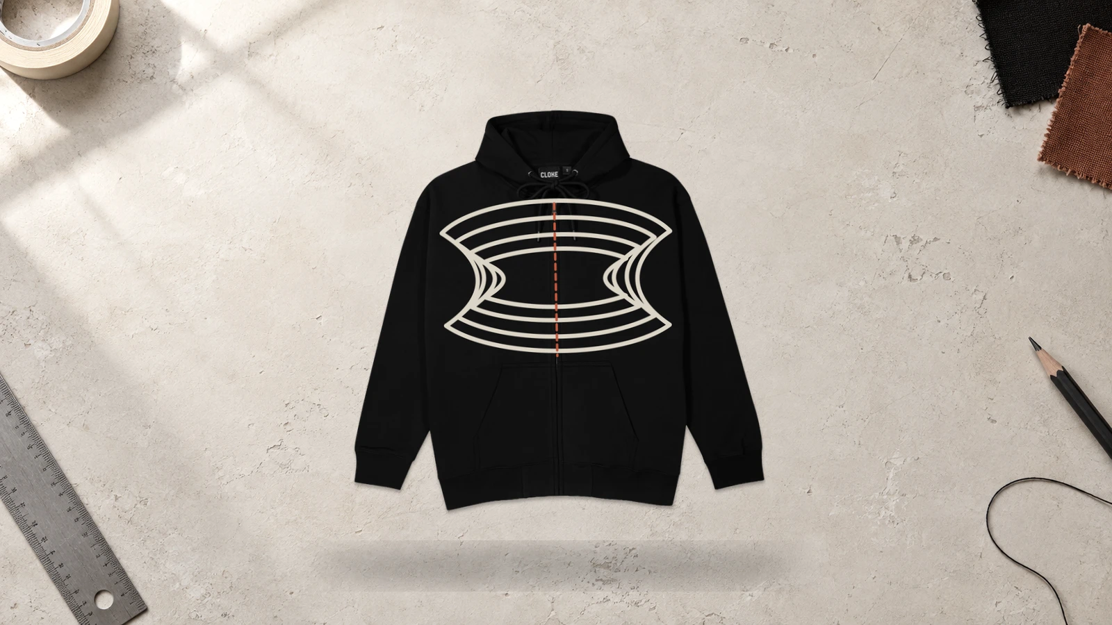
A continuous front print zip-up hoodie divides a single graphic across the left and right front panels, connecting when the hoodie is zipped shut. The composition uses the center zipper as part of the layout while maintaining clearance around zipper tape, teeth, and the pull tab. Large artwork works well because it bridges the visual separation between both fabric panels and creates a dominant chest graphic.
Key Features: Split front artwork, center zipper alignment, full chest coverage, large-scale graphics, and zipped/unzipped visual effects.
Best For: Streetwear, artist merchandise, band apparel, illustration-led collections, statement graphics, and custom zip hoodies built around large front artwork.
Popular directions:
- Split illustration: Divide a ribcage or Japanese dragon crest across both panels so the halves align when zipped.
- Mirrored graphic: Position symmetrical circuit lines or tribal wings on both sides to form a central emblem.
- Centered typography: Divide gothic lettering or a short slogan while keeping individual characters readable.
- Continuous pattern: Extend topographic lines, paisley, or abstract forms across both panels.
- Asymmetric artwork: Carry a shoulder graphic across the zipper toward the opposite pocket.
- Open-and-closed design: Create artwork that forms one image when zipped and separates into two compositions when open.
Left-Chest Logo Zip Up Hoodie Design
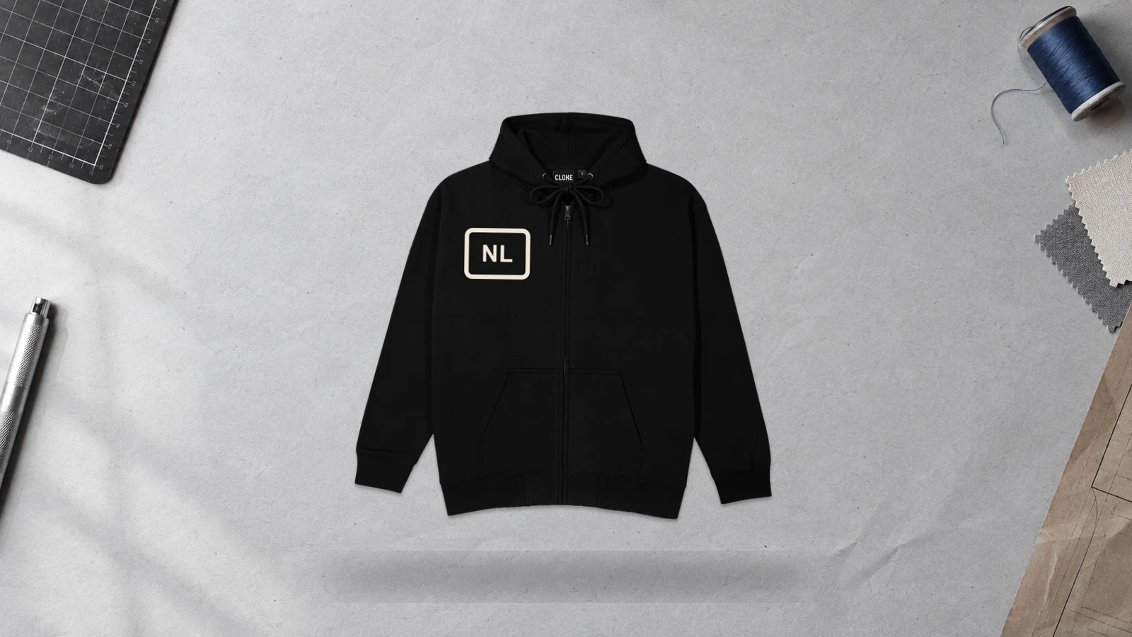
A left-chest logo zip-up hoodie design places a compact brand mark, emblem, monogram, or icon on the wearer’s left chest. This placement keeps artwork away from the center zipper while using the upper front panel as a defined design area. Small embroidery and printed logos work well here because they stay recognizable without competing with pockets or other garment features.
Key Features: Compact logo, left-chest placement, zipper separation, small print area, balanced spacing, and print or embroidery compatibility.
Best For: Company apparel, clothing brands, uniforms, clubs, team merchandise, minimalist streetwear, and custom zip-up hoodie designs that require restrained branding.
Popular directions:
- Brand logo: Place a compact company or clothing brand mark above the pocket.
- Embroidered emblem: Stitch a small crest, badge, or symbolic icon on the chest.
- Monogram: Combine two or three initials into a compact personalized mark.
- Minimal icon: Use a geometric symbol, animal mark, or recognizable graphic without supporting text.
- Logo and name: Pair an emblem with a short brand, organization, or team name.
- Tonal logo: Use thread close to the garment color for understated branding.
Front Logo and Large Back Print Zip Up Hoodie Design
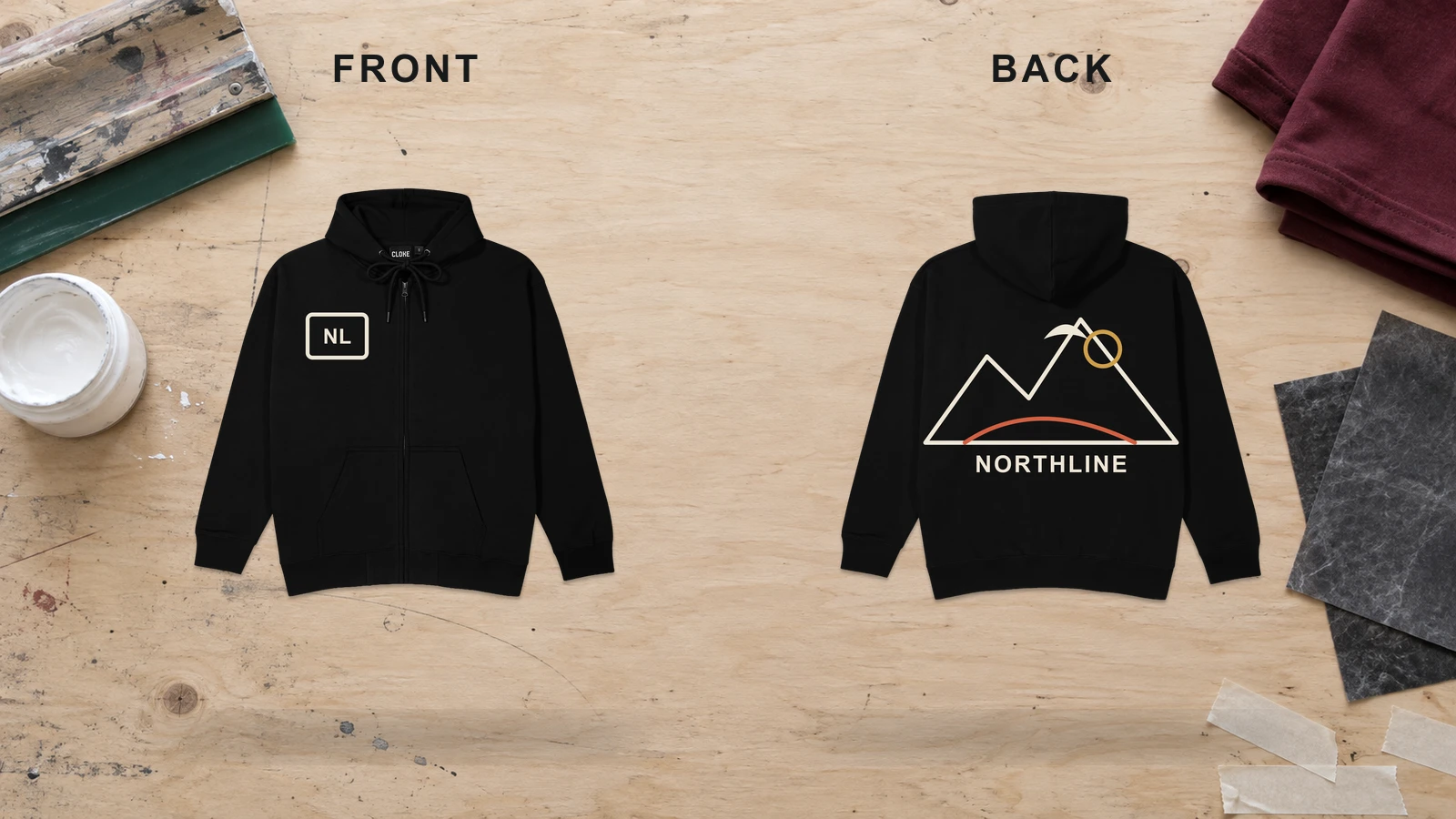
A front logo and large back print zip-up hoodie design pairs compact chest branding with oversized artwork across the back panel. The small front mark leaves the center zipper visually clear, while the uninterrupted back supports detailed illustrations, typography, and branded graphics. Position key back elements below the hood line so the hood does not conceal artwork when lowered.
Key Features: Small front logo, oversized back graphic, zipper clearance, full-back print area, visual hierarchy, and hood-aware positioning.
Best For: Streetwear labels, music merchandise, artist collections, clubs, event apparel, branded clothing, and graphic zip-up hoodies that need different front and back visual scales.
Popular directions:
- Logo and illustration: Pair a chest emblem with a detailed dragon, skull, or botanical back graphic.
- Brand mark and wordmark: Use a small front symbol with an oversized back brand name.
- Icon and artwork: Combine a minimal chest icon with a detailed back composition.
- Tour-style design: Add dates, locations, typography, and supporting imagery to the back.
- Club or team design: Pair a chest crest with a large mascot, team name, or number.
- Streetwear layout: Combine restrained front branding with oversized back artwork.
Front and Back Logo Zip Up Hoodie Design
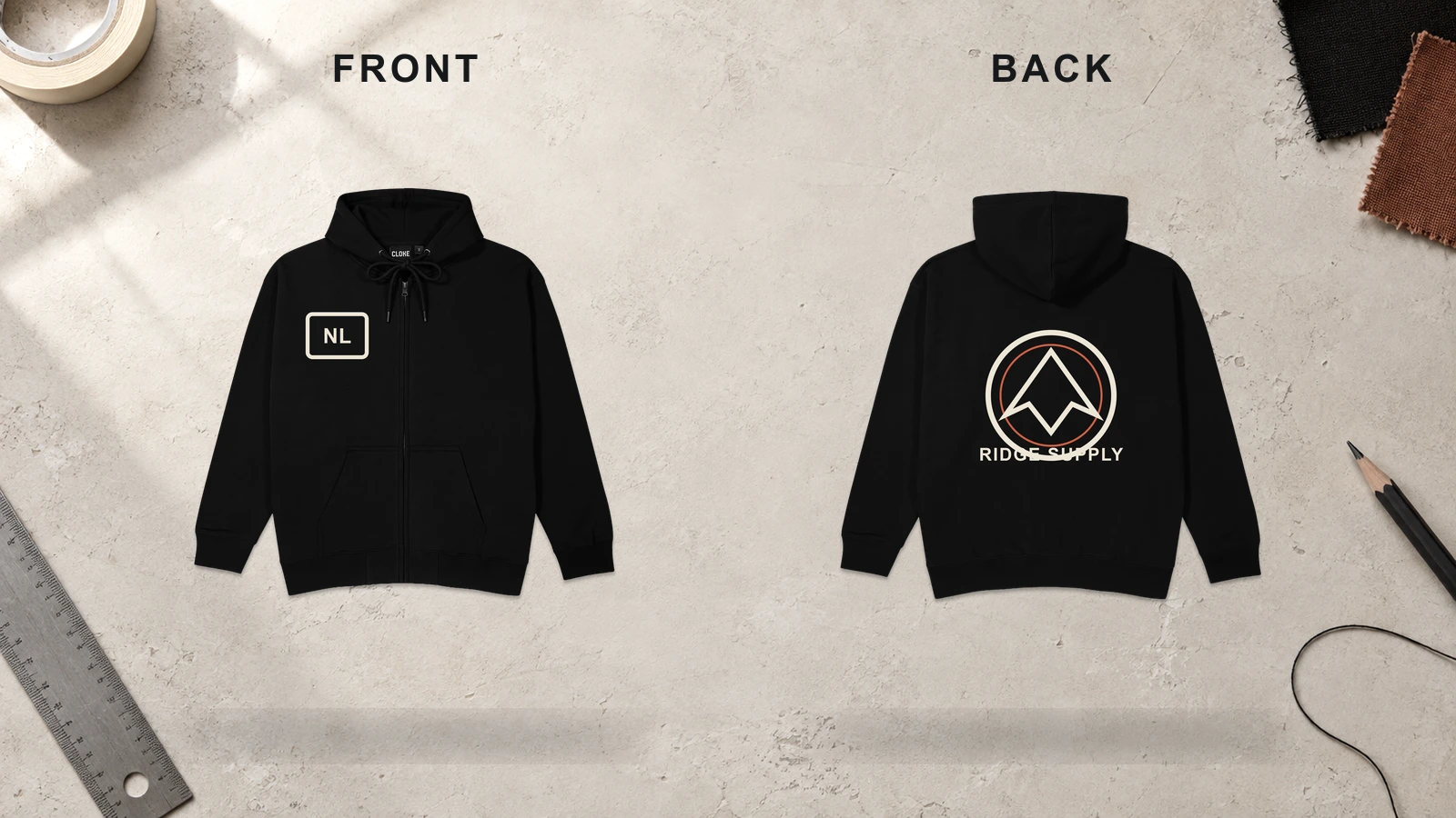
A front-and-back logo zip-up hoodie design coordinates branding across two visible areas of the garment. A compact logo sits on the left or right chest away from the zipper, while a second logo uses the larger back panel for greater visibility. Matching visual characteristics, such as typeface, iconography, and proportions, create continuity between both views.
Key Features: Front chest logo, back logo, consistent branding, zipper separation, balanced scale, and front-to-back visibility.
Best For: Businesses, staff uniforms, clubs, sports organizations, event crews, branded merchandise, and custom zip hoodies that need a recognizable identity from multiple viewing angles.
Popular directions:
- Matching logos: Repeat one logo at a small scale on the front and larger scale on the back.
- Icon and wordmark: Use an icon on the chest and complete wordmark on the back.
- Crest layout: Place a small crest on the front with an enlarged version on the back.
- Company branding: Combine a front company logo with larger rear identification.
- Team identity: Pair a chest emblem with a team name, mascot, or club logo.
- Personalized branding: Combine front initials with a larger personalized back mark.
Oversized Back Text Zip Up Hoodie Design
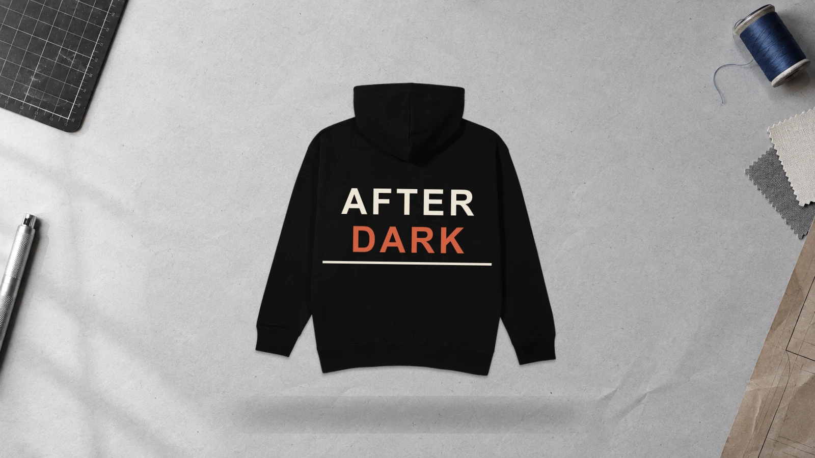
An oversized back text zip-up hoodie design makes typography the dominant element across the back panel. The broad surface supports large lettering without interruption from the center zipper. Place important words below the hood line, and leave enough clearance around garment seams so the message stays readable when the hoodie moves or the hood rests against the back.
Key Features: Oversized typography, full-back placement, text hierarchy, hood-aware positioning, readability, and large print scale.
Best For: Streetwear, collegiate apparel, music merchandise, clubs, branded clothing, statement apparel, and modern zip-up hoodie designs centered on typography.
Popular directions:
- Brand wordmark: Enlarge a clothing label or company name across the center back.
- Gothic lettering: Use large blackletter typography for a streetwear-oriented layout.
- Collegiate text: Arrange a university, city, or team name in varsity lettering.
- Vertical typography: Run a short phrase or brand name down the back.
- Statement phrase: Use a concise slogan as the primary graphic element.
- Arched lettering: Curve a brand, club, or location name across the upper-to-middle back.
Sleeve Name Zip Up Hoodie Design
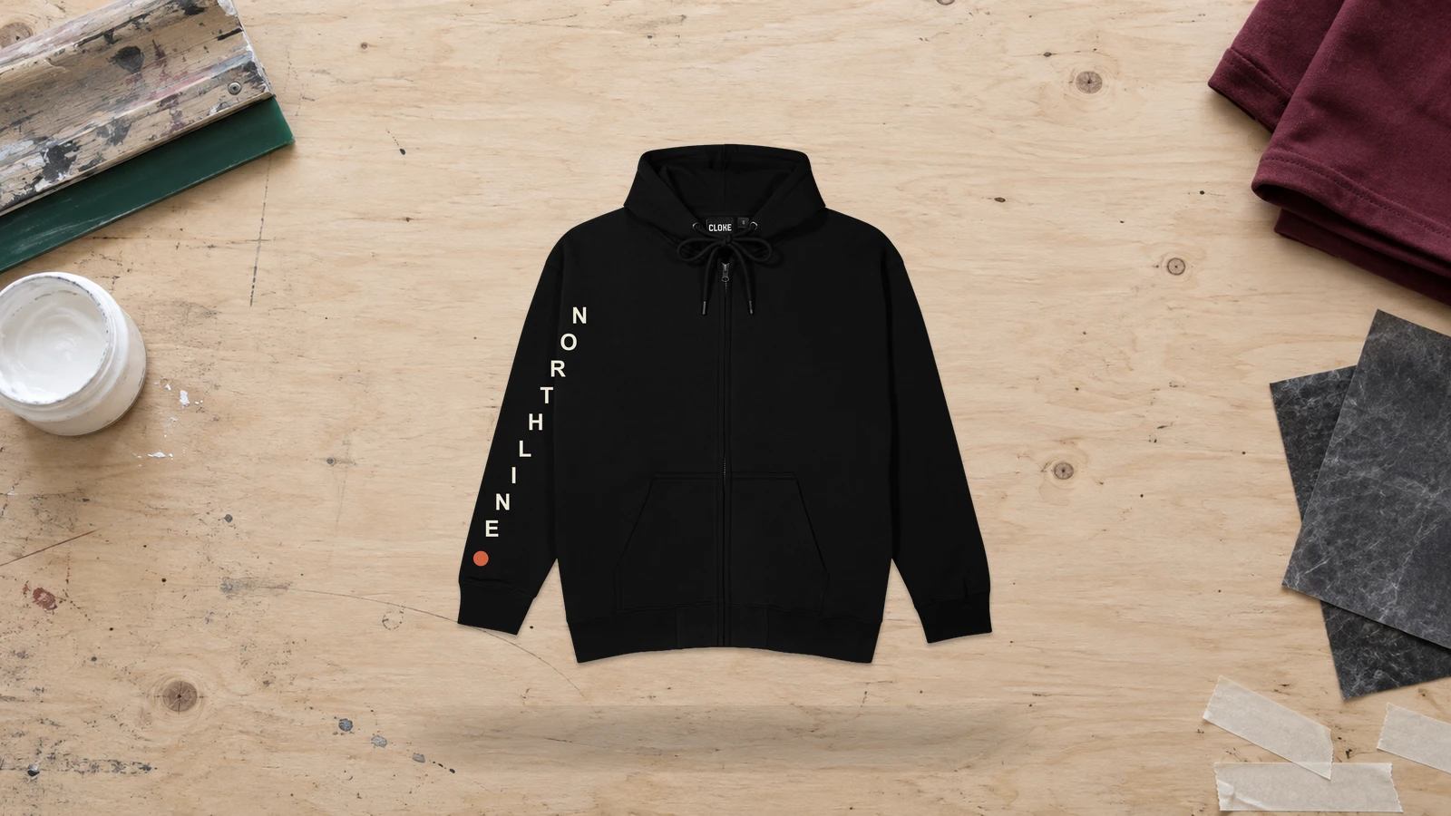
A sleeve name zip-up hoodie design places a personal name, brand name, team identity, or short word along one sleeve. The elongated print area supports vertical or rotated lettering without interfering with the center zipper or front pockets. Position lettering between the shoulder and cuff, keeping it clear of sleeve seams and areas that fold heavily when the elbow bends.
Key Features: Sleeve typography, personalized lettering, elongated placement, seam clearance, readable text, and print or embroidery compatibility.
Best For: Personalized zip hoodies, sports teams, school groups, company apparel, event merchandise, clubs, and custom zip-up designs requiring individual identification.
Popular directions:
- Personal name: Print a first name, surname, or nickname along the outer sleeve.
- Brand name: Extend a clothing label or company name toward the cuff.
- Team name: Add a club, school, or sports organization name.
- Surname lettering: Use block letters for family, group, or team apparel.
- Minimal wordmark: Position a short wordmark around the forearm.
- Dual-sleeve text: Place complementary words or names on opposite sleeves.
Cuff Initial Zip Up Hoodie Design
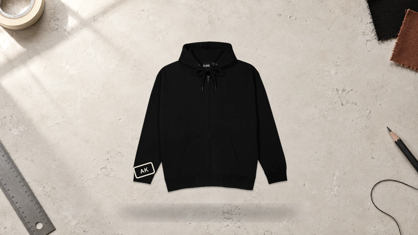
A cuff initial zip-up hoodie design places one or more initials near the wrist, turning a small garment area into a personalized detail. This placement leaves the chest, back, and center front available for larger artwork. Embroidery suits cuff initials because compact stitched lettering can occupy a limited area. Keep initials clear of ribbing and the cuff seam to reduce distortion.
Key Features: Small initials, cuff placement, personalization, seam clearance, wrist-level visibility, and embroidery compatibility.
Best For: Personalized zip hoodies, employee apparel, gifts, team clothing, school groups, premium merchandise, and minimalist custom hoodie ideas.
Popular directions:
- Single initial: Stitch one letter near the outer wrist.
- Two-letter monogram: Combine first and last initials into a compact mark.
- Three-letter monogram: Arrange three initials in a circular, stacked, or geometric format.
- Brand initials: Add abbreviated brand lettering as secondary identification.
- Matching cuffs: Repeat initials across both cuffs for symmetry.
- Contrasting embroidery: Use contrasting thread to make small lettering stand out against the fabric.
Roman Numeral Zip Up Hoodie Design
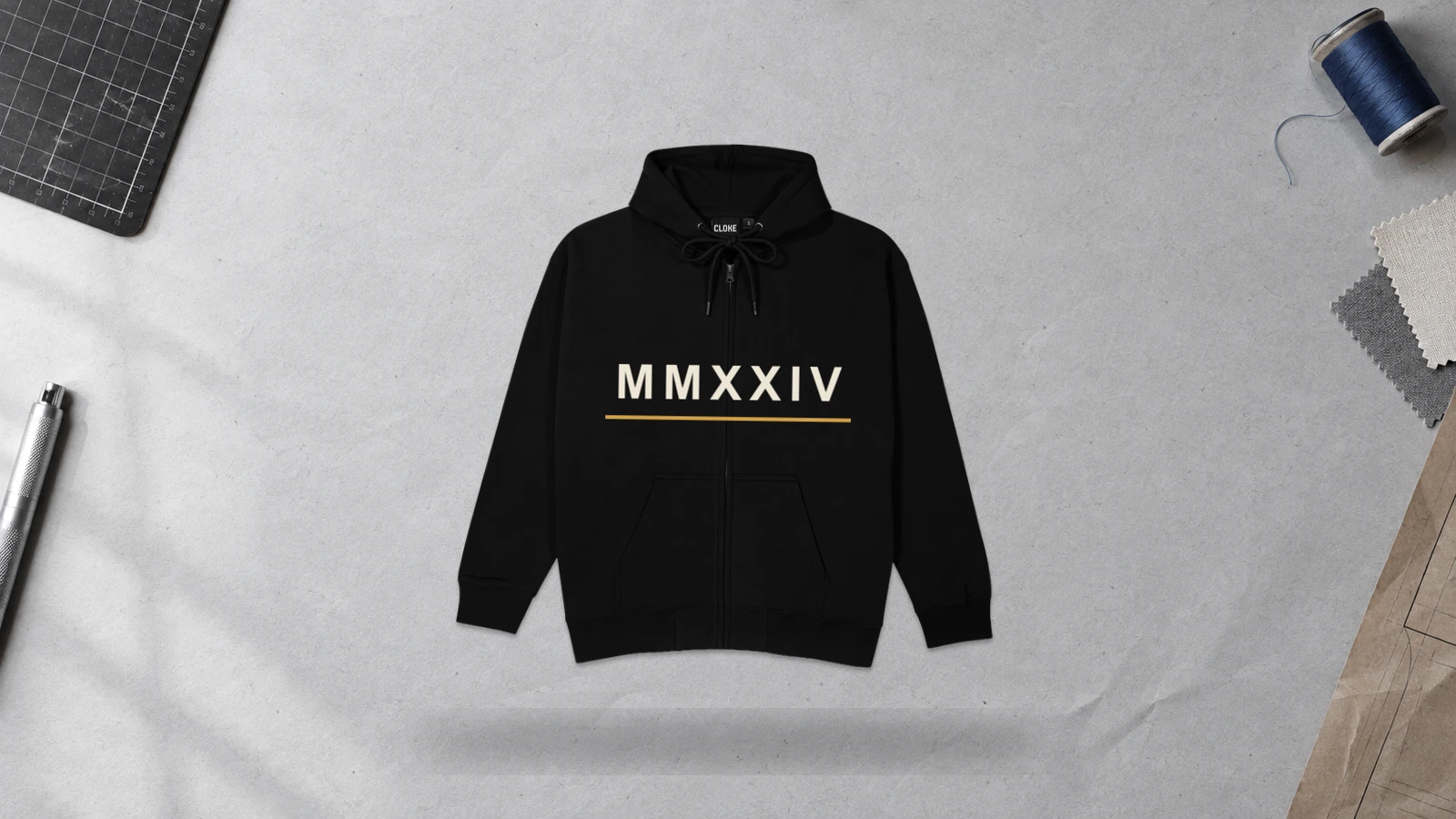
A Roman numeral zip-up hoodie design converts a meaningful year, date, number, or sequence into structured typography. Numerals can occupy the chest, sleeve, back, or one front panel without crossing the zipper. Their linear characters support both minimal and oversized compositions. For front placement, keeping the complete sequence on one panel prevents the zipper gap from interrupting readability.
Key Features: Roman numeral typography, meaningful numbers, flexible placement, structured lettering, scalable artwork, and zipper-safe positioning.
Best For: Graduation apparel, anniversary clothing, personalized zip hoodies, brand founding dates, team merchandise, commemorative apparel, and typography-led designs.
Popular directions:
- Year numerals: Convert a founding, graduation, or event year into Roman numerals.
- Date design: Represent a birthday, anniversary, or meaningful date.
- Vertical sleeve numerals: Run the characters down the outer sleeve.
- Large back numerals: Center oversized characters below the hood.
- Chest numerals: Place a short sequence on one chest panel.
- Numeral and logo: Pair numerals with a crest, monogram, or brand symbol.
Varsity Name and Number Zip Up Hoodie Design
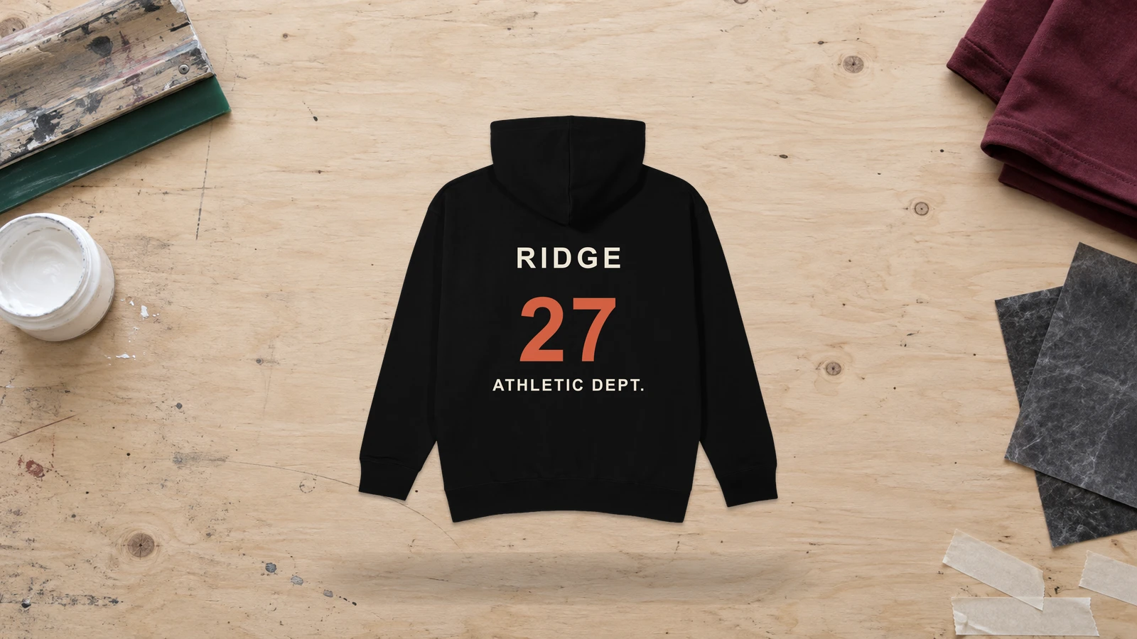
A varsity name-and-number zip-up hoodie design combines collegiate-style lettering with large numerals to create a structured athletic identity. The name can sit across the upper back while an oversized number fills the central back panel, keeping both elements clear of the front zipper. Smaller team initials, a school emblem, or a graduation year can also appear on the chest or sleeve. Bold block lettering works well because it remains readable at larger scales and complements athletic zip-up hoodie construction.
Key Features: Varsity lettering, oversized numbers, back-focused placement, athletic typography, team identity, and optional chest details.
Best For: Sports teams, school clubs, graduation apparel, collegiate collections, intramural groups, personalized zip hoodies, and athletic merchandise.
Popular directions:
- Player layout: Place a surname above a large jersey number for team or club apparel.
- School design: Pair a school name with a graduation year or class number.
- Collegiate branding: Combine arched varsity lettering with a large numeral below.
- Team identity: Add a mascot, team abbreviation, or crest beside the number.
- Sleeve number: Position smaller player numbers on the upper sleeve as supporting details.
- Personalized layout: Combine a nickname, chosen number, and small chest emblem for personalized zip hoodies.
Asymmetric Zipper Graphic Zip Up Hoodie Design
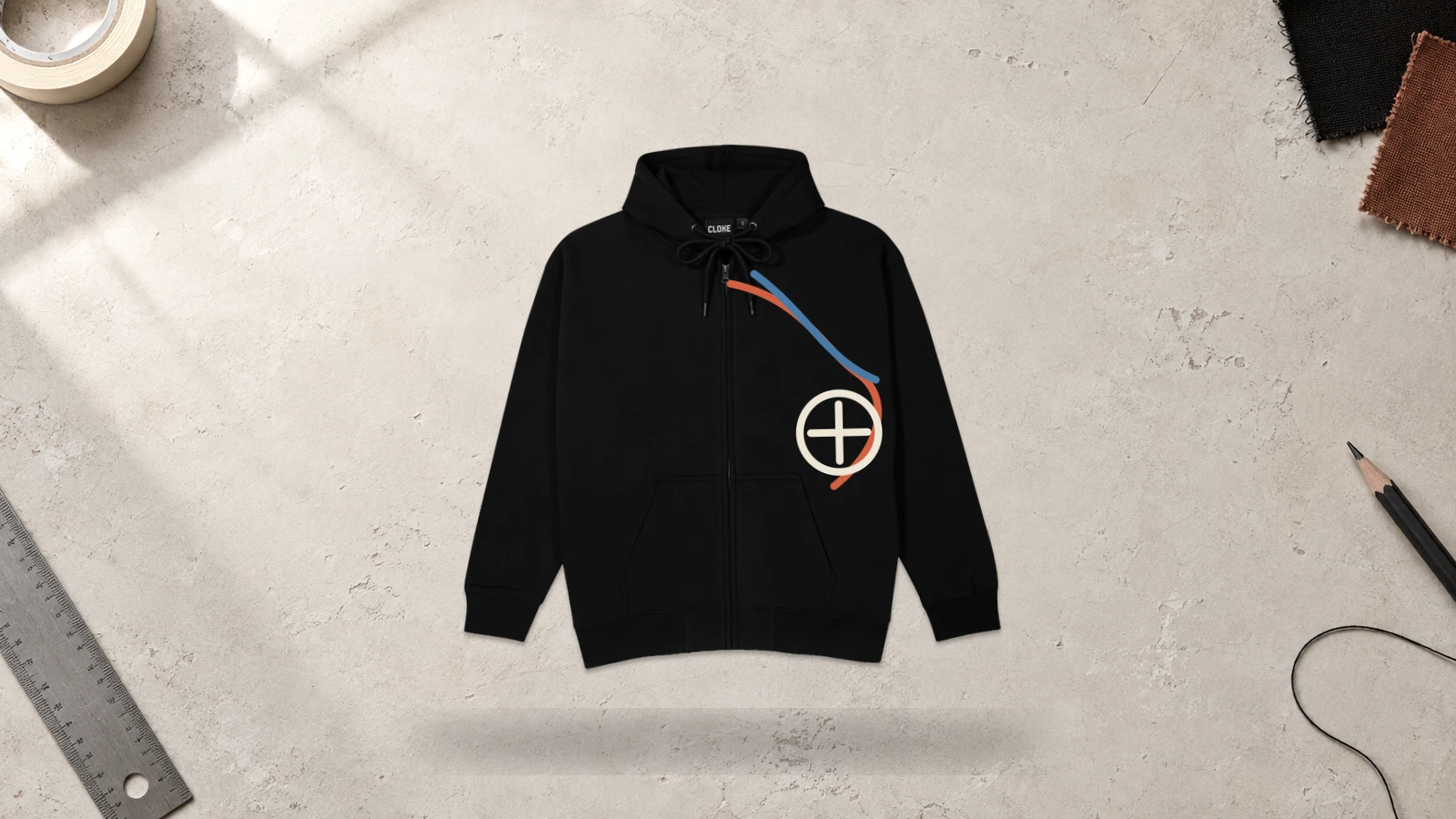
An asymmetric zipper graphic zip-up hoodie design uses the center zipper as a visual boundary rather than forcing artwork into a symmetrical layout. The main graphic can occupy one front panel and extend toward the shoulder, pocket, or opposite panel through smaller supporting elements. This approach works well for creative zip-up hoodie designs because the composition remains intentional when the hoodie is both zipped and unzipped. Keep detailed artwork away from zipper teeth, tape, and hardware to reduce printing and alignment problems.
Key Features: Uneven front composition, zipper-aware artwork, single-panel emphasis, directional graphics, balanced negative space, and open-and-closed visibility.
Best For: Streetwear, artist merchandise, experimental fashion, illustration-led collections, creative zip-up hoodie designs, and garments using unconventional front compositions.
Popular directions:
- Diagonal graphic: Run flames, vines, or abstract lines from one shoulder toward the opposite pocket.
- One-side illustration: Place a large dragon, skull, or character primarily on one front panel.
- Offset typography: Position lettering beside the zipper rather than centering it.
- Zipper-framed artwork: Use the zipper as an intentional edge for a geometric composition.
- Uneven logo layout: Combine a large logo on one side with a smaller symbol on the other.
- Flowing pattern: Extend waves, smoke, or organic shapes unevenly across the front panels.
All-Over Print Zip Up Hoodie Design
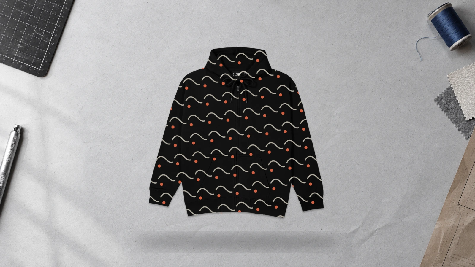
An all-over print zip-up hoodie design extends artwork across multiple garment panels, such as the front, back, sleeves, and hood, to create a continuous visual theme. Repeating patterns and large compositions work well because they can tolerate interruptions from the center zipper, seams, pockets, and panel joins. Artwork should account for each construction boundary so important faces, text, logos, or focal details do not become distorted or split during production.
Key Features: Full-garment coverage, repeating artwork, multi-panel printing, zipper-aware composition, seam transitions, and continuous visual treatment.
Best For: Fashion collections, artist merchandise, patterned streetwear, event apparel, branded collections, and custom zip hoodies requiring extensive surface coverage.
Popular directions:
- Repeating pattern: Cover the hoodie with checkerboards, symbols, or illustrated motifs for consistent surface coverage.
- Branded pattern: Repeat a logo, monogram, or brand icon across multiple garment panels.
- Botanical print: Extend leaves, flowers, or vines across the body, sleeves, and hood.
- Illustrated collage: Combine small drawings, icons, and lettering into a dense graphic composition.
- Abstract pattern: Use irregular shapes, brush marks, or flowing lines for modern zip-up hoodie designs.
- Theme-based artwork: Build full-garment graphics around subjects such as racing, music, gaming, or nature.
Geometric All-Over Zip Up Hoodie Design
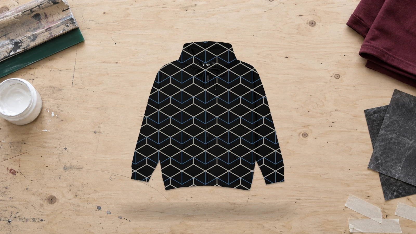
A geometric all-over zip-up hoodie design uses repeated shapes, lines, grids, or angular patterns across multiple garment panels. Triangles, diamonds, hexagons, and abstract linework can continue across the front, back, sleeves, and hood to create a unified surface design. The center zipper and seams naturally interrupt the pattern, so repeated geometric elements should allow small alignment shifts without making the composition appear incomplete. Keep focal shapes and detailed symbols away from zipper hardware and major seam intersections.
Key Features: Repeating geometry, full-garment coverage, structured patterns, multi-panel artwork, seam-aware repetition, and zipper-compatible composition.
Best For: Contemporary streetwear, sportswear, branded collections, technology-inspired apparel, patterned merchandise, and modern zip-up hoodie designs.
Popular directions:
- Triangle pattern: Repeat interlocking triangles across the body and sleeves for angular zip hoodie designs.
- Grid layout: Use squares or linear grids to create an ordered surface pattern.
- Abstract geometry: Combine circles, polygons, and irregular shapes for modern zip-up hoodie designs.
- Optical pattern: Arrange repeating lines or shapes to create controlled visual movement.
- Color-block geometry: Divide garment panels into large geometric sections using contrasting tones.
- Logo geometry: Integrate small brand marks or monograms into a repeating geometric pattern for custom zip hoodies.
Camouflage All-Over Zip Up Hoodie Design
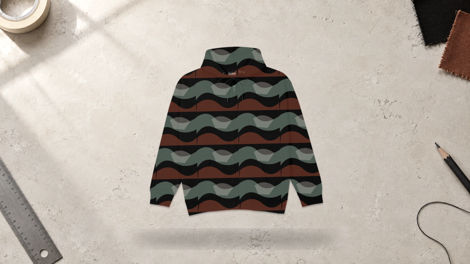
A camouflage all-over zip-up hoodie design covers the garment with irregular shapes and layered tones that repeat across the front, back, sleeves, and hood. The pattern works well with zip-up construction because its fragmented structure can continue visually despite interruptions from the center zipper, pockets, and seams. Scale the camouflage elements to the garment so the pattern remains recognizable without requiring exact alignment between separate fabric panels.
Key Features: Irregular pattern, full-garment coverage, layered shapes, multi-panel printing, seam-tolerant composition, and continuous camouflage styling.
Best For: Streetwear, outdoor-inspired apparel, team clothing, tactical-inspired fashion, casual collections, and patterned custom zip hoodies.
Popular directions:
- Woodland camouflage: Combine leaf-like green, brown, and dark shapes for outdoor-inspired custom zip hoodies.
- Urban camouflage: Mix gray, black, and neutral shapes for streetwear-focused zip hoodie designs.
- Digital camouflage: Build the pattern from small pixel-like blocks for a structured appearance.
- Abstract camouflage: Replace traditional shapes with brush strokes, waves, or irregular graphics.
- Monochrome camouflage: Use tonal variations of one color for a restrained pattern zip hoodie.
- Branded camouflage: Integrate small logos, initials, or symbols into the pattern for custom zip-up hoodie ideas with repeated branding.
Galaxy All-Over Zip Up Hoodie Design
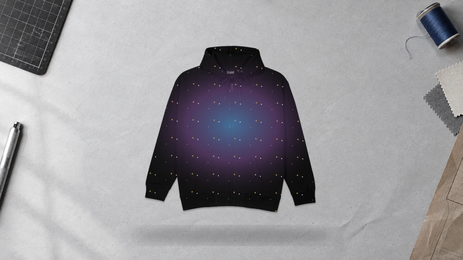
A galaxy all-over zip-up hoodie design covers multiple garment panels with stars, nebula clouds, planets, and space textures. Organic celestial artwork works across zip-up construction because minor shifts around seams, pockets, and the zipper do not necessarily disrupt the overall composition. Keep recognizable planets, typography, and other focal objects away from construction lines where possible.
Key Features: Space-inspired artwork, full-garment coverage, multi-panel printing, layered gradients, continuous imagery, and zipper-compatible composition.
Best For: Gaming merchandise, astronomy themes, festival apparel, artist collections, streetwear, science-related groups, and custom zip hoodies requiring high-coverage graphics.
Popular directions:
- Nebula print: Spread stars and colorful cloud-like textures across the garment.
- Star field: Scatter stars and constellation patterns over a dark background.
- Planet design: Combine planets with smaller celestial objects.
- Cosmic gradient: Transition between space-inspired tones across panels.
- Astronaut theme: Add astronauts, spacecraft, satellites, or lunar imagery.
- Abstract galaxy: Mix cosmic textures with geometry or graphic linework.
Abstract All-Over Zip Up Hoodie Design
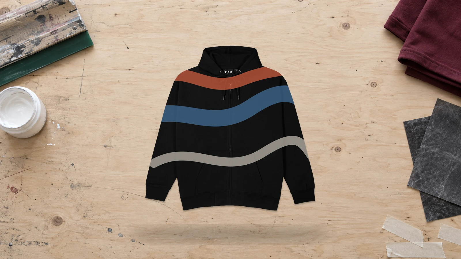
An abstract all-over zip-up hoodie design uses irregular shapes, brush marks, gradients, lines, or distorted forms across the front, back, sleeves, and hood. Abstract artwork suits zip-up construction because the composition does not depend on precise alignment at every garment boundary. Visual elements can continue around the center zipper, pockets, and seams while maintaining the overall design concept. Keep major focal elements away from zipper hardware to prevent unwanted visual breaks.
Key Features: Abstract artwork, full-garment coverage, irregular composition, multi-panel printing, flexible seam transitions, and zipper-aware placement.
Best For: Streetwear collections, artist merchandise, fashion zip hoodies, experimental apparel, creative brands, and custom zip-up designs that use expressive full-surface graphics.
Popular directions:
- Brush-stroke pattern: Spread painted marks across multiple garment panels.
- Fluid shapes: Use curved forms and flowing lines for an organic composition.
- Geometric abstraction: Combine irregular polygons, circles, and fragmented shapes.
- Gradient artwork: Blend tonal transitions with abstract textures across the hoodie.
- Distorted graphics: Stretch, fragment, or layer visual elements for an experimental effect.
- Mixed-media design: Combine illustrations, textures, typography, and shapes for creative zip-up hoodie designs.
Vintage Emblem Zip Up Hoodie Design
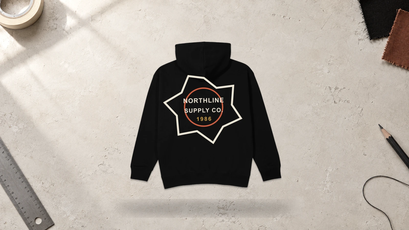
A vintage emblem zip-up hoodie design combines retro-style badges, crests, typography, and illustrated symbols to create an aged graphic identity. The emblem can sit on one chest panel, while a larger version can occupy the back without interference from the center zipper. Circular and shield-shaped compositions work well because they keep lettering and illustrations grouped within a defined boundary. Distressed textures can add a worn-print appearance without requiring complex artwork across garment seams.
Key Features: Retro emblem, badge-style composition, vintage typography, distressed texture, chest or back placement, and zipper-safe artwork.
Best For: Heritage brands, motorcycle clubs, sports-inspired apparel, automotive merchandise, music merchandise, casual streetwear, and custom zip hoodies with retro graphic themes.
Popular directions:
- Heritage badge: Combine a founding year, brand name, and small symbol inside a circular emblem.
- Motorcycle crest: Pair wings, engines, skulls, or road-inspired graphics with curved lettering.
- Collegiate emblem: Use varsity typography with dates, initials, or school-style symbols.
- Retro sports badge: Combine team lettering with stars, numbers, or mascot illustrations.
- Workwear emblem: Use shield-shaped graphics with trade names, tools, or location details.
- Distressed logo: Apply worn textures to a logo or wordmark for vintage-inspired zip hoodie designs.
Raglan Sleeve Zip Up Hoodie Design
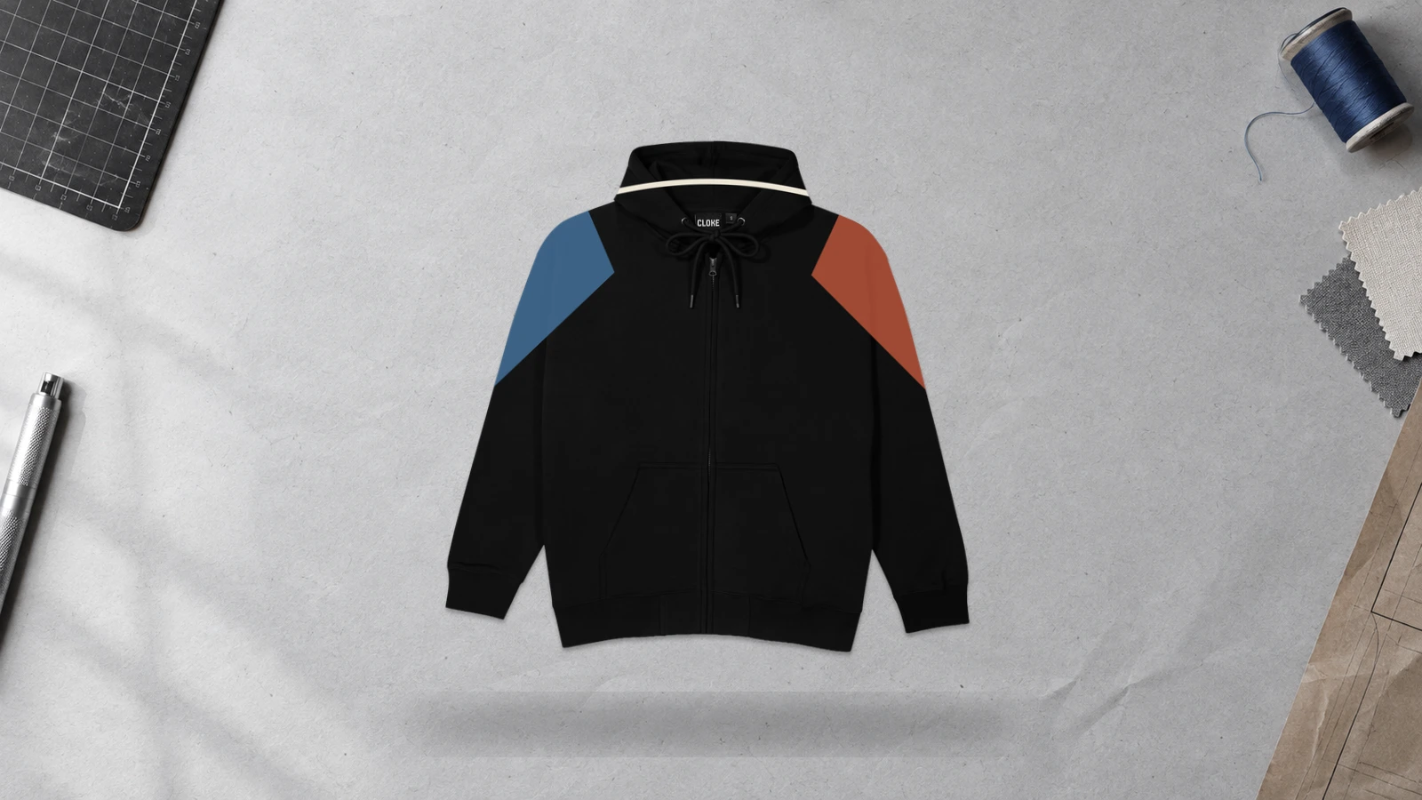
A raglan sleeve zip-up hoodie design uses sleeves that extend diagonally from the underarm toward the neckline, creating a visible boundary between the body and sleeve panels. This construction makes the sleeves a natural area for contrasting colors, graphics, lettering, or patterns while keeping the center zipper unobstructed. For precise alignment, artwork should follow the diagonal raglan seam rather than crossing it.
Key Features: Diagonal sleeve seams, defined sleeve panels, contrasting sections, extended shoulder area, zipper-safe graphics, and panel-based design.
Best For: Athletic apparel, team clothing, collegiate designs, casual sportswear, color-blocked custom zip hoodies, and branded merchandise that needs distinct sleeve treatment.
Popular directions:
- Contrast sleeves: Use a different sleeve color to separate the arms from the hoodie body.
- Sleeve graphics: Place flames, stripes, or lettering along the outer sleeve panels.
- Two-tone design: Pair a neutral body with contrasting raglan sleeves.
- Team layout: Add team colors, numbers, or names to the sleeves for athletic apparel.
- Patterned sleeves: Apply camouflage, geometric, or repeating graphics only to the sleeve panels.
- Branded sleeves: Position a wordmark or repeated logo along one or both sleeves for custom zip hoodie designs.
Chest Embroidery Zip Up Hoodie Design
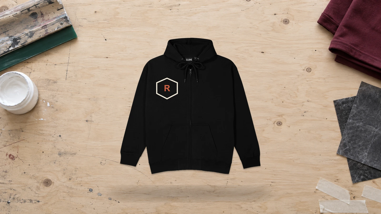
A chest embroidery zip-up hoodie design uses stitched logos, monograms, symbols, or short lettering on one upper front panel. Left-chest and right-chest placements keep the embroidery clear of the center zipper while creating a compact focal point. Simple artwork with defined shapes works well because dense stitching can reproduce small designs without requiring a large print area. Maintain clearance from the zipper tape and nearby seams to keep the embroidery flat and readable.
Key Features: Compact embroidery, chest placement, stitched detailing, zipper clearance, durable decoration, and small-scale artwork.
Best For: Company apparel, staff uniforms, team clothing, premium merchandise, minimalist streetwear, clubs, and custom zip hoodies that need subtle branding.
Popular directions:
- Embroidered logo: Stitch a compact brand mark on the left chest.
- Monogram: Combine two or three initials into a small personalized design.
- Club crest: Use a shield, badge, or team emblem for group apparel.
- Minimal icon: Embroider a simple animal, symbol, or geometric mark.
- Name embroidery: Add a short personal or company name beside a small emblem.
- Tonal embroidery: Match thread closely with the garment color for understated branding.
Hood Embroidery Zip Up Hoodie Design
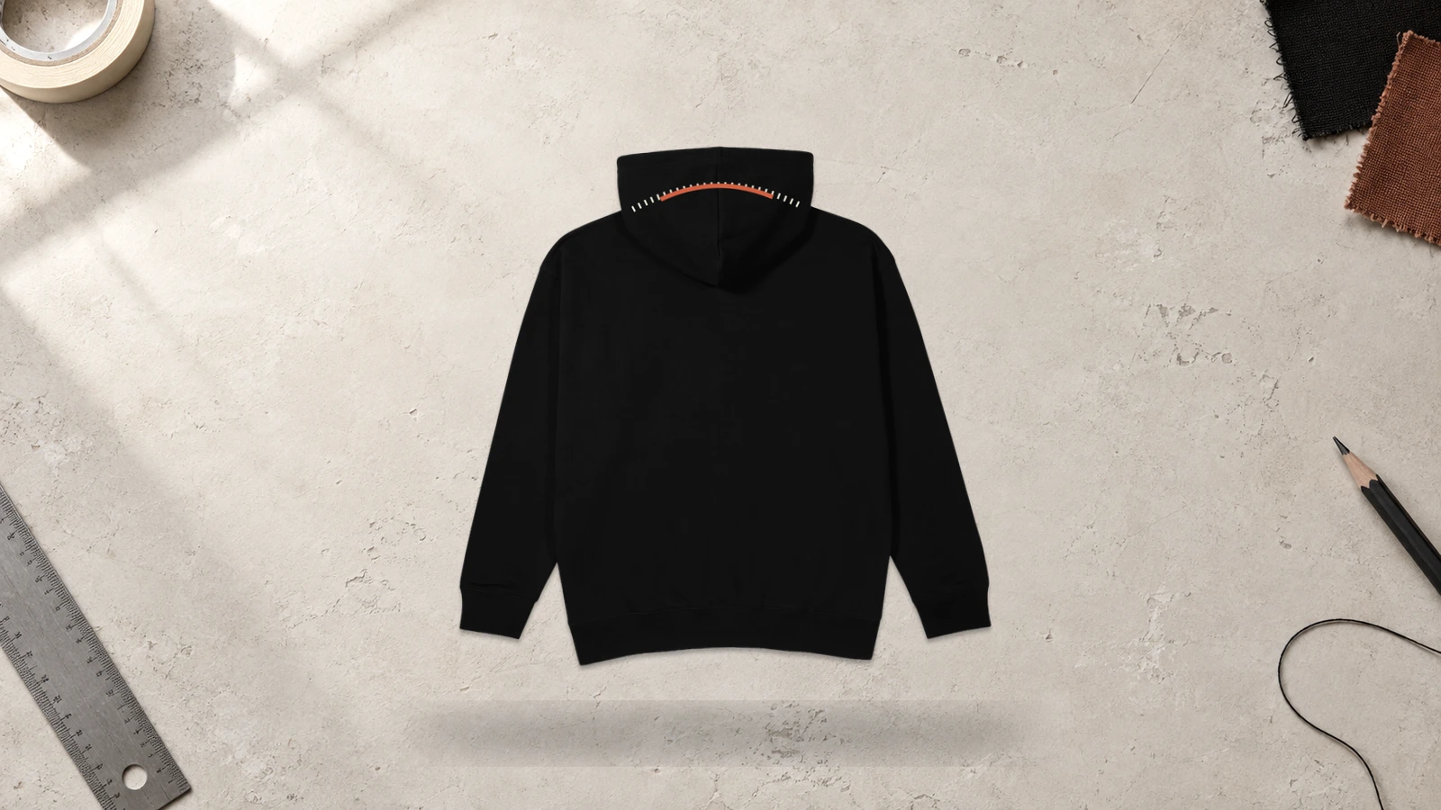
A hood embroidery zip-up hoodie design places stitched artwork directly on the hood, turning a functional garment section into a secondary design area. Small lettering, symbols, logos, and repeating motifs can sit along the hood side, edge, or rear section without competing with front graphics. Placement should account for hood folds, drawstrings, seams, and how the hood shifts when worn up or down.
Key Features: Hood placement, stitched artwork, secondary branding, compact graphics, seam-aware positioning, and visible folded or raised states.
Best For: Streetwear, fashion labels, branded merchandise, team apparel, personalized zip hoodies, and custom zip-up designs that need an unexpected detail beyond the chest and back.
Popular directions:
- Side logo: Embroider a small brand symbol along one hood panel.
- Edge lettering: Position short text near the outer hood edge.
- Rear monogram: Add initials near the back center of the hood.
- Matching symbols: Repeat small embroidered icons on both hood panels.
- Brand name: Place compact lettering along one side without crossing the hood seam.
- Coordinated embroidery: Match hood stitching with chest or cuff embroidery for a connected design.
Above-Pocket Embroidery Zip Up Hoodie Design
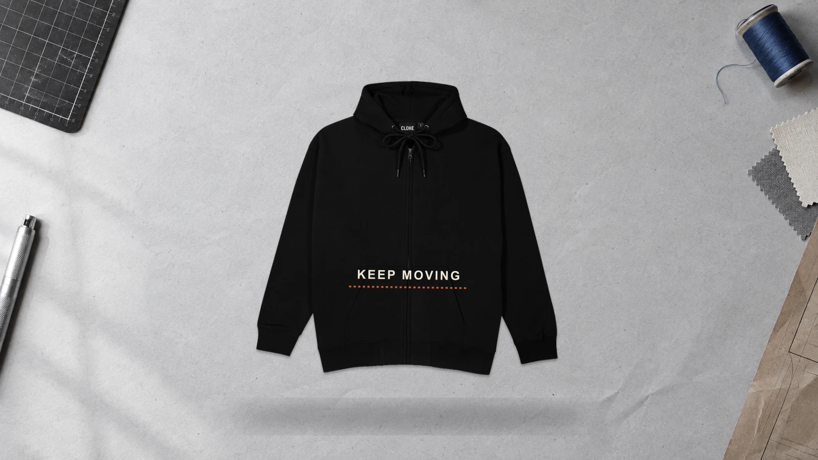
An above-pocket embroidery zip-up hoodie design places a compact stitched element on the lower front panel, directly above a pocket opening. This location creates a less conventional focal point while leaving the chest and back available for other artwork. Logos, initials, short words, and small symbols work well in this limited area. Keep embroidery clear of the pocket seam and zipper so stitching does not interfere with pocket access or garment construction.
Key Features: Lower-front embroidery, pocket-aware placement, compact artwork, seam clearance, subtle personalization, and secondary branding.
Best For: Minimal streetwear, boutique apparel, personalized zip hoodies, small brand collections, workwear-inspired clothing, and custom hoodie ideas that use unconventional logo placement.
Popular directions:
- Small logo: Stitch a compact brand mark directly above one pocket.
- Initials: Add a two-letter monogram for personalized detailing.
- Short wordmark: Embroider a brief brand name or single word above the pocket.
- Minimal symbol: Use a star, flower, animal, or geometric icon.
- Paired embroidery: Place complementary symbols above the left and right pockets.
- Chest-to-pocket system: Combine a small chest logo with supporting embroidery near the pocket.
Lower-Pocket Graphic Zip-Up Hoodie Design
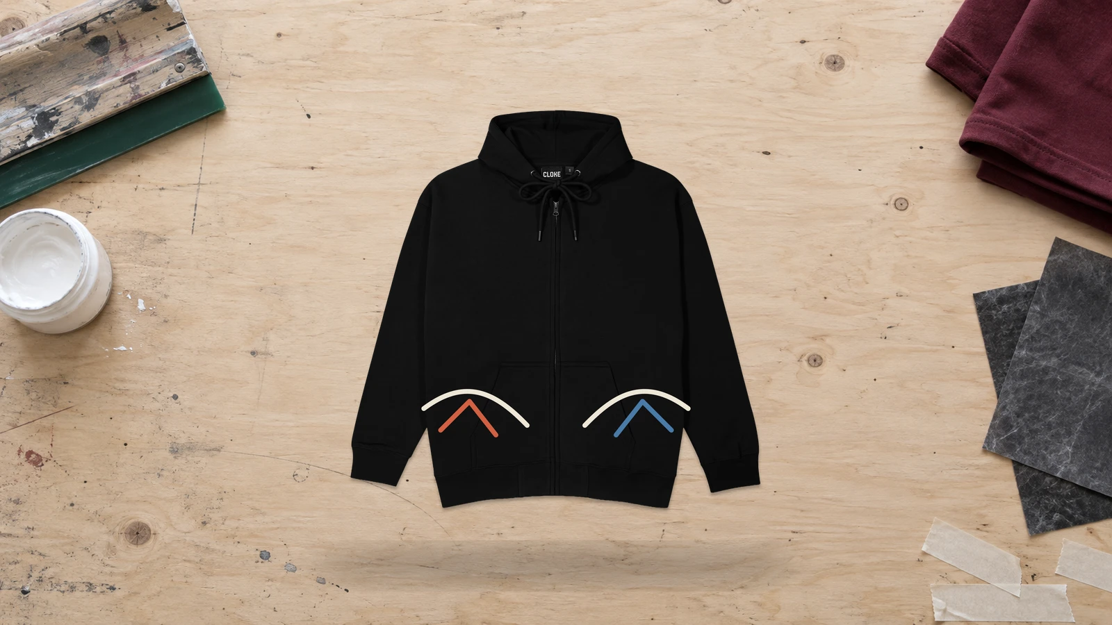
A lower-pocket graphic zip-up hoodie design positions printed artwork around, beside, or partially behind the lower front pocket area. The placement uses space that many zip hoodie designs leave blank, making it suitable for secondary graphics and directional artwork. Designs should follow pocket boundaries rather than placing important text or detailed imagery directly across thick seams. The center zipper also divides the lower front, so each graphic element needs intentional panel positioning.
Key Features: Lower-front graphics, pocket interaction, asymmetric placement, seam-aware artwork, secondary visual focus, and zipper clearance.
Best For: Streetwear, graphic merchandise, artist apparel, experimental fashion, creative zip-up hoodie designs, and custom zip hoodies that use unconventional front placement.
Popular directions:
- Pocket-side illustration: Position flames, vines, or linework beside one pocket.
- Rising graphic: Extend artwork upward from the pocket toward the chest.
- Mirrored graphics: Place matching symbols beside both front pockets.
- Asymmetric print: Use one large lower-front graphic on a single panel.
- Pocket-framed artwork: Arrange shapes or lettering around the pocket boundary without covering its opening.
- Wraparound graphic: Continue abstract lines or patterns from the lower front toward the side panel.
Which Zip-Up Hoodie Styles Work Best for Different Designs?
Full-zip hoodies suit mixed placements, oversized styles fit large graphics, cropped hoodies favor compact artwork, boxy fits support wide designs, French terry works with prints and embroidery, and athletic hoodies suit team branding. These differences come from each style’s body length, panel width, fabric surface, and garment structure. Match graphic scale and placement to the available design area while accounting for the center zipper, seams, pockets, hood, fabric stretch, and decoration method.
The following styles show which zip-up hoodie style works best for each design type:
- Full-Zip Hoodie
With a full-length torso, divided front panels, and uninterrupted back, a full-zip hoodie works best for chest logos, large back prints, sleeve graphics, and artwork intentionally designed around the center zipper. Its multiple usable areas allow small branding and oversized graphics to appear on the same garment. Back illustrations can be larger, while logos can fit on either chest panel. Any continuous front print requires accurate alignment and clearance around zipper tape, teeth, and hardware.
- Oversized Zip-up Hoodie
The wider body, dropped shoulders, and roomy sleeves of an oversized zip-up hoodie make it best for oversized back graphics, large typography, expansive illustrations, and sleeve-heavy streetwear designs. Extra fabric lets artwork take up more space without looking compressed by seams or garment edges. Asymmetric graphics also have enough room to develop across individual front panels. Compact logos need intentional positioning and scale so they remain visually connected to the broader silhouette.
- Cropped Zip-up Hoodie
Because a cropped zip-up hoodie reduces the vertical space between the chest, pockets, and hem, it works best with compact chest logos, short upper-back prints, sleeve graphics, and small embroidered details. Wide or horizontally oriented artwork generally fits the shortened torso more naturally than tall compositions. Large back designs need reduced height to stay clear of the hood and hem. Front graphics also require tighter positioning around the zipper and pocket openings.
- Boxy Zip-up Hoodie
With a broad torso and straighter proportions, a boxy zip-up hoodie works especially well with wide wordmarks, horizontal illustrations, geometric graphics, and medium-to-large back prints. Its extra lateral space lets artwork spread across the garment without requiring much vertical height. Broad typography and structured shapes can match the silhouette effectively. Keep front designs within individual panels unless you intentionally cross the zipper, and account for side seams and fabric folds in wide artwork.
- French Terry Zip-up Hoodie
A relatively smooth outer knit combined with a soft, looped interior makes French terry zip-up hoodies well suited to printed illustrations, chest embroidery, lettering, and medium-scale back or sleeve graphics. The surface can accommodate several decoration types, but fabric weight, texture, and stretch affect how fine details reproduce. Dense embroidery requires suitable stabilization to limit puckering, while printed artwork should use a method compatible with the garment’s knit structure and surface characteristics.
- Athletic Zip-up Hoodie
Designed with streamlined shapes, functional seams, and often lightweight or stretch fabrics, athletic zip-up hoodies suit team logos, player numbers, sleeve marks, small chest graphics, and controlled back branding. These graphics fit defined areas without placing unnecessary decoration across high-movement sections. Material properties also influence production because heat, heavy ink deposits, or dense stitching may affect some performance fabrics. Artwork should remain clear of zipper hardware and functional seam lines.
What Zip-Up Hoodie Design Placements Work Best?
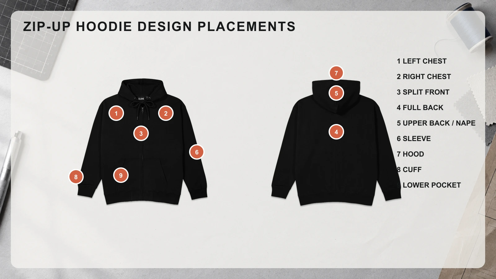
On a zip-up hoodie, the left and right chest work best for compact logos, the split front supports zipper-aware graphics, the uninterrupted back fits large artwork, and the sleeves, hood, cuffs, nape, and lower pocket areas suit supporting details. Each placement must account for the center zipper, separate front panels, seams, pockets, hood coverage, and fabric movement so artwork stays readable, balanced, and visible when the hoodie is zipped or unzipped.
Use the following placement options to match artwork size and type with the available garment area:
<<<image to show how it gonna look>>>>
- Left Chest Placement
On a zip-up hoodie, the left chest provides a compact design area beside the center zipper for logos, monograms, emblems, and short wordmarks. Small prints and embroidery fit this space without dividing the artwork between front panels. Position the design above the pocket, leaving clearance from the zipper tape and the arm-side seam. A controlled scale keeps the logo readable without making the upper front appear crowded.
- Right Chest Placement
The right chest of a zip-up hoodie works well for small logos, names, icons, and secondary brand marks because the artwork can remain entirely on one front panel. This position can also balance a left-side element or stand alone as a minimal detail. Wider graphics need enough clearance from the zipper and arm seam, while embroidery should stay above pocket construction to maintain a stable stitching area.
- Split Front Placement Across the Zipper
Across the front of a zip-up hoodie, split placement works best for large illustrations, mirrored graphics, continuous patterns, and artwork intentionally composed around the center zipper. Both halves should remain visually meaningful when the hoodie is unzipped. Zipper teeth, tape, hardware, and alignment tolerances can interrupt fine details, so avoid placing small text, faces, or other precision-dependent elements directly over the closure.
- Full Back Placement
The uninterrupted back panel of a zip-up hoodie provides the largest usable area for oversized illustrations, typography, logos, emblems, and detailed prints. Unlike the front, no zipper divides the artwork, allowing a single composition to use a larger scale. Position focal details below the resting hood and away from side seams. Large printed graphics generally suit this area better than oversized dense embroidery, which can add stiffness.
- Upper Back / Nape Placement
On a zip-up hoodie, the narrow area below the back neckline suits small logos, symbols, coordinates, and short text that function as secondary details. Centered artwork works well here because it does not interfere with the front zipper or pockets. The lowered hood can cover part or all of the design, so consider visibility. Keep graphics compact and clear of the neckline and shoulder seams.
- Sleeve Placement
Zip-up hoodie sleeves provide a long, zipper-free area for names, vertical wordmarks, numbers, stripes, symbols, and repeating graphics. Outer-sleeve placement gives elongated designs more room while keeping them separate from chest artwork. Avoid placing important details directly over underarm seams or the elbow, where bending can distort the design. Smaller embroidery suits stable upper-arm or forearm areas, while longer graphics work well as prints.
- Hood Placement
The hood of a zip-up hoodie provides a secondary surface for compact logos, short lettering, symbols, and repeated motifs that complement front or back artwork. Side hood panels offer more controlled placement than the center seam or drawstring area. Because the hood folds and shifts when raised or lowered, large, precise graphics can lose their intended shape. Simple prints and small embroidery adapt better to this changing surface.
- Cuff Placement
On a zip-up hoodie, the cuff works best for initials, monograms, tiny symbols, and other small personalized details that do not require a broad design area. Its narrow wrist-level surface favors simple artwork with limited fine detail. Keep decoration away from cuff seams and heavily ribbed areas because stretching can distort lettering or stitches. Compact embroidery is generally more practical here than large printed artwork.
- Lower Pocket Area Placement
The lower front of a zip-up hoodie offers space beside or above the pockets for small illustrations, symbols, directional graphics, and asymmetric supporting artwork. The center zipper, pocket openings, thick seams, and layered fabric divide this area into several boundaries, making it harder to place large, continuous graphics. Keep text and focal details away from these intersections, and shape the artwork around the pocket rather than treating the area as one flat panel.
How Do You Choose the Right Design Style for a Zip-Up Hoodie?
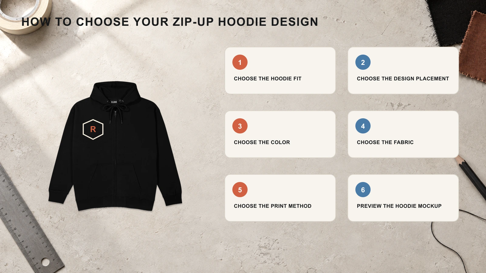
Choose the right zip-up hoodie design by matching the hoodie fit, artwork placement, color, fabric, and print method, then checking the complete design on a mockup. Each choice should account for the center zipper, separate front panels, pockets, seams, hood, and available print space. Before production, preview the hoodie zipped and unzipped to verify graphic scale, alignment, contrast, fabric compatibility, and visibility across every decorated area.
Start with these six steps to choose a zip-up hoodie design that fits your artwork:
- Step 1: Choose the Hoodie Fit
Start with a zip-up hoodie fit that provides enough usable space for your intended graphic scale. Regular and slim fits suit controlled chest and back artwork, while oversized and boxy silhouettes offer more room for large graphics and typography. Use cropped fits for compact chest, sleeve, or upper-back designs because the shorter torso reduces vertical print space. Match artwork proportions to the garment rather than resizing the same layout for every fit.
- Step 2: Choose the Design Placement
Map your artwork to the zip-up hoodie area that supports its size and visual structure. Keep compact logos on individual chest panels, use the uninterrupted back for large graphics, and reserve sleeves or the hood for supporting artwork. If a design crosses the front, account for the zipper gap and hardware. Keep important text and details away from pocket openings, thick seams, and areas that fold frequently.
- Step 3: Choose the Color
Select a zip-up hoodie color that provides enough contrast to preserve shapes, lettering, and small details. High-contrast combinations make graphics more distinct, while tonal combinations use related shades for a restrained appearance. Monochrome designs can combine one color family across the garment and artwork. Check every color against zipper tape, drawstrings, ribbing, and other visible components so the complete hoodie follows the intended color system.
- Step 4: Choose the Fabric
Match the zip-up hoodie fabric to the level of detail and decoration your design requires. Smoother surfaces generally reproduce fine printed lines more consistently, while heavier fleece and textured materials can affect small details. Fabric weight also influences how well the garment supports dense embroidery. Check stretch, surface texture, and thickness before finalizing artwork to avoid distortion, puckering, or excessive stiffness.
- Step 5: Choose the Print Method
Select a decoration method according to the zip-up hoodie artwork’s detail, scale, texture, and distance from seams or zipper hardware. Use embroidery for compact logos, screen printing for bold graphics, digital printing for detailed full-color artwork, and puff print for raised elements. All-over printing suits multi-panel patterns. Confirm production limits near zipper tape, pocket seams, hood seams, and other construction boundaries before preparing final artwork.
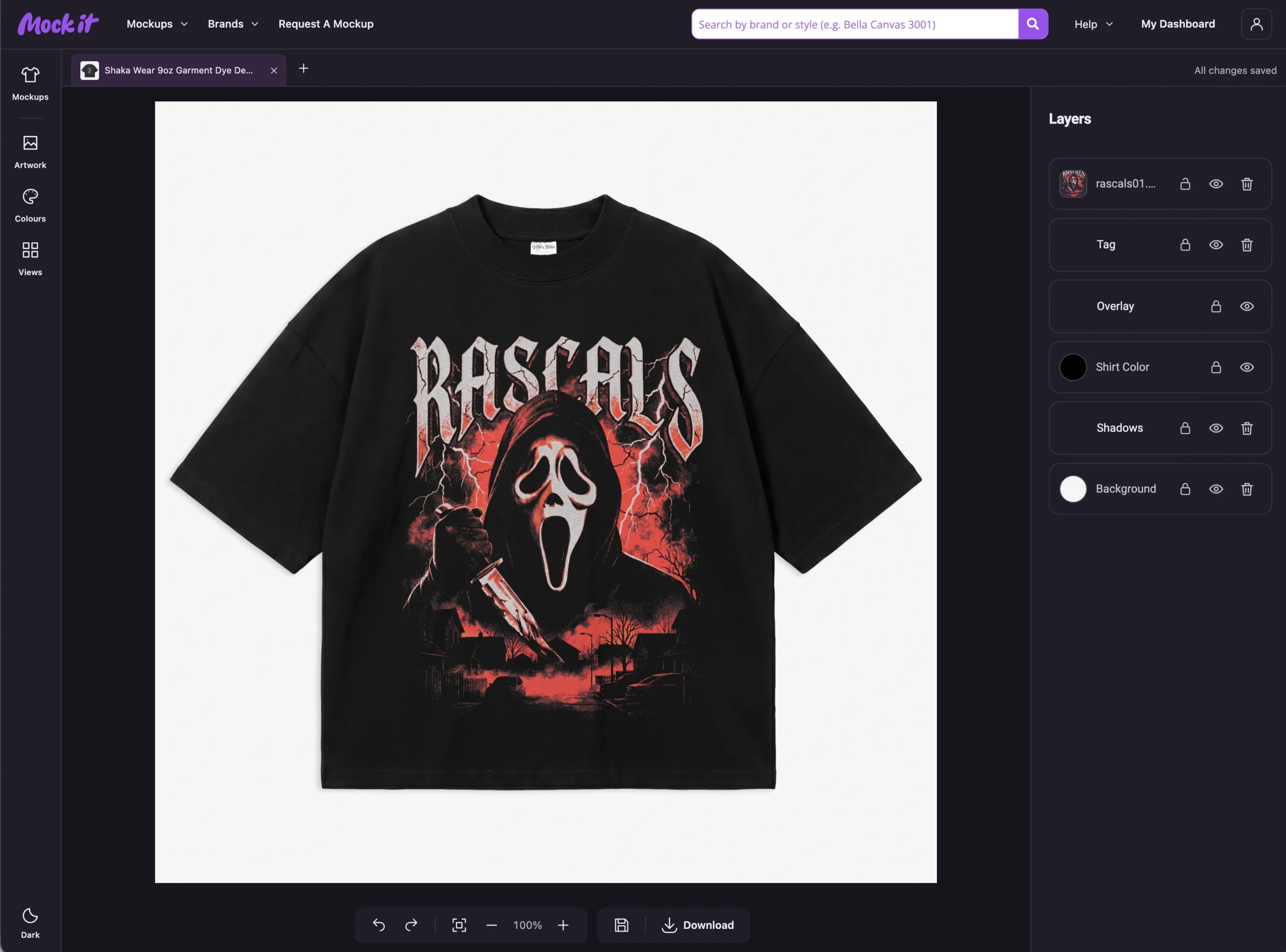
- Step 6: Preview the Hoodie Mockup
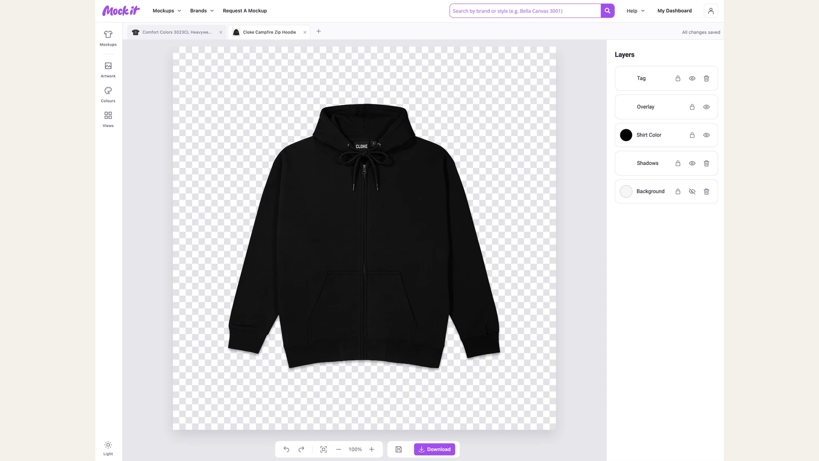
Preview the finished artwork on a zip-up hoodie mockup before sending the design to production. Check graphic scale, chest positioning, zipper alignment, pocket interference, sleeve placement, hood coverage, and overall color balance from relevant garment views. Use a hoodie mockup generator to review the design from multiple angles and identify placement or proportion issues. Compare the front in both zipped and unzipped states when artwork approaches or crosses the closure. Adjust any misplaced, obscured, distorted, or visually unbalanced elements before exporting the final design.
What Are Common Mistakes to Avoid When Choosing a Zip-Up Hoodie Design?
Avoid placing artwork over the zipper or pocket seams, ignoring zipper hardware, choosing the wrong fabric or print method, using low-resolution graphics, selecting poor color contrast, and overcrowding a zip-up hoodie design. These mistakes can split graphics, hide important details, reduce readability, distort printed or embroidered artwork, and create production problems. Before finalizing the design, check placement, artwork quality, fabric properties, garment construction, and decoration requirements.
Check these common mistakes before finalizing your zip-up hoodie design:
- Placing Designs Over the Zipper
Avoid placing important text, faces, logos, or fine details directly over a zip-up hoodie zipper. The center opening divides artwork and changes its appearance when unzipped, while zipper tape and teeth complicate printing. Keep focal elements on individual front panels, or split large graphics intentionally so both halves stay visually coherent when the hoodie opens.
- Ignoring Zipper Gaps and Hardware
Do not design the front of a zip-up hoodie as one uninterrupted flat surface. Zipper tape, teeth, stops, and the pull tab create physical gaps that can obscure or misalign artwork. Leave enough clearance around the hardware, and check both zipped and unzipped views so key graphic elements stay visible, balanced, and readable in either state.
- Using the Wrong Fabric Weight
Avoid selecting a zip-up hoodie fabric without checking whether its weight and surface suit the intended decoration. Lightweight fabric can pucker under dense embroidery, while thick fleece may reduce the clarity of fine printed details. Match embroidery density, ink application, and graphic complexity to the fabric’s thickness, texture, and stretch for a cleaner finished design.
- Placing Artwork Across Pocket Seams
Keep important zip-up hoodie artwork away from pocket openings and thick pocket seams, where layered fabric can interrupt printing and distort details. Text, logos, and faces are particularly vulnerable to these surface changes. Position focal graphics above or beside the pockets, or intentionally shape supporting artwork around pocket boundaries instead of treating the lower front as flat fabric.
- Positioning Back Graphics Too High
Do not place key back artwork directly beneath the neckline of a zip-up hoodie because the lowered hood can cover it. Logos, text, and illustration details may disappear during normal wear. Place the primary graphic below the hood’s resting area while maintaining balanced spacing from shoulder and side seams, then check visibility with the hood both raised and lowered.
- Using Low-Resolution Artwork
Avoid enlarging low-resolution artwork for full-back or oversized zip-up hoodie prints because scaling can expose pixelation, blurred edges, and unclear lettering. Prepare graphics at the required production dimensions and resolution before printing. Use vector artwork for logos and typography where suitable, and inspect large designs at their intended print size before approving them for garment production.
- Choosing Poor Color Contrast
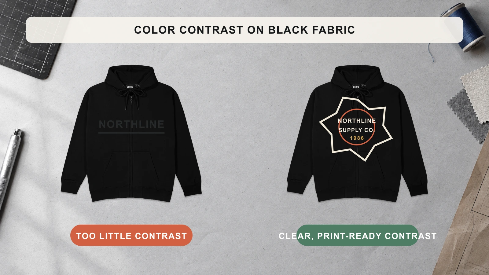
Do not choose artwork colors without comparing them against the zip-up hoodie fabric, zipper tape, ribbing, and other visible components. Insufficient contrast can make text, logos, and illustrations difficult to distinguish. Use stronger light-to-dark separation for clear graphics, or control tonal designs through deliberate shade differences so important details remain recognizable against the garment.
- Using Hard-to-Read Fonts
Thin, overly decorative, or tightly spaced fonts can become difficult to read on zip-up hoodies, especially in small chest, sleeve, or embroidered placements. Fabric texture and garment movement can further reduce character clarity. Choose clear letterforms, allow sufficient spacing, and position important words away from the zipper, seams, folds, and other areas that interrupt typography.
- Overcrowding the Design
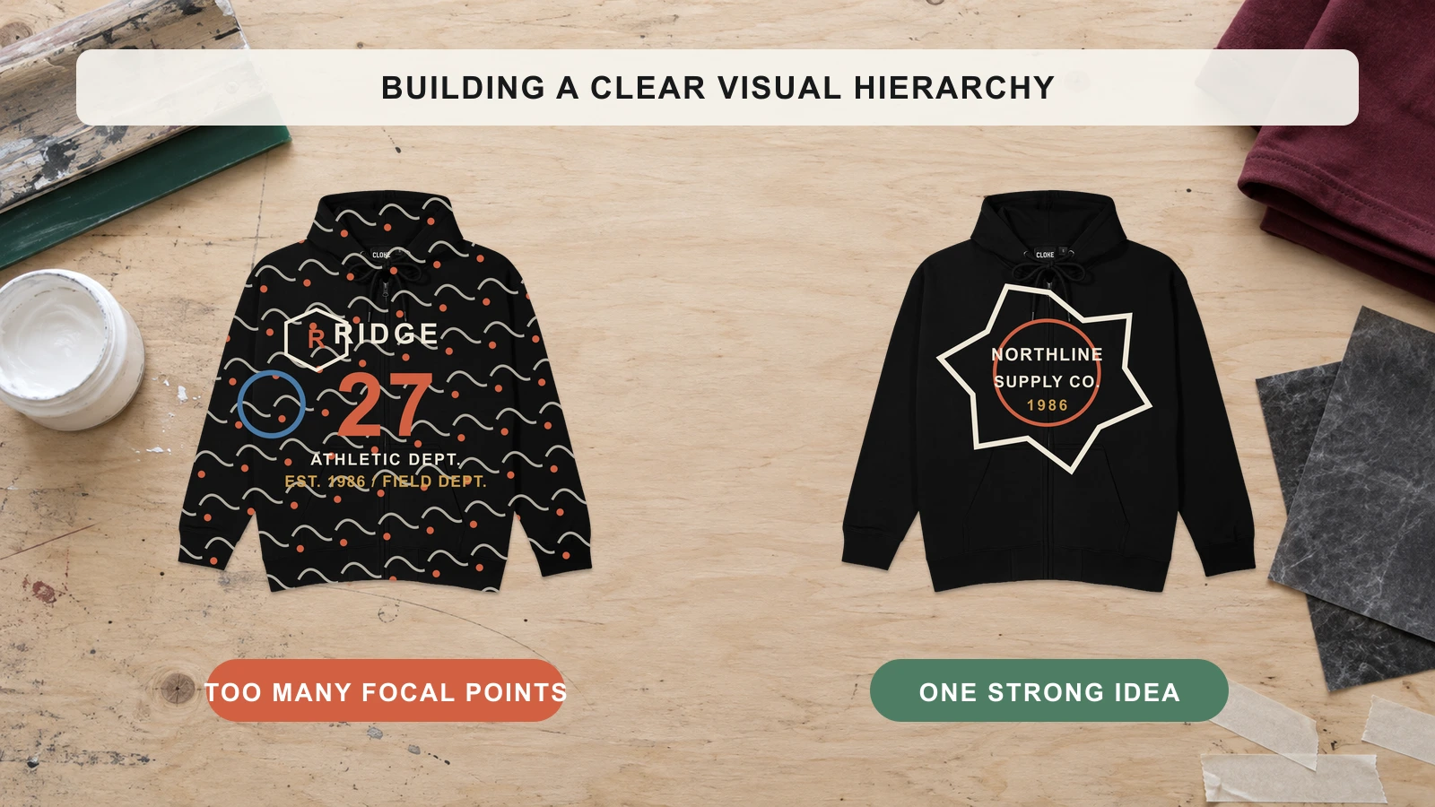
Too many logos, illustrations, patterns, and text elements can make a zip-up hoodie design appear fragmented and difficult to scan. The center zipper already creates a strong visual division across the front. Establish one primary focal area, limit supporting graphics, and maintain clear space between elements so the finished design retains hierarchy, balance, and readability.
- Wrong Print Method Near Zippers
An unsuitable print method near zip-up hoodie zippers can produce uneven application or production difficulties around hardware and layered fabric. Raised prints, heavy ink, and dense embroidery require careful placement near zipper tape and seams. Match the decoration method to the fabric and artwork location, and maintain sufficient clearance from zipper hardware for consistent production results.

 Trusted By Thousands Of Designers
 Cancel Your Subscription Anytime
 30 Day Money Back Guarantee