
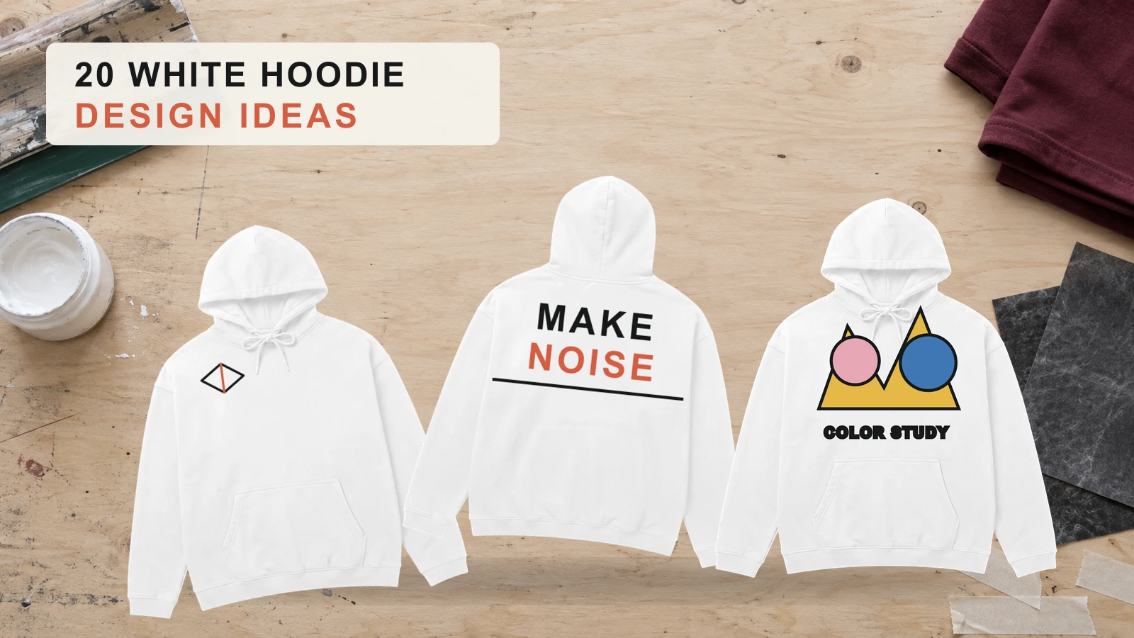
White hoodie design ideas range from minimalist embroidery, small logos, and black line art to bold back prints, retro anime graphics, Japanese typography, geometric artwork, puff prints, and oversized streetwear designs. White fabric provides a clean, neutral canvas that supports strong black-and-white contrast, visible bright colors, subtle pastel accents, and detailed multi-color artwork. Designers can use embroidery for compact textured marks, screen printing for solid graphics, and digital printing for detailed illustrations and broader color ranges.
Placement and production choices determine how effectively the artwork translates onto the garment. Left-chest and upper-back areas suit compact marks, center-chest areas support medium graphics, and the full back accommodates oversized artwork, while sleeves provide space for vertical typography. Match graphic scale and color contrast with the hoodie fit, fabric weight, and print method, then preview the composition on a realistic mockup. Poor resolution, weak contrast, unsuitable fabric, seam interference, overcrowded artwork, and incorrect production methods can reduce clarity and print quality.
20 White Hoodie Design Ideas are:
- Minimalist Embroidery White Hoodie Design
- Left-Chest Embroidery White Hoodie Design
- Small Logo White Hoodie Design
- Bold Back Print White Hoodie Design
- Front Graphic White Hoodie Design
- Front and Back Graphic White Hoodie Design
- Sleeve Typography White Hoodie Design
- Black Line Art White Hoodie Design
- Retro Anime White Hoodie Design
- Japanese Typography White Hoodie Design
- Abstract Geometric White Hoodie Design
- Color Block White Hoodie Design
- Black and White Graphic Hoodie Design
- Pastel Accent White Hoodie Design
- Bright Color Graphic White Hoodie Design
- Puff Print White Hoodie Design
- Oversized Streetwear White Hoodie Design
- Embroidered Logo White Hoodie Design
- Large Multi-Color Print White Hoodie Design
- Branding Logo White Hoodie Design
Minimalist Embroidery White Hoodie Design
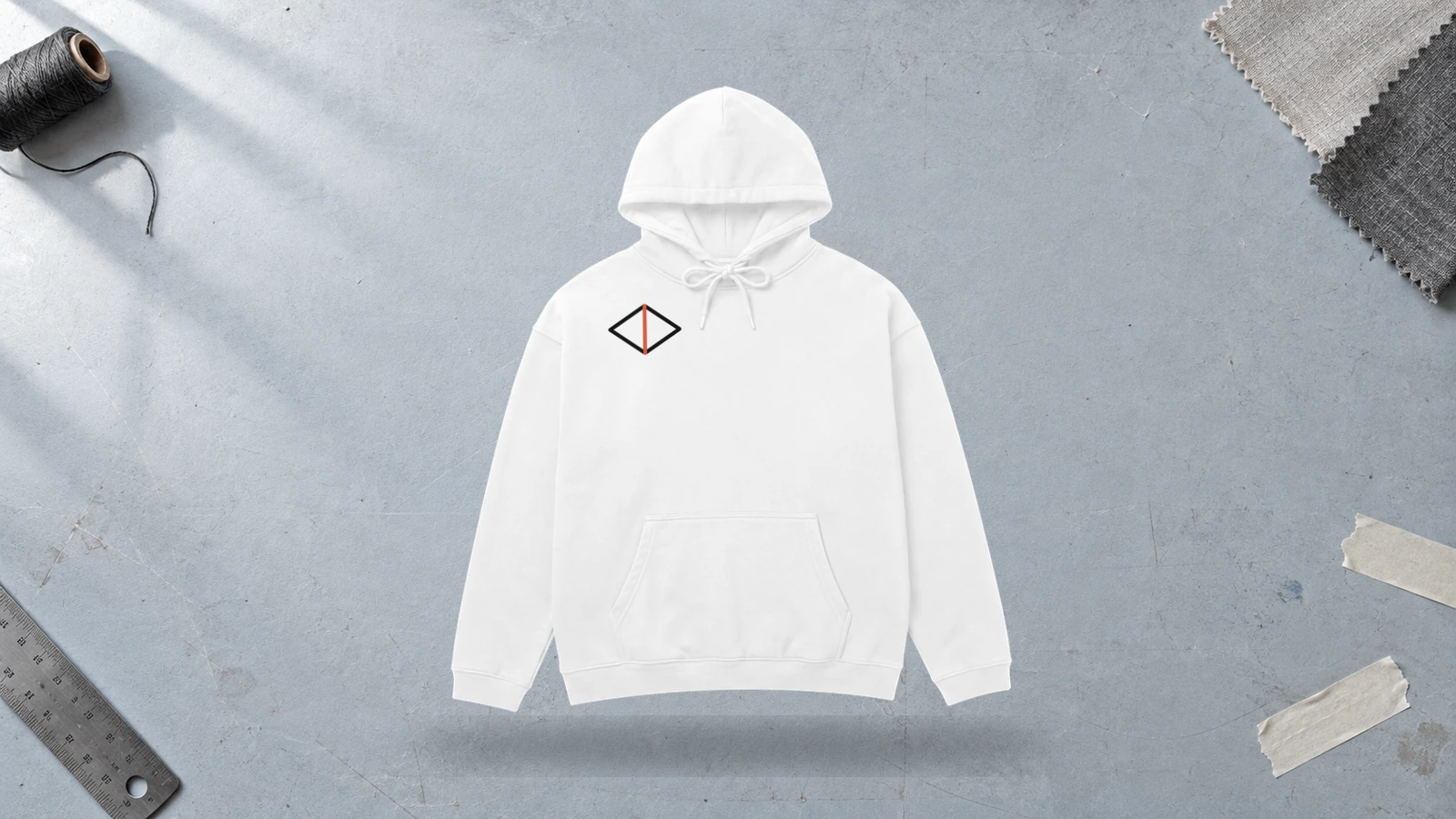
A minimalist embroidery white hoodie design uses a small stitched symbol, wordmark, monogram, or line art on clean white fabric. Compact artwork fits the left chest, sleeve, cuff, or upper back while preserving visible negative space. Black thread creates high contrast, while pastel or white thread produces subtle detail. Embroidery adds tactile texture without requiring a large printed graphic area.
Key Features: Minimalist embroidery, small artwork, clean white canvas, compact placement, subtle detailing, thread contrast, and visible negative space.
Best For: Custom white hoodies, personalized white hoodies, branding, minimalist streetwear, small logos, monograms, wordmarks, and white hoodie designs that use subtle embroidered artwork.
Popular directions:
- Small wordmark: Embroider a short brand name on the left chest using black thread against the white hoodie.
- Minimal symbol: Stitch a small star, flower, geometric symbol, or clean icon on the chest.
- Monogram: Arrange two or three letters into a compact embroidered mark for personalized branding.
- Tonal embroidery: Combine white or pastel thread with the white fabric for subtle artwork.
- Line art: Stitch a simplified outline or drawing that keeps the embroidery clean and minimal.
- Upper-back mark: Place a small logo or wordmark below the hood to add branding to the back of the white hoodie.
Left-Chest Embroidery White Hoodie Design
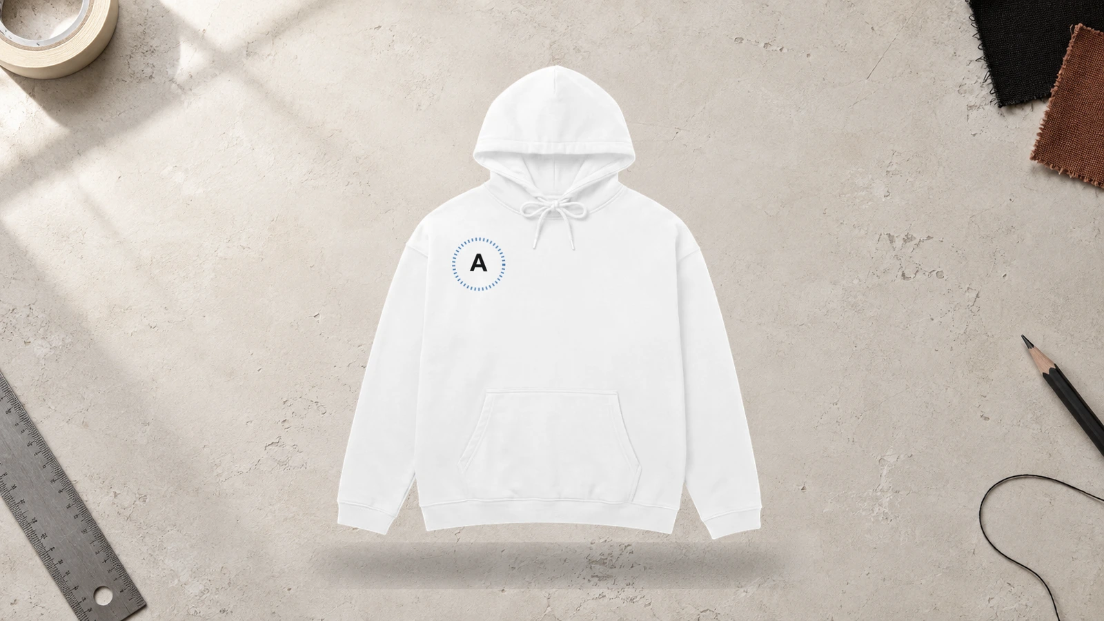
A left-chest embroidery white hoodie design places a small stitched logo, symbol, monogram, or wordmark on the upper front of the white fabric. The compact placement creates a clear focal point while preserving negative space across the chest. Black or bright thread provides strong contrast against the white canvas, while pastel thread creates subtle color. Embroidery adds raised texture and keeps branding clean without requiring large artwork.
Key Features: Left-chest placement, compact embroidery, small artwork, white canvas, thread contrast, negative space, and tactile detailing.
Best For: Clothing brands, custom white hoodies, personalized white hoodies, minimalist streetwear, company apparel, clubs, team merchandise, and embroidered branding.
Popular directions:
- Brand logo: Embroider a compact clothing brand or company logo on the left chest.
- Small wordmark: Stitch a short brand name using clean, readable lettering.
- Monogram: Combine two or three initials into a compact personalized chest mark.
- Minimal symbol: Use a small star, flower, geometric symbol, or line-based icon.
- Pastel embroidery: Apply pastel thread to create soft color against the white hoodie.
- Tonal embroidery: Stitch a white logo or wordmark for subtle branding that remains close to the garment color.
Small Logo White Hoodie Design
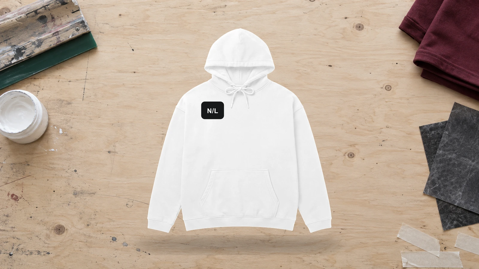
A small logo white hoodie design uses a compact symbol, wordmark, monogram, or brand mark against the clean white fabric. The light background gives dark and colored logos clear visibility while preserving negative space around the artwork. Chest, sleeve, and upper-back placements suit this design, while screen printing works for crisp graphics and embroidery adds texture to simple logo shapes.
Key Features: Compact logo, clean negative space, strong contrast, small-scale artwork, flexible placement, and print or embroidery compatibility.
Best For: Clothing brands, businesses, clubs, teams, creator merchandise, minimalist streetwear, and custom white hoodies with subtle branding.
Popular directions:
- Black logo: Use a compact black wordmark or symbol for strong contrast against the white hoodie.
- Brand icon: Place a recognizable brand symbol on the chest without supporting text.
- Monogram: Combine two or three initials into a small personalized logo.
- Colored logo: Apply a red, blue, green, or other brand color that stays visible against white fabric.
- Embroidered logo: Stitch a simple mark to introduce texture without increasing the graphic scale.
- Upper-back mark: Position a small logo below the neckline for secondary branding.
Bold Back Print White Hoodie Design
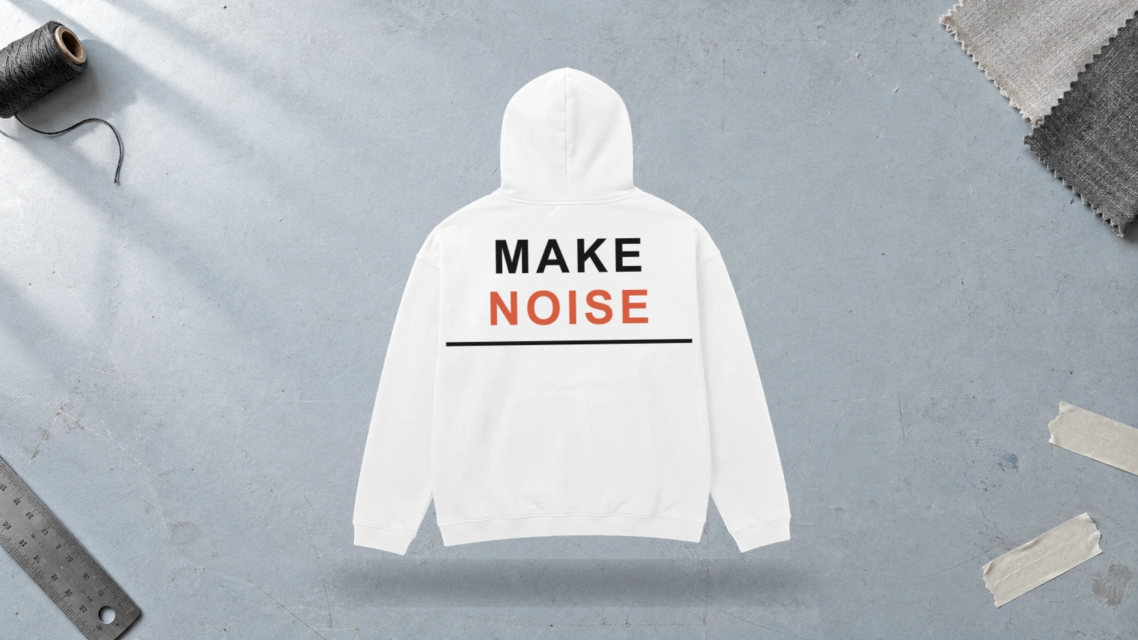
The broad back panel of a white hoodie gives oversized illustrations, typography, logos, and graphic compositions a large uninterrupted canvas. Dark artwork creates strong contrast against the light fabric, while bright and multi-color prints gain clear color separation. Screen printing suits bold shapes and solid colors, while digital printing supports detailed illustrations, gradients, and complex artwork with a wider color range.
Key Features: Oversized back artwork, large print area, strong contrast, clean negative space, high visibility, and bold graphic scale.
Best For: Streetwear, artist merchandise, music apparel, creator brands, event clothing, clubs, and graphic white hoodies built around statement artwork.
Popular directions:
- Oversized illustration: Center a large skull, botanical drawing, animal, or character below the hood.
- Bold typography: Fill the back with a large wordmark, slogan, or short phrase.
- Dark graphic: Print black or charcoal artwork for strong separation from white fabric.
- Color artwork: Combine saturated colors within a large illustration for clear visual separation.
- Poster layout: Arrange imagery, typography, dates, and symbols into one structured composition.
- Brand graphic: Enlarge a logo or branded illustration for greater rear visibility.
Front Graphic White Hoodie Design
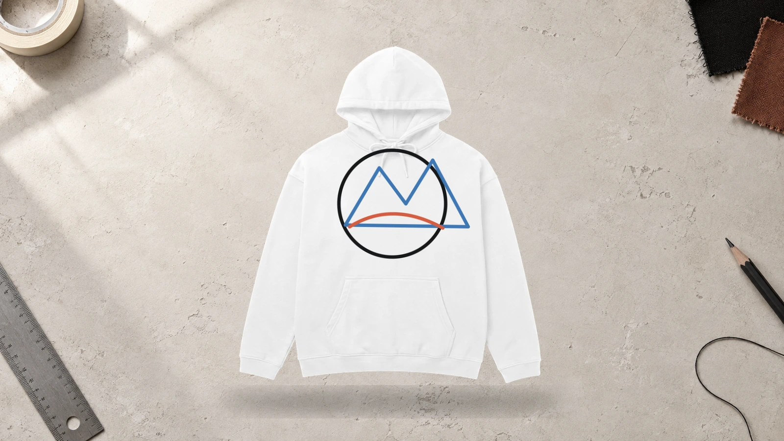
Front graphics stand out clearly on a white hoodie because the light, neutral fabric gives illustrations, typography, logos, and colorful artwork an uncluttered background. A medium or large design can fill the center chest while leaving enough white space around its edges to maintain visual balance. Screen printing suits bold shapes and limited colors, while digital printing works well for detailed, full-color artwork and gradients.
Key Features: Center-chest graphic, clean white background, medium-to-large artwork, strong contrast, balanced negative space, and flexible print methods.
Best For: Artist merchandise, graphic streetwear, creator apparel, branded collections, event hoodies, illustration-led designs, and custom white hoodies.
Popular directions:
- Illustrated graphic: Feature an animal, character, object, floral artwork, or symbolic image across the chest.
- Typography graphic: Combine a short phrase or wordmark with supporting shapes and visual elements.
- Black artwork: Create sharp contrast with dark illustrations, lettering, or graphic symbols.
- Bright graphic: Introduce red, blue, yellow, green, or other saturated colors against the white base.
- Retro composition: Combine vintage-style lettering, illustrations, dates, and small graphic details.
- Minimal artwork: Keep one focused graphic surrounded by generous white negative space.
Front and Back Graphic White Hoodie Design
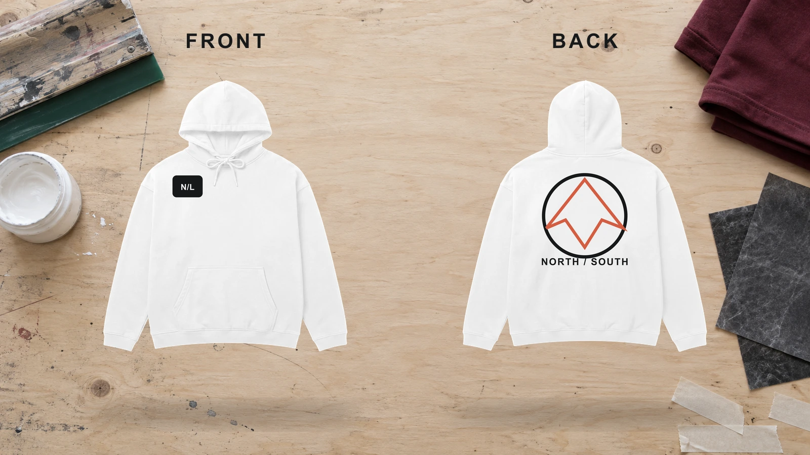
Coordinated front and back graphics give a white hoodie two connected design areas for building a complete visual concept. A smaller chest illustration, logo, or symbol can introduce the artwork, while the broader back supports oversized graphics, typography, or detailed illustrations. Repeating colors, linework, or motifs across both sides creates visual consistency, and the white fabric keeps each element clear through open negative space.
Key Features: Coordinated front and back graphics, varied artwork scale, consistent colors, visual hierarchy, clean negative space, and two-sided design.
Best For: Streetwear brands, artist merchandise, music apparel, creator collections, event hoodies, branded clothing, and custom white hoodies with multi-placement artwork.
Popular directions:
- Small front, large back: Pair a compact chest symbol with an oversized illustration on the back of the white hoodie.
- Logo and artwork: Match a front logo with a larger branded graphic or illustration on the back.
- Connected theme: Repeat symbols, shapes, characters, or motifs across both sides.
- Typography system: Introduce a short front wordmark and continue the concept with larger back lettering.
- Character design: Show a small character detail on the chest and a complete illustration on the back.
- Color-linked graphics: Repeat selected accent colors across both designs to create a consistent visual identity.
Sleeve Typography White Hoodie Design
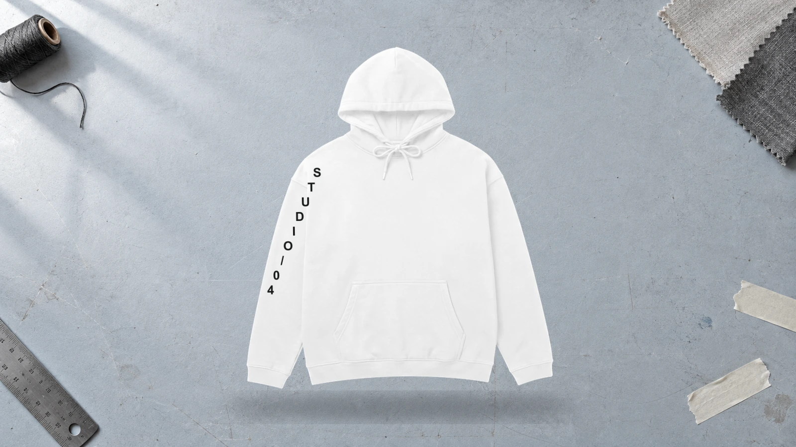
The long, narrow sleeves of a white hoodie provide a natural canvas for vertical names, wordmarks, dates, symbols, and short phrases. Black or dark lettering creates strong contrast against the white fabric, while bright typography can coordinate with front or back graphics. Screen printing suits long typographic layouts, while embroidery works better for shorter text and compact lettering on stable sleeve areas.
Key Features: Vertical typography, elongated design area, clear lettering, strong color contrast, sleeve-focused artwork, and print or embroidery options.
Best For: Streetwear brands, team apparel, event merchandise, personalized white hoodies, creator clothing, branded collections, and typography-led designs.
Popular directions:
- Vertical wordmark: Run a brand or collection name down the outer sleeve in bold lettering.
- Personal name: Add a surname, nickname, or creator name along one sleeve.
- Date design: Arrange a founding year, event date, or significant number vertically.
- Dual-sleeve text: Divide connected words or phrases between the left and right sleeves.
- Black block lettering: Create high contrast with bold black typography against white fabric.
- Accent-color text: Match bright sleeve lettering with colors already present in the chest or back artwork.
Black Line Art White Hoodie Design
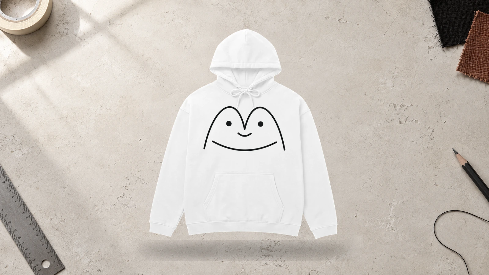
Black line art creates sharp definition on a white hoodie by turning the light fabric into negative space around and within the illustration. Contour drawings, outlines, sketches, and simplified graphics can remain visually clear without large areas of ink. Screen printing suits thicker, defined linework, while digital printing can reproduce intricate drawings with finer lines and varied detail.
Key Features: Black outlines, white negative space, high contrast, simplified illustration, limited color palette, and clean graphic definition.
Best For: Minimal streetwear, artist merchandise, tattoo-inspired graphics, illustration-led brands, creator apparel, and monochrome white hoodie designs.
Popular directions:
- Face outline: Create a continuous-line portrait or simplified facial illustration.
- Botanical drawing: Illustrate flowers, leaves, branches, or vines with dark outlines.
- Animal linework: Draw a snake, wolf, bird, tiger, or similar subject through contour lines.
- Architectural sketch: Feature buildings, landmarks, or structural drawings in black.
- Tattoo-inspired art: Combine bold outlines with controlled decorative details.
- Abstract lines: Form a minimal composition from flowing, intersecting, or irregular lines.
Retro Anime White Hoodie Design
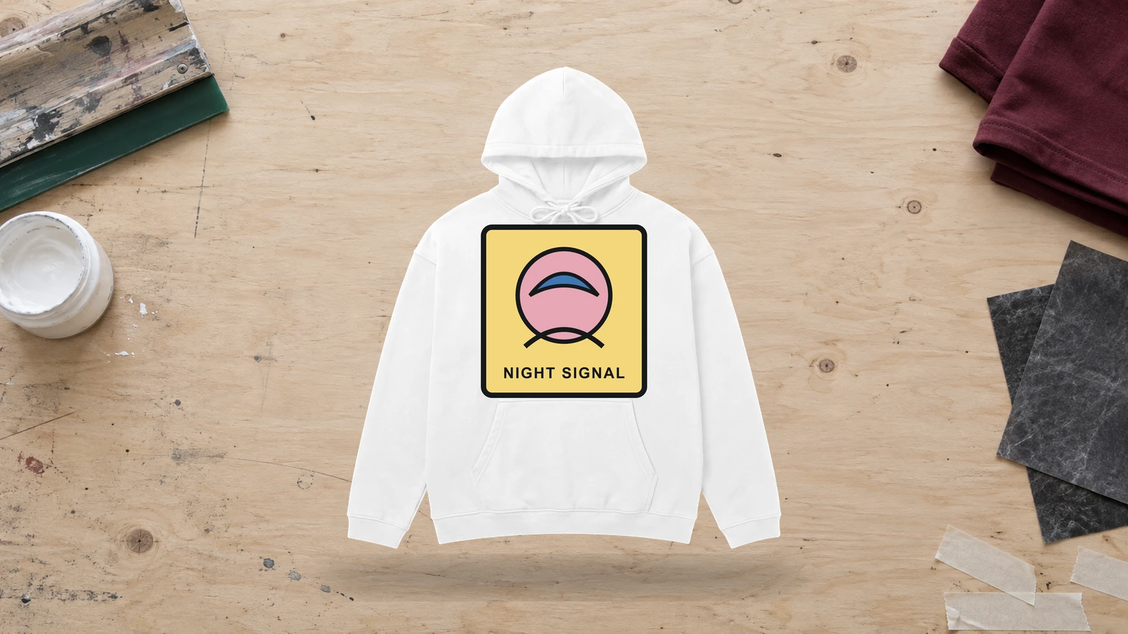
Retro anime illustrations look clean on white hoodies, keeping character outlines, muted colors, lettering, and supporting symbols distinct. Character portraits can dominate the front or back, while smaller Japanese-inspired graphics or typography can support the main artwork. Digital printing suits detailed, multi-color illustrations, while simplified color separations work well with screen printing.
Key Features: Character illustration, retro styling, outlined artwork, controlled colors, graphic typography, and detailed printing.
Best For: Anime-inspired merchandise, gaming apparel, artist collections, graphic streetwear, creator merchandise, and illustrated white hoodies.
Popular directions:
- Character portrait: Feature an illustrated face or upper-body character as the focal graphic.
- Manga panel: Build a comic-panel composition from linework, text, and limited colors.
- Retro lettering: Pair character artwork with vintage-inspired display typography.
- Muted palette: Combine black outlines with faded red, blue, yellow, or neutral tones.
- Large back artwork: Position a detailed character illustration below the hood.
- Graphic symbols: Surround the main artwork with numbers, icons, stars, or small marks.
Japanese Typography White Hoodie Design
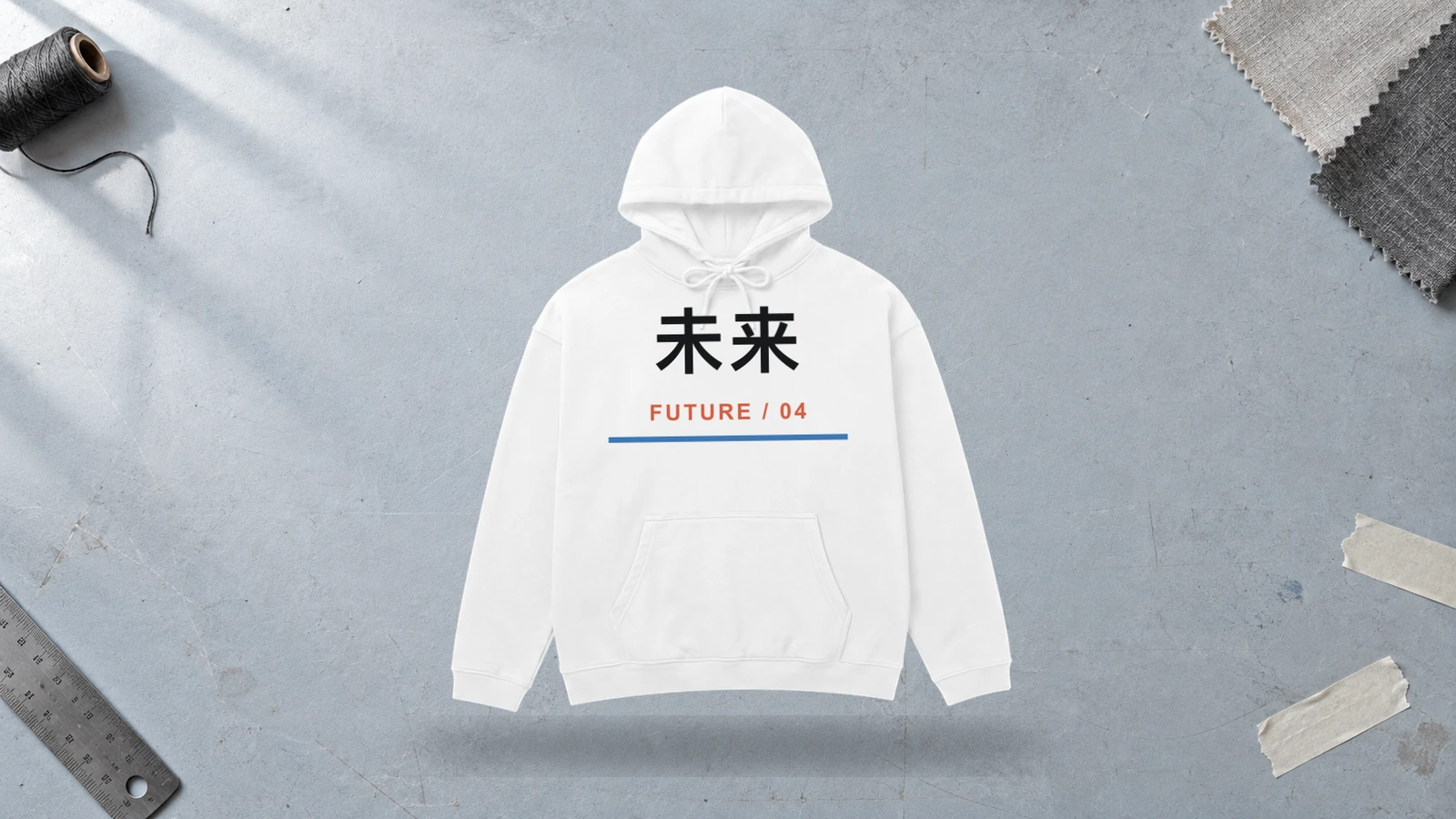
Japanese characters form a strong typographic focal point against the uncluttered surface of a white hoodie. Black lettering provides pronounced contrast, while red or other saturated accents can introduce a second color layer without overwhelming the composition. Vertical arrangements suit sleeves and back prints, while compact character groups work well on the chest and for smaller branding applications.
Key Features: Japanese characters, vertical typography, strong contrast, graphic lettering, accent colors, and flexible scale.
Best For: Typography-led streetwear, artist merchandise, graphic apparel, Japanese-inspired design concepts, creator collections, and custom white hoodies.
Popular directions:
- Vertical characters: Arrange lettering down the back or along the outer sleeve.
- Black and red: Combine black typography with a controlled red accent.
- Chest typography: Keep a compact character arrangement on the center or side chest.
- Illustrated lettering: Pair typography with waves, flowers, animals, or graphic symbols.
- Oversized characters: Scale a short character sequence across the white hoodie back.
- Minimal typography: Surround one lettering element with generous white negative space.
Abstract Geometric White Hoodie Design
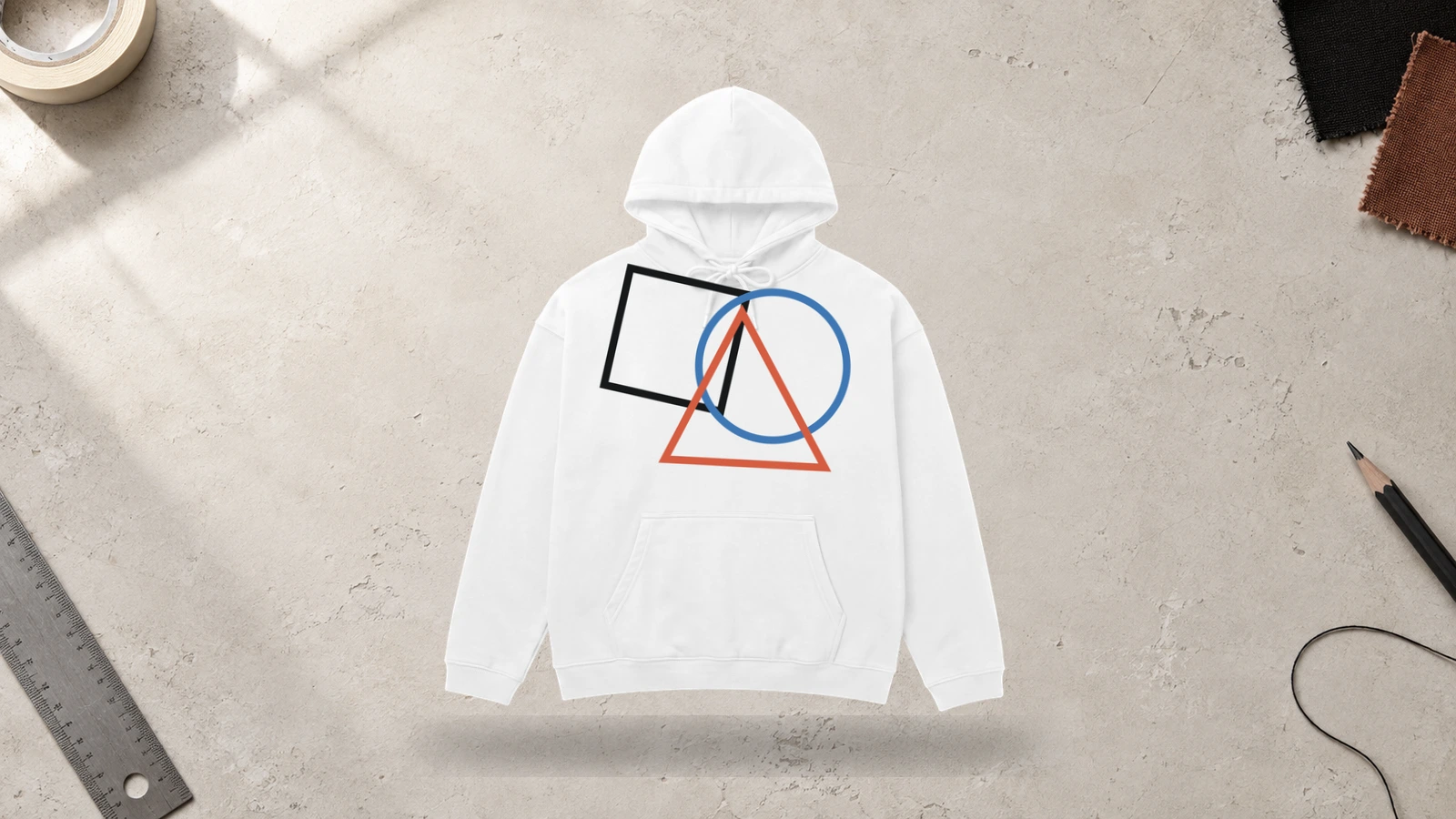
Circles, polygons, grids, lines, and angular forms remain clearly separated when white fabric surrounds each geometric element. This open background supports anything from minimal black geometry to layered, multi-color compositions without making individual shapes difficult to distinguish. Screen printing works well for solid forms, while digital printing supports gradients, overlapping vectors, and more complex abstract artwork.
Key Features: Geometric shapes, abstract composition, structured artwork, negative space, scalable graphics, and flexible color combinations.
Best For: Contemporary streetwear, technology-inspired apparel, creative brands, artist merchandise, modern white hoodie designs, and shape-based graphics.
Popular directions:
- Polygon composition: Combine triangles, rectangles, and angular forms into one graphic.
- Grid layout: Organize lines, symbols, and shapes within a structured framework.
- Circular artwork: Overlap circles with typography, symbols, or contrasting forms.
- Black geometry: Create strong tonal separation with solid black shapes.
- Color geometry: Combine bright or primary colors with selected geometric elements.
- Optical pattern: Repeat lines and shapes to create controlled visual movement.
Color Block White Hoodie Design
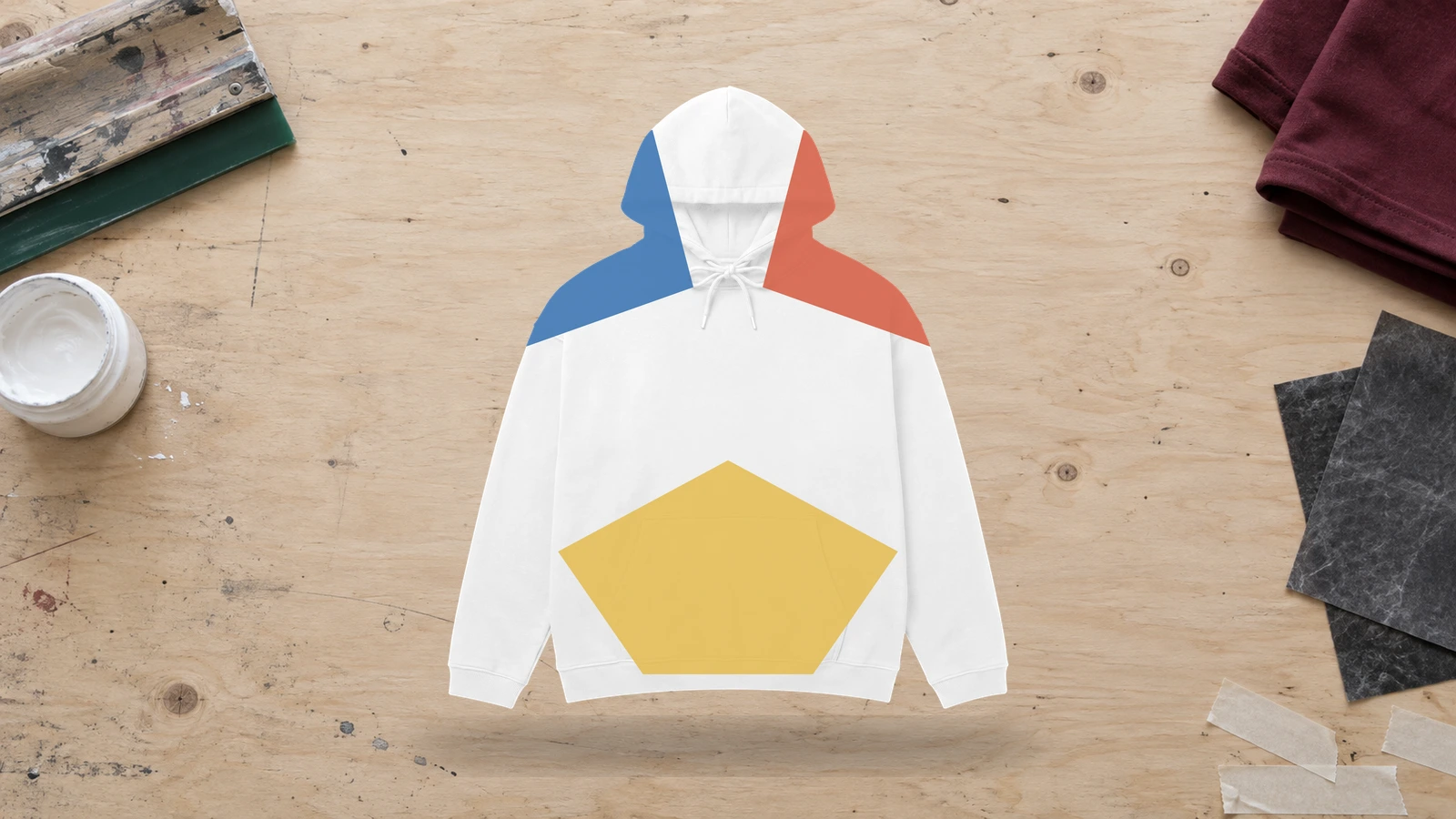
Defined areas of contrasting color can transform a white hoodie into a structured two-tone or multi-tone composition. White acts as the neutral anchor between colored sections across the body, sleeves, hood, pocket area, or printed artwork. Large solid forms suit this approach because clear boundaries and color relationships carry more visual weight than intricate illustration.
Key Features: Defined color sections, white base, contrasting areas, large shapes, garment-aware composition, and clear visual separation.
Best For: Streetwear, sports-inspired apparel, team clothing, contemporary brands, casual collections, and color-led custom white hoodies.
Popular directions:
- Contrast sleeves: Combine a white body with dark or brightly colored sleeve sections.
- Chest block: Add a broad color field behind a logo, symbol, or typography.
- Two-tone design: Pair white with one dominant contrasting color.
- Primary accents: Introduce red, blue, or yellow across selected design areas.
- Geometric blocking: Divide the composition through diagonal or angular color sections.
- Coordinated accents: Match hood, sleeve, or pocket details through a consistent accent color.
Black and White Graphic Hoodie Design
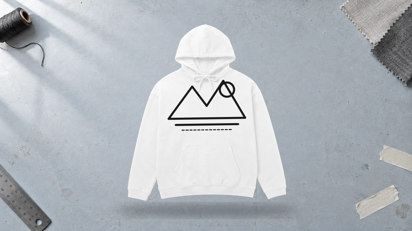
Strong tonal separation gives black graphics immediate visibility against a white hoodie while keeping the overall palette controlled. Illustrations, typography, logos, halftone images, and patterns can use black ink for focal details while the garment provides lighter areas and negative space. Screen printing is especially well-suited to solid monochrome graphics with clearly defined shapes and lettering.
Key Features: Black-and-white palette, high contrast, negative space, strong graphic definition, monochrome artwork, and versatile printing.
Best For: Streetwear, band merchandise, artist apparel, branded clothing, creator collections, minimalist graphics, and monochrome white hoodies.
Popular directions:
- Black illustration: Feature a detailed monochrome drawing across the chest or back.
- Bold typography: Print oversized black lettering against the white fabric.
- Halftone image: Convert photographic artwork into a black-and-white graphic treatment.
- Logo graphic: Enlarge a black brand mark, emblem, or wordmark.
- Repeated pattern: Arrange black icons, symbols, or abstract forms across selected areas.
- Mixed composition: Combine illustration, typography, linework, and symbols within one graphic.
Pastel Accent White Hoodie Design
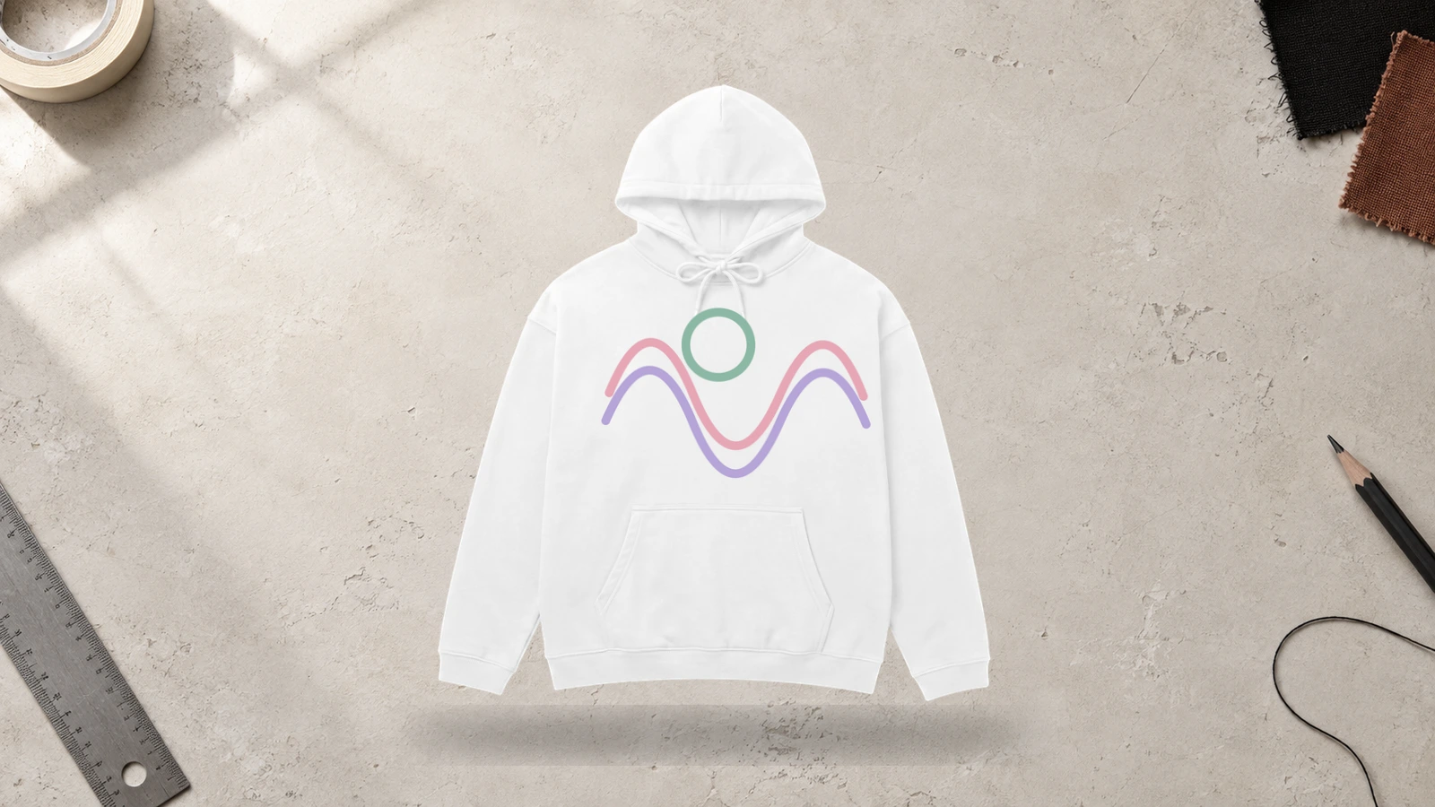
Soft pink, blue, lavender, mint, and peach tones maintain a light visual character when paired with white hoodie fabric. Their lower contrast makes them suitable for subtle graphics, small typography, line art, and embroidery rather than designs that depend on sharp tonal separation. Screen printing can reproduce defined pastel shapes, while colored thread adds similar hues through tactile embroidered details.
Key Features: Pastel colors, soft contrast, light visual palette, subtle artwork, clean background, and print or embroidery options.
Best For: Minimal apparel, boutique brands, creator merchandise, personalized white hoodies, soft graphic collections, and restrained color concepts.
Popular directions:
- Pastel logo: Add a soft pink, blue, lavender, or mint brand mark to the chest.
- Floral artwork: Combine pastel flowers with simple outlines or typography.
- Soft embroidery: Stitch compact lettering or symbols with light-colored thread.
- Pastel linework: Replace black outlines with muted colored lines.
- Multi-pastel graphic: Combine several soft hues within one simple illustration.
- Small accents: Introduce pastel details around otherwise monochrome artwork.
Bright Color Graphic White Hoodie Design
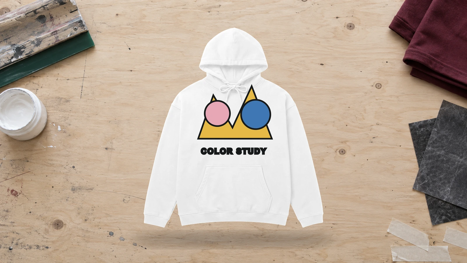
Saturated red, blue, yellow, green, orange, and pink graphics gain clear color separation against a neutral white hoodie. The light background lets vivid artwork take the visual focus without competing with a colored garment base. Screen printing works well for solid-color areas, while digital printing can reproduce gradients, detailed illustrations, and graphics with a broader range of bright hues.
Key Features: Saturated colors, strong visibility, white background, vivid artwork, clear color separation, and multi-color printing.
Best For: Artist merchandise, event apparel, creator brands, graphic streetwear, youth-focused collections, and colorful custom white hoodies.
Popular directions:
- Primary-color graphic: Combine red, blue, and yellow within one bold illustration.
- Bright typography: Make saturated lettering the dominant front or back element.
- Colorful character: Feature a vivid illustrated figure against the white fabric.
- Neon-inspired artwork: Introduce intense pink, green, orange, or blue accents.
- Bright logo: Reproduce a brand mark in a saturated signature color.
- Color splash: Frame a central graphic with irregular bright shapes or marks.
Puff Print White Hoodie Design
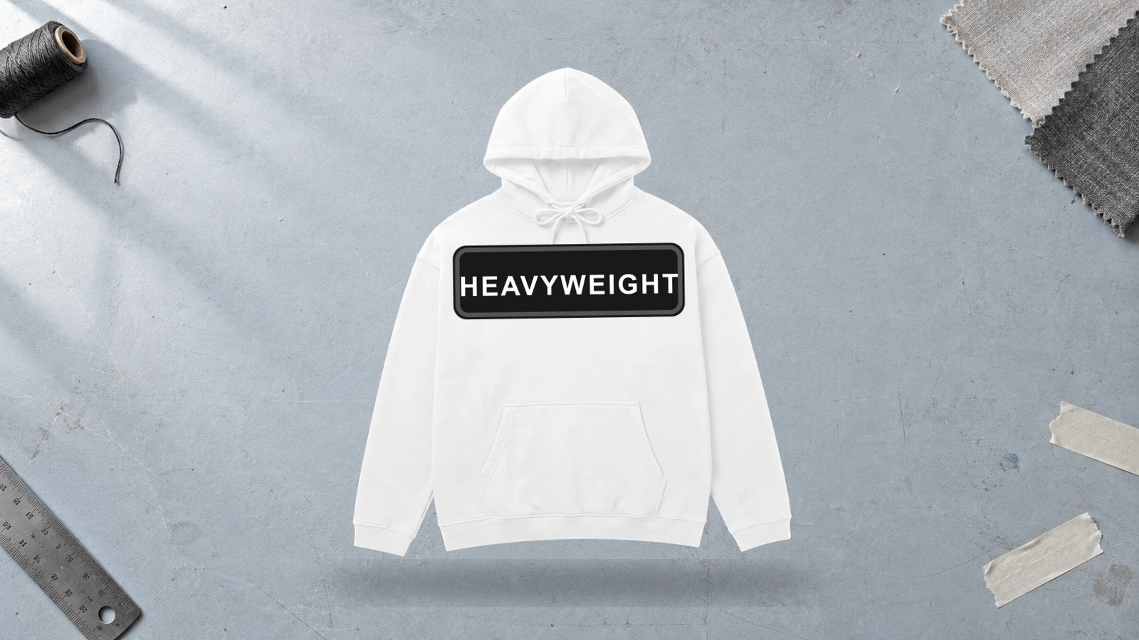
Raised ink gives a white hoodie design physical depth, making bold lettering, logos, and simplified graphics stand above the garment surface. Black or bright puff ink creates both tonal and tactile contrast, while white-on-white printing produces a subtler effect through texture alone. Thick typography and simple shapes generally suit this method better than intricate linework or very small details.
Key Features: Raised ink, tactile texture, dimensional graphics, bold shapes, surface contrast, and simplified artwork.
Best For: Streetwear labels, branded apparel, typography-led designs, creator merchandise, premium casual clothing, and textured custom white hoodies.
Popular directions:
- Raised wordmark: Create dimensional brand lettering across the chest.
- Puff logo: Turn a compact symbol or emblem into a raised front detail.
- Tonal print: Choose white or off-white puff ink for texture-led contrast.
- Black puff text: Combine dimensional lettering with strong black-and-white separation.
- Bright puff graphic: Introduce saturated color and raised texture within one design.
- Back typography: Scale dimensional lettering across the back for greater visual impact.
Oversized Streetwear White Hoodie Design
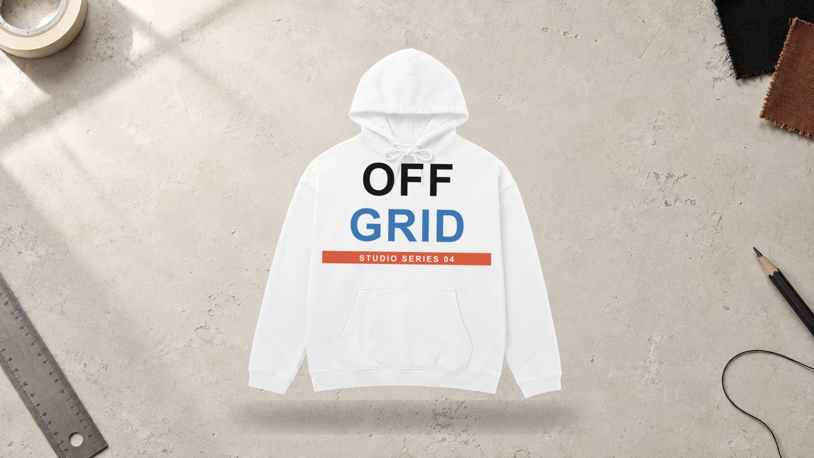
A relaxed, dropped-shoulder silhouette provides more visual space for large graphics, broad typography, sleeve artwork, and intentionally small branding. White fabric keeps oversized dark or colorful artwork distinct across the wider body, while the additional garment area supports bigger differences between primary and secondary graphics. Screen printing, digital printing, puff print, and embroidery can create varied streetwear finishes.
Key Features: Oversized silhouette, broad design areas, large graphics, streetwear styling, white negative space, and mixed decoration methods.
Best For: Streetwear labels, artist merchandise, fashion collections, creator brands, music apparel, and white designer hoodies with relaxed proportions.
Popular directions:
- Oversized back graphic: Fill much of the rear panel with illustration or typography.
- Small front branding: Contrast a compact chest mark with dominant back artwork.
- Large wordmark: Extend a brand name or statement across the chest or back.
- Sleeve graphics: Run symbols, lettering, or repeated artwork along the roomy sleeves.
- Puff typography: Add dimensional lettering to a bold streetwear composition.
- Asymmetric graphic: Offset large artwork instead of centering it on the garment.
Embroidered Logo White Hoodie Design
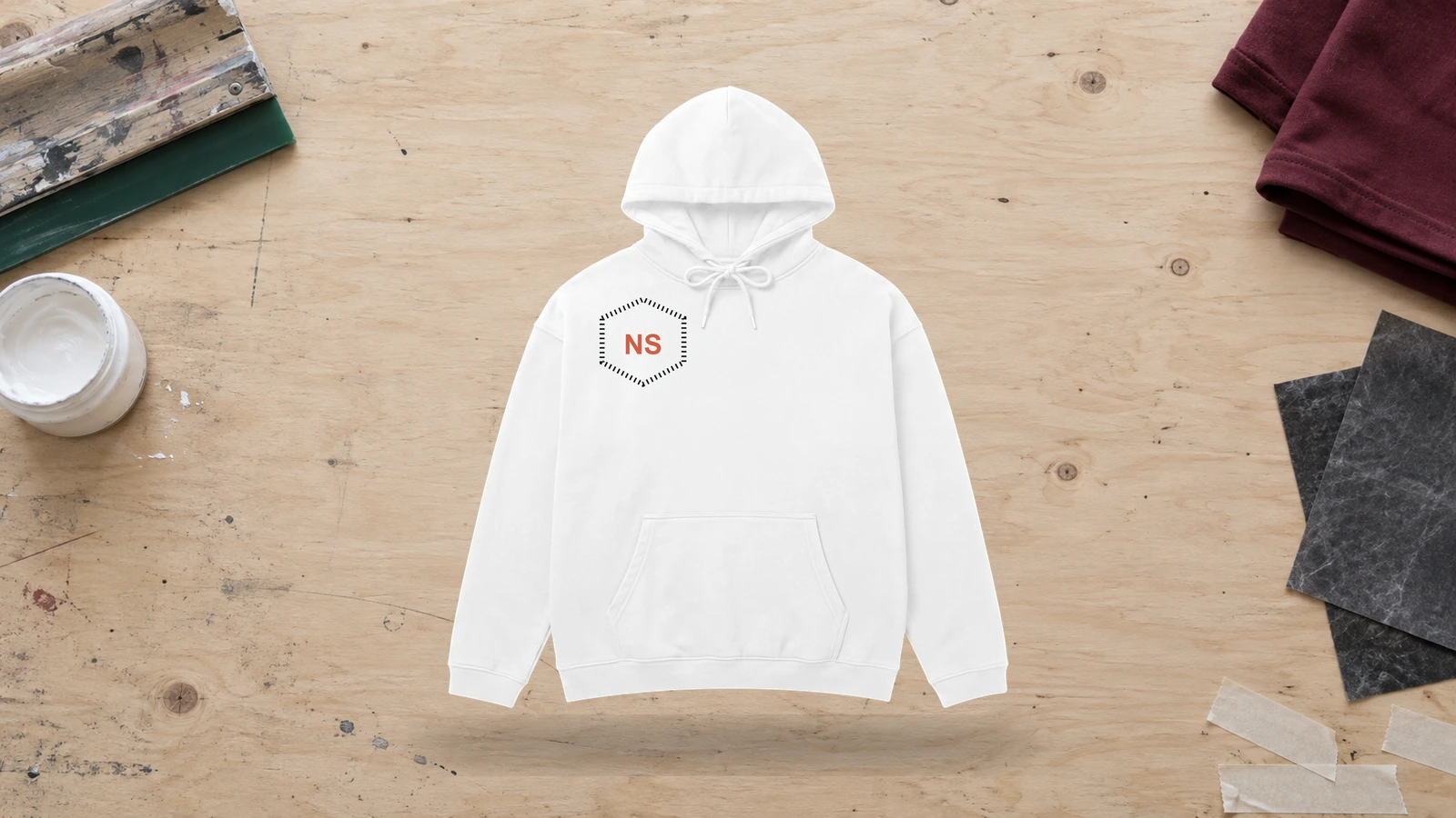
Stitched branding introduces texture to a white hoodie while keeping the overall artwork compact and controlled. Black and colored thread can define a logo clearly against the light fabric, whereas white-on-white embroidery creates subtle differentiation through raised stitches rather than color. Chest, sleeve, cuff, and upper-back areas suit simple marks that can retain clean edges at smaller scales.
Key Features: Stitched branding, tactile detail, compact artwork, thread contrast, small-scale placement, and tonal or colored embroidery.
Best For: Businesses, clothing brands, teams, clubs, staff apparel, premium merchandise, and custom white hoodies with stitched branding.
Popular directions:
- Black embroidery: Stitch a dark chest logo for pronounced contrast against white.
- Tonal logo: Select white thread for a subtle texture-based brand mark.
- Colored emblem: Reproduce a logo or crest with established brand colors.
- Monogram: Combine initials into a compact personalized mark.
- Sleeve logo: Add a small embroidered symbol to the upper arm or forearm.
- Upper-back mark: Position a stitched wordmark or icon below the neckline.
Large Multi-Color Print White Hoodie Design
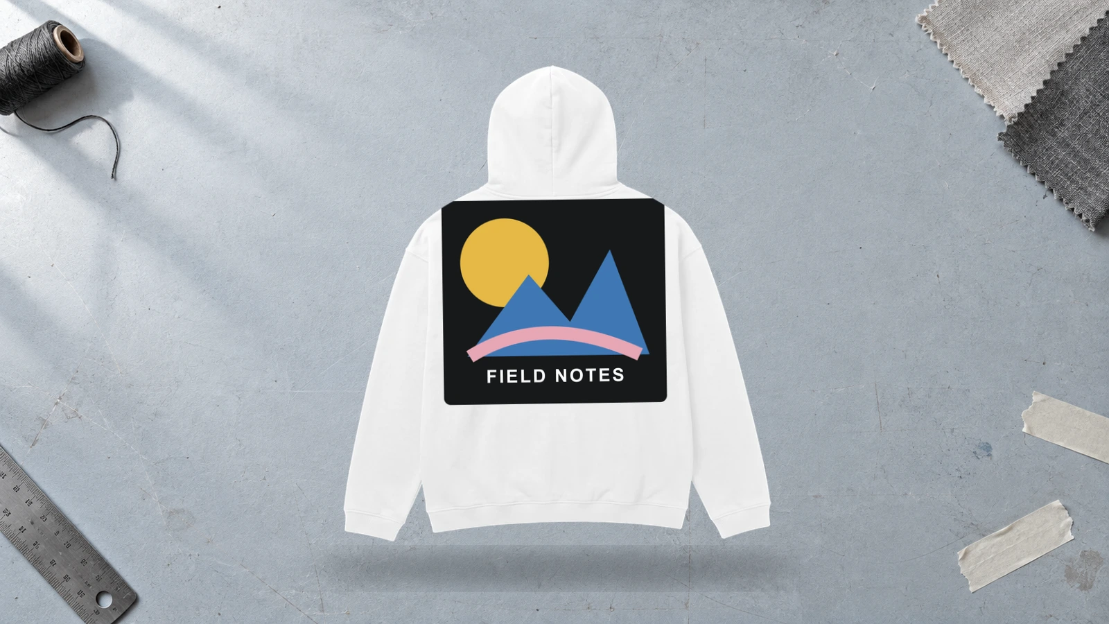
Multiple printed colors stay clearly distinguishable on white fabric because the garment doesn’t introduce another dominant background hue. Large illustrations, character graphics, collages, and poster-style compositions can therefore combine several colors while keeping individual elements separate. Digital printing supports detailed full-color imagery and gradients, while multi-color screen printing suits artwork divided into defined solid-color layers.
Key Features: Multiple colors, oversized artwork, clear color separation, white background, detailed graphics, and broad print coverage.
Best For: Artist merchandise, illustrated apparel, music merchandise, creator collections, colorful streetwear, events, and graphic white hoodies with complex artwork.
Popular directions:
- Full-color illustration: Combine several hues within a detailed chest or back graphic.
- Character artwork: Match colorful characters with typography and supporting symbols.
- Graphic collage: Layer illustrations, lettering, shapes, and contrasting color fields.
- Poster composition: Organize multiple colors within a structured graphic layout.
- Colorful branding: Expand a multi-color brand identity into larger artwork.
- Gradient graphic: Transition between several hues within an illustration or abstract design.
Branding Logo White Hoodie Design
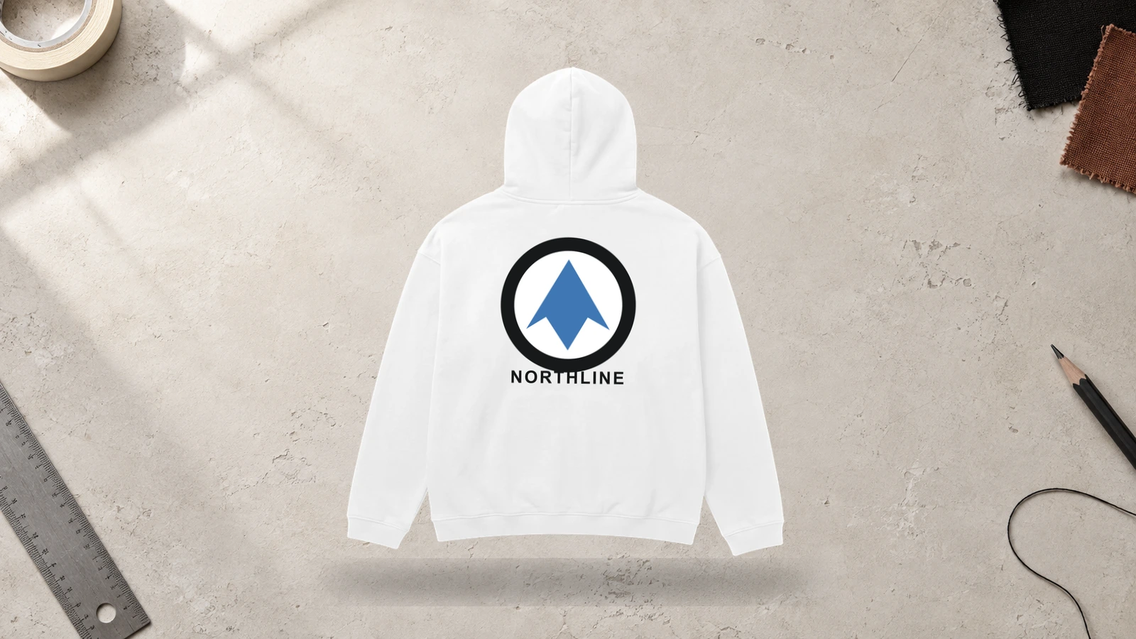
Brand colors and logo shapes can remain clearly recognizable against the neutral surface of a white hoodie without interference from a competing garment color. Company marks, wordmarks, emblems, and symbols can range from compact chest branding to large back applications depending on the required visibility. Printing suits detailed or larger logos, while embroidery gives simpler marks a textured finish.
Key Features: Brand identity, recognizable logo, neutral white base, consistent colors, flexible graphic scale, and print or embroidery options.
Best For: Businesses, clothing labels, organizations, staff apparel, events, creator brands, promotional merchandise, and branded custom white hoodies.
Popular directions:
- Chest logo: Keep a compact company or clothing label mark on the upper front.
- Large back logo: Scale the brand identity across the back for greater visibility.
- Icon and wordmark: Separate the brand symbol and full name across different areas.
- Monochrome branding: Reproduce the logo entirely in black for strong tonal contrast.
- Brand-color logo: Maintain established brand colors against the neutral white fabric.
- Multi-placement branding: Coordinate chest, sleeve, and back marks with consistent typography and proportions.
What White Hoodie Design Placements Work Best?
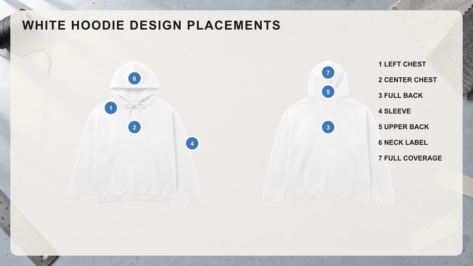
On a white hoodie, the left chest works well for compact logos, the center chest supports medium-scale graphics, and the uninterrupted back provides space for oversized artwork. Sleeves, the upper back, neck area, and full-garment coverage support typography, secondary branding, patterns, and extended compositions. Each placement should account for graphic scale, visibility, the pouch pocket, hood coverage, seams, and garment movement so the artwork remains balanced across the white surface.
Use the following placement options to match artwork size and type with the available garment area:
- Left Chest Placement
Compact logos, monograms, symbols, short wordmarks, and small embroidery fit naturally within the upper-left area of a white hoodie. The surrounding white fabric gives small artwork enough negative space to remain distinct without requiring a larger scale. Place the design above the pouch pocket and away from the arm seam, keeping proportions controlled so the upper front does not look crowded.
- Center Chest Placement
Across the main front area, medium-scale illustrations, typography, logos, emblems, and graphic marks gain a prominent viewing position. The wider horizontal space supports artwork that needs more visual weight than a small chest logo. Keep the graphic above the pouch pocket, and leave enough space from the neckline and side seams to maintain balanced proportions across the hoodie front.
- Full Back Placement
The broad rear panel provides the largest uninterrupted design area for oversized illustrations, typography, logos, character artwork, and detailed prints. Large graphics can occupy more vertical and horizontal space without competing with the pouch pocket or front design. Position important details below the resting hood and within the side seams so the main composition remains visible during normal wear.
- Sleeve Placement
Long, narrow artwork such as names, vertical wordmarks, dates, numbers, symbols, and repeated graphics fits a hoodie sleeve well. Outer-sleeve positioning provides more continuous space while separating supporting details from the primary front or back artwork. Keep important elements away from the underarm seam, elbow, and cuff, where folds and movement can interrupt lettering or graphic alignment.
- Upper Back Placement
Small logos, short text, symbols, coordinates, and secondary brand marks fit the horizontal area between the shoulders without requiring the scale of a full-back print. This position works well for supporting artwork that complements a larger front design. Leave enough space below the neckline because the lowered hood can partially cover graphics placed too high.
- Neck Label Placement
Compact brand names, logos, size details, and identity marks suit the restricted space around the neckline. Artwork needs a small, simplified scale because nearby seams leave little room for detailed illustrations or long typography. Keep lettering and symbols clear of the neckline construction so the design remains legible and proportionate to the available area.
- Full-Coverage Placement
Patterns, repeated graphics, abstract artwork, and connected compositions can extend across the front, back, sleeves, and hood, turning the white hoodie into a larger continuous design surface. Each garment panel has a different shape and usable area, so scale and position artwork accordingly. Account for seams, the pouch pocket, cuffs, hood construction, and panel transitions where continuous graphics may shift or break.
How Do You Choose the Right Design Style for a White Hoodie?
Choose a white hoodie design by defining the visual style, setting the graphic scale, selecting suitable color contrast and artwork treatment, matching the design to the hoodie fit, and checking the final composition on a mockup. The white fabric provides a neutral base, so each decision should keep artwork clear, proportional, and visually balanced across the available garment area.
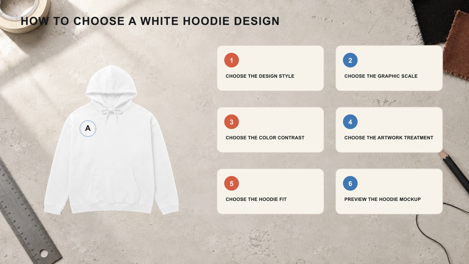
Start with these six steps to choose a white hoodie design that fits your artwork:
- Step 1: Choose the Design Style
Decide what visual direction the finished hoodie should follow, such as minimal, graphic, streetwear, typography-led, retro, or branding-focused. Select compact logos or embroidery for a minimal concept, and consider larger illustrations, typography, or multiple design areas for graphic and streetwear concepts. Keep supporting elements consistent with the chosen direction.
- Step 2: Choose the Graphic Scale
Set the artwork size based on placement and the available garment area. Keep logos and simple symbols small for the chest or upper back, increase illustrations and typography to a medium scale for the center chest, and reserve oversized graphics for the full back or wider hoodie silhouettes. Leave enough white space around focal elements to prevent crowding.
- Step 3: Choose the Color Contrast
Compare the artwork palette directly with the white fabric to confirm that important details remain visible. Choose black or dark colors for strong tonal separation, bright colors for pronounced visibility, or pastels for a softer effect. If the design uses muted or light colors, check that outlines, lettering, and small details do not disappear into the white background.
- Step 4: Choose the Artwork Treatment
Select a decoration method according to the artwork’s size, detail, color range, and intended texture. Choose embroidery for compact logos, screen printing for bold graphics and solid colors, puff print for raised lettering or shapes, and digital printing for detailed illustrations, gradients, or multi-color artwork. Confirm that the selected method can reproduce small details.
- Step 5: Choose the Hoodie Fit
Consider how the hoodie silhouette changes the space available for artwork and its perceived scale. Standard fits provide controlled front and back areas, oversized hoodies support broader graphics and large typography, while cropped fits reduce vertical space and favor compact chest, sleeve, or upper-back designs. Scale the artwork to the garment’s actual proportions rather than applying one layout to every fit.
- Step 6: Preview the Hoodie Mockup
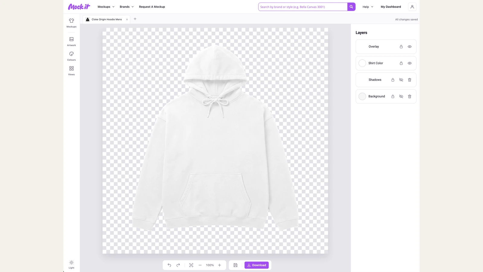
Inspect the complete design at realistic garment proportions before approving it for production. Use a hoodie mockup generator to check placement, scale, color contrast, hood coverage, pouch pocket interference, and front-to-back balance. Resize or reposition any artwork that looks crowded, obscured, too small, or disproportionate on the white hoodie.
What Are Common Mistakes to Avoid When Choosing a White Hoodie Design?
Avoid low-resolution artwork, poor color contrast, thin white fabric, incorrect pocket or seam placement, unsuitable print methods, wrong fabric weight, poor font choices, overcrowded artwork, and skipping a test print when choosing a white hoodie design. These mistakes can reduce artwork visibility, print clarity, placement accuracy, readability, and the overall appearance of graphics on white fabric.
Watch for these common mistakes when finalizing your white hoodie design:
- Using Low-Resolution Artwork
Avoid enlarging small raster images because scaling can make edges, lettering, and fine details appear pixelated or blurred on the finished print. Use high-resolution artwork at the required print dimensions or prepare logos, typography, and simple graphics as vector files when possible.
- Choosing Poor Color Contrast
Do not rely on very pale colors or low-contrast details without checking how clearly they appear against white fabric. Light gray, cream, and muted pastel elements can lose definition, especially at smaller sizes. Increase tonal separation, strengthen outlines, or introduce darker supporting elements where important details need clearer visibility.
- Using Thin White Fabric
Thin material can create problems when low opacity or limited stability conflicts with the intended decoration. Lightweight white fabric may reveal underlying layers and can become distorted under dense embroidery, heavy ink coverage, or substantial decorative areas.
- Ignoring Pocket Placement
Placing important artwork across the pouch pocket, pocket opening, or surrounding stitching can interrupt the composition. Logos, typography, illustrations, and focal details positioned too low may become divided, distorted, or partially hidden by the pocket construction.
- Printing Over Seams
Detailed graphics should not cross thick seams where an uneven printing surface can interfere with consistent reproduction. Fine linework, small lettering, and precision-dependent elements may develop breaks, uneven ink coverage, or visible alignment problems.
- Using the Wrong Print Method
An incompatible decoration method can prevent artwork from retaining its intended detail, texture, scale, or color range. Complex illustrations, fine lines, gradients, or small elements may lose definition when the selected production method cannot reproduce those characteristics accurately.
- Choosing the Wrong Fabric Weight
An unsuitable fabric weight can affect how the garment responds to printing, embroidery, and other decoration. Material that is too light for dense stitching, heavy prints, or large decorated areas may pull, distort, or lose its intended shape around the artwork.
- Using Poor Font Choices
Thin strokes, tightly spaced letters, highly decorative typefaces, and very small text can become difficult to reproduce clearly on fabric. These typographic characteristics may cause letters to merge, lose definition, or become difficult to read after printing or embroidery.
- Overcrowding the Design
Filling the white space with too many graphics, text, logos, colors, or decorative elements can weaken visual hierarchy. Too many competing elements reduce useful negative space and make individual parts of the composition harder to distinguish.
- Skipping a Test Print
Production should not proceed without checking how the artwork translates onto the intended white hoodie. Otherwise, problems involving scale, placement, color appearance, print detail, fabric interaction, or garment construction may remain unnoticed until the finished pieces are produced.

 Trusted By Thousands Of Designers
 Cancel Your Subscription Anytime
 30 Day Money Back Guarantee