
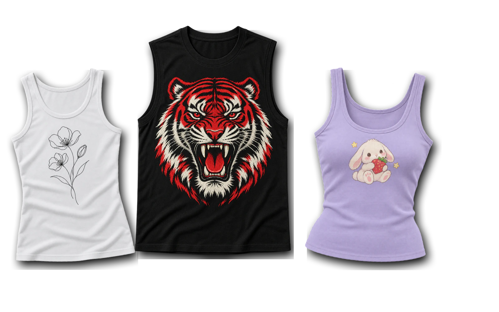
Tank top design ideas provide practical concepts for creating tank tops through graphics, typography, logos, streetwear and Y2K artwork, vintage treatments, surface effects, embroidery, embellishments, and group-based designs. These ideas include minimalist line art, bold illustrations, chest logos, distressed graphics, tie-dye and bleach effects, stitched and patch artwork, cheer and event designs, and concepts adapted for men’s and women’s tank top cuts. Each approach considers artwork composition, placement, scale, contrast, print coverage, and production method according to the available garment area.
Racerback, muscle, stringer, flowy, crop, fitted, and athletic silhouettes require different approaches to print areas, graphic size, placement, contrast, and small-logo readability. Common tank top design mistakes include using artwork that is too wide, positioning graphics near necklines or armholes, adding excessive detail to small prints, ignoring garment cuts, using weak contrast, and applying identical artwork scales across different styles. A complete tank top design process involves choosing a concept, selecting the tank top style, setting the artwork placement, adjusting the design size, testing colors and contrast, previewing the design on a tank top mockup, and preparing the final artwork for production.
33 tank top design ideas are:
- Minimalist Line Art Design
- Bold Graphic Illustration Design
- Graffiti-Inspired Design
- Cute Character and Icon Design
- Large Back Graphic Design
- Minimal Chest Logo Design
- Bold Statement Typography Design
- Retro Typography Design
- Branded Logo Design
- Y2K Star Graphic Design
- Distressed Grunge Design
- Cyber-Inspired Design
- Vintage Faded Design
- Tie-Dye Design
- Bleach Art Design
- Sun-Dyed Design
- High-Contrast Surface Design
- Embroidered Chest Mark Design
- Stitched Typography Design
- Patch Graphic Design
- Beaded and Crystal Design
- Cheer Team Design
- Sorority Letter Design
- Summer Event Design
- Athletic and Race Team Design
- Muscle Tank Back Graphic Design
- Stringer Tank Minimal Front Design
- Men’s Athletic Design
- Men’s Streetwear Design
- Racerback Vertical Graphic Design
- Flowy Tank Minimal Typography Design
- Crop Tank Y2K Design
- Women’s Cute Graphic Design
Graphic and Artwork Tank Top Design Ideas
Graphic and artwork tank top design ideas use illustrations, line art, characters, symbols, and expressive graphics to define the main visual direction of the garment. These concepts focus on artwork composition, graphic placement, focal points, scale, contrast, and the available print area. Designers can personalize the artwork by changing the motif, illustration structure, line weight, color, graphic size, and layout. From compact chest artwork to large back graphics, each approach can adapt to different necklines, armholes, straps, and torso widths while maintaining a balanced composition.
Below are some graphic and artwork tank top design ideas:
- Minimalist Line Art Design
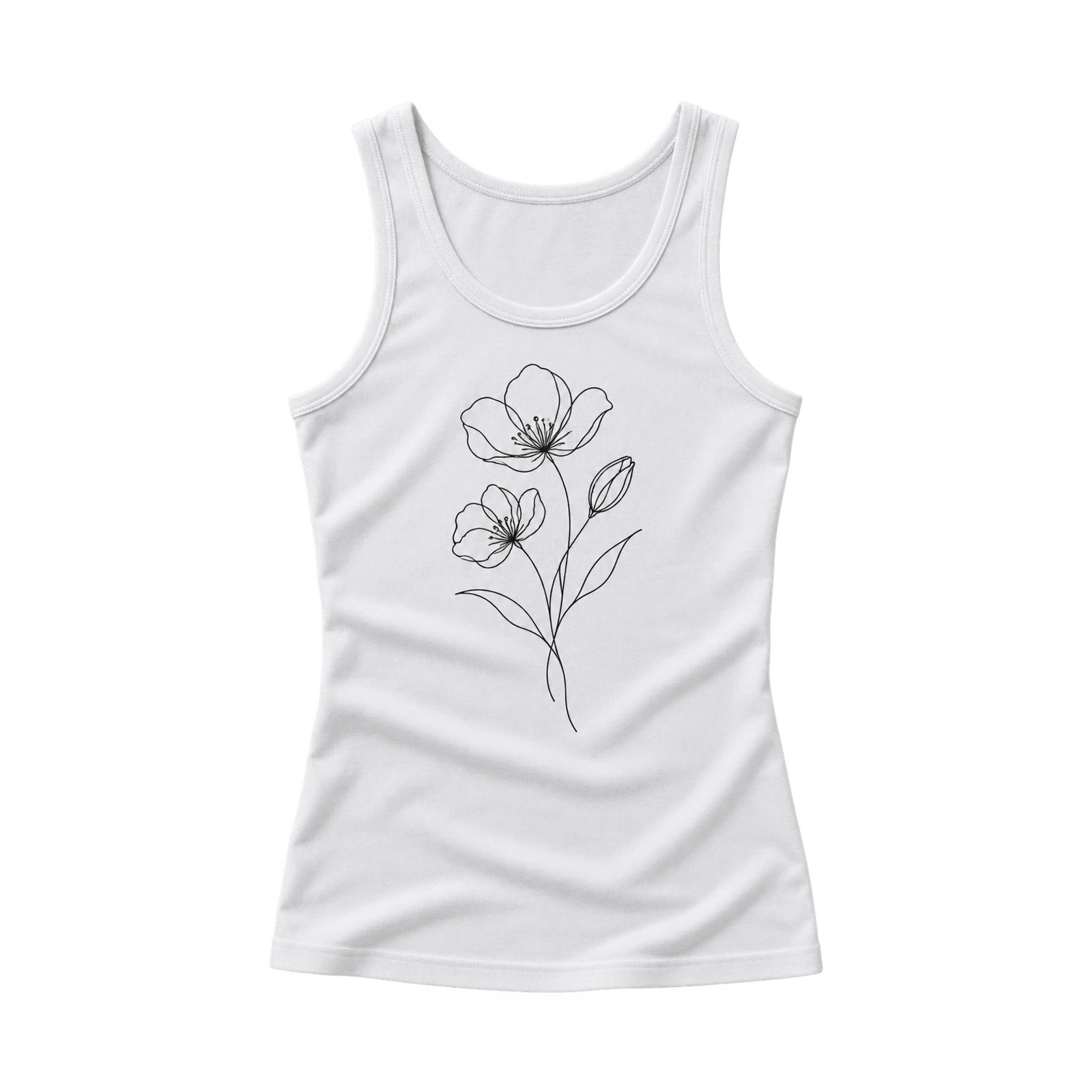
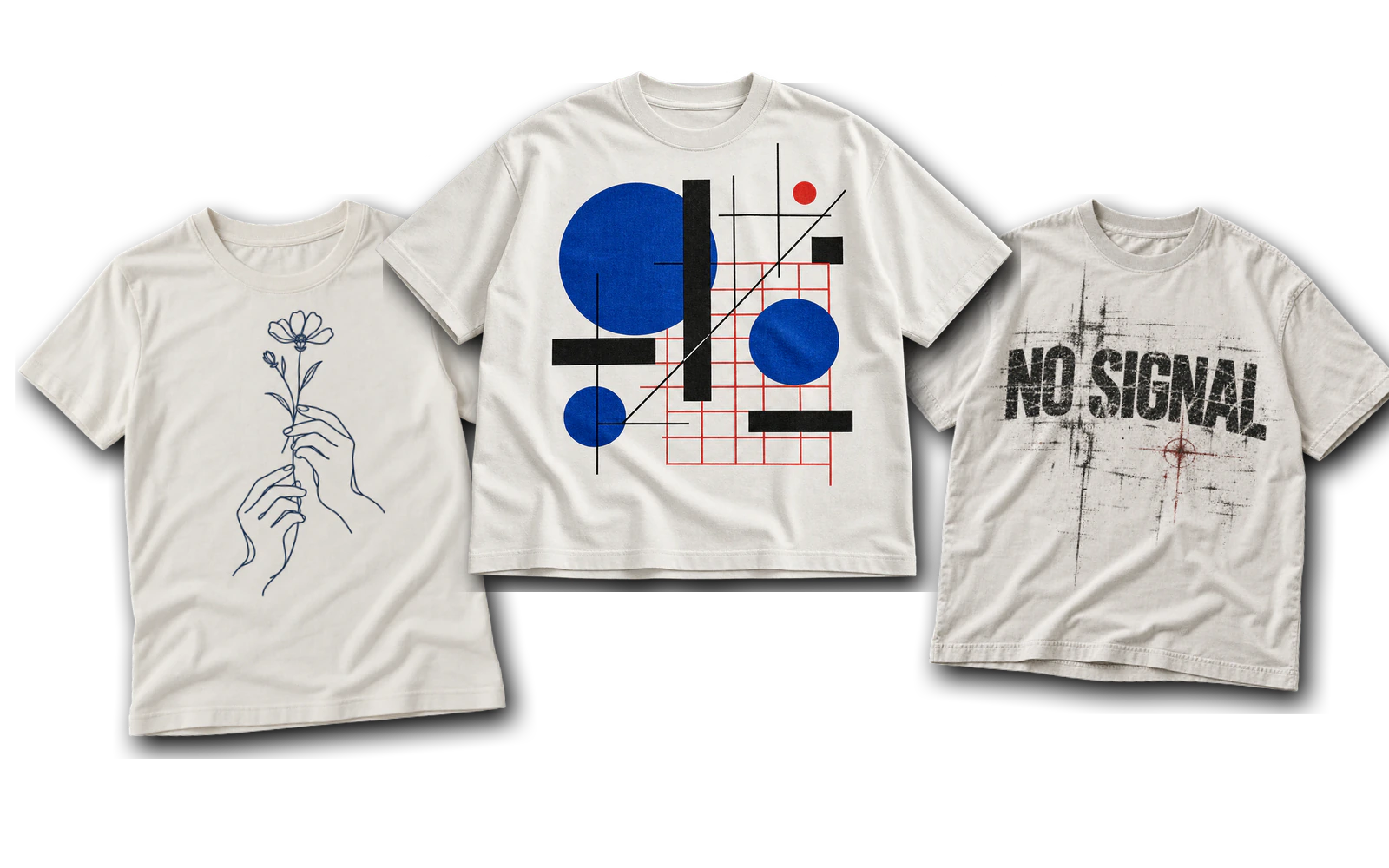
A minimal line art tank top design creates a clean composition through simple outlines, continuous strokes, and compact visual forms. Face outlines, flowers, hands, animals, and geometric shapes provide recognizable motifs without excessive artwork coverage. Small chest placements suit single-line drawings, while centered front areas accommodate larger illustrations with additional details. Consistent line thickness, open spacing, and sufficient negative space preserve clarity against the garment color. A white tank top featuring a black floral outline establishes a clear focal point, while simplified strokes and narrow gaps make the artwork suitable for embroidery.
- Bold Graphic Illustration Design
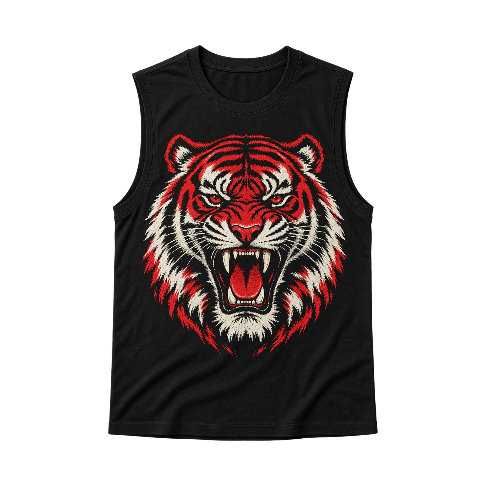
A bold illustration tank top design establishes a dominant focal point through large characters, objects, symbols, or abstract artwork. Original animals, skulls, flowers, fantasy figures, and illustrated characters suit medium front or oversized back placements, depending on the available garment area. A contrasting illustration on a black muscle tank creates visual hierarchy through its scale, positioning, and defined graphic edges. Strong contrast and controlled negative space maintain artwork clarity while preventing excessive print coverage across the fabric surface.
- Graffiti-Inspired Design
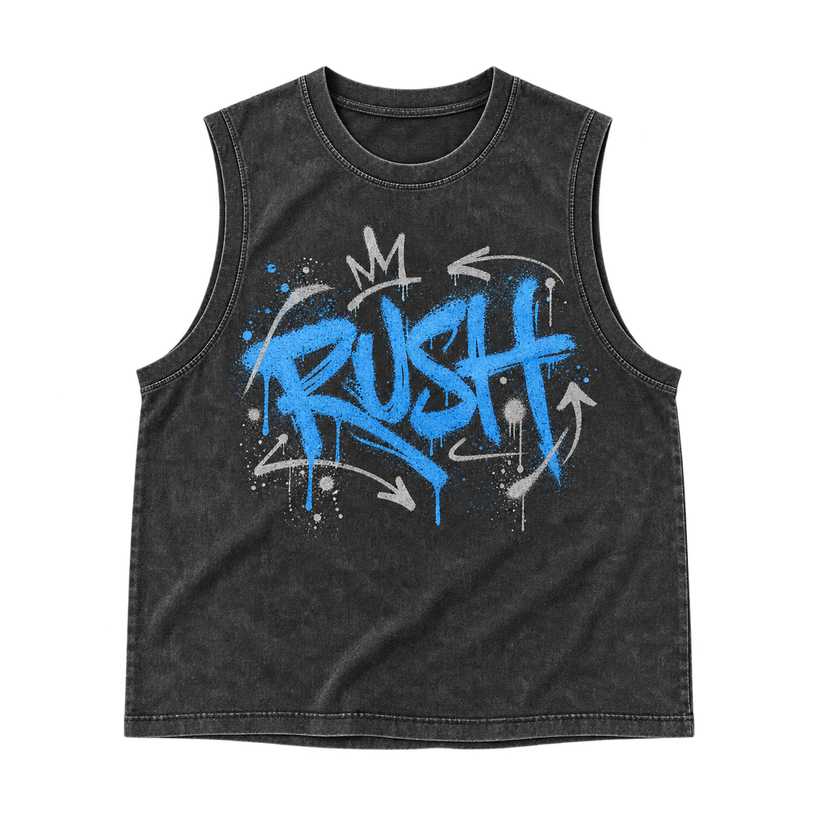
Graffiti-inspired tank top designs create expressive compositions through original tags, stylized lettering, spray-style marks, and overlapping shapes. Nicknames, initials, short phrases, and abstract symbols establish recognizable focal elements, while layered textures and contrasting outlines add variation to the artwork. Arrange surrounding marks without covering the primary lettering or reducing the visibility of individual characters. Medium or large placement preserves the irregular composition, with sufficient neckline and armhole clearance keeping important graphic details inside the printable area.
- Cute Character and Icon Design
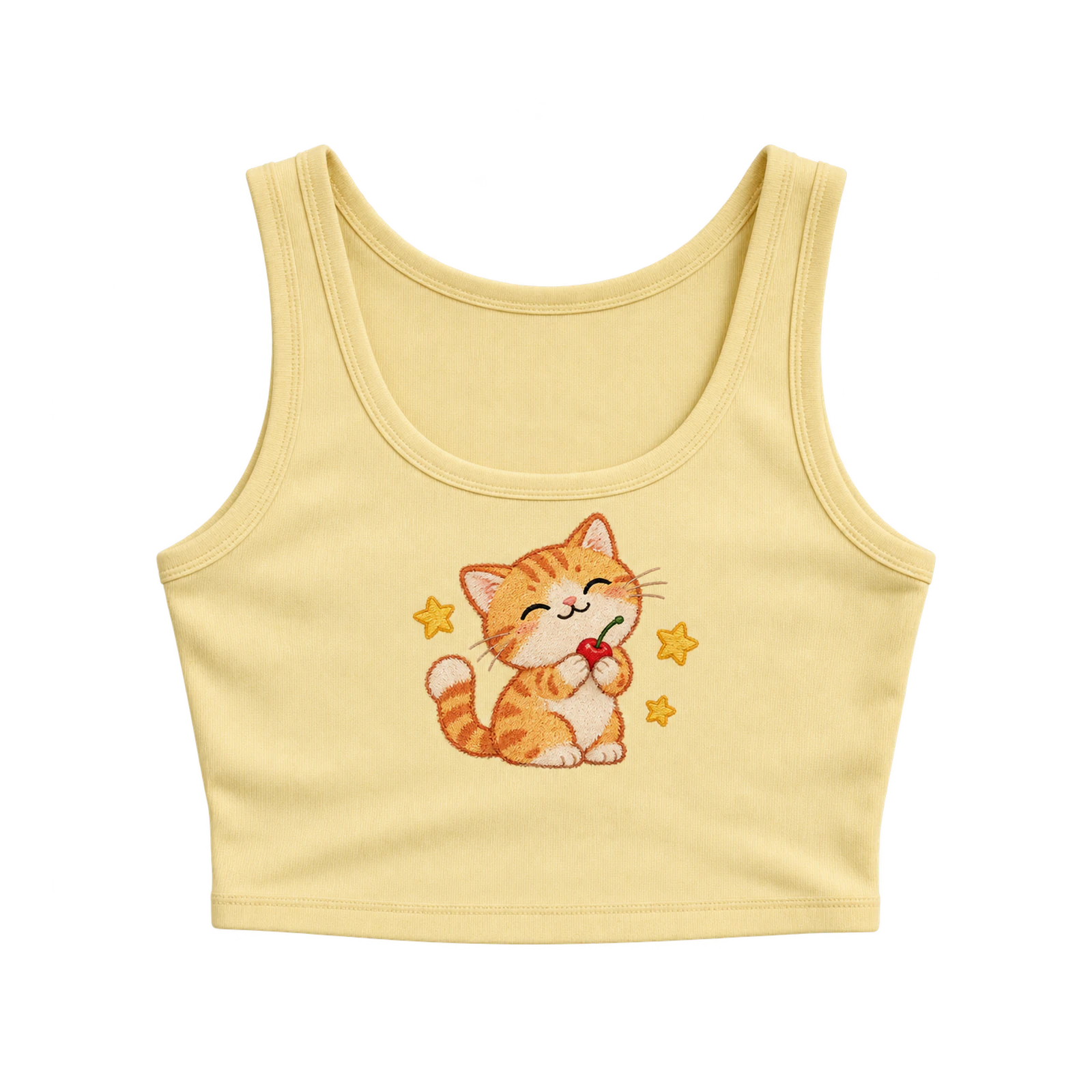
Graffiti-inspired tank top designs create expressive compositions through original tags, stylized lettering, spray-style marks, and overlapping shapes. Nicknames, initials, short phrases, and abstract symbols establish recognizable focal elements, while layered textures and contrasting outlines add variation to the artwork. Arrange surrounding marks without covering the primary lettering or reducing the visibility of individual characters. Medium or large placement preserves the irregular composition, with sufficient neckline and armhole clearance keeping important graphic details inside the printable area.
- Large Back Graphic Design
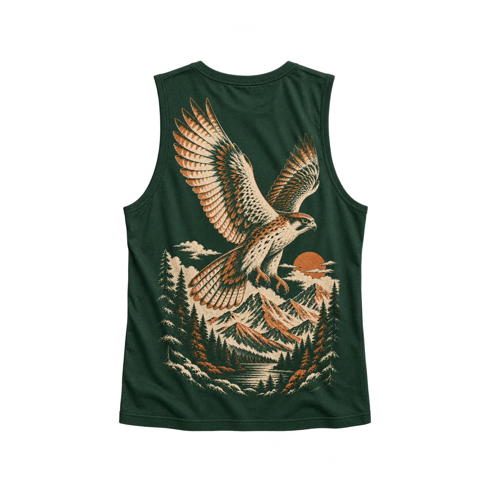
An oversized back graphic tank top design transforms the rear garment area into the primary surface for illustrations, typography, characters, or combined artwork. Wider muscle tanks accommodate horizontal compositions and dominant illustrations, while narrow racerbacks favor vertically arranged graphics that follow the available fabric area. Position the main artwork around the back center line, maintaining sufficient spacing near the neckline, armholes, and seams. Adjust graphic width, height, and overall scale for each silhouette to preserve proportional coverage, readable details, and balanced placement without clipping important elements.
Typography and Logo Tank Top Design Ideas
Typography and logo tank top design ideas establish garment identity through lettering, wordmarks, symbols, and brand marks. Compact chest logos provide a restrained visual direction, while oversized statement typography gives lettering a dominant role in the composition. Initials, custom letterforms, short phrases, and graphic symbols offer different ways to personalize the design according to its intended message. Readable type hierarchy, suitable spacing, and proportional placement keep the artwork clear across different tank top cuts and print areas.
Some typography and logo tank top design ideas are:
- Minimal Chest Logo Design
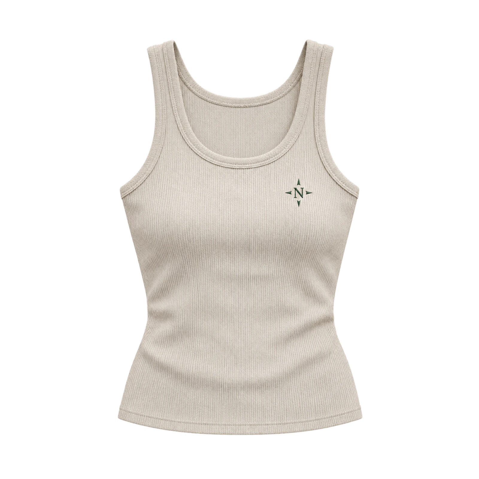
By placing a compact symbol, monogram, or wordmark on the upper chest, a minimal logo tank top design establishes a subtle visual identity without extensive artwork coverage. Small geometric emblems, initials, and simplified brand marks suit left-chest or centered placements. The surrounding fabric remains visible, creating sufficient negative space around the graphic. Clear outlines, consistent proportions, and contrasting colors preserve readability across different garment shades. A ribbed tank top featuring a small embroidered monogram demonstrates how thread texture and precise positioning support understated branding.
- Bold Statement Typography Design
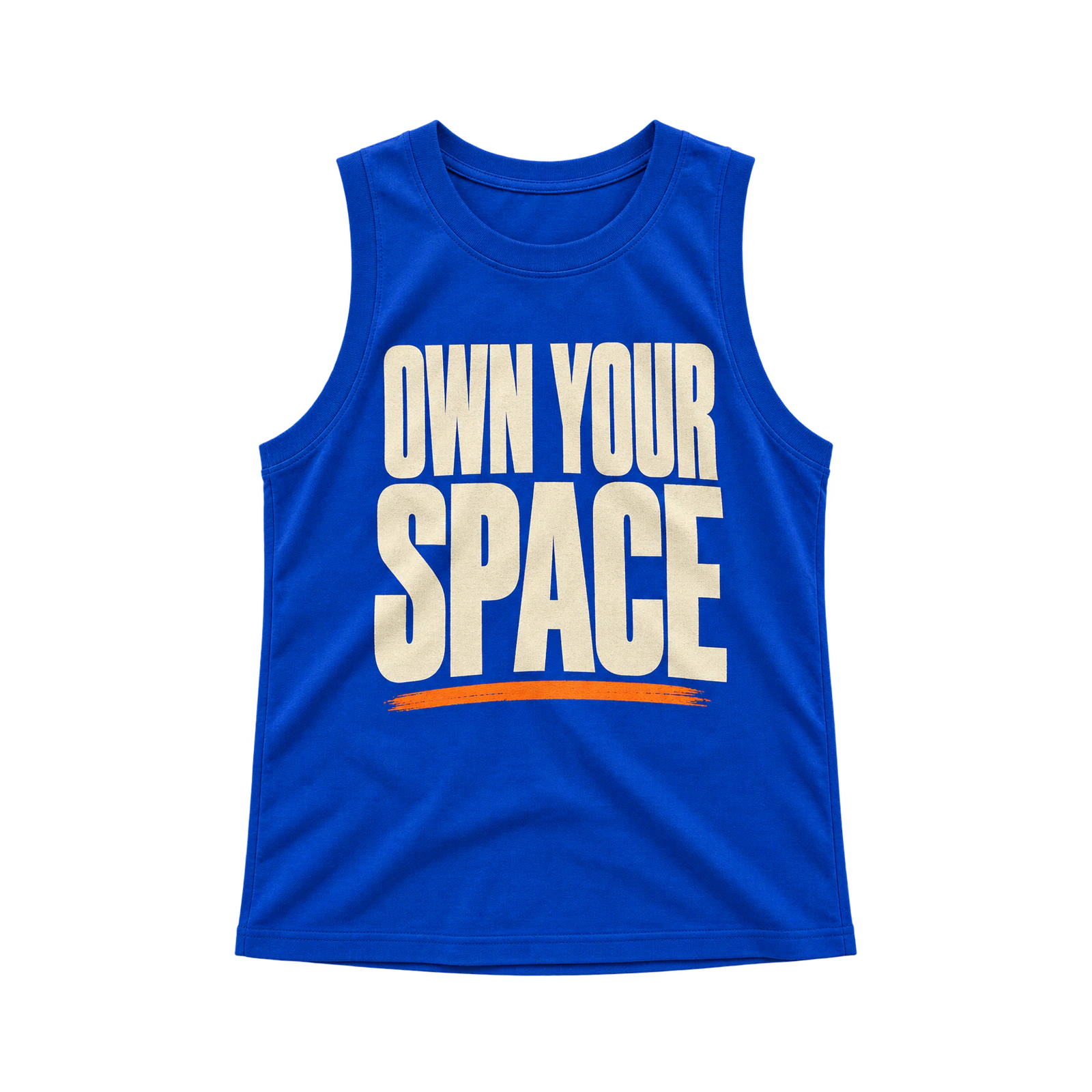
To make lettering the dominant visual element, a statement typography tank top design arranges oversized words, short phrases, or slogans across the garment. Wide letterforms suit broader muscle tanks, while condensed fonts accommodate narrower front panels. Stacked text and controlled line breaks establish hierarchy without requiring additional illustrations. A two-line slogan printed in contrasting colors creates a prominent composition on a solid-colored tank top. Adjust character spacing, text width, and vertical alignment to maintain readability near the neckline and armholes.
- Retro Typography Design
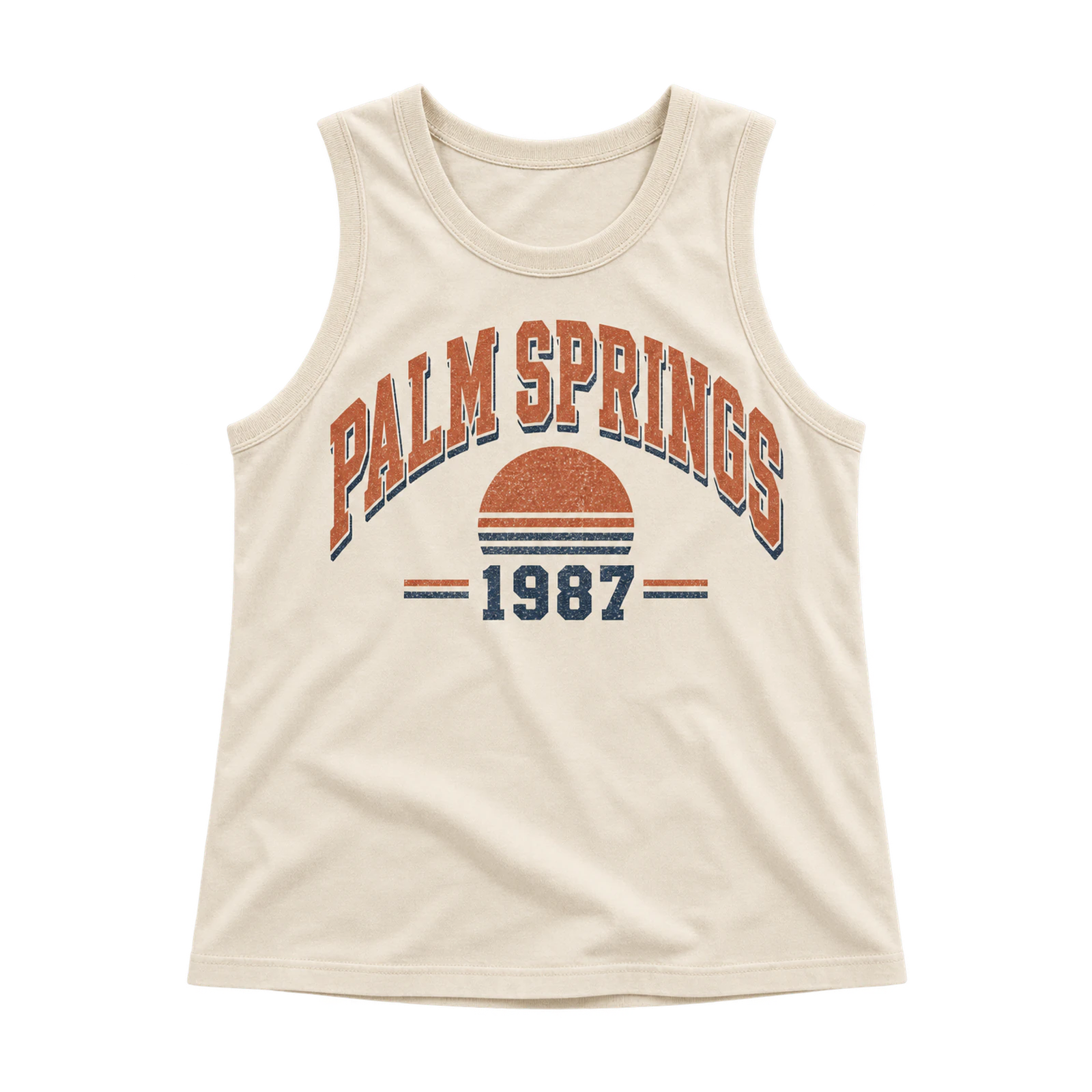
Through curved lettering, outlined characters, and faded textures, a vintage-style tank top design recreates the appearance of older athletic and casual apparel graphics. Fictional locations, dates, summer phrases, and short names provide suitable text for arched or stacked arrangements. Muted colors, drop shadows, and restrained distressing introduce an aged appearance without obscuring individual letters. On a neutral tank top, semicircular lettering with softened edges creates a cohesive composition. Preserve narrow strokes and letter openings when applying distressed effects to maintain readability at smaller print sizes.
- Branded Logo Design
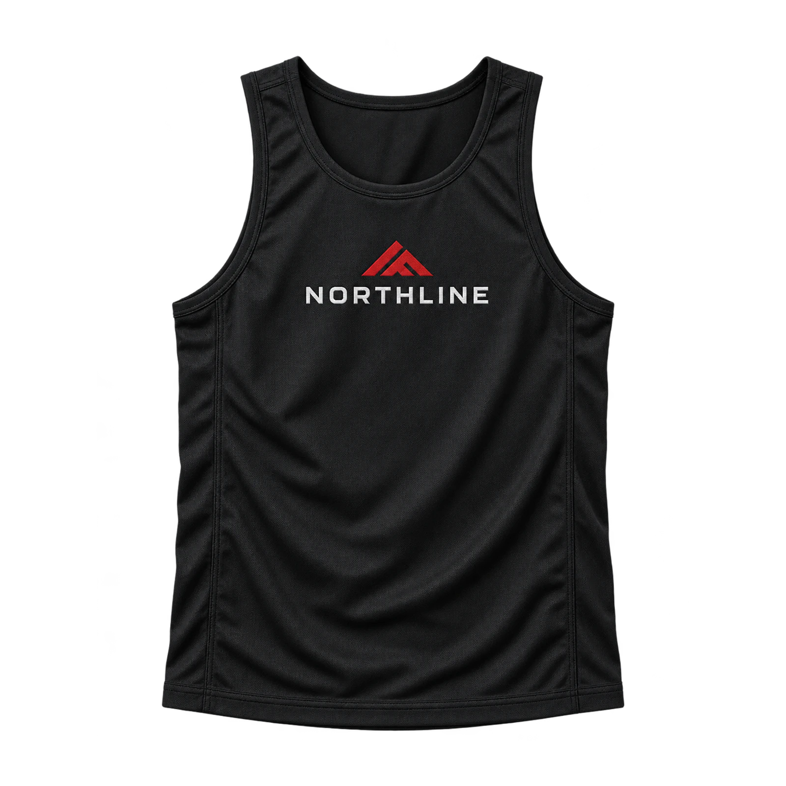
When a recognizable wordmark or symbol serves as the primary graphic, a branded tank top design communicates a consistent identity across different garment styles. Compact chest symbols suit fitted and ribbed tanks, while larger wordmarks occupy the center front of broader silhouettes. Pairing a small front emblem with a larger back logo creates a coordinated layout without repeating identical dimensions. Brand colors, letterforms, and symbol proportions should remain consistent during resizing. Printed logos accommodate finer details, whereas embroidered versions require simplified lines and adequate stitch spacing for accurate reproduction.
Streetwear, Y2K, and Vintage Tank Top Design Ideas
Streetwear, Y2K, and vintage tank top design ideas create distinct visual styles through bold graphics, metallic-style symbols, distressed textures, and faded artwork. Y2K star motifs and cyber-inspired lettering establish sharp, high-contrast compositions, while grunge graphics and vintage treatments introduce rough edges, layered marks, and muted colors. Adjusting graphic density, color contrast, print texture, and garment coverage helps each tank top design retain its intended appearance across different cuts and printable areas.
Below are some streetwear, Y2K, and vintage tank top design ideas:
- Y2K Star Graphic Design
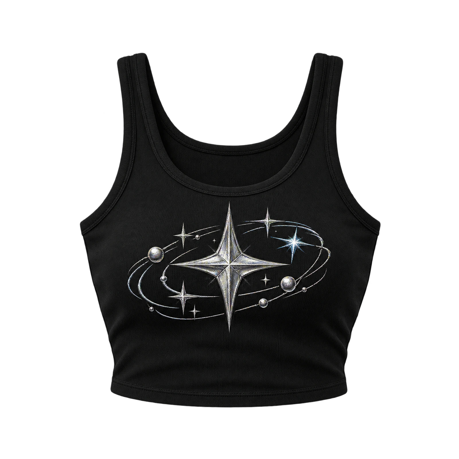
By combining sharp star motifs with metallic-style shapes and digital symbols, a Y2K tank top design recreates the graphic aesthetic of early-2000s fashion. Pointed stars, outlined forms, compact lettering, and contrasting accents suit centered chest arrangements or asymmetrical front compositions. Medium-sized graphics provide enough space for layered elements without crowding the garment’s printable area. A black cropped tank featuring a silver-style star and smaller surrounding symbols creates a recognizable Y2K composition. Defined outlines, controlled spacing, and contrasting colors preserve individual details across the shorter torso.
- Distressed Grunge Design
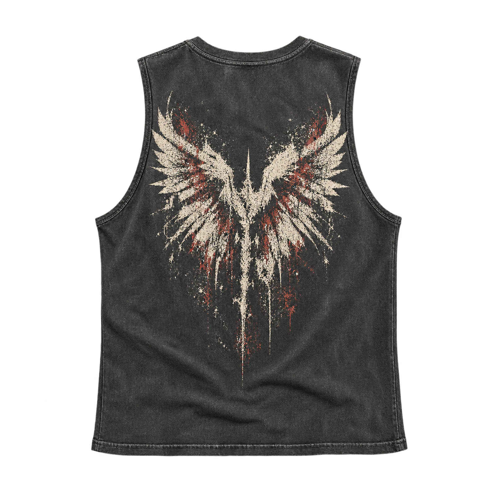
A grunge tank top design creates a worn, irregular appearance through distressed lettering, rough textures, faded marks, and fragmented graphics. Abstract illustrations, broken symbols, and layered typography suit large front or back placements where the artwork has sufficient room. Uneven edges and partially faded ink expose sections of the garment color while maintaining the main graphic’s shape. A washed black tank top with distressed back lettering establishes a cohesive grunge appearance through contrasting textures. Keep important text and illustration details recognizable by controlling the density of distressed areas.
- Cyber-Inspired Design
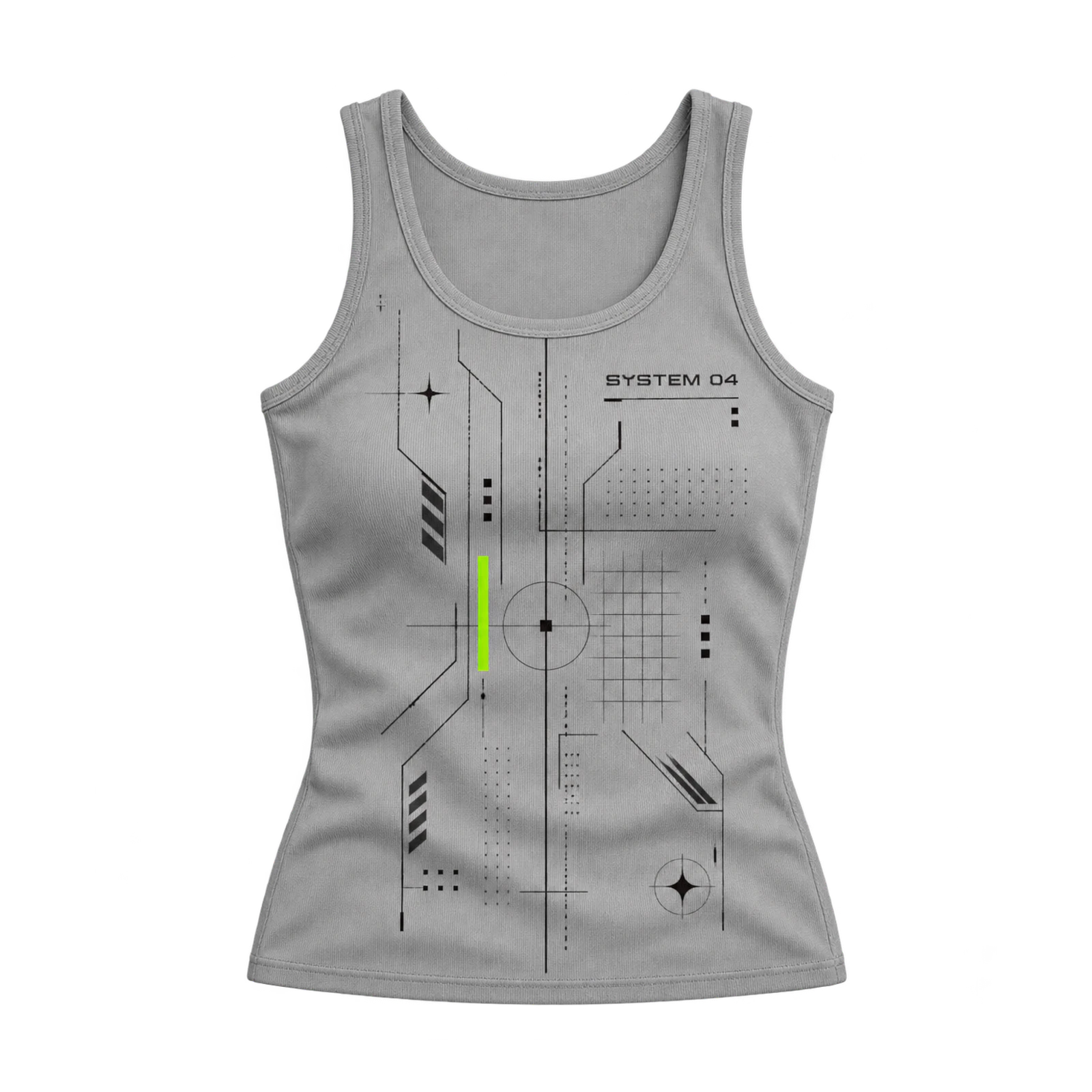
Through geometric linework, digital symbols, and structured typography, a cyber-inspired tank top design establishes a futuristic visual composition. Angular shapes, compact numbers, grids, and interface-style graphics fit centered or vertical arrangements across the garment. Narrow lettering and technical marks require crisp outlines and sufficient spacing to remain distinguishable at smaller print sizes. A fitted tank top featuring stacked numbers and geometric symbols creates a structured composition without excessive artwork coverage. Contrasting colors and consistent line thickness maintain clarity between overlapping technical elements.
- Vintage Faded Design
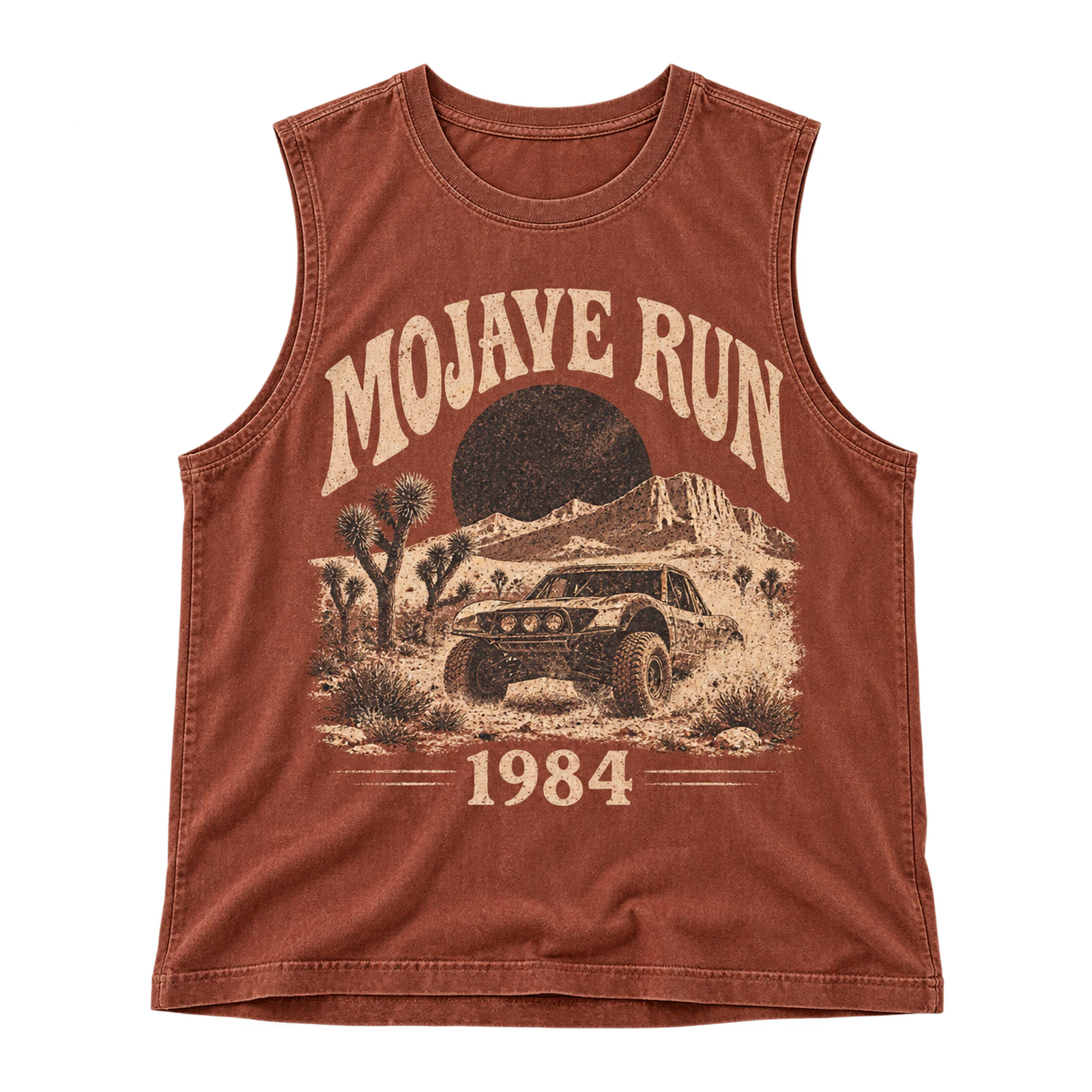
A vintage faded tank top design recreates an aged printed appearance through softened colors, worn edges, retro lettering, and partially faded illustrations. Fictional event graphics, dates, classic symbols, and simple artwork suit medium or large placements across the front or back. Muted tones allow the garment color to show through selected graphic areas without obscuring the primary motif. A neutral tank top featuring a faded event illustration and curved lettering establishes a cohesive vintage composition. Controlled distressing and sufficient contrast preserve readability while maintaining the intended worn appearance.
Tie-Dye, Bleach, and Surface-Effect Tank Top Design Ideas
Tie-dye, bleach, and surface-effect tank top design ideas create patterns and motifs through color distribution, fabric lightening, and tonal contrast. Irregular tie-dye patterns surround printed graphics, while bleach art forms shapes through lightened areas and negative space. Sun-dyed treatments introduce softer tonal variations, allowing subtle symbols and motifs to become part of the fabric composition. High-contrast designs separate artwork from patterned backgrounds, keeping typography, logos, and graphic details readable across different tank top styles.
Here are some tie-dye, bleach, and surface-effect tank top design ideas:
- Tie-Dye Design
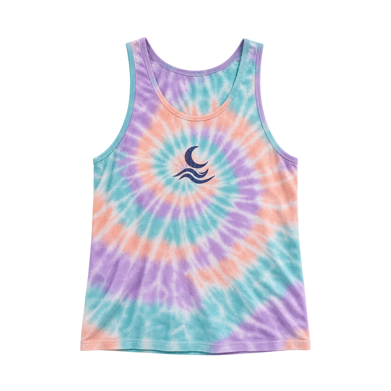
A tie-dye tank top design creates irregular color patterns through spiral arrangements, folded fabric effects, blended shades, and uneven dye distribution. Two-tone combinations, multicolor sections, and centered spirals establish different visual compositions across the front and back. Contrasting typography, symbols, and illustrations remain distinguishable when positioned against changing fabric colors. A pastel tie-dye tank top featuring a dark center graphic demonstrates how printed artwork stands apart from the surrounding pattern. Balanced color distribution and controlled graphic placement prevent the dye treatment from overwhelming the primary design.
- Bleach Art Design
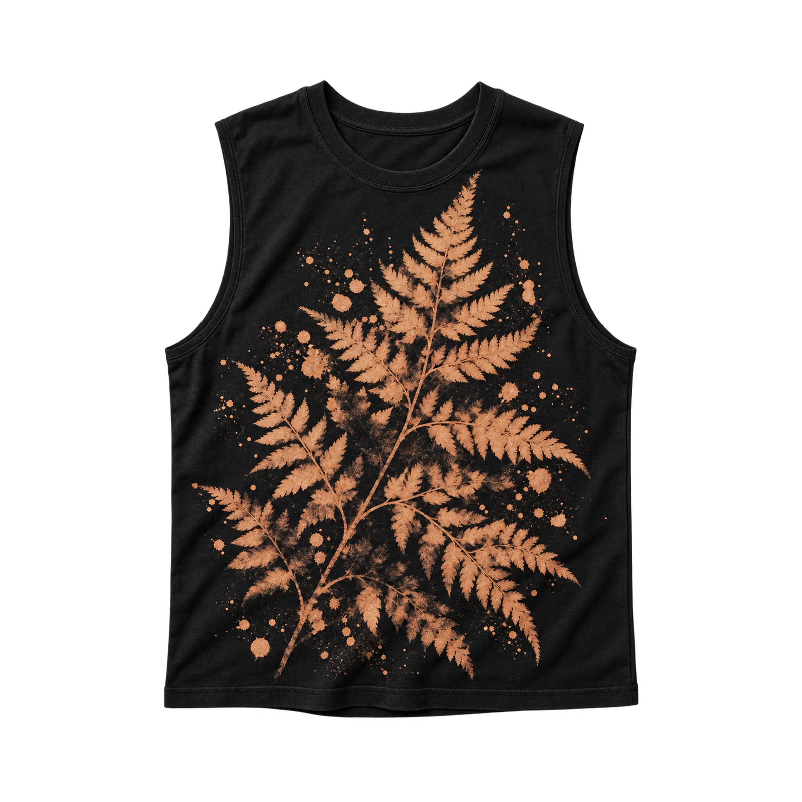
By lightening selected fabric areas, a bleach art tank top design creates expressive motifs through irregular marks, abstract shapes, and negative-space patterns. Splatter effects, geometric forms, botanical silhouettes, and oversized symbols suit front or back placements on darker garments. The original fabric color provides contrast around each lightened section, establishing definition without extensive printed artwork. A black tank top featuring a large bleached floral motif creates a prominent composition through contrasting surface tones. Controlled pattern coverage and sufficient spacing keep supporting graphics recognizable without competing with the main motif.
- Sun-Dyed Design
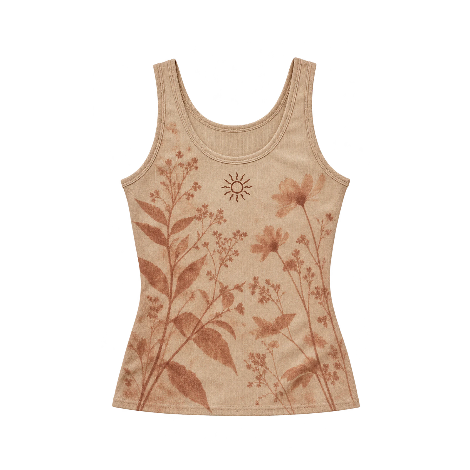
Through gradual color changes and exposed shapes, a sun-dyed tank top design establishes soft tonal patterns across the garment surface. Botanical silhouettes, organic forms, abstract symbols, and irregular outlines provide suitable motifs for subtle front or back arrangements. Uneven transitions between lighter and darker areas create visual variation while maintaining a restrained composition. A neutral tank top featuring soft botanical shapes and a small contrasting chest symbol demonstrates how tonal patterns complement printed artwork. Maintain sufficient contrast around added lettering or graphics to preserve clarity against the changing fabric shades.
- High-Contrast Surface Design
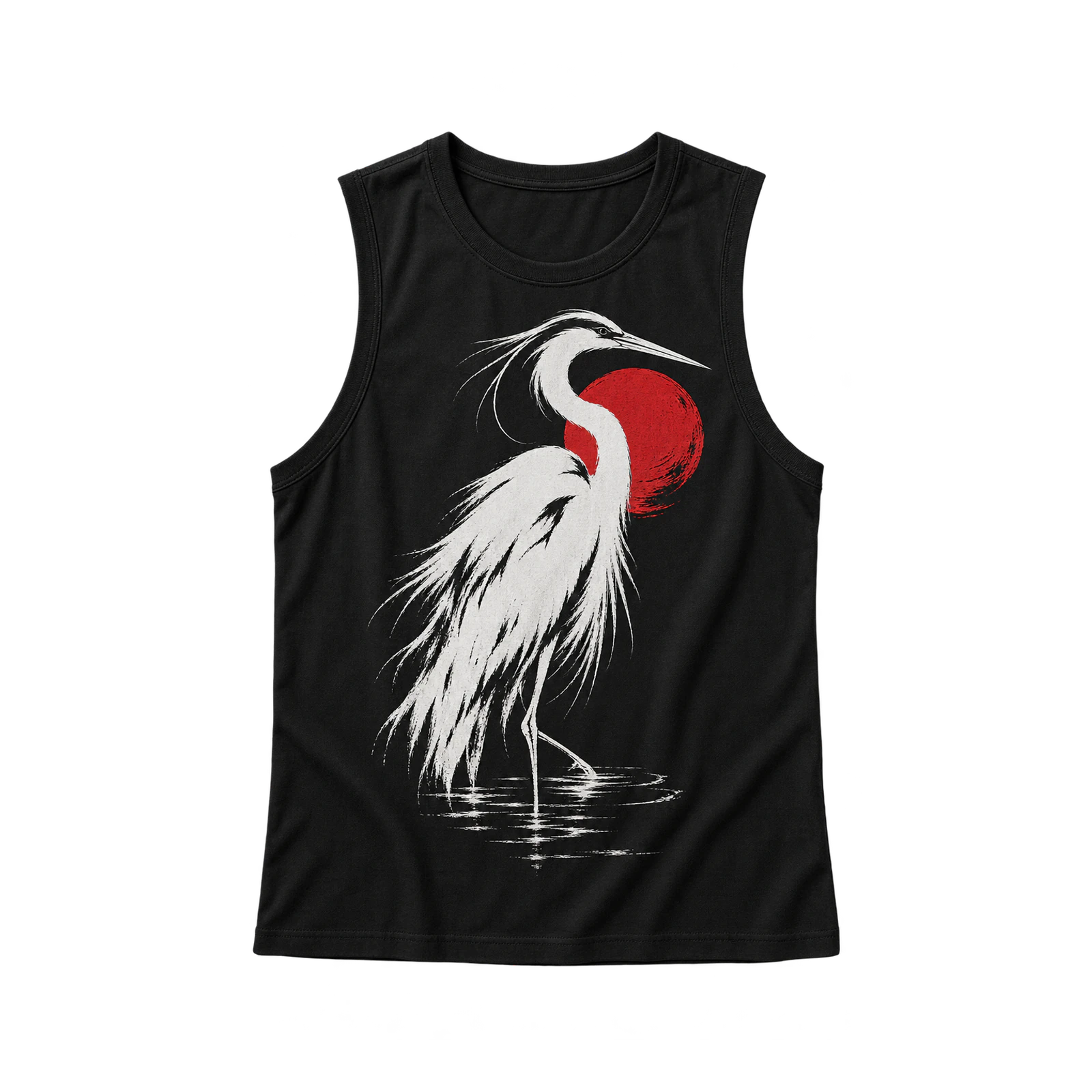
A high-contrast tank top design establishes clear visual separation between artwork and fabric through opposing colors, solid shapes, and defined graphic edges. Light illustrations suit dark garments, while black typography and symbols remain prominent against white or pale-colored tank tops. Outlines, contrasting accents, and separated color areas maintain definition when the composition includes fine details. A black muscle tank featuring a large white illustration creates a dominant focal point across the center front. Adjust graphic scale, color pairing, and spacing to preserve visibility without excessive artwork coverage.
Embroidery, Patch, and Embellished Tank Top Design Ideas
Embroidery, patch, and embellished tank top design ideas add texture and decorative detail through stitching, attached patches, beads, and crystals. Small embroidered chest logos provide compact identity marks, while stitched lettering and shaped patches introduce different artwork arrangements. Beads and crystals can accent selected motifs, but their weight and placement must account for fabric support and comfort. Thread density, stitch spacing, patch dimensions, and decorative coverage influence how well each design fits the garment and its production method.
Some embroidery, patch, and embellished tank top design ideas:
- Embroidered Chest Mark Design
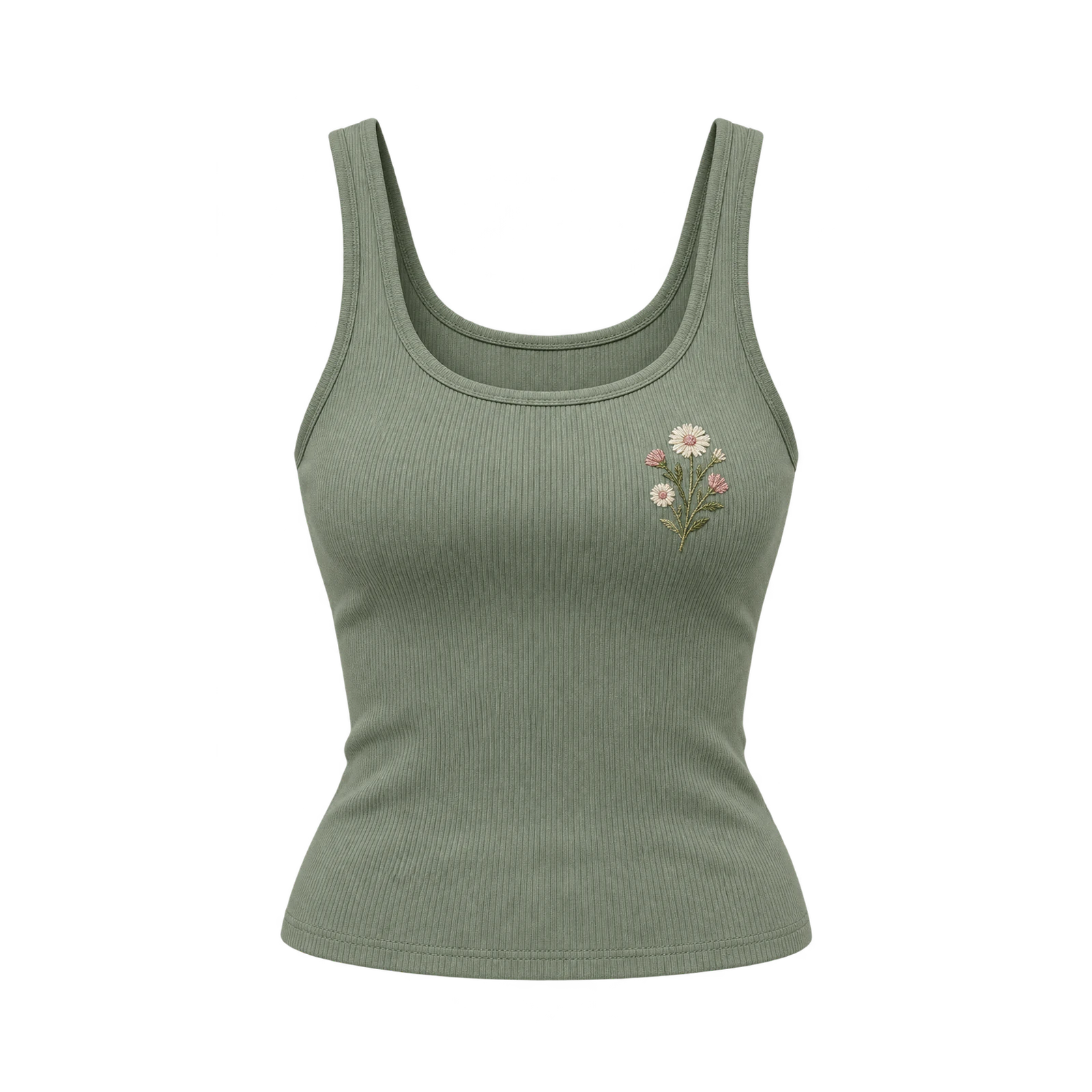
A small embroidered chest mark creates a textured tank top design through compact symbols, simple linework, and decorative stitching. Initials, flowers, monograms, geometric icons, and short wordmarks suit upper-chest placements without occupying excessive garment space. Consistent stitch density, adequate line thickness, and suitable backing preserve the artwork’s shape on lightweight or stretch fabrics. A fitted tank top featuring a contrasting floral emblem demonstrates how embroidery establishes a recognizable focal point. Limited stitch coverage and balanced positioning prevent the design from adding unnecessary weight or distorting the fabric.
- Stitched Typography Design
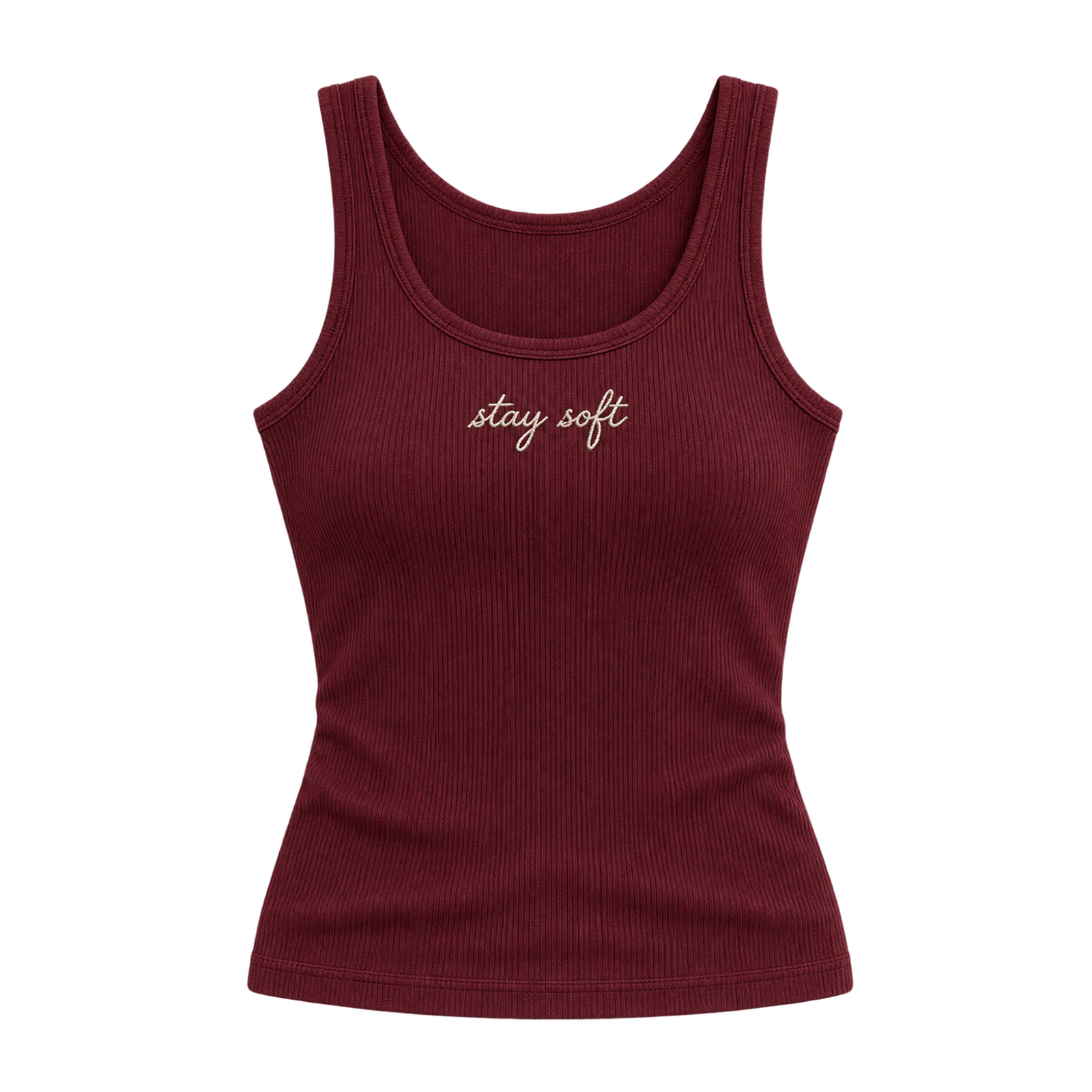
By forming letters with thread, a stitched typography tank top design introduces tactile lettering through short words, names, initials, or compact phrases. Simple fonts with defined strokes and sufficient character spacing suit chest placements where the available embroidery area remains limited. Small lettering requires adequate stitch width and height to prevent individual characters from losing definition. A ribbed tank top featuring a short embroidered phrase creates a restrained composition through contrasting thread colors. Controlled stitch density and suitable fabric stabilization maintain readability without restricting garment flexibility.
- Patch Graphic Design
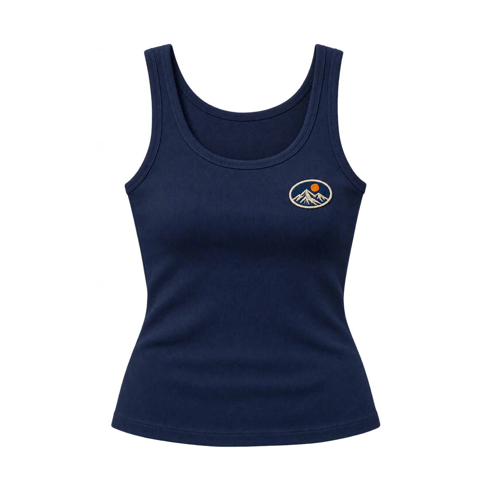
An attached graphic patch gives a tank top design a distinct decorative element through shaped fabric pieces, embroidered surfaces, and defined borders. Letters, numbers, mascots, symbols, and original illustrations suit compact chest placements or selected areas on the garment. Circular, rectangular, and custom-shaped patches introduce different compositions without requiring extensive printed artwork. A solid tank top featuring a small embroidered emblem patch establishes a recognizable focal point through contrasting textures. Match patch dimensions, attachment methods, and material weight to the garment fabric to prevent pulling, folding, or distortion.
- Beaded and Crystal Design
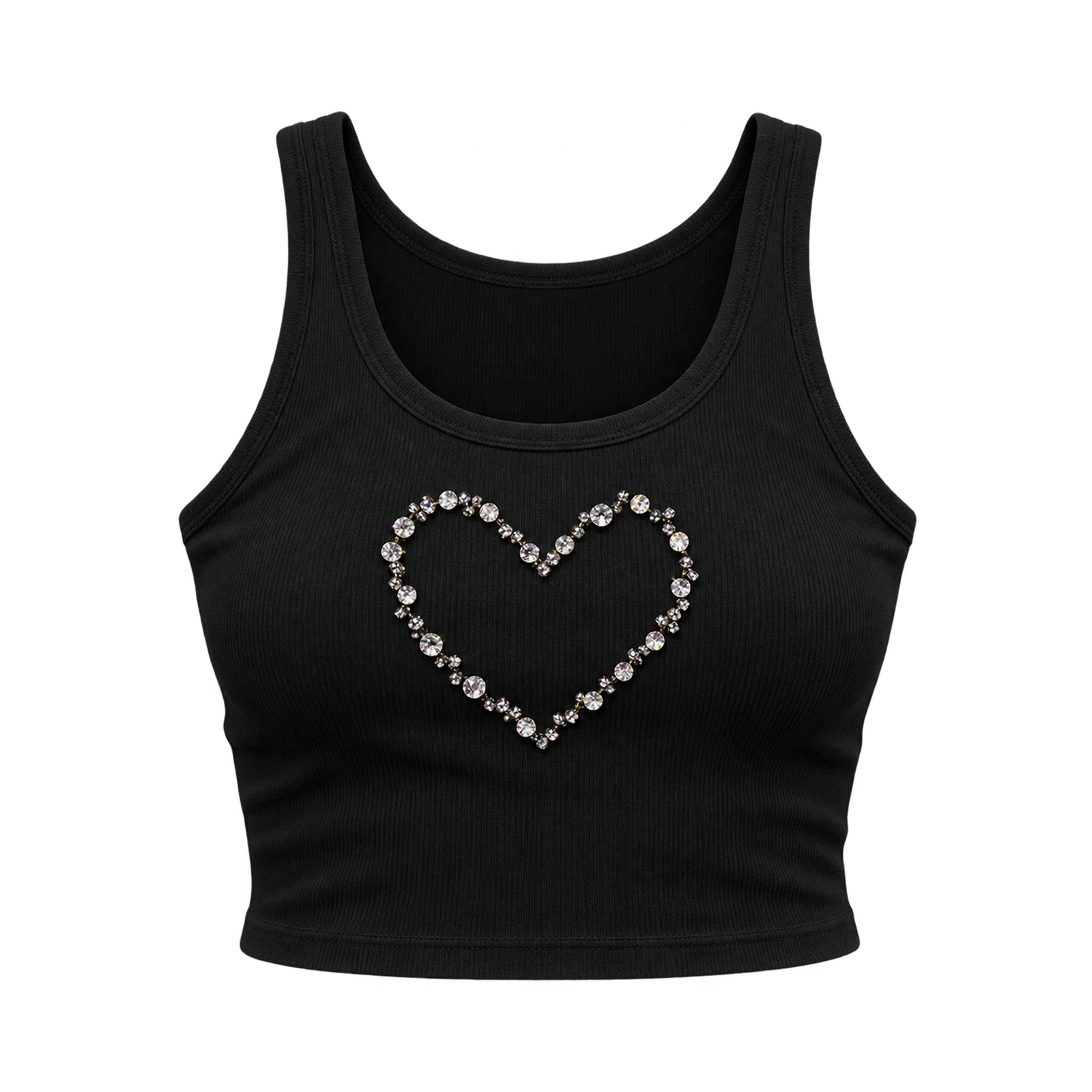
Through carefully arranged beads and crystals, an embellished tank top design introduces reflective details around symbols, lettering, and decorative motifs. Small accents suit chest graphics, outlined shapes, scattered patterns, or selected illustration details without covering large fabric areas. Crystal borders around a heart motif or spaced beads along short lettering create recognizable compositions through texture and light reflection. A fitted tank top featuring subtle crystal accents demonstrates how decorative elements complement the primary artwork. Reinforced attachment, balanced spacing, and controlled embellishment density maintain fabric flexibility while limiting unnecessary weight.
Cheer, Sorority, Team, and Event Tank Top Design Ideas
Cheer, sorority, team, and event tank top design ideas establish shared identities through group names, chapter letters, team symbols, participant numbers, and event graphics. A cheer tank top might position a mascot beneath bold team lettering, whereas a sorority design can give chapter letters the dominant position on the chest. For summer events and athletic races, dates, participant names, or numbers can appear on the back without competing with the main front graphic. Repeating the same color palette and identity marks across garment sizes maintains group recognition, even when artwork dimensions and placement change to accommodate different tank top cuts.
Some cheer, sorority, team, and event tank top design ideas:
- Cheer Team Design
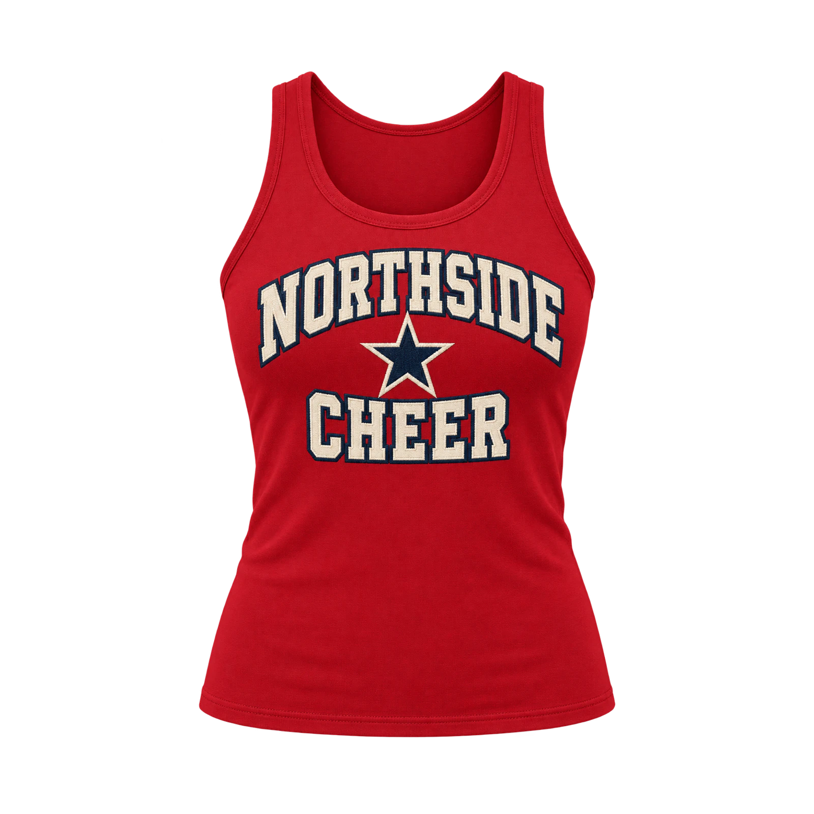
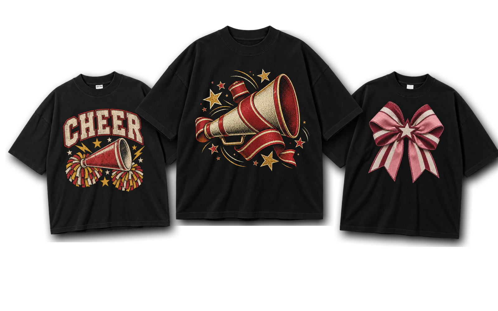
A cheer tank top design establishes team identity through bold lettering, mascot illustrations, and coordinated group colors. Team names, energetic typography, and recognizable symbols suit prominent front placements, while participant names or numbers fit the back. Consistent graphic proportions and color combinations maintain visual uniformity across different garment sizes. A fitted tank top featuring oversized team lettering on the front and personalized text on the back creates a coordinated arrangement. Adjust artwork dimensions and spacing to accommodate different silhouettes without changing the team’s primary visual identity.
- Sorority Letter Design
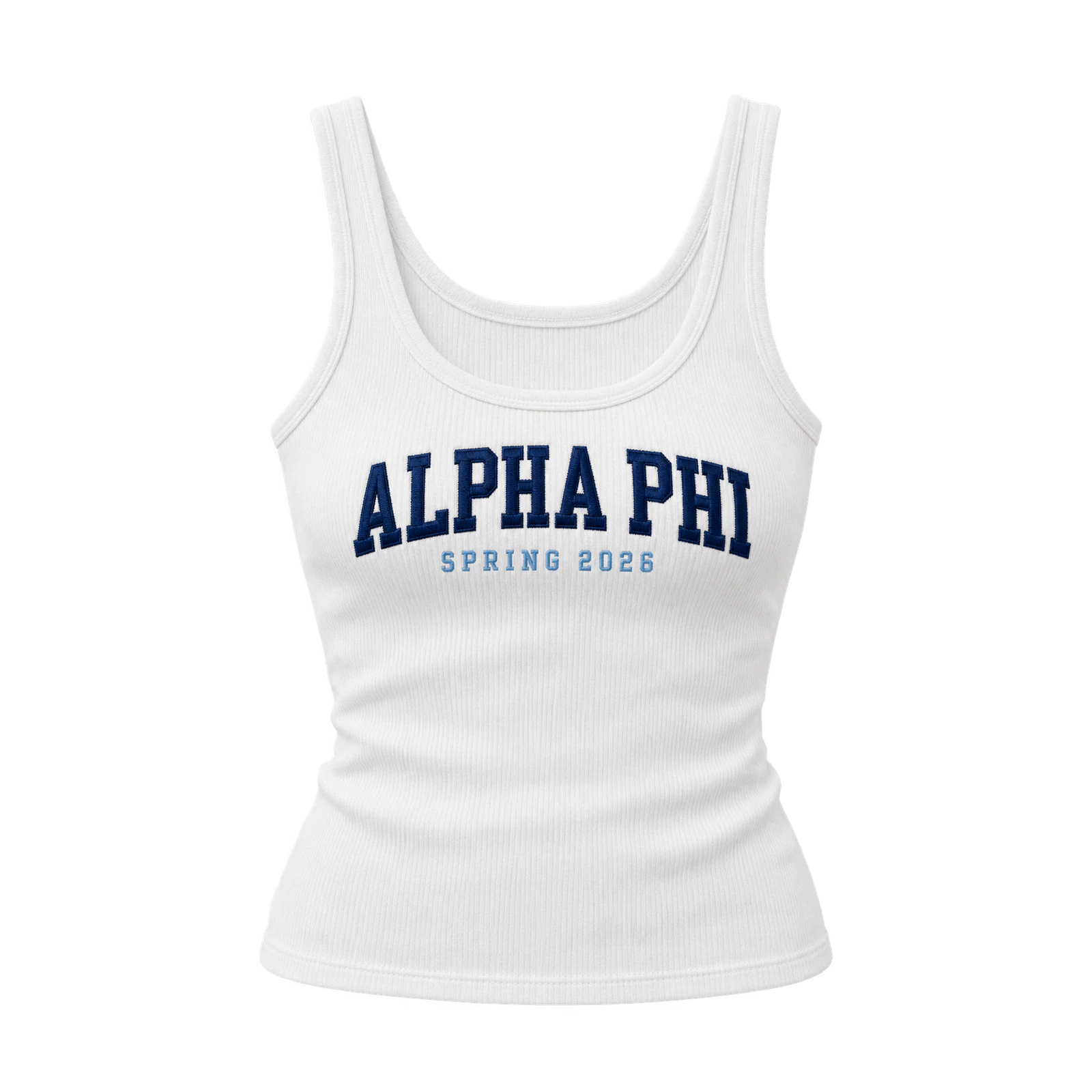
By positioning chapter letters as the main visual element, a sorority tank top design creates a recognizable group identity through typography and coordinated colors. Large Greek letters suit centered front placements, while smaller arrangements leave room for event names, dates, or supporting symbols. Consistent letter spacing, proportions, and alignment preserve recognition across different tank top cuts. A ribbed tank featuring prominent chapter letters with a compact event name underneath demonstrates a balanced composition. Simplified lettering and adequate spacing also support embroidered reproduction on lightweight fabrics.
- Summer Event Design
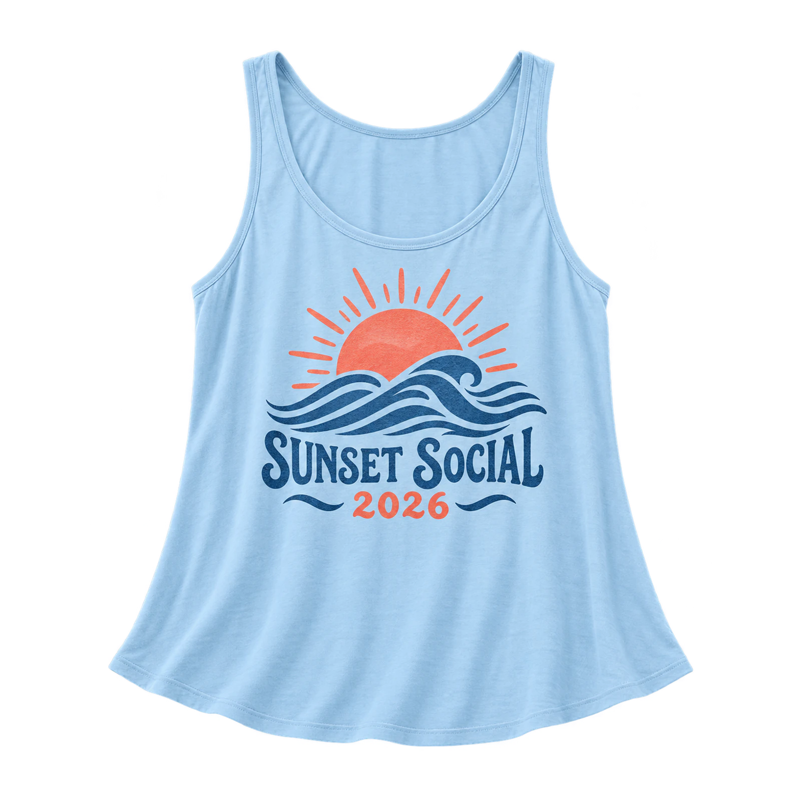
A summer event tank top design communicates a shared occasion through event names, dates, seasonal illustrations, and themed lettering. Festivals, reunions, outdoor gatherings, and group activities suit graphics featuring sun motifs, waves, palm trees, or simple decorative symbols. Medium front placements keep the event identity prominent, while supporting details occupy the back when needed. A light-colored tank top featuring an event name, date, and contrasting sun illustration creates a coordinated summer composition. Consistent artwork placement and color combinations maintain group recognition across different garment sizes.
- Athletic and Race Team Design
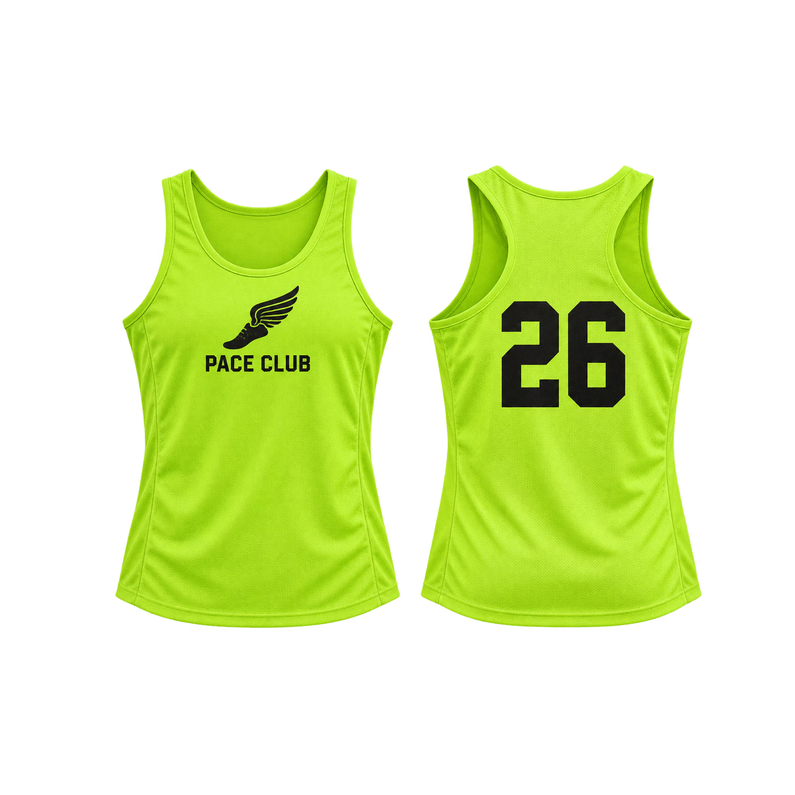
Through participant numbers, team names, and performance-inspired graphics, an athletic tank top design establishes a coordinated identity for races and sporting activities. Team symbols and event marks suit front placements, while larger numbers or individual names provide identification on the back. Strong contrast and clear typography maintain visibility without requiring dense print coverage across flexible fabric. A lightweight athletic tank featuring a compact team emblem and oversized back number demonstrates a practical front-and-back arrangement. Adjust graphic dimensions and spacing to preserve readability across different garment sizes.
Men’s Tank Top Design Ideas
Men’s tank top design ideas adapt graphics, typography, logos, and illustrations to muscle tanks, stringer tanks, and athletic silhouettes. Muscle tanks accommodate large back illustrations or oversized lettering, while stringer tanks suit compact chest symbols within their narrow front areas. Athletic designs can combine team marks, numbers, and contrasting graphics, with limited print coverage allowing for fabric stretch and movement. Armhole depth, neckline shape, and torso width influence artwork placement and scale, requiring adjustments to maintain balanced compositions across different tank top cuts.
Men’s tank top design ideas are:
- Muscle Tank Back Graphic Design
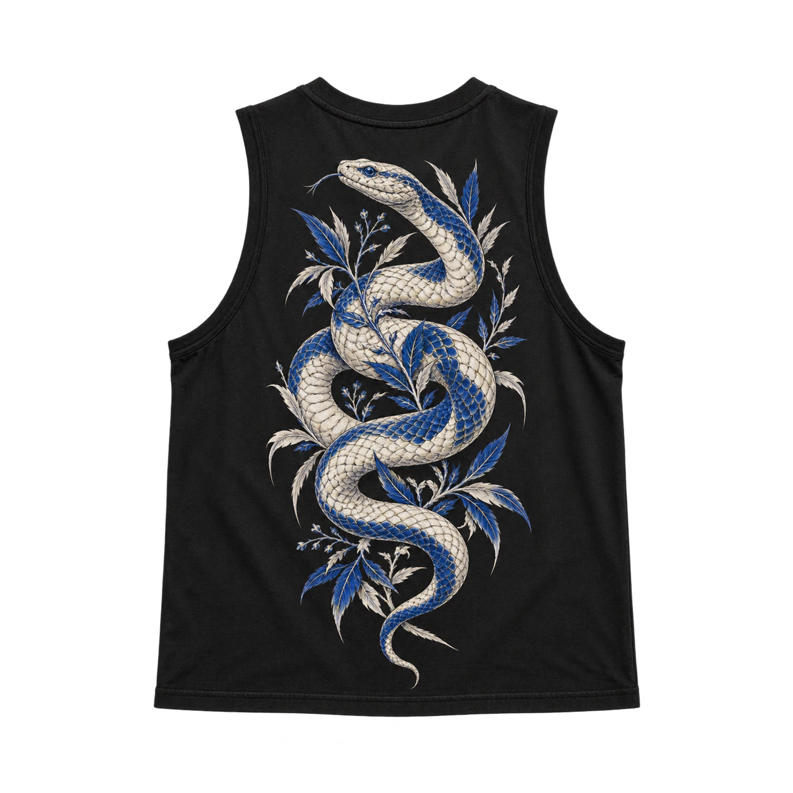
A muscle tank back graphic design creates a dominant visual composition through oversized illustrations, bold typography, or combined artwork. Wider back panels accommodate large animal graphics, abstract symbols, and horizontal lettering without crowding the garment edges. Centered illustrations establish a clear focal point, while vertical arrangements suit taller motifs and stacked text. A black muscle tank featuring a contrasting back illustration demonstrates how graphic scale complements the broader silhouette. Maintain sufficient neckline and armhole clearance to prevent important details from extending beyond the printable area.
- Stringer Tank Minimal Front Design
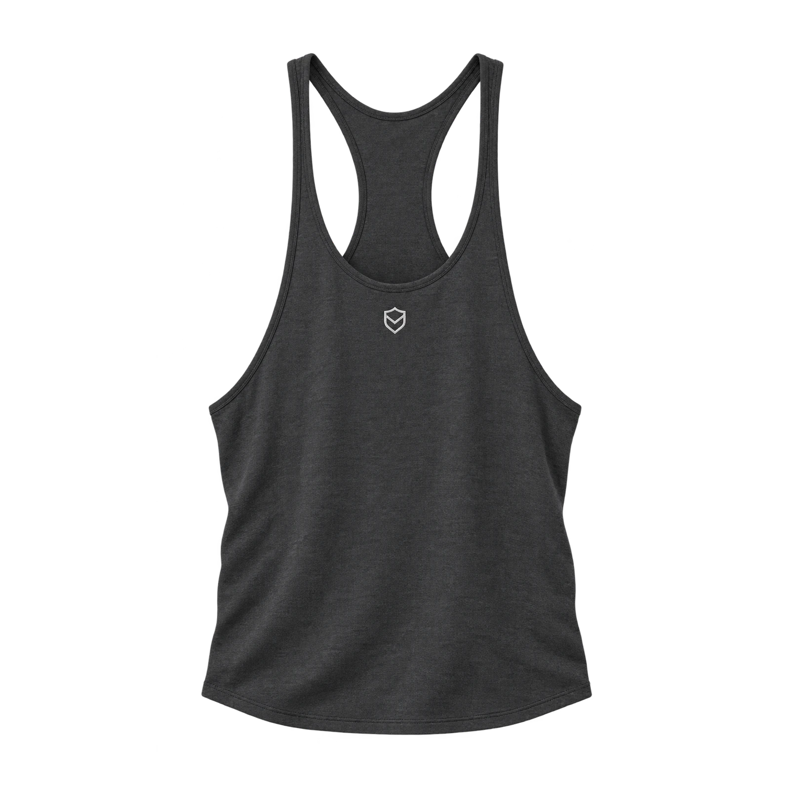
By concentrating artwork within the narrow front panel, a stringer tank design establishes a minimal appearance through compact logos, symbols, or simple illustrations. Small chest marks, geometric icons, and short wordmarks fit between the deep neckline and open armholes. Limited graphic coverage preserves the surrounding fabric while keeping the primary element recognizable. A dark stringer tank featuring a contrasting center-front emblem creates a balanced composition without oversized artwork. Adjust symbol dimensions, line thickness, and placement to maintain clarity within the restricted print area.
- Men’s Athletic Design
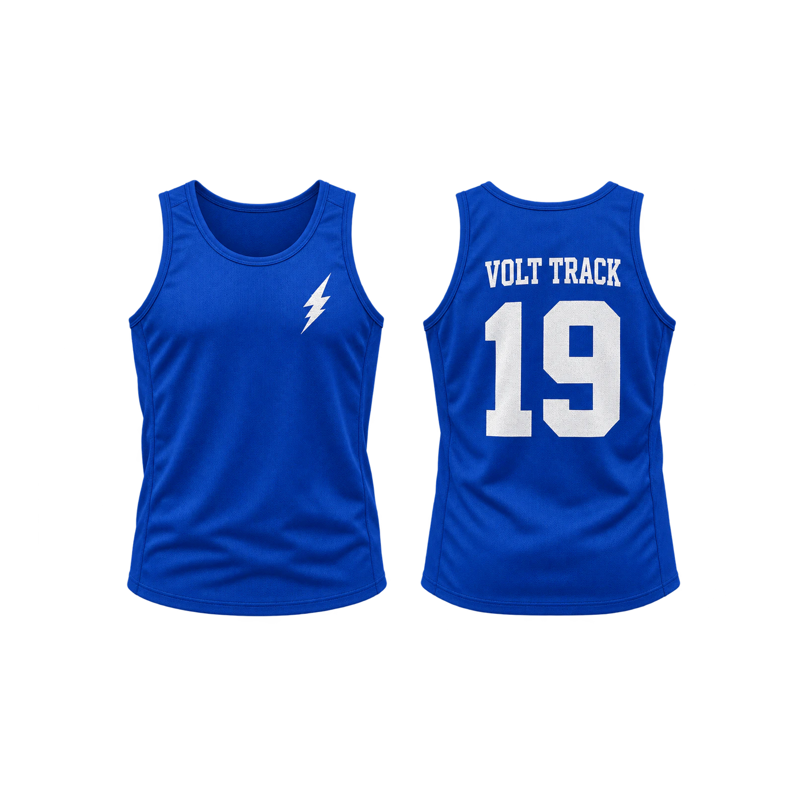
Through team symbols, participant numbers, and structured graphics, a men’s athletic tank top design establishes a recognizable identity for training and sporting activities. Compact chest logos, geometric motifs, and short lettering suit front placements, while larger numbers provide visibility across the back. Strong color contrast and defined typography maintain readability during movement. A lightweight athletic tank featuring a small front emblem and oversized back number demonstrates a practical visual hierarchy. Keep print coverage controlled and adjust artwork proportions to accommodate fabric stretch and different garment sizes.
- Men’s Streetwear Design
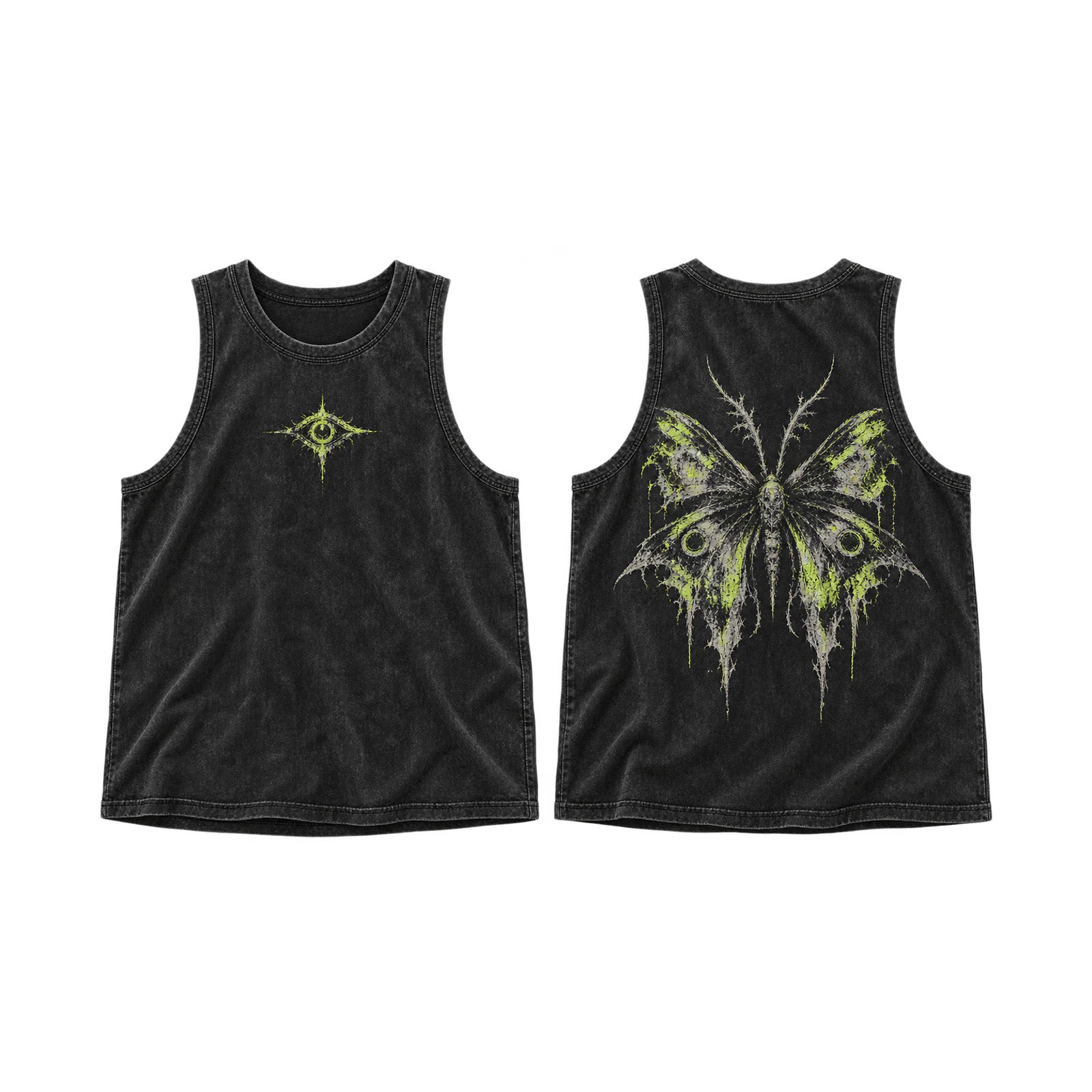
A men’s streetwear tank top design creates a bold visual identity through expressive illustrations, oversized lettering, contrasting symbols, and asymmetrical compositions. Small chest graphics establish secondary details, while larger back artwork carries the primary visual message. Graffiti-style typography, abstract illustrations, and distressed textures introduce different creative directions without requiring identical layouts. A wide-cut tank featuring a compact front symbol and oversized back illustration creates a distinct front-and-back hierarchy. Balance graphic scale, negative space, and color contrast to maintain clarity across the broader garment silhouette.
Women’s Tank Top Design Ideas
Women’s tank top design ideas adapt graphics, typography, characters, and symbols to racerback, flowy, crop, and fitted silhouettes. Vertical lettering and stacked illustrations suit the narrow back area of racerback tanks, while flowy styles accommodate compact typography that remains readable as the fabric moves. Cropped tank tops provide less vertical space for Y2K stars and symbols, making centered chest graphics and reduced artwork height more suitable. Cute character illustrations can occupy small or medium front areas on fitted tanks, with clear outlines, contrasting colors, and proportional placement maintaining graphic visibility.
Below are some women’s tank top design ideas:
- Racerback Vertical Graphic Design
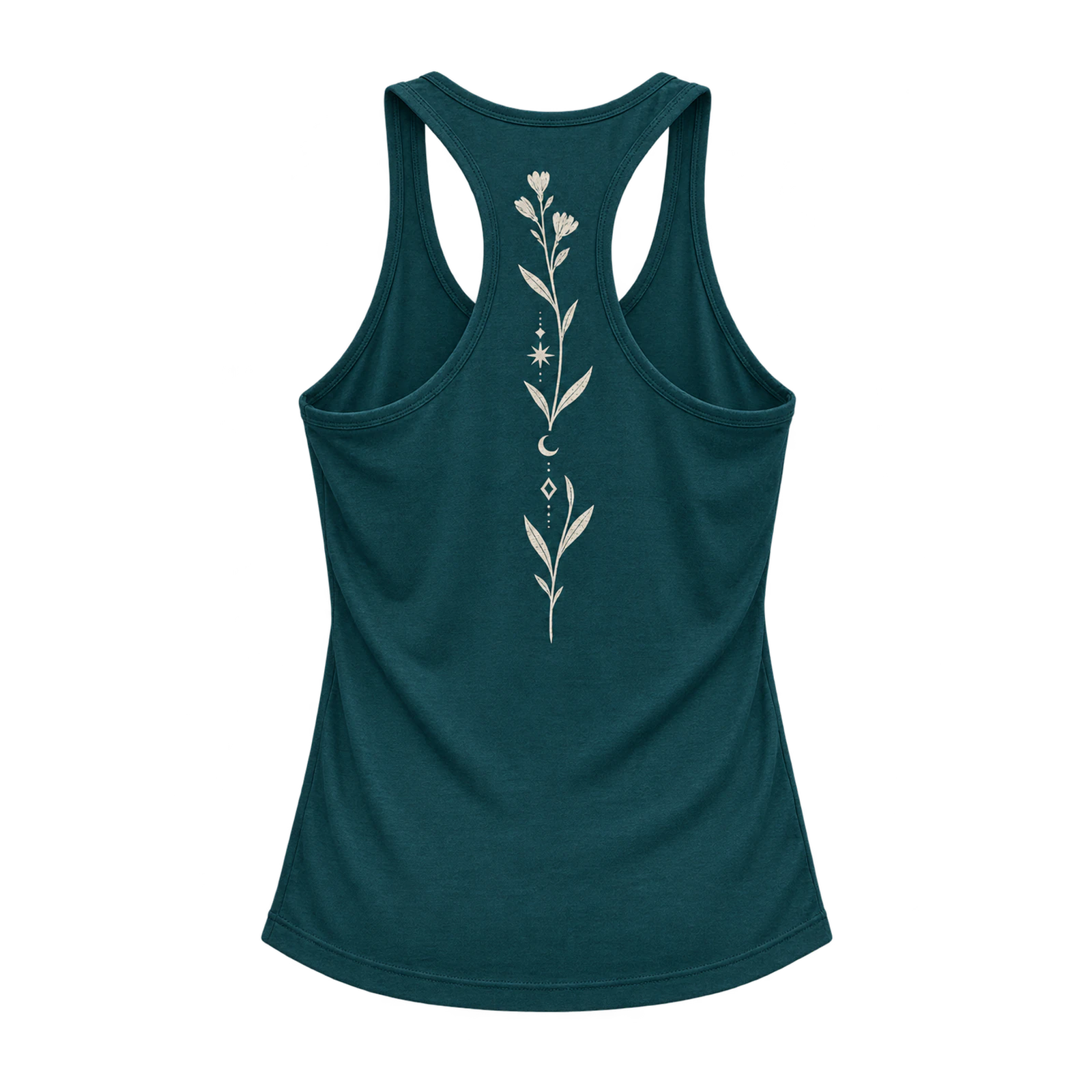
By arranging artwork vertically along the narrow back panel, a racerback tank top design creates a balanced composition through stacked lettering, symbols, and elongated illustrations. Compact typography, botanical motifs, and geometric graphics suit the limited space between the straps and open armholes. Centered alignment and controlled graphic width prevent important details from extending beyond the printable area. A racerback tank featuring vertical lettering with a small symbol demonstrates how artwork follows the garment’s narrow structure. Adjust spacing and graphic height to maintain clarity across different tank top sizes.
- Flowy Tank Minimal Typography Design
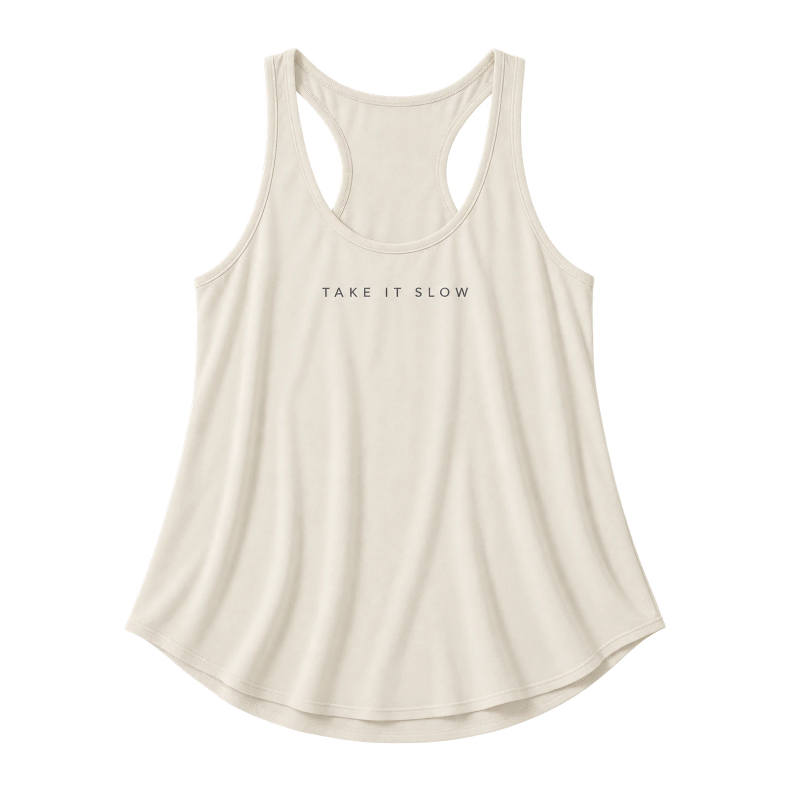
A minimal typography design gives a flowy tank top a restrained appearance through lightweight lettering, short phrases, and open spacing. Compact chest text, simple wordmarks, and centered statements establish recognizable focal points without requiring extensive print coverage. Moderate lettering size and sufficient character spacing preserve readability as the loose fabric drapes across the torso. A flowy tank featuring a short phrase in contrasting lettering creates a balanced composition while maintaining the garment’s relaxed appearance. Keep the artwork away from areas where folds interrupt text alignment.
- Crop Tank Y2K Design
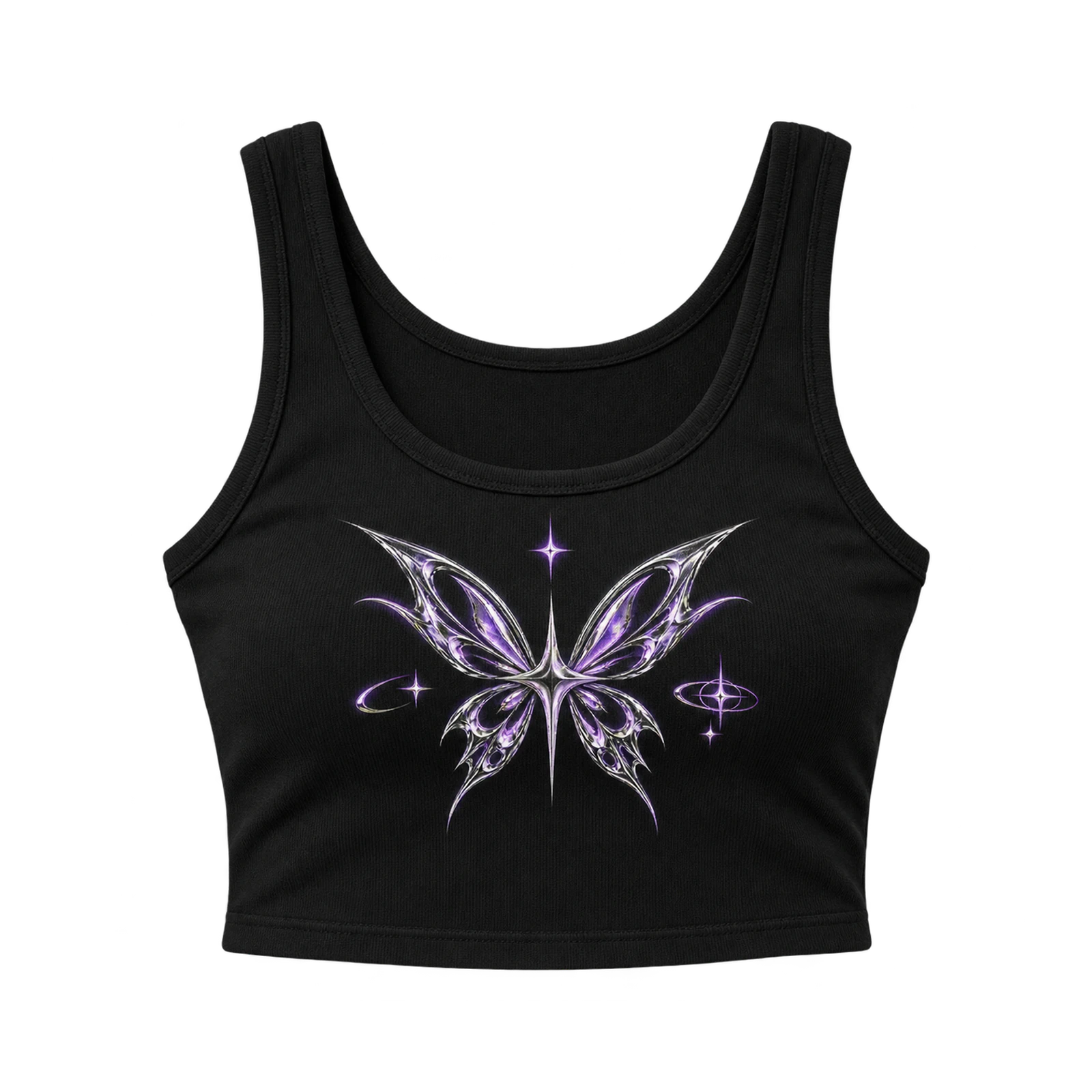
Through pointed stars, digital-style lettering, and metallic-inspired symbols, a Y2K crop tank design recreates the visual aesthetic of early-2000s fashion. Compact chest graphics and centered motifs suit the shorter torso without extending beyond the available vertical print area. Layered shapes, outlined stars, and contrasting accents establish visual depth while maintaining recognizable individual elements. A black cropped tank featuring a silver-style star surrounded by smaller symbols creates a coordinated Y2K composition. Reduce artwork height and control graphic spacing to maintain balanced proportions across the cropped silhouette.
- Women’s Cute Graphic Design
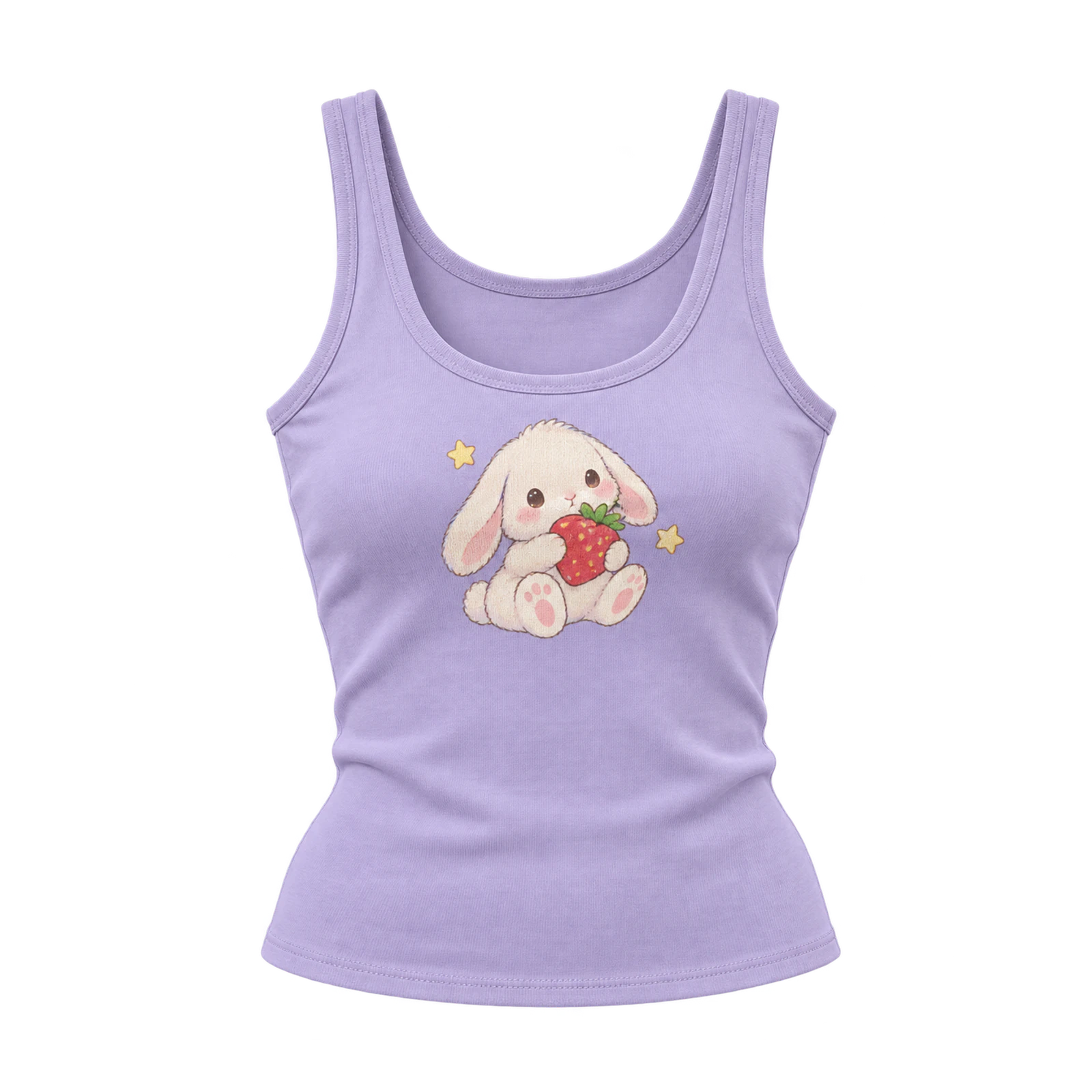
A cute graphic tank top design establishes a playful visual identity through original characters, compact illustrations, and recognizable decorative symbols. Animals, flowers, fruit, hearts, stars, and small mascots suit centered front graphics or subtle chest placements. Defined outlines, separated colors, and simplified details preserve recognition when artwork is scaled for fitted, cropped, or flowy silhouettes. A fitted pastel tank featuring a small illustrated character with surrounding star icons creates a cohesive composition through coordinated shapes and colors. Adjust illustration size and supporting elements to match the garment’s available print area.
What Are the Best Tips for Tank Top Designs?
The best tips for tank top designs include matching artwork to the garment shape, keeping graphics within the usable print area, choosing a proportional design size, and maintaining sufficient contrast for clear visibility. These tank top design tips focus on neckline shape, armhole depth, strap width, artwork placement, scale, readability, and front-and-back balance. Designers should adjust each composition for racerback, muscle, crop, flowy, stringer, and fitted tank tops rather than applying one layout across every garment. Testing these elements before preparing the final artwork helps identify placement, proportion, and visibility issues that can affect the finished design.
Here are some practical tips for tank top designs:
- Match the Design to the Tank Top Shape
Adapt the artwork to the tank top’s neckline, armholes, straps, torso width, and garment length. Place wider graphics on muscle tanks and narrower compositions on racerback or stringer styles. Reduce vertical artwork dimensions for cropped silhouettes and account for fabric drape on flowy tanks. Keep the focal graphic proportional to the available garment area.
- Keep Artwork Inside the Usable Print Area
Position the tank top artwork within the printable boundaries, leaving sufficient space around necklines, armholes, seams, and garment edges. Keep important text, logos, and illustrations away from areas where fabric openings interrupt the composition. Check the graphic’s width and height against the available surface to prevent clipping and maintain balanced placement.
- Choose the Right Design Size and Scale
Scale the tank top design according to the available front or back print area. Use compact dimensions for chest logos, medium proportions for center-front illustrations, and larger artwork for suitable back areas. Compare graphic width and height with the garment measurements, keeping lettering readable and focal elements clear without extending into armholes or seams.
- Adjust Placement for Racerback and Muscle Tanks
Align artwork with the different back structures of racerback and muscle tank tops. Choose narrow vertical graphics, stacked typography, or compact symbols for racerbacks with limited printable width. Position larger illustrations and wider lettering across the broader back area of muscle tanks. Adjust graphic dimensions and maintain clearance around straps, necklines, and armholes.
- Use Enough Contrast Between the Artwork and Garment
Pair artwork colors with contrasting garment shades to maintain clear graphic visibility. Place light designs on dark fabric or dark graphics on lighter backgrounds. For tonal artwork, introduce defined outlines or contrasting accents to separate important elements. Check small typography, fine lines, and illustration details against the selected fabric color before finalizing the palette.
- Keep Small Logos Clear and Readable
Simplify small tank top logos by reducing intricate details, increasing line thickness, and maintaining sufficient spacing between elements. Position compact wordmarks, monograms, or symbols on the chest without crowding the available print area. For embroidered logos, reduce narrow gaps and fine lettering to accommodate stitch density while preserving the original mark’s proportions.
- Test Front and Back Placement Before Finalizing
Compare front and back tank top designs to evaluate graphic alignment, spacing, and scale. Position compact chest marks against larger back illustrations to establish a balanced visual hierarchy. Preview each arrangement on the selected garment silhouette, checking neckline clearance, armhole boundaries, and artwork proportions. Revise placement and dimensions before preparing the final production file.
What Are Common Tank Top Design Mistakes?
Common tank top design mistakes include using artwork that is too wide, placing graphics near garment openings, adding excessive detail, and applying the same layout across different tank top cuts. These design mistakes can affect graphic placement, readability, contrast, scale, and the amount of artwork that remains visible within the usable print area. Designers can avoid these issues by checking the neckline, armholes, straps, torso width, garment length, and artwork dimensions before finalizing the composition. From resizing oversized graphics to improving color separation, each adjustment helps the tank top design fit the garment structure more accurately.
Below are some common tank top design mistakes to avoid:
- Using Artwork That Is Too Wide for the Garment
Oversized artwork makes a tank top design unbalanced when graphics extend into armholes or beyond the available torso width. Wide typography and horizontal illustrations suit muscle tanks but overwhelm narrower silhouettes. Reducing graphic width, changing its orientation, or simplifying the composition keeps important details within the printable area while preserving the main focal point.
- Placing Graphics Too Close to the Neckline or Armholes
Graphics positioned too close to necklines or armholes appear cropped or poorly aligned on a tank top design. Text, logos, and illustrations require sufficient spacing from garment openings to remain visible. Deep necklines and wide armholes further reduce the printable area, making centered placement and suitable clearance important for maintaining a balanced composition.
- Using Too Much Detail for Small Prints
Excessive detail reduces tank top design clarity when complex artwork is scaled down for small chest prints. Thin lines, tiny lettering, and closely arranged elements lose definition at reduced sizes. Simplifying shapes, increasing line thickness, and removing minor details preserves the main graphic, particularly for compact logos and embroidered artwork with limited space for fine details.
- Ignoring the Tank Top Cut When Positioning Artwork
Ignoring garment structure results in misplaced tank top designs across different silhouettes. Racerback, muscle, crop, stringer, and flowy tanks have different necklines, armholes, and printable areas that affect graphic positioning. Artwork placement must follow the available torso width and garment length to prevent important elements from extending into seams or openings.
- Using Weak Contrast Between the Design and Fabric
Weak contrast makes tank top designs difficult to read when artwork colors closely match the fabric. Small logos, fine typography, and detailed illustrations lose definition against similar background tones. Choosing contrasting colors, adding outlines, or separating tonal areas improves graphic visibility. Previewing artwork on the selected garment color identifies readability problems before production.
- Scaling the Same Artwork Identically Across Every Tank Style
Identical artwork dimensions create inconsistent tank top designs because garment cuts have different printable areas. A large muscle tank graphic overwhelms a narrow racerback, while standard-length artwork dominates a cropped silhouette. Adjusting graphic width, height, and placement for each tank style maintains proportional composition and keeps important details within the available garment area.
How Do You Design a Tank Top?
To design a tank top, choose the concept, select the garment style, set the artwork placement, adjust the design size, test colors, and preview the finished composition. This tank top design process connects each creative decision with the neckline, armholes, straps, torso proportions, and available print area. Designers can refine the artwork by comparing placement, scale, contrast, and garment interaction before preparing the production file. From the initial concept to the final artwork, each step helps align the graphic with the specific tank top silhouette and intended decoration method.
Follow these steps to design a tank top:
- Choose the Design Concept
Define the tank top design concept based on the intended audience, message, and visual style. Consider line art, typography, logos, characters, streetwear graphics, Y2K symbols, or vintage artwork. Identify one primary motif and arrange supporting elements around it. Maintain consistent colors, lettering, and graphic details to establish a clear focal point.
- Select the Tank Top Style
Identify the tank top silhouette that best accommodates the intended artwork. Compare racerback, muscle, stringer, crop, flowy, and fitted styles based on neckline, armhole depth, strap width, and torso length. Favor vertical graphics for narrow racerbacks and wider compositions for muscle tanks. Match the layout to the garment’s available print area.
- Set the Artwork Placement
Position the tank top artwork within the garment’s usable print area. Determine whether chest, center-front, or back placement suits the graphic’s size and visual hierarchy. Maintain sufficient clearance around necklines, armholes, and seams. Align the focal element with the garment’s center line while keeping surrounding spacing proportional.
- Adjust the Design Size
Scale the tank top design according to the available print dimensions and garment proportions. Keep chest logos compact, center-front graphics medium-sized, and back illustrations proportional to the garment width. Reduce artwork height for cropped tanks and graphic width for narrow silhouettes. Verify lettering, line thickness, and spacing at the intended print size.
- Test Colors and Contrast
Evaluate the tank top design against the selected fabric color to confirm artwork visibility. Pair light graphics with dark garments or dark artwork with lighter backgrounds. Inspect typography, outlines, and small symbols for sufficient contrast. Refine ink colors, borders, or tonal separation wherever graphic details blend into the fabric.
- Preview the Design on a Tank Top Mockup

Visualize the artwork on the selected tank top silhouette to assess placement, scale, and garment interaction. Compare front and back views using a Tank Top Mockup to identify spacing and alignment issues. Examine neckline clearance, armhole boundaries, and color contrast across the garment. Revise graphic dimensions and positioning before finalizing the layout.
- Prepare the Final Artwork
Finalize the tank top design with the required dimensions, resolution, color setup, and transparent background. Confirm print size and placement against the selected garment. Inspect line thickness, typography, and graphic edges according to the decoration method. Simplify intricate artwork for embroidery and export the file in the required production format.

 Trusted By Thousands Of Designers
 Cancel Your Subscription Anytime
 30 Day Money Back Guarantee