
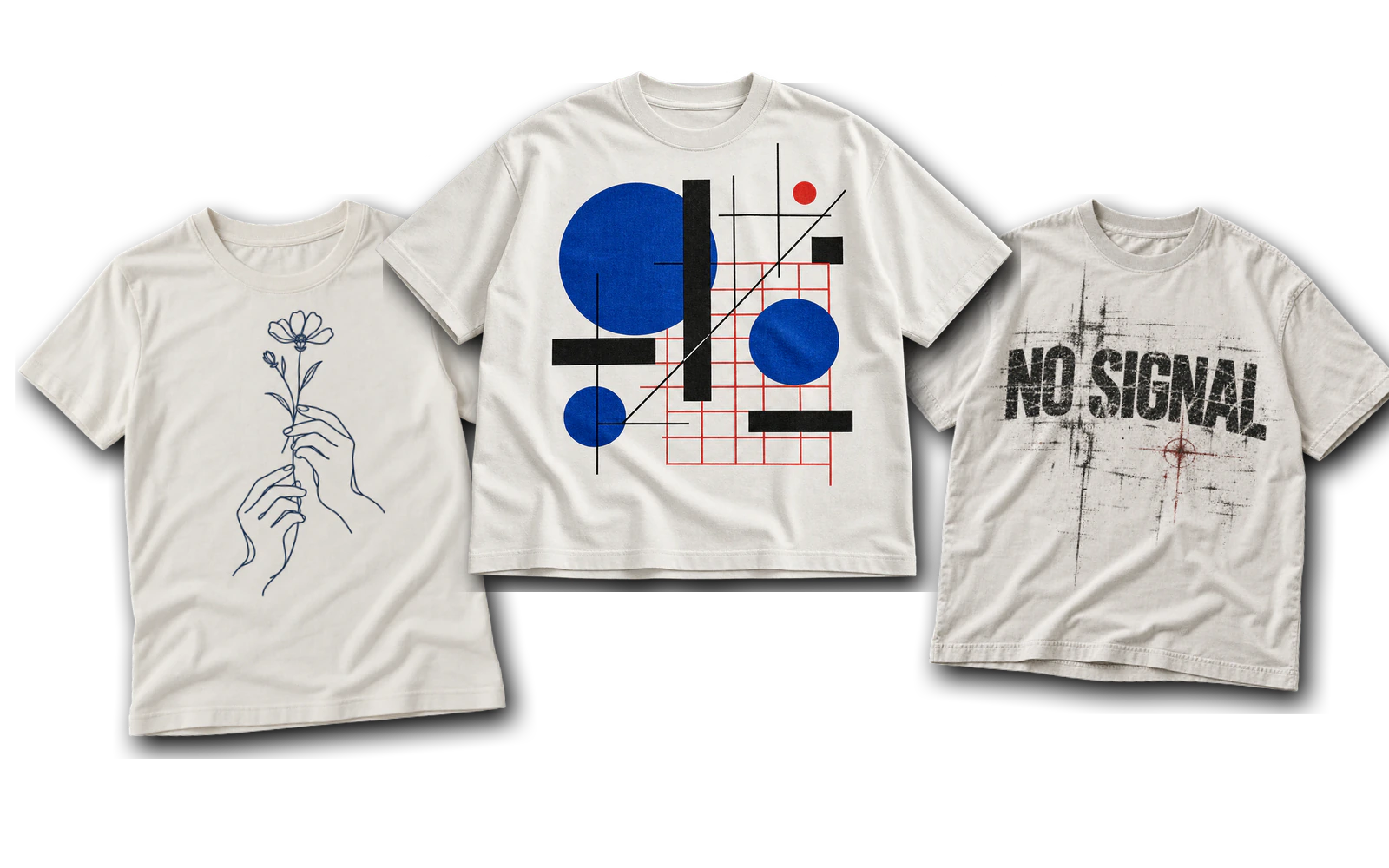
White T-shirt design ideas include typography, illustrations, logos, bold graphics, embroidery, hand-painted artwork, and textured surface treatments suited to a clean white garment. The fabric itself forms part of the composition by separating visual elements, strengthening contrast, framing focal points, and replacing lighter areas within selected graphics. Each concept leaves room to adjust artwork style, color, placement, scale, spacing, and production method.
From compact chest logos and centered typography to oversized black back graphics, Y2K artwork, halftone photography, and stitched details, white T-shirt designs support many visual directions. Designers can compare front and back placements, balance printed and blank areas, simplify artwork for different production methods, and preview variations on a T-shirt mockup before preparing the final file. Careful control of contrast, proportion, negative space, and print behavior helps the artwork remain balanced and readable on the finished garment.
28 white T-shirt design ideas are:
- Small Centered Typography Design
- Single-Word Statement Design
- Positive Tagline Design
- Retro Serif Typography Design
- Vertical Typography Design
- Continuous Line Art Design
- Bold Character Illustration Design
- Halftone Pop Art Design
- Abstract Geometric Design
- Large Back Illustration Design
- Tiny Chest Logo Design
- Centered Brand Mark Design
- Vintage Badge Logo Design
- Front-and-Back Logo System Design
- Y2K Star Graphic Design
- Cyber-Sigilism Design
- Distressed Grunge Design
- Japanese-Inspired Back Print Design
- Vintage Automotive Graphic Design
- Black Typography Design
- Black Line Art Design
- Black Oversized Back Graphic Design
- Black-and-White Photo Halftone Design
- Hand-Painted Graphic Design
- Collar Accent Design
- Small Floral Embroidery Design
- Embroidered Phrase Design
- Mixed-Media Texture Design
Minimalist and Typography White T-Shirt Design Ideas
Minimalist and typography white T-shirt design ideas focus on lettering, spacing, proportion, and negative space rather than dense graphic artwork. The white garment surface gives single words, short phrases, retro typefaces, and narrow text arrangements enough room to remain visually distinct. From compact centered statements to vertically arranged lettering, these designs depend on readable typography, deliberate scale, strong contrast, and controlled placement to keep the composition balanced across the shirt.
Below are several minimalist and typography white T-shirt design ideas:
- Small Centered Typography Design
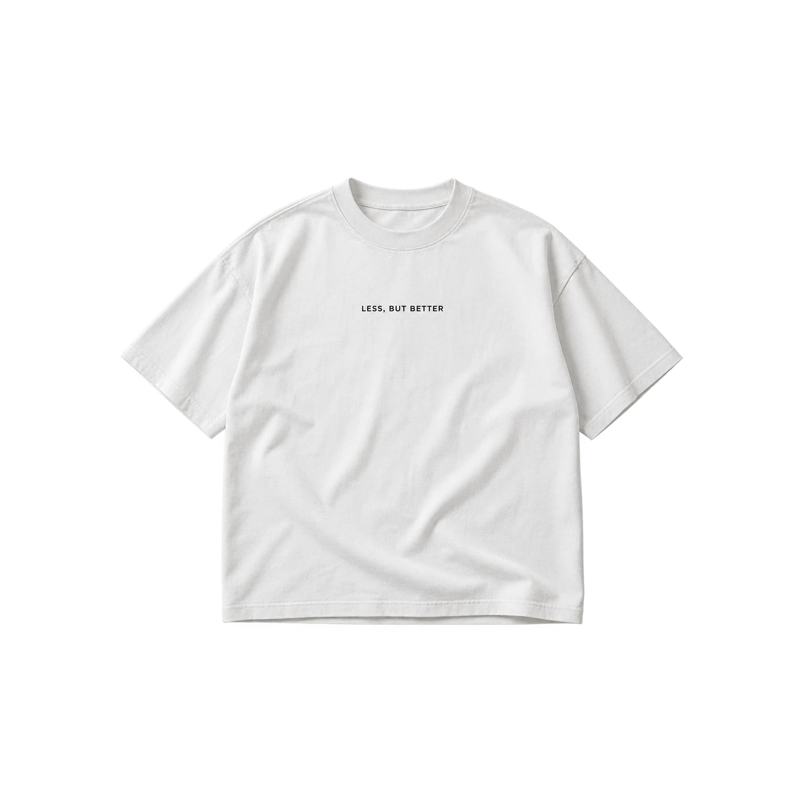
A small centered typography design gives a white T-shirt a restrained focal point by placing a compact phrase within a wide area of blank fabric. Short statements, initials, dates, or simple messages work well when the lettering remains readable without occupying much of the chest. Black, navy, burgundy, or another saturated ink provides clear contrast against white. Moderate font weight, balanced letter spacing, and a controlled print width complete the clean appearance while allowing surrounding negative space to remain part of the composition.
- Single-Word Statement Design
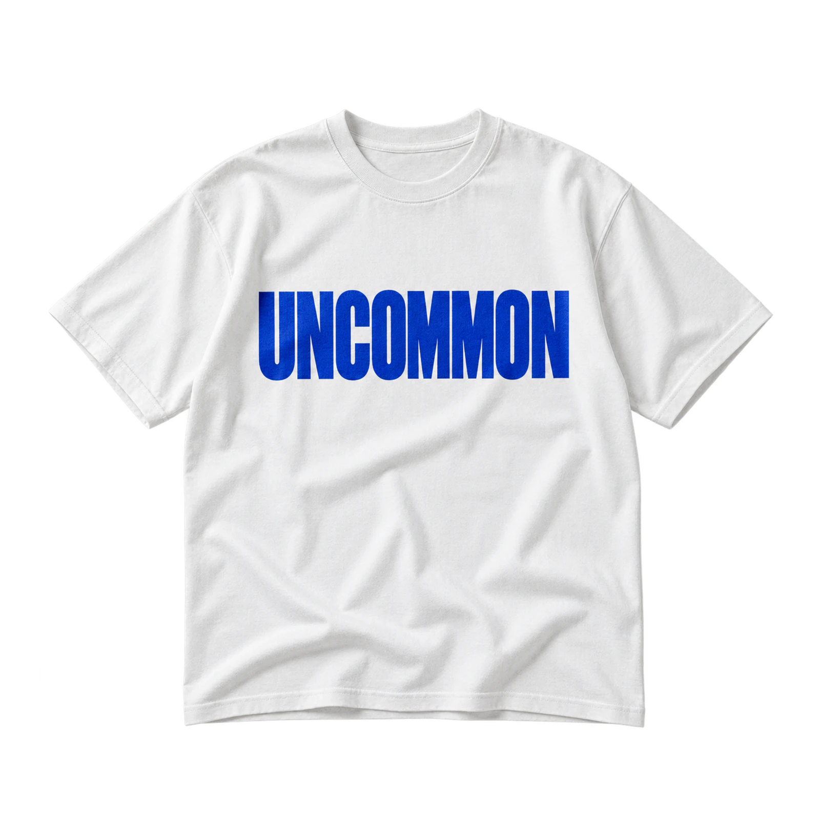
With one bold word as its main element, this white shirt design delivers a direct visual statement without relying on supporting illustrations or decorative graphics. Condensed lettering or a heavier font increases visual weight, while lighter typography produces a more understated result. Center placement emphasizes the word across the front, whereas a smaller upper-chest position keeps the layout restrained. Strong ink contrast, deliberate kerning, and generous surrounding space help the typography remain clear while giving the chosen word enough presence to define the entire design.
- Positive Tagline Design

Short positive taglines turn a white T-shirt graphic into a message-led composition by arranging a brief phrase around clear hierarchy and readable line breaks. Two or three lines work well when the key words receive greater size or weight and supporting text remains visually secondary. Medium-scale placement across the chest provides enough room for the message without filling the garment. Consistent spacing, restrained color choices, and simple typography keep the wording easy to scan while maintaining enough white space around the complete text block.
- Retro Serif Typography Design
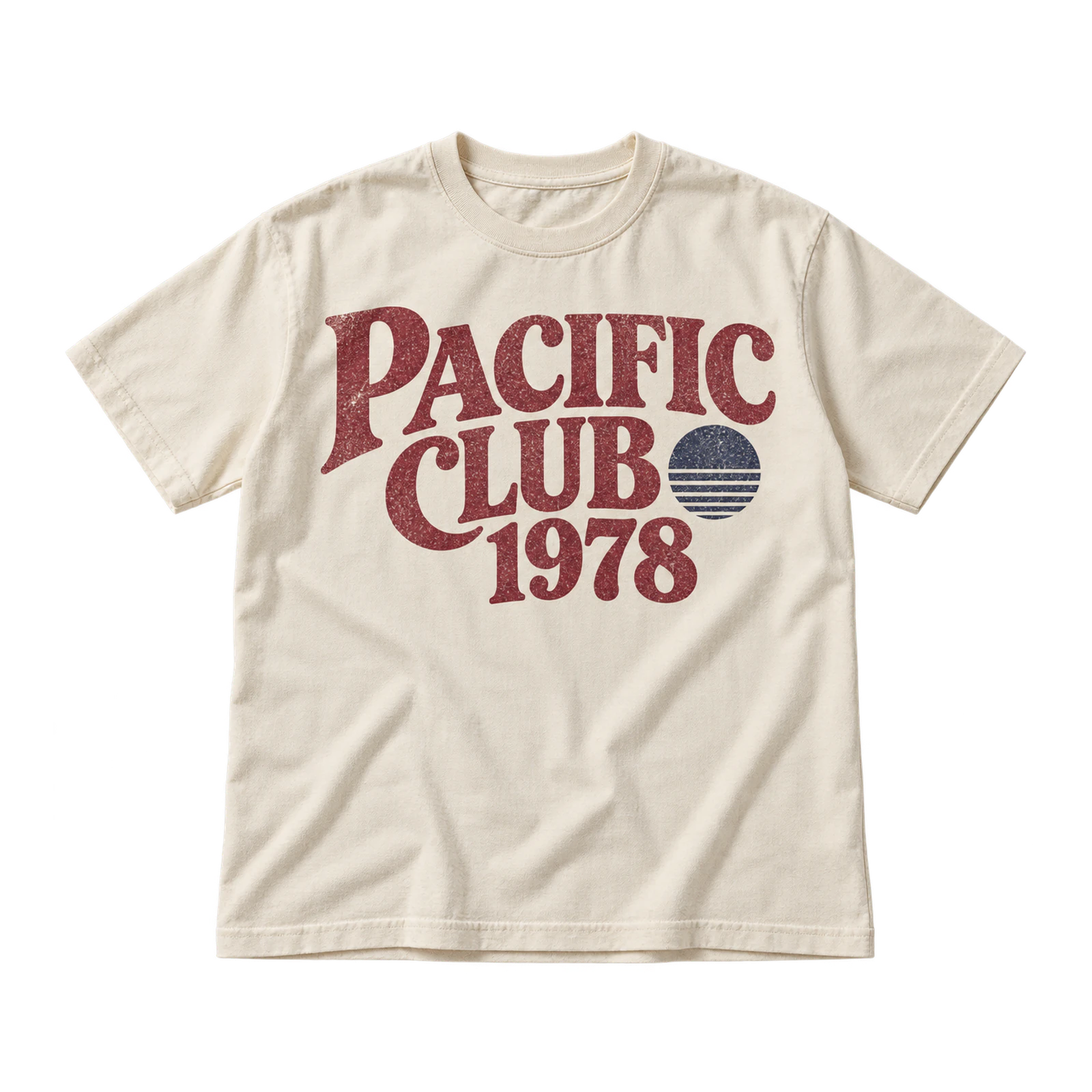
Retro serif typography brings a vintage identity to white T-shirt artwork through period-inspired letter shapes, heavier strokes, and selectively aged print treatments. Burgundy, faded red, brown, navy, and black complement the nostalgic direction while maintaining clear separation from the light fabric. Decorative serifs, slightly condensed spacing, and subtle distress add character without overwhelming the wording. Open margins around the typography keep individual letters distinct, while controlled texture prevents smaller counters, edges, and ornamental details from losing clarity at the final print size.
- Vertical Typography Design
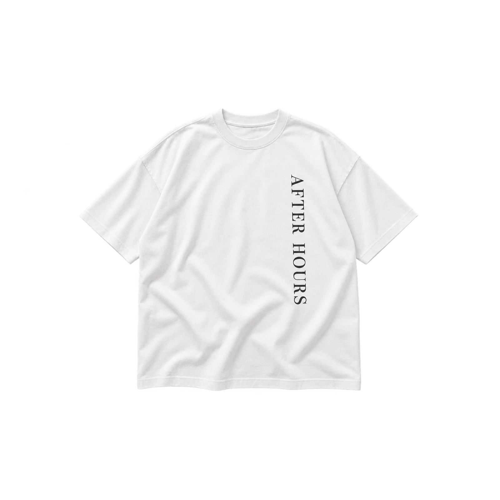
When lettering runs from top to bottom, a white tee design gains a narrow directional layout that makes stronger use of the garment’s height than standard horizontal text. The composition may sit through the center, along one side of the torso, or down the back depending on the desired emphasis. Dark or saturated ink keeps the letterforms visible against white fabric. Consistent spacing, a clear reading direction, and limited horizontal width preserve the elongated structure while preventing the text from feeling cramped or visually unbalanced.
Graphic and Illustration White T-Shirt Design Ideas
Graphic and illustration white T-shirt design ideas turn drawings, characters, shapes, and visual scenes into the dominant element of the garment. With a white surface acting as the lightest area of the composition, illustrations gain natural separation between colors and details without needing a printed background. Simple line drawings, character graphics, halftone artwork, geometric forms, and detailed back illustrations all require scale, line weight, placement, and color treatment that suit the complexity of the final artwork.
Some graphic and illustration white T-shirt design ideas include:
- Continuous Line Art Design
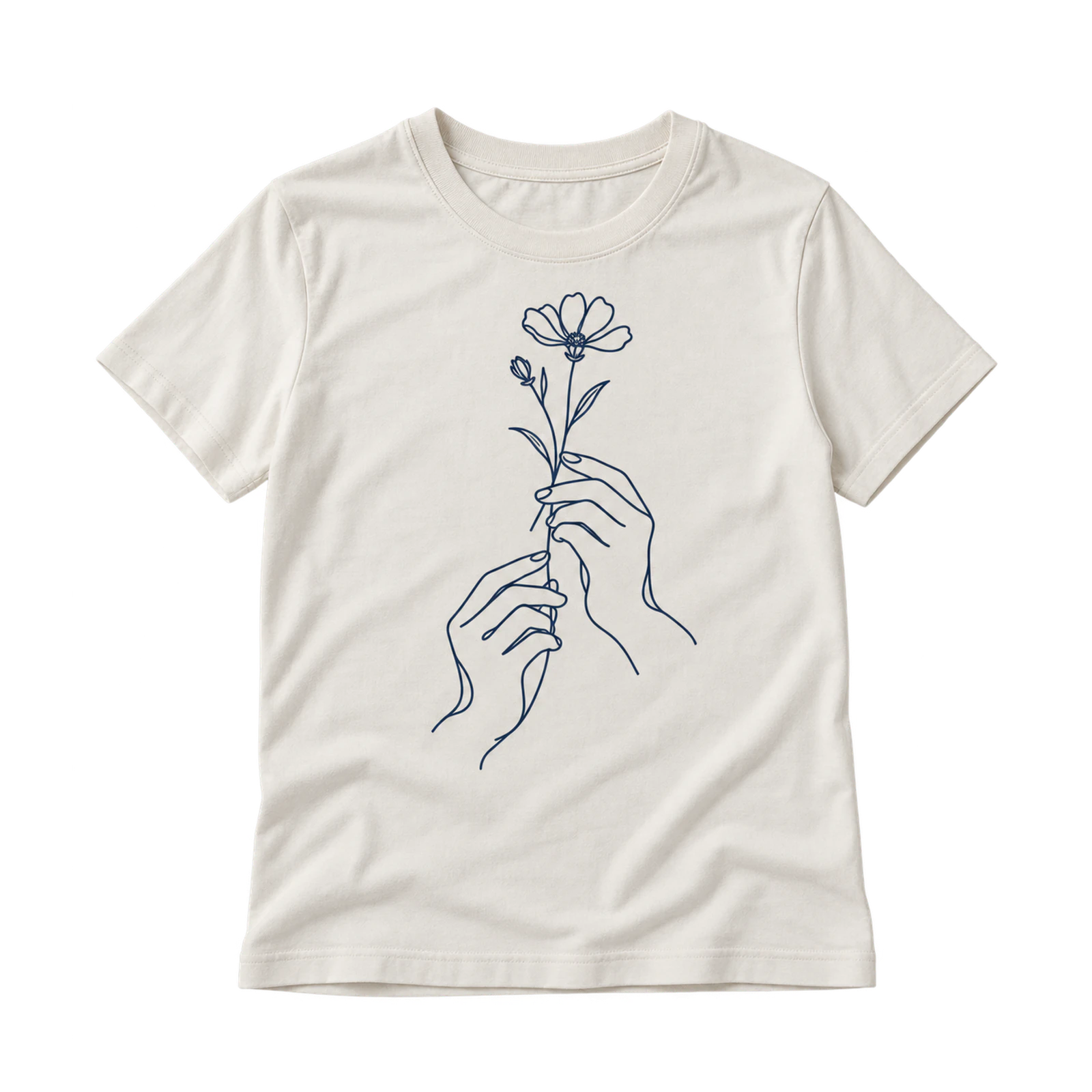
A continuous line art design gives a white T-shirt a clean illustrated focal point by relying on simple outlines and large areas of untouched fabric. Faces, flowers, hands, animals, and abstract subjects fit this approach well when each stroke remains thick enough for reliable reproduction. Small or medium placements help preserve the restrained character of the artwork. Black, navy, or another dark ink strengthens visibility, while open spacing around the drawing keeps the composition light, balanced, and easy to recognize.
- Bold Character Illustration Design
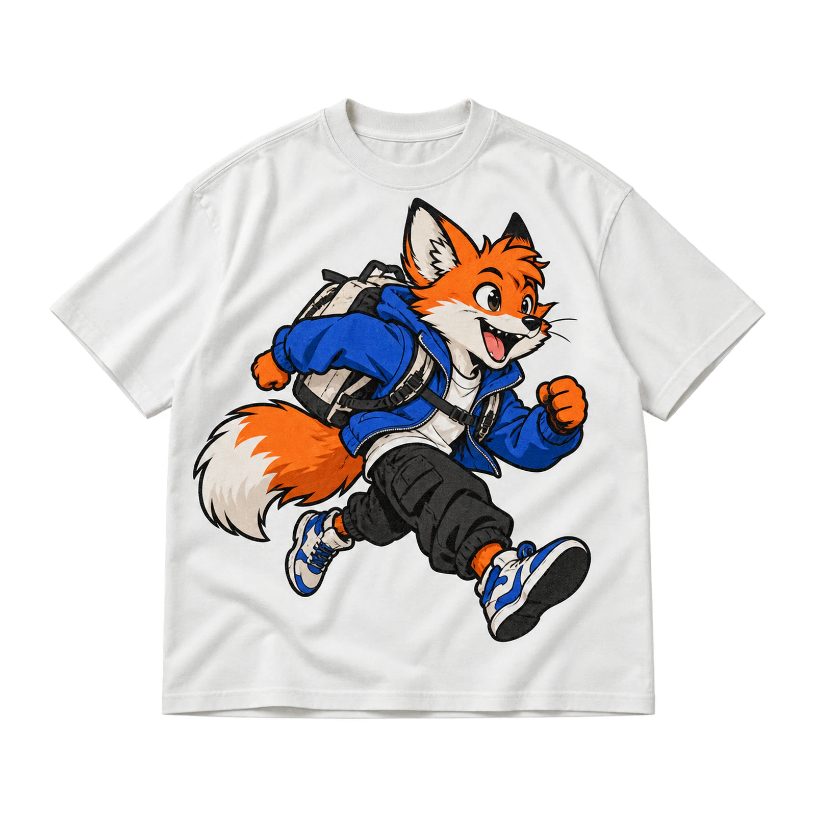
With an original character as the main subject, a white shirt graphic gains a stronger visual identity through expressive poses, defined outlines, and recognizable details. Medium or large placement gives facial features, clothing, accessories, and supporting graphics enough room to remain clear rather than compressed. Separate colors distinctly so the figure stands apart from the white background. Simplified interior details, controlled shading, and consistent line weight help the character retain its personality while remaining suitable for the intended print size.
- Halftone Pop Art Design
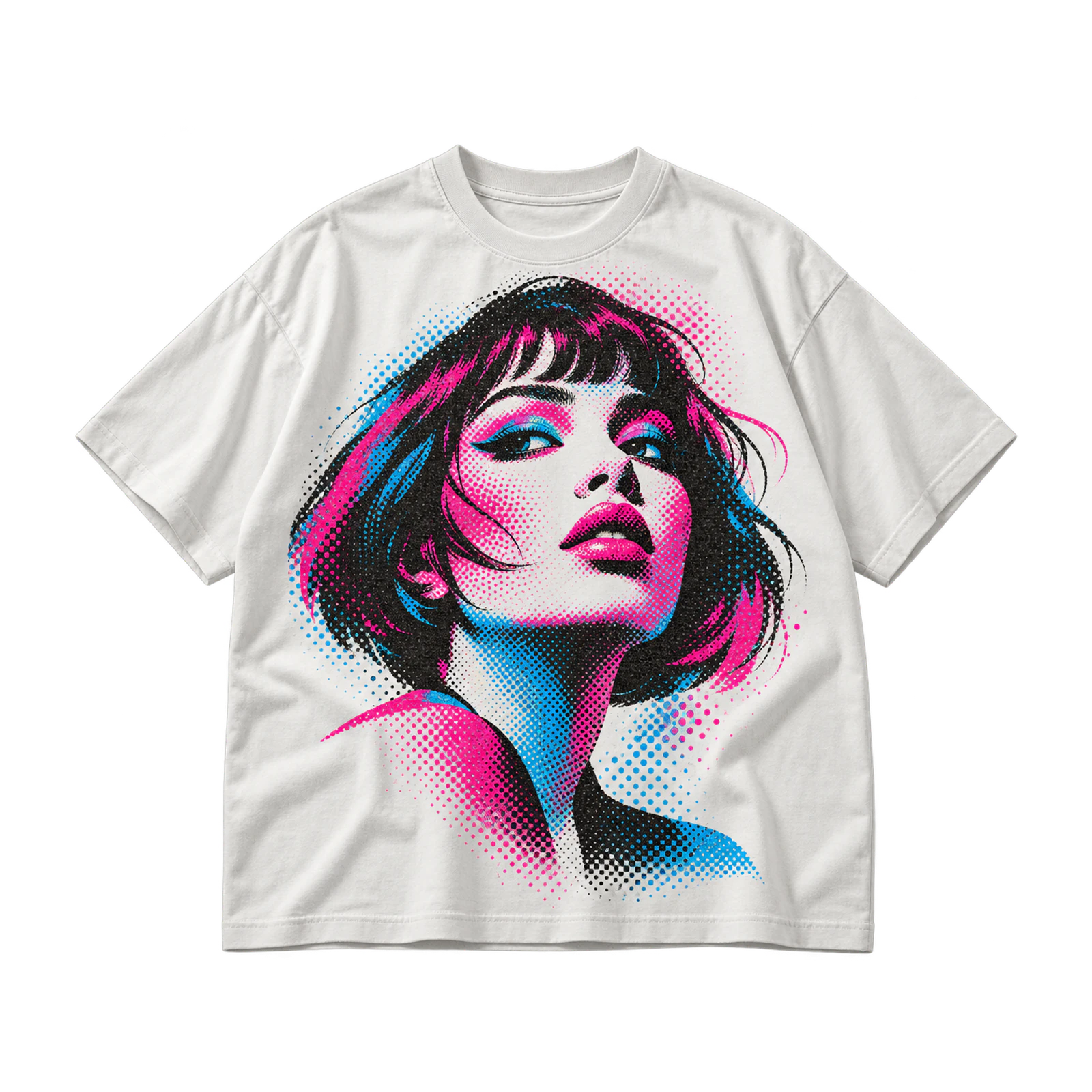
Halftone treatment turns a white T-shirt design into a high-contrast graphic by building portraits, objects, or illustrations from dots and simplified tonal values. The garment itself serves as the lightest part of the image, reducing the need for a solid printed background. Larger artwork gives the dot pattern enough room to stay visible and distinct. Strong source contrast, controlled halftone density, and clear tonal separation preserve facial features, shadows, and important details without allowing darker areas to merge together.
- Abstract Geometric Design
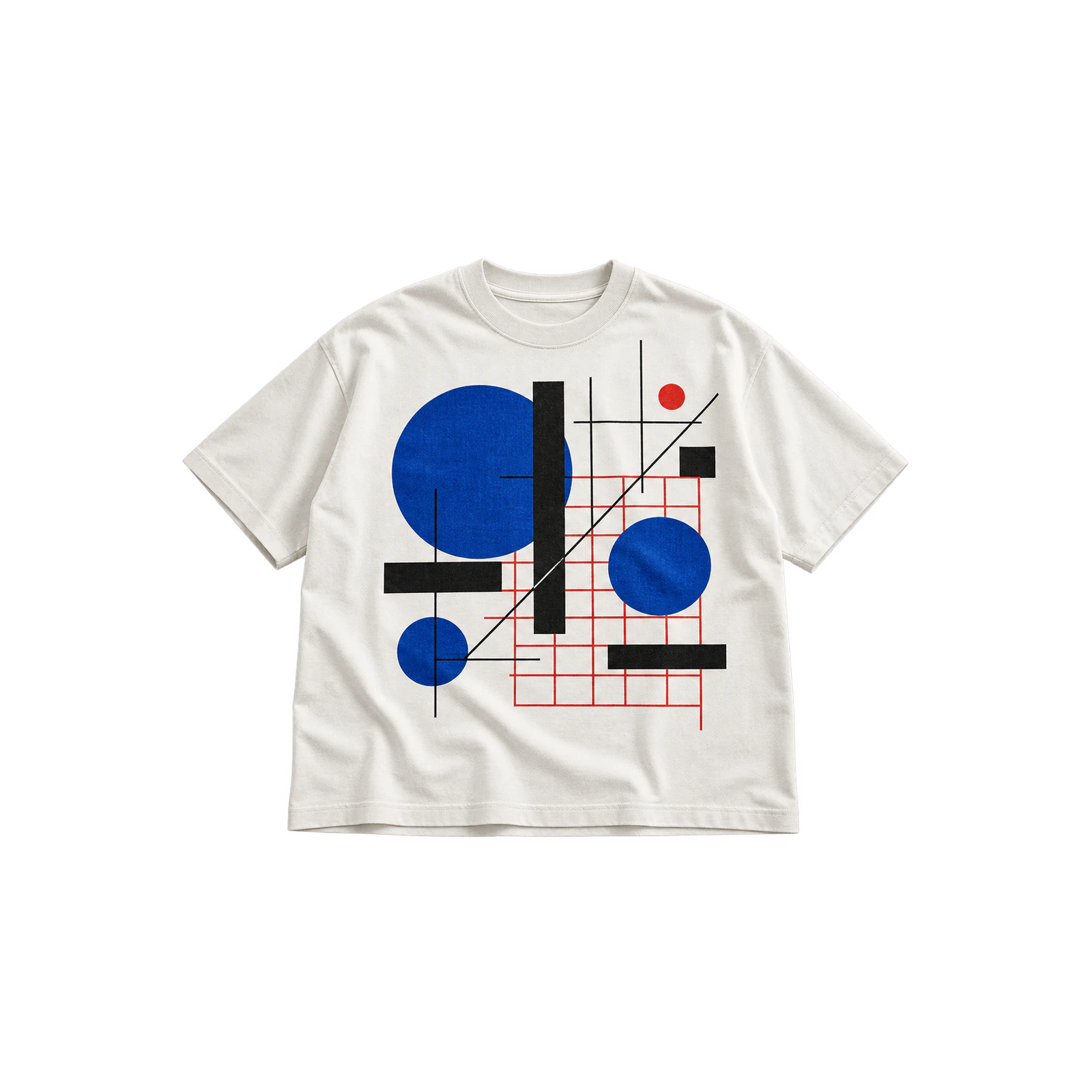
By arranging circles, blocks, lines, grids, and repeated forms, an abstract white T-shirt graphic develops structure through proportion and controlled visual rhythm. Symmetrical layouts produce a more ordered appearance, while offset or asymmetrical arrangements introduce movement across the garment. Leave enough white fabric between neighboring forms to keep each shape visually separate. A limited color palette, deliberate spacing, and balanced scale help the composition remain coherent instead of turning into a dense collection of competing geometric elements.
- Large Back Illustration Design
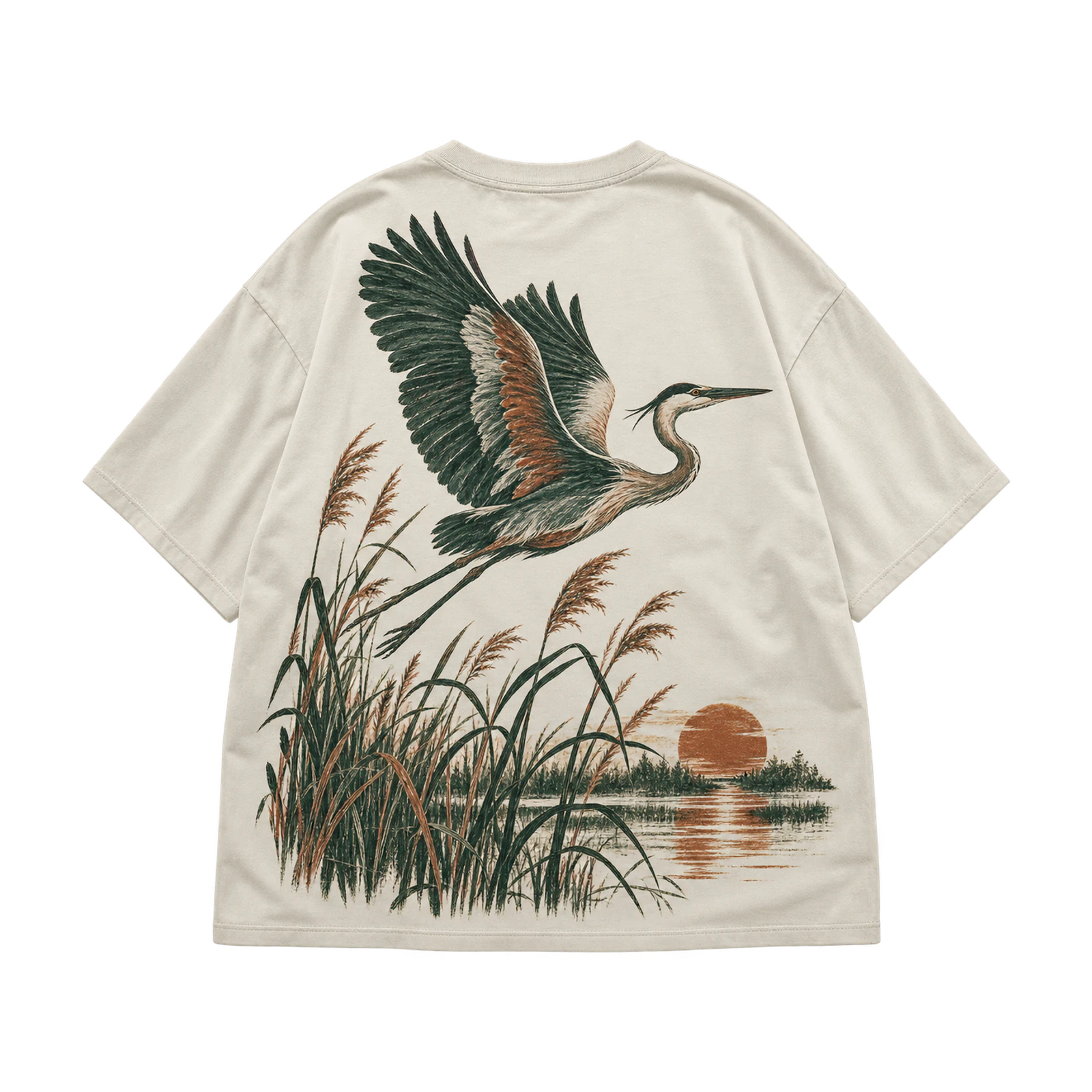
The rear panel gives a white T-shirt design enough room to support detailed scenes, characters, symbols, and layered graphic compositions at a more substantial scale. Enlarging the artwork helps preserve smaller details, but the layout should still leave sufficient clearance beneath the collar and away from side seams. Keep one clear focal area within the composition so the image remains easy to interpret. A small front symbol, phrase, or logo can connect both sides while leaving the back illustration visually dominant.
Logo and Branded White T-Shirt Design Ideas
Logo and branded white T-shirt design ideas combine symbols, wordmarks, monograms, emblems, and coordinated identity systems to turn the garment into a recognizable brand surface. Against white fabric, dark inks, saturated colors, and stitched marks stand out clearly while the surrounding blank area gives each element room to breathe. Compact chest logos, centered marks, vintage badges, and front-and-back systems all benefit from controlled scale, strong hierarchy, and deliberate placement that keeps the branding clear without overwhelming the shirt.
Here are several logo and branded white T-shirt design ideas:
- Tiny Chest Logo Design
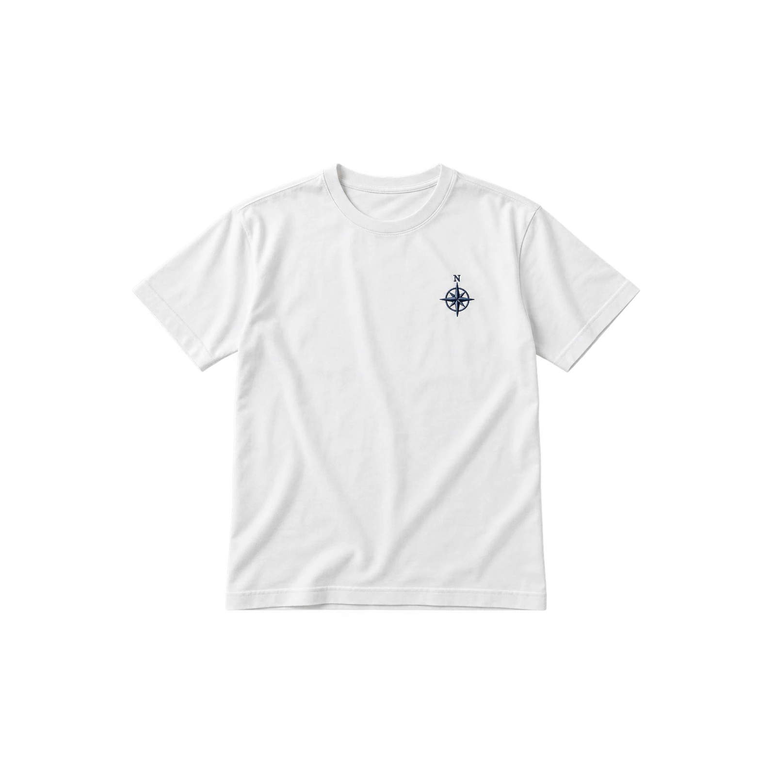
A compact chest logo gives a white T-shirt a subtle branded focal point without taking attention away from the rest of the garment. Symbols, monograms, icons, and short wordmarks fit well on the left chest or upper center when their shapes stay readable at a reduced scale. Simplify small internal details, leave enough clear space around the mark, and use dark ink, colored thread, or a limited palette to keep the logo distinct while preserving the restrained appearance of the shirt.
- Centered Brand Mark Design
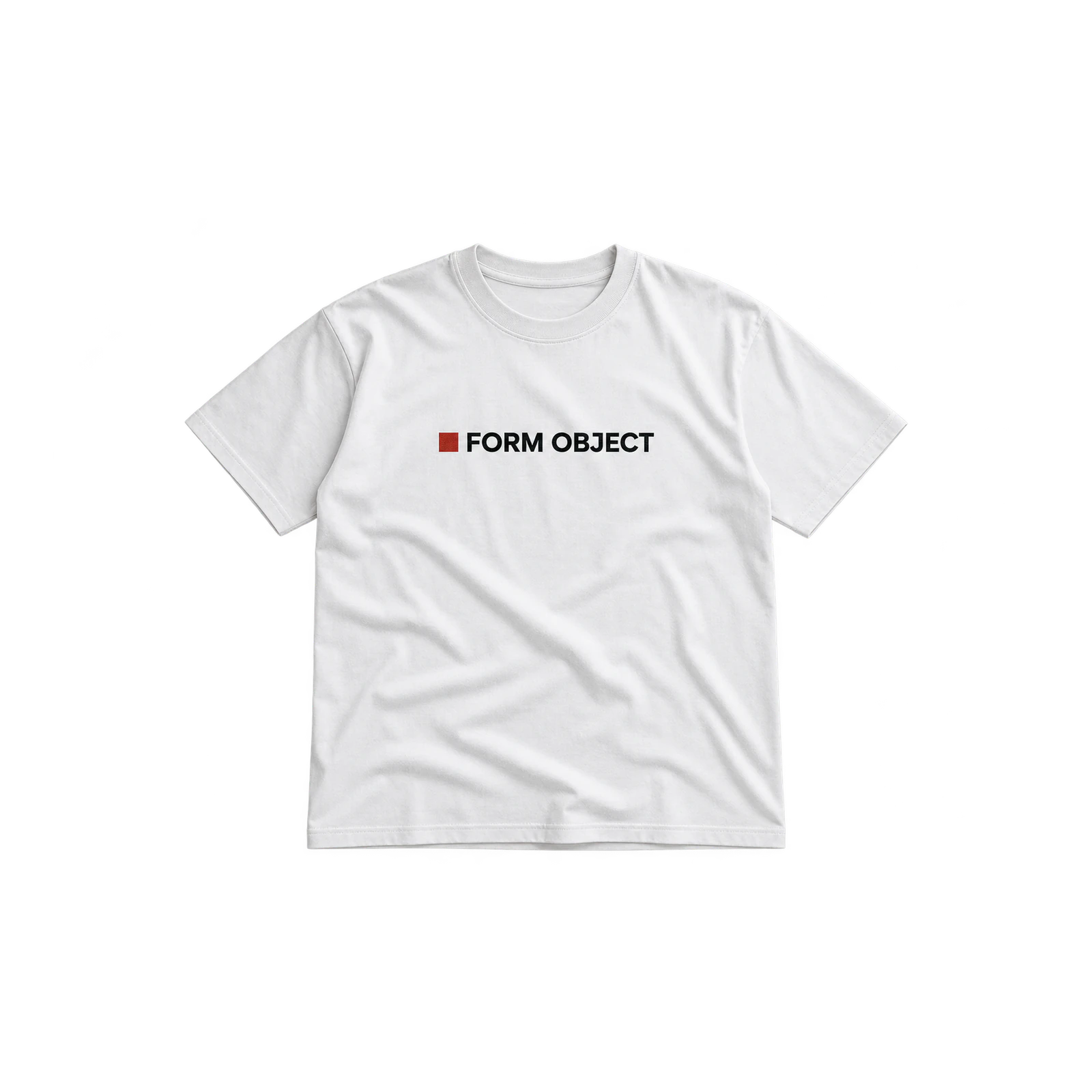
When a brand mark sits across the center of a white T-shirt, the identity gains stronger visual emphasis while still benefiting from the surrounding blank surface. Medium-scale wordmarks, symbols, and combined logo systems work well across the upper or middle chest when their proportions remain balanced. Check visual centering as carefully as numerical alignment, particularly with asymmetrical marks. Consistent spacing, clear edges, and sufficient contrast help the branding feel deliberate rather than oversized or awkwardly positioned.
- Vintage Badge Logo Design
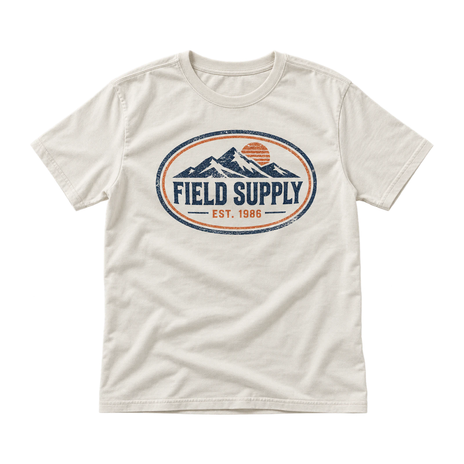
Retro badge graphics bring a heritage-style identity to white shirt designs through emblem shapes, aged lettering, outlines, dates, and compact supporting details. Circular, shield, oval, and service-inspired forms suit chest or centered placements where the entire badge remains easy to read. Dark ink and restrained accent colors strengthen separation from the fabric, while selective distress adds character. Keep small text and fine outlines clear enough to survive reduction so the badge retains its internal hierarchy at print size.
- Front-and-Back Logo System Design
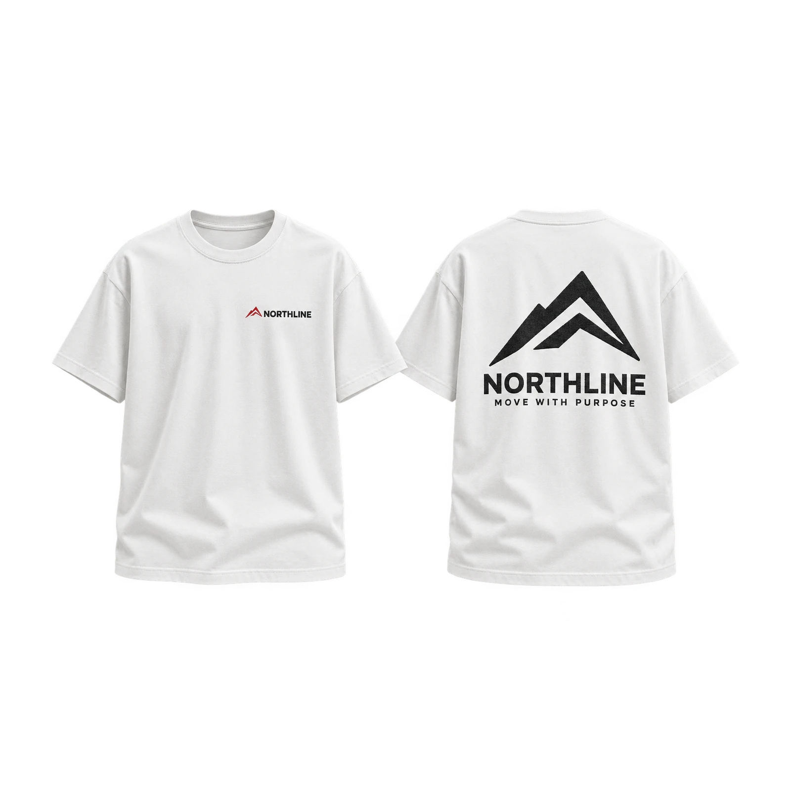
Pairing a smaller front identity with a larger rear composition gives a white branded T-shirt a more complete visual system than repeating the same mark on both sides. Use the chest for a compact symbol, monogram, or wordmark, then extend the brand across the back through a slogan, emblem, illustration, or expanded graphic. Repeated colors, typography, and motifs connect both placements, while different scale and content give each side a distinct role within the overall identity.
Streetwear, Y2K, and Vintage White T-Shirt Design Ideas
Streetwear, Y2K, and vintage white T-shirt design ideas bring together layered graphics, distressed textures, sharp symbols, retro references, and oversized compositions. Against a white garment, metallic-style details, dark linework, faded effects, and saturated accents remain visually distinct while the blank surface keeps dense artwork from feeling overly heavy. Y2K symbols, cyber-inspired forms, grunge treatments, Japanese-influenced back prints, and automotive graphics all benefit from original artwork, deliberate scale, controlled placement, and a palette that supports the intended style.
Consider the following streetwear, Y2K, and vintage white T-shirt design ideas:
- Y2K Star Graphic Design
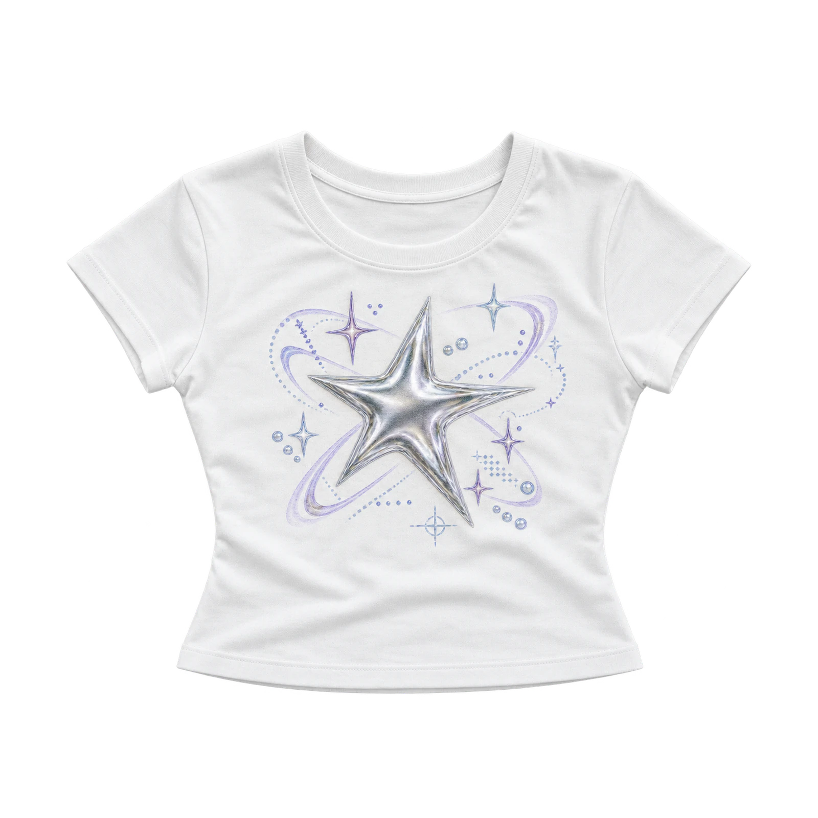
A Y2K-inspired white T-shirt design brings an early-2000s feel through metallic-style stars, digital symbols, sharp forms, and layered graphic elements. Medium-scale placement across the front or back gives overlapping details enough room to remain distinct without making the composition feel compressed. Silver, black, blue, pink, and purple reinforce the futuristic direction, while controlled spacing keeps smaller stars and pointed shapes readable. Glossy effects, symmetrical arrangements, and restrained layering complete the nostalgic digital look.
- Cyber-Sigilism Design
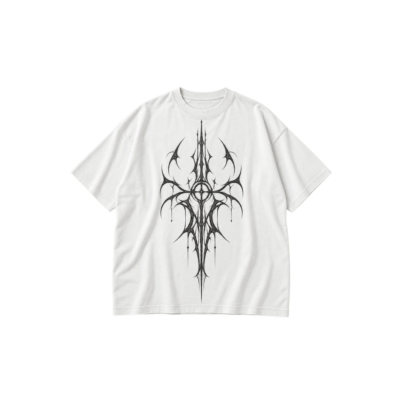
With narrow symbols, sharp curves, and digital-looking linework, cyber-sigilism gives a white tee graphic an intricate futuristic character. Centered or vertical placement emphasizes the elongated forms and keeps the composition visually focused across the garment. Black or another dark ink strengthens contrast against the white background, while generous spacing prevents neighboring strokes from merging. Pointed shapes, narrow gaps, and internal details should remain large enough for crisp reproduction at the intended print size.
- Distressed Grunge Design
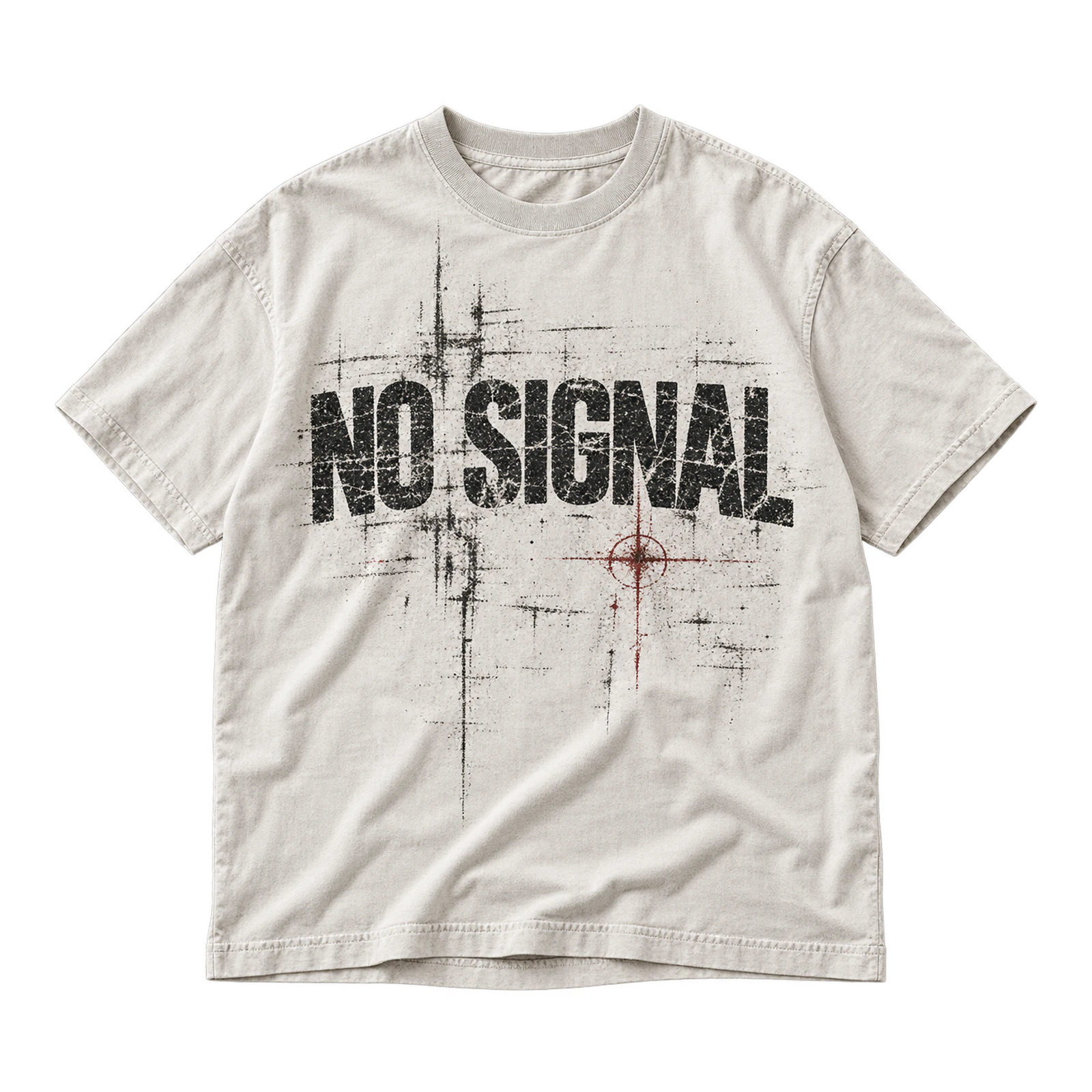
Rough edges, faded lettering, grain, scratches, and broken textures give a white shirt design an intentionally worn and rebellious appearance. Medium or large artwork leaves enough room for distressed treatments without erasing the underlying word, symbol, or illustration. Darker solid areas help preserve the main focal point against the light fabric, while selective fading adds age around the edges. Controlled texture keeps the graphic expressive without allowing the distressed finish to become muddy or difficult to read.
- Japanese-Inspired Back Print Design
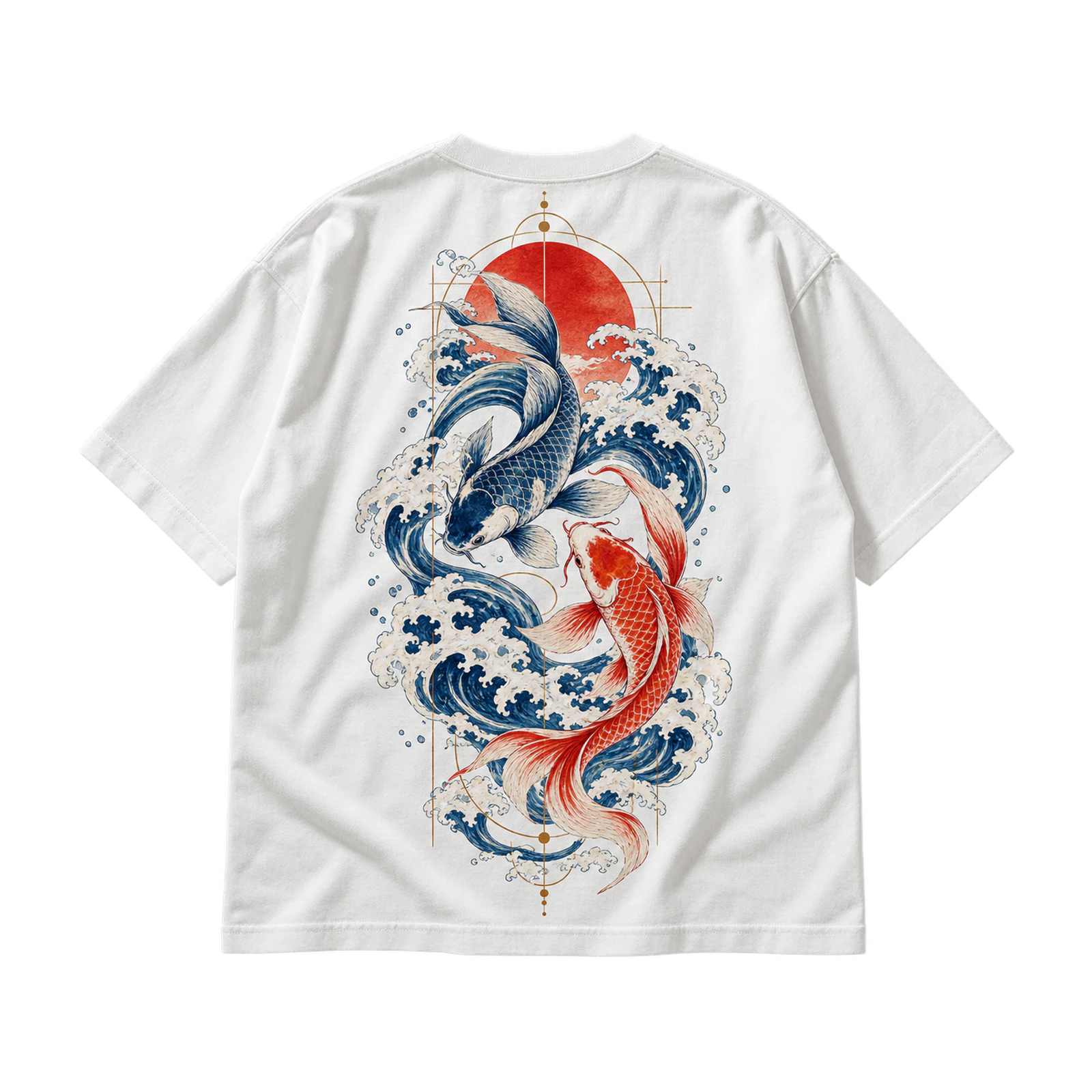
Across a white T-shirt, a Japanese-inspired back print builds visual depth through vertically arranged text, illustration, flowers, waves, symbols, or geometric details. Large rear placement provides enough room to separate the main artwork from supporting elements and establish a clear reading order. A restrained front treatment keeps attention on the back composition. Accurate language, respectful visual references, and consistent spacing help the design feel intentional while preserving clarity across the larger print area.
- Vintage Automotive Graphic Design
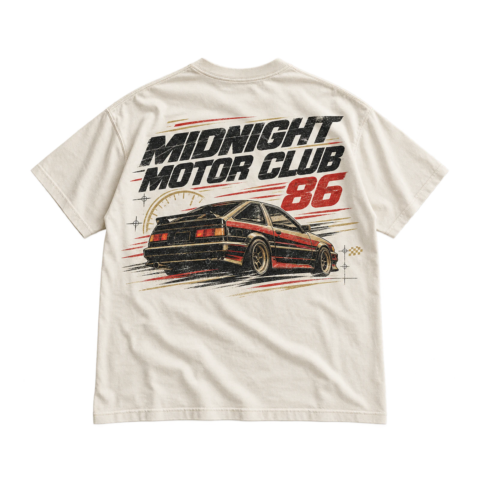
Retro vehicle artwork gives white T-shirt designs a layered motorsport character through service-style lettering, racing numbers, mechanical details, speed lines, and badge-inspired forms. Larger front or back layouts provide enough room for several elements while keeping individual details readable. Faded ink, limited colors, and subtle distress reinforce the aged appearance without overwhelming the composition. A compact front emblem paired with a fuller rear graphic creates a balanced automotive theme across both sides of the shirt.
Black-on-White and High-Contrast White T-Shirt Design Ideas
Black-on-white and high-contrast white T-shirt design ideas rely on dark artwork, sharp separation, and unprinted fabric to produce bold monochrome compositions. With the white garment acting as the lightest visual area, black lettering, linework, oversized graphics, and halftone photography gain immediate definition without requiring additional background color. These concepts work best when ink coverage, line thickness, scale, and internal negative space are controlled carefully enough to preserve clarity across the finished print.
Some black-on-white and high-contrast white T-shirt design ideas include:
- Black Typography Design
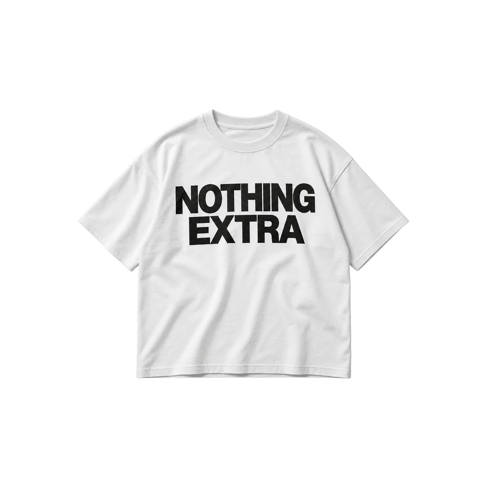
Black lettering gives a white T-shirt design an immediate focal point by turning slogans, wordmarks, or short phrases into the dominant visual element. Large type works well across the chest or back, while smaller wording suits more restrained placements. Adjust line breaks, letter spacing, and alignment so the text feels deliberate rather than compressed. Generous blank fabric around the lettering preserves the high-contrast effect and prevents the composition from becoming visually heavy.
- Black Line Art Design
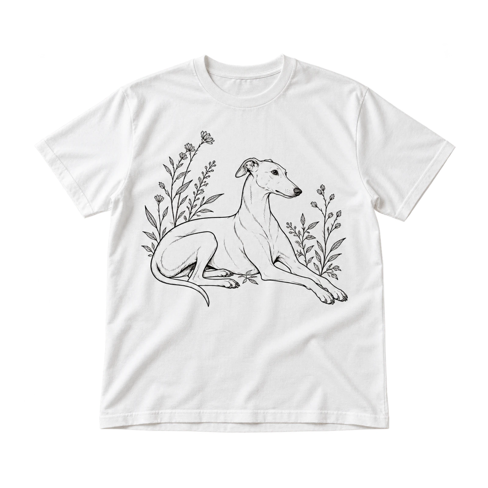
Against white fabric, black line art gives a T-shirt graphic a crisp illustrated look without relying on filled backgrounds or multiple colors. Contour drawings, portraits, flowers, animals, and simplified subjects all suit this approach when the stroke weight matches the final print size. Open areas within the drawing keep the artwork light, while wider spacing between fine details prevents neighboring lines from merging. Consistent line thickness helps the illustration remain clear after printing.
- Black Oversized Back Graphic Design
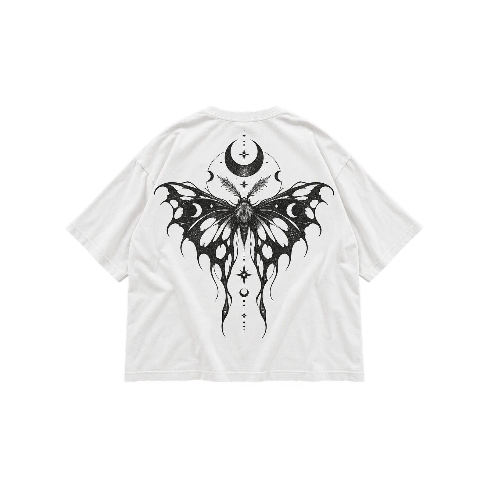
A large black back graphic gives a white T-shirt strong visual weight by turning the rear panel into the main artwork area. Illustrations, symbols, abstract forms, and oversized typography work especially well when internal white space breaks up broad sections of ink. Leave enough clearance below the collar and around side seams to keep the layout balanced. A much smaller front graphic can support the theme while allowing the rear composition to remain visually dominant.
- Black-and-White Photo Halftone Design
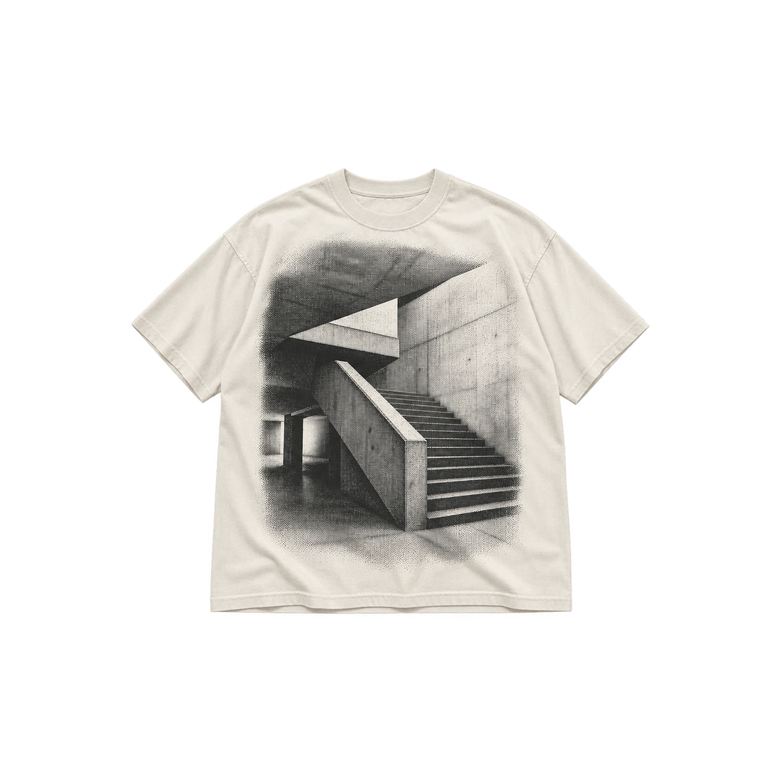
When a photograph is translated into halftone dots, a white shirt becomes part of the image by supplying the brightest tonal values. Portraits, buildings, objects, and other high-contrast photos suit this treatment because strong light and shadow produce clearer tonal separation. Larger print dimensions give the dot pattern enough room to retain facial features and texture. Controlled density in darker regions prevents individual tones from collapsing into a single heavy black area.
Embroidery, Hand-Painted, and Textured White T-Shirt Design Ideas
Embroidery, hand-painted, and textured white T-shirt design ideas bring physical depth to the garment through stitching, paint, patches, and other surface treatments. Rather than relying only on flat graphics, these approaches change how the artwork feels and moves with the fabric while adding visible texture around selected details. Hand-painted graphics, neckline accents, floral embroidery, stitched phrases, and mixed-media compositions all require careful control of placement, material weight, stitch density, paint coverage, and overall balance.
Embroidery, painted, and textured white T-shirt design ideas include:
- Hand-Painted Graphic Design
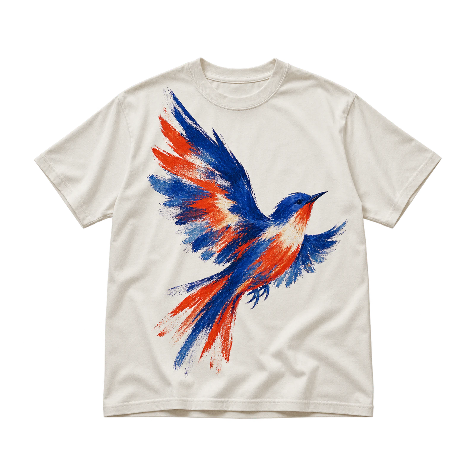
Hand-painted artwork gives a white T-shirt design a more expressive surface by introducing visible brush texture, irregular edges, and individually applied marks. Symbols, lettering, abstract shapes, and illustrations all benefit from the clean garment base, which keeps darker and saturated colors easy to distinguish. Plan the scale and placement before applying paint, then keep important details away from areas that fold or stretch heavily. Controlled brushwork and deliberate spacing help the finished graphic feel intentional rather than random.
- Collar Accent Design
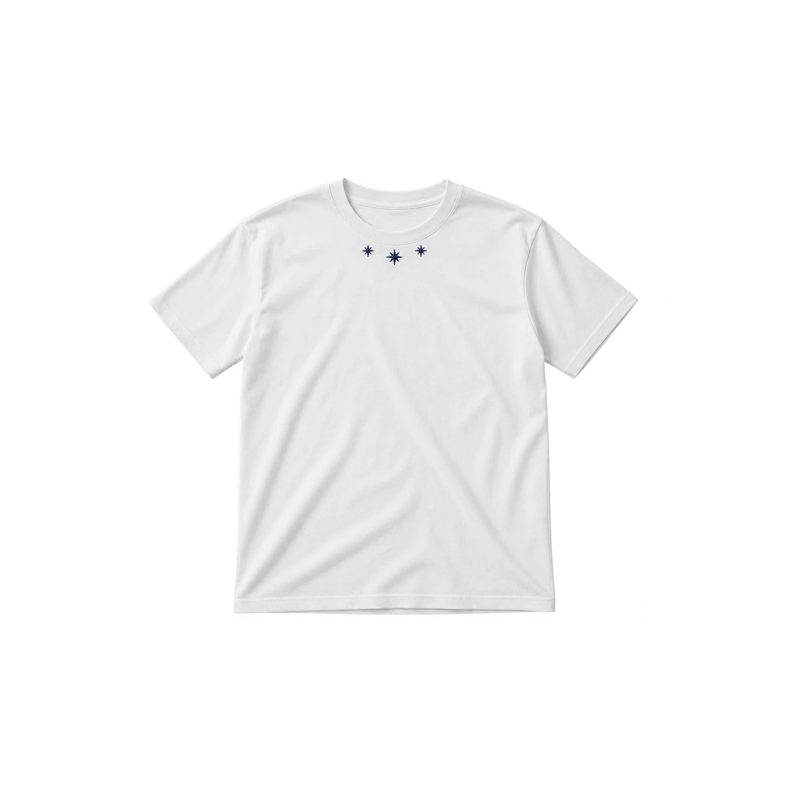
A small detail near the neckline gives a white tee design a focused point of interest in an area that often remains undecorated. Tiny symbols, short phrases, stitched lines, or repeated motifs fit this placement when they stay clear of the collar seam and do not interfere with comfort. Symmetrical positioning produces a neater appearance, while an offset treatment feels more unconventional. Keeping the accent compact allows it to attract attention without competing with the wider shirt surface.
- Small Floral Embroidery Design
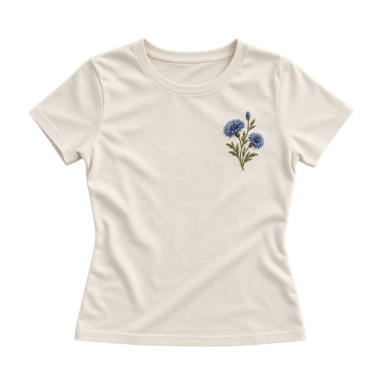
Compact botanical stitching gives a white T-shirt design subtle texture through flowers, leaves, stems, and simplified floral forms. Chest, hem, and other small focal areas suit this treatment because the embroidery remains visible without covering a large section of fabric. Select thread colors with enough contrast against white, simplify very small petals or narrow lines, and control stitch density carefully. Suitable backing helps stabilize the fabric so the motif keeps its intended shape after stitching.
- Embroidered Phrase Design
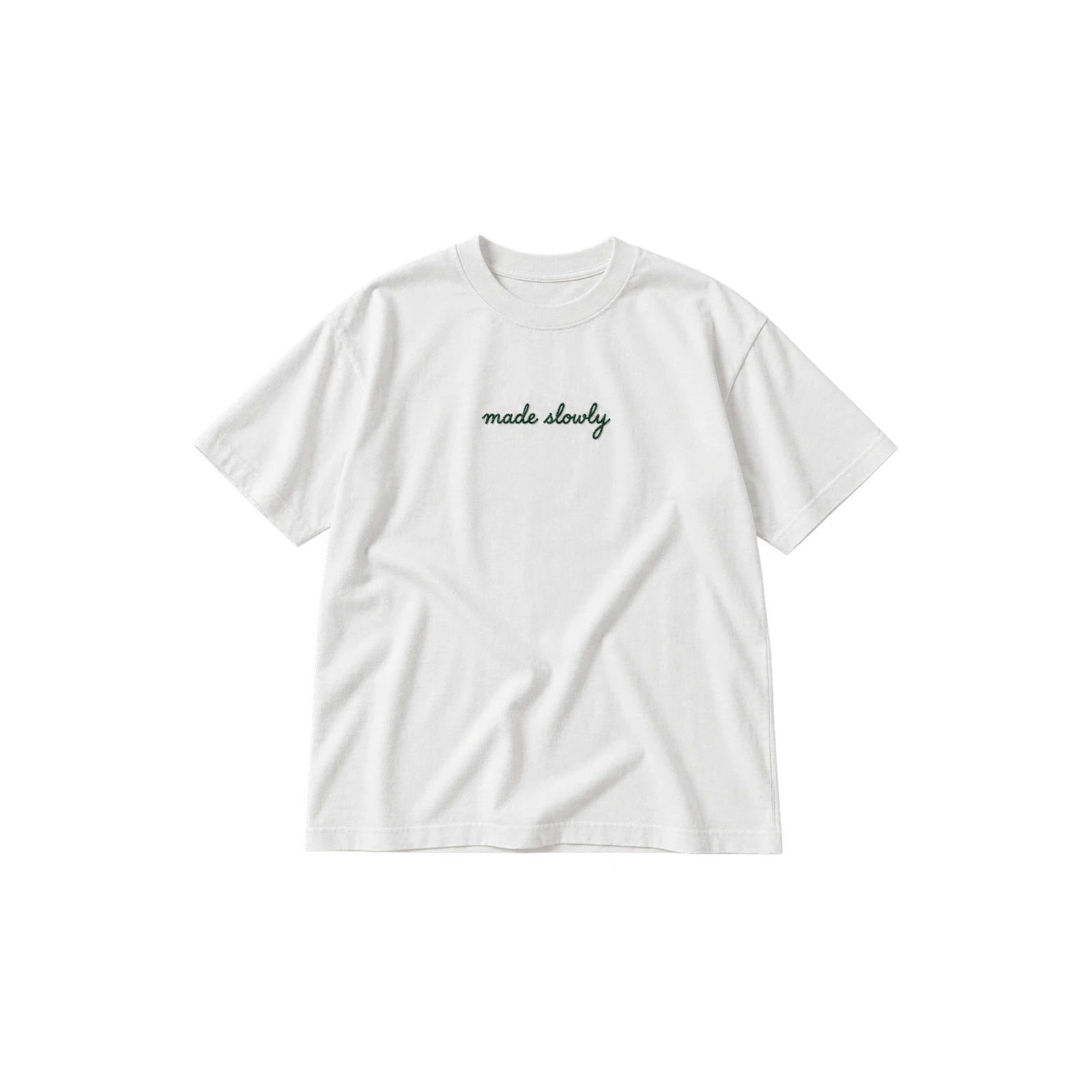
Short embroidered wording turns a white shirt design into a tactile text-based composition through names, dates, coordinates, or brief slogans. Letter height, stroke thickness, spacing, and thread contrast determine whether the phrase remains clear after stitching. Compact chest or centered placements work well for concise wording, while simple letterforms reproduce more cleanly than delicate scripts. Avoid tightly packed characters and narrow gaps, since thread width often closes fine spaces and reduces readability at smaller sizes.
- Mixed-Media Texture Design
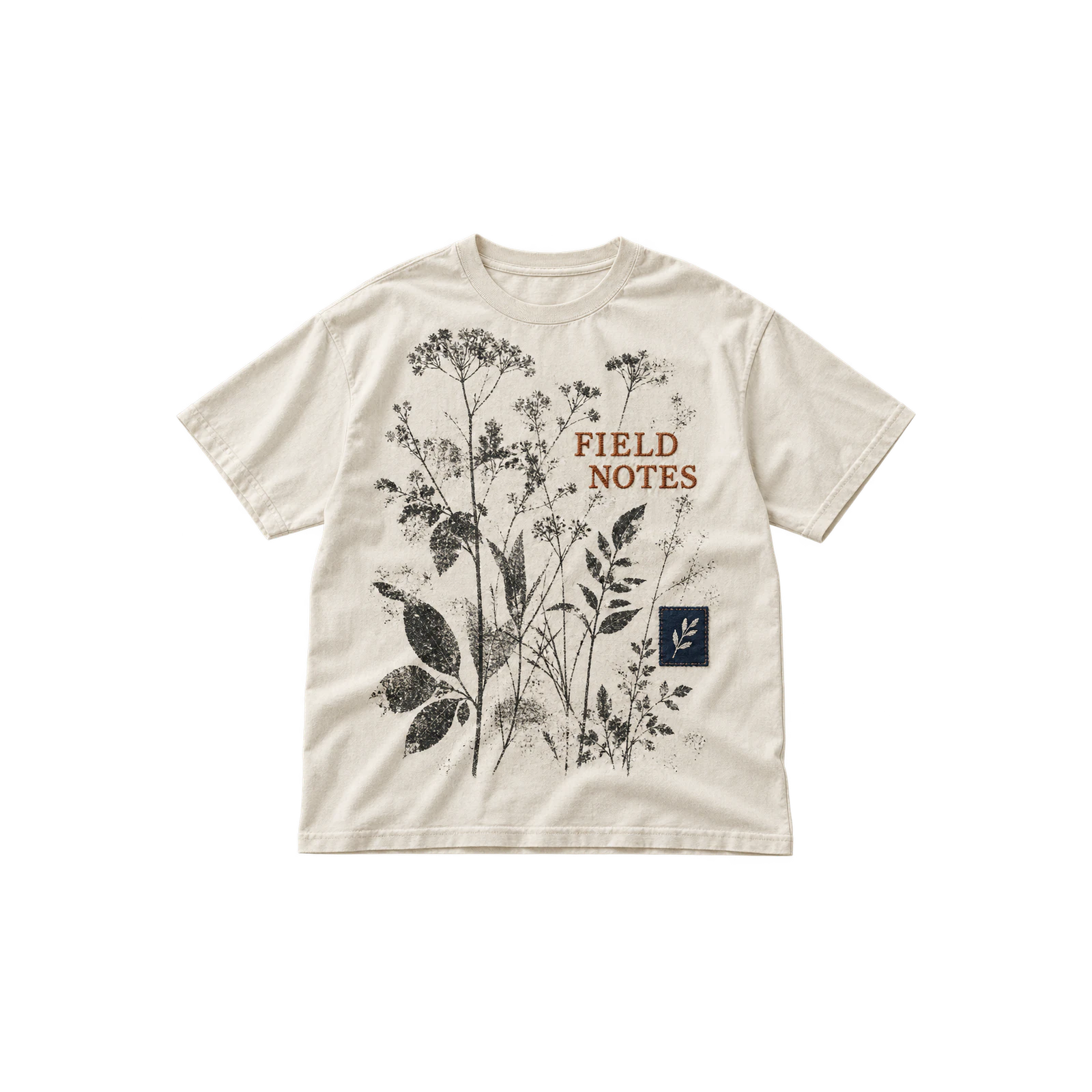
Mixing print, embroidery, patches, and decorative stitching gives a white T-shirt design greater surface variety when the techniques follow a clear hierarchy. A printed illustration might sit beneath stitched lettering, while an embroidered symbol or patch highlights one part of the composition. Keep one treatment visually dominant and let the others support it rather than compete for attention. Material compatibility, added weight, spacing, and scale should remain controlled so the finished garment feels cohesive rather than overloaded.
What Are the Best White T-Shirt Designing Tips?
The best white T-shirt designing tips include using negative space, maintaining strong contrast, limiting the color palette, establishing visual hierarchy, keeping typography readable, and removing unnecessary elements. White fabric already provides a clean background, so each printed or stitched detail should support the central idea. These principles improve readability, balance, and production suitability across different white T-shirt designs.
The best white T-shirt designing tips are:
- Use Negative Space
Leaving enough unprinted fabric around a white T-shirt design helps separate elements and frame the main focal point. Space around typography, logos, illustrations, and symbols prevents competing details from becoming visually crowded. Larger blank areas also make compact graphics feel more deliberate. Judge the spacing on the complete garment because the surrounding shirt surface determines whether the final composition feels balanced, open, or unnecessarily dense.
- Use Strong Contrast
Strong contrast keeps a white shirt design visible from a normal viewing distance and prevents important details from fading into the garment. Black, navy, red, dark green, purple, and other saturated shades usually separate clearly from white fabric. When lighter colors appear in the artwork, darker outlines or neighboring elements improve definition. Review the composition at realistic size rather than relying only on a close digital preview.
- Limit the Color Palette
Keeping the palette controlled helps white T-shirt artwork remain coherent instead of becoming visually fragmented. Choose one dominant hue with a small number of supporting accents where the concept allows it. Treat the white garment itself as part of the palette because it forms highlights, borders, and open regions inside many graphics. Fewer competing colors also make hierarchy easier to manage across complex layouts.
- Create Visual Hierarchy
Clear hierarchy helps a white shirt graphic communicate which element should attract attention first. Use scale, placement, contrast, spacing, and color to distinguish the dominant illustration, logo, word, or symbol from supporting details. A large back composition might lead while a small chest mark remains secondary. Equal emphasis across every component often makes the design feel unfocused and harder to interpret.
- Use Readable Typography
Readable lettering keeps text-based white T-shirt designs clear at the actual print or embroidery size. Thin strokes, tight spacing, compressed line heights, and highly decorative typefaces often lose definition during production. Limit unnecessary font combinations and give each style a distinct role within the composition. Strong contrast and sufficient letter weight help slogans, wordmarks, and supporting text remain legible from a realistic distance.
- Keep the Design Simple
Removing unnecessary details helps a white shirt design retain a clear focal idea without sacrificing visual character. Complex artwork still feels controlled when each color, word, symbol, or texture serves a defined purpose. Eliminate secondary elements that weaken hierarchy, reduce spacing, or introduce visual noise. Reviewing the artwork at final dimensions helps identify decorations that add little value to the finished garment.
What White T-Shirt Design Mistakes Should You Avoid?
White T-shirt design mistakes include retaining unwanted white backgrounds in artwork files, combining too many fonts, relying on low-resolution graphics, overcrowding the composition, misaligning artwork, and including details that are too small for the production method. These problems reduce readability, disrupt balance, or cause the finished print or embroidery to differ from the original digital artwork.
Common white T-shirt design mistakes include:
- White Background
Leaving an unwanted white or off-white rectangle inside white T-shirt artwork often results in visible edges or unnecessary printed coverage. The background might appear invisible on screen but become noticeable once transferred onto fabric. Check transparency before export and inspect the full artwork boundary carefully. Only intended visual elements should remain, especially where the shirt itself is supposed to form the background.
- Too Many Fonts
Combining several unrelated typefaces often weakens hierarchy in a white shirt design and makes the composition feel disconnected. Assign each font a clear role and limit variation where it adds no useful contrast. One display typeface paired with one supporting style is sufficient for many layouts. Consistent weights, spacing, and letterforms help separate text elements while keeping them within the same visual system.
- Low-Resolution Artwork
Insufficient resolution causes white T-shirt graphics to look blurry, pixelated, or uneven once they are enlarged for production. Confirm the intended output dimensions first, then work with vector artwork or high-resolution raster files where appropriate. Inspect edges, small lettering, textures, and detailed illustrations at final size rather than relying on a reduced screen preview to judge quality.
- Cluttered Design
Too many graphics, colors, symbols, and text blocks make a white T-shirt design harder to understand because several elements compete for attention. Remove unnecessary details and rebuild the layout around a clear focal point. Large areas of blank white fabric are useful visual space rather than unfinished sections. They help separate important information from secondary decorative details and strengthen overall readability.
- Poor Alignment
Even mathematically centered artwork can look uneven on a white shirt when neckline shape, sleeve position, torso width, or graphic asymmetry changes the visual balance. Review the design on the actual garment shape or a realistic mockup rather than judging placement only from coordinates. Adjust the artwork until its weight feels balanced in relation to the shirt instead of relying solely on numerical measurements.
- Excessive Detail
Very small lines, dense textures, tiny text, and intricate shapes often lose clarity in white T-shirt artwork once the design reaches actual production size. Simplify the composition according to the selected print or embroidery method. Narrow gaps may close, thin strokes may disappear, and small lettering often becomes unreadable. Final-size review helps identify which details need enlargement, reduction, or removal.
How Do You Design a White T-Shirt?
You design a white T-shirt by selecting the garment fabric and fit, defining the purpose and audience, preparing suitable artwork, choosing a compatible production method, setting the artwork placement and dimensions, previewing the design on a mockup, and preparing the final production file. Following this sequence connects the graphic with the physical shirt and reveals issues involving scale, contrast, alignment, detail, and reproduction before production.
Follow these steps to design a white T-shirt:
- Choose the White T-Shirt Fabric and Fit
Before finalizing white T-shirt artwork, select the garment because fabric surface, weight, silhouette, and available print area influence how the design appears. A fitted shirt has different proportions from an oversized style, while smooth and textured fabrics reproduce fine detail differently. Check the neckline, sleeve joins, seams, torso width, and usable print zone before setting the final artwork dimensions.
- Define the Design Purpose and Audience
Identify who will wear the white T-shirt, what message the design should communicate, and whether it represents a brand, event, group, collection, or personal concept. Use this purpose to guide the typography, illustration style, color palette, scale, and overall visual direction. Keep every design element relevant to the intended audience and remove themes or details that do not support the central idea.
- Create the Artwork in a Print-Ready Format
Prepare the white T-shirt artwork at the dimensions required for the intended print size. Use vector files when the design needs to scale without losing clarity, or work with high-resolution raster graphics at the correct output dimensions. Remove unwanted backgrounds, confirm transparency where required, clean up rough edges, and keep all important elements inside the artwork boundaries before moving to production.
- Choose the Printing Method
Select a production method that matches the white T-shirt design, fabric, color count, level of detail, texture, and required quantity. Use screen printing for bold shapes and controlled palettes, digital printing for detailed or multicolor artwork, and embroidery for simplified graphics with thicker lettering and lines. Check how the selected method handles gradients, halftones, fine details, solid ink areas, and texture before finalizing the design.
- Set the Artwork Placement and Dimensions
Choose where the white T-shirt graphic will sit before setting its final dimensions. Compare chest, full-front, back, neckline, and other placement areas according to the artwork size and level of detail. Leave enough clearance from collars, seams, sleeve joins, and garment edges. Scale the design in proportion to the shirt so important details remain readable and the composition does not appear undersized or overcrowded.
- Preview the Design on a White T-Shirt Mockup

Place the finished white T-shirt design on a realistic garment mockup before approving it for production. Use a T-shirt mockup to check scale, placement, contrast, spacing, and front-to-back balance on the actual shirt shape. Compare different sizes and positions, then adjust any artwork that appears too small, crowded, uneven, or visually off-center.
- Prepare the Final Production File
Review the final white T-shirt artwork before exporting it for production. Confirm the dimensions, resolution, transparency, color setup, and file requirements for the selected decoration method. Check text, linework, halftones, textures, and small details at actual output size, then verify that nothing extends beyond the intended artwork area. Export the production file only after the placement, scale, and mockup preview have been approved.



 Trusted By Thousands Of Designers
 Cancel Your Subscription Anytime
 30 Day Money Back Guarantee