
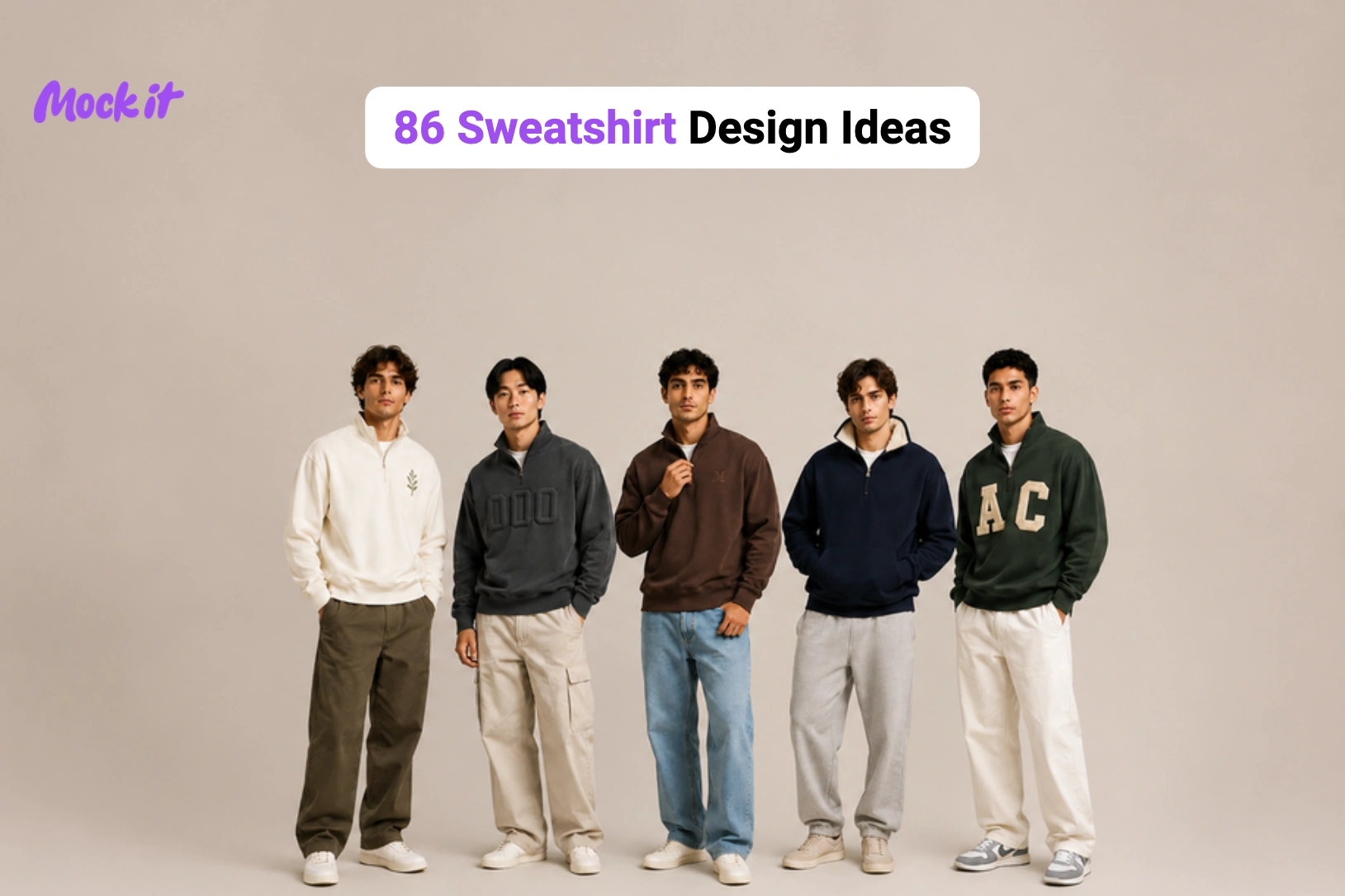
The best sweatshirt designs combine the right garment silhouette with a visual style that reflects the intended audience, occasion, or brand identity. A minimalist embroidered crewneck creates a different impression than an oversized streetwear graphic, while vintage collegiate typography, botanical illustrations, Y2K artwork, retro sports logos, chenille patches, puff prints, and color-blocked layouts each bring a distinct personality to the finished garment. Exploring a variety of sweatshirt design ideas makes it easier to identify concepts that align with your creative vision, rather than relying on repetitive or generic designs.
This collection features 86 sweatshirt design ideas, organized by type, including crewneck, oversized, cropped, embroidered, graphic, vintage, French terry, raglan, sherpa-lined, drop-shoulder, fitted, half-zip, quarter-zip, performance, full-zip, and mock-neck. Each idea explains its defining visual elements, recommended artwork, decoration techniques, print placement, and ideal use cases, helping you create custom sweatshirt designs that are visually balanced, production-ready, and suitable for clothing brands, print-on-demand businesses, corporate merchandise, schools, teams, and personal apparel.
Crewneck Sweatshirt Design Ideas
Crewneck sweatshirts offer a clean, uninterrupted surface for embroidery, screen printing, appliqué, and graphic artwork, with a versatile silhouette that works across casual wear, brand merchandise, school apparel, and streetwear. The design ideas below span timeless collegiate styles to bold oversized graphics, helping you find the right fit for your brand, audience, and creative direction.
Vintage Collegiate Crewneck Design
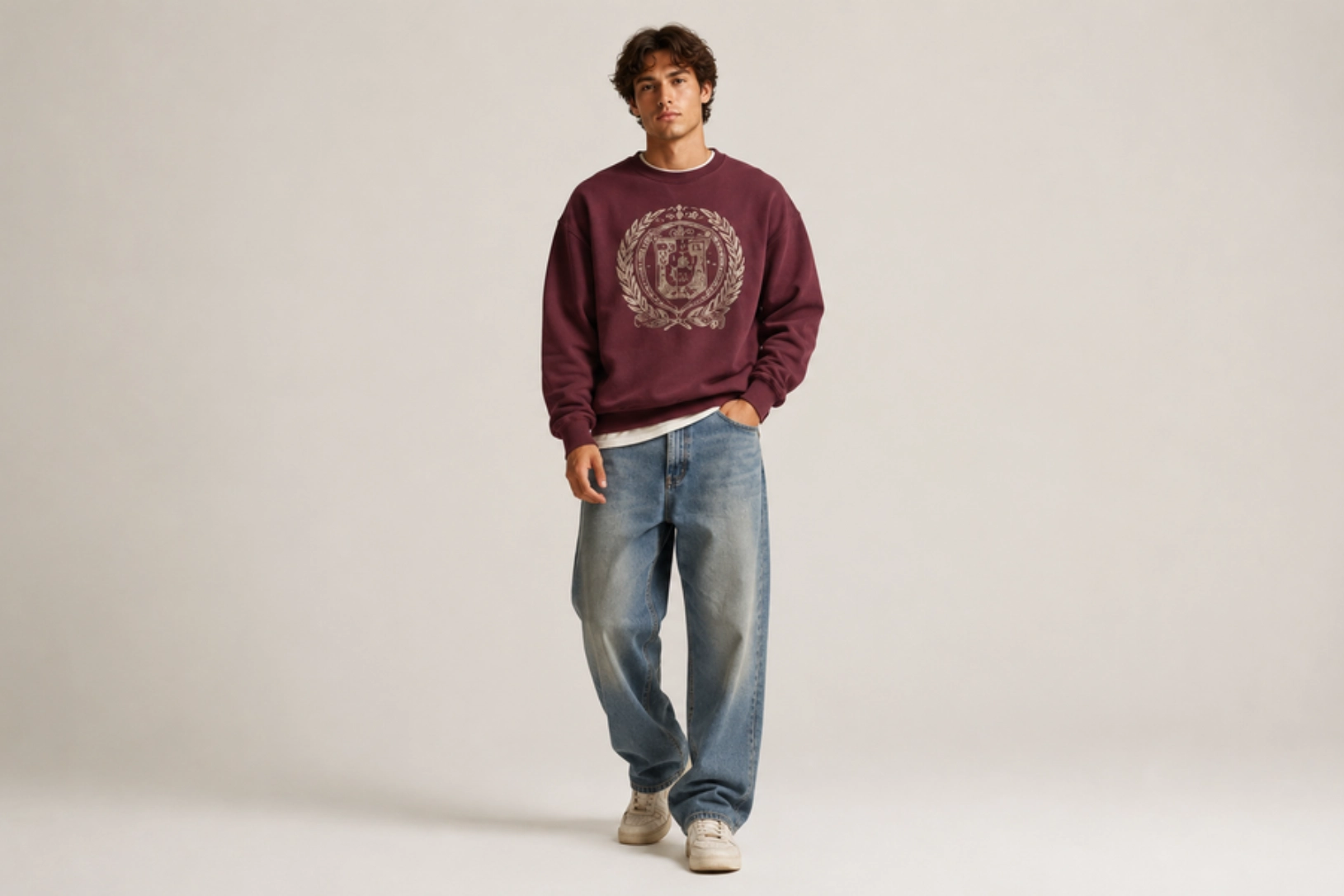
Arched varsity lettering, established dates, athletic crests, and distressed typography give vintage collegiate crewneck sweatshirts the timeless character of classic university apparel. Cracked ink textures, washed color palettes, and faded graphics recreate the worn-in appearance of heritage campus clothing, while heather grey, vintage navy, maroon, forest green, and cream remain the most recognizable color combinations for this aesthetic. School-inspired wordmarks, fictional college logos, mascot illustrations, and retro athletic emblems reinforce the nostalgic appeal, making this one of the most popular sweatshirt design ideas for brands seeking an authentic vintage look.
Best for: College apparel, vintage streetwear, alumni merchandise, clothing brands
Design placement: Center chest
Preferred print method: Distressed screen printing, DTG
Styling tips: Use heavyweight washed crewnecks with muted collegiate colors like heather grey, navy, maroon, or forest green.
Minimalist Micro-Embroidered Crewneck Design
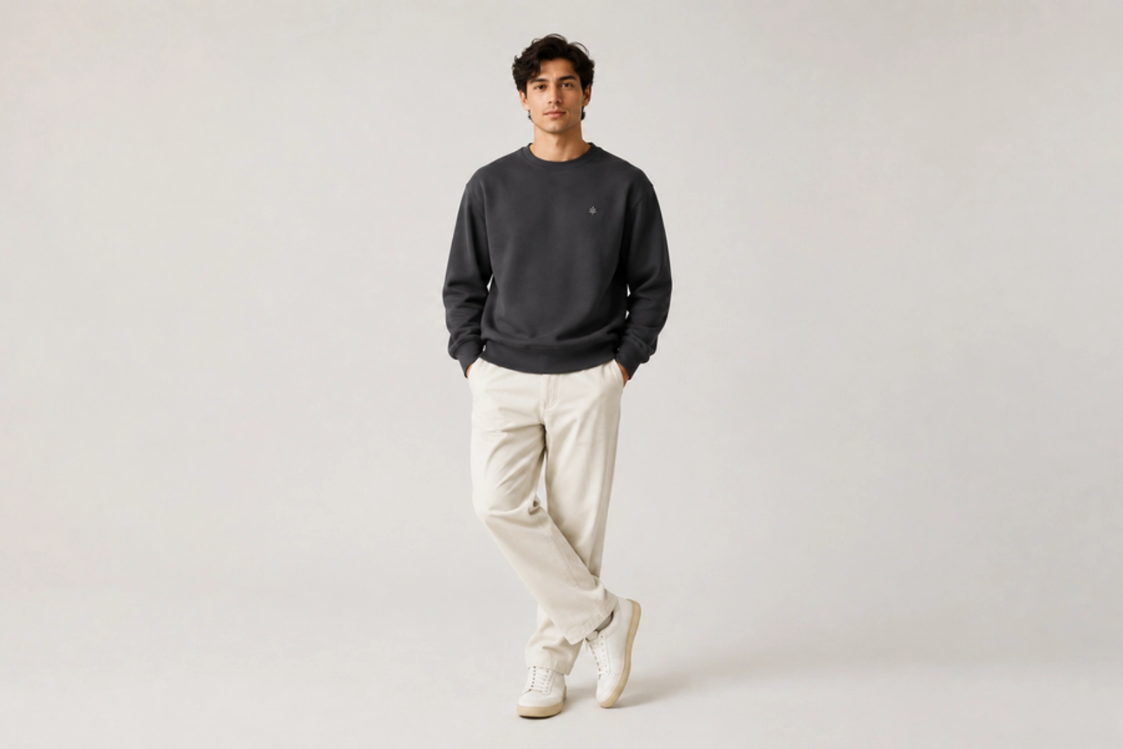
Fine embroidery, clean typography, subtle monograms, and minimalist line-art graphics create a refined sweatshirt design that prioritizes texture over large printed artwork. Small embroidered details placed on the left chest, cuff, or near the collar add a premium finish without overwhelming the garment, while tonal or two-color thread keeps the design timeless and versatile. Initials, brand wordmarks, geometric symbols, and simple botanical motifs are popular choices for creating understated crewneck sweatshirt designs that work across casual and premium apparel collections.
Best for: Premium clothing brands, corporate apparel, minimalist fashion, everyday wear
Design placement: Left chest, cuff, or near the collar
Preferred print method: Embroidery
Styling tips: Pair tonal embroidery with heavyweight cotton or French terry crewnecks in neutral colors for a clean, premium look.
Retro Outdoor Badge Crewneck Design
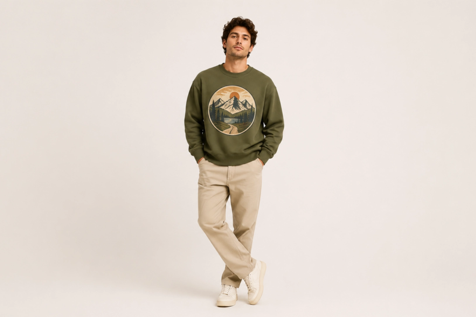
Mountain silhouettes, pine trees, sunsets, hiking trails, compass icons, and badge-style emblems give retro outdoor crewneck sweatshirts a rugged, adventure-inspired look. Circular and shield-shaped layouts, combined with earthy color palettes, distressed textures, and vintage typography, evoke classic national park souvenirs and heritage outdoor apparel. Regional landmarks, camping graphics, wildlife illustrations, and trail coordinates further enhance the design while maintaining a timeless aesthetic.
Best for: Outdoor brands, travel merchandise, camping apparel, lifestyle collections
Design placement: Center chest
Preferred print method: Screen printing, DTG
Styling tips: Pair with earth-tone crewnecks in olive, sand, rust, forest green, or charcoal for an authentic vintage outdoor look.
Oversized Streetwear Graphic Crewneck Design
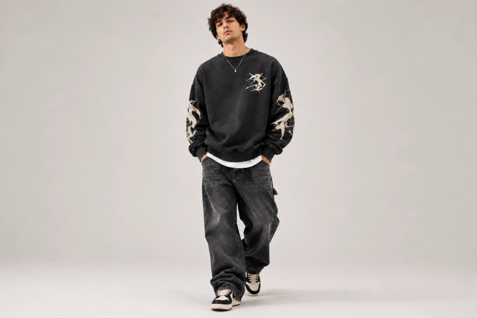
Oversized typography, bold back graphics, abstract illustrations, graffiti-inspired artwork, and high-contrast color combinations define streetwear crewneck sweatshirt designs. Large-scale visuals paired with a small front emblem create a balanced composition, while chrome lettering, geometric shapes, artistic illustrations, and statement graphics add a contemporary edge. The expanded print area on the back allows intricate artwork to become the focal point, making this style a favorite for modern fashion labels and limited-edition drops.
Best for: Streetwear brands, fashion collections, artist merchandise, limited-edition releases
Design placement: Oversized back graphic with a small left chest or center chest logo
Preferred print method: Screen printing, DTG
Styling tips: Pair with heavyweight oversized crewnecks in black, charcoal, cream, or washed neutrals to make bold graphics stand out.
Oversized Sweatshirt Design Ideas
Oversized sweatshirts feature dropped shoulders, a wider body, and extended sleeves, creating generous space for bold graphics, statement typography, artistic illustrations, and layered compositions. Their larger design area makes them a natural choice for back prints and layouts that would feel crowded on a standard fit. The ideas below balance scale, placement, and visual impact with the garment’s relaxed silhouette.
Japanese Back-Panel Graphic Design
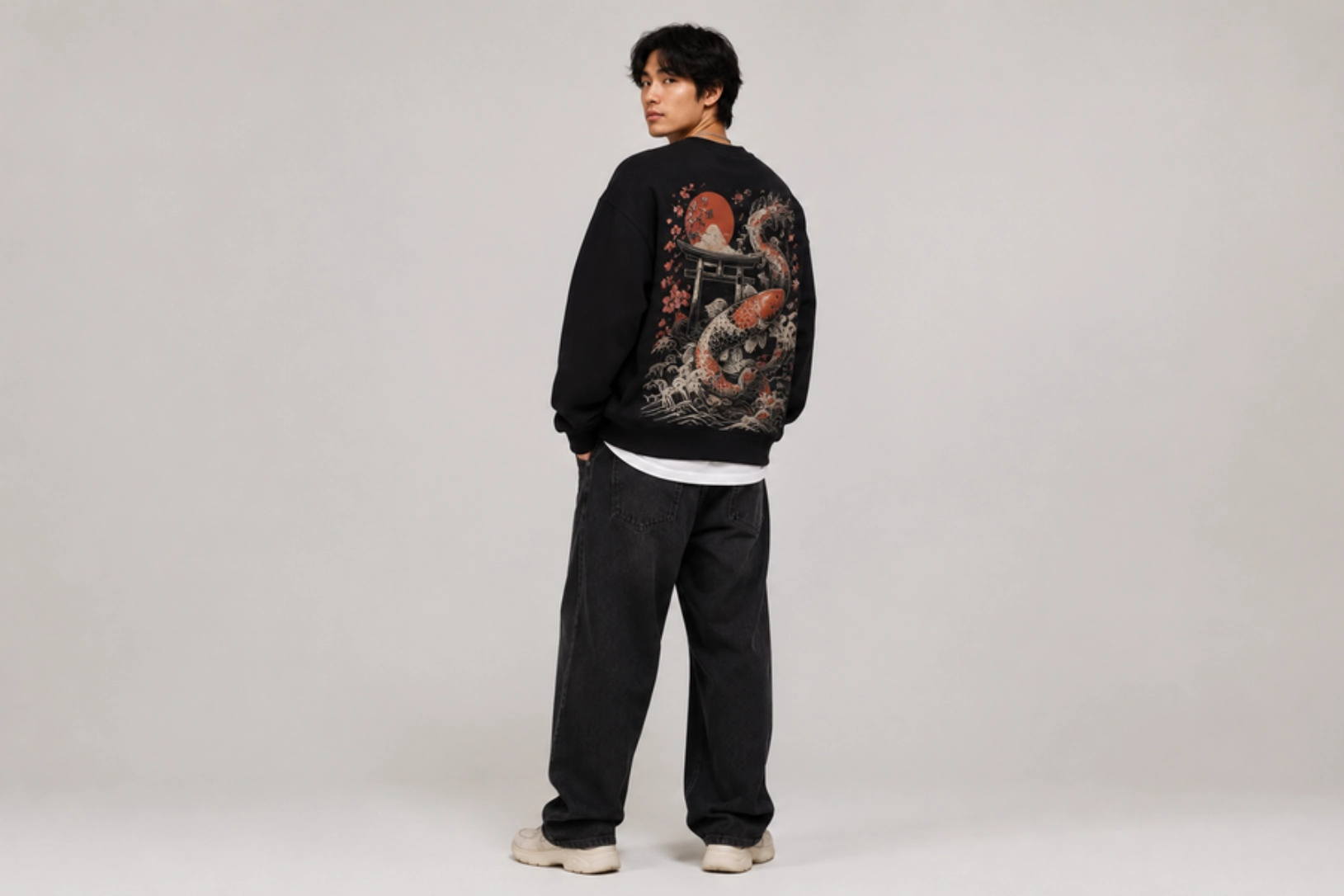
Flowing waves, koi fish, cherry blossoms, dragons, cranes, torii gates, and vertical Japanese typography create bold back-panel designs for sweatshirts inspired by traditional and modern Japanese art. Large illustrations paired with a small front emblem establish visual balance, while deep black, off-white, crimson, navy, and muted earth tones enhance the artwork without overpowering it. This style remains a popular sweatshirt design idea for oversized streetwear collections because the expanded back panel showcases intricate illustrations with maximum impact.
Best for: Streetwear brands, anime-inspired apparel, fashion collections, artist merchandise
Design placement: Oversized back with a small left chest graphic
Preferred print method: DTG, screen printing
Styling tips: Use heavyweight oversized sweatshirts with monochrome or muted color palettes to let detailed artwork become the focal point.
Celestial Constellation Back Design
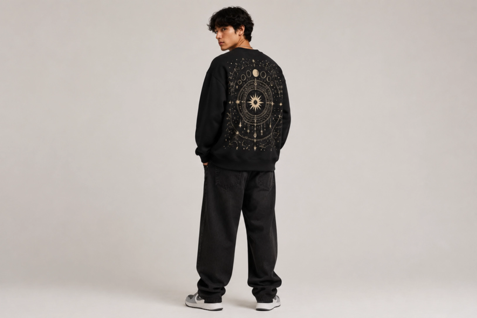
Constellations, moon phases, stars, zodiac symbols, celestial maps, and fine connecting lines create elegant back-panel designs for sweatshirts inspired by the night sky. Metallic accents, soft white ink, and minimalist line art stand out against darker garments, while symmetrical layouts and subtle cosmic details give the design a modern yet timeless appeal. Oversized sweatshirts provide ample space for expansive celestial artwork, making this style a favorite for minimalist fashion, astrology-inspired collections, and contemporary streetwear.
Best for: Astrology apparel, minimalist fashion, streetwear, lifestyle brands
Design placement: Oversized back graphic with a small chest symbol
Preferred print method: Screen printing, DTG
Styling tips: Pair with oversized black, navy, charcoal, or deep green sweatshirts, and use metallic or light-colored inks for strong contrast.
Botanical Back Print Design
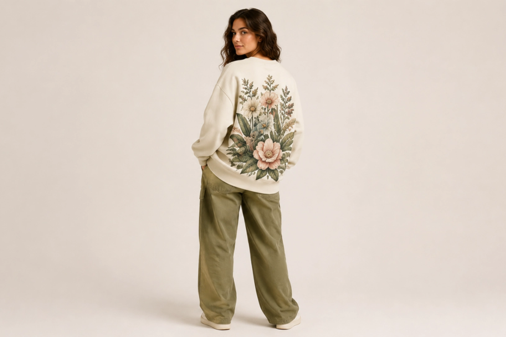
Oversized flowers, tropical leaves, wildflowers, vines, and hand-drawn botanical illustrations create nature-inspired sweatshirt designs with a soft, artistic feel. Vertical compositions and full-back floral arrangements take advantage of the oversized silhouette, while earthy greens, sage, terracotta, cream, dusty pink, and muted neutrals reinforce the organic aesthetic. Botanical artwork pairs well with minimalist front branding, allowing the detailed back print to remain the focal point.
Best for: Lifestyle brands, nature-inspired apparel, women’s collections, casual streetwear
Design placement: Oversized back with a small left chest logo or wordmark
Preferred print method: DTG, screen printing
Styling tips: Use neutral or earth-tone oversized sweatshirts with muted botanical color palettes for a clean, premium finish.
Minimalist Chest Wordmark Design
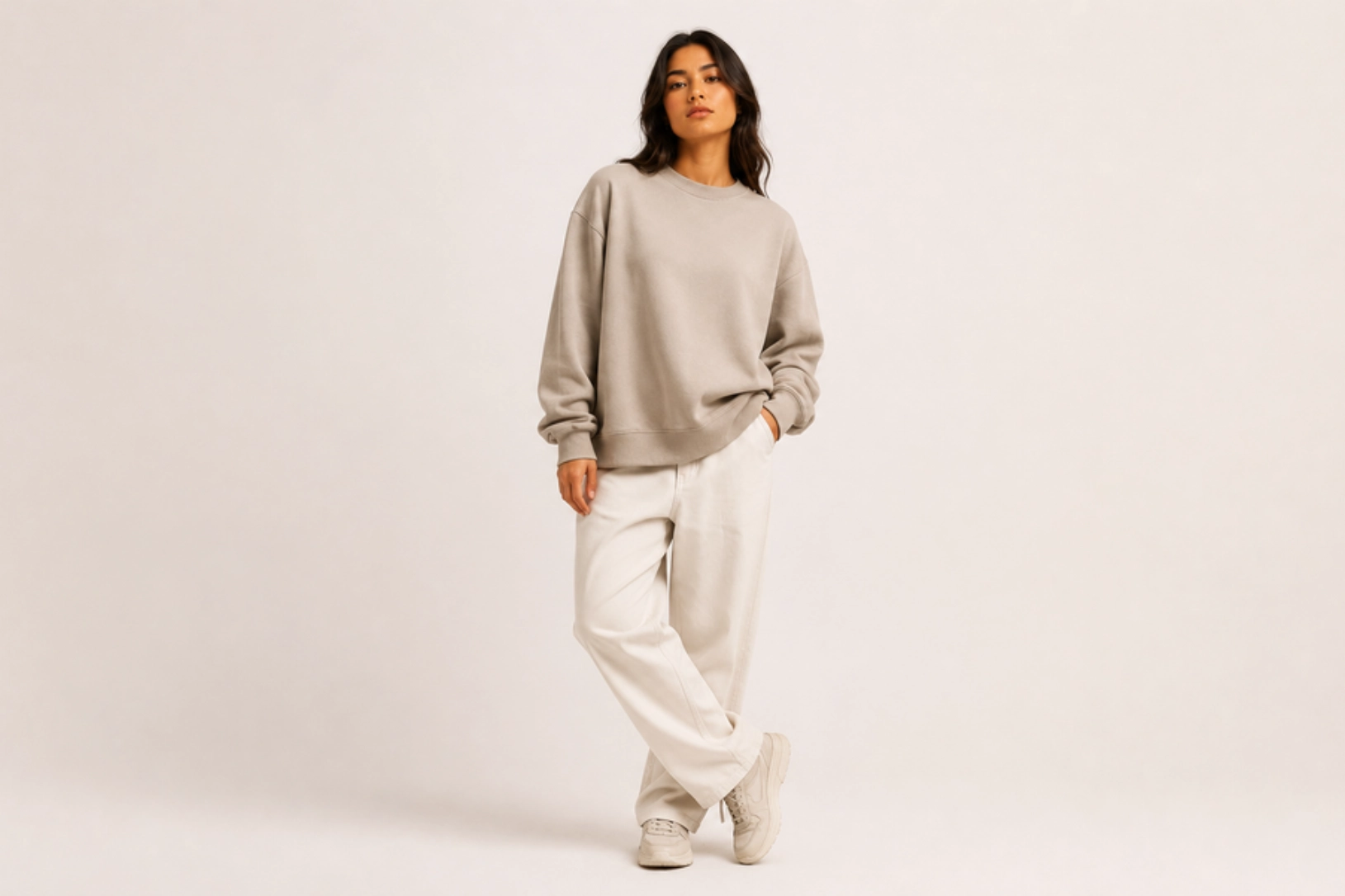
Clean typography, generous spacing, subtle branding, and monochromatic color palettes make minimalist chest wordmark designs a timeless choice for oversized sweatshirts. A single word, brand name, meaningful phrase, or short slogan placed across the chest creates a refined look without competing with the garment’s relaxed silhouette. Sans serif fonts, understated serif lettering, and tonal prints maintain a premium aesthetic while allowing the oversized fit to remain the main design feature.
Best for: Minimalist brands, premium apparel, lifestyle collections, everyday wear
Design placement: Center chest
Preferred print method: Screen printing, embroidery, DTG
Styling tips: Pair with oversized sweatshirts in neutral shades like black, cream, grey, or beige, and keep the typography tonal or limited to one or two colors.
Acid Wash Bleach-Dye Design
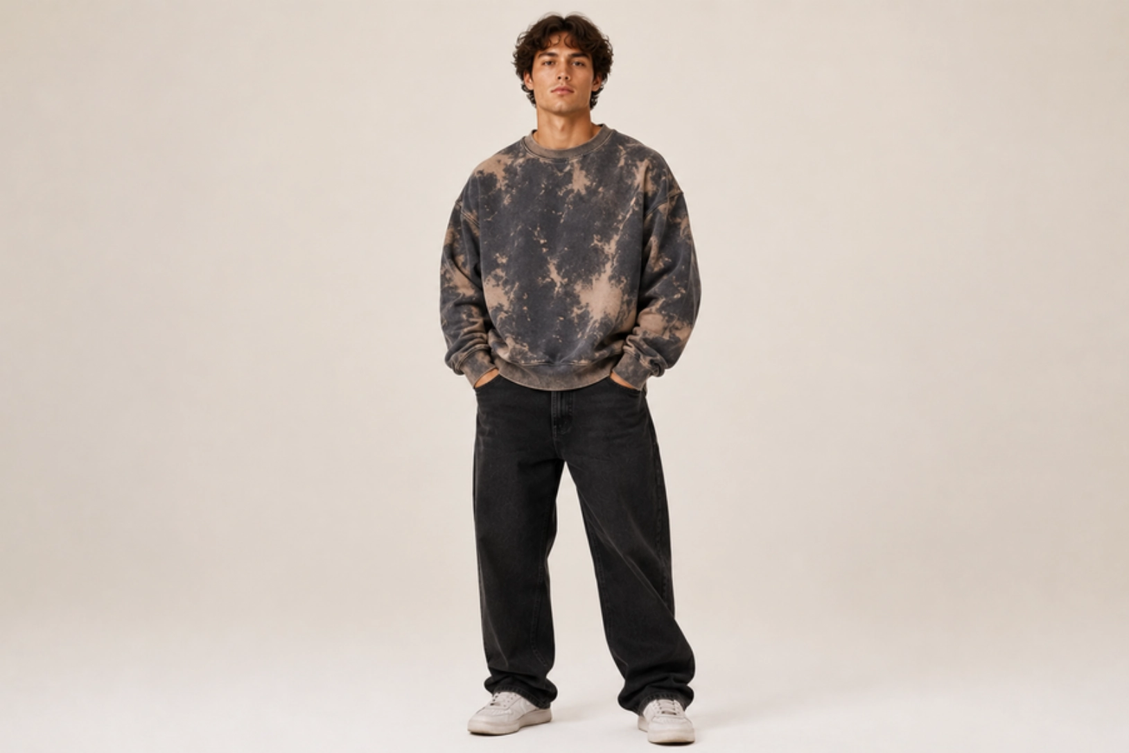
Irregular bleach patterns, faded washes, cloud-like textures, and distressed color variations give acid wash sweatshirt designs a bold vintage streetwear appeal. The unique dyeing process ensures no two garments look exactly alike, while subtle typography, minimalist logos, or small chest graphics complement the textured finish without overwhelming it. Black, charcoal, navy, olive, and washed earth tones are among the most popular sweatshirt colors for this style, creating a naturally worn-in aesthetic that continues to trend in contemporary fashion.
Best for: Streetwear brands, vintage-inspired collections, casual fashion, limited-edition apparel
Design placement: Small left chest graphic, center chest logo, or oversized back print
Preferred print method: Screen printing, DTG
Styling tips: Keep graphics simple and use washed, heavyweight, oversized sweatshirts so the acid-wash pattern remains the focal point.
Cropped Sweatshirt Design Ideas
Cropped sweatshirts shift visual focus to the chest, sleeves, and upper body, making compact graphics, embroidered details, statement typography, and decorative embellishments the right approach. The reduced design space rewards restraint and precise placement. The ideas below highlight styles that balance proportion and contemporary trends across casual wear, athleisure, and streetwear.
Y2K Airbrush Typography Design
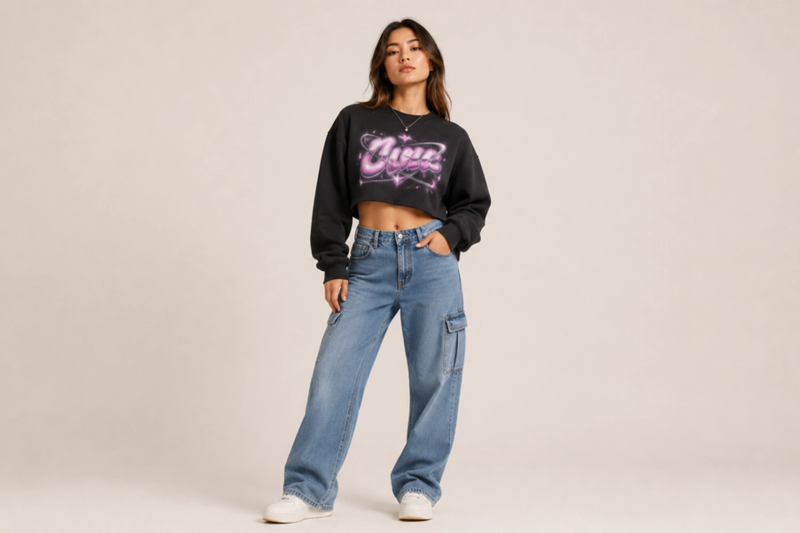
Chrome lettering, airbrush gradients, glossy effects, bubble fonts, and futuristic typography define Y2K-inspired cropped sweatshirt designs. Soft pastel shades, metallic finishes, hearts, stars, flames, butterflies, and playful phrases capture the nostalgic early-2000s aesthetic while complementing the cropped silhouette. Compact center-chest graphics keep the design balanced, making this one of the most popular sweatshirt design ideas for trend-focused fashion collections and social media-inspired apparel.
Best for: Y2K fashion, women’s apparel, streetwear brands, Gen Z collections
Design placement: Center chest
Preferred print method: DTG, screen printing
Styling tips: Pair with pastel, baby blue, pink, lavender, cream, or black cropped sweatshirts and use glossy gradients or metallic-inspired colors for an authentic Y2K look.
Butterfly Rhinestone Chest Design
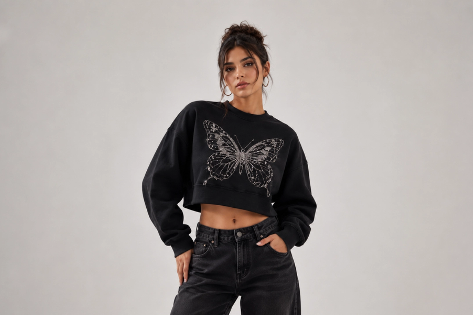
Butterfly motifs, sparkling rhinestones, delicate wing patterns, and symmetrical layouts create eye-catching cropped sweatshirt designs with a glamorous Y2K influence. Crystal embellishments add texture and shine without requiring large graphics, while metallic outlines, subtle floral accents, and soft pastel colors enhance the feminine aesthetic. Centered butterfly artwork remains the focal point, making this sweatshirt design ideal for trend-driven fashion collections and statement casual wear.
Best for: Women’s fashion, Y2K collections, boutique brands, festival apparel
Design placement: Center chest
Preferred print method: Rhinestone heat transfer, embroidery
Styling tips: Pair with black, white, pink, lavender, or cream cropped sweatshirts and keep surrounding graphics minimal to let the rhinestone design stand out.
Minimalist Botanical Embroidery Design
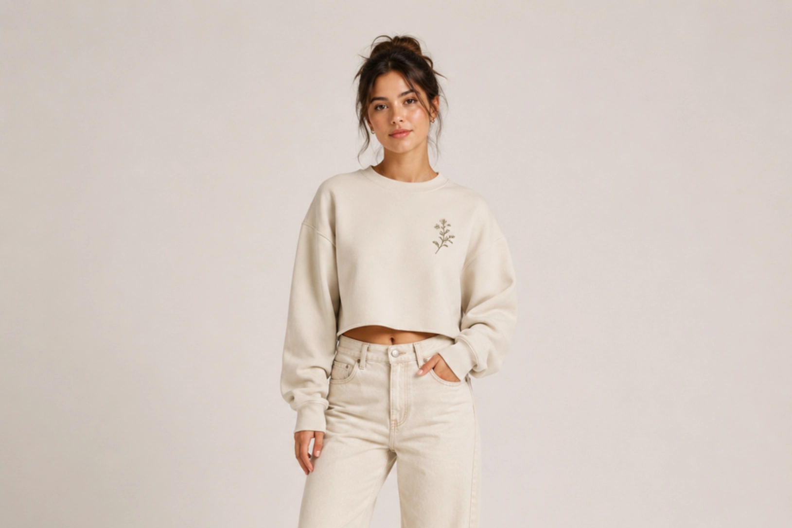
Delicate floral stems, leafy branches, wildflowers, and fine botanical line art create elegant cropped sweatshirt designs with a soft, natural aesthetic. Small embroidered motifs add subtle texture without overpowering the garment, while tonal stitching or muted thread colors maintain a clean, premium appearance. Simple daisies, lavender sprigs, eucalyptus leaves, and minimalist vine patterns remain popular choices because they complement the cropped silhouette and suit both casual and elevated fashion collections.
Best for: Women’s apparel, minimalist fashion, boutique brands, everyday wear
Design placement: Left chest, sleeve, or near the hem
Preferred print method: Embroidery
Styling tips: Pair with neutral or pastel cropped sweatshirts and use tonal embroidery for a refined, understated finish.
Distressed Collegiate Sleeve Design
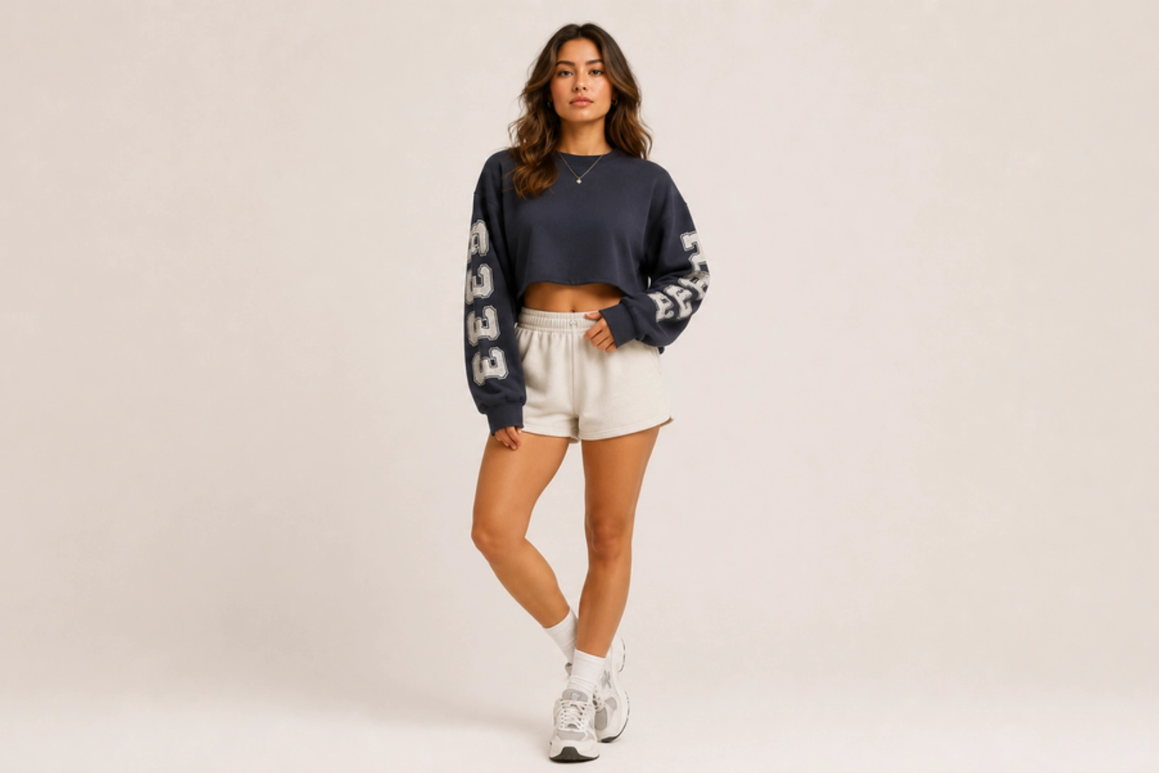
Faded varsity lettering, athletic numbers, vintage block fonts, and cracked ink textures transform sweatshirt sleeves into bold design features without crowding the chest. Long-sleeve graphics featuring college names, established dates, mascots, or team-inspired typography create a balanced collegiate look, while distressed printing reinforces the worn-in character of vintage campus apparel. This design pairs especially well with cropped sweatshirts because the sleeve graphics add visual interest while keeping the body of the garment clean and uncluttered.
Best for: College apparel, vintage streetwear, campus merchandise, lifestyle brands
Design placement: Along one or both sleeves
Preferred print method: Distressed screen printing, DTG
Styling tips: Pair with washed cropped sweatshirts in heather grey, cream, navy, or maroon, and keep the chest minimal to let the sleeve graphics stand out.
Embroidered Sweatshirt Design Ideas
Embroidery adds texture, depth, and durability that printed graphics cannot replicate, making it a go-to for premium sweatshirt designs. Stitched details ranging from minimalist line art and monograms to floral accents and quotes create a refined, timeless look. The ideas below explore how thread, placement, and texture can elevate custom sweatshirts across fashion brands, corporate apparel, gifting, and everyday wear.
Minimalist Line Art Embroidery Design
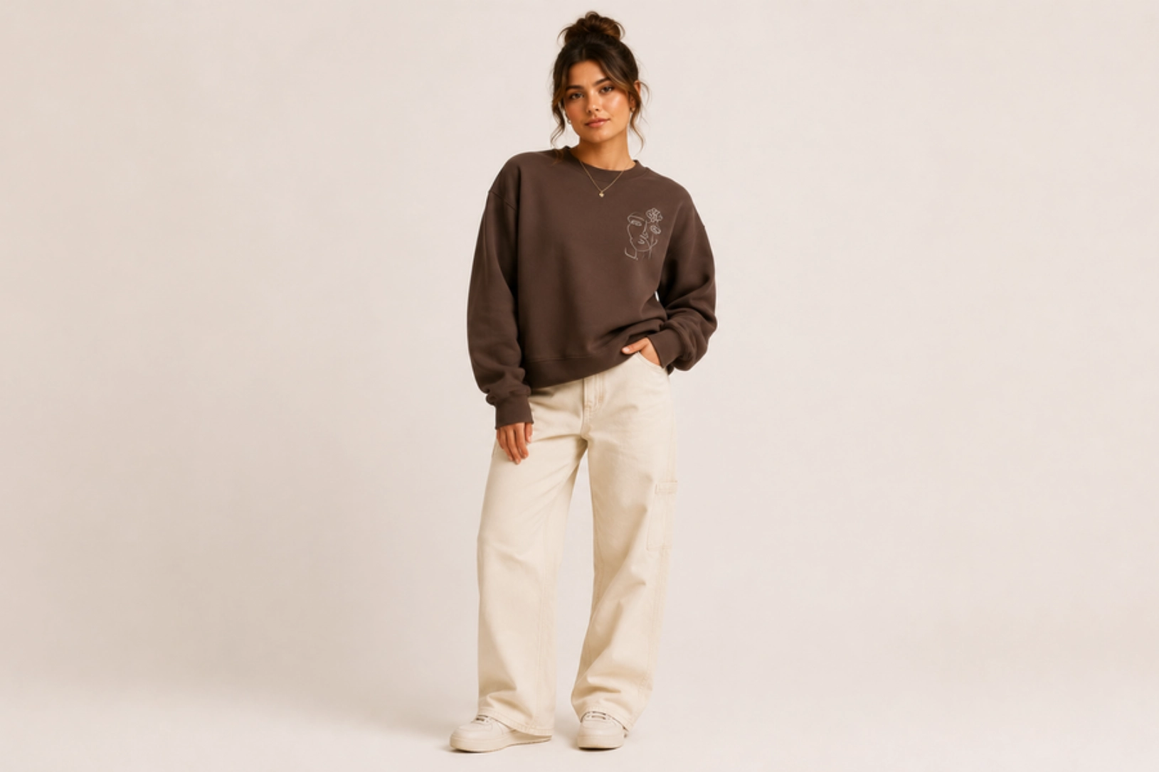
Continuous line drawings, abstract faces, botanical illustrations, geometric shapes, and single-line artwork create embroidered sweatshirt designs with a clean, contemporary aesthetic. Fine stitching highlights the simplicity of each design while adding subtle texture that printed graphics cannot achieve. Minimal thread colors, precise embroidery, and uncluttered compositions make this style a timeless choice for premium apparel, allowing the artwork to remain elegant without overwhelming the sweatshirt.
Best for: Minimalist fashion, premium clothing brands, lifestyle apparel, everyday wear
Design placement: Left chest, sleeve, or upper back
Preferred print method: Embroidery
Styling tips: Pair tonal or monochrome embroidery with neutral-colored sweatshirts to emphasize the clean lines and textured finish.
Personalized Initial Chest Design
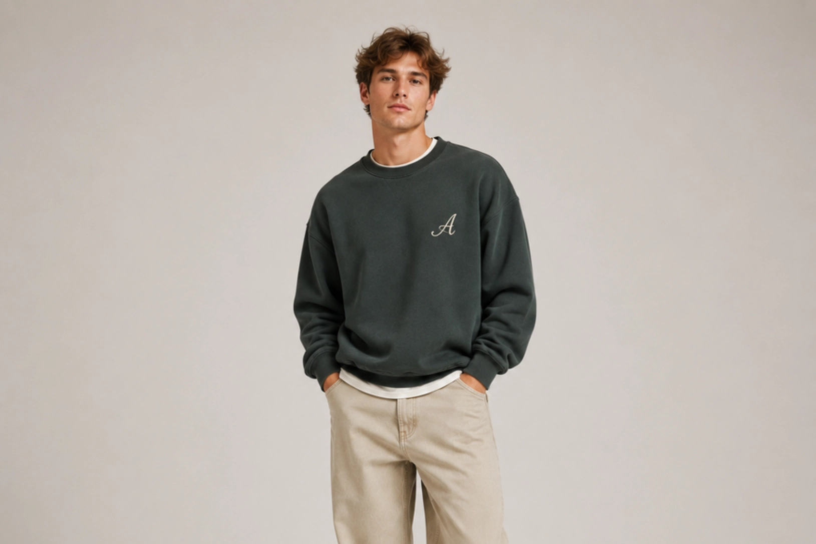
Custom initials, monograms, elegant serif fonts, handwritten scripts, and classic block lettering create personalized sweatshirt designs that feel timeless and distinctive. A single letter, a two-letter monogram, or embroidered initials add subtle character without dominating the garment, while tonal thread or contrasting embroidery enhances visibility, depending on the desired aesthetic. This design remains a popular choice for personalized sweatshirts because it balances individuality with a clean, premium appearance.
Best for: Personalized gifts, premium apparel, corporate wear, everyday fashion
Design placement: Left chest or center chest
Preferred print method: Embroidery
Styling tips: Match the thread color with the sweatshirt for a subtle look, or use contrasting embroidery to make the initials stand out.
Witty Text Embroidery Design
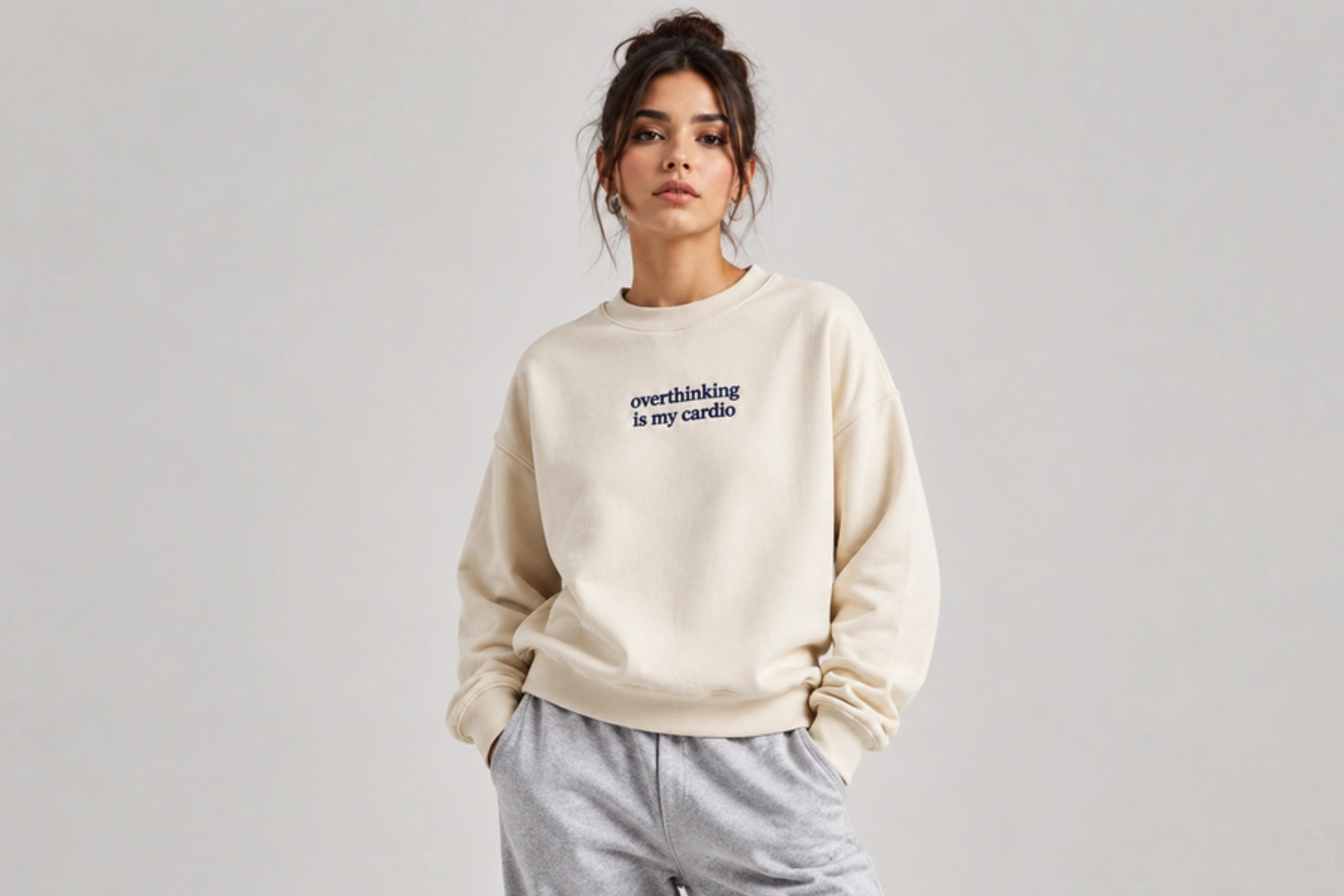
Short quotes, clever one-liners, playful phrases, and witty expressions transform simple sweatshirts into conversation starters without relying on large graphics. Clean typography, compact embroidery, and minimal thread colors keep the design refined, while humorous sayings, motivational words, sarcastic captions, or everyday expressions add personality to the garment. The embroidered finish gives text-based sweatshirt designs a premium look while ensuring the message remains timeless and easy to wear.
Best for: Casual fashion, lifestyle brands, personalized gifts, everyday wear
Design placement: Center chest, left chest, cuff, or sleeve
Preferred print method: Embroidery
Styling tips: Keep the phrase short and choose clean, legible fonts with tonal or contrasting thread for maximum readability.
Floral Accent Embroidery Design
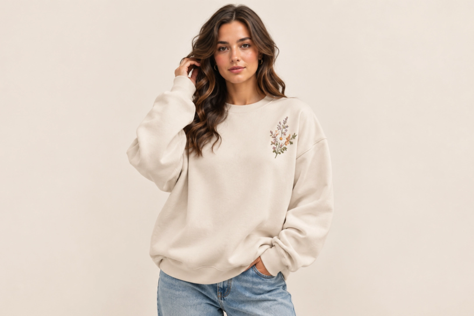
Delicate vines, blooming flowers, leafy branches, and finely stitched botanical elements create embroidered sweatshirt designs with natural texture and understated elegance. Wildflowers such as daisies, lavender, cherry blossoms, and eucalyptus leaves work beautifully as embroidered motifs, while satin stitches and fill embroidery add dimension without making the design feel heavy. Soft earth tones, pastel thread colors, or monochromatic embroidery complement the organic aesthetic, making this style suitable for both modern fashion collections and timeless wardrobe staples.
Best for: Women’s apparel, boutique clothing brands, spring collections, personalized gifts
Design placement: Left chest, shoulder, sleeve, or upper back
Preferred print method: Embroidery
Styling tips: Pair floral embroidery with neutral, sage green, cream, dusty pink, or light blue sweatshirts to create a soft, premium look that highlights the stitched details.
Fleece Sweatshirt Design Ideas
Fleece sweatshirts combine exceptional warmth with versatile style, making them a popular choice for outdoor adventures, winter apparel, streetwear, and branded merchandise. Their soft-brushed interior pairs well with embroidered details, minimalist graphics, and nature-inspired artwork. The ideas below show how different aesthetics and print techniques create garments that are functional and visually appealing.
Tonal Monogram Embroidery Design
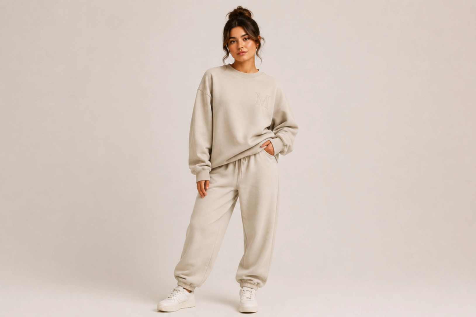
Tone-on-tone embroidery, elegant monograms, clean serif lettering, and finely stitched initials create fleece sweatshirt designs with a refined, understated appearance. Matching the thread color to the fabric allows the raised embroidery to stand out without bold contrast, making single initials, two-letter monograms, family names, or small brand logos look refined. This minimalist style is popular for luxury casualwear, personalized gifts, and corporate apparel.
Best for: Premium apparel, personalized gifts, corporate wear, luxury casualwear
Design placement: Left chest, cuff, sleeve, or upper back
Preferred print method: Embroidery
Styling tips: Choose heavyweight fleece sweatshirts in cream, beige, charcoal, navy, or black, and match thread color closely to the fabric for a monochromatic look.
Collegiate Fabric Appliqué Design
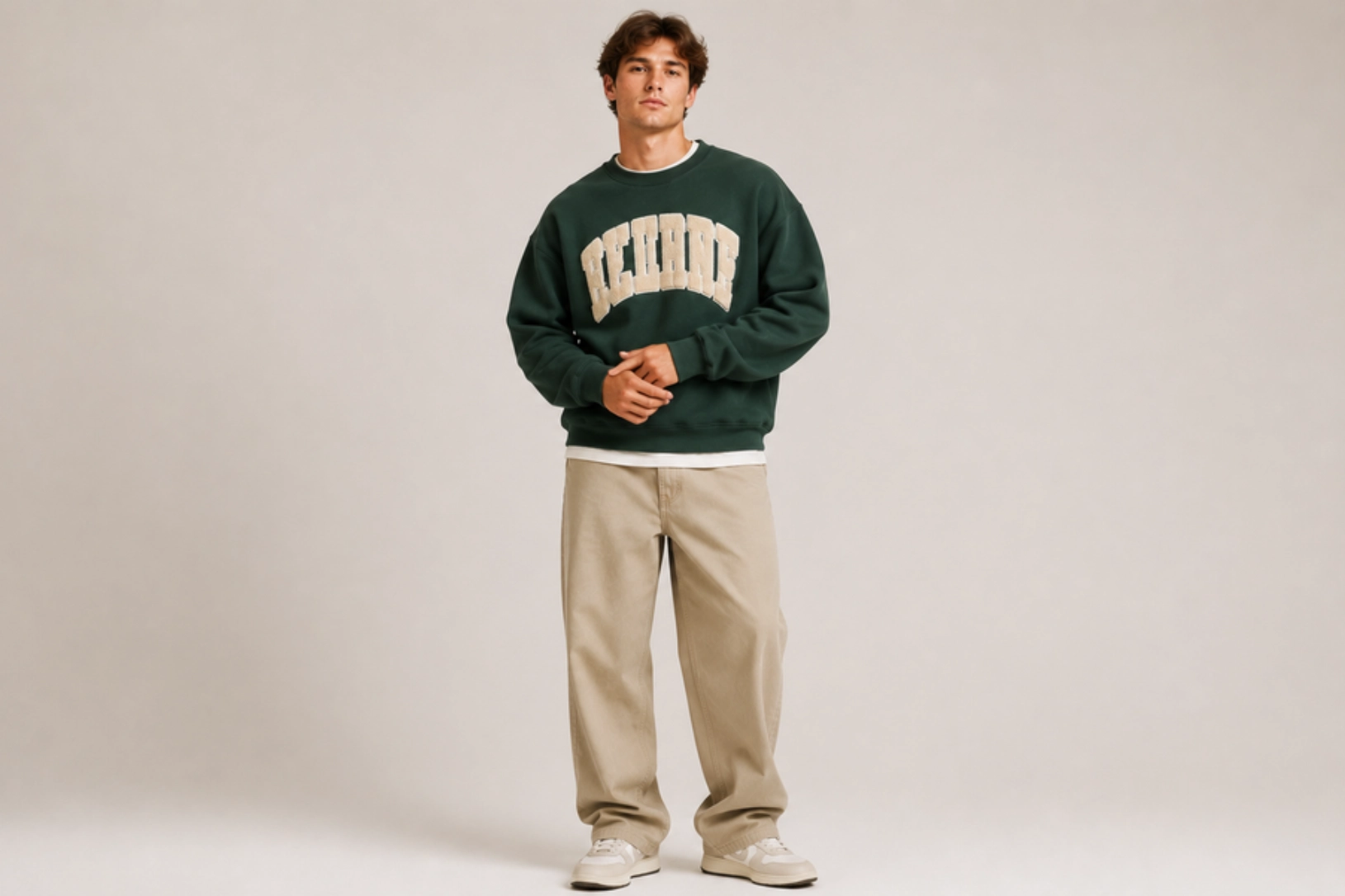
Layered felt letters, chenille patches, tackle twill fabric, and bold varsity typography give fleece sweatshirts the classic look of university apparel. Raised fabric appliqué adds dimension and durability, making it ideal for college names, athletic numbers, mascots, graduation years, or team logos. Traditional color combinations such as navy and white, maroon and gold, or forest green and cream reinforce the heritage-inspired aesthetic while creating a premium finish that withstands frequent wear.
Best for: College apparel, sports teams, alumni merchandise, varsity fashion
Design placement: Center chest
Preferred print method: Fabric appliqué with embroidery
Styling tips: Pair with heavyweight fleece sweatshirts in classic collegiate colors for an authentic varsity-inspired finish.
Contrast Fabric Panel Design
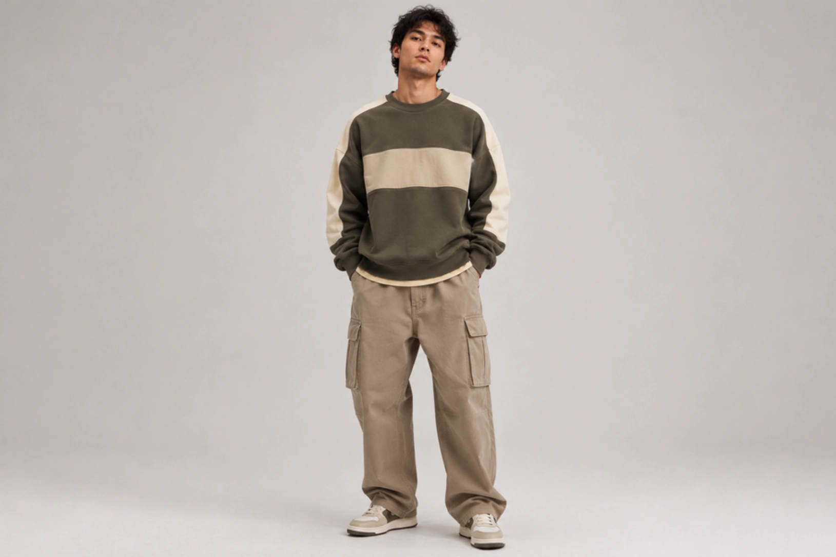
Color-block panels, mixed fabric textures, and contrasting fleece inserts create visual depth while highlighting the sweatshirt’s construction. Combining fabrics in complementary colors, such as black and grey, cream and olive, or navy and tan, gives the garment a modern athletic or outdoor-inspired look. Horizontal chest panels, shoulder yokes, or sleeve inserts add structure without relying on large graphics, making this design ideal for premium casualwear and performance-inspired collections.
Best for: Streetwear brands, outdoor apparel, athleisure collections, casual fashion
Design placement: Chest panel, sleeves, shoulders, or side panels
Preferred print method: Cut-and-sew panel construction
Styling tips: Keep logos and embroidery minimal so the panel design becomes the focal point, and choose colors that complement rather than compete.
Decorative Contrast Stitching Design
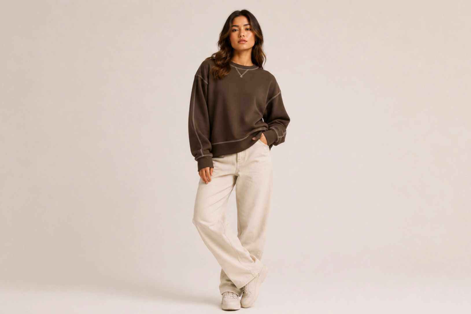
Visible topstitching, thick decorative thread, reinforced seams, and contrast-colored stitching turn construction details into standout design features on fleece sweatshirts. White stitching on black fleece, tan thread on olive fabric, or tonal stitching with subtle contrast adds depth without additional graphics. This technique highlights raglan sleeves, shoulder seams, kangaroo pockets, or side panels while giving the sweatshirt a handcrafted, workwear-inspired finish that complements heavyweight fleece.
Best for: Workwear brands, premium casualwear, streetwear collections, outdoor apparel
Design placement: Shoulder seams, sleeves, side seams, pockets, and neckline
Preferred print method: Decorative topstitching during garment construction
Styling tips: Use heavyweight fleece with contrasting thread colors and minimal branding to let the stitching speak for itself.
Graphic Sweatshirt Design Ideas
Graphic sweatshirts transform everyday apparel into wearable art through bold illustrations, typography, photography, and creative compositions. From vintage prints and minimalist line drawings to nature-themed artwork and cyber aesthetics, the ideas below cover artistic styles, color palettes, and printing techniques suited to streetwear, lifestyle collections, and custom apparel.
Retro Collegiate Graphic Design
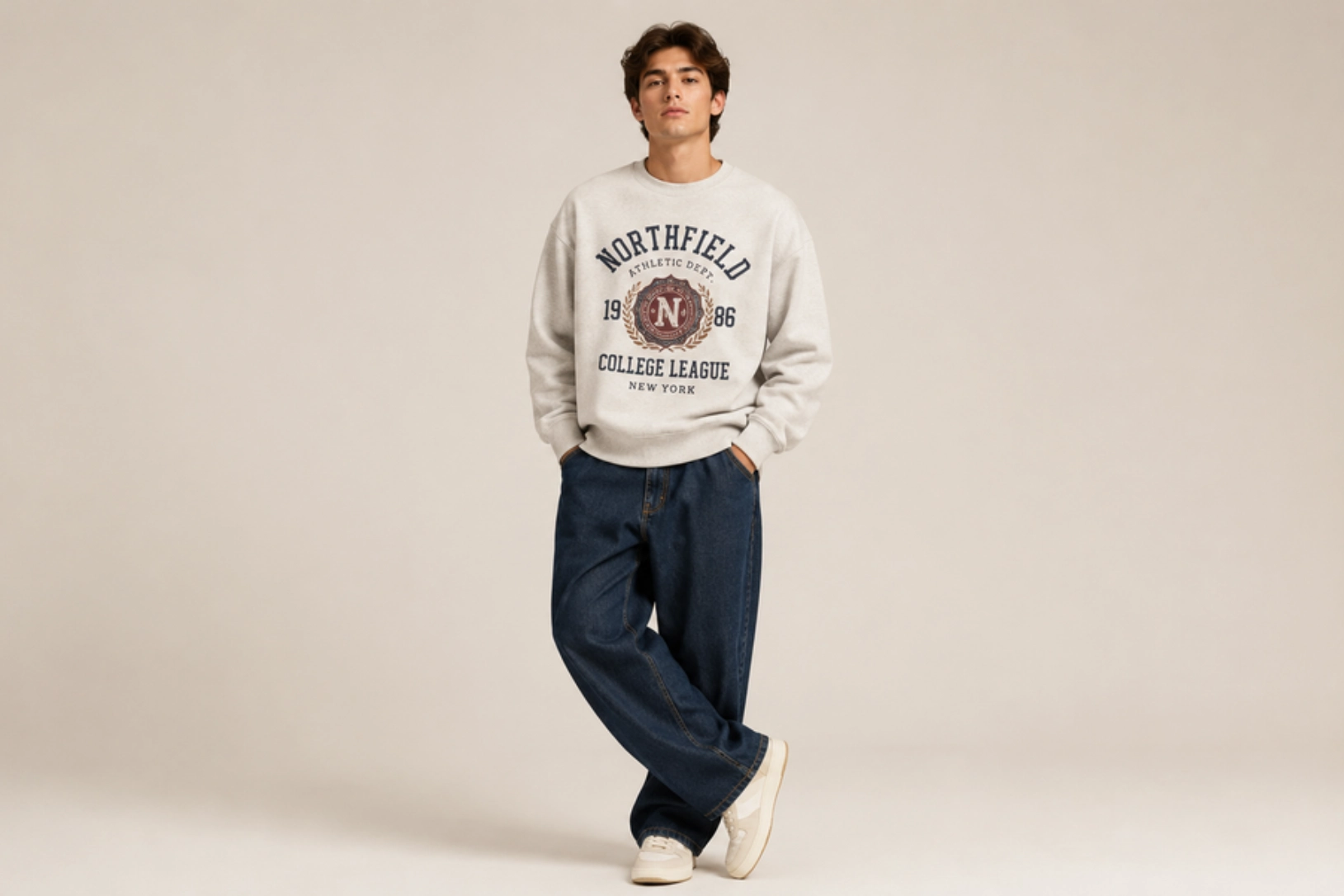
Vintage varsity lettering, distressed mascots, athletic emblems, and faded campus-inspired illustrations create graphic sweatshirts with timeless appeal. Classic block typography, established dates, university crests, and muted color palettes reflect the heritage of American college apparel while giving modern sweatshirts an authentic worn-in look. Soft distressing and retro graphics enhance the nostalgic aesthetic without overpowering the garment.
Best for: College apparel, vintage streetwear, alumni merchandise, lifestyle brands
Design placement: Center chest or full front
Preferred print method: Distressed screen printing or DTG
Styling tips: Pair with washed heavyweight sweatshirts in heather grey, cream, navy, or maroon to reinforce the vintage collegiate aesthetic.
Minimalist Line Art Graphic Design
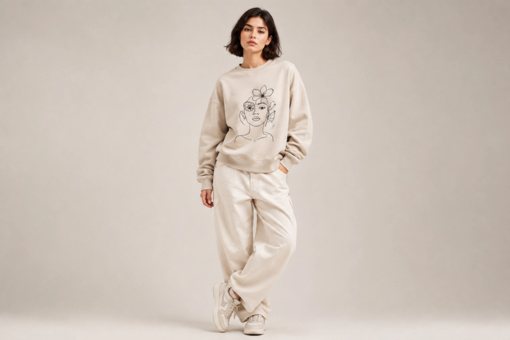
Continuous line drawings, abstract faces, botanical illustrations, geometric shapes, and single-stroke artwork create graphic sweatshirts with a clean, contemporary aesthetic. Monochrome prints, negative space, and simple compositions keep the design visually balanced while allowing the artwork to stand out without excessive detail. This versatile style complements both casual and premium apparel collections, offering a timeless look that pairs effortlessly with a range of colors and fabrics.
Best for: Minimalist fashion, lifestyle brands, premium apparel, everyday wear
Design placement: Center chest, back, or left chest
Preferred print method: Screen printing or DTG
Styling tips: Choose neutral-colored sweatshirts and monochrome artwork to maintain a refined, modern appearance.
Sci-Fi Cyber Y2K Graphic Design
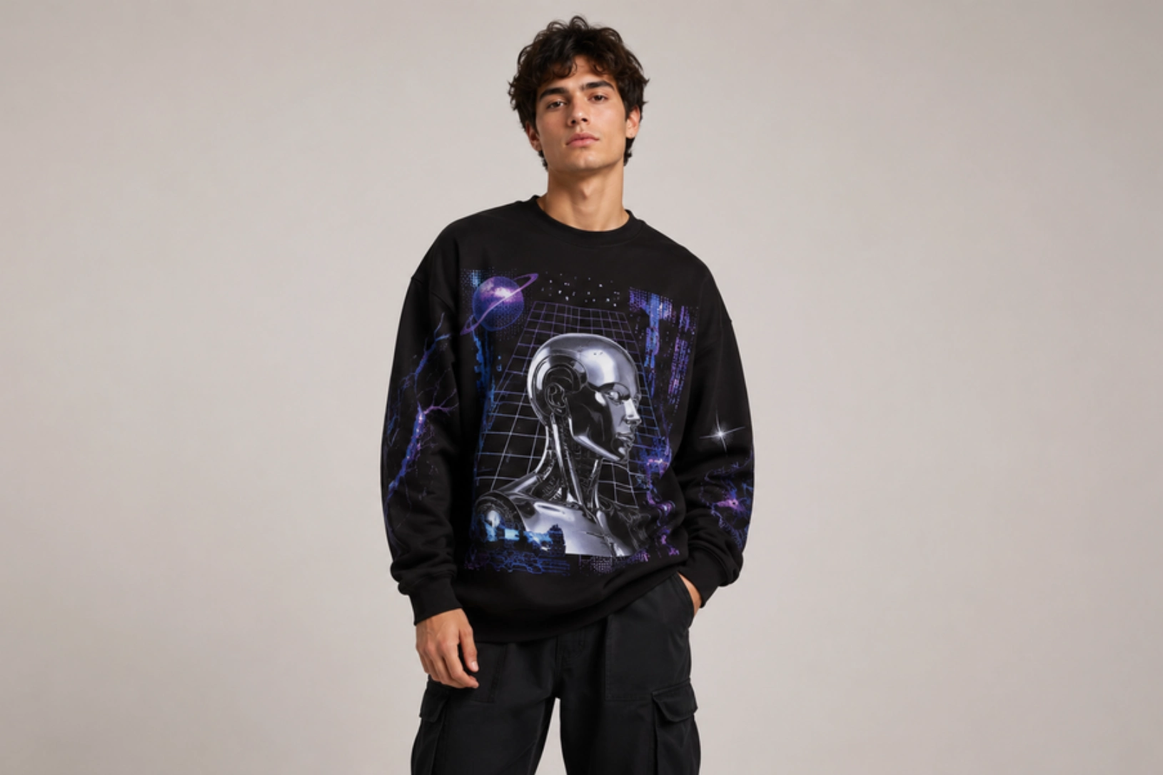
Chrome typography, neon gradients, digital grids, holographic effects, pixel graphics, and futuristic symbols define sci-fi Cyber Y2K sweatshirt designs. Electric blue, silver, purple, and black color palettes create high-contrast visuals, while robotic illustrations, glitch effects, circuit patterns, and futuristic typography reinforce the tech-inspired aesthetic. Large front or back graphics give the artwork room to stand out, making this style a favorite in modern streetwear and youth fashion.
Best for: Streetwear brands, Gen Z fashion, gaming apparel, music merchandise
Design placement: Full front, oversized back, or wraparound print
Preferred print method: Screen printing or DTG
Styling tips: Pair oversized graphics with black, charcoal, or washed grey sweatshirts to maximize the futuristic visual impact.
Abstract Nature Graphic Design
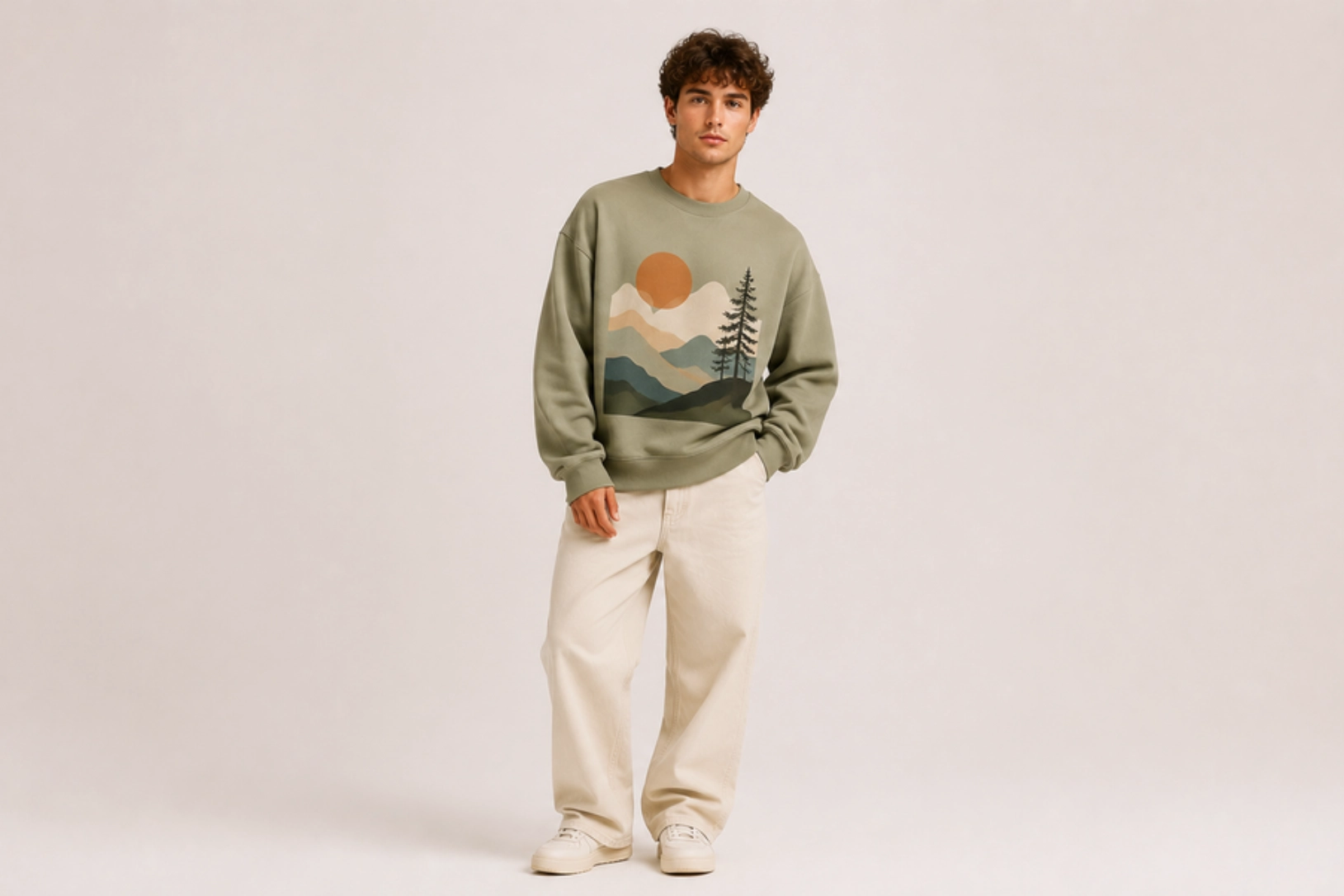
Flowing landscapes, organic textures, watercolor gradients, mountain silhouettes, sun motifs, and botanical shapes create abstract nature sweatshirt designs with a calm, artistic feel. Rather than realistic illustrations, these graphics use layered forms, earthy color palettes, and geometric compositions to capture the essence of forests, deserts, oceans, or sunsets. The result is a modern design that blends natural inspiration with contemporary fashion, making it suitable for both lifestyle and outdoor apparel.
Best for: Lifestyle brands, outdoor apparel, creative fashion, eco-conscious collections
Design placement: Center chest, oversized back, or full front
Preferred print method: Screen printing or DTG
Styling tips: Use earth-tone sweatshirts such as sage, sand, rust, or charcoal to complement the natural color palette and artistic composition.
Whimsical Nostalgic Graphic Design
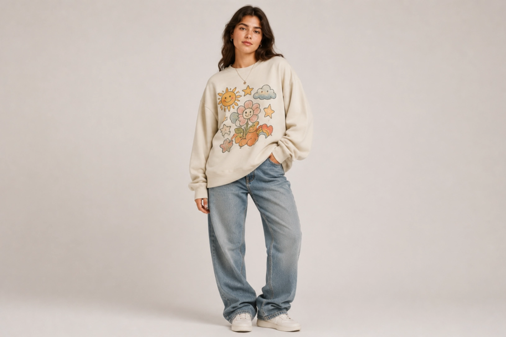
Hand-drawn doodles, smiling characters, playful typography, retro stickers, clouds, stars, flowers, and pastel color palettes create whimsical sweatshirt designs with a cheerful, nostalgic charm. Inspired by 90s cartoons, vintage stationery, childhood illustrations, and scrapbook aesthetics, these graphics evoke a sense of familiarity while adding personality to everyday apparel. Soft colors, rounded shapes, and expressive illustrations make the design approachable and visually engaging without feeling overly complex.
Best for: Lifestyle brands, gift shops, youth fashion, casual streetwear
Design placement: Center chest, oversized back, or full front
Preferred print method: DTG or screen printing
Styling tips: Pair with pastel, cream, or washed-out color sweatshirts to enhance the playful vintage aesthetic, and keep accessories simple so the artwork stands out.
Vintage Sweatshirt Design Ideas
Vintage sweatshirt designs capture well-worn character through faded graphics, distressed textures, retro typography, and heritage-inspired artwork. Drawing from classic college apparel, old sportswear, and 1970s and 1980s fashion, these styles deliver a timeless aesthetic that remains popular in modern streetwear. The ideas below combine nostalgic elements with contemporary techniques for authentic, lived-in custom apparel.
Vintage Collegiate Typography Design
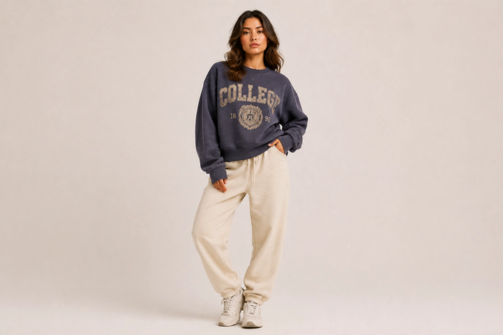
Distressed varsity lettering, arched college names, established dates, classic serif fonts, and faded athletic graphics create sweatshirt designs inspired by vintage campus apparel. Cracked ink effects, washed color palettes, and oversized typography replicate the appearance of decades-old university sweatshirts, while simple layouts keep the design timeless. This heritage-inspired style remains a staple for casual fashion, alumni merchandise, and vintage streetwear.
Best for: College apparel, vintage fashion, alumni merchandise, lifestyle brands
Design placement: Center chest or full front
Preferred print method: Distressed screen printing or DTG
Styling tips: Pair with garment-dyed or washed sweatshirts in heather grey, cream, navy, or burgundy to enhance the authentic vintage look.
Retro Sports Logo Design
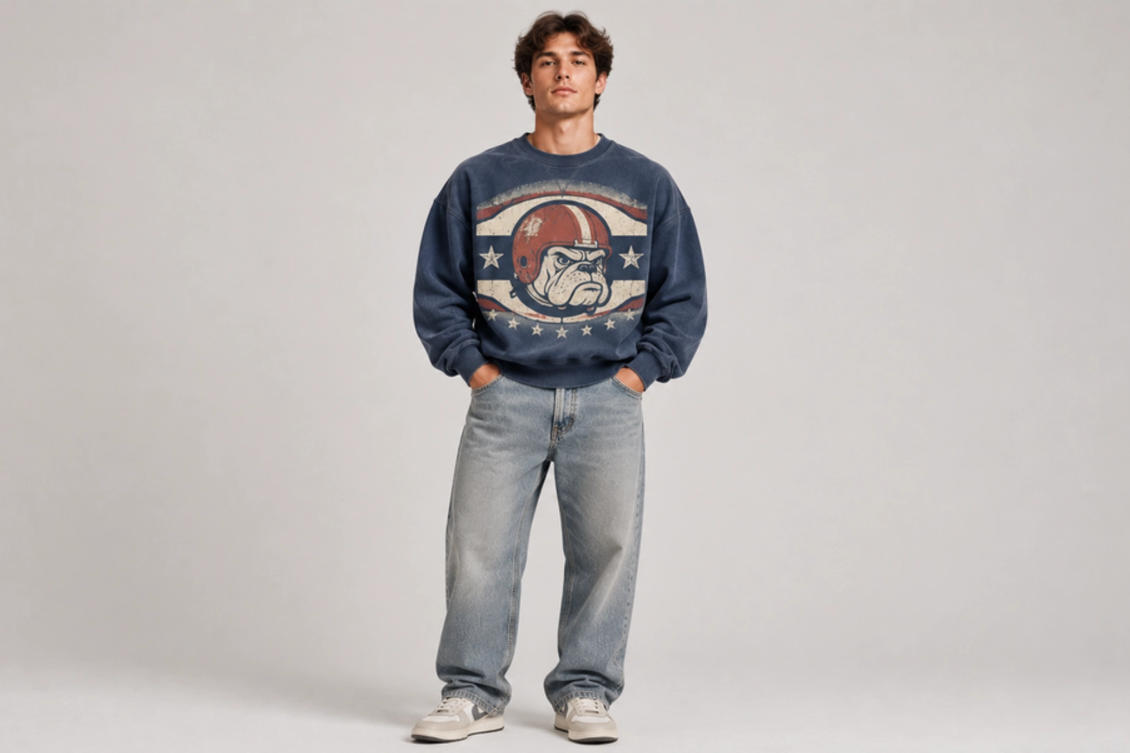
Classic team crests, vintage mascots, athletic emblems, championship graphics, and bold block typography give sweatshirts the unmistakable feel of retro sportswear. Inspired by old baseball, football, basketball, and collegiate team apparel, these designs feature faded color palettes, distressed textures, and heritage-style logos that recreate the look of well-loved vintage merchandise. The combination of nostalgic graphics and worn-in finishes makes this style a timeless choice for casual and streetwear collections.
Best for: Sports merchandise, vintage streetwear, fan apparel, lifestyle brands
Design placement: Center chest or full front
Preferred print method: Distressed screen printing or DTG
Styling tips: Pair with washed heavyweight sweatshirts in navy, forest green, burgundy, or heather grey to enhance the authentic retro sports aesthetic.
1970s Psychedelic Art Design
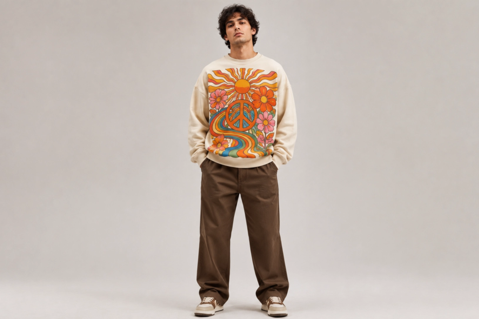
Swirling typography, wavy lettering, oversized flowers, sunbursts, peace symbols, and vibrant rainbow gradients define 1970s psychedelic sweatshirt designs. Inspired by vintage concert posters, hippie culture, and retro album artwork, these graphics feature bold color combinations, organic shapes, and hand-drawn illustrations that create a free-spirited aesthetic. The expressive artwork brings energy and nostalgia to modern sweatshirts while making each design visually distinctive.
Best for: Music merchandise, vintage fashion, festival apparel, lifestyle brands
Design placement: Full front, center chest, or oversized back
Preferred print method: Screen printing or DTG
Styling tips: Pair with washed cream, mustard, rust, olive, or faded black sweatshirts to complement the retro-inspired color palette and artwork.
Sun-Faded Distressed Design
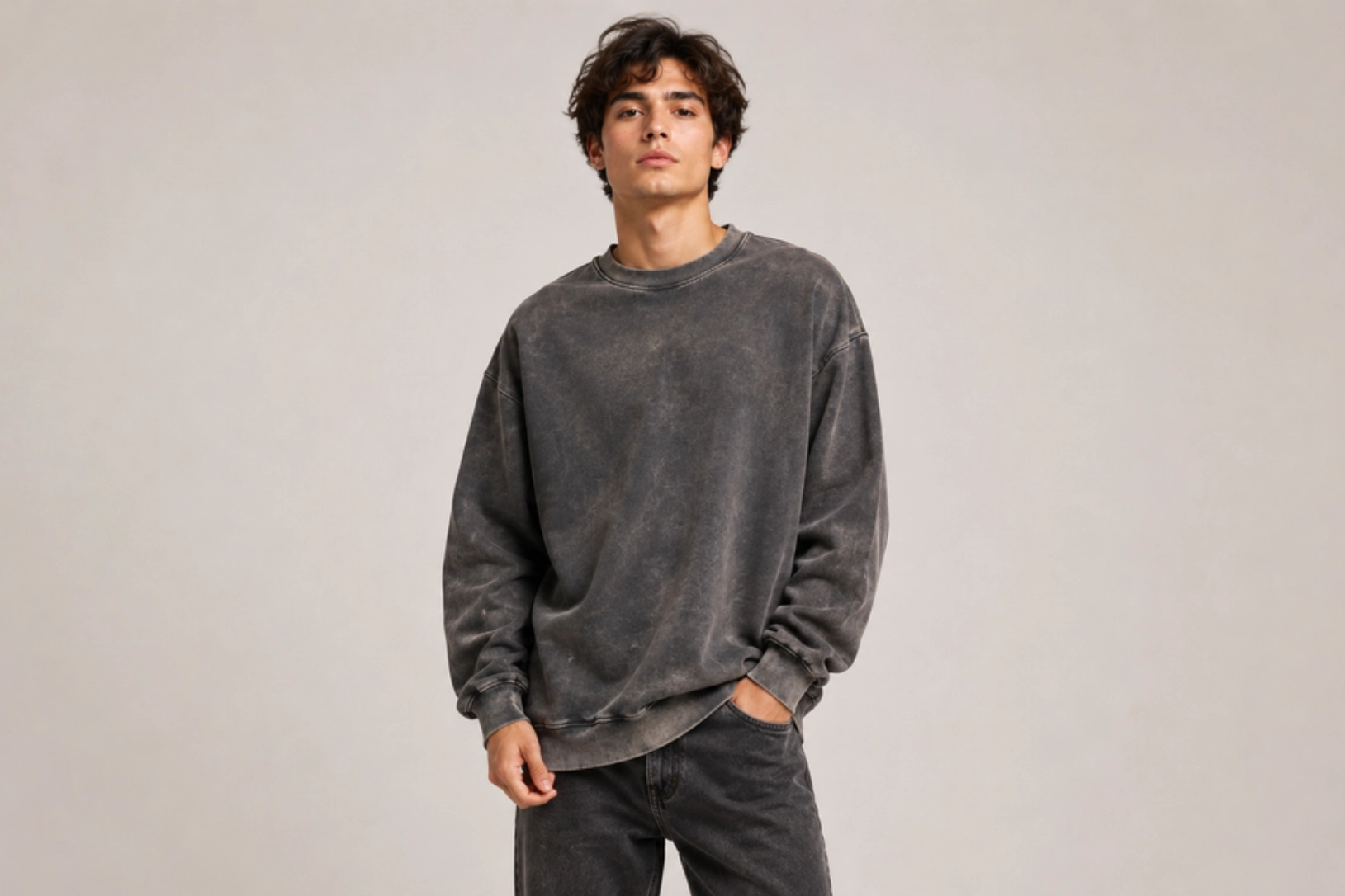
Faded graphics, washed color palettes, cracked ink textures, and softly worn edges recreate the appearance of sweatshirts naturally aged by years of wear and sunlight. Garment dyeing, enzyme washing, pigment-dyed fabrics, and vintage-inspired distressing add depth without compromising comfort, while muted tones such as faded navy, dusty black, washed olive, and cream reinforce the lived-in aesthetic. This timeless style pairs effortlessly with minimalist graphics, retro typography, or classic logos for an authentic vintage finish.
Best for: Vintage streetwear, lifestyle brands, casual fashion, premium basics
Design placement: Center chest, full front, or oversized back
Preferred print method: Distressed screen printing or garment dye with DTG
Styling tips: Choose heavyweight, washed sweatshirts in muted colors with subtle distressing to achieve a naturally worn, heritage-inspired look.
French Terry Sweatshirt Design Ideas
French terry sweatshirts feature a smooth outer surface and a looped interior that make them lighter and more breathable than fleece, making them suited to year-round wear. Refined embroidery, tonal prints, and textured graphics all complement the fabric well, emphasizing comfort without sacrificing style. The ideas below highlight clean aesthetics and premium finishing techniques for fashion brands, athleisure, and everyday casualwear.
Micro-Embroidered Chest Design
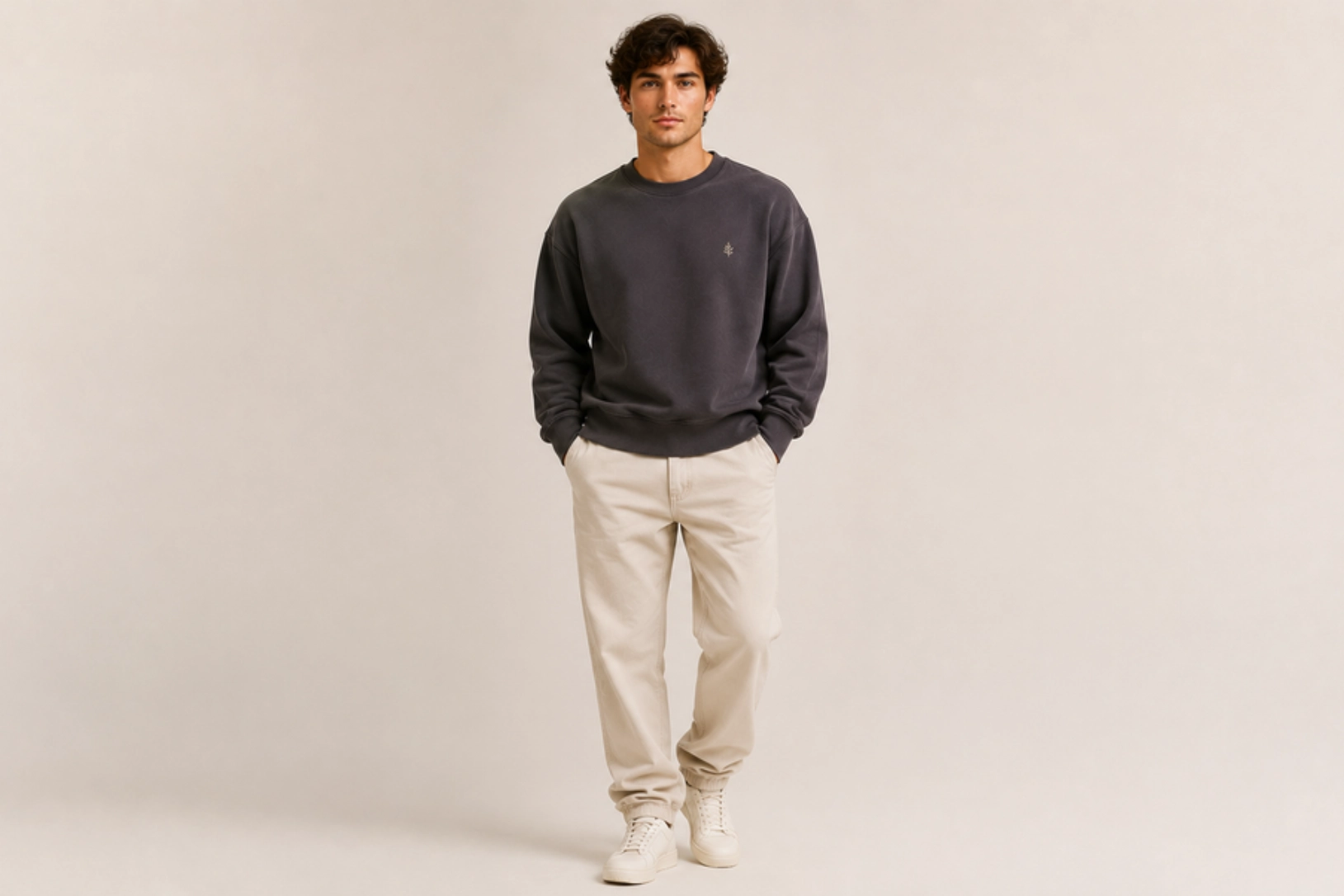
Small embroidered icons, minimalist logos, initials, and fine-line artwork create understated French terry sweatshirt designs with a premium finish. The smooth fabric surface showcases clean stitching, while subtle thread colors add texture without dominating the garment. Compact embroidery works particularly well for luxury basics and modern casualwear, delivering a timeless look that complements the lightweight character of French terry.
Best for: Premium basics, lifestyle brands, corporate apparel, everyday wear
Design placement: Left chest or center chest
Preferred print method: Embroidery
Styling tips: Use tonal or neutral thread colors on French terry sweatshirts in cream, charcoal, olive, or navy for a clean, refined appearance.
3D Puff Ink Graphic Design
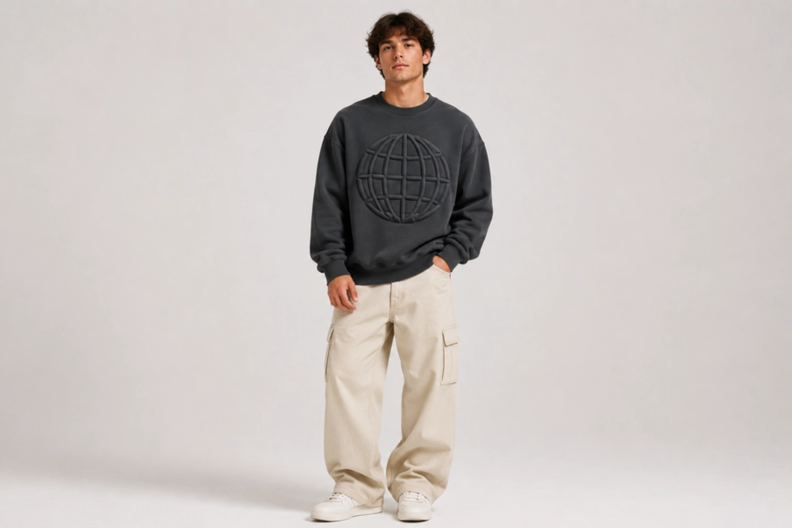
Raised lettering, bold logos, geometric graphics, and textured artwork create eye-catching French terry sweatshirt designs with a soft three-dimensional finish. The elevated print creates a soft three-dimensional effect that works especially well with block lettering, minimalist logos, geometric shapes, and retro-inspired artwork. Combined with the smooth surface of French terry, puff printing delivers a modern, premium finish that stands out through texture rather than complex graphics.
Best for: Streetwear brands, fashion collections, branded merchandise, casual apparel
Design placement: Center chest, full front, or upper back
Preferred print method: 3D puff screen printing
Styling tips: Use monochromatic or high-contrast color combinations with neutral French terry sweatshirts to highlight the raised-print effect.
Tone-on-Tone Print Design
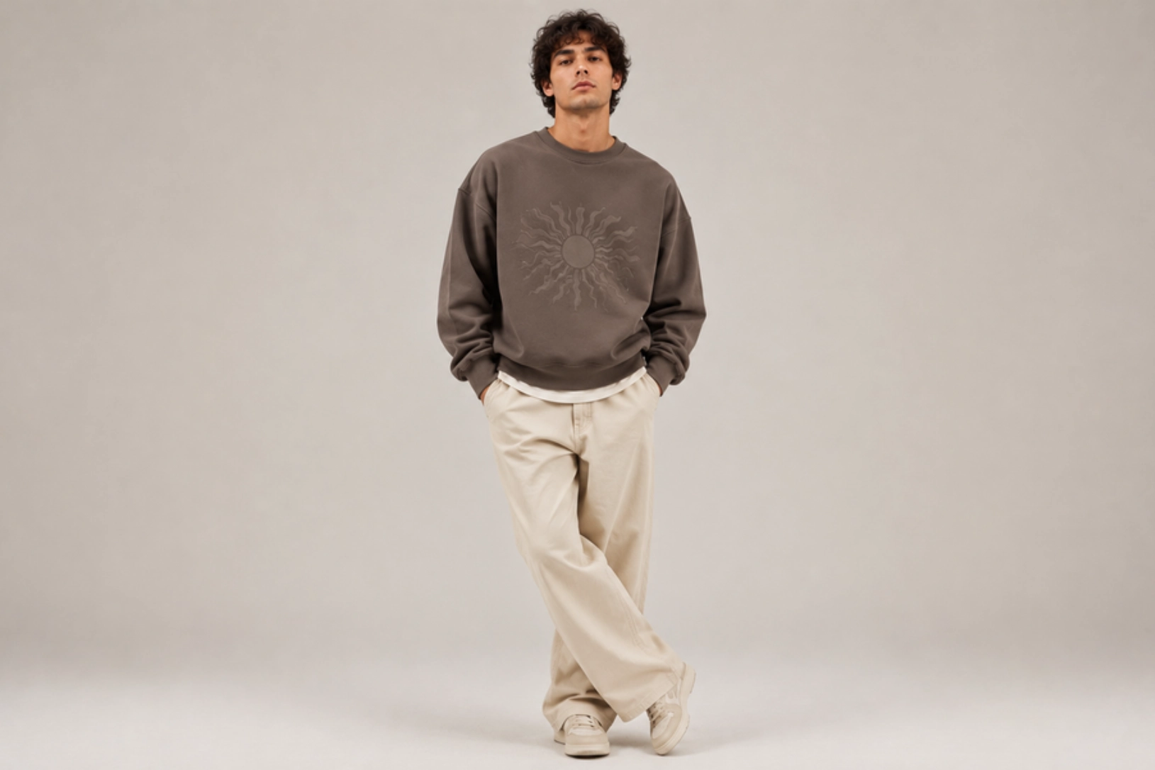
Matching ink colors, subtle typography, and low-contrast illustrations create a refined, minimalist aesthetic on French terry sweatshirts. Ink that closely matches the fabric produces a clean, layered look where texture and composition take center stage over bold contrast. This understated approach works well for brand logos, abstract graphics, and oversized wordmarks across premium casualwear and luxury basics.
Best for: Premium apparel, minimalist fashion, lifestyle brands, luxury basics
Design placement: Center chest, full front, or oversized back
Preferred print method: Screen printing or water-based printing
Styling tips: Choose tonal ink on neutral French terry sweatshirts in cream, stone, olive, charcoal, or navy for a sophisticated monochromatic finish.
Scalloped Collar Trim Design
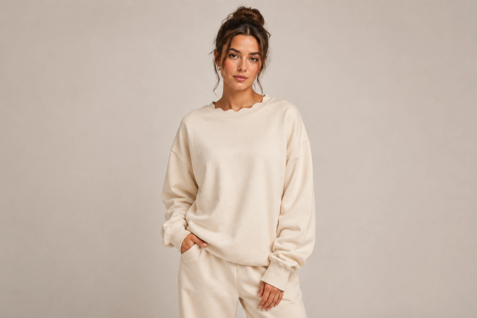
Scalloped collar edges, curved ribbed trim, contrast stitching, and soft, rounded finishes add distinctive details to French terry sweatshirts. Unlike traditional ribbed necklines, scalloped trims introduce subtle texture and visual interest while maintaining a clean, premium appearance. This decorative finish pairs well with minimalist embroidery, tonal graphics, and monochrome color palettes, making it a refined choice for boutique fashion and contemporary casualwear.
Best for: Boutique fashion, women’s apparel, premium casualwear, lifestyle brands
Design placement: Collar and neckline
Preferred print method: Cut-and-sew trim construction
Styling tips: Pair scalloped collars with solid-colored French terry sweatshirts and minimal graphics to highlight the unique neckline detail.
Ribbed V-Inset Design
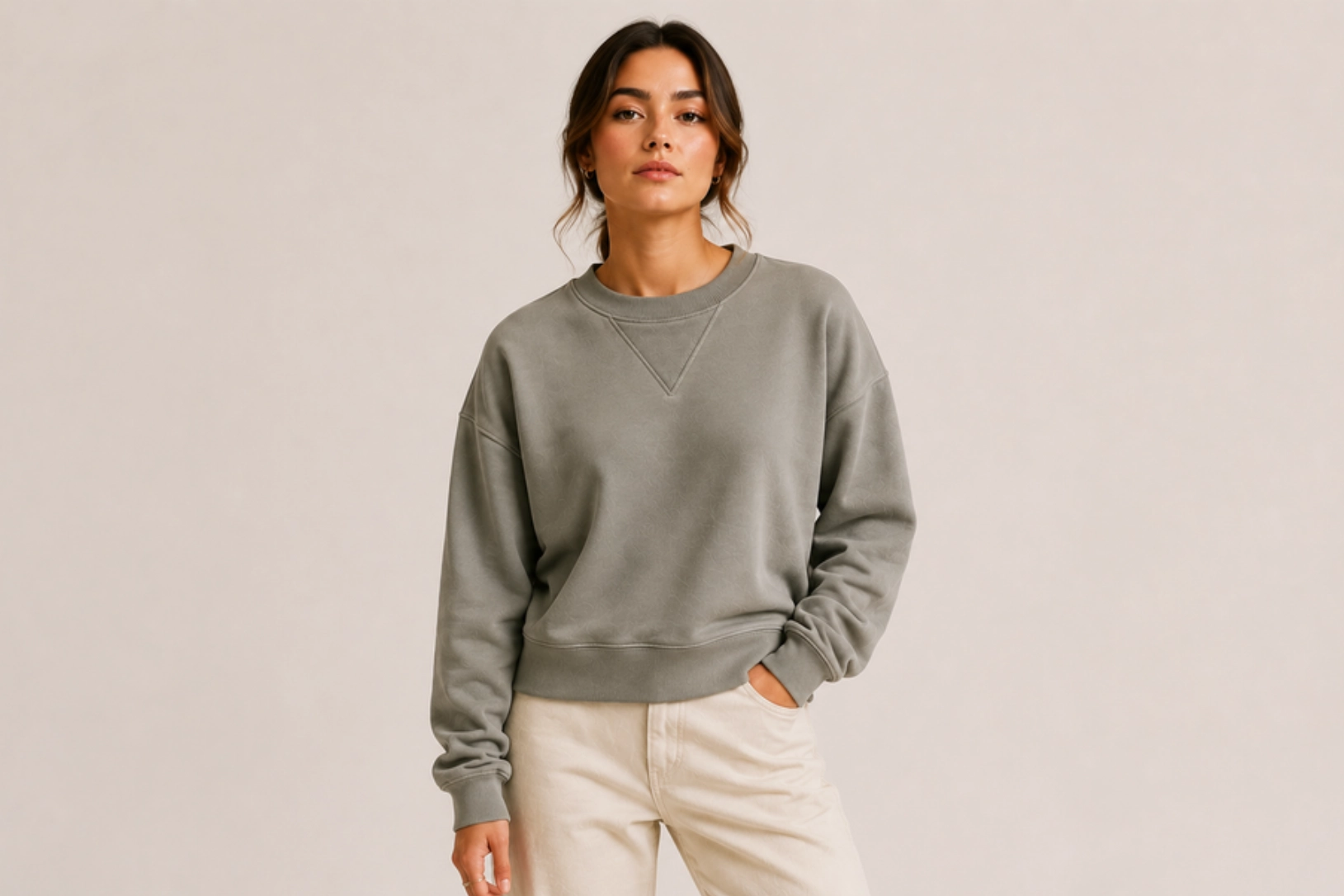
Ribbed V-insets, triangular neck panels, reinforced stitching, and heritage-inspired construction give French terry sweatshirts a classic athletic look. Originally designed to improve flexibility and absorb moisture in vintage sportswear, the V-inset has become a signature design element that adds both character and authenticity. Combined with minimalist logos, tonal embroidery, or clean typography, it creates a timeless sweatshirt that blends function with understated style.
Best for: Heritage apparel, athleisure brands, premium basics, vintage-inspired collections
Design placement: Front neckline below the collar
Preferred print method: Cut-and-sew construction with embroidery or screen printing
Styling tips: Keep graphics minimal and choose neutral French terry colors such as grey, navy, cream, or olive so the V-inset serves as a subtle focal point.
Turtleneck Sweatshirt Design Ideas
Turtleneck sweatshirts combine the comfort of classic sweatshirts with the elevated look of a high neckline, suiting casual, streetwear, and premium fashion collections. The extended collar naturally draws attention to subtle embroidery, bold chest graphics, and color-blocked details. The ideas below highlight modern aesthetics that balance warmth, functionality, and contemporary style.
Tonal Chest Embroidery Design
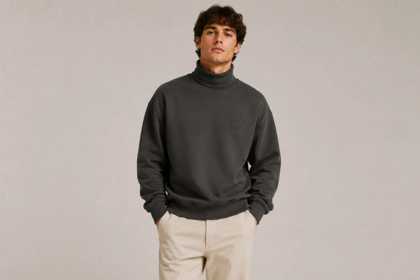
Tone-on-tone embroidery, minimalist logos, elegant monograms, and finely stitched typography create turtleneck sweatshirts with a refined, premium aesthetic. Matching the thread color to the fabric adds subtle texture while allowing the high collar to remain the focal point. Small embroidered brand marks, initials, or simple icons complement the clean silhouette, making this design ideal for luxury basics and contemporary casualwear.
Best for: Premium apparel, luxury basics, corporate wear, lifestyle brands
Design placement: Left chest or center chest
Preferred print method: Embroidery
Styling tips: Pair tonal embroidery with neutral turtleneck sweatshirts in black, cream, charcoal, or olive for a sophisticated monochromatic look.
Minimalist Collar Embroidery Turtleneck Sweatshirt Design
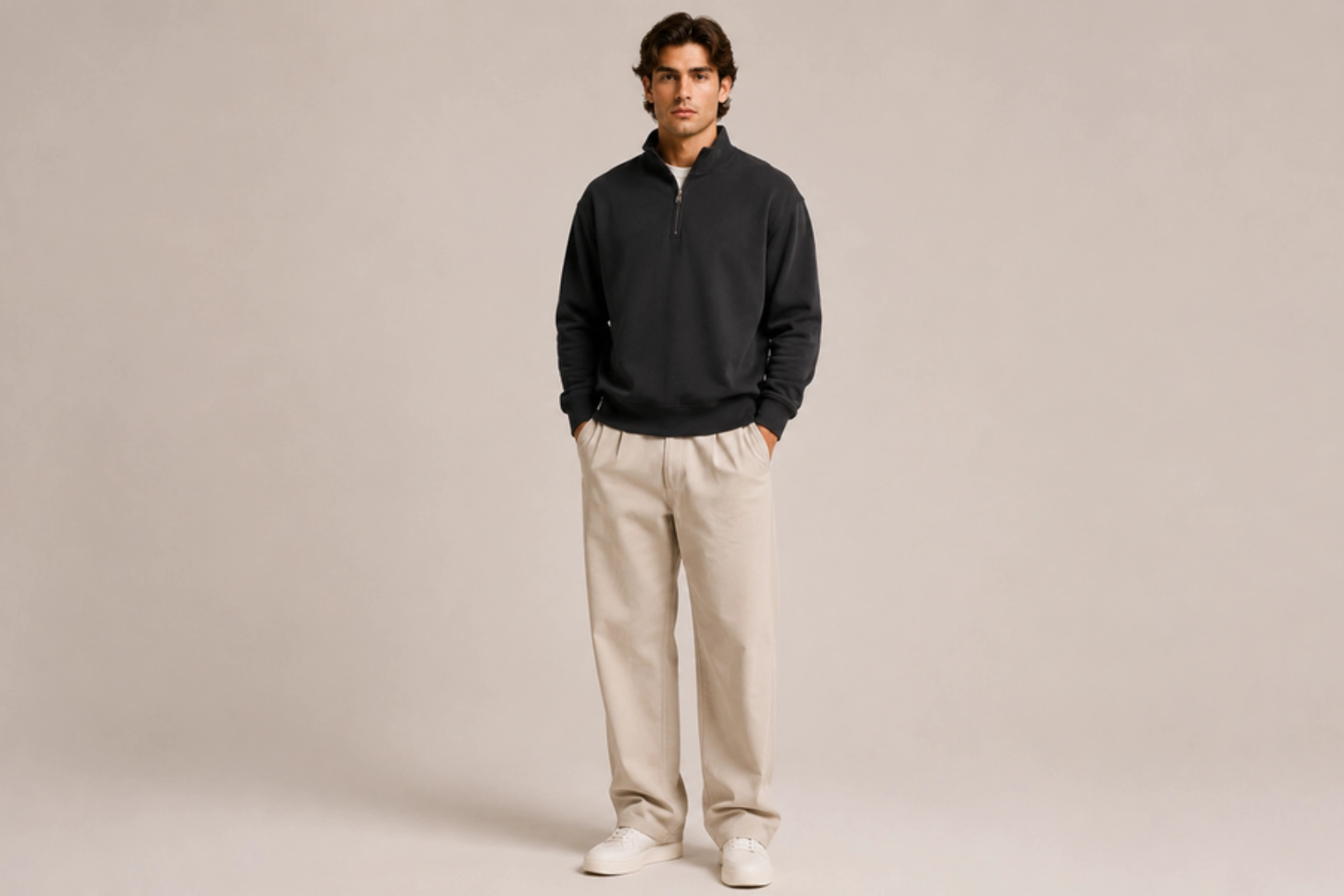
Small embroidered words, delicate floral motifs, geometric symbols, and subtle monograms placed along the turtleneck collar create an understated yet distinctive design. The elevated neckline provides a unique canvas for fine embroidery, allowing simple details to become a focal point without adding large graphics. This clean aesthetic complements premium fabrics and minimalist fashion while adding a custom, handcrafted finish.
Best for: Premium fashion, boutique brands, personalized apparel, luxury basics
Design placement: Turtleneck collar
Preferred print method: Embroidery
Styling tips: Use tonal or contrasting thread on solid-colored sweatshirts to highlight the embroidered collar without overwhelming the garment.
Oversized Center-Chest Graphic Design
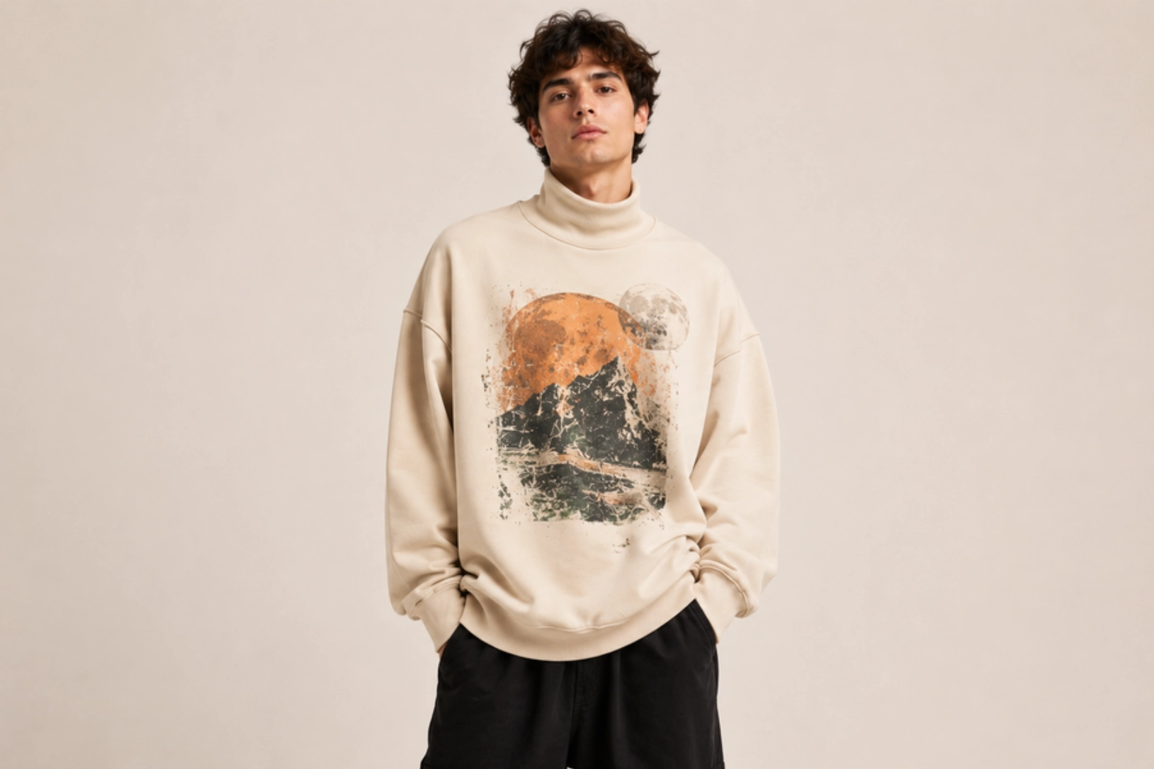
Bold typography, abstract illustrations, oversized logos, and artistic graphics create a striking focal point on turtleneck sweatshirts. The clean body of the sweatshirt provides ample space for statement artwork, while the high collar balances the composition and adds a premium silhouette. Screen-printed illustrations, vintage-inspired graphics, or contemporary artwork work particularly well for streetwear and fashion collections.
Best for: Streetwear brands, fashion collections, branded merchandise, casual apparel
Design placement: Center chest
Preferred print method: Screen printing or DTG
Styling tips: Pair oversized graphics with neutral-colored turtlenecks to create strong visual contrast and let the artwork take center stage.
Color-Blocked Sleeve Streetwear Design
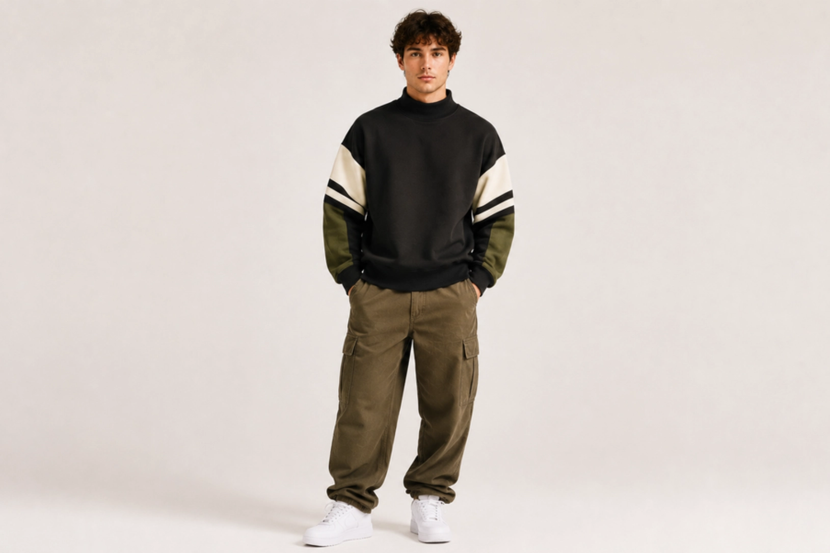
Contrasting sleeve panels, bold color blocking, oversized typography, and athletic-inspired details give turtleneck sweatshirts a contemporary streetwear aesthetic. Combining colors such as black and white, olive and beige, or navy and grey creates visual depth, while striped panels, printed sleeve graphics, or embroidered logos add extra character. This design blends modern fashion with sporty influences, making it suitable for both casual and urban collections.
Best for: Streetwear brands, athleisure collections, urban fashion, lifestyle apparel
Design placement: Sleeves with optional chest logo
Preferred print method: Cut-and-sew construction with screen printing or embroidery
Styling tips: Use two or three complementary colors and keep the chest branding minimal to emphasize the bold sleeve design.
Lightweight Sweatshirt Design Ideas
Lightweight sweatshirts prioritize comfort, layering, and year-round versatility. Their breathable fabrics and smooth surfaces suit clean graphics, subtle embroidery, and soft printing techniques that maintain flexibility without bulk. The ideas below focus on modern aesthetics that complement relaxed fits, transitional weather, and everyday casual wear.
Minimalist Line Art Design
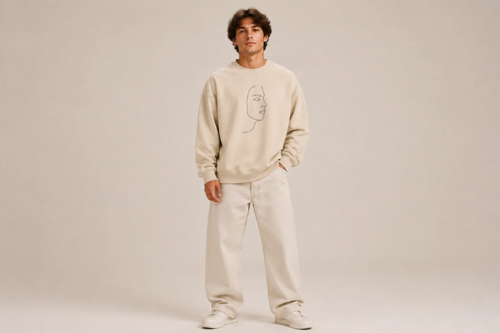
Continuous line drawings, abstract faces, botanical illustrations, and geometric shapes create lightweight sweatshirts with a clean, contemporary aesthetic. Thin strokes, monochrome graphics, and generous negative space keep the design visually balanced while allowing the breathable fabric to remain the focus. This timeless style suits modern fashion collections that value simplicity and versatility.
Best for: Minimalist fashion, lifestyle brands, premium basics, everyday wear
Design placement: Left chest, center chest, or upper back
Preferred print method: Screen printing or DTG
Styling tips: Pair monochrome artwork with neutral-colored sweatshirts for a refined, effortless look.
Vertical Sleeve Typography Design
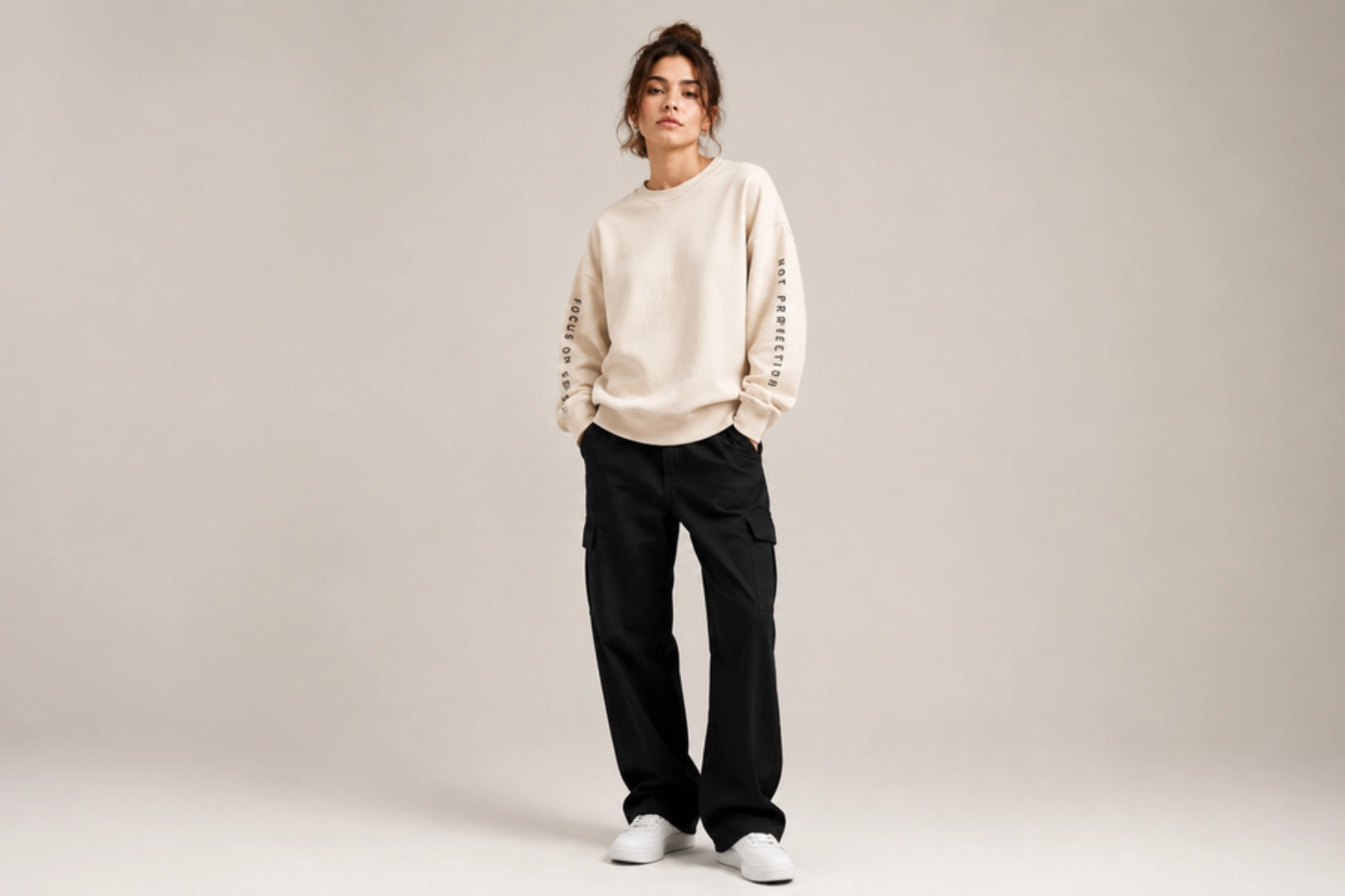
Vertical typography, motivational quotes, brand names, or coordinate graphics printed along the sleeve create a modern, understated design without dominating the sweatshirt. Slim sans-serif fonts, clean spacing, and minimalist layouts draw attention to the garment’s silhouette while maintaining a lightweight aesthetic. This design pairs well with plain fronts for a balanced, contemporary appearance.
Best for: Streetwear brands, fitness apparel, lifestyle collections, branded merchandise
Design placement: One or both sleeves
Preferred print method: Screen printing or heat transfer vinyl
Styling tips: Keep the chest free of large graphics to let the sleeve typography become the primary design feature.
Tone-on-Tone Graphic Design
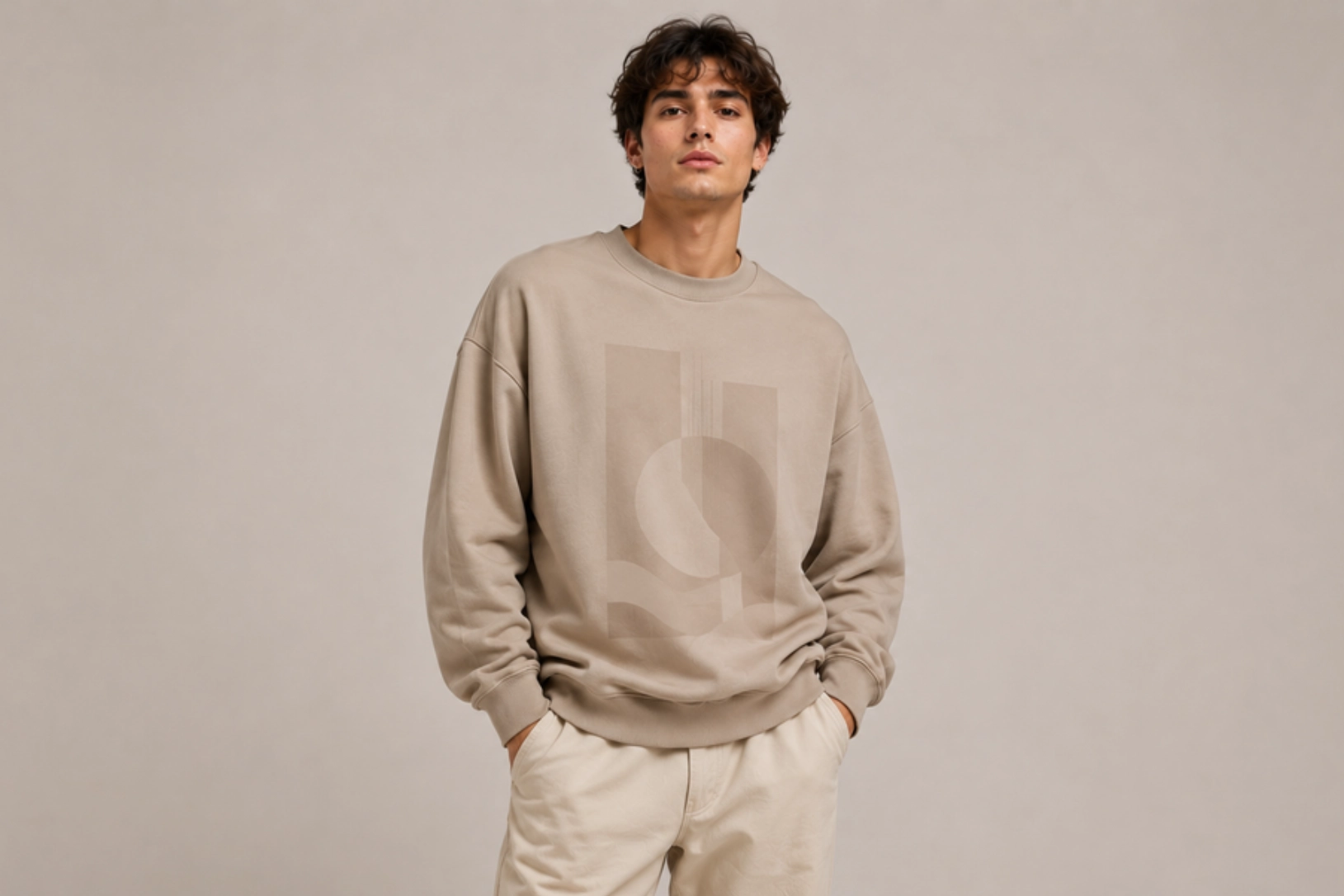
Matching ink colors, subtle illustrations, oversized wordmarks, and monochromatic graphics create lightweight sweatshirts with understated visual depth. Printing in shades that closely match the fabric emphasizes texture and composition instead of bold contrast, making the design feel modern and premium. This approach works especially well for abstract artwork, minimalist branding, and clean geometric patterns.
Best for: Premium casualwear, luxury basics, lifestyle brands, minimalist apparel
Design placement: Center chest, full front, or oversized back
Preferred print method: Water-based screen printing or DTG
Styling tips: Choose tonal prints on cream, stone, olive, charcoal, or navy sweatshirts for a sophisticated monochromatic finish.
Vintage Distressed Print Design
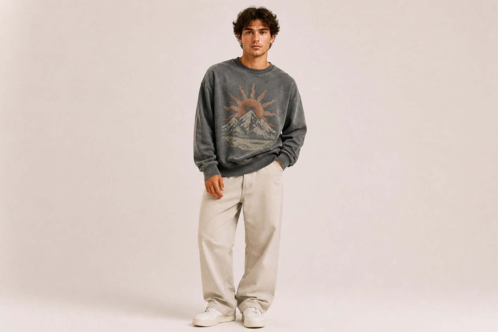
Faded typography, cracked ink textures, worn graphics, and washed color palettes give lightweight sweatshirts an authentic vintage character. Soft distressing, pigment-dyed fabrics, and retro-inspired artwork recreate the appearance of well-loved apparel while preserving the garment’s lightweight feel. This timeless style works equally well with collegiate graphics, classic logos, and heritage-inspired illustrations.
Best for: Vintage fashion, casual apparel, lifestyle brands, streetwear
Design placement: Center chest or full front
Preferred print method: Distressed screen printing or DTG
Styling tips: Pair with washed fabrics in faded black, heather grey, cream, or dusty blue to reinforce the vintage aesthetic.
Coastal Travel Graphic Design
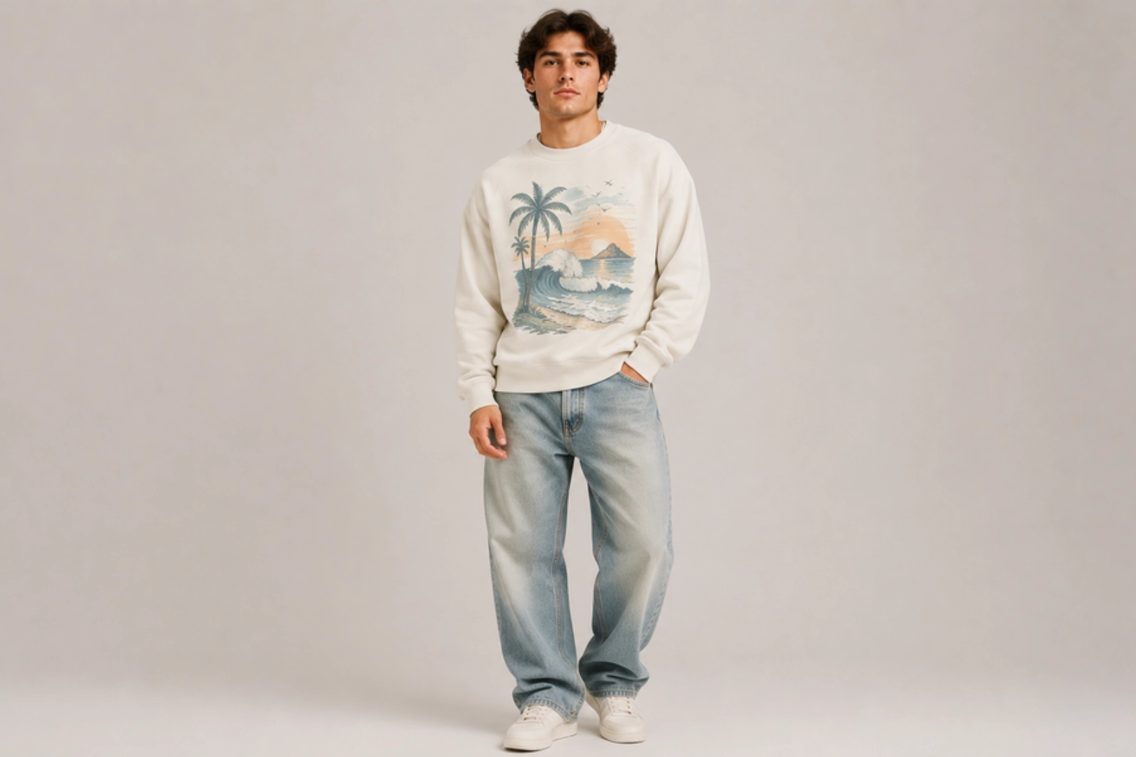
Ocean waves, palm trees, vintage postcards, coastal maps, beach sunsets, and destination typography bring a relaxed travel-inspired aesthetic to lightweight sweatshirts. Soft blue, sand, coral, and seafoam color palettes reflect coastal landscapes, while hand-drawn illustrations and retro graphics create an effortless vacation feel. These designs appeal to beachwear collections, resort merchandise, and casual lifestyle brands.
Best for: Resort wear, travel brands, beach merchandise, lifestyle apparel
Design placement: Center chest, oversized back, or full front
Preferred print method: Screen printing or DTG
Styling tips: Choose lightweight sweatshirts in white, sand, light blue, or sage green to complement the coastal-inspired artwork.
Raglan Sweatshirt Design Ideas
Raglan sweatshirts are recognized by their diagonal shoulder seams, offering greater mobility and a sporty silhouette. The contrasting sleeve construction naturally complements color blocking, varsity details, bold graphics, and embroidered accents, all of which emphasize the garment’s athletic heritage. The ideas below combine classic sportswear influences with modern fashion trends for custom apparel, team merchandise, and casual streetwear.
Two-Tone Color-Blocked Design
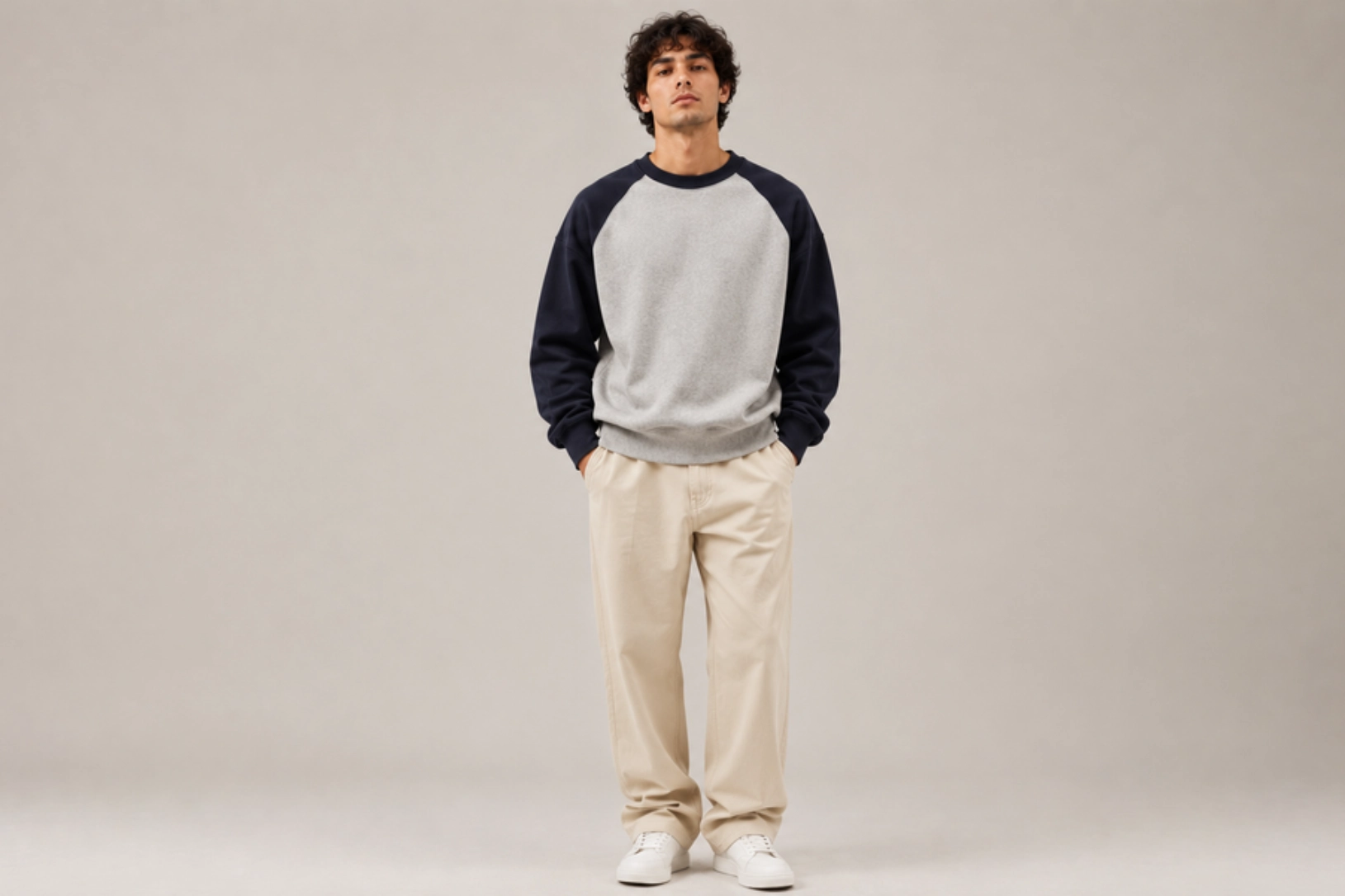
Contrasting raglan sleeves, complementary color combinations, and clean panel transitions highlight the signature construction of raglan sweatshirts. Pairings such as grey and navy, black and white, or cream and forest green create visual contrast without relying on large graphics. Minimal logos or small chest embroidery complete the athletic-inspired look while keeping the design versatile and timeless.
Best for: Athleisure brands, casual apparel, sportswear, everyday fashion
Design placement: Color-blocked sleeves with optional left chest logo
Preferred print method: Cut-and-sew construction with embroidery or screen printing
Styling tips: Choose classic two-tone color combinations and avoid oversized graphics to let the raglan construction remain the focal point.
Chenille Varsity Patch Design
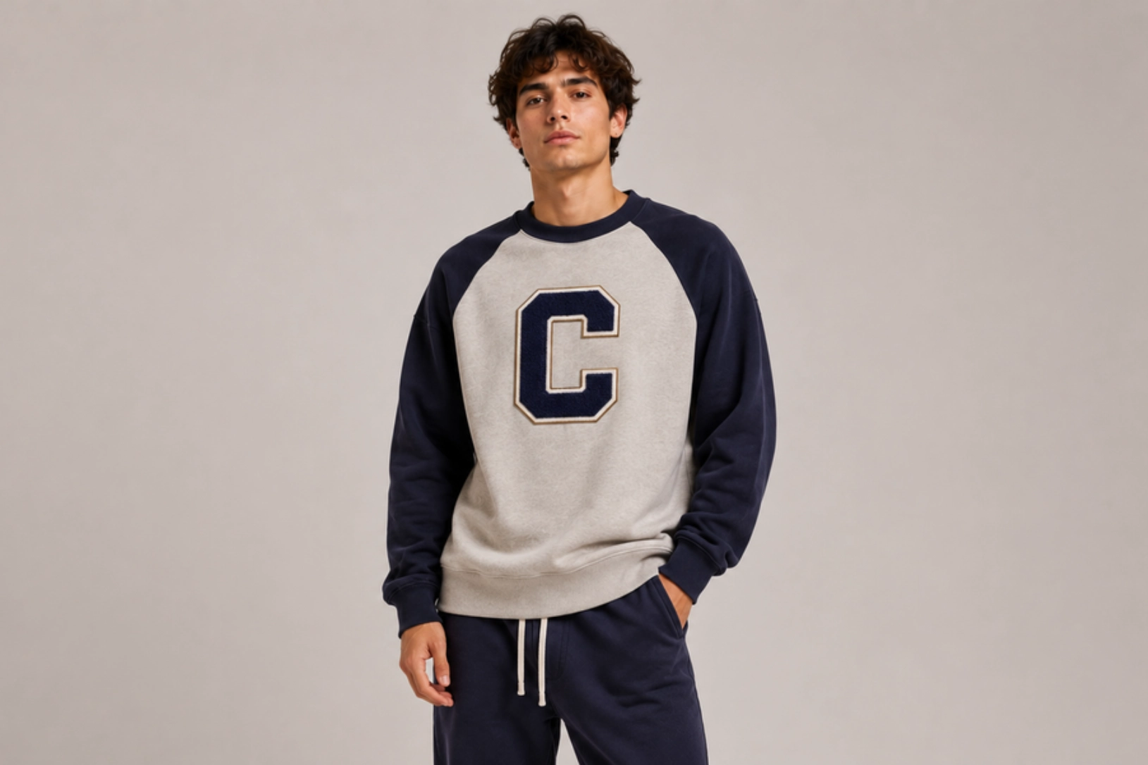
Soft chenille letters, embroidered borders, tackle twill appliqué, and bold varsity initials give raglan sweatshirts an authentic collegiate identity. Raised patches add texture and depth while showcasing school names, athletic numbers, mascots, or team emblems with a premium finish. Combined with contrasting raglan sleeves, this design captures the classic look of varsity jackets and heritage sportswear.
Best for: College apparel, sports teams, alumni merchandise, varsity fashion
Design placement: Center chest or left chest
Preferred print method: Chenille patch with embroidery
Styling tips: Pair with classic raglan color combinations, such as grey and navy or cream and burgundy, to reinforce the collegiate aesthetic.
Chain-Stitch Mascot Embroidery Design
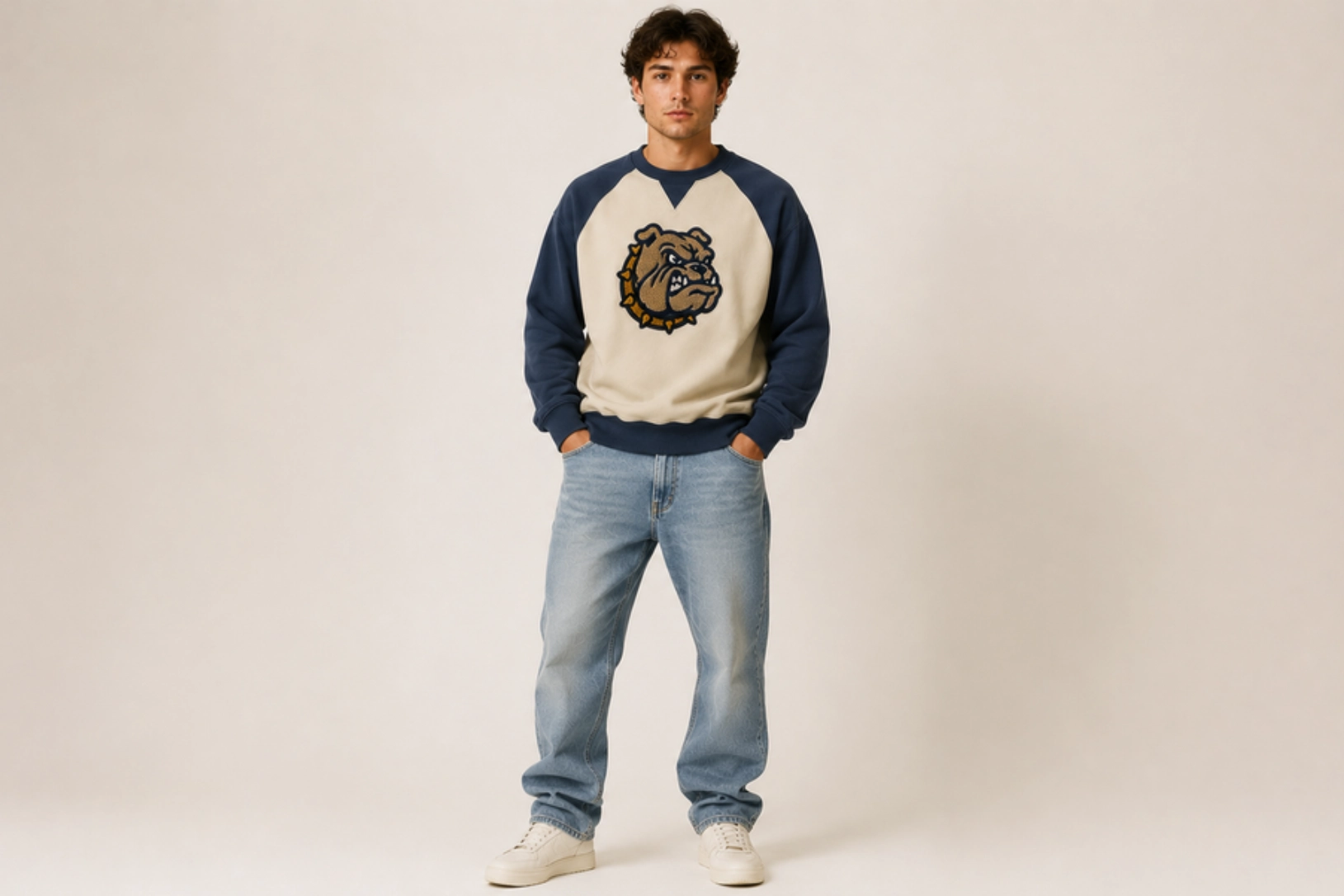
Chain-stitch embroidery, vintage mascots, athletic emblems, and bold lettering create raglan sweatshirts with handcrafted character and heritage appeal. The textured stitching adds dimension while enhancing animal mascots, school crests, baseball-inspired graphics, or retro team logos. This traditional embroidery technique complements the athletic roots of raglan sweatshirts and delivers a durable, premium finish.
Best for: School merchandise, vintage sportswear, college apparel, team apparel
Design placement: Center chest or left chest
Preferred print method: Chain-stitch embroidery
Styling tips: Use heavyweight raglan sweatshirts in vintage-inspired colors and keep additional graphics minimal to showcase the embroidery.
Distressed Oversized Graphic Design
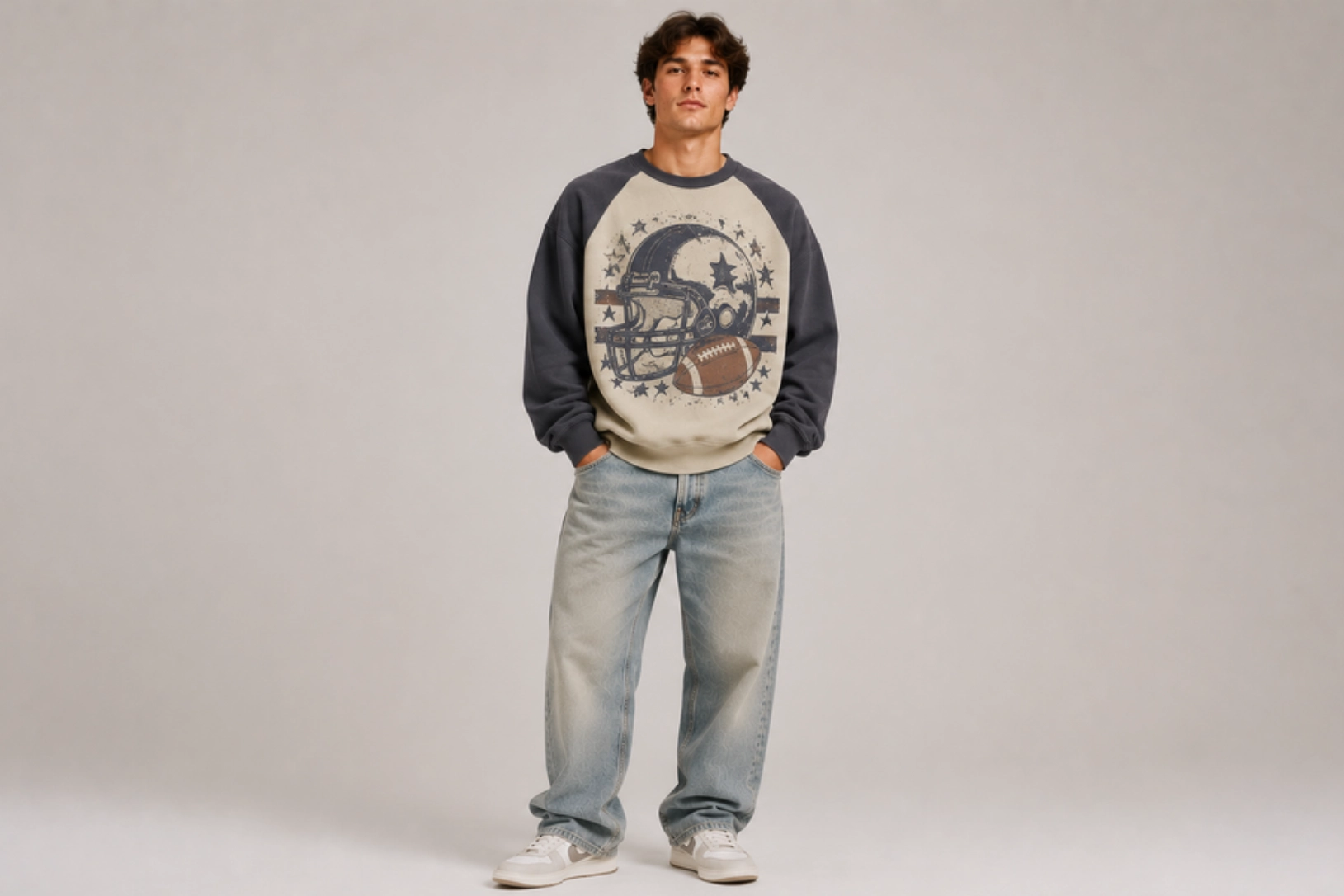
Oversized typography, faded illustrations, cracked ink textures, and vintage-inspired graphics create raglan sweatshirts with a bold yet worn-in appearance. Large front prints, retro athletic artwork, and distressed logos balance the sporty silhouette while adding streetwear appeal. Washed color palettes and soft distressing enhance the authentic vintage finish without overwhelming the contrasting sleeves.
Best for: Vintage streetwear, lifestyle brands, sports-inspired fashion, casual apparel
Design placement: Full front or oversized back
Preferred print method: Distressed screen printing or DTG
Styling tips: Pair with washed raglan sweatshirts in muted colors such as heather grey, faded navy, or cream for an authentic heritage look.
Botanical Sleeve-Seam Line Art Design
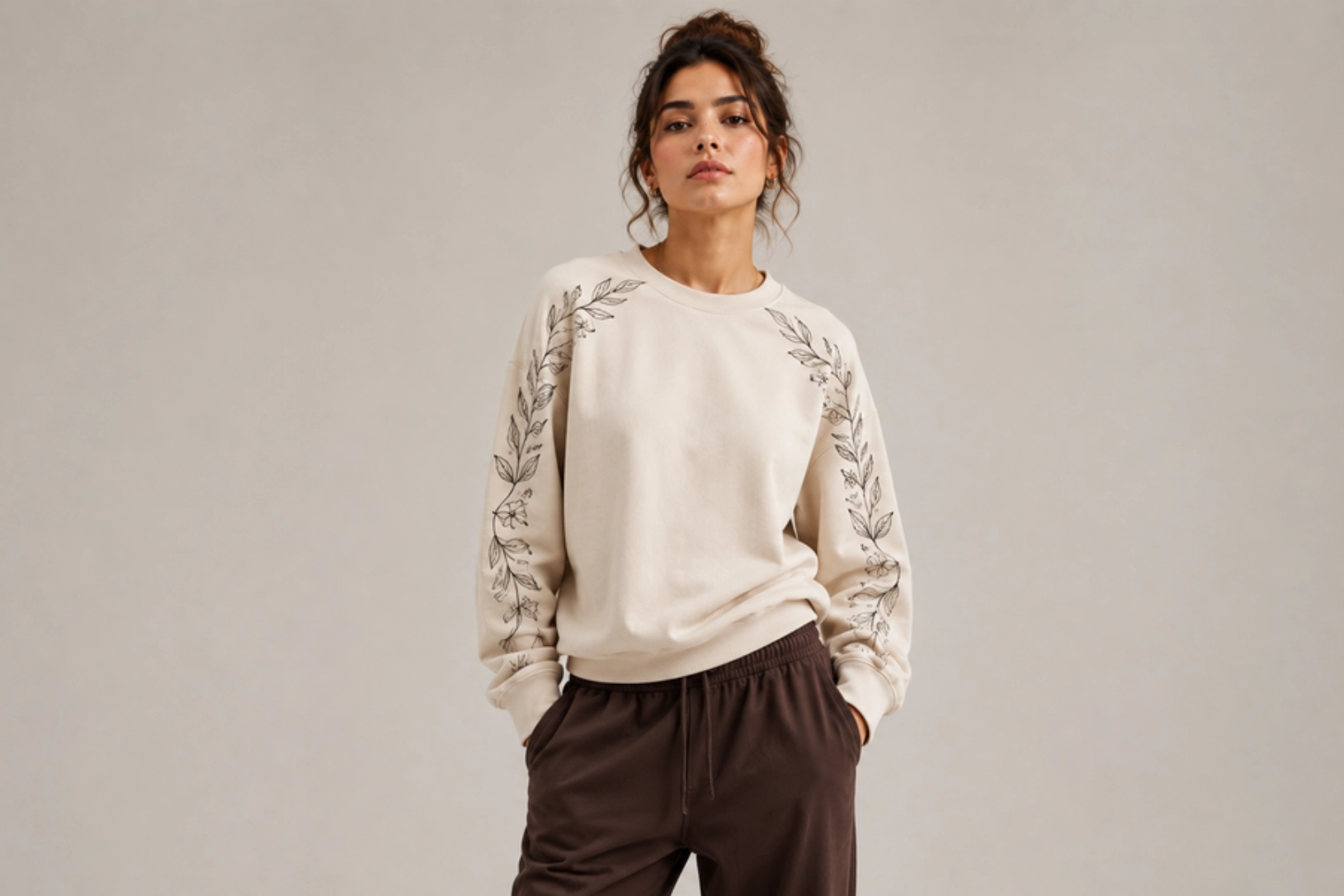
Delicate botanical illustrations, flowing vines, leafy branches, and continuous line art follow the raglan sleeve seams to create a subtle yet distinctive design. Instead of placing graphics across the chest, the artwork traces the garment’s unique construction, adding movement and visual interest. Fine monochrome lines and minimalist floral motifs complement lightweight embroidery or screen printing, making this style ideal for modern casualwear and boutique fashion.
Best for: Boutique brands, women’s apparel, minimalist fashion, lifestyle collections
Design placement: Along the raglan sleeve seams
Preferred print method: Screen printing or fine-line embroidery
Styling tips: Use neutral or earth-tone raglan sweatshirts with monochrome artwork to emphasize the elegant seam-following design.
Sherpa-Lined Sweatshirt Design Ideas
Sherpa-lined sweatshirts combine a soft insulating interior with durable outer fabrics, making them ideal for cold-weather layering and outdoor wear. Their heavyweight construction pairs well with utility-inspired details, textured embroidery, vintage graphics, and earth-tone palettes that emphasize warmth and craftsmanship. The ideas below balance function with modern style for winter fashion, outdoor brands, and premium casual apparel.
Mixed-Media Utility Panel Design
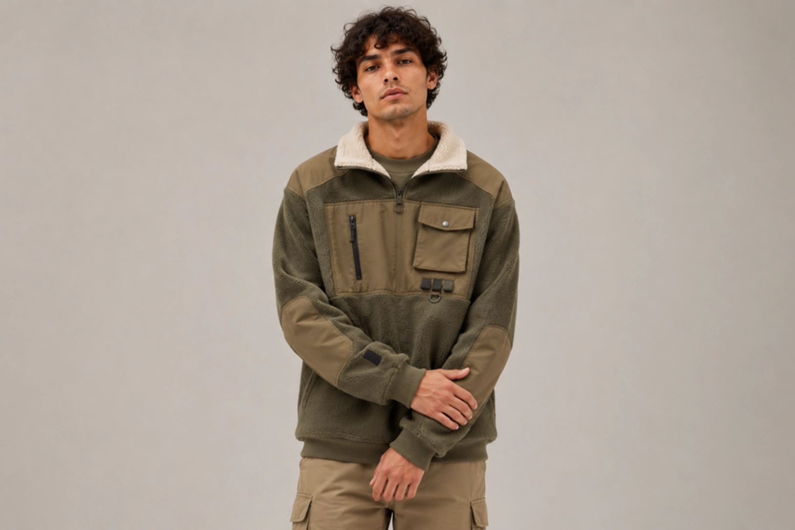
Canvas chest panels, ripstop pocket overlays, reinforced elbow patches, YKK zipper pockets, and woven utility labels give sherpa-lined sweatshirts a rugged outdoor aesthetic. Combining heavyweight cotton fleece with durable fabrics such as canvas, nylon, or Cordura creates visual contrast while improving durability in high-wear areas. Utility-inspired details, including webbing loops, snap-button pockets, and contrast stitching, add functional character without overwhelming the design, making this style popular for workwear, hiking apparel, and outdoor lifestyle collections.
Best for: Outdoor brands, workwear, hiking apparel, utility fashion
Design placement: Chest panels, pockets, shoulders, or elbows
Preferred print method: Cut-and-sew construction with woven labels or embroidery
Styling tips: Pair canvas or ripstop panels with neutral sherpa-lined sweatshirts in olive, tan, charcoal, or black for a durable outdoor-inspired finish.
Minimalist Chest Monogram Design
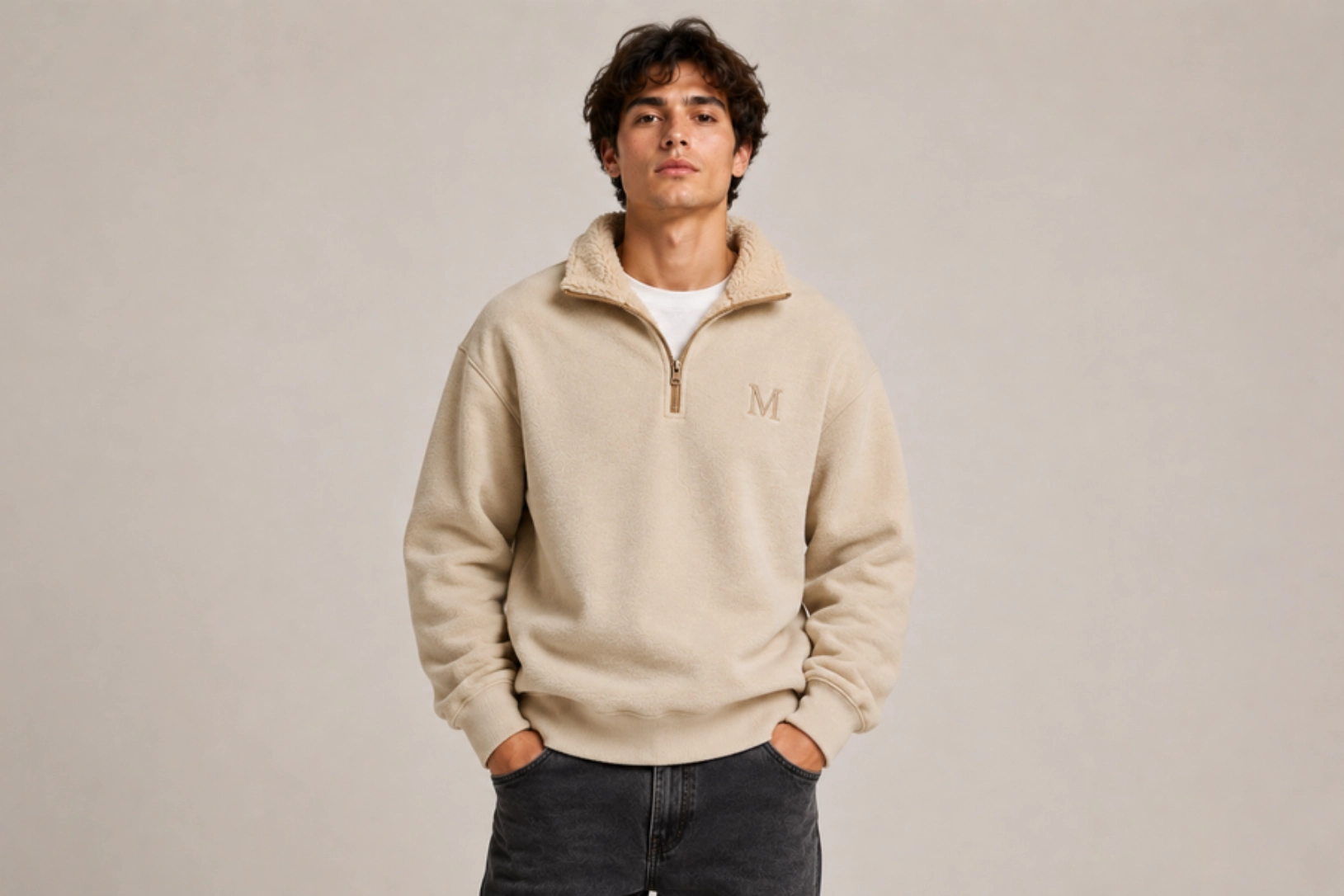
Tone-on-tone monograms, embroidered initials, clean serif lettering, and fine satin stitching create sherpa-lined sweatshirts with a refined, premium appearance. Positioned on the left chest, subtle embroidery complements the garment’s plush sherpa lining and heavyweight cotton exterior without competing with its textured construction. Matching thread colors, raised embroidery, and compact monograms add depth while maintaining a minimalist aesthetic, making this design equally suitable for luxury casualwear, corporate apparel, personalized gifts, and boutique fashion collections.
Best for: Premium apparel, personalized gifts, luxury basics, corporate wear
Design placement: Left chest
Preferred print method: Embroidery
Styling tips: Choose tonal embroidery on neutral-colored sherpa-lined sweatshirts to create a refined monochromatic finish.
Bold Retro Back Graphic Design
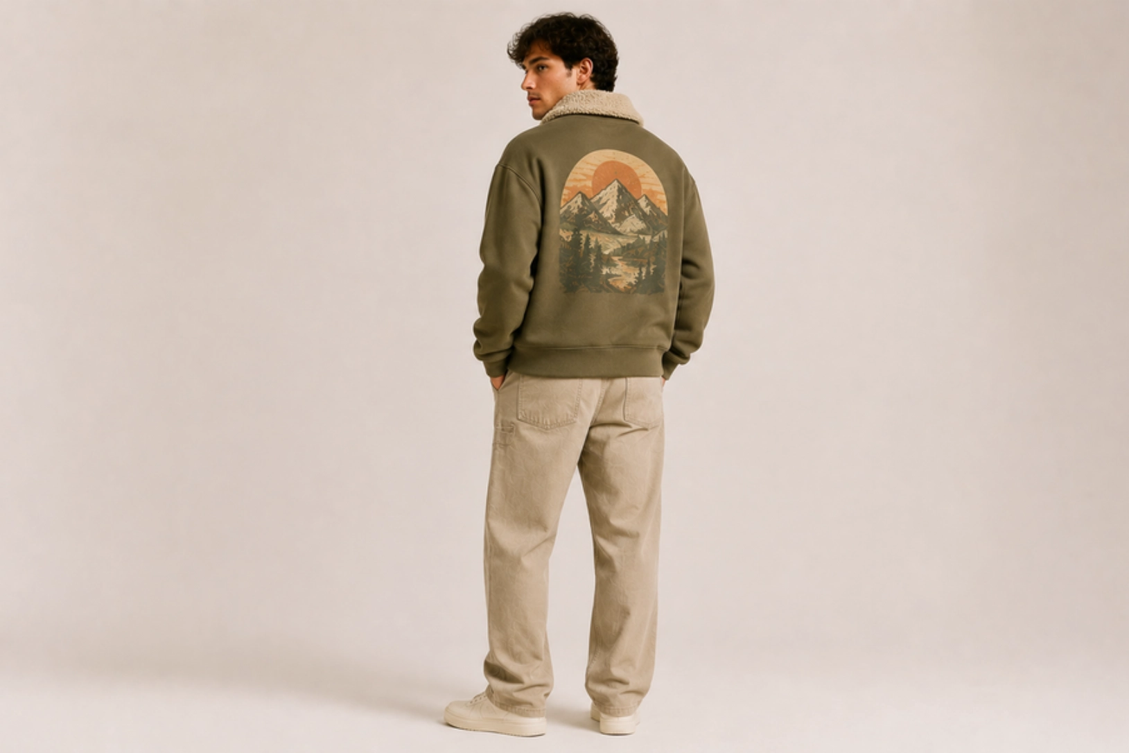
Oversized wilderness illustrations, vintage typography, retro badges, and faded color palettes transform the back of a sherpa-lined sweatshirt into a standout design feature. Inspired by national parks, mountain ranges, and heritage outdoor brands, these graphics often include pine forests, wildlife, and sunrise scenes printed with distressed textures for an aged look. A small embroidered chest logo paired with a large back print creates a balanced composition that suits the heavyweight construction.
Best for: Outdoor brands, travel merchandise, vintage streetwear, lifestyle apparel
Design placement: Oversized back with optional small chest logo
Preferred print method: Screen printing or DTG
Styling tips: Pair faded earth-tone graphics with olive, sand, charcoal, or cream sherpa-lined sweatshirts to reinforce the heritage outdoor aesthetic.
Vintage Earth-Tone Color-Blocked Design
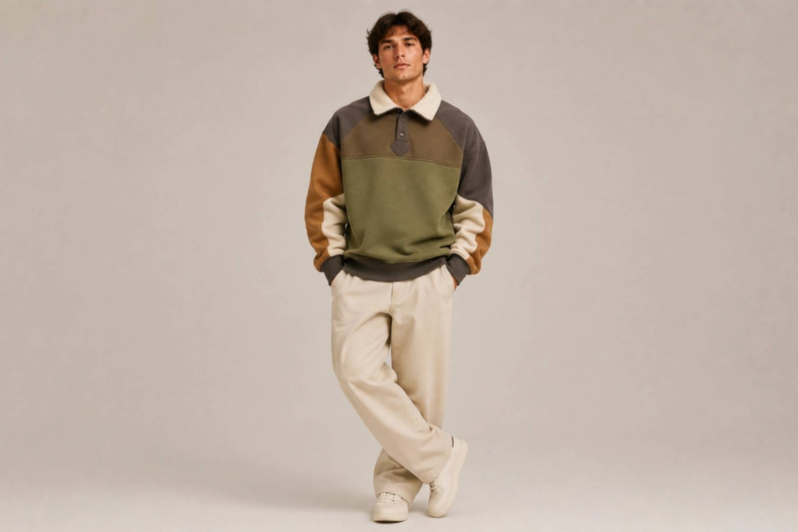
Olive green, camel, rust, cream, chocolate brown, and charcoal panels create a warm, heritage-inspired color palette that complements the cozy look of sherpa-lined sweatshirts. Color blocking across the sleeves, shoulders, or chest adds visual depth, while contrasting canvas trims, ribbed cuffs, and woven patches reinforce a classic outdoor aesthetic. Inspired by vintage hiking gear and workwear jackets, this design balances rugged functionality with everyday style.
Best for: Outdoor apparel, heritage fashion, casual winter wear, lifestyle brands
Design placement: Sleeves, chest panels, shoulders, or upper yoke
Preferred print method: Cut-and-sew color-block construction with embroidery or woven patches
Styling tips: Combine two or three earth-tone fabrics with subtle embroidery or woven labels to create a balanced, premium winter-inspired design.
Drop-Shoulder Sweatshirt Design Ideas
Drop-shoulder sweatshirts feature relaxed seams and oversized silhouettes that have become staples in modern streetwear and contemporary casual fashion. Their wider fit provides more space for bold graphics, textured prints, and statement typography while maintaining a laid-back appearance. The ideas below highlight styles that pair oversized proportions with premium finishes for fashion brands, custom merchandise, and everyday wear.
Puff-Ink Back Graphic Design
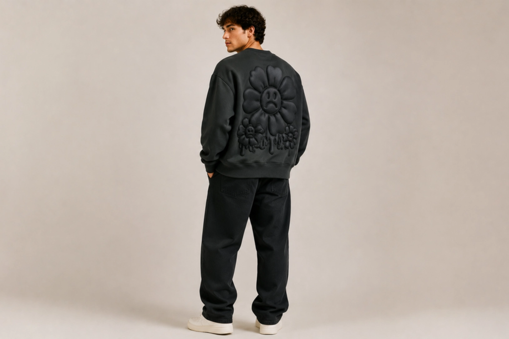
Raised puff ink, oversized typography, bold illustrations, and streetwear-inspired graphics turn the back of a drop-shoulder sweatshirt into a high-impact statement. Three-dimensional printing adds texture to block lettering, abstract artwork, graffiti-style graphics, or oversized brand logos, creating depth without relying on complex color palettes. The relaxed silhouette provides a large canvas for full-back designs, making puff printing especially effective on heavyweight cotton and oversized streetwear sweatshirts.
Best for: Streetwear brands, fashion collections, music merchandise, lifestyle apparel
Design placement: Oversized back with optional small chest logo
Preferred print method: 3D puff screen printing
Styling tips: Use monochrome or high-contrast graphics on black, charcoal, cream, or washed grey sweatshirts to emphasize the raised print effect.
3D Textured Embroidery Design
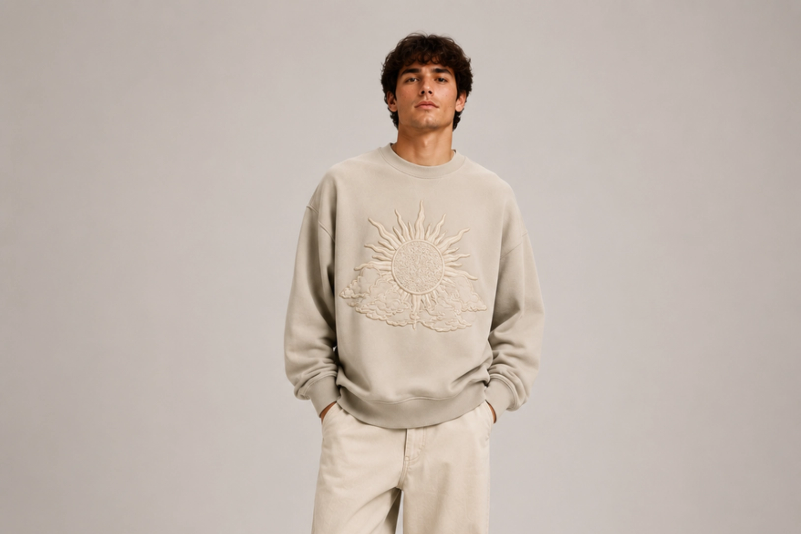
High-density embroidery, raised satin stitches, chenille accents, and layered threadwork give drop-shoulder sweatshirts a premium handcrafted appearance. Textured embroidery adds depth to oversized logos, varsity lettering, floral motifs, or abstract graphics while complementing the relaxed silhouette. Combining multiple stitch techniques creates a tactile finish that stands out without overwhelming the garment’s minimalist shape.
Best for: Premium streetwear, boutique fashion, luxury casualwear, branded apparel
Design placement: Center chest or oversized back
Preferred print method: High-density embroidery or chenille embroidery
Styling tips: Pair textured embroidery with heavyweight oversized sweatshirts in neutral colors to highlight the dimensional stitching.
Vintage Wash Design
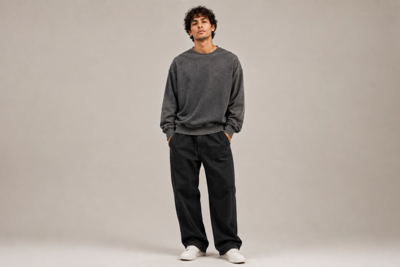
Garment-dyed fabrics, enzyme washing, pigment dyes, and faded color treatments give drop-shoulder sweatshirts an authentic worn-in character. Soft washes in faded black, washed olive, dusty blue, charcoal, and vintage cream create natural color variation that enhances oversized fits. Minimal graphics, distressed typography, or subtle embroidery pair seamlessly with the aged finish, making this style a favorite for heritage-inspired streetwear collections.
Best for: Vintage streetwear, premium basics, lifestyle brands, casual fashion
Design placement: Minimal chest graphic, oversized back, or sleeve detail
Preferred print method: Garment dyeing with screen printing, DTG, or embroidery
Styling tips: Choose heavyweight cotton sweatshirts with subtle fading and minimal graphics to let the vintage wash remain the defining feature.
Wide Chest Typography Design
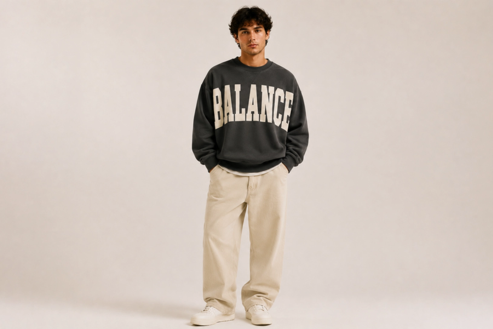
Extra-wide wordmarks, bold sans-serif lettering, collegiate fonts, and oversized brand names stretch across the chest to complement the broad proportions of drop-shoulder sweatshirts. Clean typography, generous letter spacing, and balanced layouts create strong visual impact while maintaining readability. Screen-printed slogans, motivational quotes, or minimalist branding work particularly well on relaxed silhouettes, delivering a modern streetwear aesthetic without excessive graphics.
Best for: Streetwear brands, lifestyle apparel, branded merchandise, fashion collections
Design placement: Full-width center chest
Preferred print method: Screen printing or DTG
Styling tips: Use oversized typography with simple color palettes and pair it with neutral sweatshirts to keep the design clean, bold, and contemporary.
Fitted Sweatshirt Design Ideas
Fitted sweatshirts offer a tailored silhouette that complements clean lines, refined details, and modern styling. Their structured shape works well with subtle embroidery, minimalist typography, and precision-cut panels that enhance the garment without adding bulk. The ideas below combine contemporary aesthetics with premium finishing techniques for fashion brands, athleisure collections, and everyday wear.
Tonal Chest Monogram Design
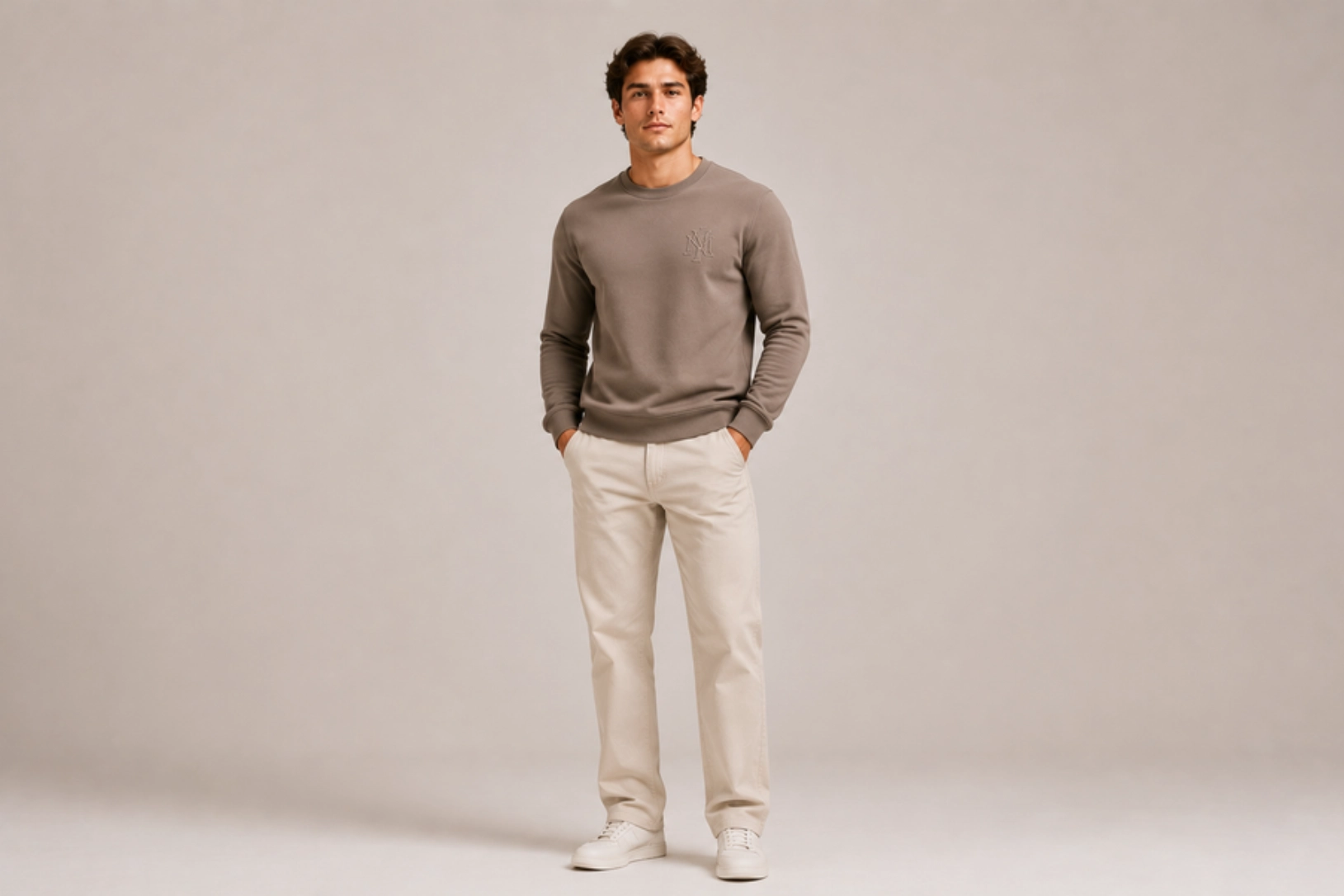
Tone-on-tone monograms, embroidered initials, minimalist logos, and fine satin stitching create fitted sweatshirts with a polished, understated aesthetic. Positioned on the left chest, tonal embroidery adds subtle texture while preserving the garment’s clean silhouette. Matching thread colors and compact monograms complement premium cotton blends, French terry fabrics, and performance fleece, making this design ideal for luxury casualwear and corporate apparel.
Best for: Premium apparel, corporate wear, luxury basics, personalized gifts
Design placement: Left chest
Preferred print method: Embroidery
Styling tips: Match the embroidery thread to the sweatshirt color for a refined monochromatic finish that emphasizes texture over contrast.
Minimalist Cuff Typography Design
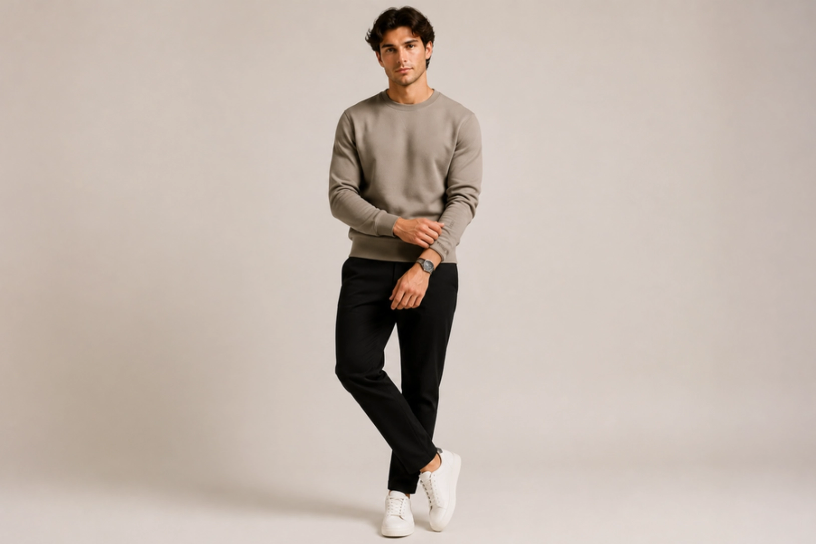
Small embroidered words, motivational phrases, brand signatures, or coordinates stitched along the ribbed cuff add a discreet design element without disrupting the sweatshirt’s streamlined look. Fine typography, tonal thread, and clean sans-serif fonts create a subtle premium detail that becomes noticeable only on closer inspection. This placement pairs particularly well with fitted silhouettes that emphasize tailored construction and minimalist styling.
Best for: Lifestyle brands, premium fashion, personalized apparel, luxury basics
Design placement: Ribbed cuff
Preferred print method: Embroidery
Styling tips: Keep the rest of the sweatshirt clean and choose short words or phrases for maximum readability.
Y2K Rhinestone Graphic Design
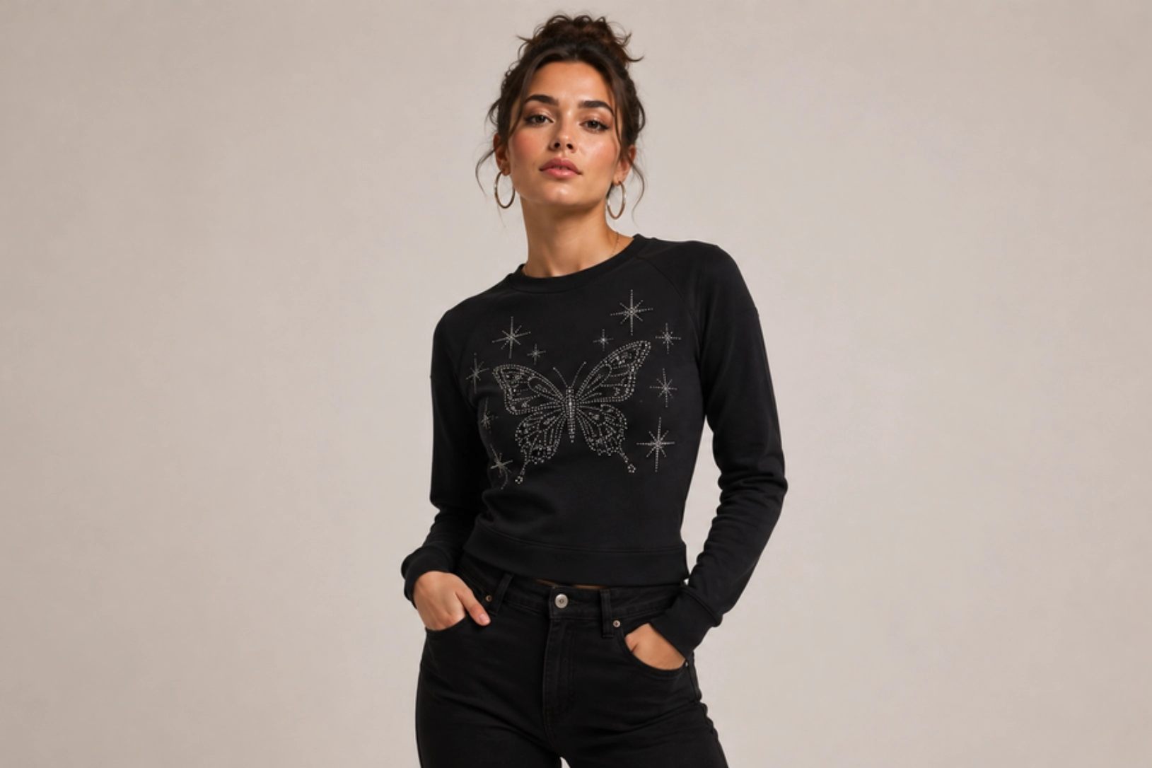
Crystal rhinestones, chrome typography, butterfly motifs, star graphics, and shimmering embellishments bring early-2000s fashion back to fitted sweatshirts. Inspired by Y2K pop culture, this design combines sparkling stone placement with script lettering, heart icons, flames, or celestial symbols to create eye-catching statement pieces. Placing rhinestones on the chest or upper back enhances the fitted silhouette while adding texture and reflective detail.
Best for: Women’s fashion, Y2K apparel, boutique brands, festival wear
Design placement: Center chest or upper back
Preferred print method: Rhinestone heat transfer
Styling tips: Pair crystal embellishments with black, baby pink, white, or lavender sweatshirts to amplify the nostalgic Y2K aesthetic.
Contrast Ribbed Trim Design
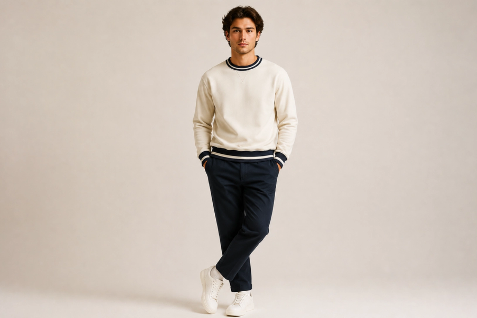
Contrasting ribbed collars, cuffs, and waistbands frame fitted sweatshirts with clean definition while adding subtle visual interest. Color combinations such as black and white, navy and cream, or forest green and beige highlight the garment’s tailored construction without relying on large graphics. This classic finishing detail is commonly used in premium sportswear, golf apparel, and heritage-inspired fashion collections.
Best for: Premium casualwear, golf apparel, athleisure brands, lifestyle fashion
Design placement: Collar, cuffs, and waistband
Preferred print method: Cut-and-sew ribbed trim construction
Styling tips: Use complementary trim colors and minimal branding to create a timeless, refined appearance.
Geometric Paneling Design
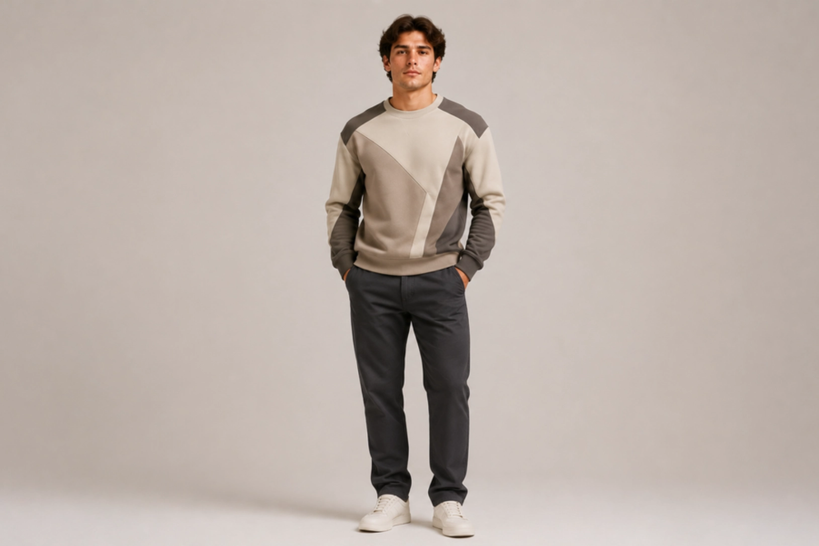
Angular seam lines, precision-cut fabric panels, color-blocked inserts, and structured construction give fitted sweatshirts a sleek architectural look. Diagonal chest panels, shoulder yokes, side inserts, or sleeve blocks create depth through garment construction rather than printed graphics. Combining smooth cotton, French terry, or performance knit fabrics in tonal or contrasting colors reinforces the modern aesthetic while maintaining a streamlined silhouette.
Best for: Contemporary fashion, athleisure collections, premium casualwear, designer apparel
Design placement: Chest, shoulders, side panels, and sleeves
Preferred print method: Cut-and-sew panel construction
Styling tips: Choose two or three complementary fabric colors and keep logos understated to showcase the geometric panel design.
Half-Zip Sweatshirt Design Ideas
Half-zip sweatshirts combine casual comfort with a sporty, layered silhouette, making them a popular choice for athleisure, golf apparel, outdoor wear, and premium casual fashion. The zipper placket naturally complements minimalist embroidery, color blocking, oversized graphics, and sleeve details without disrupting the garment’s clean lines. The ideas below showcase versatile styles that balance functionality with contemporary aesthetics.
Minimalist Left-Chest Embroidery Design
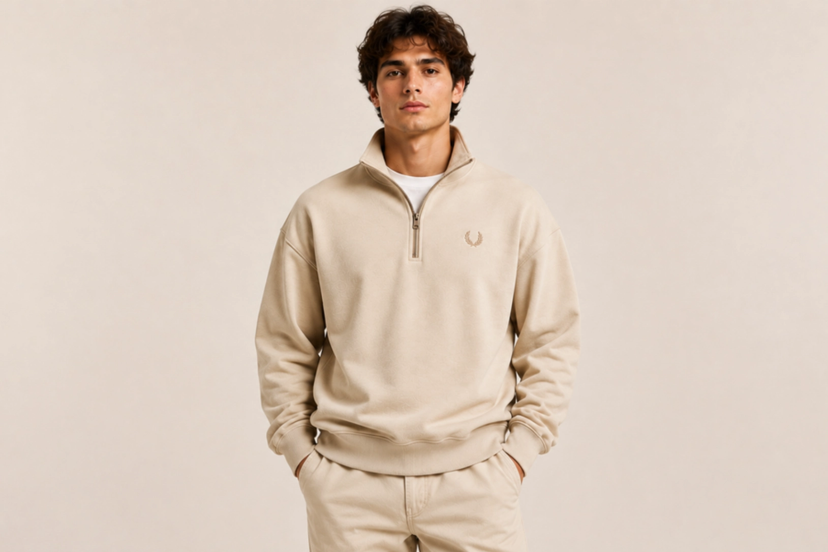
Small embroidered logos, monograms, initials, and minimalist icons create a clean, premium look that complements the structured design of a half-zip sweatshirt. Positioned beside the zipper placket, fine satin stitching and tonal embroidery add subtle texture without distracting from the high collar or metal zipper. This understated design works particularly well on cotton fleece, French terry, and performance knit fabrics, making it a versatile choice for golf apparel, corporate wear, and luxury casual collections.
Best for: Corporate apparel, golf wear, premium basics, lifestyle brands
Design placement: Left chest
Preferred print method: Embroidery
Styling tips: Match the embroidery thread to the sweatshirt color and choose matte or antique-finish zippers for a refined appearance.
Contrast Yoke Color-Block Design
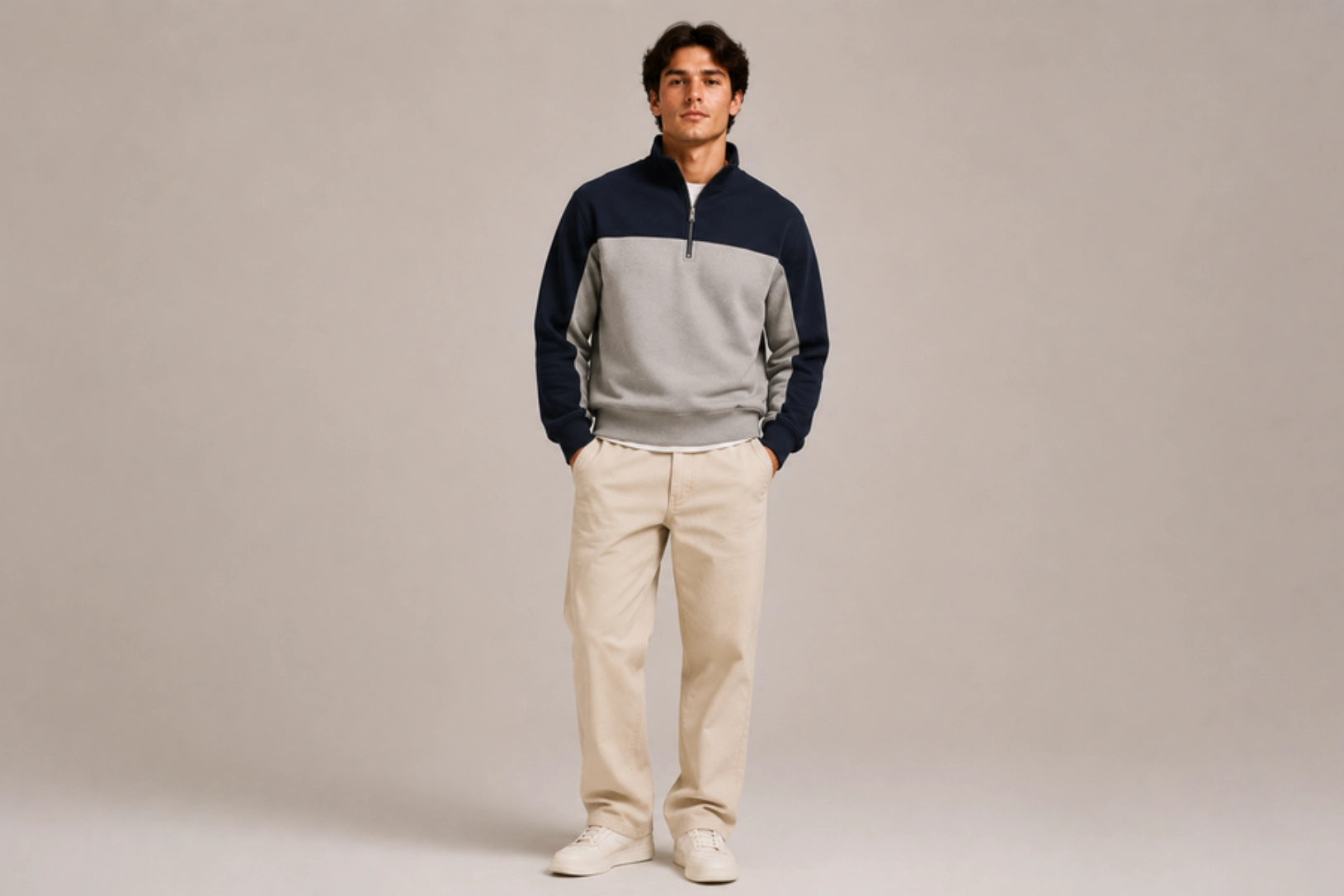
Contrasting shoulder yokes, upper chest panels, and sleeve transitions give half-zip sweatshirts a structured, athletic-inspired appearance. Color combinations such as navy and grey, black and tan, or forest green and cream highlight the yoke construction while drawing attention to the zipper neckline. Combining heavyweight fleece or French terry with subtle embroidery creates a balanced design inspired by heritage sportswear and outdoor apparel.
Best for: Outdoor brands, golf apparel, athleisure, casual fashion
Design placement: Shoulder yoke and upper chest
Preferred print method: Cut-and-sew color-block construction
Styling tips: Limit the design to two complementary colors and add a small embroidered logo for a clean, premium finish.
Oversized Back Graphic Design
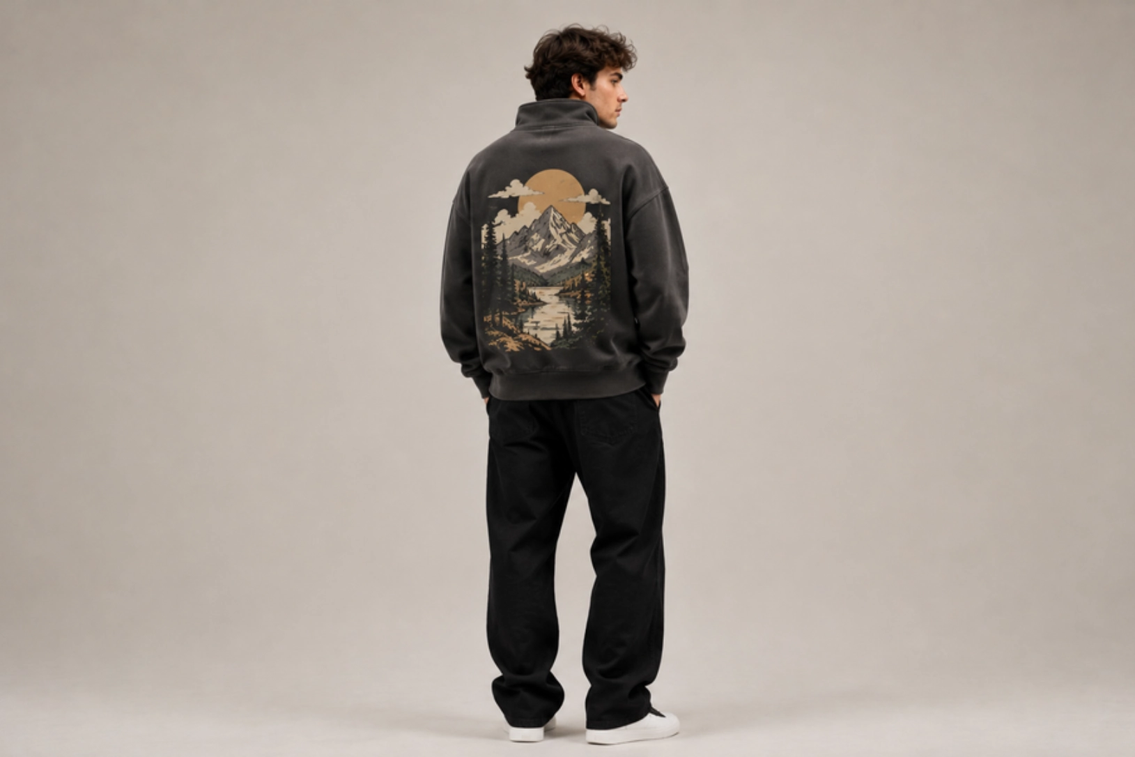
Large illustrations, bold typography, vintage badges, and destination-inspired artwork transform the back of a half-zip sweatshirt into a statement feature. Outdoor landscapes, collegiate graphics, retro sports logos, or adventure-themed illustrations pair naturally with the garment’s relaxed silhouette, while a small embroidered chest logo keeps the front balanced. Screen printing with soft-hand inks or DTG printing produces detailed graphics that complement heavyweight cotton and fleece fabrics.
Best for: Streetwear brands, outdoor apparel, travel merchandise, lifestyle collections
Design placement: Oversized back with optional left chest logo
Preferred print method: Screen printing or DTG
Styling tips: Pair large back graphics with neutral-colored half-zips and keep the front design minimal to maximize visual impact.
Vertical Sleeve Typography Half-Zip Sweatshirt Design
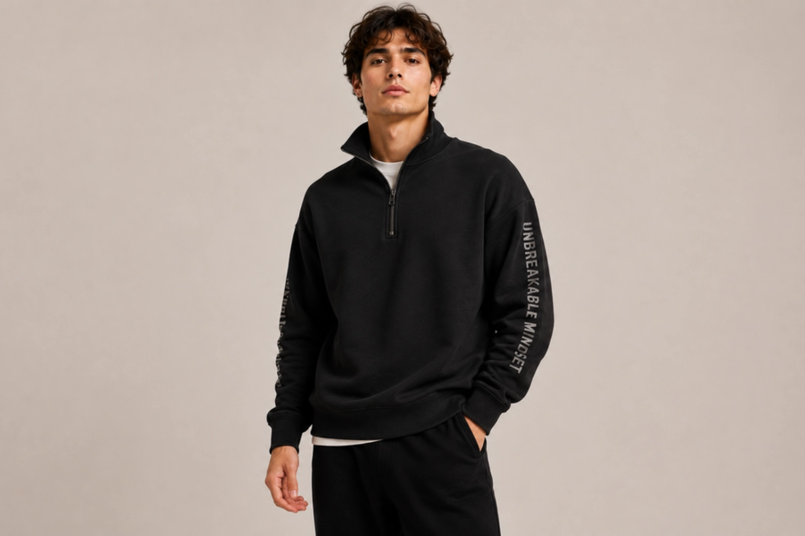
Vertical brand names, motivational quotes, geographic coordinates, and clean sans-serif typography printed along the sleeve create a modern athletic aesthetic. Running parallel to the sleeve seam, the text adds visual interest without competing with the zipper placket or collar, making it ideal for minimalist designs. This layout is commonly used in performance apparel, golf wear, and contemporary streetwear because it complements the streamlined silhouette of half-zip sweatshirts.
Best for: Athleisure brands, golf apparel, fitness wear, streetwear
Design placement: One or both sleeves
Preferred print method: Screen printing, heat transfer vinyl, or embroidery
Styling tips: Keep the chest free of large graphics and use clean typography with generous spacing for a sleek, modern finish.
Quarter-Zip Sweatshirt Design Ideas
Quarter-zip sweatshirts blend athletic heritage with polished casual styling, making them a popular choice for corporate apparel, golf collections, university merchandise, and everyday wear. The stand collar and quarter-length zipper create natural focal points for embroidery, typography, woven patches, and athletic-inspired graphics. The ideas below combine refined detailing with versatile construction for both professional and lifestyle applications.
Corporate Left-Chest Logo Embroidery Design
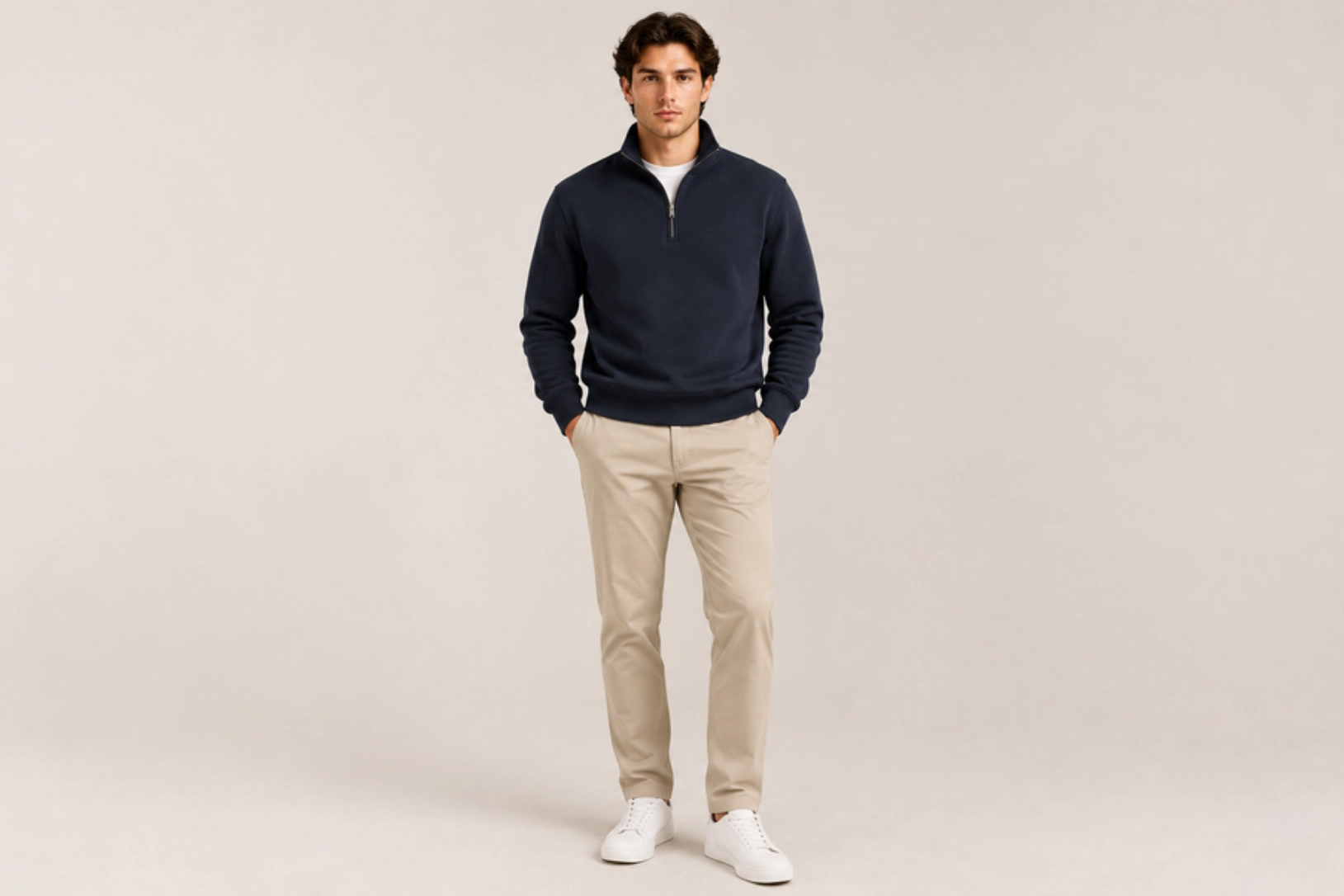
Clean embroidered company logos, minimalist brand marks, monograms, and professional emblems positioned on the left chest create a polished appearance that suits the structured silhouette of a quarter-zip sweatshirt. Fine satin stitching, tonal thread, and compact logo sizing maintain a refined look alongside metal or nylon coil zippers and ribbed cuffs. Premium cotton fleece, performance polyester blends, and moisture-wicking fabrics make this design suitable for office uniforms, conferences, client events, and executive team apparel.
Best for: Corporate uniforms, employee apparel, golf teams, promotional merchandise
Design placement: Left chest
Preferred print method: Embroidery
Styling tips: Pair tonal embroidery with neutral colors such as navy, charcoal, black, or heather grey and choose high-quality zipper hardware for a premium finish.
Vintage Collegiate Quarter-Zip Typography Design
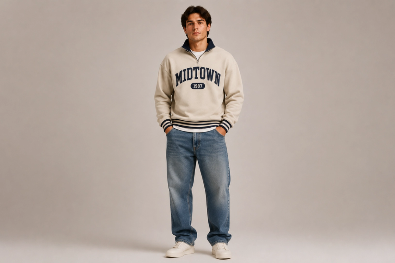
Classic varsity lettering, university-inspired wordmarks, established dates, and arched collegiate typography give quarter-zip sweatshirts a timeless campus aesthetic. Felt appliqué, tackle-twill lettering, chain-stitch embroidery, or distressed screen printing add authentic texture inspired by traditional college athletics. Contrasting ribbed collars, striped cuffs, and heritage color combinations such as navy and cream or maroon and grey reinforce the vintage academic look while preserving the sweatshirt’s clean structure.
Best for: University merchandise, alumni apparel, varsity collections, heritage fashion
Design placement: Center chest
Preferred print method: Chenille appliqué, tackle twill, embroidery, or screen printing
Styling tips: Combine collegiate typography with vintage color palettes and subtle distressed finishes for an authentic campus-inspired appearance.
Bold Athletic Numbering Design
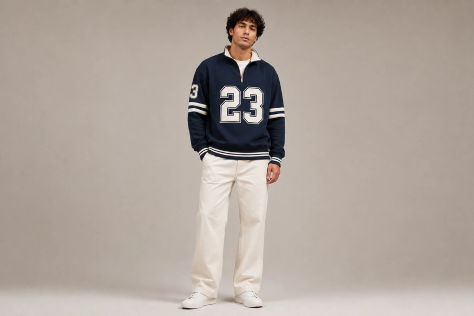
Oversized varsity numbers, block lettering, team names, and championship-inspired graphics transform quarter-zip sweatshirts into sporty statement pieces. Large numerals printed or appliquéd across the back, chest, or sleeve reference classic football, baseball, and basketball uniforms, while contrasting outlines and tackle twill fabrics add depth and durability. Pairing athletic numbering with striped rib trims and embroidered team logos creates a balanced design rooted in traditional sportswear.
Best for: Sports teams, athletic brands, fan merchandise, varsity apparel
Design placement: Back, center chest, or sleeve
Preferred print method: Tackle twill appliqué, screen printing, or heat transfer
Styling tips: Use bold contrasting colors and classic varsity fonts to create an authentic athletic aesthetic that remains easy to read from a distance.
Tonal Collar Embroidery Design
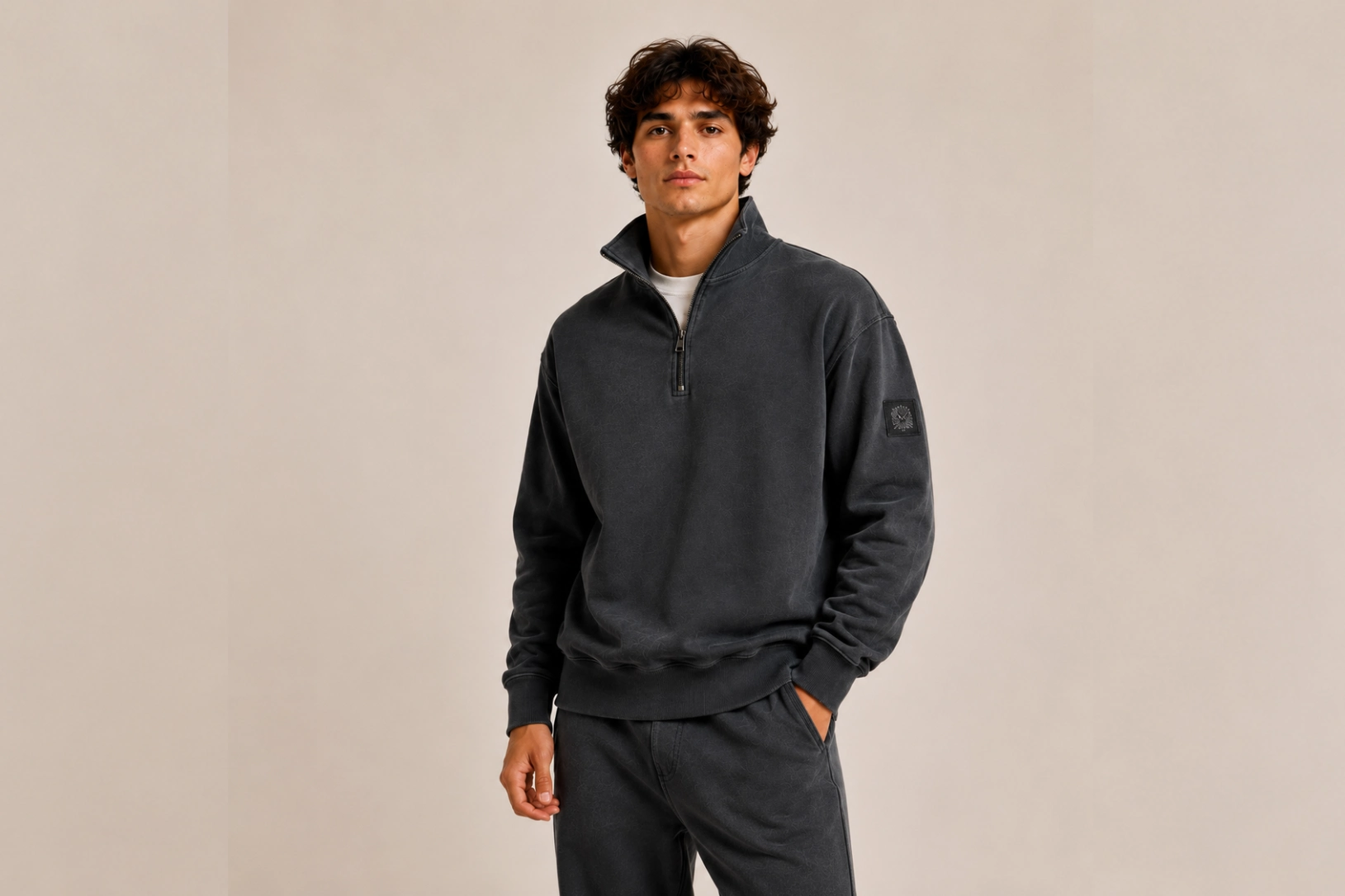
Subtle embroidered initials, coordinates, brand names, or signature icons stitched along the stand collar introduce an understated premium detail unique to quarter-zip sweatshirts. Matching thread colors, fine satin stitches, and clean typography preserve the minimalist appearance while drawing attention to the raised collar when worn zipped up or partially open. This discreet embellishment pairs naturally with smooth cotton fleece, French terry, and performance knit fabrics.
Best for: Luxury casualwear, golf apparel, premium basics, personalized apparel
Design placement: Stand collar
Preferred print method: Embroidery
Styling tips: Keep the chest branding minimal and use tonal thread to emphasize craftsmanship through texture rather than high color contrast.
Woven Fabric Patch Design
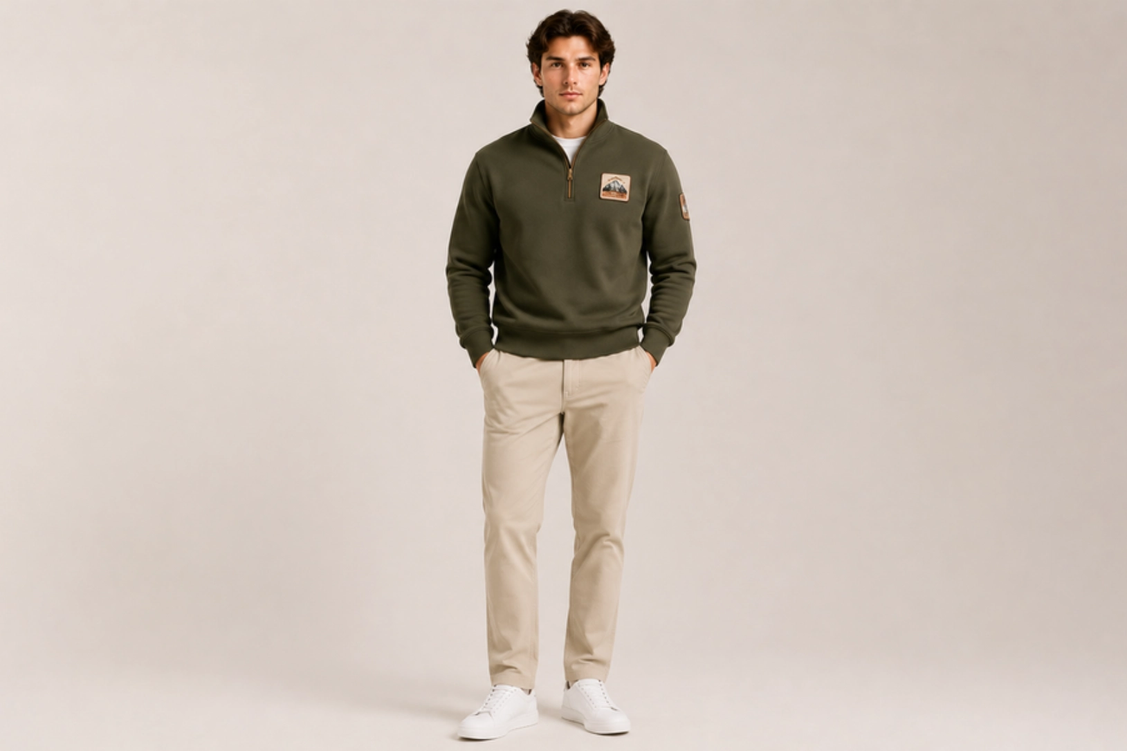
Premium woven labels, embroidered crest patches, heritage badges, and branded fabric emblems add texture and dimension without relying on large printed graphics. Twill patches, canvas badges, faux leather labels, and merrowed-edge emblems stitched onto the chest or sleeve create a durable finish inspired by outdoor apparel, collegiate uniforms, and vintage workwear. Reinforced stitching ensures long-lasting wear while complementing the structured construction of quarter-zip sweatshirts.
Best for: Heritage brands, outdoor apparel, university merchandise, lifestyle fashion
Design placement: Left chest, upper sleeve, or lower hem
Preferred print method: Woven patch or embroidered appliqué
Styling tips: Pair neutral-colored sweatshirts with woven patches in complementary earth tones or classic varsity colors to create a timeless, premium look.
Performance Sweatshirt Design Ideas
Performance sweatshirts are engineered for movement, comfort, and durability, making them ideal for training, team sports, and active lifestyles. Moisture-wicking polyester, stretch-knit panels, and breathable fleece blends provide functional benefits while supporting modern graphics and technical embellishments. The ideas below combine athletic aesthetics with innovative decoration techniques that maintain flexibility and long-lasting wear.
Gradient Screen-Print Design
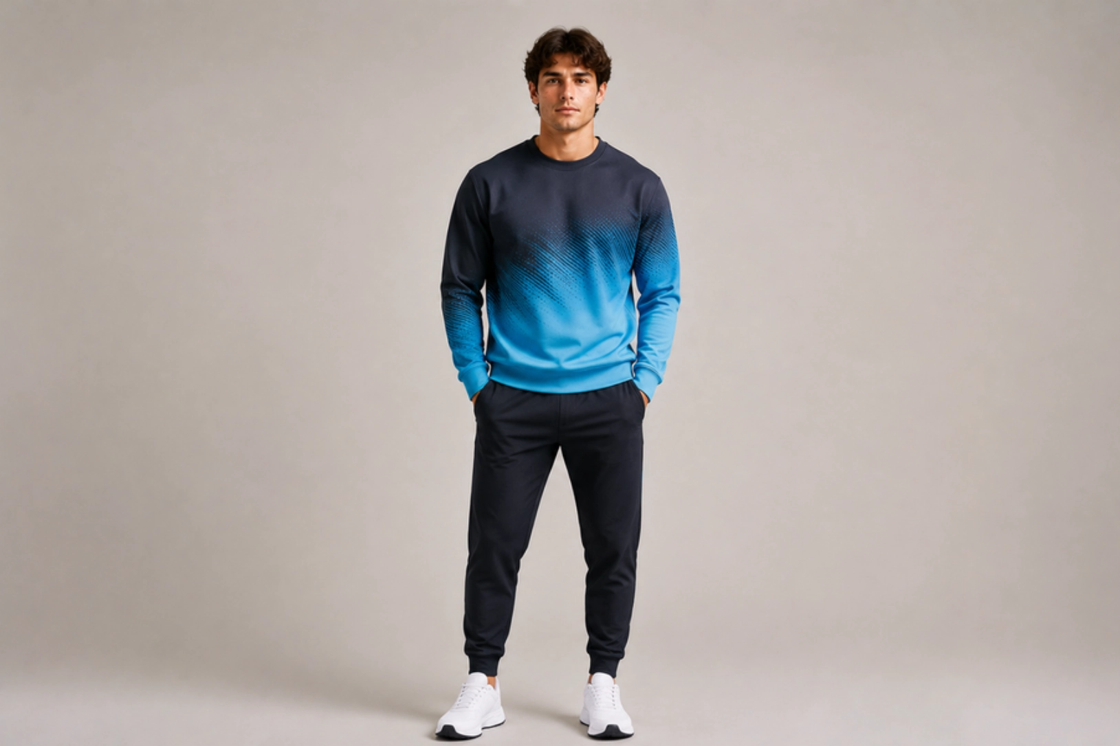
Smooth color transitions, dynamic geometric graphics, and athletic-inspired gradients create a sense of speed and motion across performance sweatshirts. Ombre effects blending navy into teal, black into electric blue, or charcoal into neon green pair well with lightweight polyester fleece, moisture-wicking fabrics, and stretch performance knits. Large chest graphics, angled side fades, and abstract motion patterns printed with soft-hand inks maintain breathability while delivering vibrant color without adding unnecessary weight.
Best for: Running apparel, gym wear, sports teams, fitness brands
Design placement: Full chest, front panel, or upper back
Preferred print method: Screen printing with gradient halftones
Styling tips: Pair high-contrast gradients with reflective accents and neutral base colors to create a clean, energetic athletic look.
Raised Silicone Logo Design
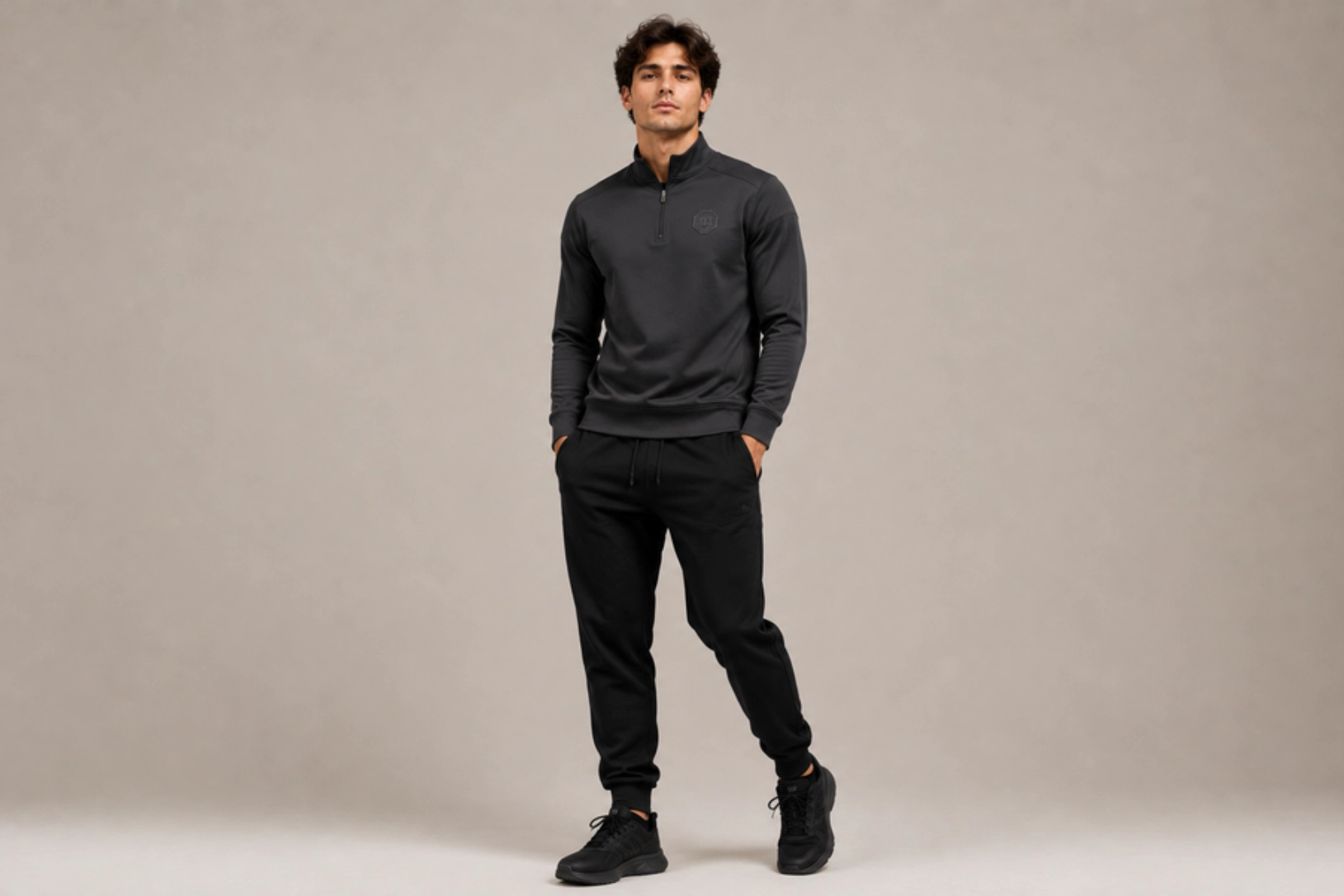
Three-dimensional silicone logos, molded rubber emblems, and matte TPU badges provide a durable, flexible branding solution for performance sweatshirts. Heat-applied silicone maintains its shape through stretching, repeated washing, and intense workouts while adding a modern technical aesthetic. Compact logos placed on the chest, sleeve, or upper back complement smooth performance fleece, recycled polyester, and compression-inspired fabrics without restricting movement or compromising comfort.
Best for: Sportswear brands, athletic uniforms, outdoor apparel, premium activewear
Design placement: Left chest, sleeve, or upper back
Preferred print method: Heat-applied silicone transfer
Styling tips: Combine tonal silicone logos with clean seam lines and performance fabrics to emphasize a sleek, high-tech appearance.
Reflective Seam-Stripe Design
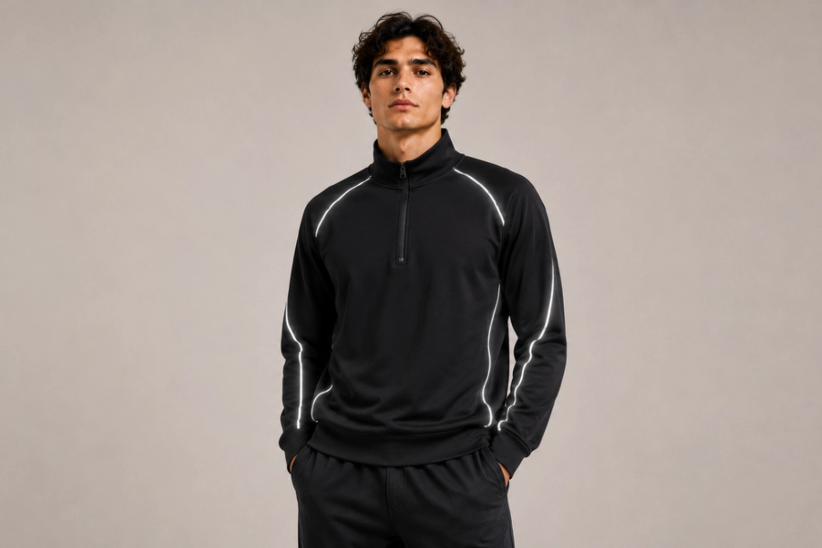
Reflective piping, heat-transfer seam stripes, and silver reflective tape enhance visibility while adding a technical design element to performance sweatshirts. Positioned along raglan seams, shoulders, sleeves, or side panels, reflective details catch the light during early-morning runs, evening training sessions, and outdoor activities. Stretch-compatible reflective materials integrate seamlessly with moisture-wicking fabrics, flatlock stitching, and ergonomic panel construction for both safety and style.
Best for: Running apparel, cycling gear, outdoor fitness, performance sportswear
Design placement: Shoulder seams, sleeves, side panels, or upper back
Preferred print method: Reflective heat-transfer film or reflective piping
Styling tips: Pair reflective details with dark performance fabrics such as black, graphite, or navy for maximum nighttime visibility.
Vertical Motivational Typography Design
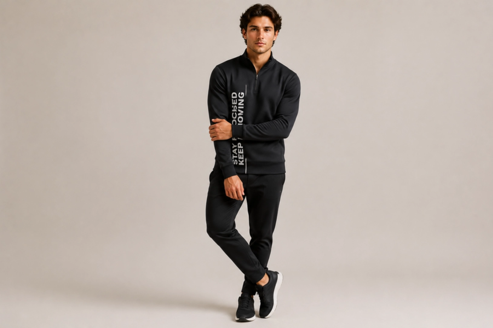
Inspirational quotes, training slogans, achievement-focused messaging, and clean sans-serif typography printed vertically along the torso or sleeve reinforce an athletic mindset without overwhelming the garment. Performance-focused phrases such as “Never Settle,” “Train Hard,” or “Stay Ready” complement streamlined silhouettes and technical fabrics. Minimal layouts, high-contrast lettering, and durable inks maintain readability while preserving the sweatshirt’s lightweight feel.
Best for: Fitness brands, gym apparel, training programs, motivational merchandise
Design placement: Sleeve, side panel, or front torso
Preferred print method: Screen printing or heat transfer
Styling tips: Use concise phrases with bold typography and pair them with monochromatic performance fabrics for a clean, modern athletic aesthetic.
Sublimated Topographic Pattern Design
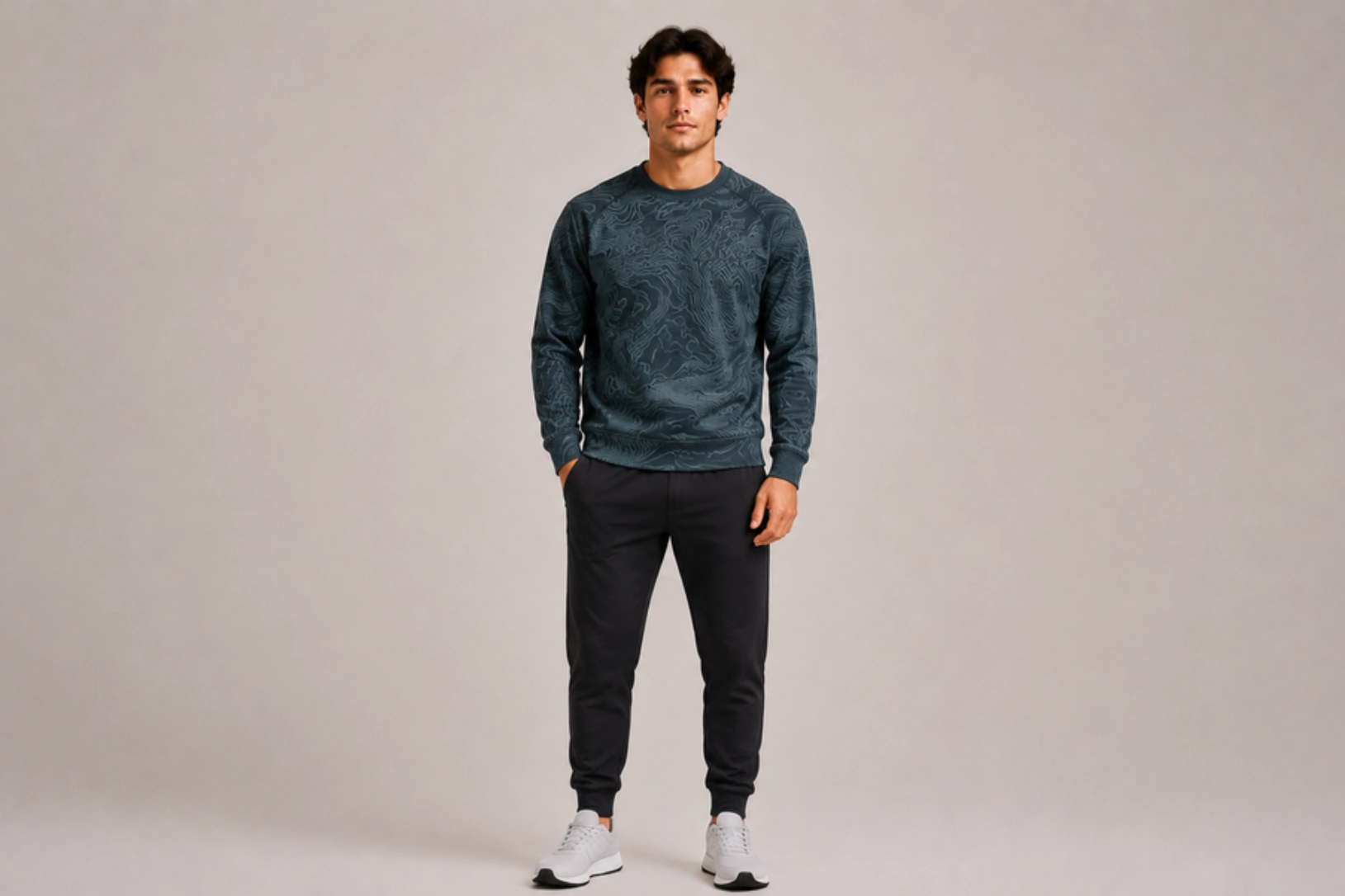
Topographic contour lines, digital terrain maps, elevation graphics, and abstract geographic patterns create an energetic visual texture across performance sweatshirts. Full-panel sublimation allows intricate linework and tonal gradients to become part of the fabric without affecting breathability, flexibility, or moisture management. Inspired by hiking trails, mountain landscapes, GPS mapping, and endurance sports, this design delivers a technical outdoor aesthetic that complements lightweight polyester and recycled athletic fabrics.
Best for: Trail running, hiking apparel, outdoor brands, endurance sports
Design placement: Full body, sleeves, shoulder panels, or upper chest
Preferred print method: Dye sublimation
Styling tips: Choose tonal contour patterns in charcoal, slate blue, forest green, or black to create subtle depth while maintaining a premium technical appearance.
Full-Zip Sweatshirt Design Ideas
Full-zip sweatshirts combine versatility with functional design, making them popular for streetwear, athleisure, corporate apparel, and outdoor layering. The front zipper divides the garment into two panels, creating opportunities for split graphics, mirrored typography, sleeve details, and oversized back artwork. The ideas below maximize the unique construction of zip-front garments while maintaining a balanced, visually appealing layout.
Split-Front Graphic Design
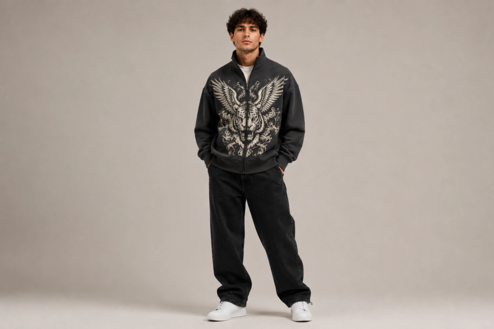
Large illustrations, geometric artwork, mascots, or abstract graphics, seamlessly divided across both sides of the zipper, create an eye-catching visual effect when the sweatshirt is fully zipped. Precision alignment ensures the artwork connects naturally across the zipper placket, while bold linework, oversized illustrations, and high-resolution graphics minimize visual interruption. Heavyweight cotton fleece, French terry, and brushed-back knit fabrics provide a stable surface for accurate graphic registration and long-lasting print quality.
Best for: Streetwear brands, artist merchandise, fashion collections, promotional apparel
Design placement: Full front across both zipper panels
Preferred print method: Screen printing or DTG
Styling tips: Use symmetrical artwork with bold outlines to ensure the graphic remains recognizable whether the zipper is open or closed.
Mirrored Typography Design
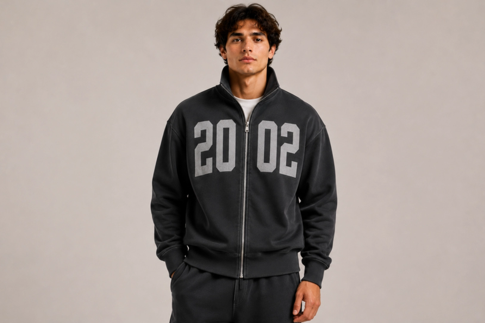
Bold words, stacked phrases, oversized initials, or brand names mirrored across each side of the zipper create a clean, contemporary design that highlights the garment’s construction. Sans-serif fonts, varsity lettering, and minimalist typography align precisely along the zipper to form complete words when the zipper is fully closed. High-density screen printing or embroidery keeps the design crisp while allowing the zipper to remain the visual center of the composition.
Best for: Lifestyle brands, streetwear, gym apparel, branded merchandise
Design placement: Split front panels
Preferred print method: Screen printing, embroidery, or heat transfer
Styling tips: Choose bold typography with generous letter spacing and avoid intricate fonts that may lose readability across the zipper.
Puff-Ink Chest Design
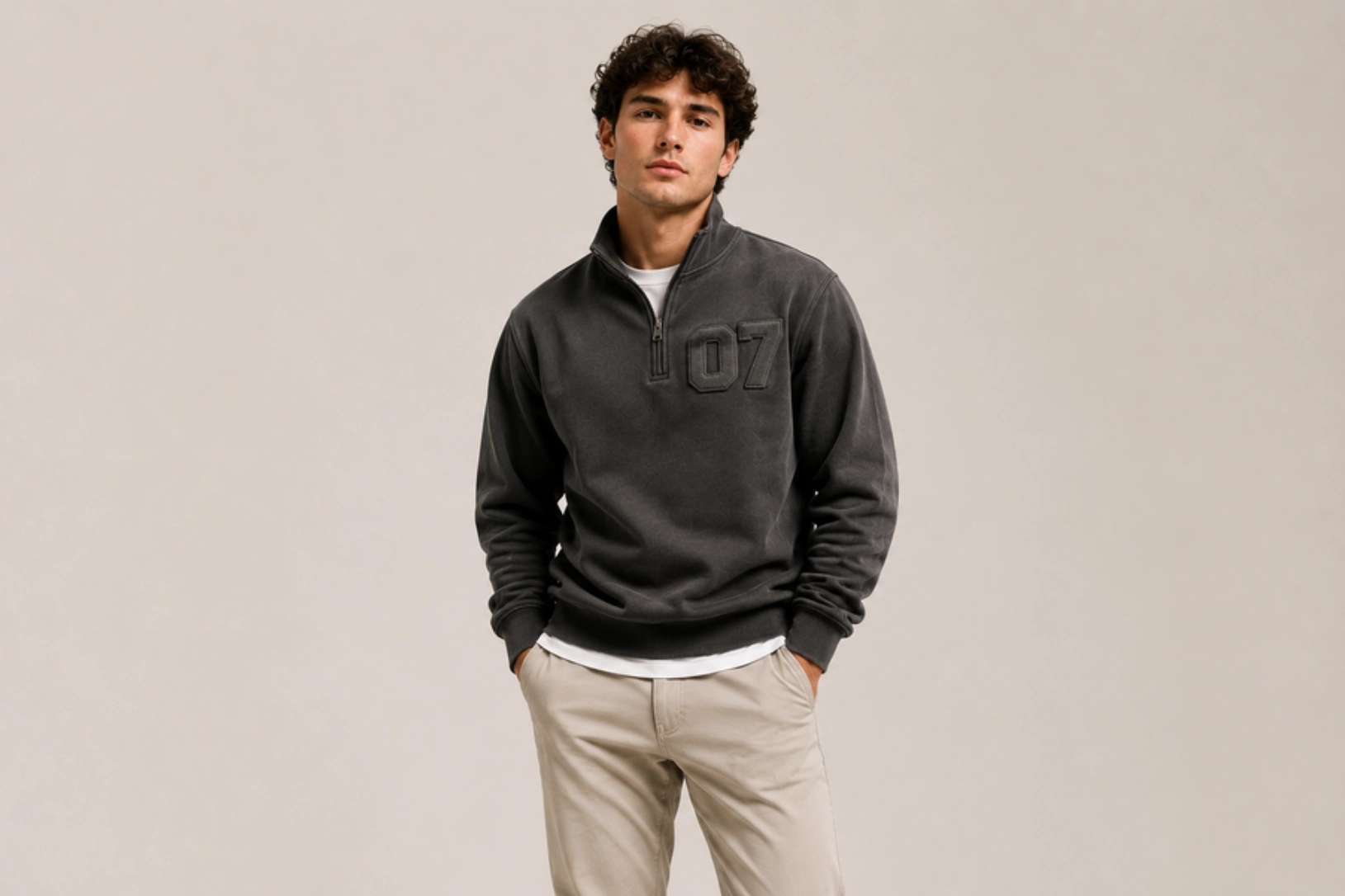
Raised puff ink, bold logos, oversized initials, and minimalist graphics add tactile dimension to the chest without overwhelming the functional zip-front silhouette. Positioned on one side of the zipper, puff printing creates a soft three-dimensional finish that pairs naturally with heavyweight cotton fleece, garment-dyed fabrics, and oversized streetwear styles. Monochromatic color schemes and thick block lettering further emphasize the elevated texture while maintaining a modern aesthetic.
Best for: Streetwear brands, premium casualwear, fashion collections, lifestyle apparel
Design placement: Left or right chest
Preferred print method: 3D puff screen printing
Styling tips: Pair tonal puff prints with washed black, charcoal, cream, or olive sweatshirts to highlight the raised texture through subtle contrast.
Oversized Back Graphic Full-Zip Sweatshirt Design
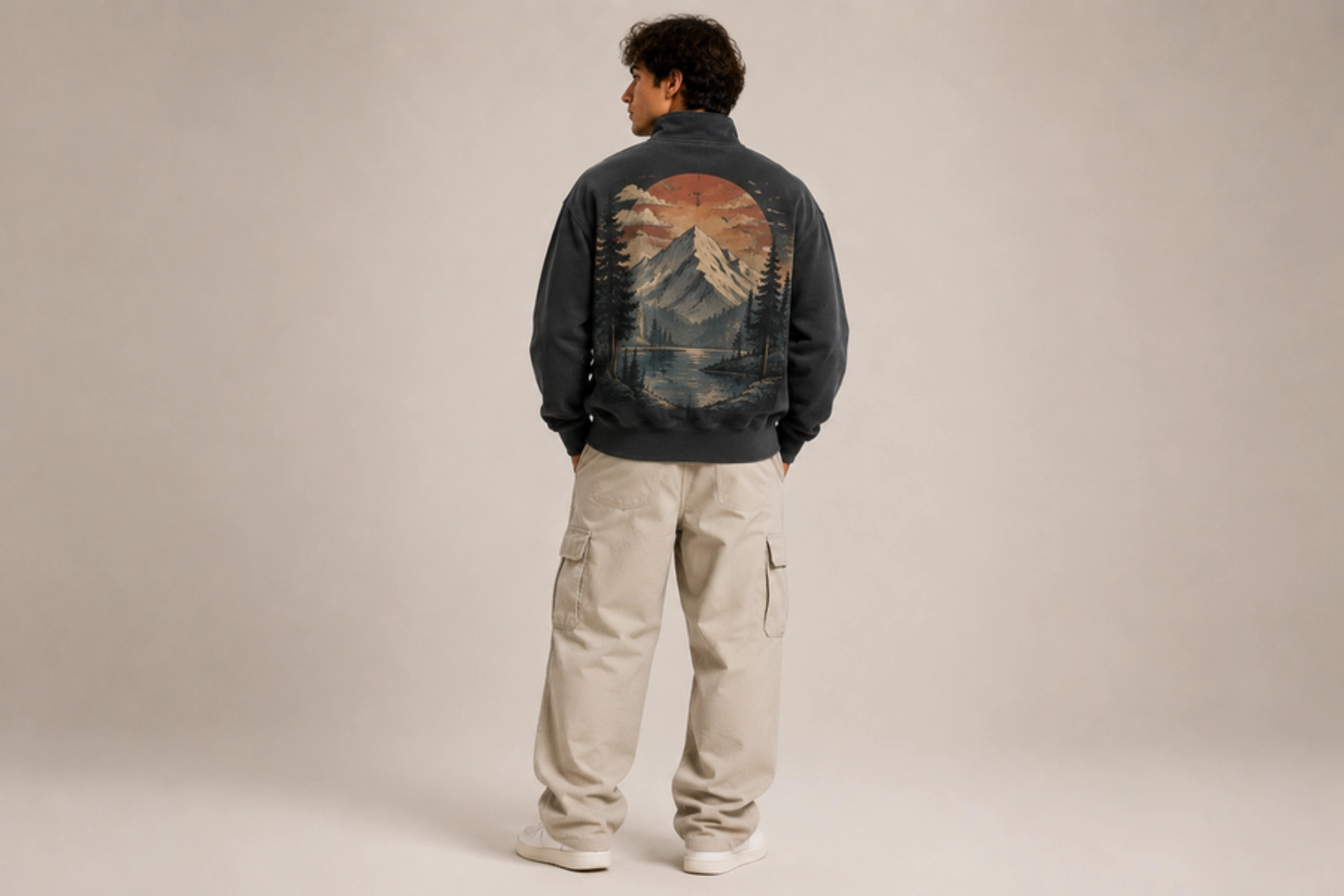
Large destination illustrations, vintage sports graphics, graffiti artwork, anime-inspired illustrations, or outdoor landscape prints transform the uninterrupted back panel into the focal point of a full-zip sweatshirt. Soft-hand screen printing and DTG technology reproduce intricate details while preserving fabric flexibility and comfort. A small embroidered chest logo or woven hem label balances the front, allowing the oversized back artwork to become the garment’s signature feature.
Best for: Streetwear labels, band merchandise, outdoor brands, lifestyle apparel
Design placement: Full back with optional small chest logo
Preferred print method: Screen printing or DTG
Styling tips: Combine oversized back graphics with understated front branding to create a clean front profile and a memorable statement from the back.
Vertical Sleeve Symbol Design
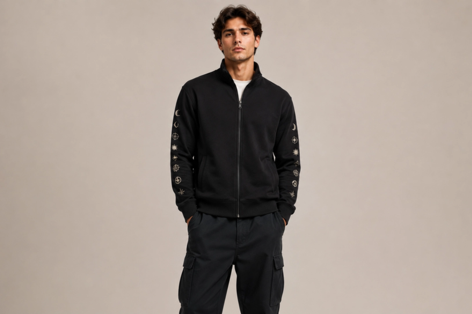
Minimal icons, geometric symbols, celestial motifs, Japanese characters, or athletic-inspired emblems arranged vertically along the sleeve create subtle visual movement without competing with the zipper. Repeating graphics, tonal embroidery, silicone transfers, or screen-printed symbols follow the sleeve seam to reinforce the streamlined silhouette. This understated approach works particularly well on performance fleece, heavyweight cotton, and modern streetwear collections where refined details elevate the overall design.
Best for: Contemporary streetwear, performance apparel, outdoor brands, minimalist fashion
Design placement: One or both sleeves
Preferred print method: Screen printing, embroidery, or silicone transfer
Styling tips: Keep the chest graphics minimal and use evenly spaced symbols to create a balanced, modern design that complements the clean zip-front construction.
Mock-Neck Sweatshirt Design Ideas
Mock-neck sweatshirts feature a raised collar that elevates the classic sweatshirt silhouette, bridging casual comfort and contemporary fashion. The higher neckline creates opportunities for subtle embroidery, contrast trims, and premium detailing. Popular in minimalist streetwear, golf apparel, and luxury casual collections, they emphasize craftsmanship over oversized decoration.
Vintage Arched Graphic Design
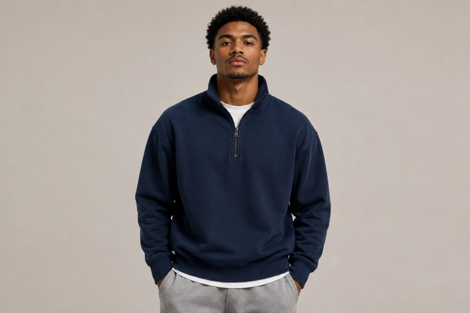
Classic arched typography, retro athletic lettering, established dates, and heritage-inspired emblems create a timeless graphic that complements the structured neckline of a mock-neck sweatshirt. Distressed screen printing, faded inks, cracked textures, and collegiate fonts evoke vintage university apparel, while small shield crests, laurel wreaths, or mascot illustrations reinforce the nostalgic aesthetic. Heavyweight cotton fleece, garment-dyed fabrics, and washed finishes enhance the authentic worn-in appearance without overpowering the garment’s clean silhouette.
Best for: Heritage fashion, university merchandise, vintage streetwear, lifestyle brands
Design placement: Center chest
Preferred print method: Distressed screen printing or DTG
Styling tips: Pair vintage typography with washed navy, faded black, heather grey, or forest green sweatshirts for an authentic collegiate-inspired look.
Minimalist Collar Embroidery Design
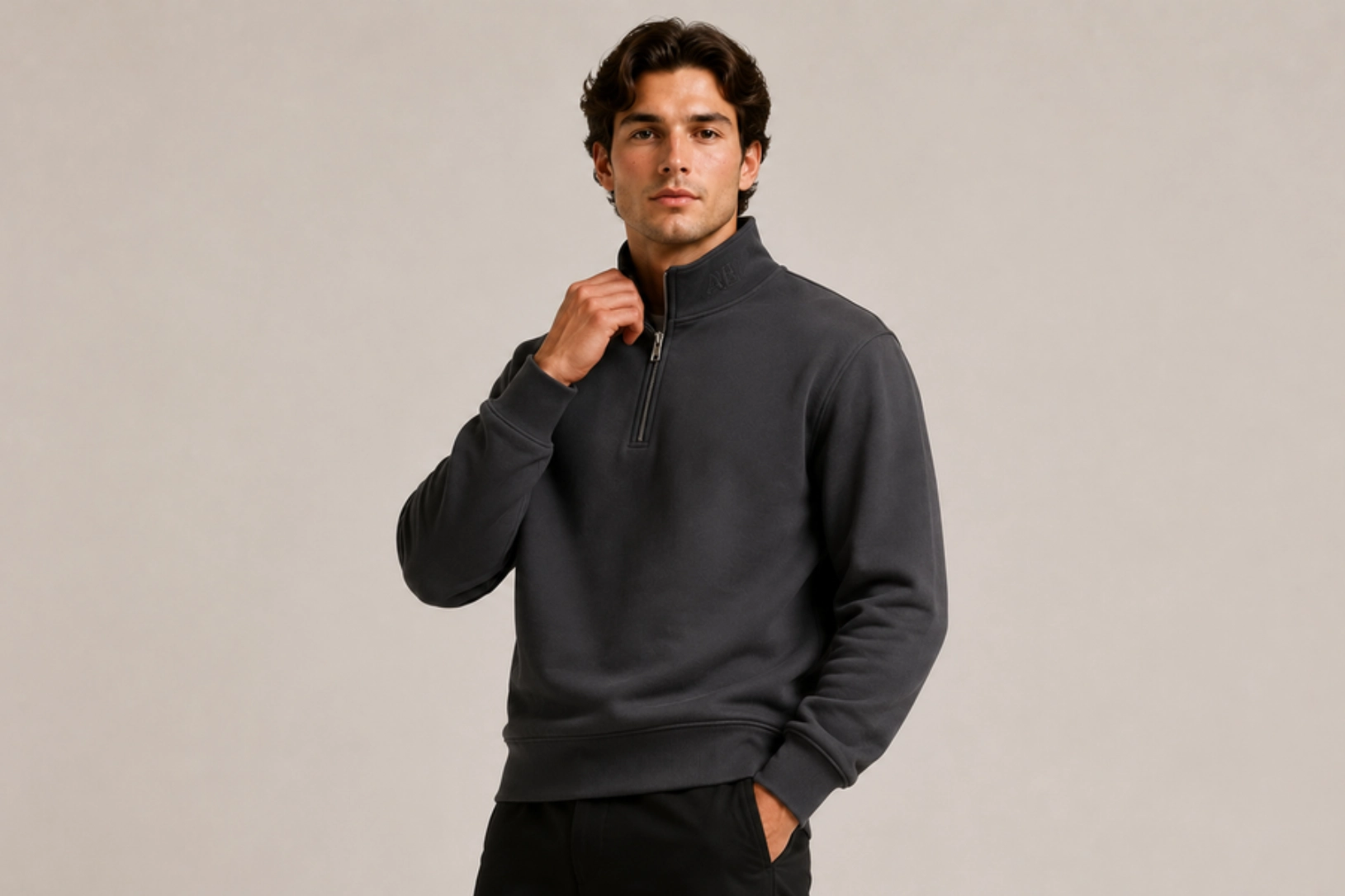
Small embroidered initials, monograms, coordinates, brand signatures, or symbolic icons stitched directly onto the mock neck create a refined detail visible when the collar is folded or worn upright. Fine satin stitching, tonal thread, and compact typography maintain the sweatshirt’s minimalist aesthetic while highlighting the unique neckline construction. This subtle embellishment pairs naturally with premium cotton fleece, French terry, and brushed jersey fabrics for an elevated everyday look.
Best for: Luxury casualwear, premium basics, golf apparel, personalized fashion
Design placement: Front or side of the mock collar
Preferred print method: Embroidery
Styling tips: Match the embroidery thread to the garment color and avoid large chest graphics to let the collar detail become the focal point.
Tonal Lower-Back Typography Design
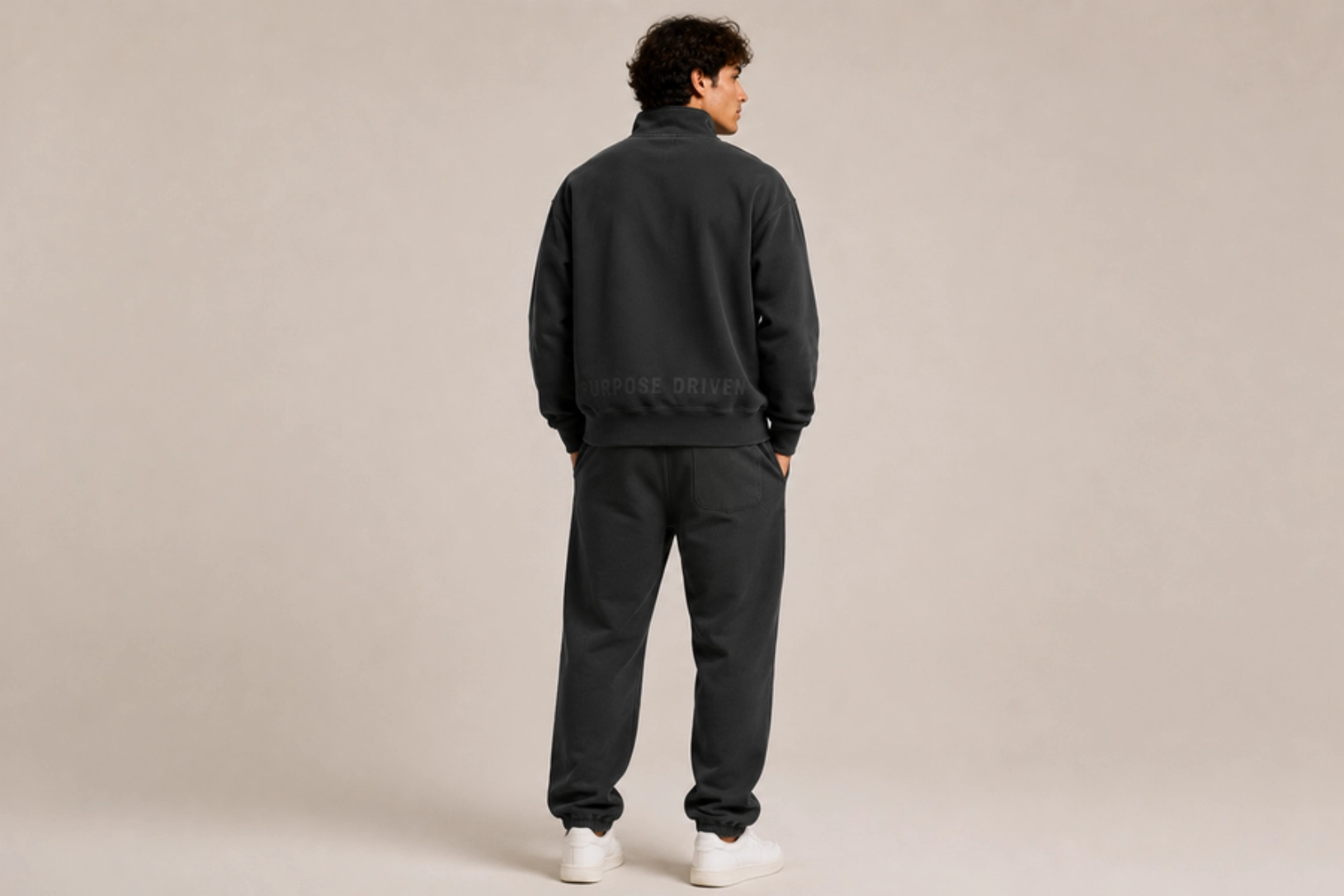
Subtle tonal lettering, inspirational phrases, brand signatures, or geographic coordinates printed just above the hem create an understated design feature that reveals itself from the back. Matte inks, monochromatic color palettes, and clean sans-serif typography blend seamlessly into heavyweight cotton fleece and French terry fabrics while adding texture through low-contrast printing. This discreet placement preserves the clean front appearance and complements the minimalist character of mock-neck sweatshirts.
Best for: Contemporary fashion, luxury streetwear, premium basics, lifestyle apparel
Design placement: Lower back above the waistband
Preferred print method: Screen printing or high-density heat transfer
Styling tips: Use short phrases in tonal colors and pair them with monochrome sweatshirts for a sophisticated, understated finish.
Contrast Bias-Tape Trim Design
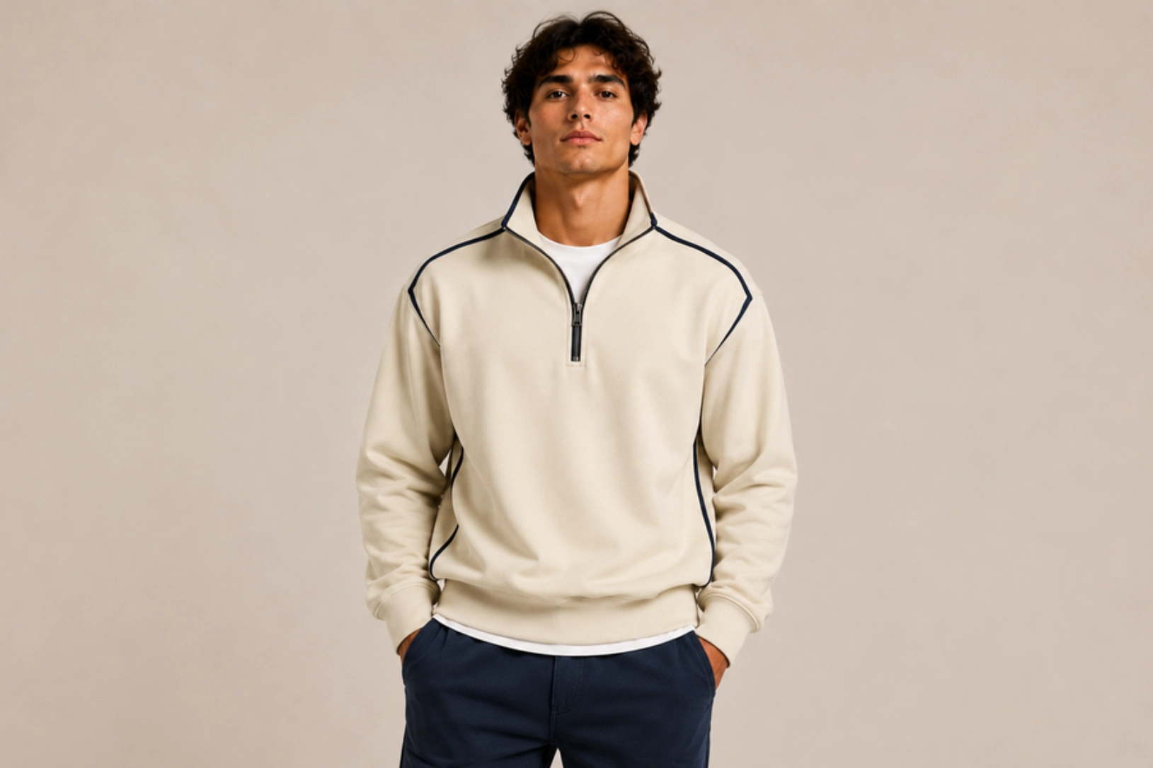
Contrast bias tape along shoulder seams, collar edges, zipper guards, or side seams introduces subtle color definition while reinforcing garment construction. Cotton herringbone tape, woven twill binding, and durable edge finishes in cream, black, navy, or burgundy create a tailored appearance inspired by premium sportswear and heritage outerwear. Combined with reinforced flatlock stitching and ribbed trims, the contrast detailing adds visual interest without relying on printed graphics.
Best for: Premium casualwear, golf apparel, outdoor fashion, designer basics
Design placement: Collar edge, shoulder seams, side seams, or neckline
Preferred print method: Sewn-on bias tape construction
Styling tips: Choose narrow contrast trims that complement the sweatshirt color and combine them with minimalist embroidery for a refined, premium aesthetic.
Nature-Inspired Patchwork Design
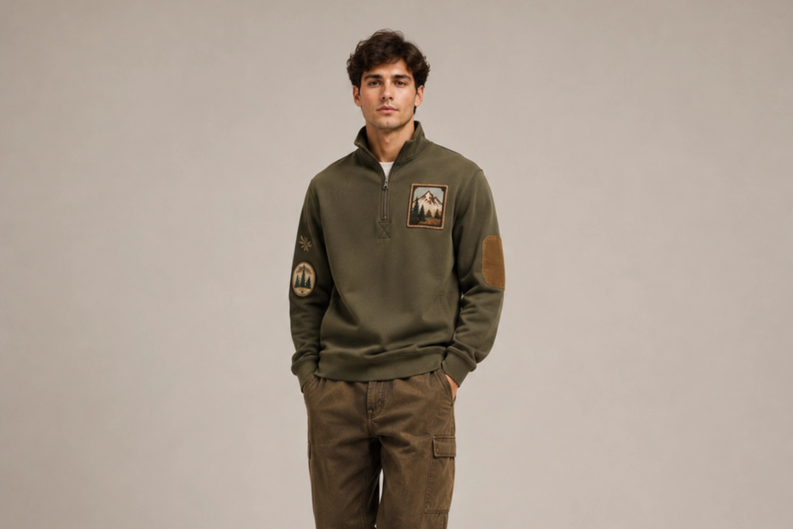
Woven forest badges, mountain emblems, botanical appliqués, canvas elbow patches, and embroidered wildlife motifs bring handcrafted character to mock-neck sweatshirts. Cotton twill, canvas, corduroy, felt, and faux suede patches stitched onto the chest, sleeves, or shoulders create layered texture inspired by hiking apparel, national parks, and heritage outdoor gear. Decorative blanket stitching, woven labels, and earthy color palettes further enhance the artisanal aesthetic while maintaining the clean lines of the mock-neck silhouette.
Best for: Outdoor brands, eco-conscious fashion, adventure apparel, heritage collections
Design placement: Left chest, sleeves, shoulders, or elbow panels
Preferred print method: Woven patches, embroidered appliqués, or fabric patchwork
Styling tips: Combine olive, camel, rust, moss green, and cream fabrics with embroidered nature patches to create a timeless outdoor-inspired design.
How Do You Choose the Right Sweatshirt Design?
Choosing the right sweatshirt design means aligning your purpose, audience, fit, fabric, decoration method, placement, size, color contrast, and readability to create something that looks professional and lasts. Whether you are creating custom sweatshirts for a clothing brand, business, sports team, event, or personal project, evaluating these factors helps ensure the final design appeals to the intended audience.
- Purpose
Define why you are creating the sweatshirt before making any design decisions. Promotional merchandise, corporate uniforms, streetwear collections, university apparel, sports teams, and fashion brands each require different design approaches. A startup may prioritize minimalist logo embroidery for everyday branding, while a music festival may benefit from oversized back graphics and vibrant artwork that attract attention.
- Target audience
Understanding who will wear the sweatshirt influences every design decision, including graphics, typography, colors, and decoration methods. Younger audiences often prefer oversized streetwear graphics, Y2K aesthetics, or bold typography, while professionals typically favor clean embroidery, tonal branding, and minimalist designs. Matching the design style to audience preferences increases both wearability and long-term appeal.
- Sweatshirt fit
The silhouette directly influences how artwork is perceived and how much design space is available. Oversized and drop-shoulder styles provide generous space for large graphics, puff prints, and statement typography, while fitted and cropped styles benefit from smaller embroidery, subtle branding, and carefully balanced layouts. Choosing a design that complements the garment’s proportions creates a more cohesive final product.
- Fabric texture
The fabric composition determines which decoration methods will perform best on the garment. Smooth cotton fleece, French terry, and polyester performance fabrics produce crisp screen prints and detailed DTG graphics, while sherpa, quilted fabrics, ribbed knits, and heavyweight brushed cotton showcase embroidery, woven patches, chenille appliqués, and silicone logos more effectively than highly detailed printed artwork.
- Decoration method
The right decoration technique depends on the artwork style, fabric type, order quantity, and budget. Screen printing produces vibrant colors for bulk orders, DTG printing captures detailed illustrations, embroidery adds premium texture, puff ink creates three-dimensional graphics, sublimation delivers permanent all-over designs on polyester, and woven patches introduce a handcrafted appearance. Selecting the right method ensures the artwork complements both the fabric and the intended use.
- Design placement
Where the design sits on the garment affects visual balance, wearability, and overall impact. Left-chest embroidery creates a timeless professional look, oversized back graphics make bold fashion statements, sleeve typography introduces subtle detail, collar embroidery highlights premium craftsmanship, and lower-hem or cuff graphics add understated branding. Choosing placement based on the garment’s construction ensures the design enhances rather than competes with seams, zippers, or pockets.
- Design size
Artwork size should reflect the garment’s silhouette and the scale of the design area. Oversized silhouettes accommodate large chest prints and full-back illustrations, while fitted sweatshirts benefit from smaller logos, monograms, or compact typography. Designs that are too large may overwhelm tailored garments, whereas graphics that are too small can appear lost on oversized apparel.
- Color contrast
The relationship between ink or thread color and fabric color affects both visibility and aesthetic tone. High-contrast combinations such as white on black or navy on cream maximize readability, whereas tonal embroidery and monochromatic printing create a subtle, premium aesthetic. Consider the sweatshirt color, decoration method, and lighting conditions to ensure graphics remain visually effective across different environments.
- Design readability
Clear, legible artwork ensures the design communicates effectively at both close and moderate viewing distances. Simple fonts, balanced spacing, clean linework, and uncluttered compositions improve readability across embroidery, screen printing, puff ink, and heat transfers. Avoid excessive decorative elements or overly intricate layouts that reduce legibility, particularly for branded apparel and promotional merchandise.
How to Create an Effective Sweatshirt Design for Any Style?
To create a successful sweatshirt design, balance creativity with practical production considerations across every stage, from defining your aesthetic and selecting artwork to preparing print-ready files, reviewing mockups, and approving a physical sample before production. Each decision affects the final appearance, durability, and overall alignment with your brand identity or creative vision.
1. Define the design aesthetic
Start with a clear visual direction before making any other design decisions. Popular aesthetics include minimalist, vintage, streetwear, collegiate, Y2K, luxury casual, outdoor, athletic, and graphic-focused styles. This decision influences every element that follows, including typography, illustrations, color palettes, and decoration methods. Maintaining a consistent aesthetic creates a cohesive design that resonates with your target audience.
2.Choose the artwork style
Select artwork that reflects both the sweatshirt style and your brand identity. Line art, hand-drawn illustrations, vintage badges, abstract graphics, botanical illustrations, mascots, geometric patterns, and bold typography all create different visual impressions. Choose artwork that scales well for the intended print size and remains clear when applied to the selected garment.
3.Select the color palette
Colors should reinforce the intended aesthetic while maintaining strong visual harmony. Neutral shades such as black, charcoal, cream, navy, and heather grey create timeless designs, earth tones support heritage and outdoor collections, and vibrant colors or neon accents work well for streetwear, sportswear, and Y2K-inspired apparel. Keep print colors compatible with the sweatshirt fabric to maximize visual impact.
4.Match the typography
Typography should reflect the overall design style and remain easy to read. Bold sans-serif fonts suit modern streetwear and athletic apparel, serif fonts reinforce vintage and collegiate aesthetics, and script lettering complements luxury or personalized designs. Maintain a consistent font hierarchy, spacing, and alignment so that text integrates naturally with graphics rather than competing for attention.
5.Prepare print-ready artwork
Convert the final artwork into production-ready files before manufacturing begins. Vector formats such as AI, EPS, PDF, and SVG preserve sharp edges for logos and typography, while high-resolution PNG or PSD files support detailed raster illustrations. Separate colors when preparing screen-print artwork, outline fonts where necessary, and verify image resolution to prevent quality issues during printing.
6.Create a sweatshirt mockup
Place the artwork onto a digital mockup to visualize scale, placement, and overall composition before production. Mockups help evaluate chest graphics, sleeve prints, back artwork, collar embroidery, and zipper alignment across different sweatshirt styles. Testing multiple garment colors also reveals how contrast and decoration methods affect the final appearance.
7.Review the sweatshirt mockup
Carefully inspect the mockup for alignment, spacing, and consistency. Check that graphics are centered, typography remains readable, and decorative elements do not overlap seams, pockets, ribbed cuffs, or zipper plackets. Using the sweatshirt mockup generator to view the design from multiple angles helps identify adjustments before committing to production.
8.Check visual balance
Assess how every design element interacts across the garment. Large back graphics pair best with subtle chest logos, while sleeve graphics should complement rather than overpower the primary artwork. Balance typography, illustrations, embroidery, and empty space so the sweatshirt appears intentional from the front, back, and sides without feeling crowded.
9.Review a physical sample
Request a production sample before placing a full order. A physical sample allows you to evaluate embroidery density, print registration, puff ink height, color accuracy, fabric feel, stitch quality, and overall garment construction under real lighting conditions. This step helps identify issues that digital mockups cannot fully replicate.
10.Finalize the design
After reviewing both digital mockups and physical samples, make any final adjustments to artwork, colors, sizing, placement, or decoration methods. Confirm print specifications, embroidery files, Pantone color references, production notes, and garment measurements before approving manufacturing. A thorough final review minimizes production errors and ensures the finished sweatshirt meets both quality standards and design expectations.

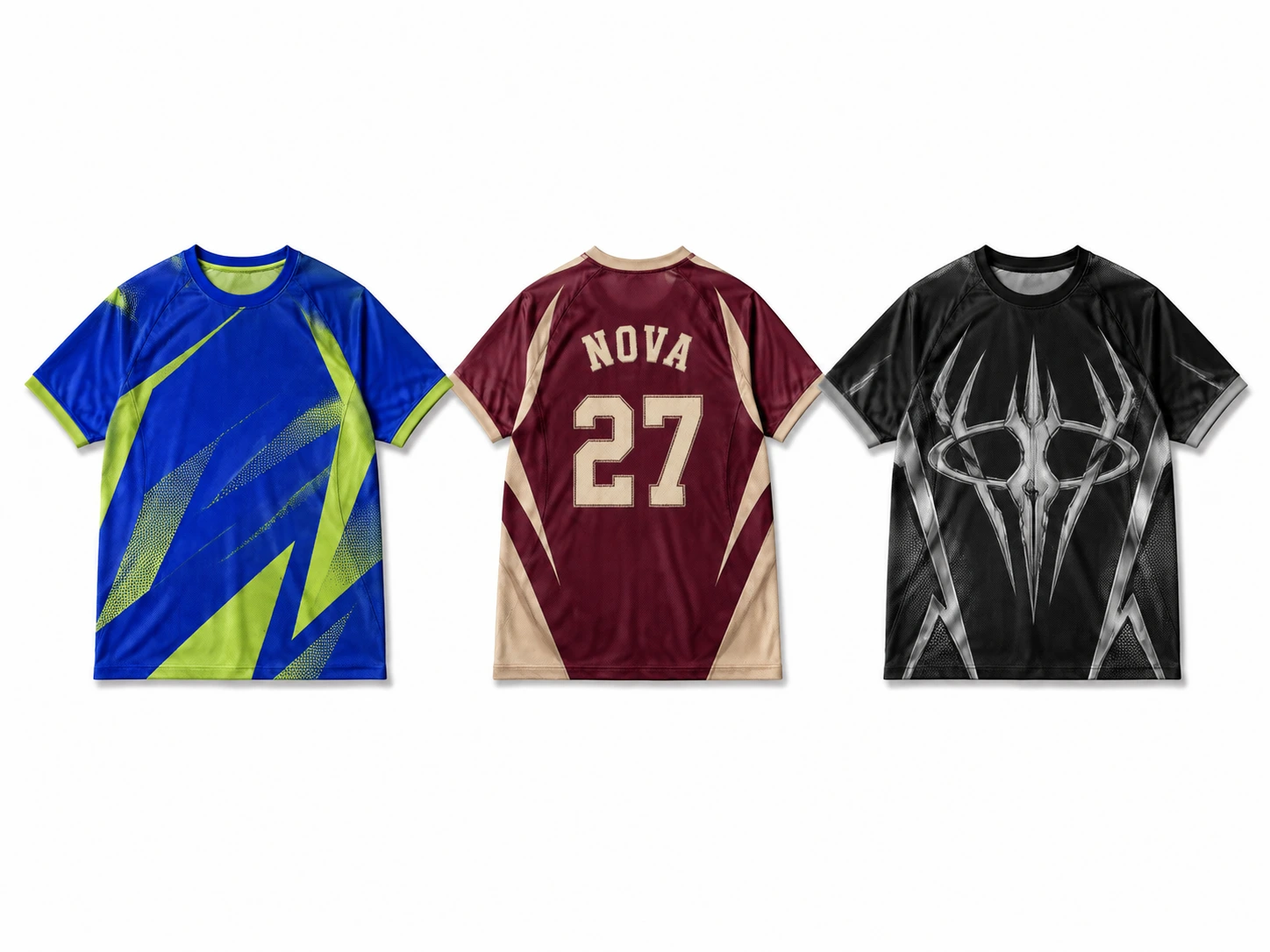
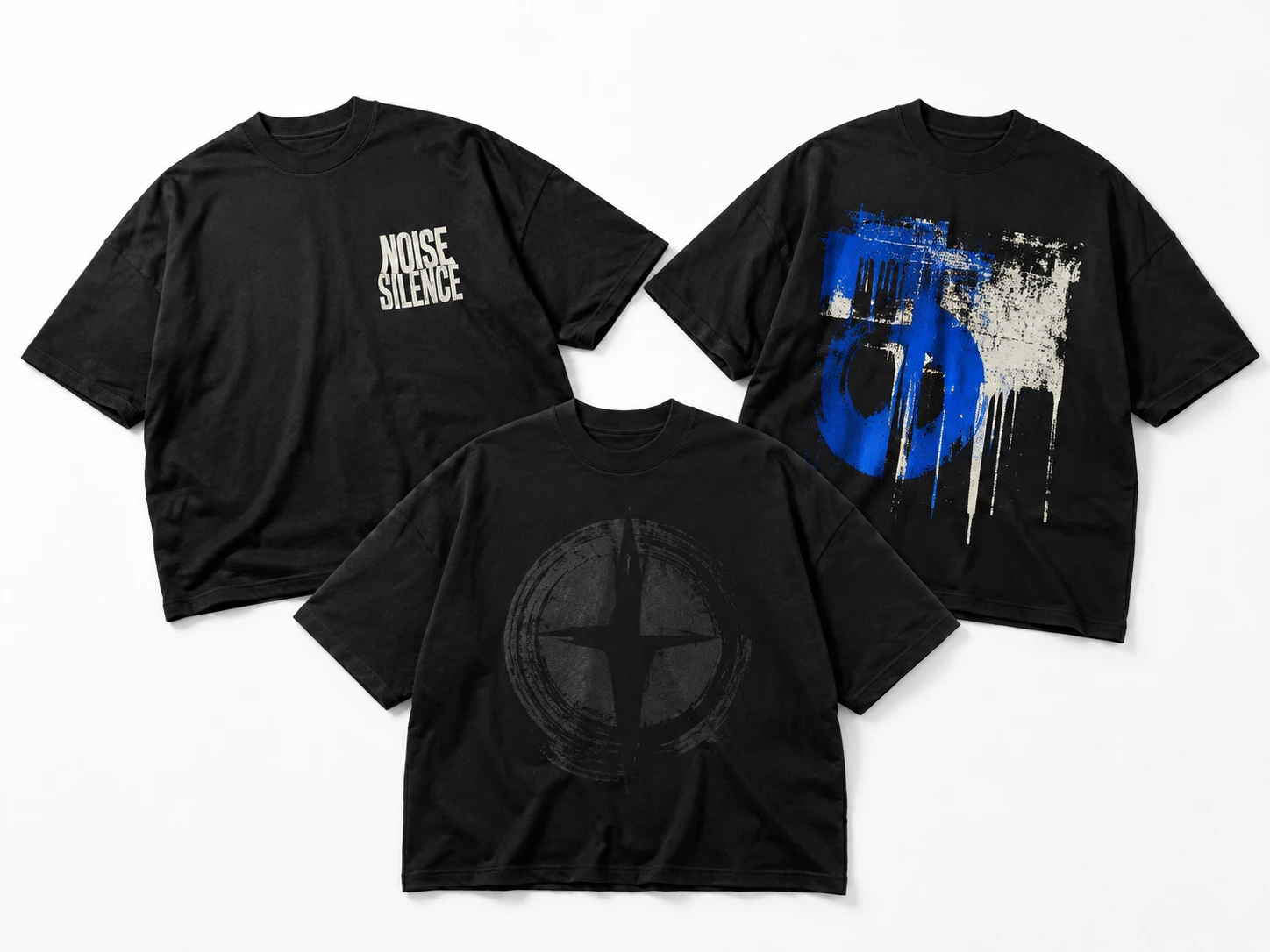
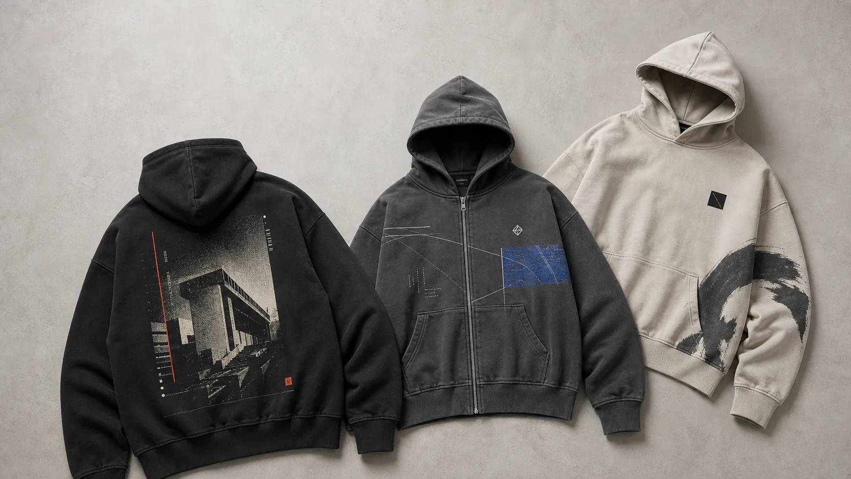
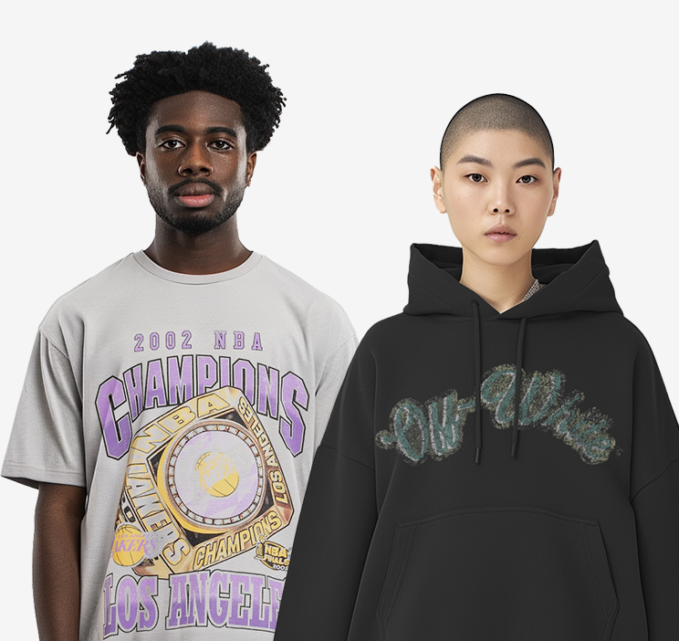
 Trusted By Thousands Of Designers
  Cancel Your Subscription Anytime
  30 Day Money Back Guarantee