
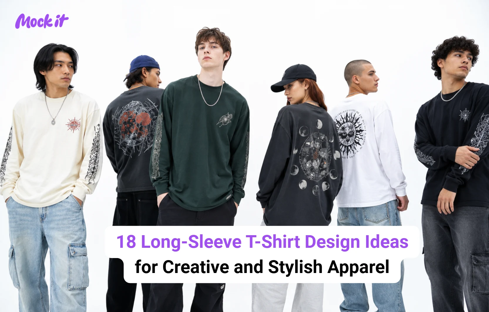
Long-sleeve t-shirt design ideas include graphic prints, typographic layouts, vintage artwork, minimalist branding, nature-inspired illustrations, and streetwear concepts. Unlike standard t-shirts, long sleeve styles provide additional design space across the chest, back, sleeves, cuffs, and hem, allowing for more creative and visually balanced layouts.
The most effective long-sleeve t-shirt designs combine the right design style with strategic print placement. From subtle left-chest logos and sleeve graphics to oversized back prints and wraparound artwork, each placement creates a distinct visual impact. This guide covers popular design ideas, print placement options, current trends, and practical tips to help create long-sleeve t-shirts that are both visually appealing and functional.
What Are the Best Long-Sleeve T-Shirt Design Ideas?
Graphic prints, typography, minimalist, vintage, nature-inspired, streetwear, and color-block designs rank among the best long-sleeve t-shirt design ideas for 2026. Long-sleeve t-shirts offer ample design space for a wide range of creative styles, from subtle branding to bold statement graphics. The right approach depends on the intended audience, aesthetic, and purpose of the garment. The following styles remain among the most popular choices for long sleeve apparel because they balance visual appeal with versatility.
Graphic Print Long-Sleeve T-Shirt Designs
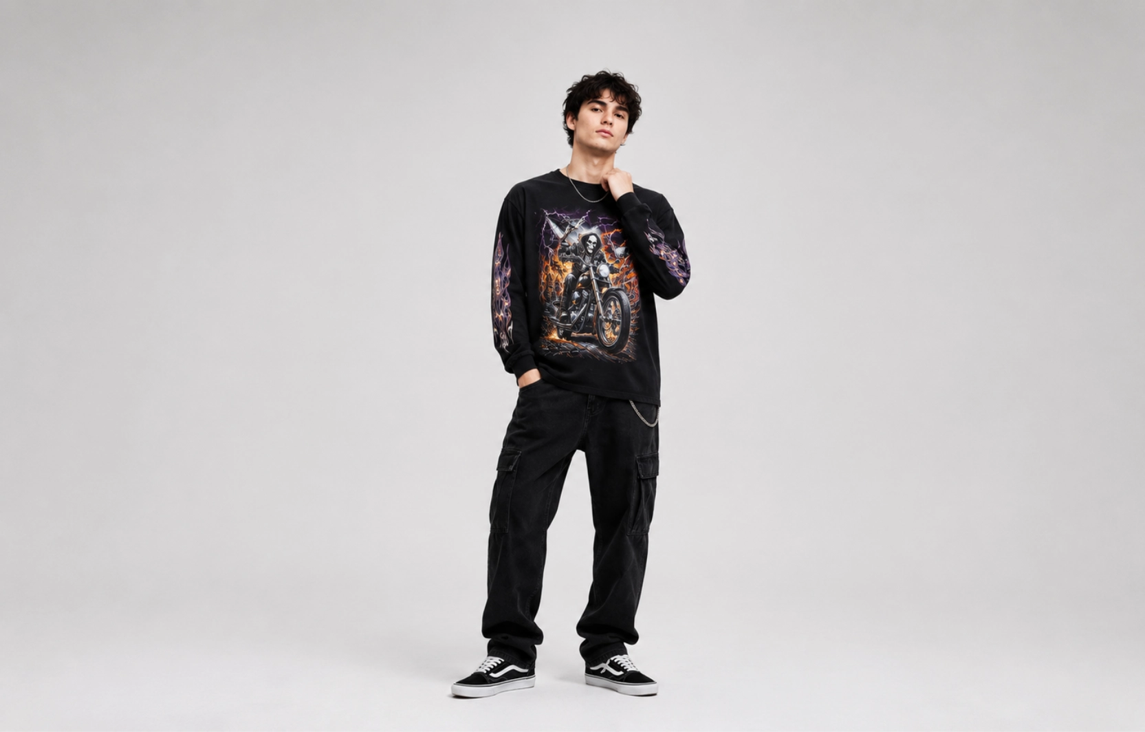
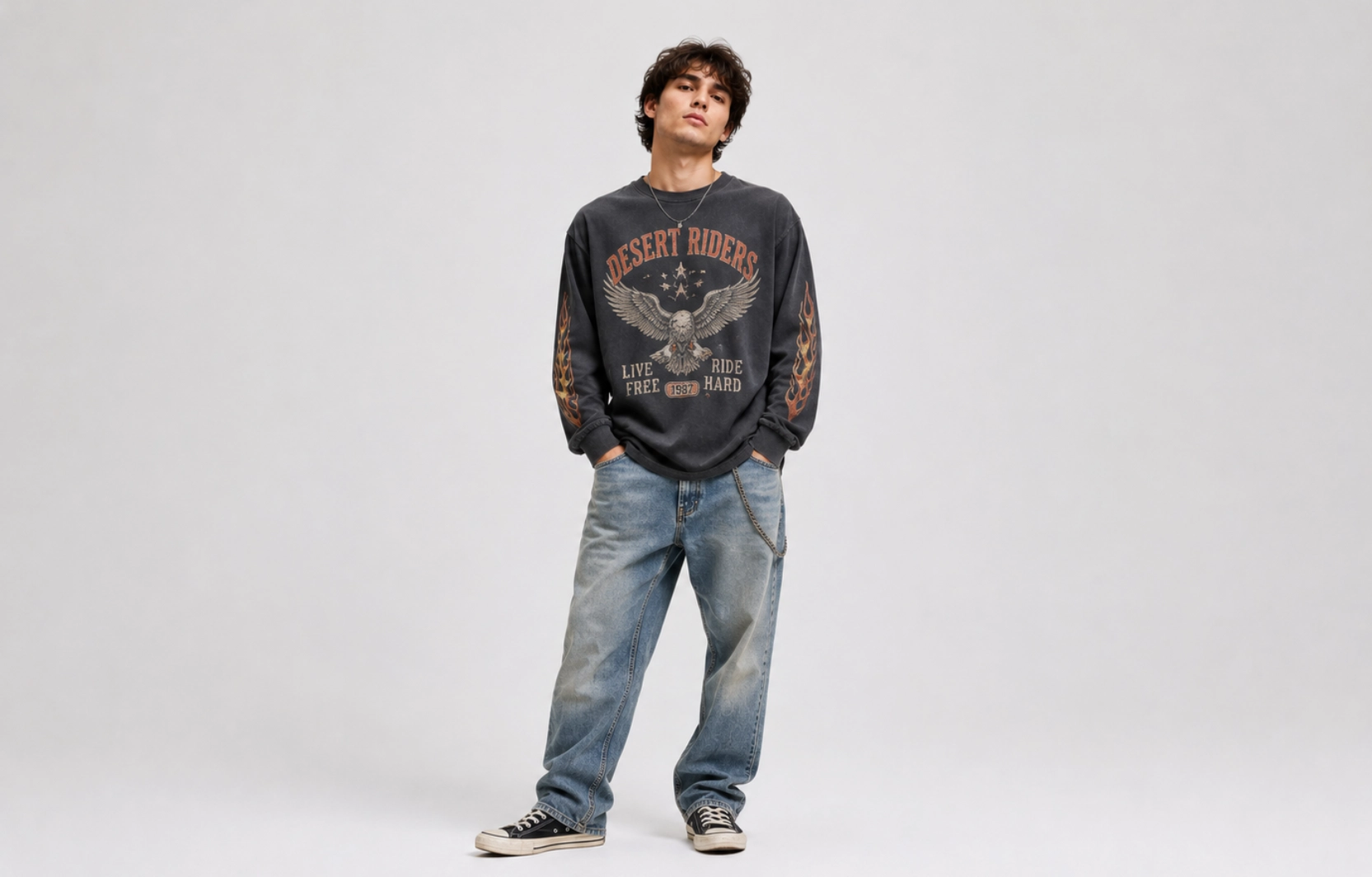
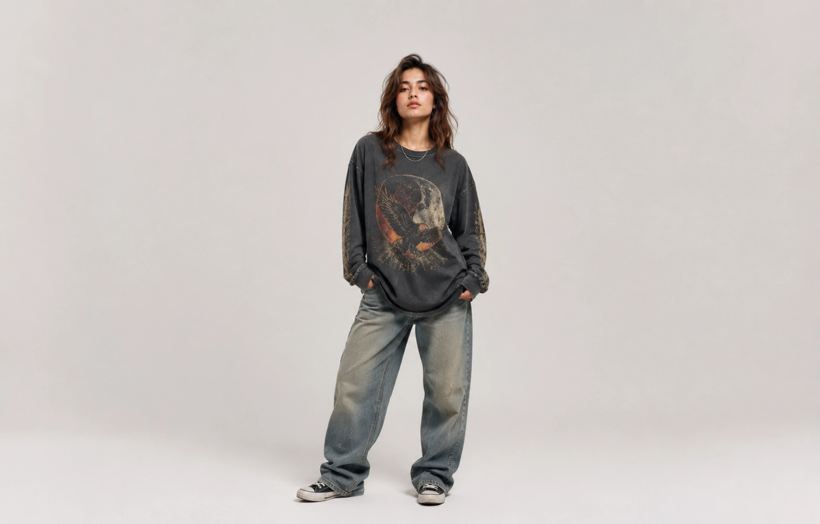
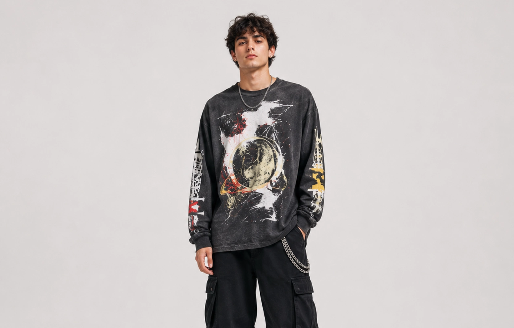
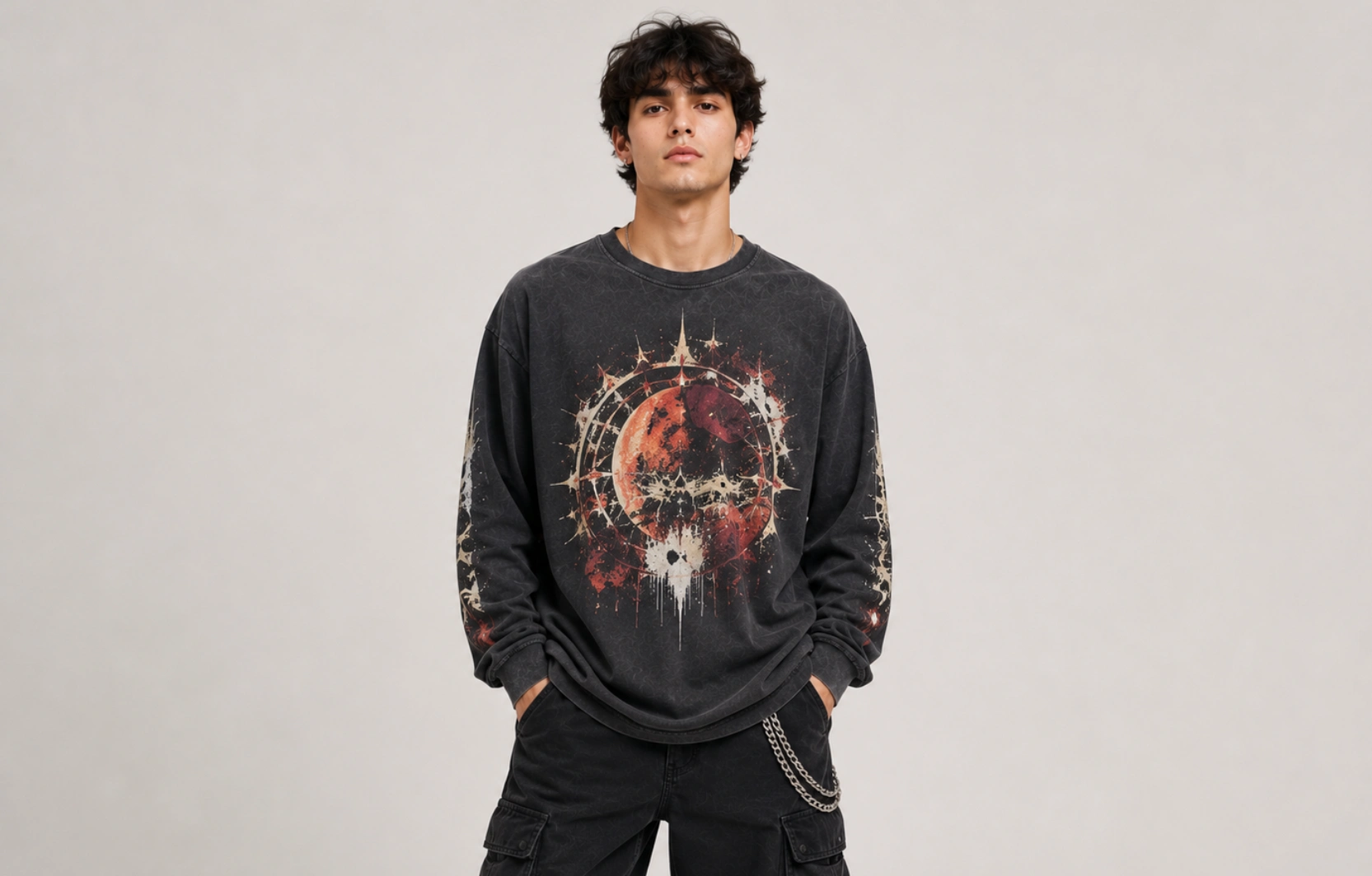
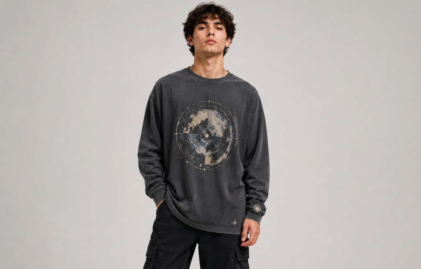
Graphic prints use illustrations, artwork, symbols, and themed visuals to create a strong visual focal point on the garment. This style remains one of the most popular long-sleeve options because it adapts to nearly any audience, from streetwear drops to band merch to corporate event giveaways, and it scales easily between a small accent graphic and a full all-over print.
Visual Style: Bold, attention-grabbing, and artwork-focused.
Common Elements:
- Illustrations
- Character artwork
- Sports graphics
- Abstract designs
Best Placement:
- Center chest
- Full back
- Sleeve graphics
Ideal For: Streetwear brands, merchandise collections, and event apparel.
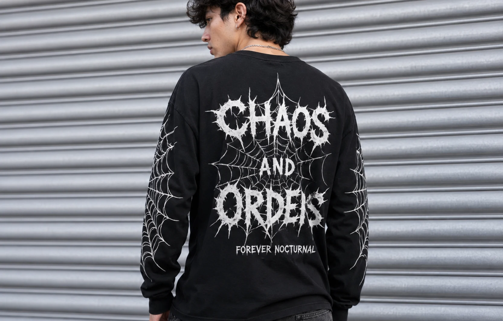
Typography Long-Sleeve T-Shirt Designs
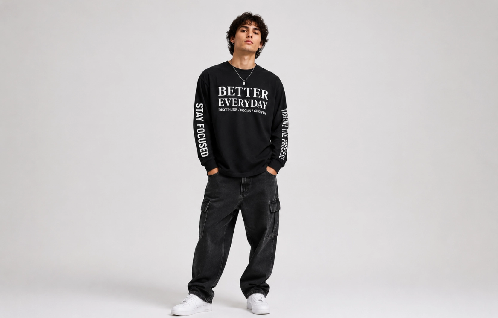
Typography designs use text as the primary visual element rather than relying on illustrations or graphics. The sleeves give this style extra room to work with, letting a slogan wrap around the arm or a quote stretch across the chest in large type, so the wording itself carries the design rather than competing with the artwork for attention.
Visual Style: Text-driven and message-focused.
Common Elements:
- Quotes
- Slogans
- Brand messaging
- Motivational phrases
Best Placement:
- Sleeves
- Center chest
- Upper back
Ideal For: Lifestyle brands, promotional apparel, and personal expression.
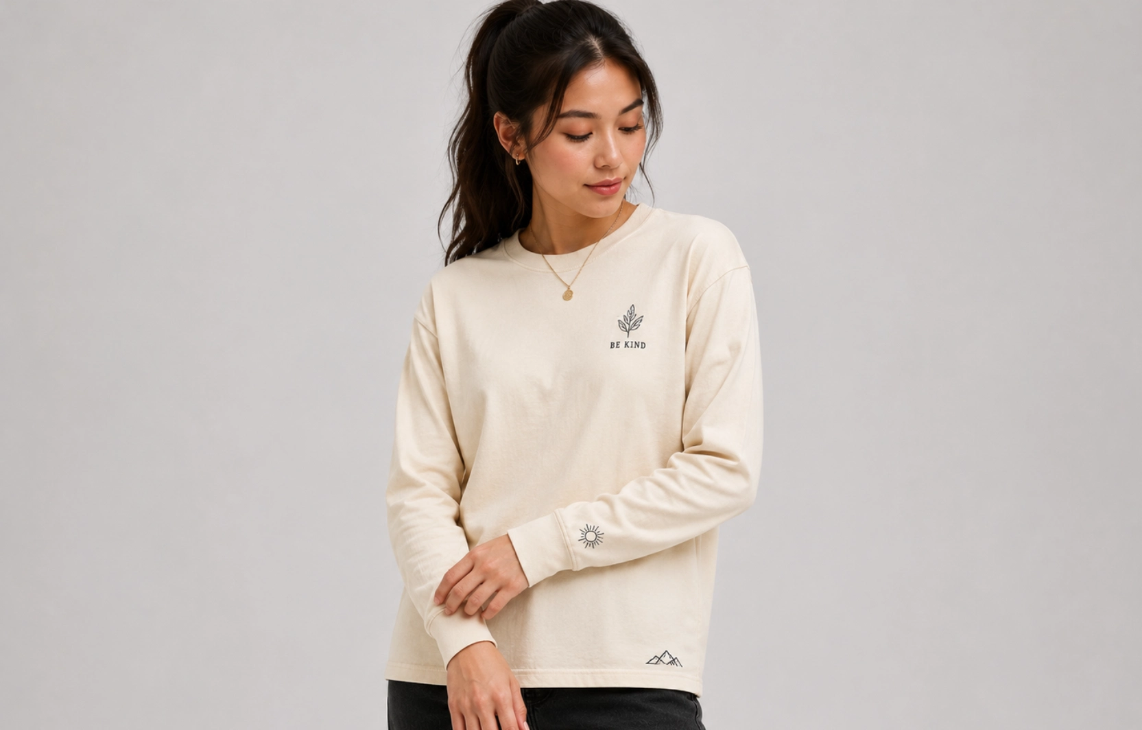
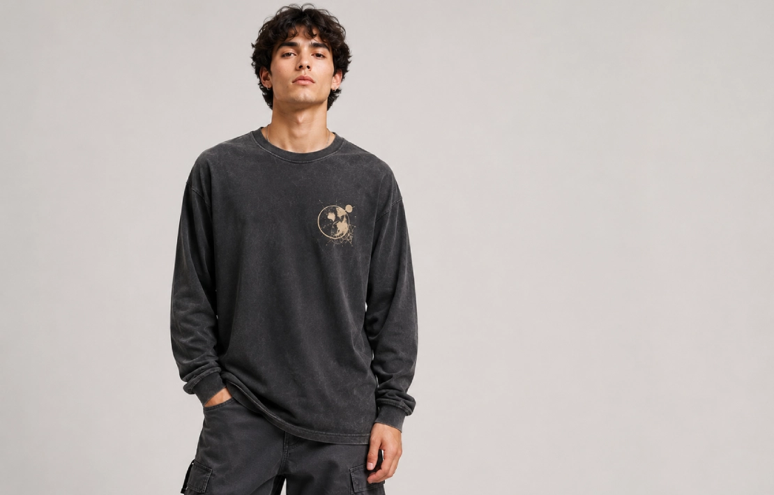
Minimalist Long-Sleeve T-Shirt Designs
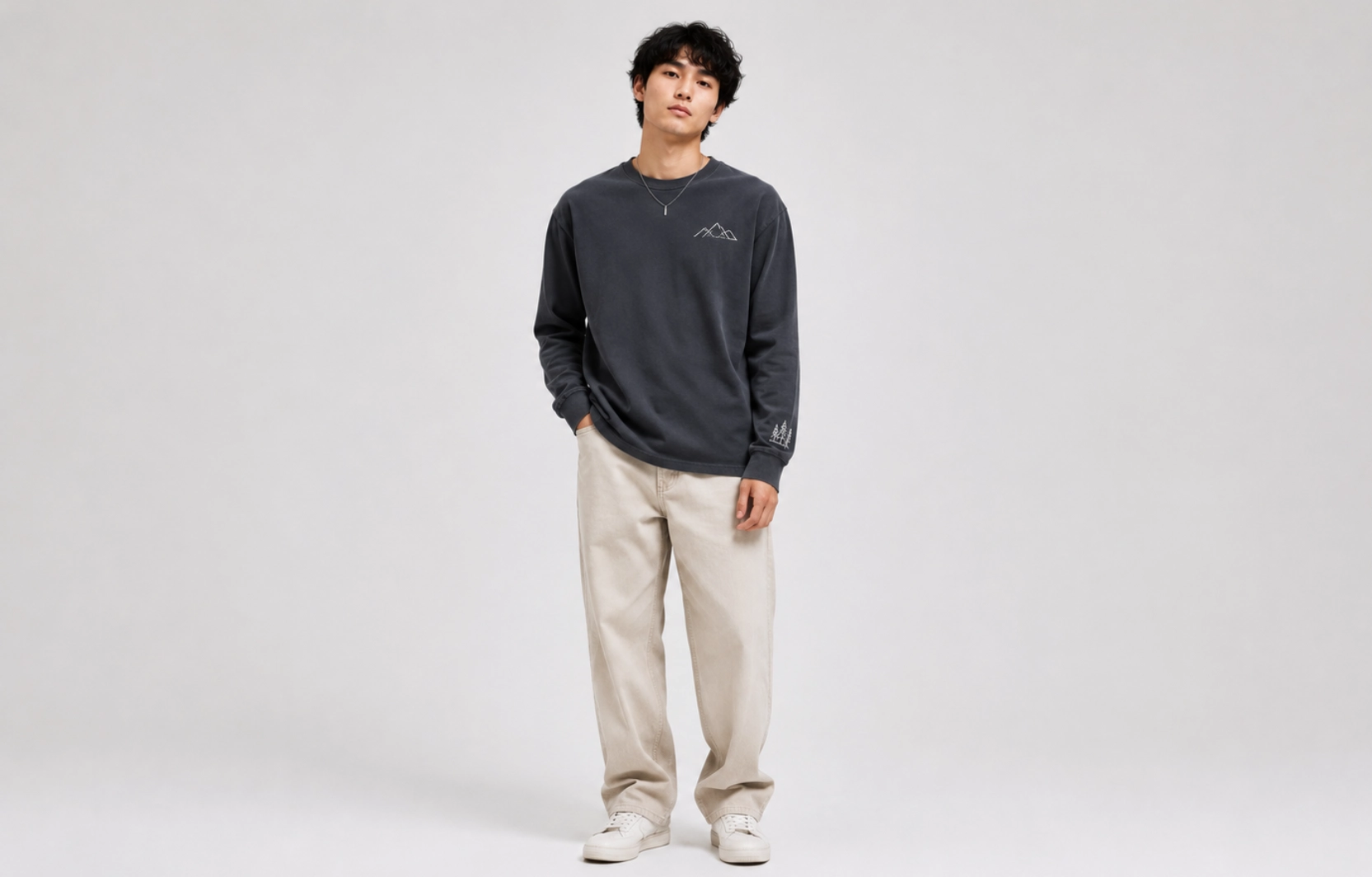
Minimalist designs for long-sleeve t-shirts focus on simplicity, using a single small graphic or restrained line work instead of large or busy artwork. Because the design stays compact, it pairs well with premium fabrics and neutral colorways, which is why this approach shows up so often in capsule collections meant to be worn season after season.
Visual Style: Clean, simple, and understated.
Common Elements:
- Small logos
- Line art
- Monochrome graphics
- Simple icons
Best Placement:
- Left chest
- Upper sleeve
- Cuff area
Ideal For: Lifestyle brands, premium apparel, and modern fashion collections.
Vintage Long-Sleeve T-Shirt Designs
Vintage designs draw on retro fashion through aged graphics, distressed effects, and nostalgic artwork that mimic decades-old prints. Cracked ink textures, sun-faded color, and throwback typefaces give the long-sleeve t-shirts a worn-in look straight off the rack, which is part of why this style keeps cycling back into demand alongside broader 90s and Y2K fashion revivals.
Visual Style:
Retro, distressed, and nostalgic.
Common Elements:
- Faded graphics
- Retro typography
- Washed effects
- Heritage-inspired artwork
Best Placement:
- Center chest
- Full back
- Front-and-back combinations
Ideal For:
Vintage apparel brands, music merchandise, and retro-inspired collections.
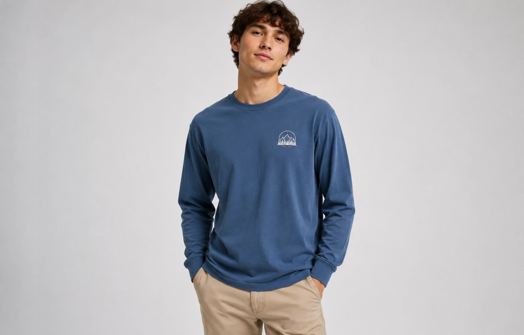
Nature-Inspired Long-Sleeve T-Shirt Designs
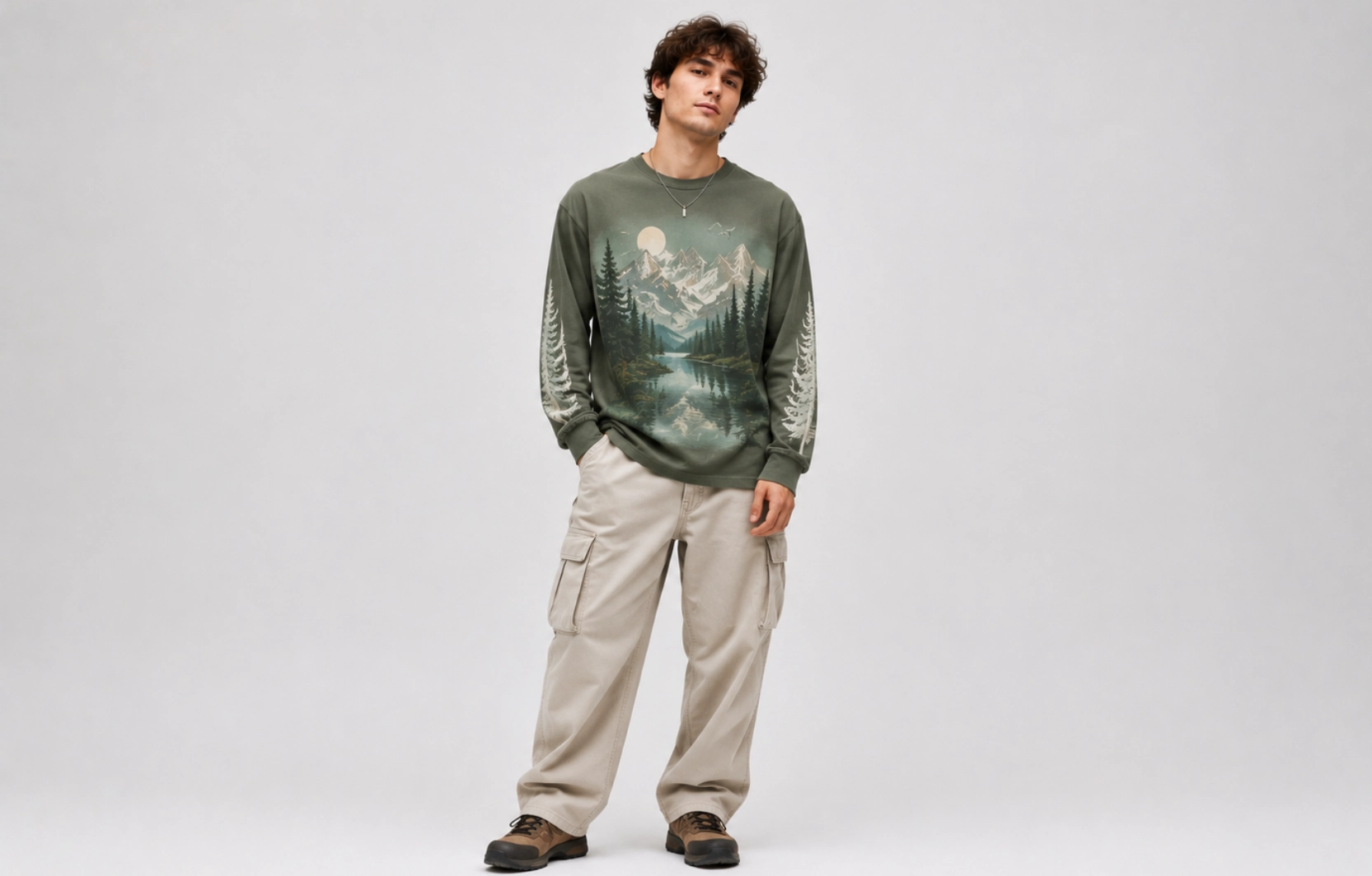
Nature-inspired t-shirt designs bring outdoor themes and organic visuals onto the garment, drawing on landscapes, wildlife, and natural environments for inspiration. The longer sleeves and larger back panel give these scenes more room to breathe, so a mountain range or a detailed wildlife illustration can be rendered with the depth a smaller print area would not allow.
Visual Style: Organic, scenic, and illustration-focused.
Common Elements:
- Mountain graphics
- Wildlife illustrations
- Botanical artwork
- Ocean-inspired visuals
Best Placement:
- Full back
- Center chest
- Sleeve graphics
Ideal For: Outdoor brands, travel merchandise, and nature-themed apparel.
Streetwear Long-Sleeve T-Shirt Designs
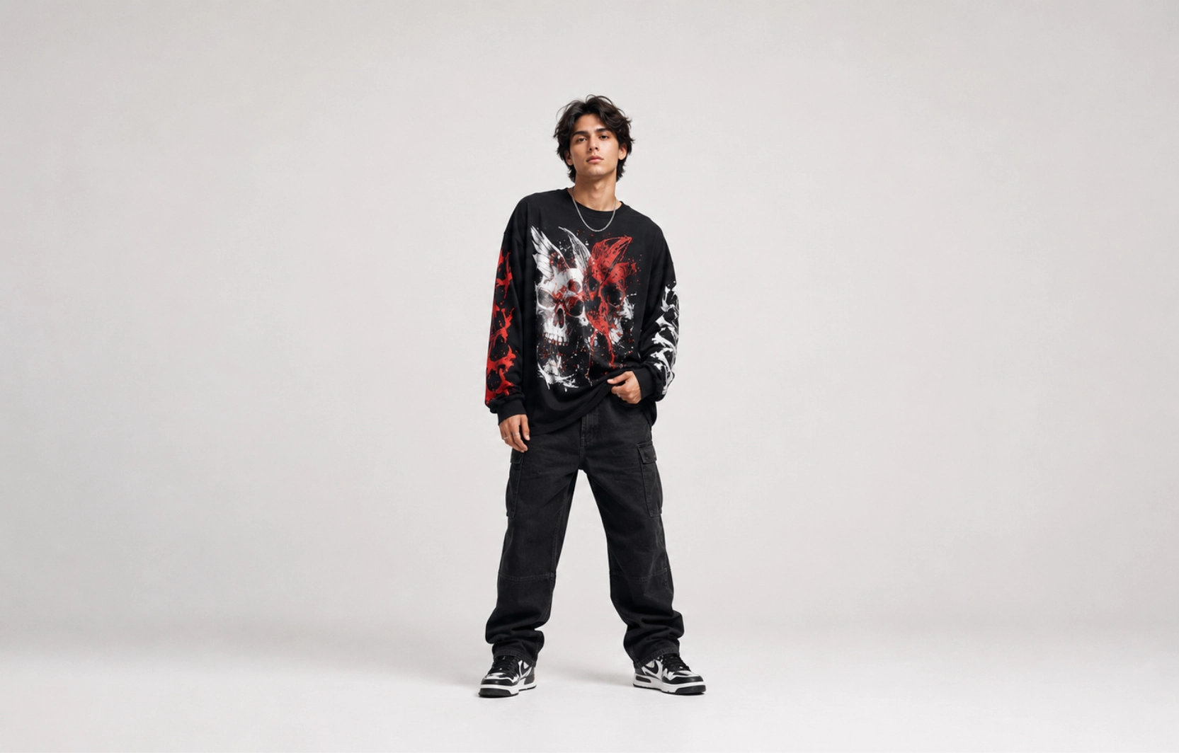
Streetwear designs lean on bold graphics, oversized artwork, and placements that break from the standard front-and-back layout. Sleeve wraps, asymmetric prints, and high-contrast color blocking turn the long sleeve into an extension of the t-shirt design rather than just extra fabric, which is exactly why this cut has become a streetwear staple in its own right.
Visual Style: Bold, expressive, and trend-focused.
Common Elements:
- Oversized graphics
- Sleeve typography
- Abstract artwork
- Large back prints
Best Placement:
- Full back
- Sleeves
- Front-and-back layouts
Ideal For: Streetwear brands, fashion collections, and youth-oriented apparel.
Color-Block Long-Sleeve T-Shirt Designs
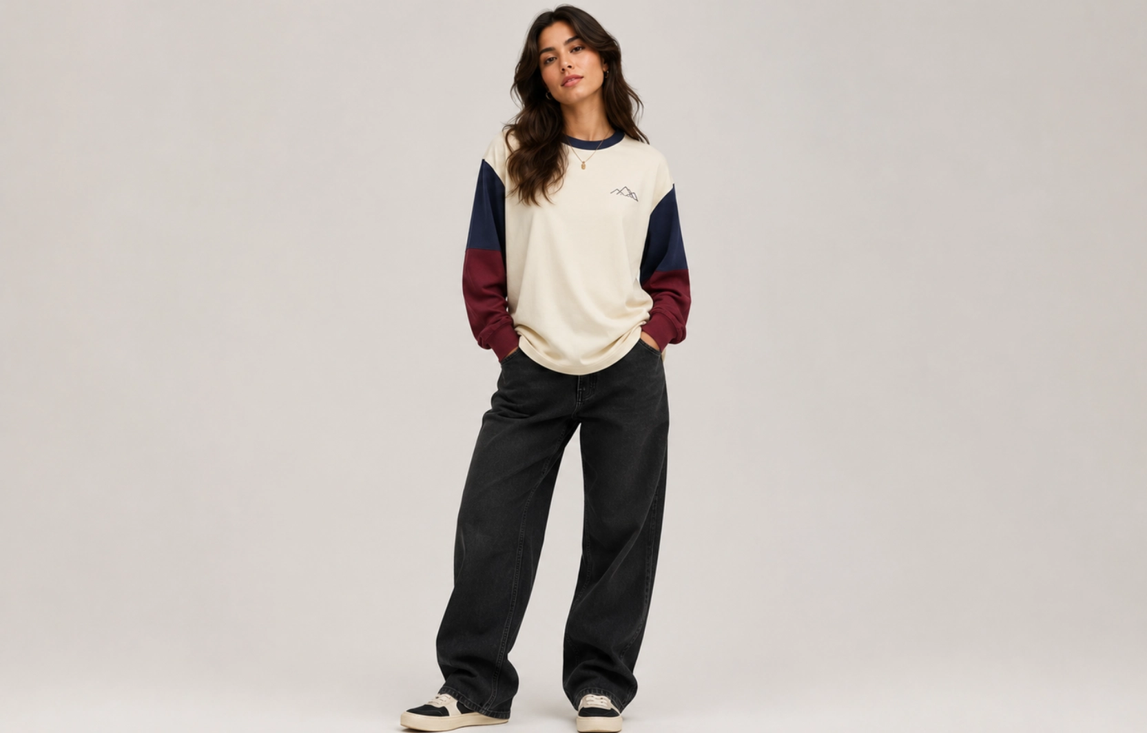
Color-block designs use contrasting color sections, often two or three distinct panels, to create visual separation and emphasis without relying on heavy artwork. Instead of building impact through graphics alone, this style combines garment color pairings, such as a solid body with contrasting sleeves, and the strategic placement of design elements to create a bold, structured appearance.
Visual Style: Clean, modern, and contrast-driven.
Common Elements:
- Contrasting sleeve colors
- Split-color panels
- Geometric sections
- Minimal graphics
Best Placement:
- Center chest
- Upper sleeve
- Across color transition areas
Ideal For: Athletic apparel, lifestyle brands, and contemporary fashion collections.
What Are the Best Long-Sleeve T-Shirt Design Ideas by Placement?
Left chest, center chest, full back, sleeve, and cuff or hem are the five main placement options for long-sleeve t-shirt designs. The placement of a design can influence how noticeable, balanced, and effective a long-sleeve t-shirt looks. While the same artwork can be used in multiple locations, each placement creates a different visual impact and serves a different purpose. Understanding these options helps match the design with the intended style and audience.
Left Chest Designs for Long-Sleeve T-Shirts
The left chest area is one of the most widely used placements because it creates a clean, professional appearance that works on its own or alongside a second design elsewhere on the shirt. Small graphics in this location stay visible without dominating the garment, which is why it’s the default spot for branded uniforms, corporate apparel, and everyday casual wear.
Best For:
- Brand logos
- Monograms
- Small icons
- Minimalist artwork
Advantages:
- Clean appearance
- Easy to pair with other print locations
- Suitable for everyday wear
Common Design Size: 2.5 to 5 inches wide
Center Chest Design for Long-Sleeve T-Shirts
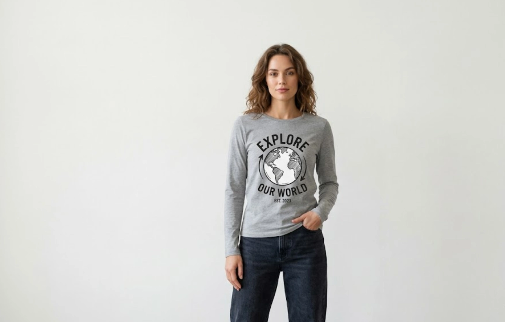
Center chest placement creates an immediate focal point and suits designs meant to be the main attraction rather than a supporting detail. Because the area sits at eye level and reads clearly from a distance, it works for both a simple one-color graphic and a more layered illustration without needing a second placement to balance it out.
Best For:
- Graphic illustrations
- Typography designs
- Event merchandise
- Promotional apparel
Advantages:
- High visibility
- Balanced appearance
- Suitable for most design styles
Common Design Size: 6 to 12 inches wide
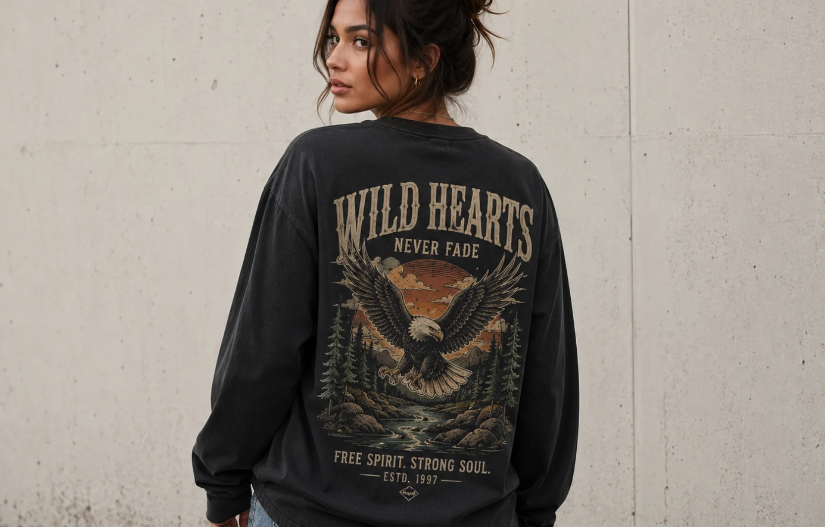
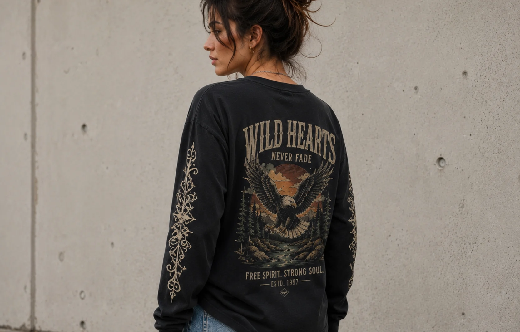
Full Back Designs for Long-Sleeve T-Shirts
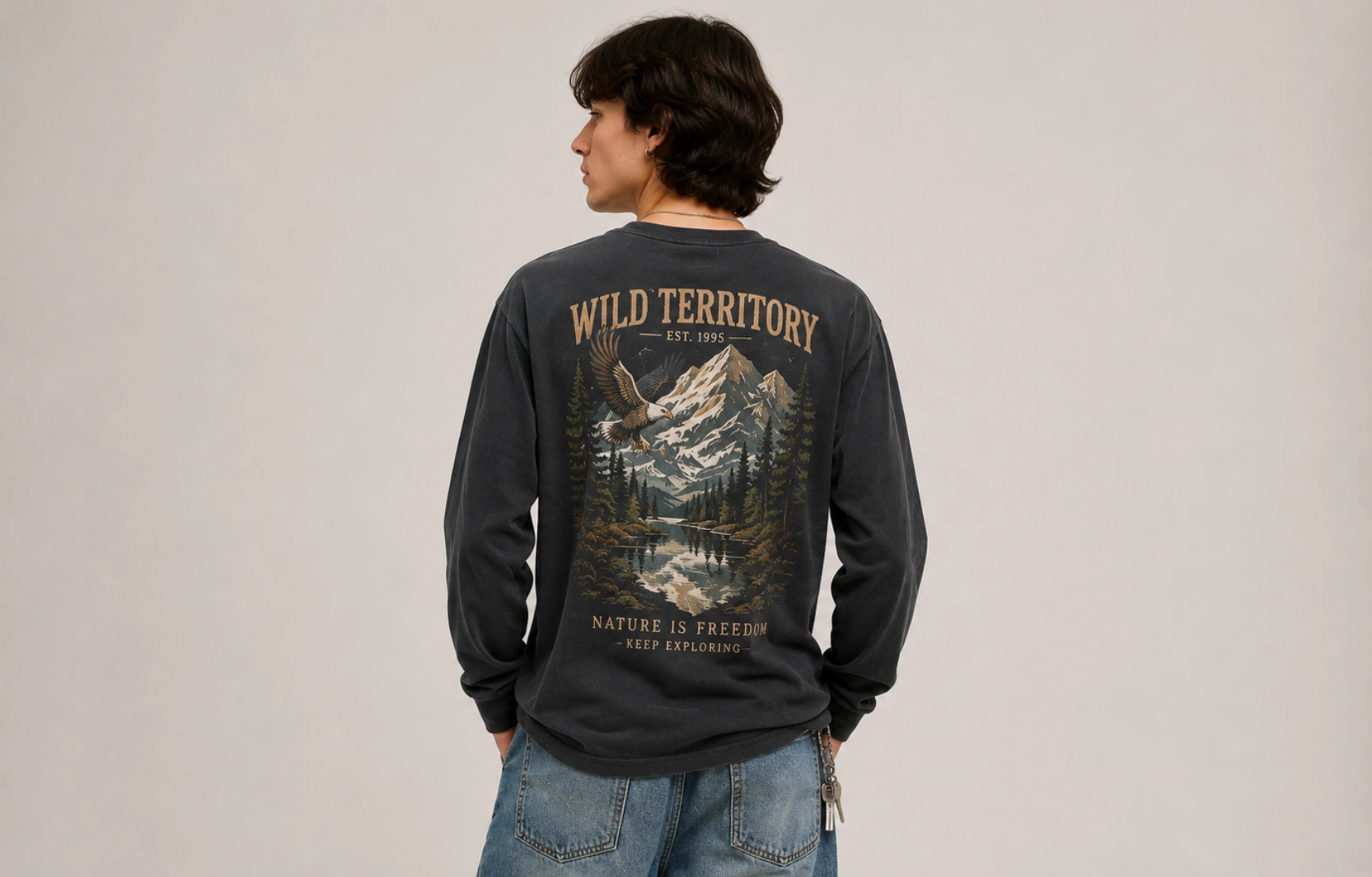
The back of a long-sleeve t-shirt offers the largest printable area on the garment, giving artists and brands room to build out detailed scenes, layered typography, or multi-element compositions that would not fit on a smaller placement. Because it is only visible when the wearer turns or walks away, this spot often doubles as a reveal moment, making it a favorite for statement graphics and storytelling artwork.
Best For:
- Large illustrations
- Streetwear graphics
- Vintage artwork
- Brand storytelling
Advantages:
- Maximum design space
- Strong visual impact
- Supports detailed artwork
Sleeve Print Designs for Long-Sleeve T-Shirts
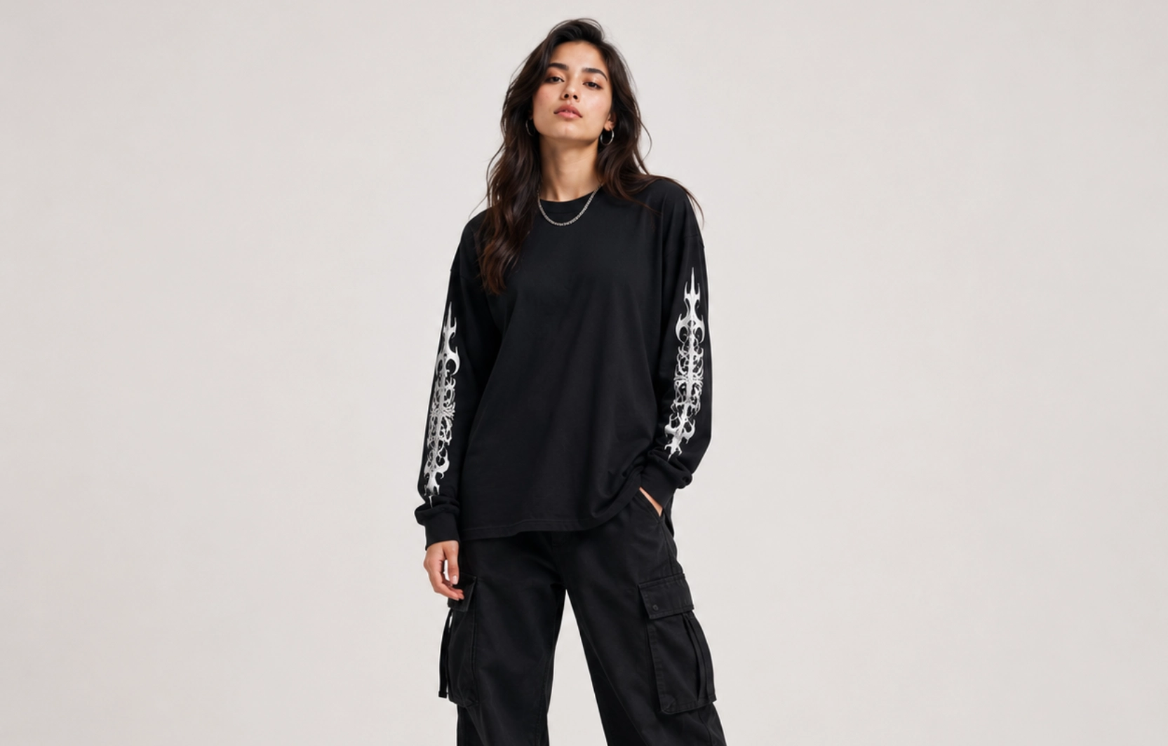
Running from the shoulder seam to the wrist, each sleeve offers a narrow but elongated strip of canvas that no other placement on the shirt can replicate. A word stacked vertically, a repeating pattern, or a small logo placed just below the shoulder stays visible whether the wearer is facing forward, sideways, or mid-motion, giving sleeve placements a 360-degree presence that chest and back prints alone cannot match.
Best For:
- Typography
- Logos
- Repeating patterns
- Graphic accents
Advantages:
- Distinctive appearance
- Increased visibility
- Complements front and back designs
Common Design Size: 2 to 4 inches wide (length varies by design style)
Cuff and Hem Designs for Long-Sleeve T-Shirts
Tucked along the sleeve opening or the bottom edge of the shirt, cuff and hem designs for long-sleeve t-shirts hold a single line of text, a date, a small symbol, or a signature mark in a space barely wider than a couple of inches. Sitting at the garment’s natural finishing points, these details read as intentional design choices rather than afterthoughts, which is part of why premium and limited-run apparel lines use them so often.
Best For:
- Small logos
- Initials
- Symbols
- Signature graphics
Advantages:
- Subtle branding
- Premium appearance
- Supports minimalist design styles
Common Design Size: 1 to 3 inches wide
What Are the Trending Long Sleeve T-Shirt Design Styles?
The trending long-sleeve t-shirt design styles include oversized back graphics, vintage-washed prints, puff-print graphics, Y2K-inspired designs, abstract artwork, and wrap-around sleeve prints. While classic graphics and logo placements remain popular, these newer styles focus on larger artwork, unique print techniques, and more creative use of sleeve space.
Oversized Back Graphics Long-Sleeve T-Shirt Designs
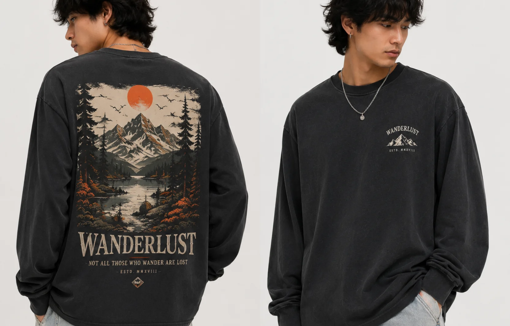
Oversized back graphics stretch artwork across the full width and length of the back panel, often spanning 12 inches or more and covering everything from the shoulder seam to the mid-back. Brands favor this scale because a single design at this size reads clearly from across a room or a crowd, doing the work that a small chest logo simply cannot.
Key Features:
- Large illustrations
- Brand artwork
- Statement graphics
- Detailed compositions
Popular Pairing: Small front logo + oversized back print
Works Best For:
- Streetwear
- Fashion collections
- Brand merchandise
Vintage Washed Prints Long-Sleeve T-Shirt Designs
Vintage washed prints run the garment through a chemical or pigment dye after printing, cracking the ink by 20-40%, and softening the colors so the graphic looks like it survived a decade in someone’s closet. The faded, weathered finish draws inspiration from retro apparel and remains popular across multiple fashion categories.
Key Features:
- Distressed artwork
- Faded typography
- Retro color palettes
- Aged print effects
Popular Pairing: Vintage graphics + washed fabric finishes
Works Best For:
- Music merchandise
- Lifestyle apparel
- Retro-inspired collections
Puff Print Graphics Long-Sleeve T-Shirt Designs
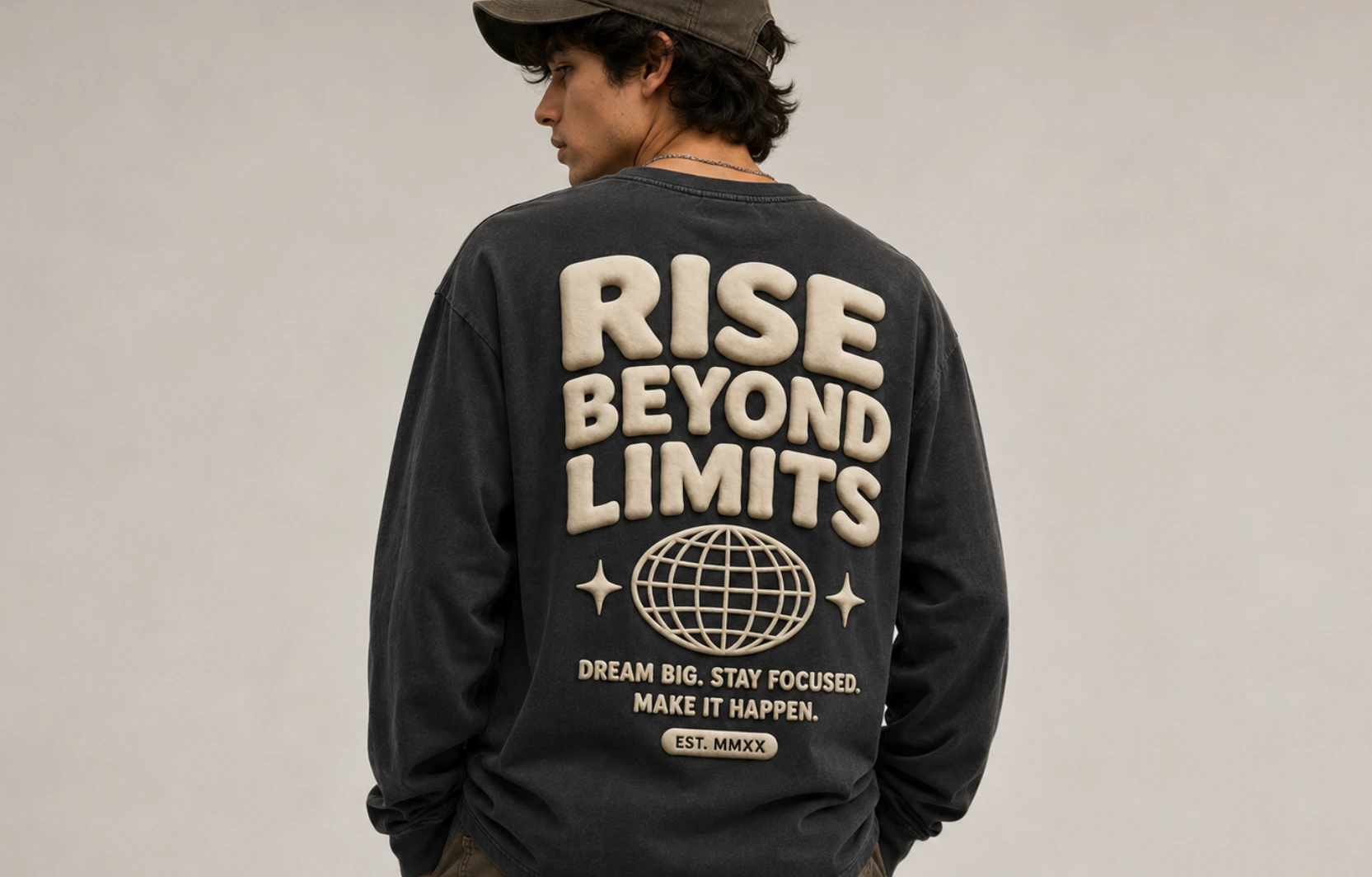
Puff print graphics rely on a foaming agent mixed into the ink that expands when heated, lifting the design off the fabric by 1 to 2 millimeters or more, so it can actually be felt, not just seen. The raised texture gives bold lettering or simple shapes a tactile, almost sculpted quality that flat screen printing cannot replicate.
Key Features:
- Raised print texture
- Bold typography
- Dimensional graphics
- High-contrast designs
Popular Pairing: Large text-based designs
Works Best For:
- Streetwear
- Premium apparel
- Fashion-focused collections
Y2K-Inspired Long-Sleeve T-Shirt Designs
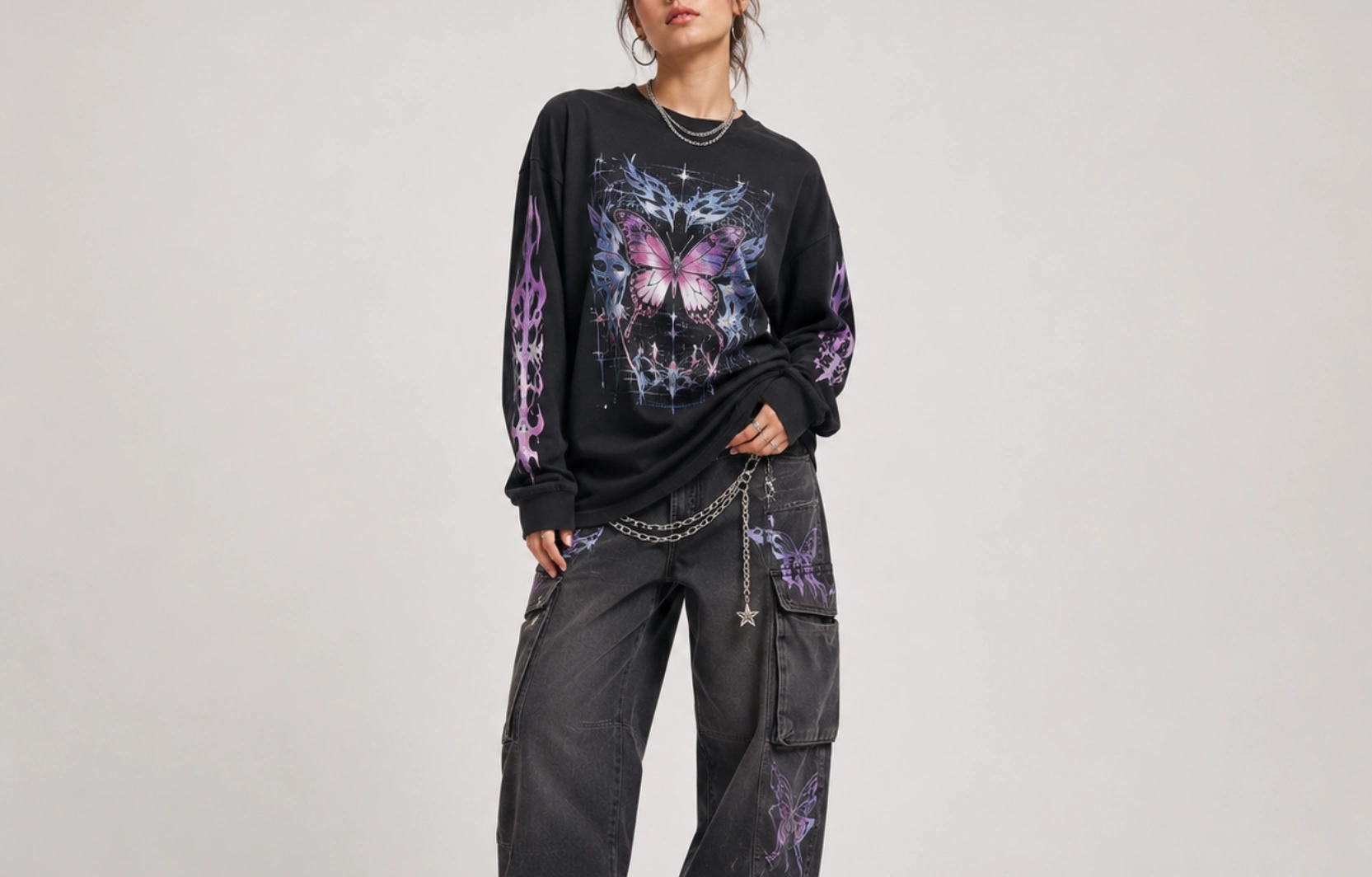
Y2K-inspired designs draw directly from early-2000s visual culture: chrome and gradient lettering, butterfly and flame motifs, low-slung graphic placements, and pixelated or glitch-style digital effects that mimic the look of early computer graphics. These elements work together to recreate the bold, slightly maximalist look that defined early-2000s streetwear and music merchandise.
Key Features:
- Futuristic artwork
- Chrome-inspired graphics
- Bold typography
- Digital aesthetics
Popular Pairing: Sleeve graphics + center chest artwork
Works Best For:
- Youth-focused brands
- Fashion collections
- Trend-driven apparel
Abstract Artwork Long-Sleeve T-Shirt Designs
Abstract artwork builds a composition from geometric shapes, brushstrokes, color blocking, and asymmetric patterns rather than recognizable objects or scenes. Because there is no literal subject to anchor the design, brands have more room to experiment with color and layout while still producing apparel that looks deliberate and gallery-worthy.
Key Features:
- Geometric forms
- Artistic patterns
- Color compositions
- Non-representational visuals
Popular Pairing: Full back prints and Wrap-around layouts
Works Best For:
- Creative brands
- Artistic merchandise
- Contemporary fashion
Wrap-Around Sleeve Prints T-Shirt Designs
Wrap-around sleeve prints extend a single design past the front and back seams of the sleeve, so the graphic curves continuously around the arm rather than stopping flat on one panel. This seamless wrap turns the sleeve into a 360-degree canvas, giving even a simple pattern or wordmark a sense of motion as the wearer moves.
Key Features:
- Continuous artwork
- Repeating patterns
- Sleeve typography
- Connected graphics
Popular Pairing: Minimal front design + detailed sleeve artwork
Works Best For:
- Streetwear
- Athletic apparel
- Custom merchandise
How to Choose the Right Long Sleeve T-Shirt Design
Choosing the right long-sleeve t-shirt design depends on the target audience, design purpose, print placement, color, contrast, and design complexity. The most effective designs align with the intended audience, purpose, placement strategy, and overall aesthetic, and considering these factors early helps create apparel that feels cohesive and achieves its intended visual impact.
- Define the Target Audience
The audience often determines the style, graphics, and overall presentation of a design, since streetwear enthusiasts, outdoor and lifestyle communities, sports teams, event attendees, and brand customers each respond to different visual approaches. A streetwear crowd tends to favor oversized graphics and bold typography, while a corporate or outdoor audience usually responds better to smaller, more restrained branding.
Design Tip: Match the design style to audience preferences rather than following trends alone. - Identify the Design Purpose
The purpose of the shirt, whether it’s brand awareness, merchandise sales, event promotion, team identification, or personal expression, determines how prominent the graphics should be and which design elements deserve the most attention. A shirt built for brand awareness usually leans on a clear, visible logo placement, while a fashion-driven release can prioritize artwork over branding.
Design Tip: Prioritize one primary objective to maintain a clear visual direction. - Choose the Right Print Placement
Placement affects visibility, balance, and how viewers interact with the design. Left chest suited to subtle branding, the center chest to primary graphics, the full back to detailed artwork, the sleeves to typography and accents, and the cuffs and hem to small details. The same artwork can look entirely different depending on which of these five zones it occupies, so the placement decision should happen alongside the design itself, not after.
Design Tip: Avoid using every available print area on a single shirt unless the concept requires a highly detailed layout. - Consider Color and Contrast
Color selection influences both visual appeal and readability, with shirt color, print color, brand colors, and seasonal palettes all playing a role in how a design ultimately performs. Strong contrast, such as a light print on a dark garment, keeps graphics legible at a distance, while closely matched tones can mute a design’s impact even when the artwork itself is strong.
Design Tip: Test designs on both light and dark garment colors before finalizing artwork. - Balance Design Complexity
The level of detail should match the size and placement of the design, since larger print areas like the back panel can support detailed illustrations, scene-based artwork, and layered graphics, while smaller placements like the left chest or cuffs work better with logos, icons, short text, and minimalist graphics. Overloading a small placement with too much detail often makes a design illegible once printed, while underusing a large area can leave it feeling unfinished.
Design Tip: Focus on clarity and readability before adding additional design elements.
Long Sleeve T-Shirt Print Placement Guide
The best print placements for long-sleeve t-shirts include the left chest, center chest, full back, sleeves, cuffs, and hem. Each location offers different levels of visibility, design space, and visual impact, making the selection of placement an important part of the overall design process.
| Placement | Recommended Size | Visibility | Best For |
| Left Chest | 2.5″–5″ wide | Medium | Logos, icons, minimalist branding |
| Center Chest | 6″–12″ wide | High | Graphics, typography, promotional designs |
| Full Back | 10″–14″ wide | High | Large artwork, storytelling graphics, statement designs |
| Sleeve Print | 2″–4″ wide | Medium to High | Typography, patterns, vertical logos |
| Cuff Print | 1″–3″ wide | Low to Medium | Subtle branding, symbols, small details |
| Hem Print | 1″–3″ wide | Low | Signature graphics, secondary branding |
Left Chest Placement
Left chest placement remains one of the most popular options because it creates a clean, professional appearance that mirrors where a blazer pocket or name badge would sit, and small graphics in this area stay visible while leaving enough space for additional design elements elsewhere on the garment. It works best for brand logos, monograms, small illustrations, and minimalist graphics, offering a timeless appearance that works across most apparel styles and pairs easily with back or sleeve prints.
Center Chest Placement
Center chest designs sit directly at eye level, immediately drawing attention and often becoming the focal point of the garment, with this placement supporting both a simple one-color graphic and more detailed artwork while maintaining strong visibility from a distance. It works best for graphic artwork, typography, event apparel, and promotional designs, delivering high visibility and a balanced presentation suitable for most design categories.
Full Back Placement
Full back placement provides the largest printable area on a long-sleeve t-shirt, often spanning 10 to 14 inches across the shoulder blades, and that extra real estate allows designers to incorporate larger graphics, detailed illustrations, and storytelling elements that may not fit comfortably on the front. It works best for large illustrations, streetwear graphics, vintage artwork, and brand storytelling, offering maximum creative freedom, support for complex artwork, and strong visual impact.
Sleeve Placement
Sleeve placement takes advantage of the extended vertical canvas running from shoulder to wrist, where designs can run vertically, repeat along the sleeve, or wrap around the arm to create a more dynamic appearance. It works best for typography, logos, repeating patterns, and graphic accents, giving the garment a distinctive look, visibility from multiple angles, and a finish that complements front and back artwork.
Cuff and Hem Placement
Cuff and hem placement favors subtle design details over large visual statements, often holding nothing more than a small symbol or a few characters of text, which makes it particularly well-suited to branding elements that add character without competing with the primary design. It works best for small logos, initials, symbols, and signature marks, resulting in a clean, understated, premium aesthetic that adds detail without cluttering the design.
Long-Sleeve T-Shirt Design Style vs Best Placement
Different design styles perform better in specific print locations. Matching the design style with the right placement helps improve visibility, balance, and overall visual impact.
| Design Style | Best Placement | Alternative Placement | Why It Works |
| Graphic Prints | Center Chest | Full Back | Creates a strong focal point for detailed artwork |
| Typography Designs | Sleeves | Center Chest | Allows text to remain visible from multiple angles |
| Minimalist Designs | Left Chest | Cuff | Maintains a clean and understated appearance |
| Vintage Designs | Full Back | Center Chest | Provides enough space for distressed artwork and retro graphics |
| Nature-Inspired Designs | Full Back | Center Chest | Supports larger illustrations and scenic compositions |
| Streetwear Designs | Full Back + Sleeves | Center Chest | Maximizes visual impact through multiple print areas |
| Abstract Artwork | Full Back | Wrap-Around Sleeve | Gives artwork more room to create movement and visual interest |
| Y2K Designs | Center Chest + Sleeves | Full Back | Supports bold typography and futuristic graphics |
| Puff Print Graphics | Center Chest | Full Back | Enhances visibility of raised print textures |
| Wrap-Around Designs | Sleeves | Full Sleeve | Uses the unique structure of long-sleeve apparel effectively |
Quick Takeaway: If you are unsure where to place a design, start by matching the design style to its most commonly used print location. Graphic-heavy concepts generally perform best on the chest or back, while typography and branding elements often work better on sleeves, cuffs, and smaller placement areas.
What Are the Common Long-Sleeve T-Shirt Design Mistakes You Should Avoid?
The most common long-sleeve t-shirt design mistakes include overcrowding the layout, ignoring sleeve placement opportunities, using incorrect print sizes, choosing low-resolution artwork, creating poor color contrast, and mixing multiple design styles within the same design. Avoiding these issues helps improve readability, visual balance, and overall design quality.
- Adding Too Many Design Elements
Using too many graphics, text blocks, logos, and decorative elements, including multiple competing graphics, excessive typography, too many print locations, and limited white space, can make a design feel cluttered, and when several visual elements compete for attention, the overall message becomes less clear, and the design loses its focal point. A better approach prioritizes one primary focal point, limits supporting design elements, and leaves sufficient spacing between graphics. - Not Using Sleeve Space Effectively
One of the biggest advantages of a long-sleeve t-shirt is the additional design space provided by the sleeves, and while leaving sleeves completely unused is not always a mistake, blank sleeves, despite complex front designs, unbalanced front-to-back layouts, and missed branding opportunities, can mean failing to consider them results in missed potential for branding and visual balance. A better approach adds sleeve typography or icons, uses subtle sleeve branding, and extends design themes across sleeves when appropriate. - Choosing the Wrong Print Size
Print size affects both visibility and visual balance, and common issues like small graphics on large print areas, oversized chest artwork, and poor scaling between design elements show how graphics that are too small may go unnoticed, while oversized artwork can overwhelm the garment and make the design feel disproportionate. A better approach matches artwork size to placement area, tests multiple size variations, and maintains proportional spacing throughout the design. - Using Low-Resolution Artwork
Image quality directly affects print quality, and low-resolution graphics often appear pixelated, blurry, or distorted after printing, especially when detail is lost during enlargement, which reduces the professional appearance of the finished garment. A better approach uses high-resolution artwork files, creates designs in scalable formats when possible, and reviews artwork quality before production. - Using Colors That Reduce Visibility
A design can contain strong artwork and still perform poorly if the colors blend into the shirt fabric, with dark graphics on dark garments, light graphics on light garments, and difficult-to-read typography, all stemming from insufficient contrast that makes graphics and text difficult to see from a distance. A better approach uses contrasting color combinations, tests designs on multiple garment colors, and prioritizes readability when selecting colors. - Combining Conflicting Design Styles
Mixing unrelated design aesthetics, such as combining vintage artwork, futuristic typography, minimalist branding, and streetwear graphics within the same design, can create an inconsistent appearance, often resulting in inconsistent visual themes, conflicting typography styles, and a lack of design cohesion that weakens the overall concept. A better approach is to choose one primary design direction, use complementary visual elements, and maintain consistency across graphics, typography, and placement.
How Can You Preview a Long-Sleeve T-Shirt Design Before Printing?
You can preview a long-sleeve t-shirt design before printing by using digital mockups, placement proofs, and design previews to evaluate artwork size, positioning, color combinations, and overall garment appearance.
- Review Design Placement
A design may look balanced on a blank canvas but appear completely different when applied to a garment, which is why reviewing placement, including graphic alignment, spacing between design elements, sleeve placement accuracy, and overall visual balance, helps ensure graphics align correctly with the chest, back, sleeves, and other print areas. Proper placement improves readability and creates a more professional appearance. - Compare Different Shirt Colors
Color selection can significantly affect how artwork appears on a garment, so testing a design across multiple shirt colors and checking color contrast, typographic readability, graphic visibility, and brand color consistency helps determine whether the graphics remain visible and visually appealing. A design that works on a white shirt may not perform equally well on darker-colored garments.
- Validate Print Size
Artwork size influences both visibility and proportion, so previewing print dimensions and checking artwork scale, placement proportions, typography size, and viewing distance visibility helps ensure graphics fit the selected placement without appearing too small or overwhelming the garment. Proper sizing improves design balance and prevents printing issues.
- Review Front, Back, and Sleeve Layouts Together
Long-sleeve t-shirts often use multiple print locations, so reviewing all design areas simultaneously, including the relationship between front and back graphics, sleeve-to-body design consistency, visual hierarchy, and overall composition, helps create a cohesive visual experience across the garment. Multiple print areas should complement each other rather than compete for attention.
- Use Mockups to Visualize the Final Design
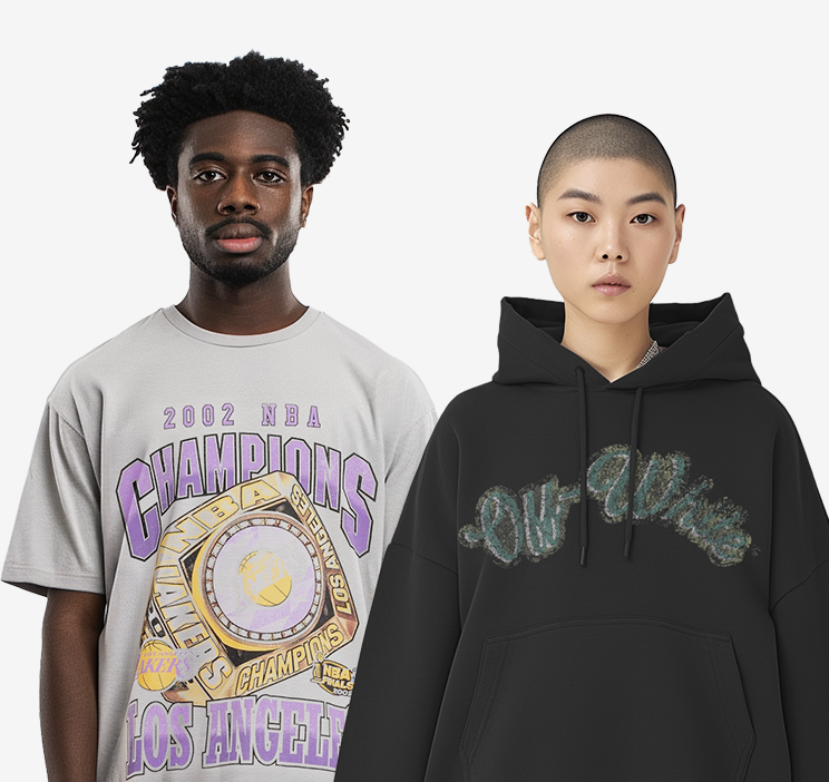
Digital mockups provide a realistic representation of how a design may appear on a finished long-sleeve t-shirt, letting designers evaluate artwork, placement, colors, and proportions before production. A mockup generator speeds this up by automatically applying artwork to garment templates across multiple colors and placements. Benefits include faster design evaluation, better placement decisions, and easier color comparisons. Mockups help reduce design revisions and provide greater confidence before moving into printing or production.
Frequently Asked Questions
What are the most popular long-sleeve t-shirt design ideas?
The most popular long-sleeve t-shirt design ideas include graphic prints, typography designs, minimalist logos, vintage artwork, nature-inspired graphics, streetwear-style layouts, and color-block designs. These styles remain popular because they adapt well to different print placements and apparel aesthetics.
What is the best print placement for a long-sleeve t-shirt?
The best print placement depends on the design objective. Left chest placement works well for logos and minimalist branding, center chest placement suits primary graphics, full back placement supports larger artwork, and sleeve prints are effective for typography and decorative accents.
How large should a sleeve print be on a long-sleeve t-shirt?
Most sleeve prints are between 2 and 4 inches wide, while the length varies depending on the design. Typography, logos, and repeating patterns are commonly placed vertically along the sleeve to maximize visibility without overwhelming the garment.
Are back prints better than front prints on long-sleeve shirts?
Neither placement is universally better because each serves a different purpose. Front prints provide immediate visibility, while back prints offer more space for detailed artwork and statement graphics. Many long-sleeve t-shirt designs combine both placements to create a balanced layout.
What long-sleeve t-shirt design trends are popular right now?
Current long-sleeve t-shirt design trends include oversized back graphics, vintage washed prints, puff-print typography, Y2K-inspired artwork, abstract illustrations, and wrap-around sleeve designs. These styles remain popular because they create a strong visual impact while utilizing the additional space available on long-sleeve apparel.
How can you preview a long-sleeve t-shirt design before printing?
You can preview a long-sleeve t-shirt design by using digital mockups, placement proofs, and design previews. These tools help evaluate artwork size, print placement, color combinations, and overall garment appearance before moving into production.

 Trusted By Thousands Of Designers
  Cancel Your Subscription Anytime
  30 Day Money Back Guarantee