
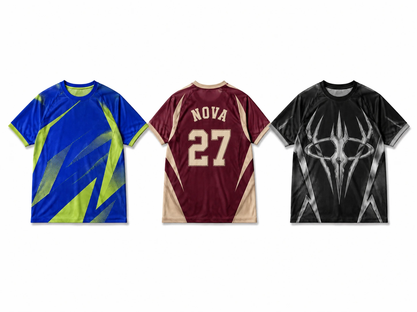
Jersey T-shirt design ideas include team logo layouts, player name and number styles, varsity lettering, collegiate crests, retro club designs, sublimation patterns, geometric graphics, stripes, color blocks, monochrome styles, streetwear influences, oversized logos, and statement back graphics. Each jersey tee style uses different combinations of typography, logos, numbers, patterns, colors, and placement to create a distinct visual identity. These designs help customize sports apparel for teams, schools, events, brands, and personal wear.
Choosing the right jersey T-shirt design requires balancing purpose, audience, style, garment type, print method, and artwork placement. Consider graphic scale, color contrast, typography hierarchy, and readability to keep the composition clear. Review designs with realistic mockups and physical samples to catch sizing, alignment, and production issues before final printing. A structured approach creates effective jersey T-shirts with strong identity and practical design execution.
28 Jersey T-Shirt Design Ideas are:
1. Team Logo and Name Design
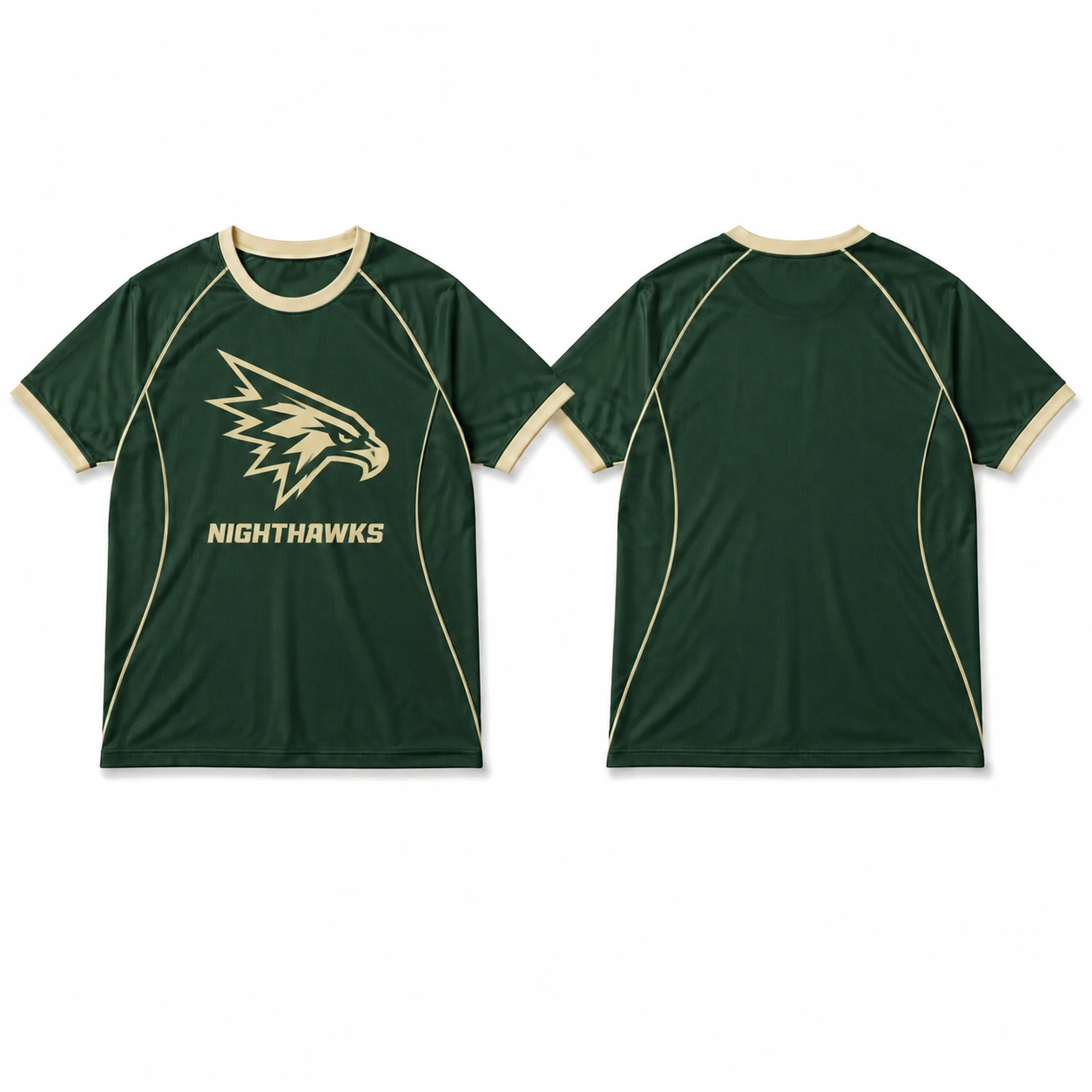
Team logo and name design combines team identity with clear typography, using the logo as the primary recognition element and the team name as supporting text. Balance their size, spacing, and placement so neither element competes for attention. Consistent team colors and suitable positioning strengthen the overall jersey T-shirt design.
Defining elements: logo prominence, team name hierarchy, balanced typography, consistent colors, and chest or back placement.
Popular directions:
- Chest logo placement: position a compact logo on the left chest with a smaller team name for a clean jersey tee.
- Large back layout: place the team name above a larger logo or player number for a traditional sports jersey look.
- Balanced combination: match logo size, typography, and colors for cohesive custom jersey T-shirts.
- Modern branding: use simplified graphics and spacing for distinctive jersey T-shirt design ideas.
2. Player Name and Number Design
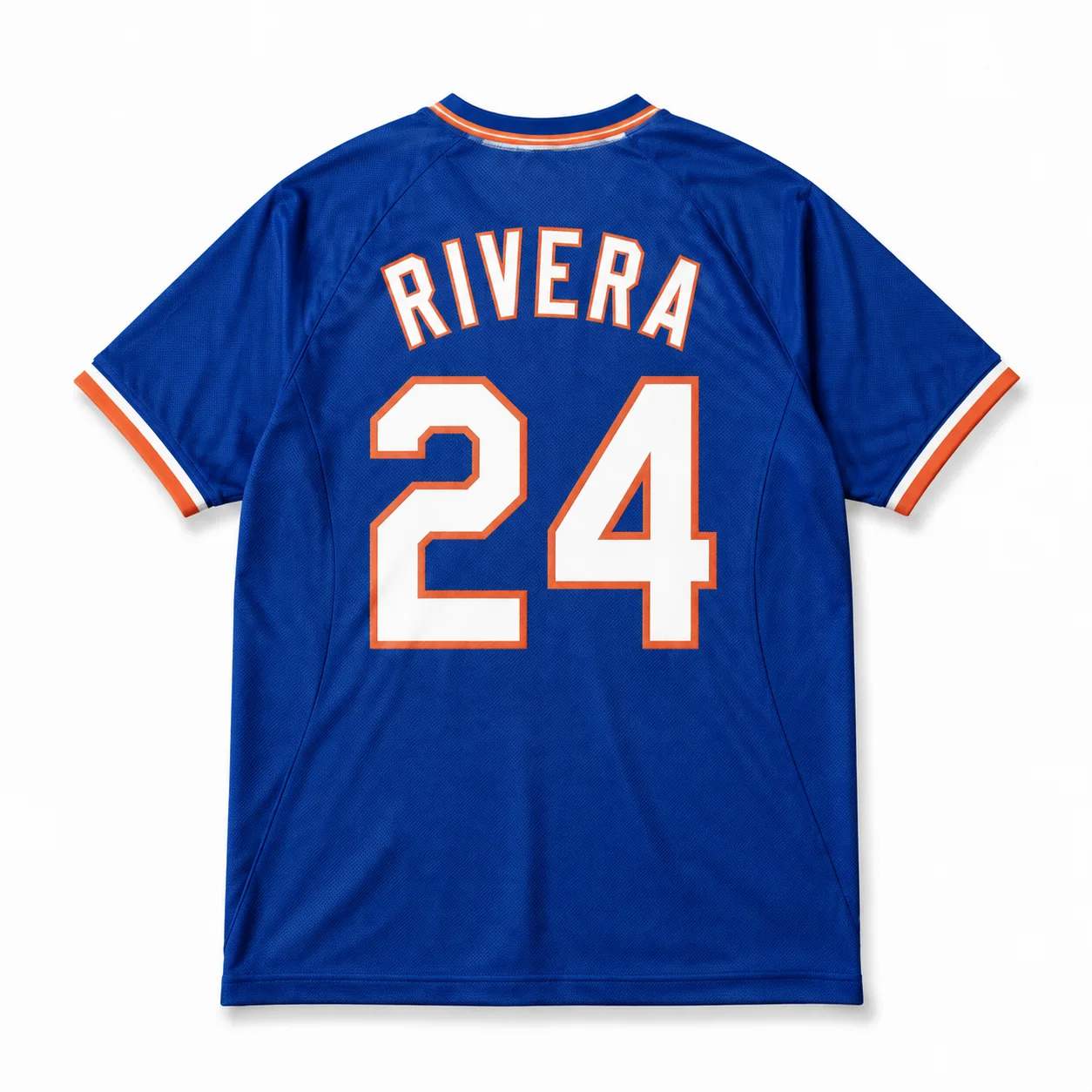
Player name and number design creates a personalized athletic identity by making the number the main focal point while using the player name as supporting information. Careful control of spacing, scale, contrast, and alignment keeps the composition clear and polished for a sports jersey.
Defining elements: oversized numbers, player-name placement, jersey-style typography, strong contrast, balanced spacing, and clear visual hierarchy.
Popular directions:
- Number-focused back design: place a large number at the center back with the name above for a classic team jersey look.
- Name and number combination: coordinate typography, spacing, and colors for a cohesive jersey T-shirt design.
- Minimal athlete layout: use a clean number with smaller supporting text for a simple jersey tee.
- Professional sports style: apply bold lettering and structured placement for personalized jersey T-shirts.
3. Minimal Block Number Design
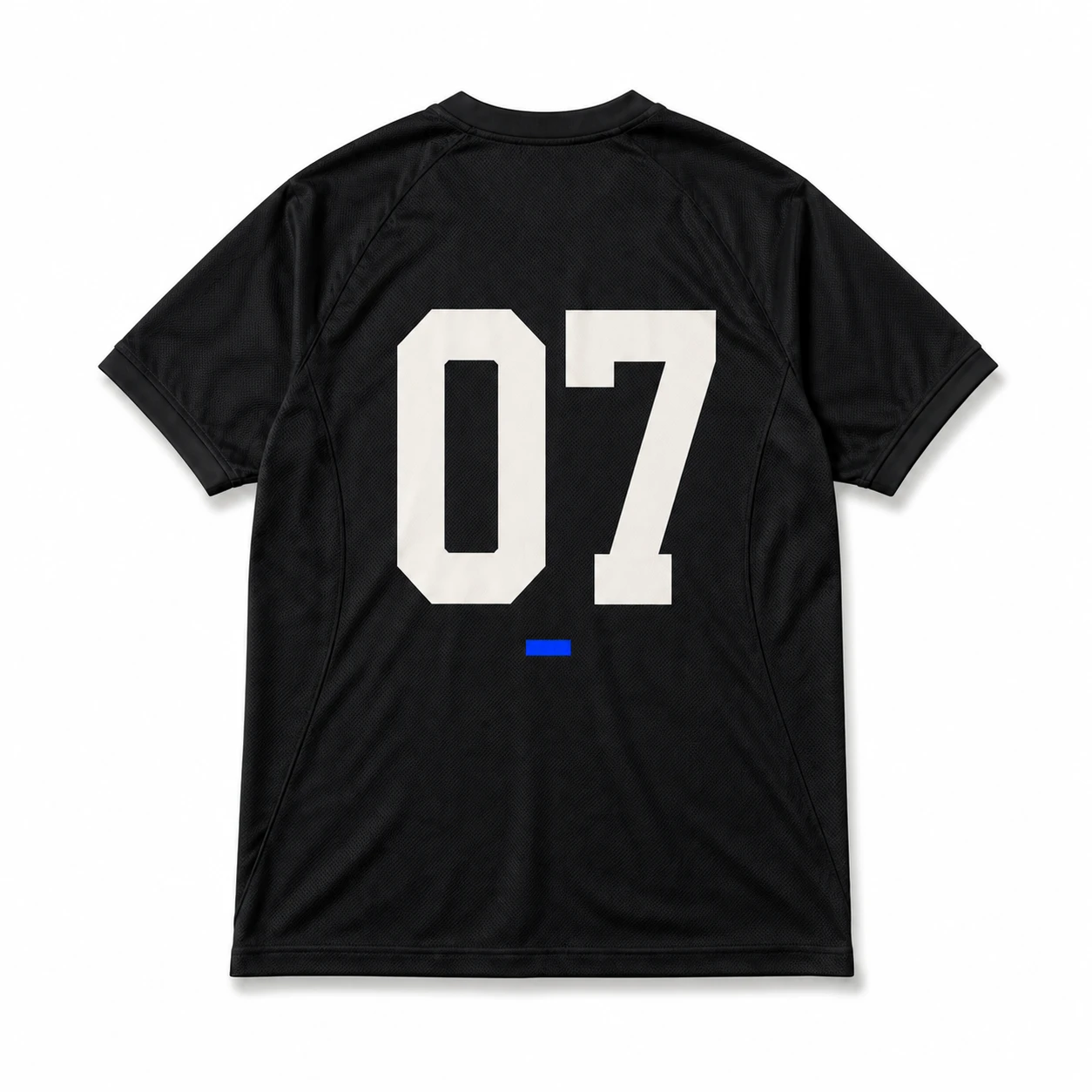
Minimal block number design makes the number the central feature of the jersey T-shirt design, creating a look with little clutter. An oversized number provides recognition, while supporting details keep composition organized. Careful placement, spacing, and contrast help the number remain readable across jersey tee styles and positions.
Defining elements: oversized block numbers, minimal text, clean spacing, strong contrast, readable typography, and balanced placement.
Popular directions:
- Large back number: position an oversized number at the center back with minimal text above or below for a classic team jersey style.
- Front number placement: use a smaller block number on the chest for a simple jersey tee design.
- Number-focused layout: limit graphics so the bold number remains the primary identity element.
- Contrast-based design: use contrasting colors for clear custom jersey T-shirts.
4. Varsity Arch Lettering Design
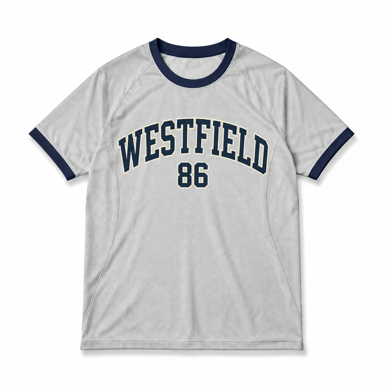
Varsity arch lettering design uses curved athletic typography to create a classic collegiate look for jersey T-shirts. Arched text makes the team or school name the main visual element while balancing logos or numbers. Bold lettering, consistent spacing, and careful chest placement create a structured sports-inspired composition.
Defining elements: curved varsity lettering, bold typography, balanced spacing, athletic styling, chest placement, and collegiate structure.
Popular directions:
- Classic chest arch: place a curved team name across the upper chest for a traditional jersey tee look.
- School-style lettering: use collegiate typography with team names, mascots, or locations for recognizable jersey T-shirt designs.
- Layered arch layout: combine arched text with a small logo or number while keeping typography dominant.
- Retro varsity style: use vintage lettering and team colors for personalized jersey T-shirts.
5. Collegiate Crest Design
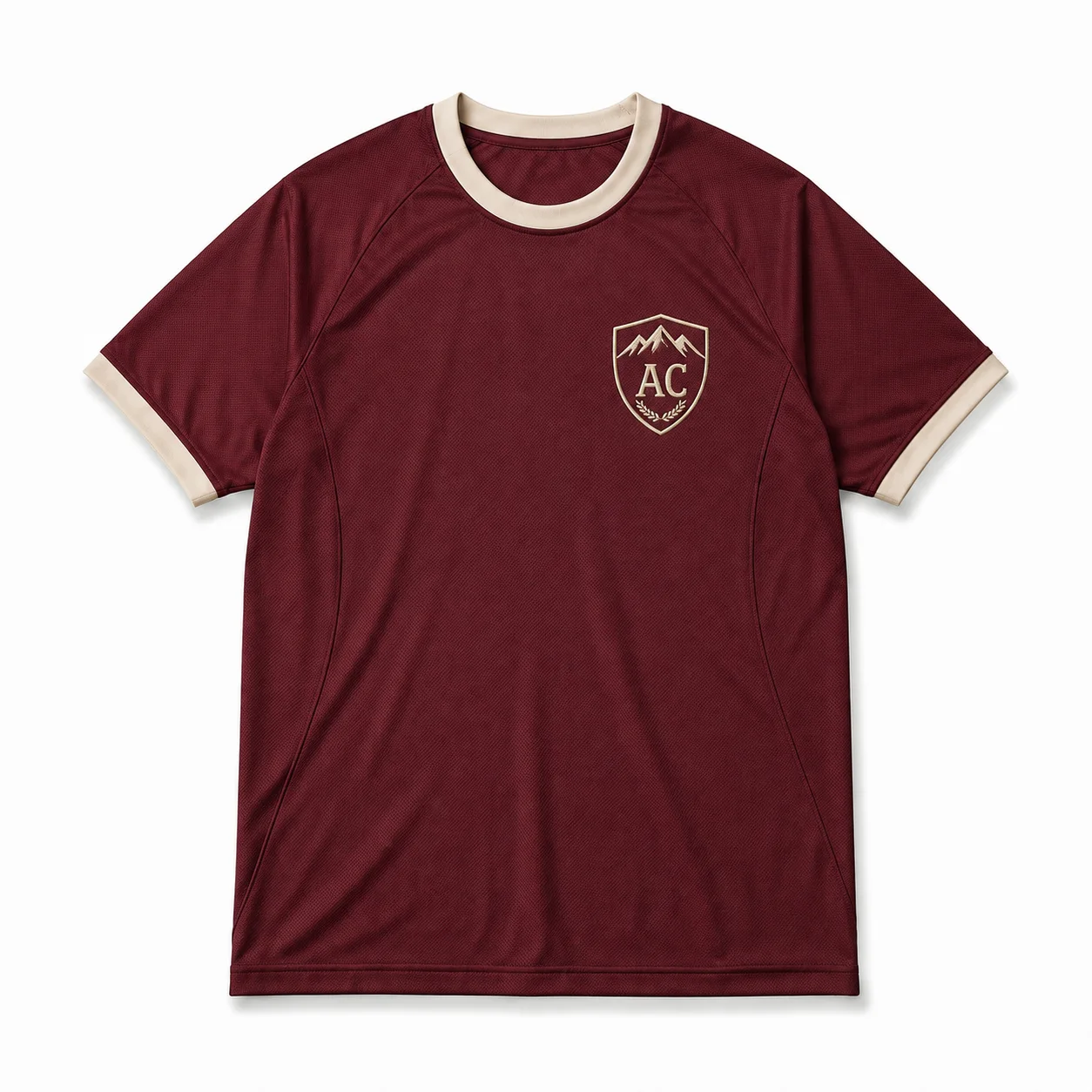
Collegiate crest design combines team identity, athletic heritage, and compact emblem placement to create classic jersey T-shirt designs. Shields, initials, mascots, and badge-style graphics work well on the chest when their details remain clear at a smaller scale. A controlled layout balances typography, symbols, and team colors without making the crest appear crowded.
Defining elements: compact crest size, emblem structure, collegiate typography, clean shapes, balanced spacing, and controlled graphic details.
Popular directions:
- Shield crest: use a structured shield with team initials, mascot, or short text for a classic athletic look.
- Badge design: combine symbols, typography, and team colors within a compact layout for personalized jersey T-shirts.
- Mascot emblem: place a simplified mascot illustration inside a crest for recognizable jersey designs.
- Letter mark: use initials or a monogram within a small chest crest for a minimal jersey tee.
6. Retro Club Jersey Design
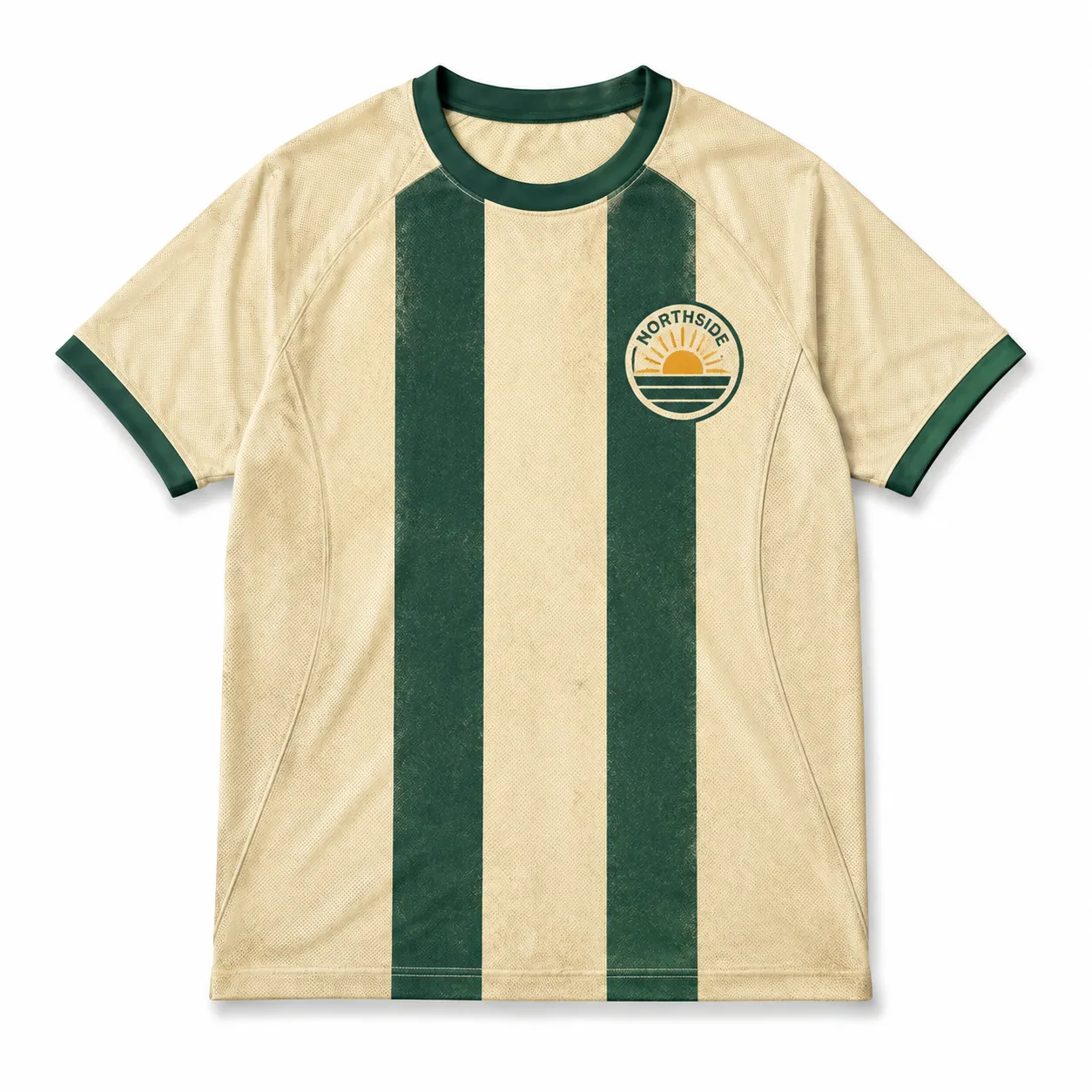
A jersey T-shirt takes on a distinctive, period-inspired sports aesthetic when retro club design elements draw from classic team uniforms and historic athletic styles. Traditional striping and heritage logos reference club identities, while vintage typography recreates classic sports lettering and restrained colors create a timeless throwback appearance.
Defining elements: vintage typography, traditional stripes, heritage logos, classic collars, restrained colors, structured layouts.
Popular directions:
- Classic club style: combine vintage logos with traditional typography for a historic look.
- Striped jersey style: use horizontal or vertical stripes with controlled colors for a classic uniform.
- Vintage typography: apply old-style lettering for team names or slogans in a retro jersey T-shirt design.
- Heritage badge: style a crest with classic shapes and typography for a traditional club look.
7. Vintage Pinstripe Jersey Design
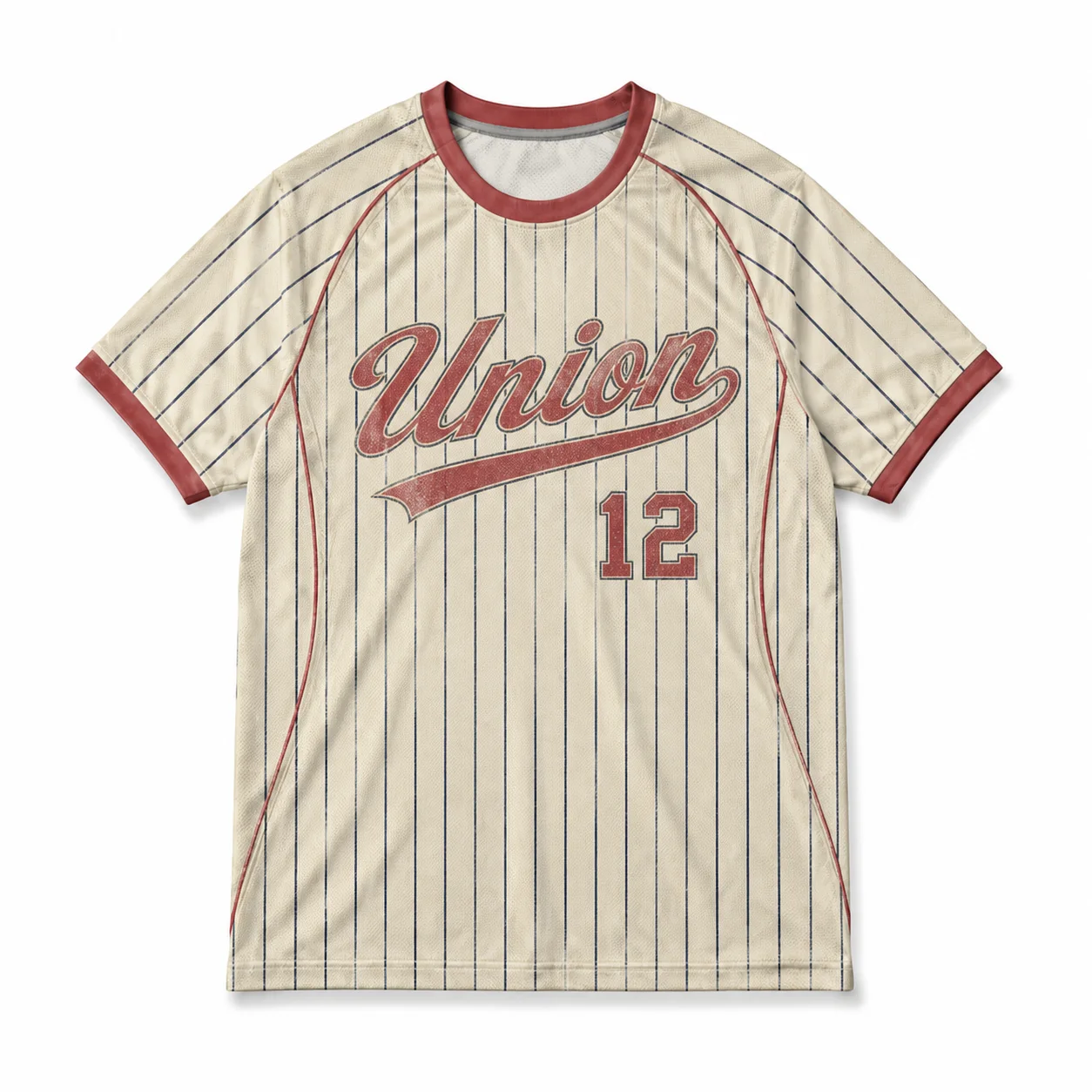
Vintage graphics bring an aged, heritage-inspired direction to jersey T-shirt design ideas through artwork that reflects classic sports uniforms and historic club styles. Traditional pinstripes, worn lettering, muted colors, and heritage-style logos create a nostalgic appearance, while careful spacing keeps names, numbers, and graphics readable.
Defining elements: pinstripe spacing, stripe direction, muted colors, vintage typography, heritage logos, and structured layouts.
Popular directions:
- Classic pinstripe: use evenly spaced vertical stripes with traditional team colors for a heritage-inspired jersey look.
- Faded stripe style: combine softened stripes with worn lettering for a vintage jersey tee.
- Logo-focused layout: place a team logo over the stripes while maintaining clear visual contrast.
- Number placement: add bold player numbers over stripes for personalized jersey T-shirts.
8. Geometric Sublimation Design
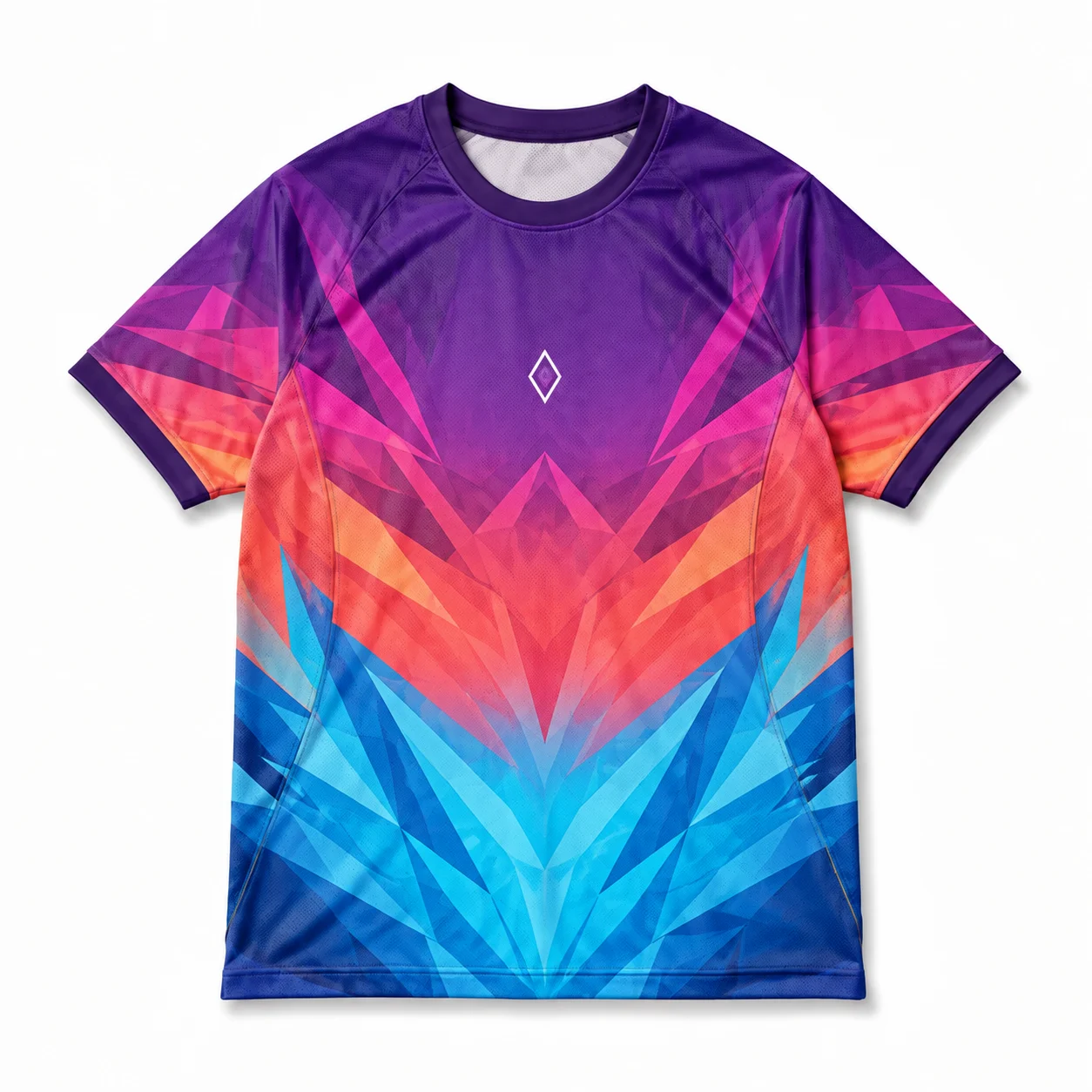
Geometric design builds jersey T-shirt artwork around structured shapes, repeated forms, and deliberate spatial relationships. Circles, polygons, grids, angled lines, and symmetrical patterns can create a dynamic visual system, while sublimation allows these elements to extend across the garment with edge-to-edge coverage. Controlled scale, spacing, and color transitions help the pattern remain cohesive as it wraps around the jersey.
Defining elements: geometric shapes, repeated patterns, color transitions, consistent spacing, controlled scale, and full-garment placement.
Popular directions:
- Grid composition: arrange geometric shapes within a structured grid with consistent spacing across the jersey.
- Repeated shapes: combine circles, triangles, or polygons into a continuous sublimated pattern.
- Symmetrical graphic: mirror geometric forms across the garment for a balanced composition.
- Color-flow design: blend contrasting colors through repeated shapes to create seamless edge-to-edge artwork.
9. Tribal Sublimation Pattern
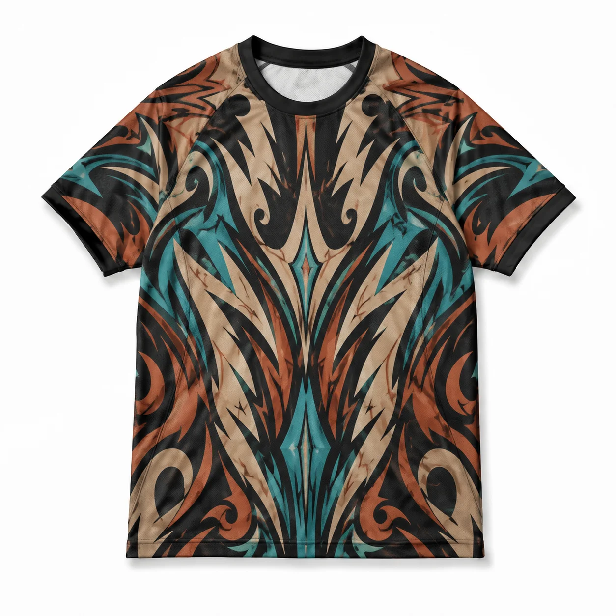
A jersey T-shirt takes on a distinctive, pattern-driven appearance when tribal sublimation elements use repeated motifs and flowing graphic structures across the garment surface. Symmetrical tribal shapes can create balanced designs, directional patterns can add movement, and full-surface sublimation lets detailed artwork extend across the entire jersey tee without limiting placement.
Defining elements: tribal motifs, repeated patterns, symmetrical structures, directional flow, full garment coverage, strong contrast, and sublimation-based artwork.
Popular directions:
- Symmetrical pattern: combine mirrored tribal shapes for a balanced jersey t-shirt design.
- Flowing motif: use connected patterns that move across panels and garment sections.
- Full-surface design: apply repeated graphics across the entire jersey for a bold custom look.
- Contrast pattern: combine dark and light elements to maintain clear visibility and visual structure.
10. Topographic Pattern Design
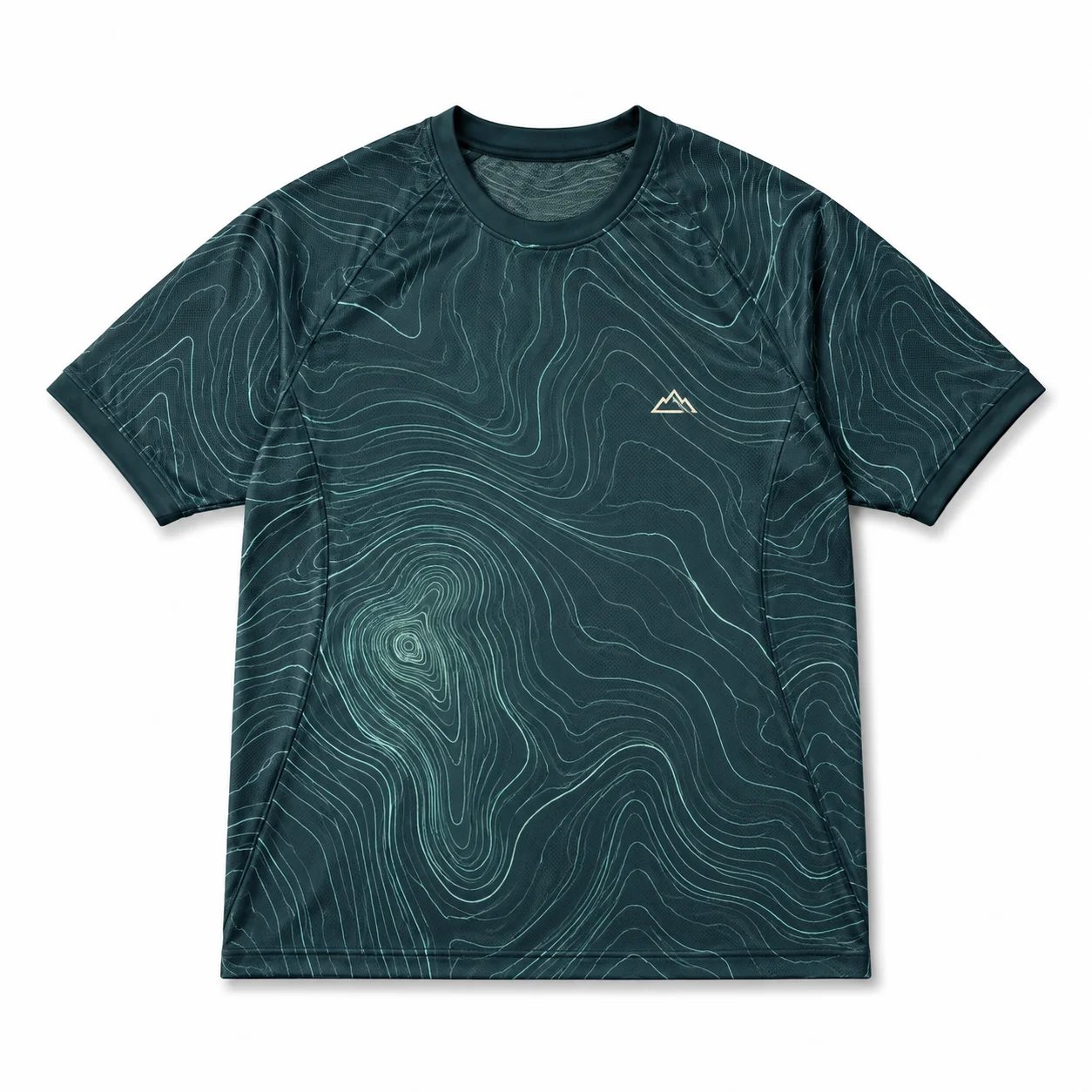
Topographic patterns give a jersey T-shirt a dimensional, map-inspired look through contour lines that flow across the garment. Varying line density can create areas of visual focus, while controlled colors help separate the pattern from logos, numbers, or typography. Wrapping the artwork across multiple garment sections can create a continuous design without disrupting its overall flow.
Defining elements: contour lines, pattern density, directional flow, controlled colors, garment wrapping, visual hierarchy, and print readability.
Popular directions:
- Contour-line pattern: use layered lines to create a map-inspired look across the jersey tee.
- Dense terrain design: increase line density in selected areas for greater visual depth.
- Color contour: combine different tones within the lines for a distinctive jersey T-shirt design.
- Full-garment flow: extend contour graphics across the front, back, and sleeves for cohesive jersey T-shirt design ideas.
11. Contoured Wrap Graphic Design
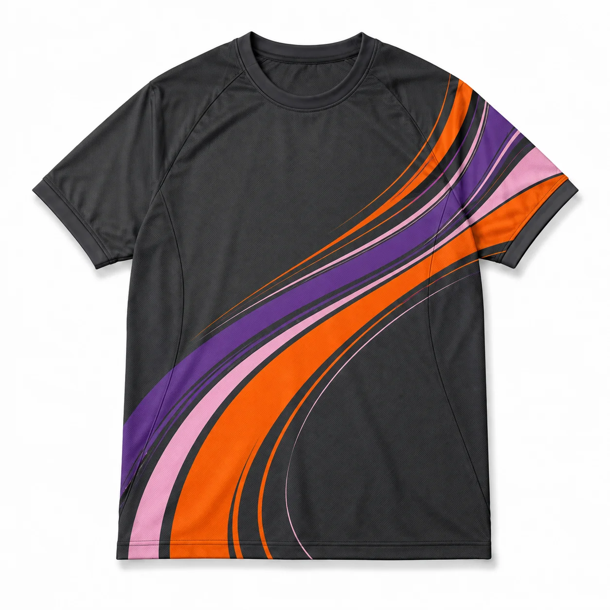
Contoured wrap graphic design creates a flowing jersey T-shirt appearance by using connected lines and vector shapes that follow the garment’s contours. The artwork can move across the torso, sides, and sleeves, creating continuity while maintaining a clear focal area. Controlled line direction, scale, and color help the graphic align with body contours without overwhelming logos, numbers, or typography.
Defining elements: contour flow, connected graphics, body alignment, controlled scale, color transitions, seam interaction, and continuous garment coverage.
Popular directions:
- Torso wrap: extend curved graphics across the front and sides for a continuous jersey tee design.
- Side-flow graphic: direct lines toward the side seams to create movement across garment panels.
- Layered contours: combine overlapping vectors with varied scales for added visual depth.
- Full-wrap design: connect artwork across the torso and sleeves for cohesive jersey T-shirt designs.
12. Bold Stripe Jersey Design
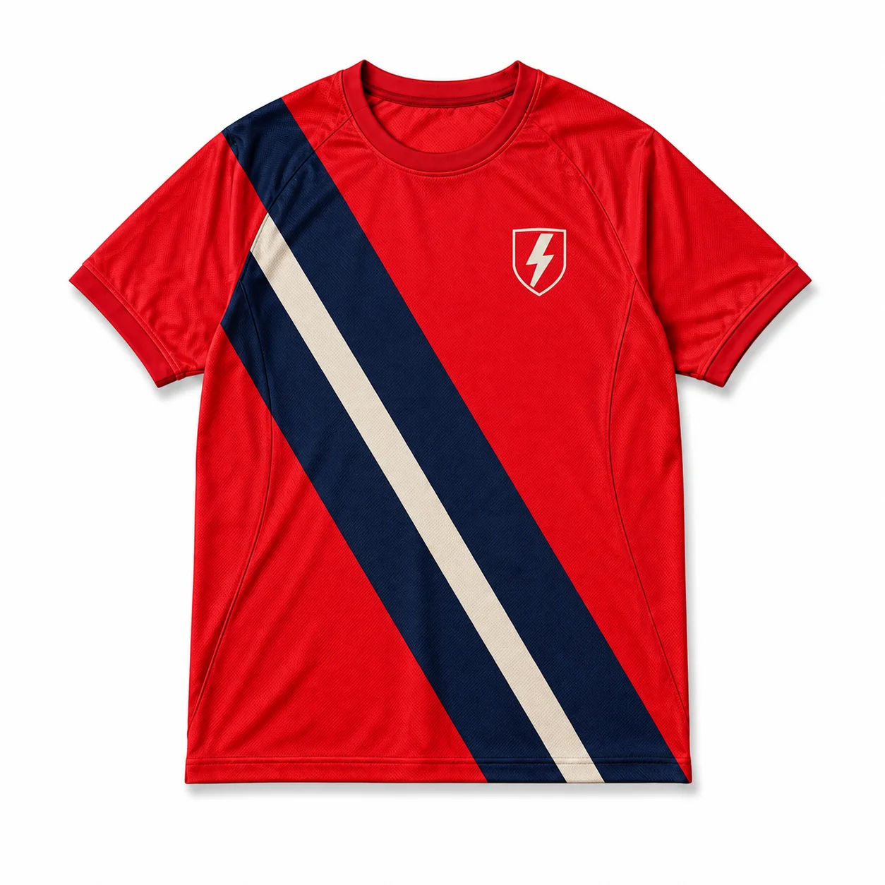
Bold stripe jersey design uses strong horizontal, vertical, or angled bands to create a dynamic sports-inspired appearance. Stripe width, direction, and spacing can establish the visual rhythm, while team colors and contrast help the pattern remain distinct. Logos, names, and numbers should sit within or around the stripes without becoming difficult to read.
Defining elements: stripe width, direction, spacing, strong contrast, team colors, graphic hierarchy, and balanced placement.
Popular directions:
- Horizontal stripes: use evenly spaced bands across the torso for a classic sports-jersey look.
- Vertical stripes: create a streamlined look with elongated stripes running from shoulder to hem.
- Angled stripes: position diagonal bands to add movement and energy to the jersey tee.
- Logo integration: place team logos, names, or numbers over contrasting stripes for clear custom jersey T-shirts.
13. Gradient Color Block Design
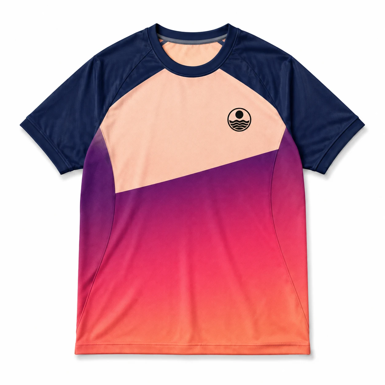
Gradient color block design combines distinct color sections with smooth transitions to create a dynamic jersey T-shirt appearance. Gradients can flow horizontally, vertically, or diagonally, while defined color-block boundaries maintain structure. Strong contrast helps logos, numbers, and typography remain visible against changing backgrounds.
Defining elements: gradient direction, color-block boundaries, smooth transitions, contrast, focal areas, and balanced coverage across the garment.
Popular directions:
- Horizontal gradient: blend colors across the torso for a smooth jersey tee design.
- Diagonal transition: angle the gradient across the garment to create movement.
- Color-block layout: combine solid sections with gradients for a structured custom jersey.
- Graphic overlay: place logos or numbers over stable color areas for clear readability.
14. Monochrome Jersey Design
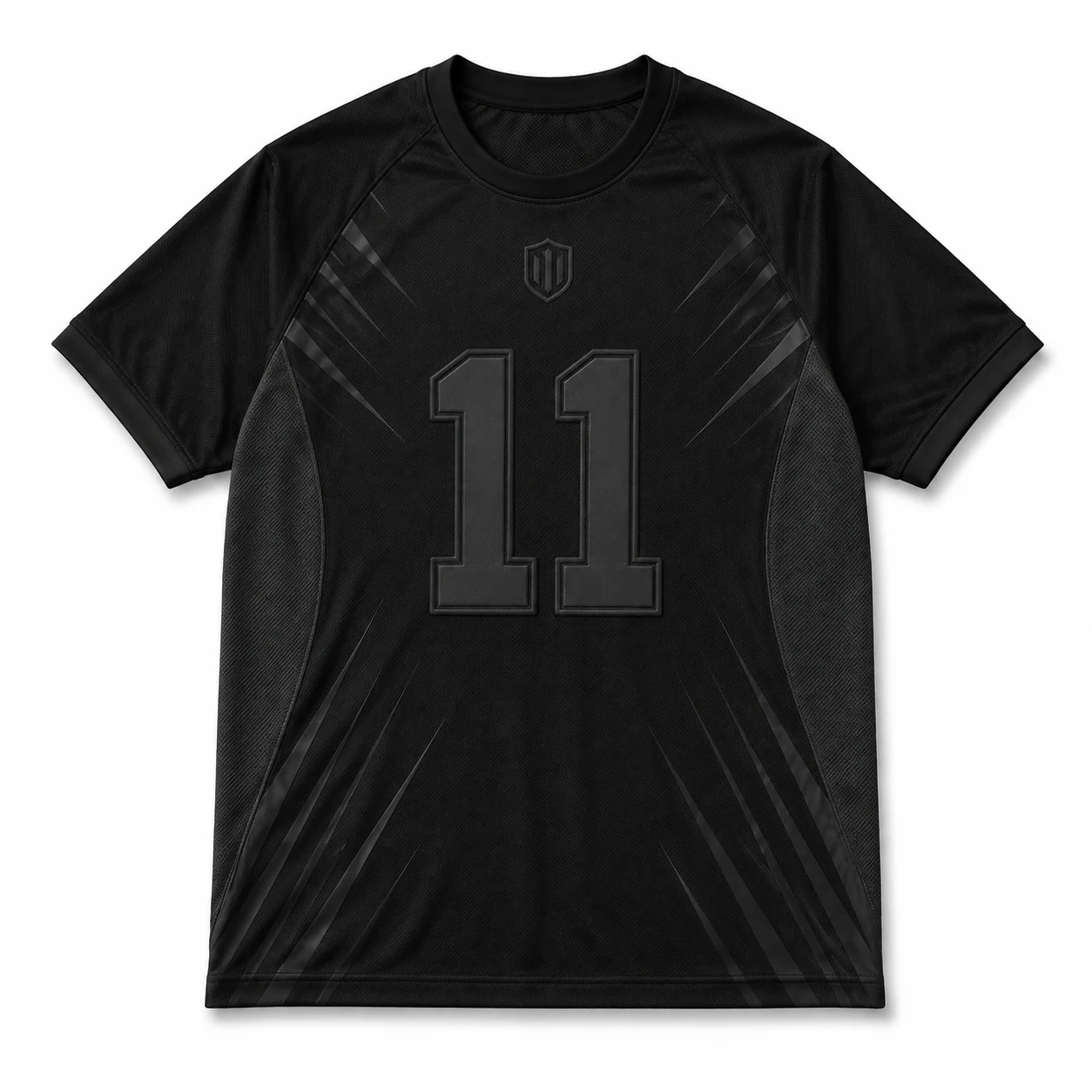
Monochrome jersey design uses different tones within a single color family to create a cohesive, understated appearance. Tonal contrast can separate logos, numbers, typography, and patterns without introducing additional colors. Subtle variations in shade and texture can add depth while maintaining a clean visual system.
Defining elements: single-color palette, tonal contrast, subtle graphics, typography visibility, controlled shading, and cohesive styling.
Popular directions:
- Tonal logo: use lighter or darker logo treatment for subtle team branding.
- Shade layering: combine multiple tones to create depth across the jersey tee.
- Monochrome typography: use contrasting shades for names and numbers.
- Pattern integration: add tonal patterns for distinctive jersey T-shirt designs.
15. High-Contrast Two-Tone Design
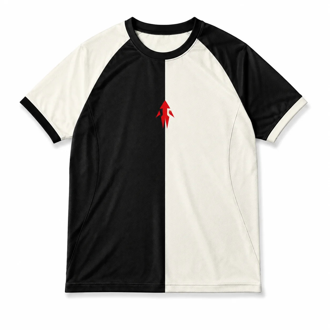
High-contrast two-tone design creates a bold jersey appearance by pairing a dominant color with a strong accent shade. Separating the colors across garment sections establishes clear visual hierarchy, while logos, numbers, and typography can use the strongest contrast for readability. Keeping the palette limited keeps the design from feeling crowded.
Defining elements: dominant color, accent color, strong contrast, garment division, typography clarity, and controlled palette.
Popular directions:
- Split-color layout: divide the jersey into two contrasting sections for a bold athletic look.
- Accent panel: use one color for the main garment and another on selected panels.
- Contrast typography: place names or numbers in the strongest contrasting shade.
- Two-tone branding: coordinate logos and graphics with the two-color system for custom jersey T-shirts.
16. Streetwear Mesh Jersey Design
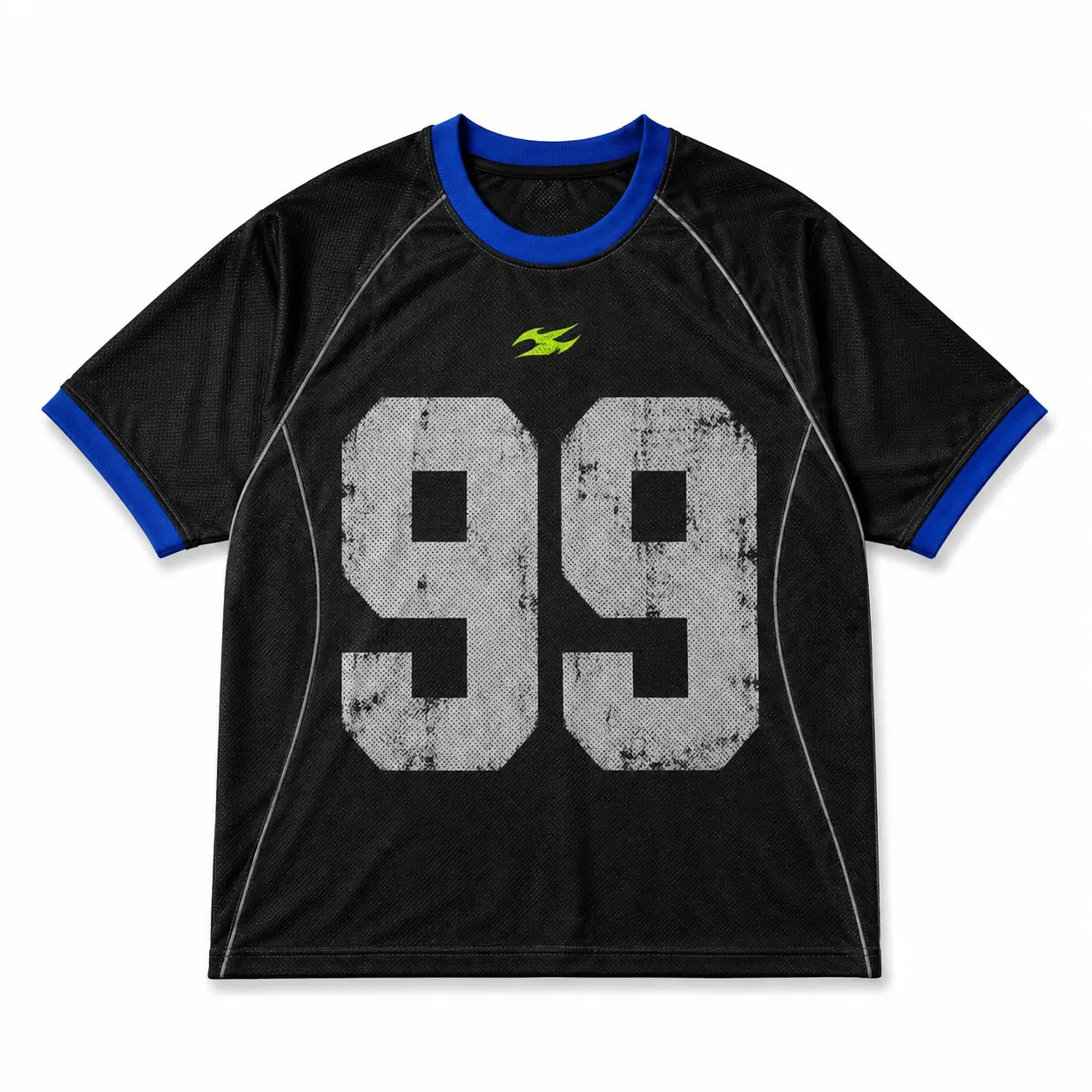
Streetwear mesh jersey design blends athletic construction with oversized graphics and casual lifestyle styling. Mesh texture, ribbed trims, relaxed silhouettes, and bold branding can shift a traditional sports jersey toward contemporary streetwear. Large graphics should work with the garment’s proportions while maintaining a clear visual hierarchy.
Defining elements: mesh texture, oversized silhouette, ribbed trim, lifestyle branding, bold graphics, and relaxed proportions.
Popular directions:
- Oversized graphic: place a large graphic across the front for a statement jersey tee.
- Mesh number: combine athletic numbers with textured mesh for a contemporary look.
- Lifestyle branding: use simplified logos and typography for casual wear.
- Contrast trim: pair bold graphics with contrasting ribbing or sleeve details.
17. Oversized Logo Jersey Design
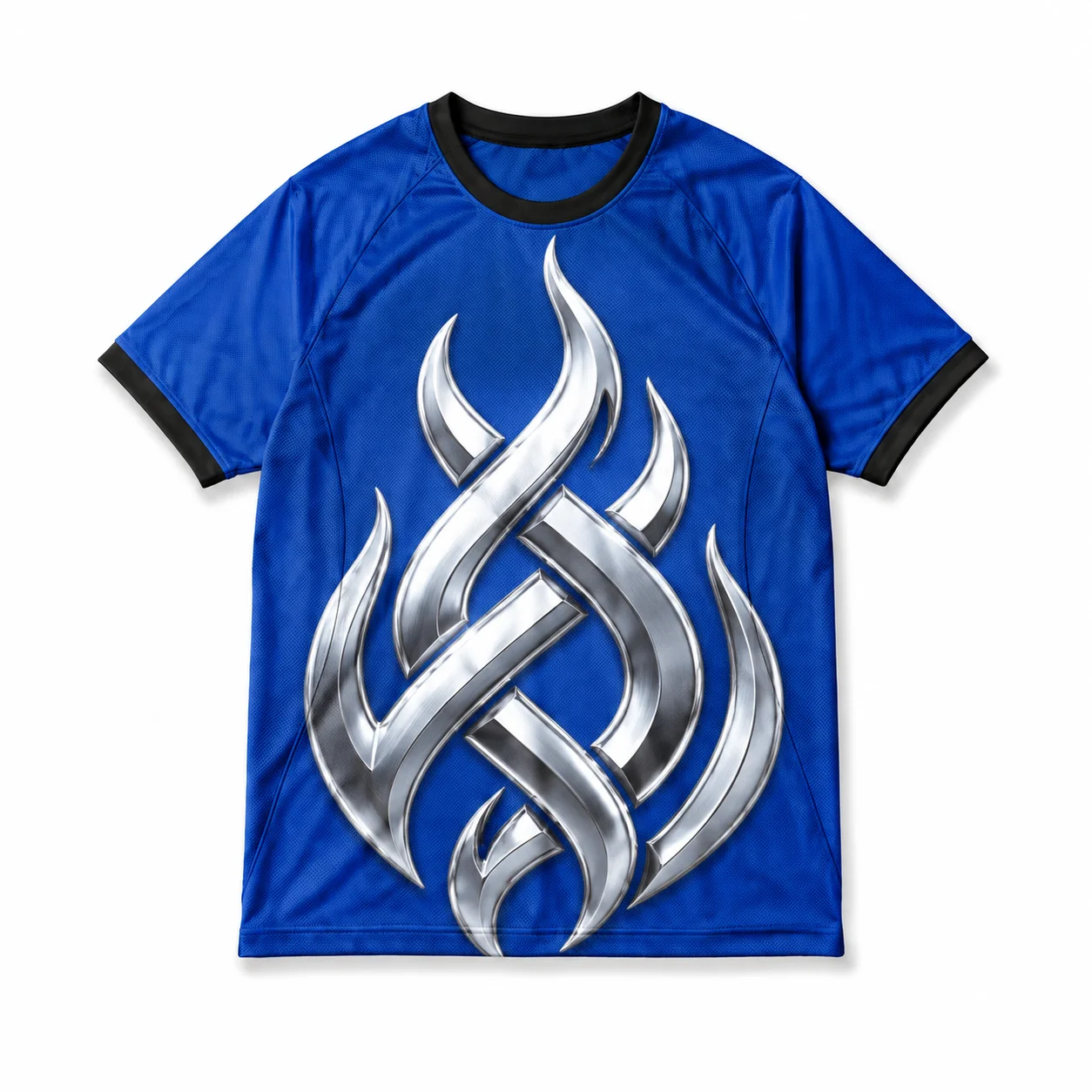
An oversized logo jersey design makes a large graphic the garment’s dominant visual element. The logo should occupy enough space to create immediate recognition, while surrounding negative space prevents the composition from feeling crowded. Keep supporting text secondary so the main graphic retains its visual authority.
Defining elements: large logo scale, focal placement, negative space, garment proportion, restrained supporting text, and clear branding.
Popular directions:
- Centered logo: position a large logo at the chest or front center for maximum impact.
- Back logo: use an oversized graphic across the back for a bold jersey T-shirt design.
- Layered branding: combine a dominant logo with small supporting text.
- Minimal support: keep surrounding elements simple to emphasize the main logo.
18. Minimal Chest Crest Design
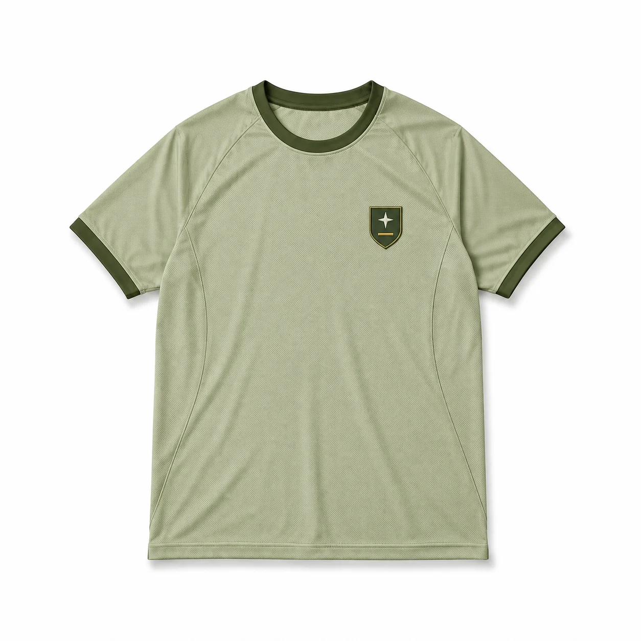
A minimal chest crest design uses a compact emblem to create a refined, understated jersey look. Simplified shapes, restrained typography, and limited details keep the crest clear at small sizes. Positioning the emblem on the chest leaves more open space across the garment for a clean jersey tee aesthetic.
Defining elements: compact crest, simplified details, restrained typography, small-scale graphics, clean spacing, and chest placement.
Popular directions:
- Simple emblem: use a small geometric crest with limited internal details.
- Initial crest: combine team initials within a compact badge for subtle identity.
- Minimal mascot: simplify a mascot into a recognizable chest emblem.
- Tonal crest: use a subtle color variation for understated jersey T-shirt designs.
19. Sleeve Accent Design
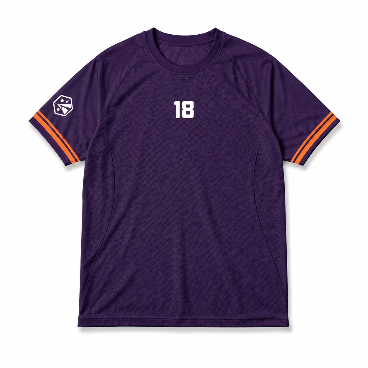
Sleeve accent design adds secondary graphics to the jersey while keeping the main chest or back artwork dominant. Small logos, stripes, numbers, or text can create visual continuity without competing with primary elements. Use orientation, scale, and available print zones to guide how you position each accent.
Defining elements: sleeve placement, secondary hierarchy, compact graphics, orientation, controlled scale, and print-zone limitations.
Popular directions:
- Sleeve logo: place a small team or brand logo along the upper sleeve.
- Number accent: add a compact player number for personalized jersey T-shirts.
- Sleeve stripe: use contrasting bands to complement the main jersey design.
- Vertical text: position short lettering along the sleeve for a modern jersey tee.
20. Back Statement Graphic Design
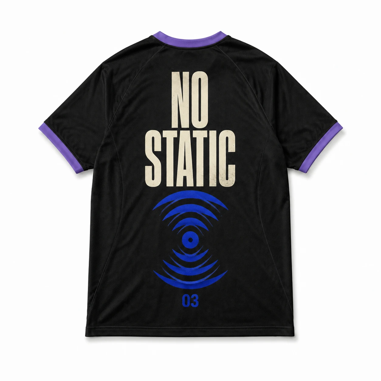
Back statement graphic design makes the rear of the garment the primary visual area through large artwork, bold text, or a combination of both. Graphic scale and spacing should create a strong focal point while leaving enough room for player names or numbers when needed. Balanced vertical and horizontal placement keeps the composition organized.
Defining elements: dominant back artwork, statement text, graphic scale, spacing, visual hierarchy, and balanced placement.
Popular directions:
- Statement text: use large lettering across the back for a bold jersey T-shirt design.
- Graphic centerpiece: place a dominant illustration at the center back.
- Name integration: combine a statement graphic with a smaller player name or number.
- Vertical composition: stack graphics and text for a structured custom jersey layout.
21. Sponsor-Style Jersey Layout
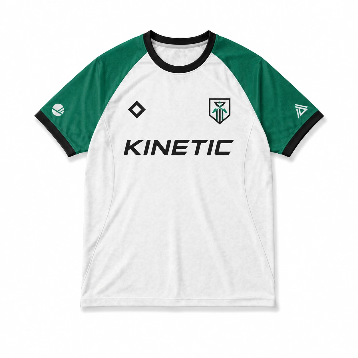
Sponsor-style jersey layouts organize multiple logos and marks into a structured sports-inspired composition. Primary branding should receive the strongest placement, while secondary logos remain smaller and evenly spaced. A clear hierarchy helps the design resemble an authentic team jersey without making the garment look overcrowded.
Defining elements: logo hierarchy, chest placement, secondary marks, spacing, team identity, and balanced composition.
Popular directions:
- Primary sponsor layout: place a dominant logo across the chest with smaller marks below or around it.
- Multi-logo design: arrange supporting logos across the chest and sleeves with consistent spacing.
- Team branding: combine sponsor-style marks with team names or numbers for a cohesive jersey T-shirt design.
- Minimal sponsor look: use fewer logos and controlled sizing for a cleaner jersey tee.
22. Mascot Illustration Design
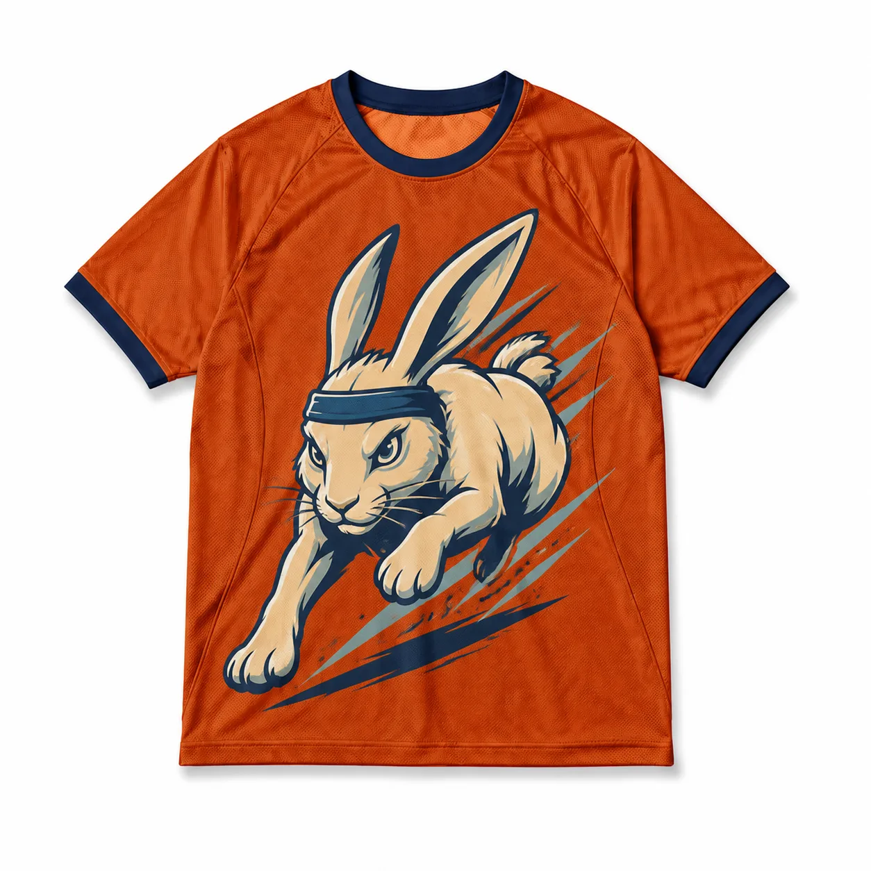
Mascot illustration design gives jersey T-shirts a recognizable team identity through a central character or symbolic graphic. Simplified illustrations work well when the artwork must stay clear at different sizes, while team colors and supporting typography reinforce the overall identity. The mascot should remain the main focal point without overwhelming the garment.
Defining elements: mascot illustration, team colors, graphic scale, focal hierarchy, supporting typography, and print clarity.
Popular directions:
- Character mascot: feature a bold illustrated mascot as the main front graphic.
- Badge mascot: place a simplified mascot inside a crest or emblem.
- Action pose: use a dynamic mascot pose to create an athletic jersey T-shirt design.
- Minimal mascot: reduce the illustration to recognizable shapes for a clean jersey tee.
23. City or Team Identity Design
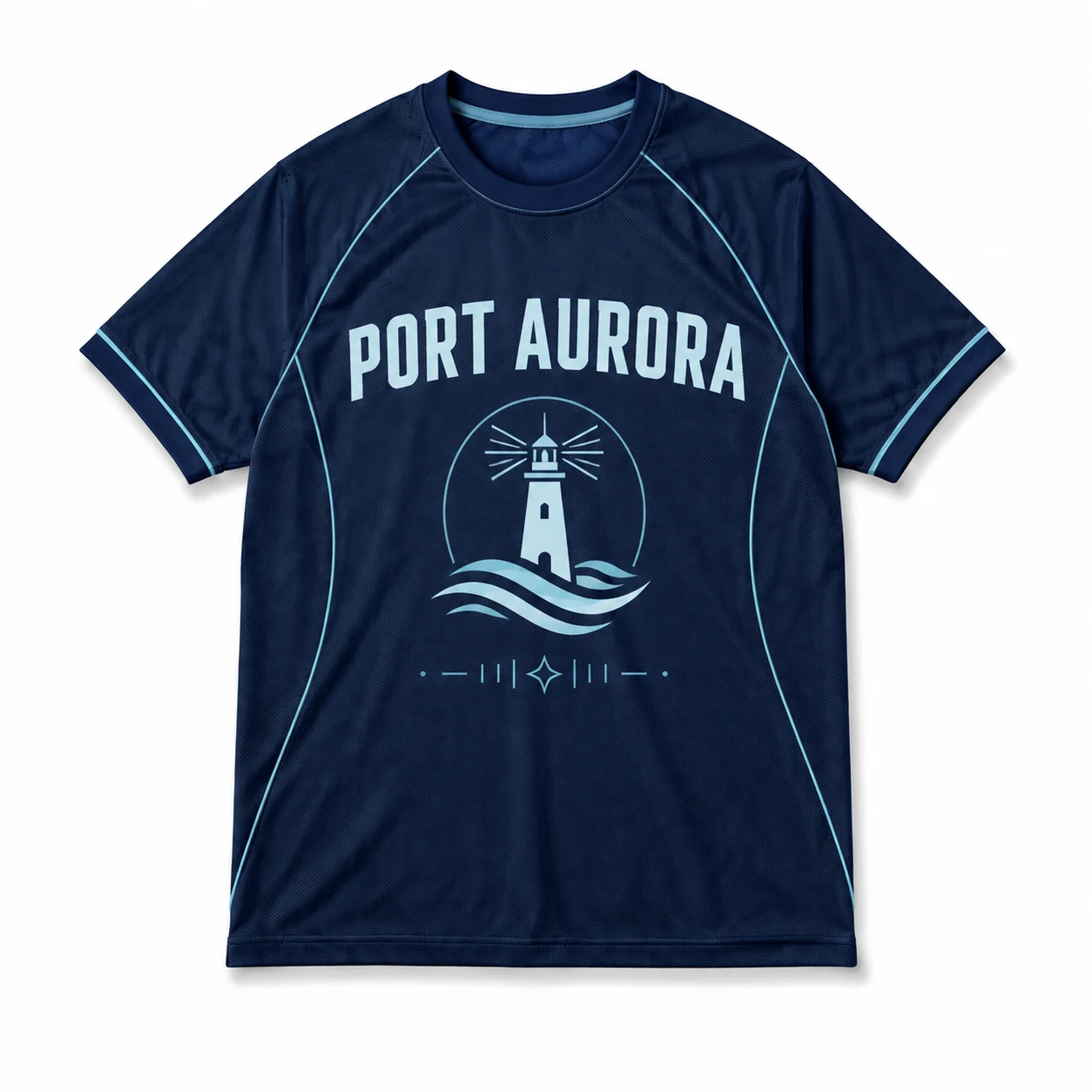
City or team identity design combines location-based references with team names, symbols, colors, or abbreviations to create a distinctive jersey concept. Typography can highlight the city or team name, while local symbols add visual context without overcrowding the composition. A consistent visual system helps connect each identity element.
Defining elements: city name, team name, local symbols, abbreviations, typography, team colors, and cohesive composition.
Popular directions:
- City-name design: make the city name the primary graphic across the chest.
- Local symbol: combine a recognizable local element with team typography.
- Abbreviation layout: use bold initials or shortened names for a modern jersey tee.
- Identity combination: blend city references and team colors into cohesive jersey T-shirt designs.
24. Season Year Jersey Design
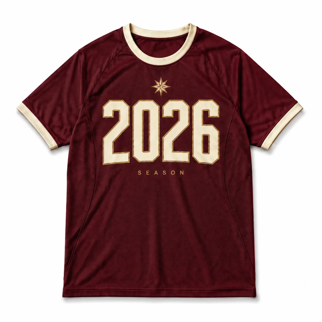
Season year jersey design commemorates a specific team season by combining the year with team identity, typography, and supporting graphics. The year can serve as the main visual element or work alongside a logo, team name, or number. Clear hierarchy keeps the commemorative details prominent without overwhelming the design.
Defining elements: year prominence, team identity, typography hierarchy, supporting graphics, balanced placement, and seasonal distinction.
Popular directions:
- Year-focused design: make the season year the dominant graphic for a bold jersey tee.
- Team-and-year layout: combine the team name and year in a structured jersey T-shirt design.
- Number integration: incorporate the year into an oversized number or athletic graphic.
- Badge treatment: place the year inside a compact crest for a classic custom jersey.
26. Championship or Event Jersey Design
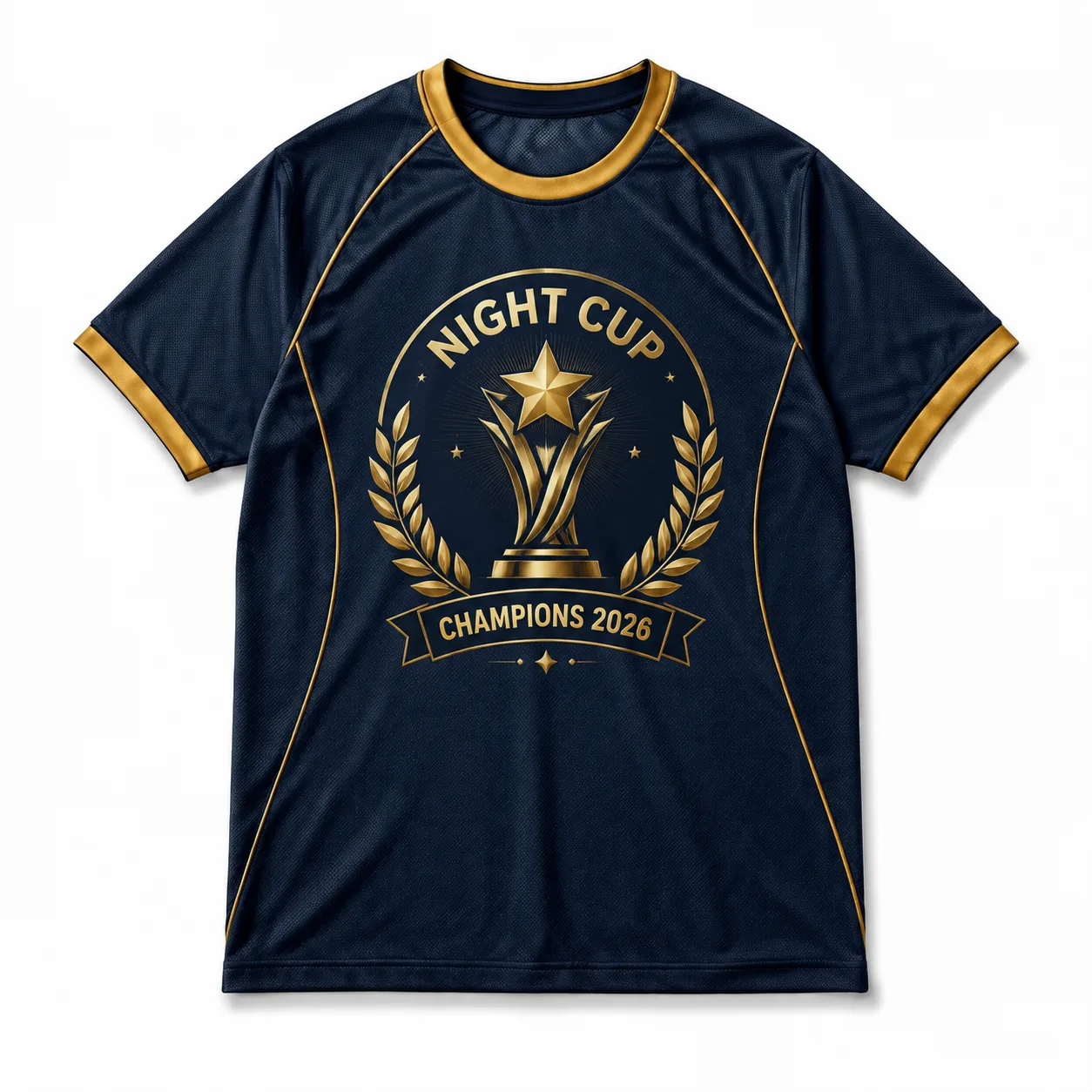
Championship or event jersey design celebrates a specific competition, achievement, or occasion through prominent wording, dates, team identity, and commemorative graphics. Keep the main message visually dominant, while supporting elements provide context. A strong hierarchy helps distinguish event information from decorative details.
Defining elements: event wording, year, team identity, commemorative graphics, typography hierarchy, and strategic placement.
Popular directions:
- Championship graphic: highlight the championship name with team branding for a commemorative jersey tee.
- Event-date layout: combine the event title and date with supporting graphics.
- Achievement badge: place championship details inside a structured emblem.
- Celebration design: use bold typography and team colors for distinctive jersey T-shirt designs.
26. Custom Slogan Jersey Design
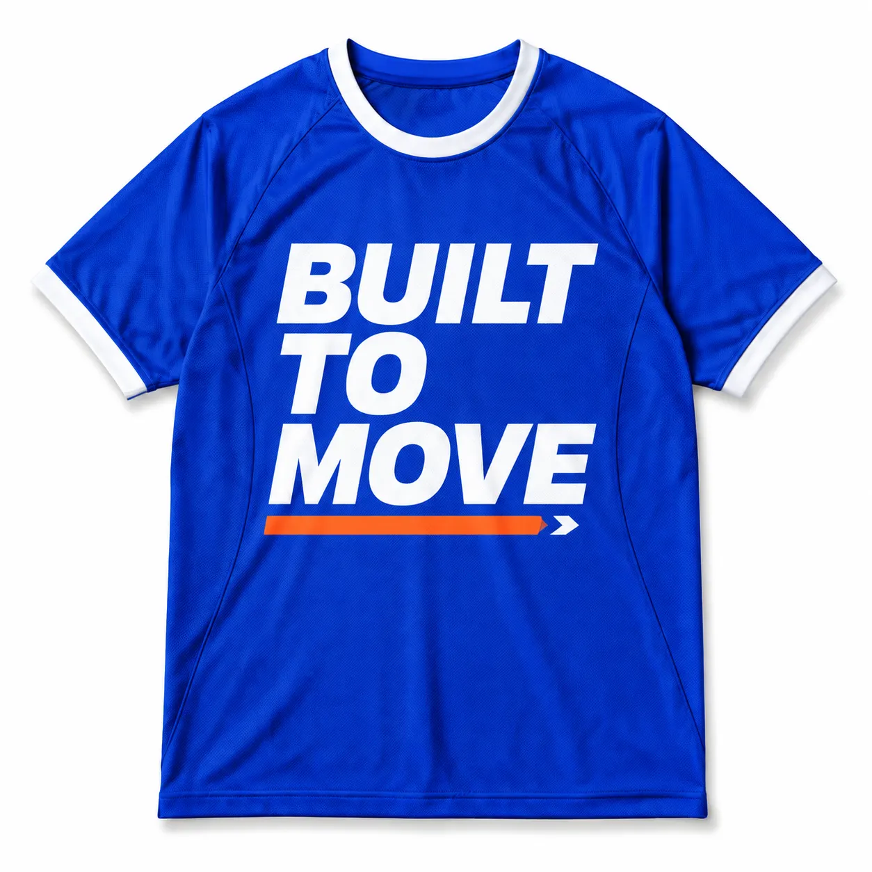
Custom slogan jersey design uses memorable phrases, team messages, or short statements as the main visual element. Typography becomes especially important because line breaks, letter weight, spacing, and scale determine how quickly readers can understand the slogan. Supporting graphics should reinforce the message without competing with the words.
Defining elements: slogan priority, typography style, line breaks, spacing, graphic scale, placement, and readability.
Popular directions:
- Bold chest slogan: place a short phrase across the chest for a strong jersey tee design.
- Back statement: use larger typography on the back for a prominent message.
- Layered typography: combine the slogan with a small logo or number for team identity.
- Minimal phrase: use concise lettering and open space for clean jersey T-shirt designs.
27. Abstract Motion Graphic Design
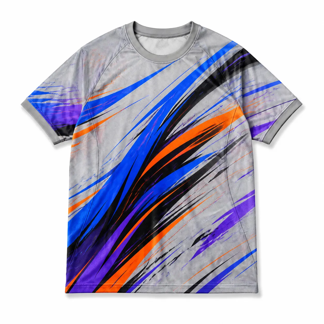
Abstract motion graphic design creates a dynamic jersey appearance through directional shapes, layered vectors, and flowing color patterns. Angled forms and visual movement can suggest speed and energy without relying on literal sports imagery. Keep scale and garment wrapping controlled so the composition stays readable across panels.
Defining elements: directional shapes, layered vectors, motion cues, color flow, garment wrapping, controlled scale, and visual balance.
Popular directions:
- Speed lines: use angled lines and tapered shapes to suggest movement across the jersey tee.
- Layered vectors: overlap geometric forms to create depth and visual energy.
- Flowing color: move contrasting colors through the artwork for a dynamic jersey T-shirt design.
- Wraparound motion: extend directional graphics across panels for continuous custom jersey artwork.
28. Fantasy Kit Jersey Design
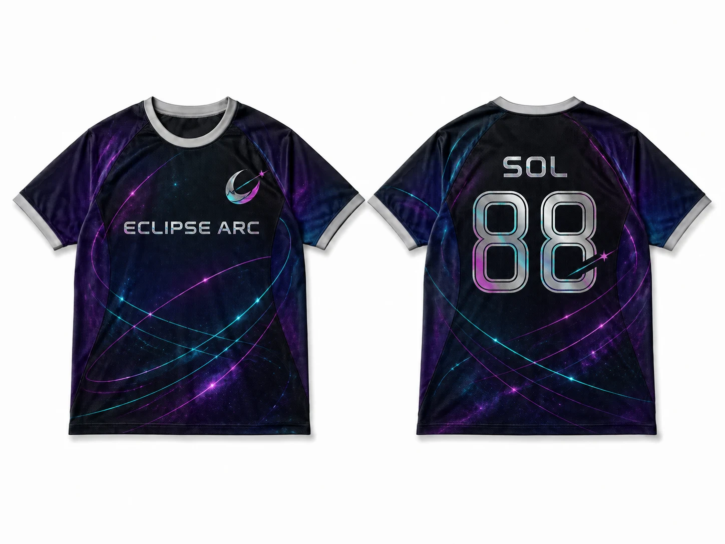
Fantasy kit jersey design lets you experiment with fictional team identities, unconventional colors, badges, and patterns. A fictional club name or custom emblem can establish the concept, while experimental graphics provide a distinctive visual direction. Keeping the badge, typography, colors, and pattern connected makes the concept feel like a complete kit.
Defining elements: fictional identity, experimental colors, custom badge, pattern choice, typography, graphic hierarchy, and cohesive styling.
Popular directions:
- Fictional club: create an original team name, badge, and color system for a unique jersey tee.
- Experimental palette: combine unexpected colors while maintaining clear visual hierarchy.
- Fantasy badge: design a custom emblem with imaginative symbols and typography.
- Concept kit: combine distinctive patterns, graphics, and team elements for creative jersey T-shirt design ideas.
How Do You Choose the Right Jersey T-Shirt Design?
Choose the right jersey T-shirt design by defining its purpose, target audience, jersey style, fabric type, print method, and placement requirements before creating the artwork. Consider how logos, typography, numbers, colors, graphics, and patterns work together to match the intended use. The right design approach balances scale, contrast, readability, and garment structure to create effective jersey tees that clearly communicate team identity, personalization, or brand style.
Consider these key factors when selecting the right jersey T-shirt design direction:
- Purpose
Define the jersey T-shirt’s purpose before developing the artwork, because the intended use shapes the overall design direction. Team and school use may call for logos, names, numbers, mascots, and established colors, while event wear can emphasize dates or commemorative graphics. Fan apparel can use recognizable team elements, whereas streetwear may favor bold or experimental styling. Promotional jersey tees may need clearer branding. Identifying the purpose helps determine the appropriate level of formality and customization.
- Target audience
Identify who will wear the jersey T-shirt so the visual style and level of personalization match their expectations. Players may need prominent names and numbers, while students may suit school colors, mascots, and collegiate typography. Supporters may want bold team graphics, while staff may prefer simpler branding. Casual buyers may prefer personalized jersey T-shirts or streetwear-inspired graphics. Consider the audience when choosing typography, graphic complexity, colors, personalization, and overall jersey T-shirt design direction.
- Jersey style
Choose a jersey style that matches the intended appearance and keeps every visual element consistent. Varsity styles can use curved lettering and athletic typography, while retro designs may feature vintage graphics, traditional stripes, and restrained colors. Collegiate styles work well with crests, initials, and structured layouts, whereas minimal jersey tees benefit from limited graphics and open space. Streetwear, sublimated, and geometric styles offer additional directions. Selecting one clear style helps create cohesive jersey T-shirt design ideas.
- Fabric and garment type
Consider the fabric and garment construction because they can affect how jersey T-shirt artwork appears and where it can be placed. Mesh and polyester can suit athletic jersey tees and sublimation, while jersey knit or standard T-shirt construction may require different artwork treatments. Surface texture, stretch, seams, and garment panels can influence graphic detail and alignment. Account for these characteristics when developing jersey T-shirt designs so logos, typography, numbers, and patterns work naturally with the garment structure.
- Print method
Select the print method before preparing the final jersey T-shirt artwork because production affects color, detail, texture, and available design areas. Sublimation supports detailed patterns and full-surface graphics, making it useful for geometric or edge-to-edge jersey designs. Screen printing can suit defined graphics and controlled color areas, while embroidery works well for smaller logos and crests. Match the artwork to the selected method so the colors, typography, graphics, and details translate appropriately onto the finished jersey tee.
- Design placement
Plan each element’s placement based on its visual role in the jersey T-shirt design. The chest can accommodate compact logos, crests, or team names, while the back provides space for large numbers, player names, or statement graphics. Sleeves can carry secondary logos, stripes, or small details, while full-garment placement works well for sublimated patterns. Assign each element a clear position and avoid competing focal points. Thoughtful placement helps jersey tees maintain structure and makes important graphics easier to recognize.
- Graphic scale
Set the graphic scale based on garment size, available print area, and typical viewing distance. Compact artwork can suit the chest or sleeves, while oversized graphics may work better across the front or back of a jersey T-shirt. Player numbers and team logos need enough size to stay recognizable, while detailed patterns need appropriate scaling to avoid visual clutter. Consider the jersey tee proportions before finalizing artwork, especially when developing oversized graphics or full-garment jersey T-shirt design ideas.
- Color contrast
Select colors that create clear contrast between the jersey T-shirt and its artwork while maintaining team or brand consistency. High-contrast combinations can improve the visibility of names, numbers, logos, and graphics, while tonal colors can create a more understated jersey tee appearance. Consider whether the design uses a monochrome palette, dominant color with accents, or contrasting shades. Consistent color relationships across the garment help maintain visual structure and keep important elements of the jersey T-shirt design noticeable.
- Design readability
Review the readability of every important element before finalizing the jersey T-shirt design. Typography should have appropriate size, weight, and spacing, while player numbers need sufficient contrast and scale to remain visible. Logos should retain their defining details, and dense patterns should not interfere with names or messages. Check how graphics, typography, numbers, and patterns interact across the garment rather than viewing them separately. Clear hierarchy helps jersey tees communicate team identity, personalization, or other intended messages effectively.
What Are Tips for Creating an Effective Jersey T-Shirt Design?
Create an effective jersey T-shirt design by defining the style, selecting suitable artwork, choosing colors, matching typography, preparing print-ready files, and reviewing the design through mockups and samples. Focus on visual consistency, placement, scale, contrast, and readability throughout. These steps help jersey tees achieve balanced layouts, accurate production results, and clear communication of team identity, branding, or personal style.
Below are the tips to consider when creating an effective jersey T-shirt design:
- Define the design style
Before adding individual elements, establish the visual direction for the jersey T-shirt design. Consider the reference style, intended audience, composition, graphic scale, placement, and hierarchy. Whether the concept is varsity, retro, collegiate, minimal, or streetwear, keep it consistent throughout the jersey tee. A defined style gives every later design decision a clear visual framework.
- Choose the artwork
Start with a primary visual element that supports the chosen jersey T-shirt direction, whether it is a logo, mascot, number, crest, stripe system, geometric pattern, slogan, or illustration. Match its complexity to the garment and print method. Consider available print areas, garment construction, detail requirements, and each graphic’s role in the overall composition and hierarchy.
- Select the color palette
Build the palette around primary, supporting, and accent colors that complement the jersey T-shirt and intended identity. Evaluate how artwork contrasts with the garment so names, numbers, logos, and graphics remain visible. Limit accent colors to purposeful areas that reinforce hierarchy. Consistent color relationships also help connect separate elements and maintain structure across the entire jersey tee.
- Match the typography
Choose lettering that complements the jersey T-shirt’s visual direction and gives each text element an appropriate role. Select fonts for team names, player names, numbers, and slogans, then refine their weight, size, spacing, and hierarchy. Keep typography visually compatible with the artwork so text remains readable without competing with logos, patterns, illustrations, or other prominent graphic elements.
- Prepare print-ready artwork
Convert the finished artwork into clean vector files or high-resolution graphics at the required production dimensions. Remove unnecessary backgrounds and retain transparency where appropriate. Adjust colors according to the selected printing process, then inspect edges, line details, resolution, and file specifications. Proper preparation ensures the digital jersey T-shirt artwork reproduces accurately during production.
- Create a T-shirt mockup
Place the completed artwork onto a realistic jersey T-shirt mockup to evaluate how the design functions on the garment. Inspect scale, positioning, colors, seams, panels, folds, and fabric behavior. A T-shirt mockup generator can reveal problems hidden in flat artwork, especially when graphics cross garment sections or shift around seams. Make adjustments before approving the production version.
- Review the mockup
Inspect the completed mockup at realistic viewing sizes and examine alignment, proportions, color contrast, typography, and placement. Evaluate the entire composition on the garment rather than judging individual artwork files separately. Watch for distorted graphics, crowded sections, weak contrast, or misplaced elements. Resolve these issues while changes remain practical and before production files receive final approval.
- Check visual balance
Evaluate the relationship between focal points, spacing, negative space, and secondary elements across the jersey T-shirt. Use symmetry when it strengthens the composition, or introduce intentional asymmetry to create movement. Keep supporting graphics, text, names, numbers, and patterns subordinate to the main focal point. Balanced distribution prevents crowded areas while preserving enough visual interest throughout the garment.
- Review a physical sample
Examine a physical jersey T-shirt sample before approving the final production run. Compare print accuracy, color output, line detail, texture, placement, and garment fit against the digital mockup. Pay attention to areas affected by seams, stretching, and fabric texture. Document discrepancies between the screen preview and physical shirt, then make necessary corrections before production approval.
- Finalize the design
After mockup and sample evaluations, apply the required corrections to artwork, typography, colors, placement, scale, and spacing. Confirm that production files satisfy the selected printing method and contain the correct dimensions and specifications. Inspect front, back, and side views for consistency, then approve the final artwork and retain organized master files for future production needs.

 Trusted By Thousands Of Designers
  Cancel Your Subscription Anytime
  30 Day Money Back Guarantee