
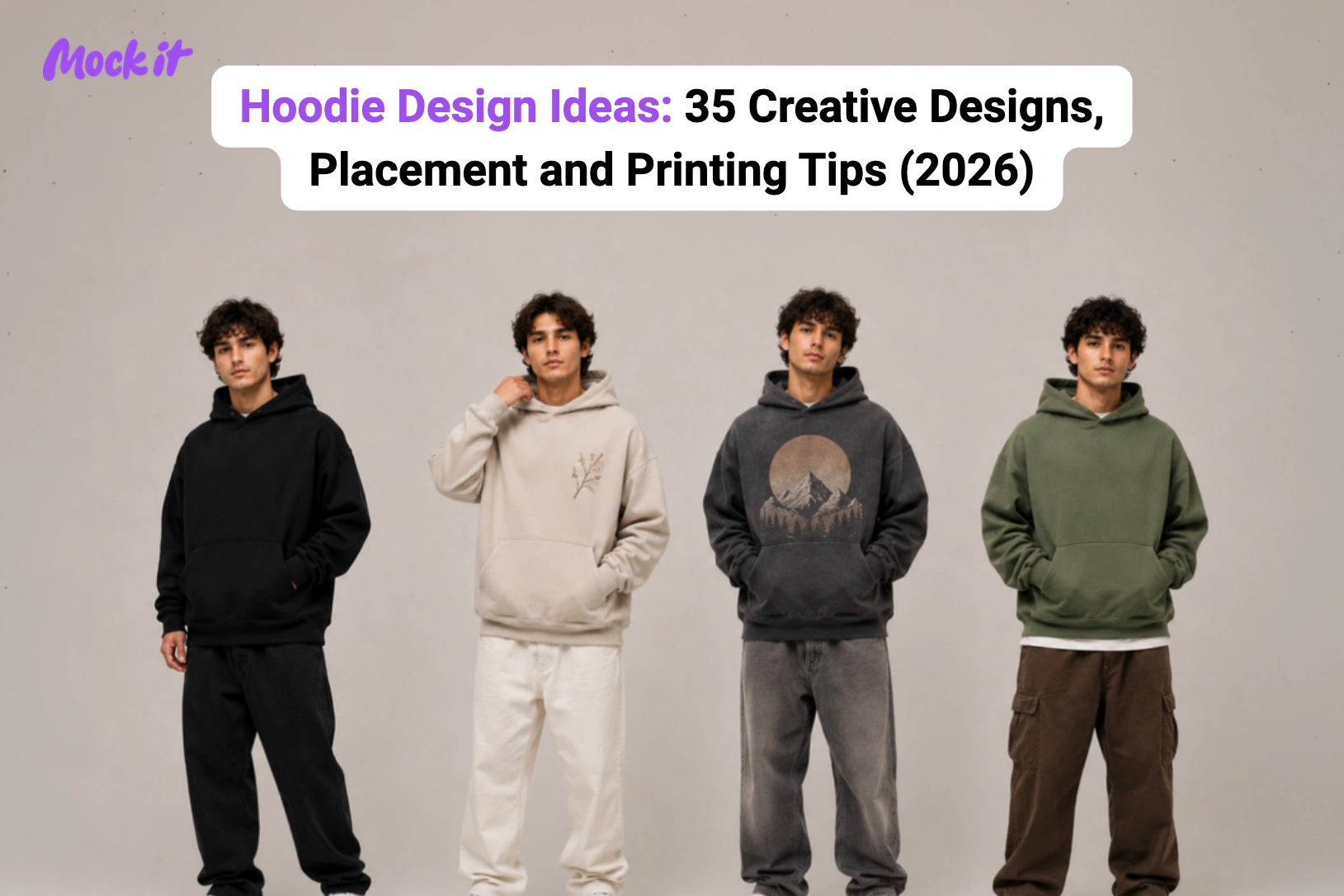
Hoodie design ideas combine creative concepts, graphic styles, logo placement, typography, illustrations, color palettes, fabric choices, and printing techniques to create apparel that matches a specific audience, purpose, or brand identity. Whether you are designing a minimalist streetwear hoodie, custom company merchandise, a school club hoodie, a gym pump cover, or a limited-edition clothing collection, every design decision influences how the hoodie looks, feels, and performs after production.
This guide features 35 original hoodie design ideas across popular styles, including minimalist, streetwear, vintage, graphic, embroidered, typography, seasonal, and team designs. Each idea includes a visual example with recommendations for the best hoodie style, artwork placement, and print method, making it easier to compare concepts and choose the right direction for your project.
You will also learn how to select fabrics and GSM, compare screen printing, embroidery, DTG and DTF, position artwork for maximum visual impact, avoid common design mistakes, and preview your hoodie before printing, helping you confidently move from inspiration to a production-ready design.
35 Hoodie Design Ideas
The best hoodie design ideas balance creativity with wearability. While some designs rely on bold graphics to make a statement, others use subtle embroidery, clean typography, or carefully placed artwork to create a premium look. The right approach depends on who will wear the hoodie, how it will be used, and the impression you want the design to leave.
These 35 ideas are grouped by style and purpose, with built-in guidance on print method and placement, so you can move from concept to a production-ready brief without backtracking.
Minimalist Hoodie Design Ideas
Minimalist hoodie designs focus on clean layouts, restrained graphics, and premium finishes instead of oversized artwork. They work particularly well for fashion brands, startups, cafés, creators, and businesses that want timeless apparel with broad everyday appeal. Simple designs also translate well across embroidery and printing methods, making them easier to produce while maintaining a refined appearance.
- Minimal Logo Hoodie Design Ideas
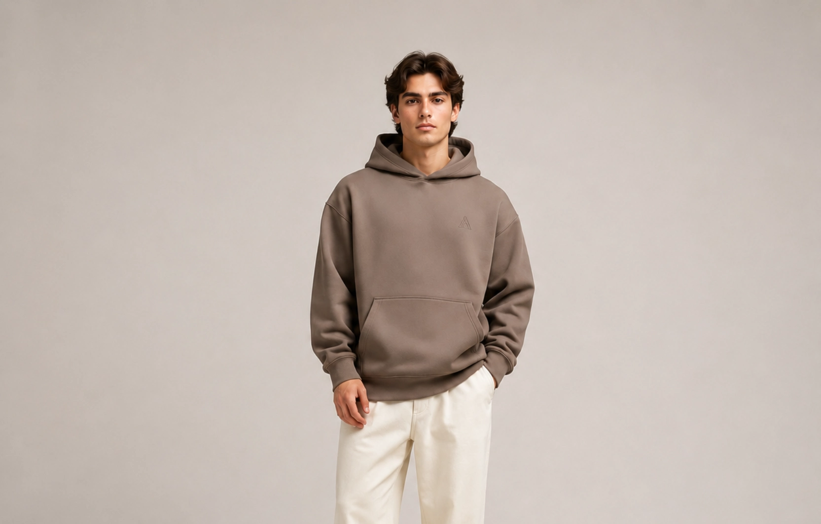
Best for: Clothing brands, startups, company merchandise
A small logo placement feels intentional without dominating the hoodie, which is exactly why it has staying power across clothing brands, corporate merch, and everyday streetwear alike. The design succeeds through restraint, where a compact wordmark, a standalone icon, or a simple monogram lets the fabric quality and colorway do the heavy lifting. Because the visual footprint is small, the hoodie stays versatile enough to be worn repeatedly in different contexts.
Best placement: Left chest
Recommended print method: Embroidery
Recommended hoodie: Heavyweight pullover
Pro tip: Use tonal thread that closely matches the hoodie color for a luxury-inspired finish.
- Tonal Embroidery Hoodie Design Ideas
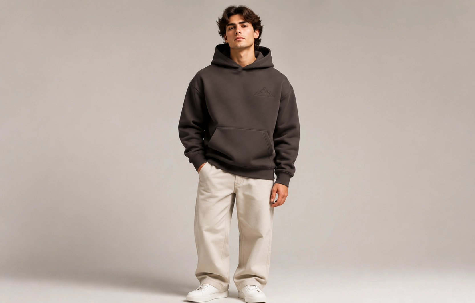
Best for: Premium apparel brands, cafés, lifestyle brands, corporate merchandise
Tonal embroidery creates branding through texture rather than contrast, producing a hoodie design that only fully reveals itself up close. The effect works because the raised stitch surface catches light differently from the surrounding fabric, giving the hoodie a dimensional quality that flat printing cannot replicate. It is the approach most associated with premium and luxury-adjacent apparel, understated enough for corporate gifting and refined enough for a fashion label’s core range.
Best placement: Left chest or sleeve cuff
Recommended print method: Embroidery
Recommended hoodie: Heavyweight cotton hoodie (400+ GSM)
Pro tip: Choose matte thread in the same color family as the hoodie for a clean, luxury-inspired finish.
- One-Line Art Hoodie Design Ideas
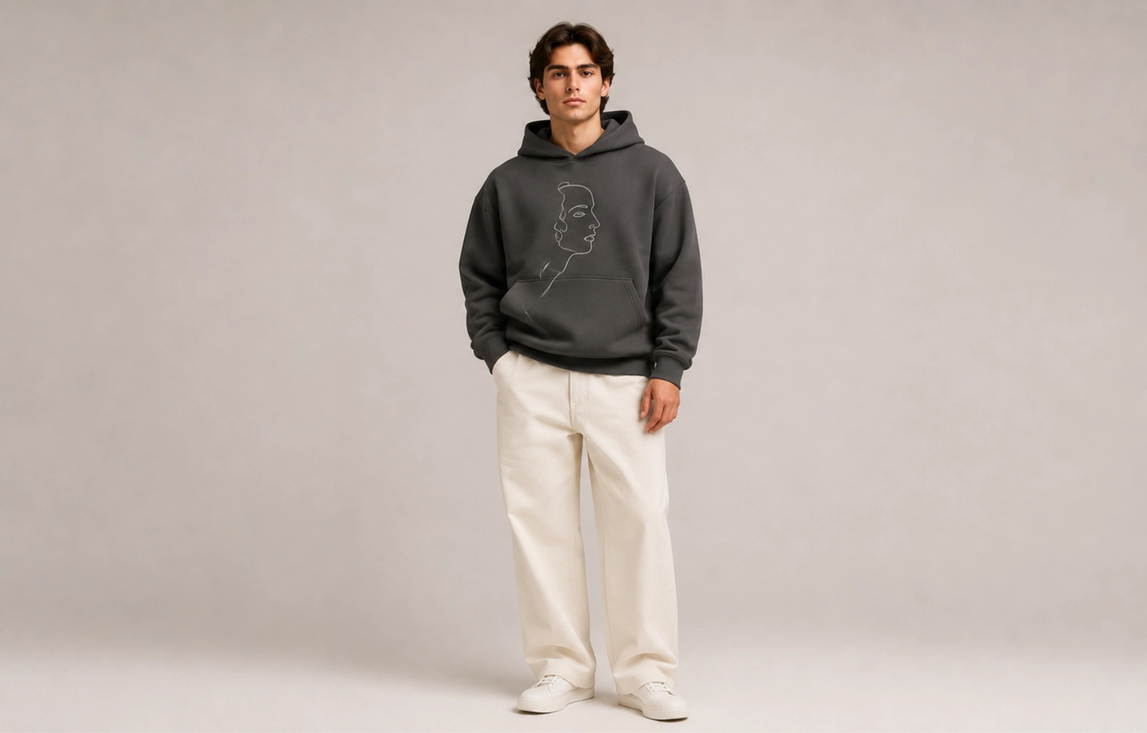
Best for: Creative brands, artists, cafés, lifestyle apparel
One-line illustrations transform a single unbroken stroke into a recognizable subject, whether a face, a botanical, an animal, or an abstract figure, without relying on fill, shading, or color contrast to carry the hoodie design. The appeal lies in the simplicity where the stroke does everything, making the artwork feel confident and considered rather than busy. Popular in artist merch, café branding, and lifestyle apparel, it is a design style that reads as handcrafted even when printed at scale.
Best placement: Center chest or upper back
Recommended print method: DTG or embroidery
Recommended hoodie: Midweight or heavyweight pullover
Pro tip: Keep line thickness consistent to preserve clarity when printing or embroidering.
- Negative Space Hoodie Design Ideas
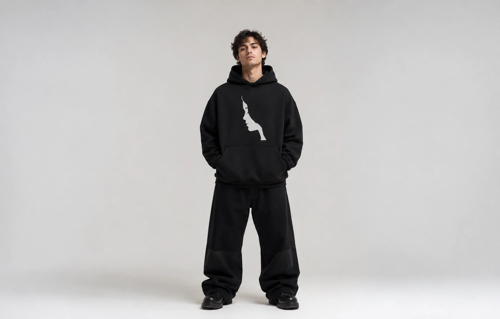
Best for: Contemporary fashion brands, streetwear labels, creative merchandise
Hoodies with negative-space design use the garment’s empty areas as an active part of the composition rather than as background filler. A single strong graphic surrounded by open space creates more visual weight than a crowded design, because the eye has somewhere to land and nowhere to wander. The approach rewards restraint and translates particularly well to oversized fits, where the extra surface area amplifies the breathing room rather than making the design feel lost.
Best placement: Center chest or full back
Recommended print method: Screen printing or DTG
Recommended hoodie: Oversized heavyweight hoodie
Pro tip: Limit the design to one focal element and allow generous spacing around it to strengthen visual hierarchy.
Streetwear Hoodie Design Ideas
Streetwear hoodie designs emphasize bold graphics, oversized silhouettes, premium fabrics, and trend-driven details, making the garment the focal point of an outfit. Popular influences include Y2K fashion, vintage sportswear, Japanese typography, and textured printing techniques that create depth and personality.
- Puff Print Hoodie Design Ideas
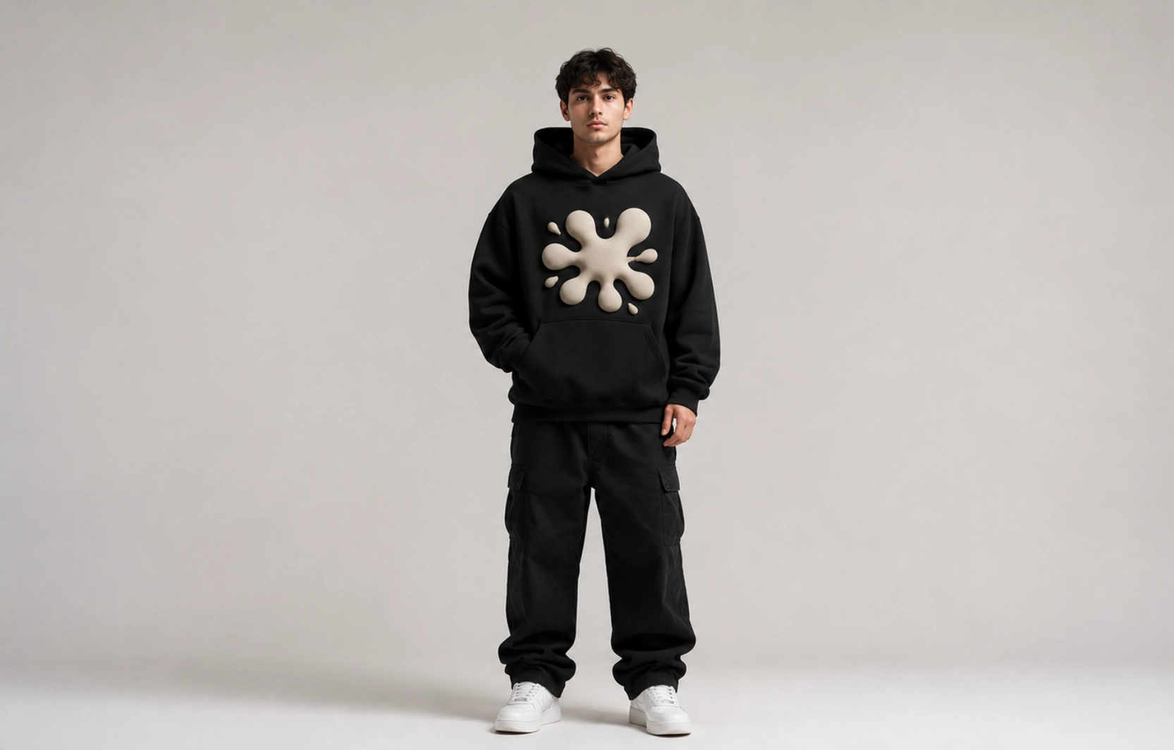
Best for: Streetwear brands, limited drops, fashion collections
Unlike flat printing methods, puff ink expands during heat-curing to create raised graphics that add texture and dimension to the hoodie’s surface. The technique rewards bold typography and high-contrast illustrations over detailed artwork, since fine detail loses definition in the expanded ink. The three-dimensional finish gives graphics a tactile quality that photographs well and holds attention in person.
Best placement: Center chest or full back
Recommended print method: Puff screen printing
Recommended hoodie: Heavyweight oversized hoodie (400–500 GSM)
Pro tip: Use bold lettering or simple graphics since fine details do not reproduce well with puff ink.
- Oversized Back Graphic Hoodie Design Ideas
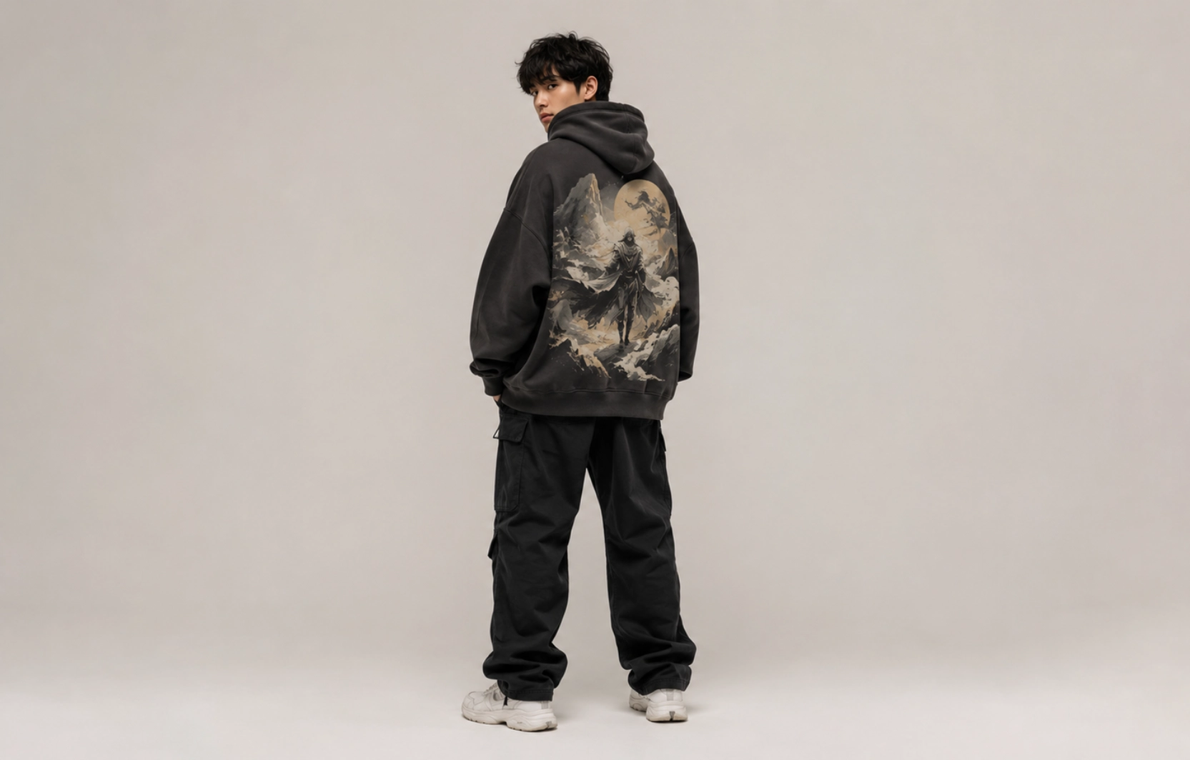
Best for: Clothing brands, artist collaborations, merchandise
Shifting the hoodie’s visual weight to the rear panel transforms the garment into a statement piece that leads with artwork rather than branding. The full back provides an uninterrupted canvas with no zippers, seams, or pockets to work around, making it one of the most versatile placements for large illustrations, abstract compositions, and bold brand graphics. Keeping the front minimal gives each side a clear visual role.
Best placement: Full back
Recommended print method: DTF or Screen Printing
Recommended hoodie: Oversized heavyweight pullover
Pro tip: Pair a large back graphic with a small left chest logo to create a balanced front-to-back composition.
- Chrome Typography Hoodie Design Ideas
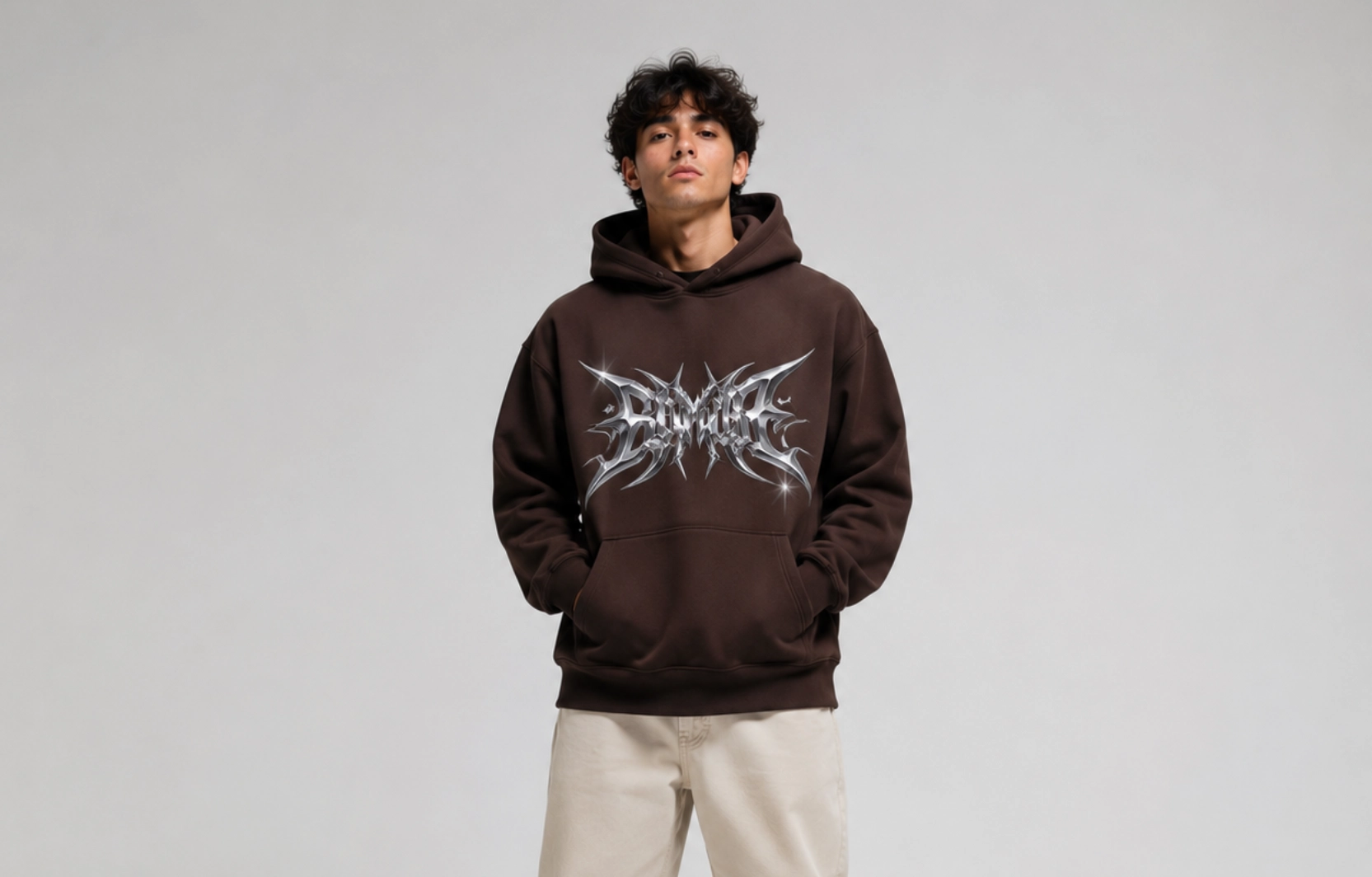
Best for: Y2K collections, fashion brands, music merchandise
Few techniques create as much visual impact at a distance as chrome typography, which uses metal-inspired lettering with reflective gradients and beveled edges to make text the dominant design element on a hoodie. The aesthetic draws directly from Y2K fashion and music culture, where bold shiny text on dark garments became a defining visual language. Dark hoodie colorways amplify the contrast and let the metallic finish lead without competition.
Best placement: Center chest or upper back
Recommended print method: DTF
Recommended hoodie: Black or charcoal heavyweight hoodie
Pro tip: Keep supporting graphics minimal so the typography remains the primary visual element.
- Japanese Typography Hoodie Design Ideas
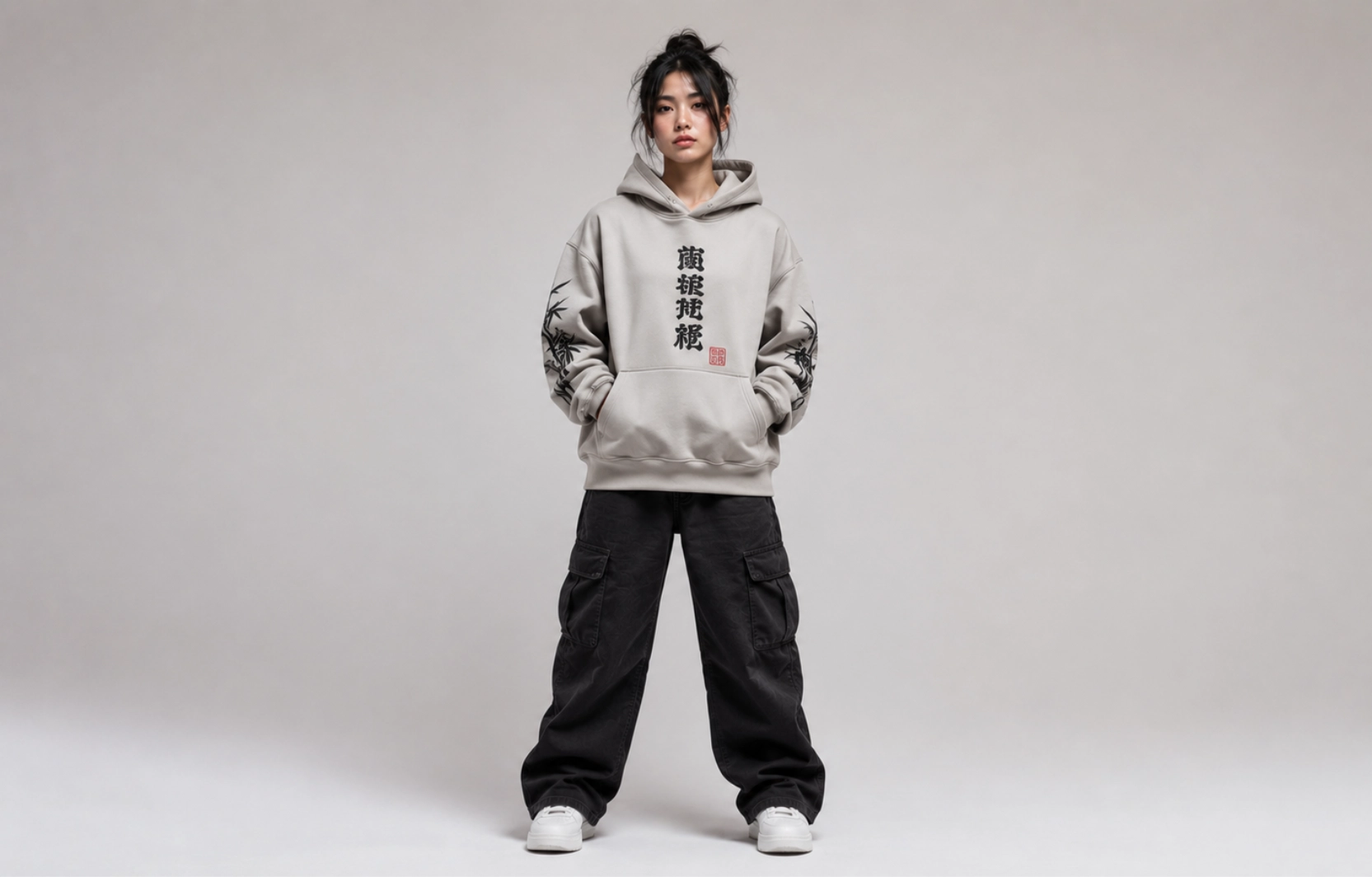
Best for: Contemporary streetwear, fashion labels, creative merchandise
The visual structure of Japanese script makes it one of the most naturally suited typographic systems for hoodie design. Kanji, Katakana, and Hiragana characters carry aesthetic weight through their stroke forms alone, and their compact vertical compositions suit sleeve and back placements that Latin typography rarely fills as well. The result is an international streetwear aesthetic that has moved from subcultural reference into mainstream fashion.
Best placement: Sleeve, center chest, or vertical back
Recommended print method: Screen Printing or DTF
Recommended hoodie: Relaxed-fit heavyweight hoodie
Pro tip: Always verify translations with a native speaker or reliable language source before finalizing artwork.
- Washed Vintage Graphic Hoodie Design Ideas
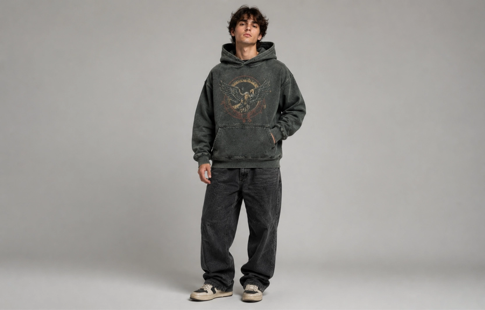
Best for: Vintage-inspired collections, lifestyle brands, casual apparel
Authenticity is what separates a well-executed washed vintage hoodie from one that simply looks old. Garment-dyed fabric paired with distressed artwork creates a design in which the faded base and aged print tell the same visual story rather than working independently. Cracked ink textures, muted palettes, and retro illustrations reinforce each other, making fabric treatment and print approach inseparable parts of the same concept.
Best placement: Full front or full back
Recommended print method: Screen Printing
Recommended hoodie: Garment-dyed heavyweight hoodie
Pro tip: Earth tones, washed black, faded navy, and vintage grey enhance the distressed effect and complement retro graphics.
Vintage Hoodie Design Ideas
Inspired by decades of classic fashion, vintage hoodie designs combine nostalgic aesthetics with modern garment construction to create apparel that feels familiar, authentic, and timeless. Distressed graphics, retro typography, faded color palettes, and heritage-inspired artwork give these hoodies a worn-in character that resonates across fashion brands, merchandise collections, and everyday casual wear.
- Varsity Hoodie Design Ideas
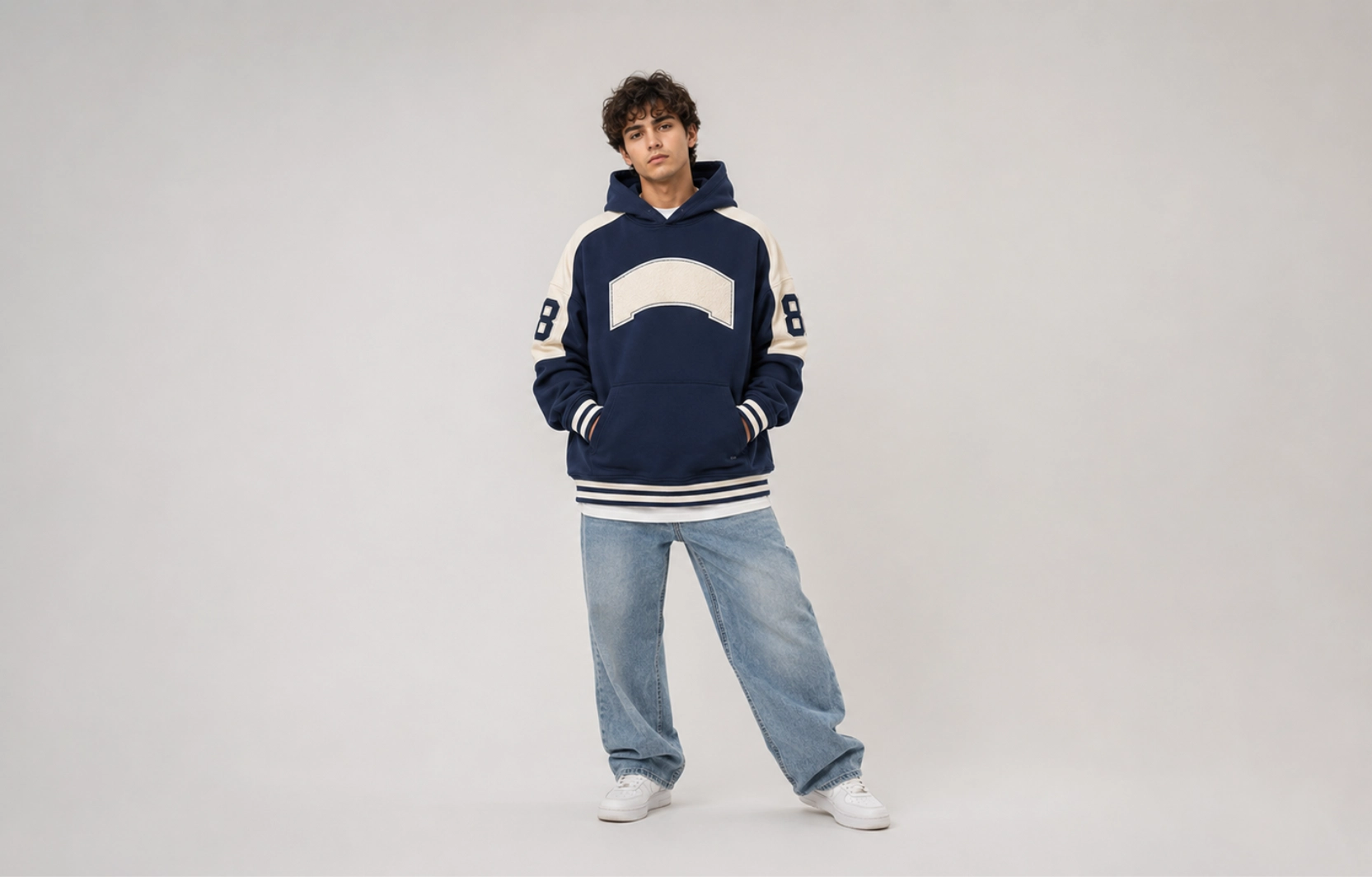
Best for: School apparel, college clubs, sports teams, fashion brands
Collegiate lettering, bold initials, athletic numbers, and contrast color palettes give the varsity hoodie a campus-inspired identity that has translated well beyond school apparel into fashion and lifestyle branding. The design language is immediately recognizable, making it effective for organizations and brands that want a strong visual identity without complex artwork. Its staying power comes from simplicity: a few well-chosen typographic elements that work together as a system.
Best placement: Center chest with optional sleeve numbers
Recommended print method: Screen Printing or Embroidery
Recommended hoodie: Midweight or heavyweight pullover
Pro tip: Pair varsity fonts with contrasting sleeve or hood colors to reinforce the collegiate aesthetic.
- Racing Hoodie Design Ideas
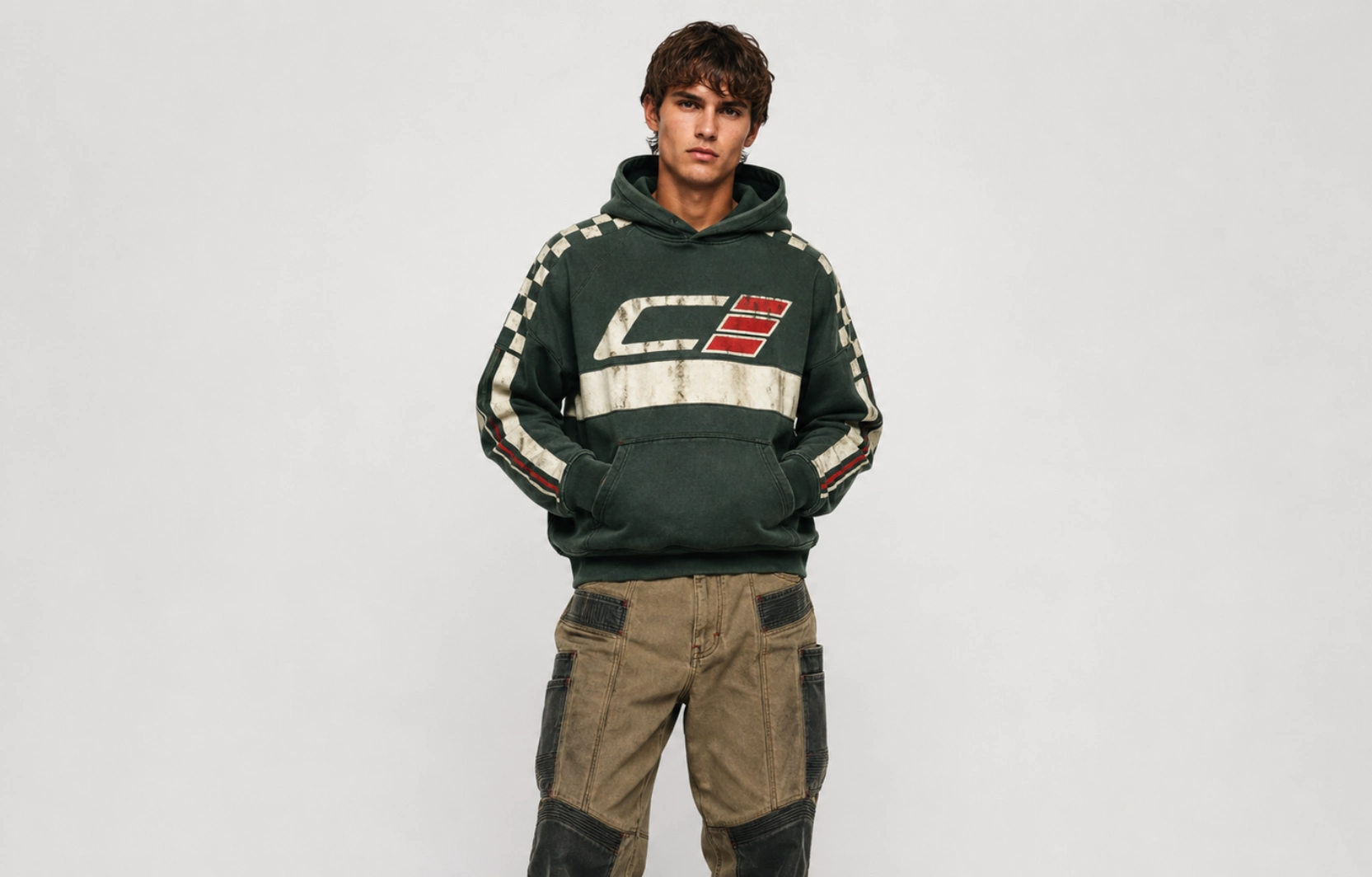
Best for: Automotive brands, motorsport fans, lifestyle apparel
Motorsport culture has one of the most visually distinctive hoodie design languages, built around sponsor-style graphics, racing numbers, checkered flag elements, and retro typography that reference the golden era of circuit racing. Layered compositions and aged textures give the design an authentic worn-in appearance that feels earned rather than manufactured. The style translates naturally to lifestyle apparel for audiences well beyond automotive enthusiasts.
Best placement: Full front or full back
Recommended print method: Screen Printing
Recommended hoodie: Garment-dyed heavyweight hoodie
Pro tip: Use muted reds, cream, navy, and faded black to strengthen the retro racing theme.
- Vintage Band Hoodie Design Ideas
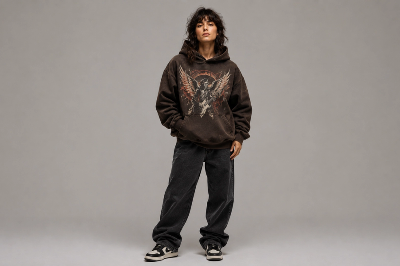
Best for: Music merchandise, streetwear brands, creative collections
Few apparel references carry as much creative weight as classic concert merchandise, and the vintage band-inspired hoodie draws directly from that visual language through oversized artwork, distressed typography, and faded print effects. Original illustrations and custom graphics recreate that energy without referencing copyrighted material, giving brands creative freedom within a well-defined aesthetic. The format rewards bold, confident artwork that holds up under intentional distressing.
Best placement: Full front or full back
Recommended print method: Screen Printing
Recommended hoodie: Oversized washed hoodie
Pro tip: Combine distressed textures with a limited color palette to create an authentic vintage look.
- Distressed College Hoodie Design Ideas
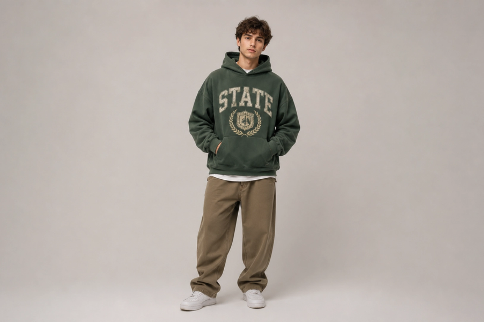
Best for: University merchandise, alumni apparel, lifestyle brands
Distressed collegiate hoodies modernize traditional campus design by pairing aged lettering with cracked textures and vintage-inspired layouts, making the garment feel worn-in rather than freshly printed. The approach retains the familiarity of university apparel while giving it enough character for everyday casual wear beyond campus. The design works because the distressing feels like part of the garment’s history rather than a surface-level effect.
Best placement: Center chest
Recommended print method: Screen Printing
Recommended hoodie: Heavyweight cotton hoodie
Pro tip: Vintage cream, maroon, forest green, and faded navy pair naturally with distressed collegiate graphics.
Graphic & Artistic Hoodie Design Ideas
For those who want artwork to take center stage, graphic and artistic hoodie designs offer endless creative possibilities beyond traditional logos and text. Illustrations, abstract compositions, geometric patterns, and themed graphics give each hoodie a distinctive identity while allowing designers to showcase their artistic style. This approach is widely used by creative brands, artists, and limited-edition apparel collections.
- Botanical Illustration Hoodie Design Ideas
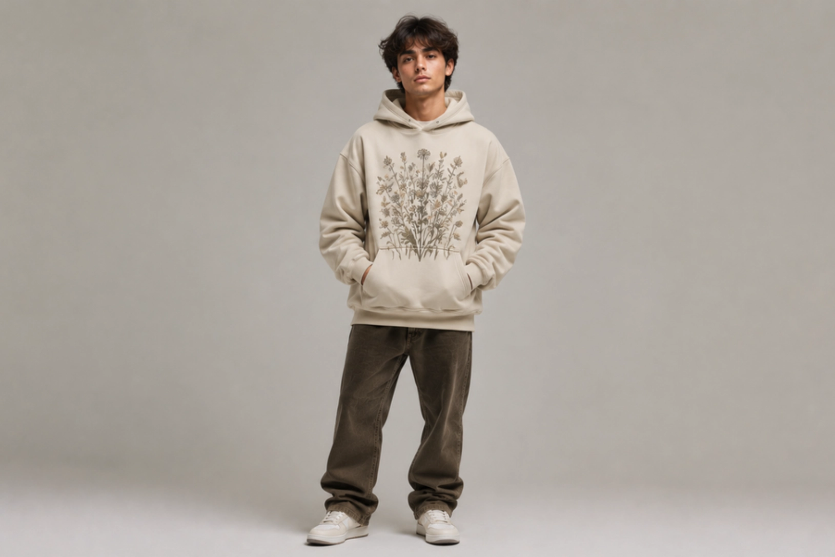
Best for: Lifestyle brands, nature-inspired collections, cafés, outdoor apparel
Botanical hoodies bring hand-drawn flowers, leaves, branches, and wild plants into a design format that feels calm, organic, and inherently wearable. The style works because fine linework and natural subject matter age well visually, making the hoodie relevant across seasons rather than trend-dependent. Monochrome execution or muted earth tones keep the illustration refined rather than decorative, which is what separates botanical design from generic floral print.
Best placement: Center chest or full back
Recommended print method: DTG
Recommended hoodie: Midweight cotton hoodie
Pro tip: Use monochrome artwork or muted earth tones to maintain a refined, nature-inspired look.
- Abstract Art Hoodie Design Ideas
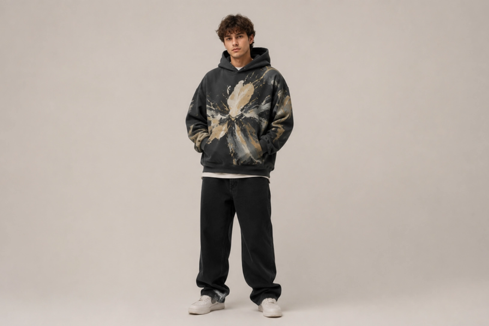
Best for: Creative brands, artists, galleries, contemporary fashion
What makes abstract hoodie designs distinct is their ability to convey a visual identity without relying on recognizable imagery or typography, using shapes, brushstrokes, textures, and color compositions that invite interpretation rather than deliver a fixed message. The format gives artists and creative brands room to express character through pure visual language. A restrained color palette is what keeps the composition coherent rather than chaotic.
Best placement: Full front or oversized back
Recommended print method: DTG or DTF
Recommended hoodie: Oversized heavyweight hoodie
Pro tip: Limit the color palette to three or four complementary colors to create a balanced composition.
- Geometric Pattern Hoodie Design Ideas
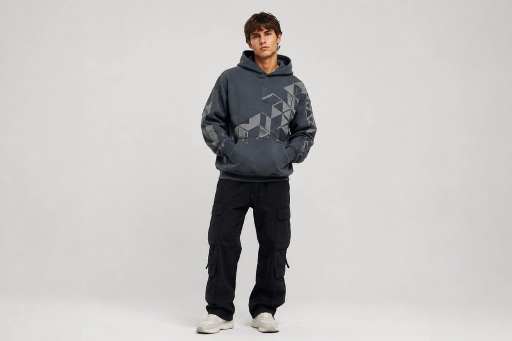
Best for: Tech brands, minimalist fashion, modern merchandise
Built around repeating shapes, clean lines, and symmetrical layouts, geometric hoodie designs create visual structure without relying on illustration or a central graphic to anchor the composition. The approach suits brands that want a contemporary, considered aesthetic where the pattern itself carries the design. Hexagons, triangles, angular grids, and circular forms all work within this format as long as spacing and proportion remain consistent throughout.
Best placement: Sleeve, upper back, or center chest
Recommended print method: Screen Printing
Recommended hoodie: Pullover hoodie with a solid color base
Pro tip: Maintain consistent spacing between shapes to keep the pattern clean and visually balanced.
- Space & Galaxy Hoodie Design Ideas
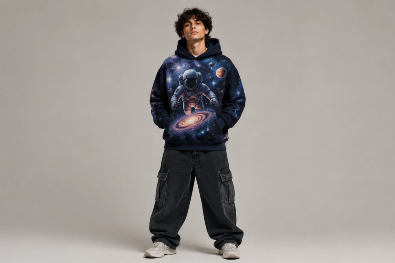
Best for: Gaming brands, sci-fi enthusiasts, creative apparel, merchandise
Space and galaxy hoodie designs tap into a visual language centered on cosmic scale, deep color, and imaginative subject matter that works naturally on dark-base garments. Galaxies, planets, constellations, and astronaut figures give designers room to work with bold gradients and vibrant color without the composition feeling out of place. The full-back or full-front placement suits this style best, giving the artwork enough surface area to convey the depth the subject demands.
Best placement: Full back or full front
Recommended print method: DTG
Recommended hoodie: Black or navy heavyweight hoodie
Pro tip: Use high-resolution artwork with subtle gradients to preserve depth and detail during printing.
Typography Hoodie Design Ideas
Typography hoodie designs rely on font selection, text hierarchy, spacing, and placement to create visual interest without complex artwork. They work particularly well for quotes, slogans, motivational messages, and brand statements where readability is just as important as style.
- Funny Quote Hoodie Design Ideas
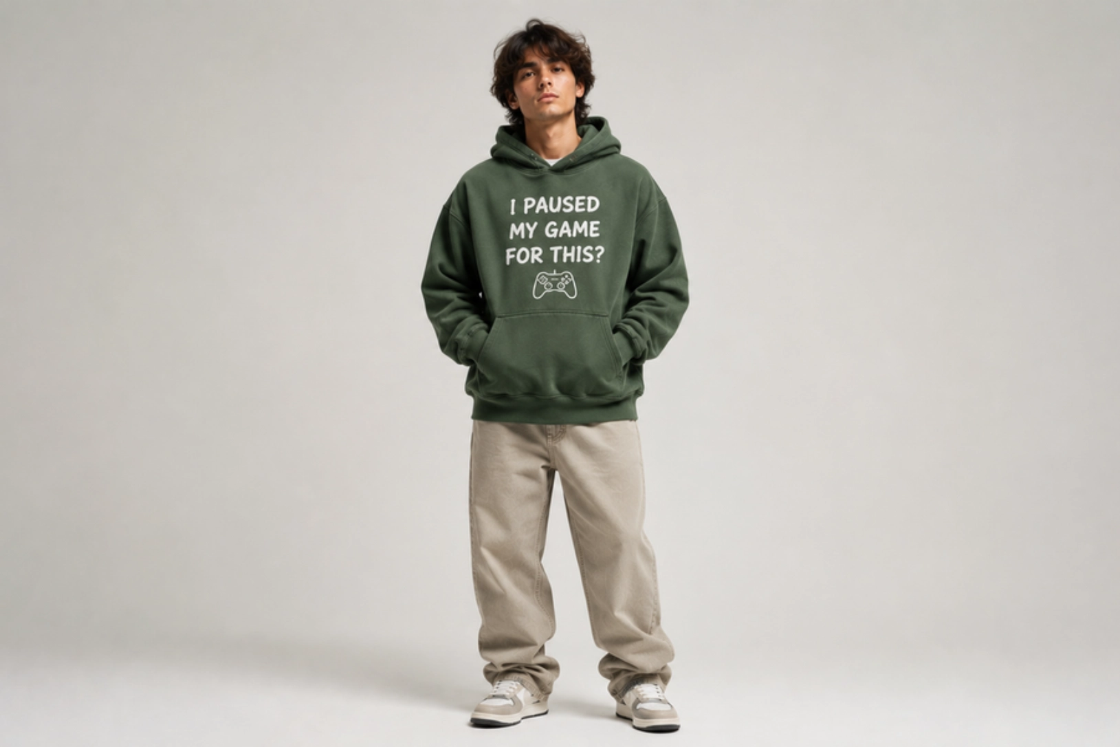
Best for: Casual apparel, gifts, events, lifestyle brands
Funny quote hoodies turn a single witty one-liner or relatable phrase into the entire design concept, making the garment as much a conversation starter as a piece of apparel. Phrases like “I paused my game for this” or “professionally tired” work because they land instantly without setup, which also keeps the layout clean and the typography easy to read at a distance. A simple font choice and centered placement let the humor do the work without visual distraction competing for attention.
Best placement: Center chest
Recommended print method: Screen Printing or DTF
Recommended hoodie: Midweight pullover hoodie
Pro tip: Keep the quote short so it remains readable from a distance.
- Motivational Hoodie Design Ideas
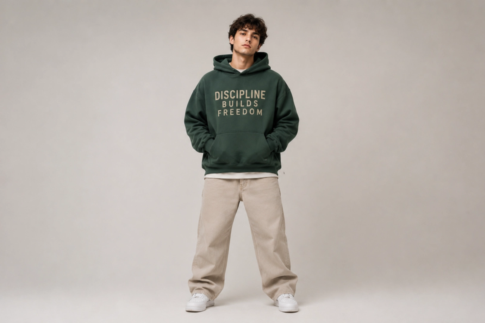
Best for: Fitness brands, personal development, lifestyle apparel
Where funny quote hoodies lead with humor, motivational hoodie designs use inspiring words and affirmations to create apparel that connects with the wearer’s identity rather than just their sense of humor. Phrases like “outwork everyone” or a single word like “relentless” become the focal point, which means typography weight, spacing, and placement carry more design responsibility than any graphic element. Strong lettering paired with generous negative space keeps the result wearable rather than preachy.
Best placement: Center chest or upper back
Recommended print method: Screen Printing or Embroidery
Recommended hoodie: Heavyweight cotton hoodie
Pro tip: Pair bold typography with generous spacing to improve readability and visual impact.
- Statement Typography Hoodie Design Ideas
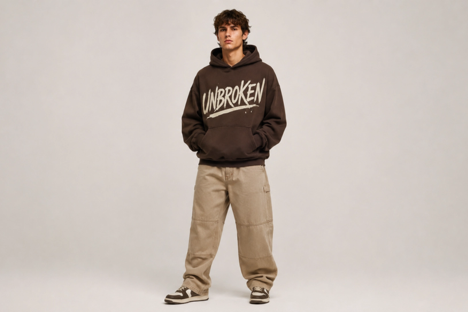
Best for: Streetwear brands, creative collections, awareness campaigns
Statement typography hoodies distill brand identity, personal values, or a cultural position into a single word or short phrase that commands attention through scale and typeface rather than illustration. Designs built around words like “dissent,” “unfiltered,” or a brand name rendered in an oversized custom font succeed through confidence, with lettering that feels definitive rather than decorative. Unlike motivational or quote-based designs, the statement hoodie does not ask for a reaction; it makes one.
Best placement: Full back or center chest
Recommended print method: DTF or Screen Printing
Recommended hoodie: Oversized heavyweight hoodie
Pro tip: Choose a distinctive typeface that matches the message’s tone without sacrificing readability.
Embroidered Hoodies Design Ideas
Embroidered hoodie designs are popular for brands and organizations that want a clean, professional look without large printed graphics. Stitched logos, monograms, and badges add depth, durability, and a premium finish, making embroidery a preferred choice for fashion labels, corporate apparel, schools, and clubs.
- Monogram Hoodie Design Ideas
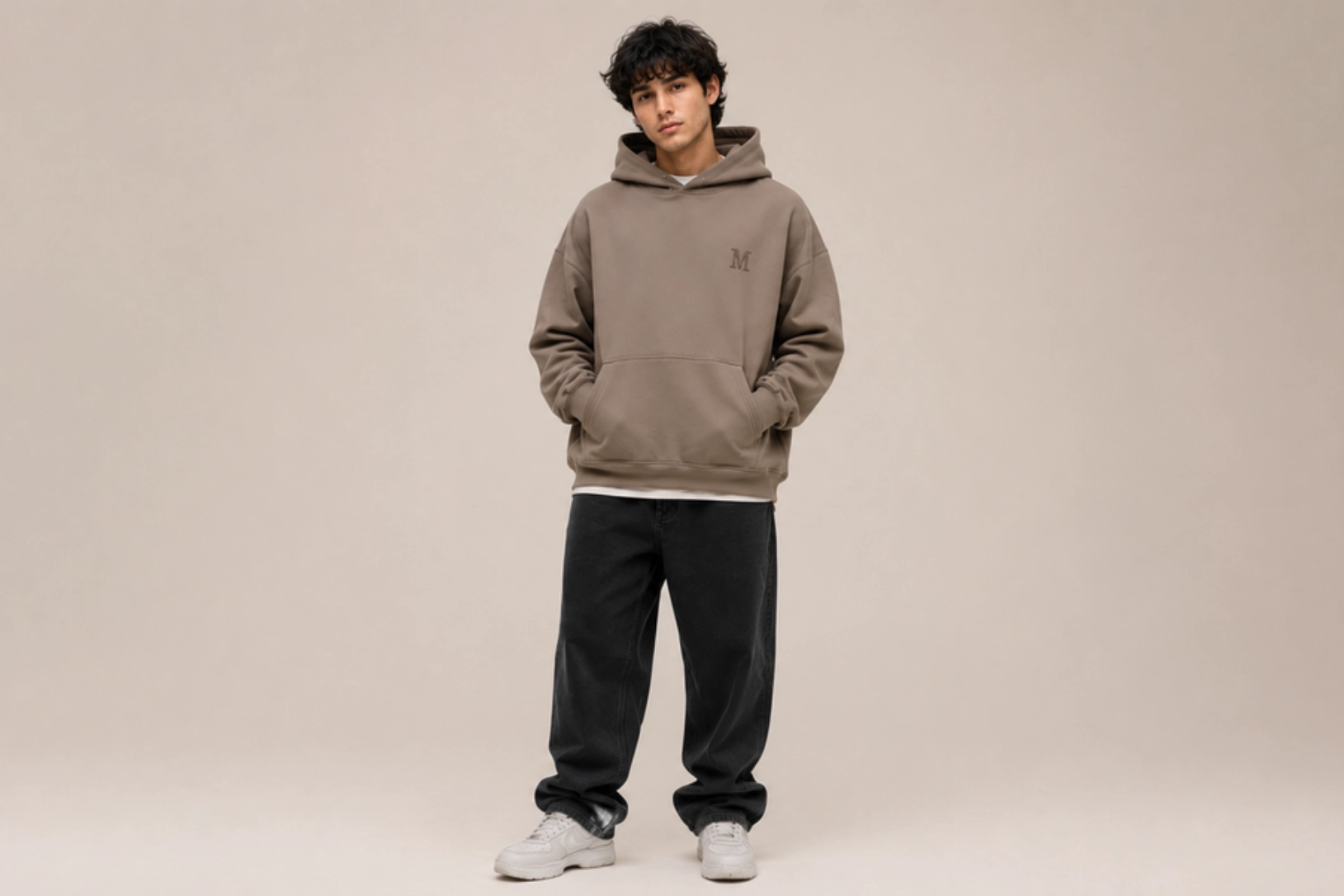
Best for: Premium clothing brands, personal apparel, gifts
Monogram hoodies build an entire design around one or more stitched initials, producing a result that feels personal and considered without relying on complex artwork. A single letter rendered in a clean serif or sans-serif thread on the left chest, or stacked initials on a sleeve cuff, carries enough visual weight to define the garment without overwhelming it. The format suits premium personal apparel and gift-focused collections where individuality matters more than brand recognition.
Best placement: Left chest or sleeve cuff
Recommended print method: Embroidery
Recommended hoodie: Heavyweight cotton hoodie
Pro tip: Use small embroidery with tonal or neutral thread colors for a timeless appearance.
- Crest and Badge Hoodie Design Ideas
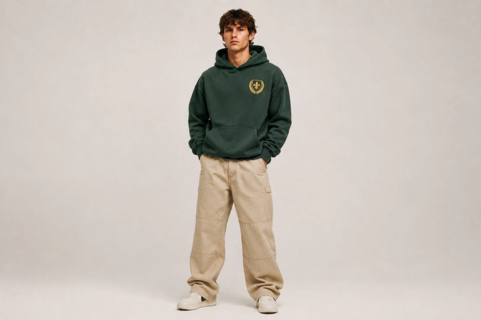
Best for: Schools, clubs, sports teams, heritage brands
Crest and badge hoodies draw from collegiate, military, and heritage design traditions to create embroidered emblems that carry instant authority and identity. A shield with a founding year, a laurel wreath encircling a mascot, or a custom insignia with stacked lettering all communicate belonging and craftsmanship in a way flat printing rarely achieves. The format works particularly well for schools, clubs, and heritage brands where the emblem itself is the identity rather than a supporting element.
Best placement: Left chest
Recommended print method: Embroidery
Recommended hoodie: Midweight or heavyweight pullover
Pro tip: Keep the embroidery design simple with bold shapes and minimal text to preserve stitch quality.
Personal Hoodie Design Ideas
Personal hoodie designs offer complete creative freedom by allowing names, portraits, meaningful dates, custom illustrations, and personal messages to become part of the garment. This level of customization makes them ideal for gifts, celebrations, family events, and everyday apparel that carries personal significance.
- Couple Hoodie Design Ideas
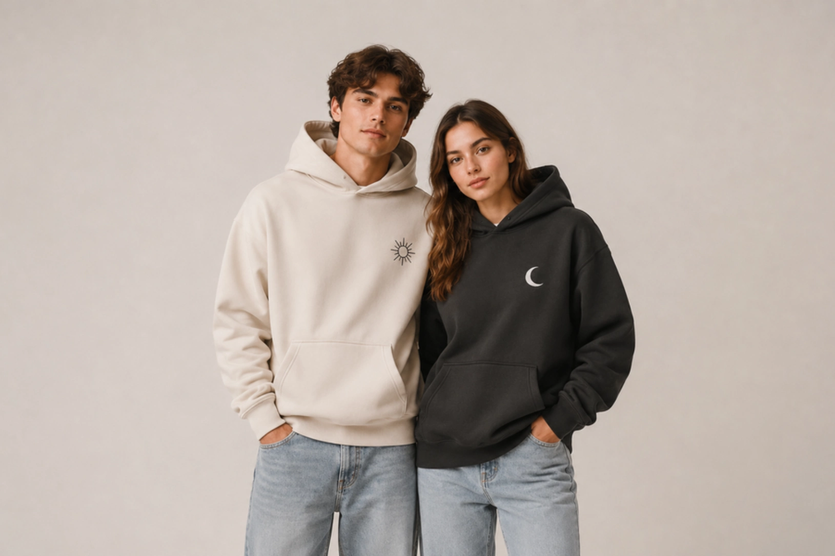
Best for: Anniversaries, Valentine’s Day, matching outfits
Couple hoodie designs work best when the two garments connect visually without being identical, using complementary graphics, split illustrations, or coordinating phrases that only make complete sense together. A classic approach pairs “sun” on one hoodie with “moon” on the other, or splits a single illustration across two left-chest placements that align when the wearers stand side by side. The design succeeds when each hoodie stands on its own while clearly belonging to a set.
Best placement: Left chest, center chest, or full back
Recommended print method: DTG or Embroidery
Recommended hoodie: Matching heavyweight pullovers
Pro tip: Use complementary designs that work together rather than duplicating the same artwork.
- Family Hoodie Design Ideas
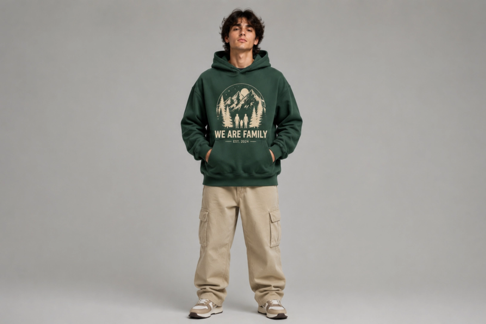
Best for: Family gatherings, reunions, vacations, holiday celebrations
Bringing a group together under one cohesive design is what family hoodies do best, using matching graphics, family names, established dates, or themed illustrations that give the occasion a visual identity. A reunion hoodie featuring the family surname above a founding year, or a vacation design with individual names on the back, creates a keepsake quality that outlasts the event. The format works best when the core design stays consistent while individual details personalize each piece.
Best placement: Center chest or full back
Recommended print method: Screen Printing
Recommended hoodie: Midweight cotton hoodie
Pro tip: Keep the main design consistent while personalizing each hoodie with individual names or roles.
- Pet Portrait Hoodie Design Ideas
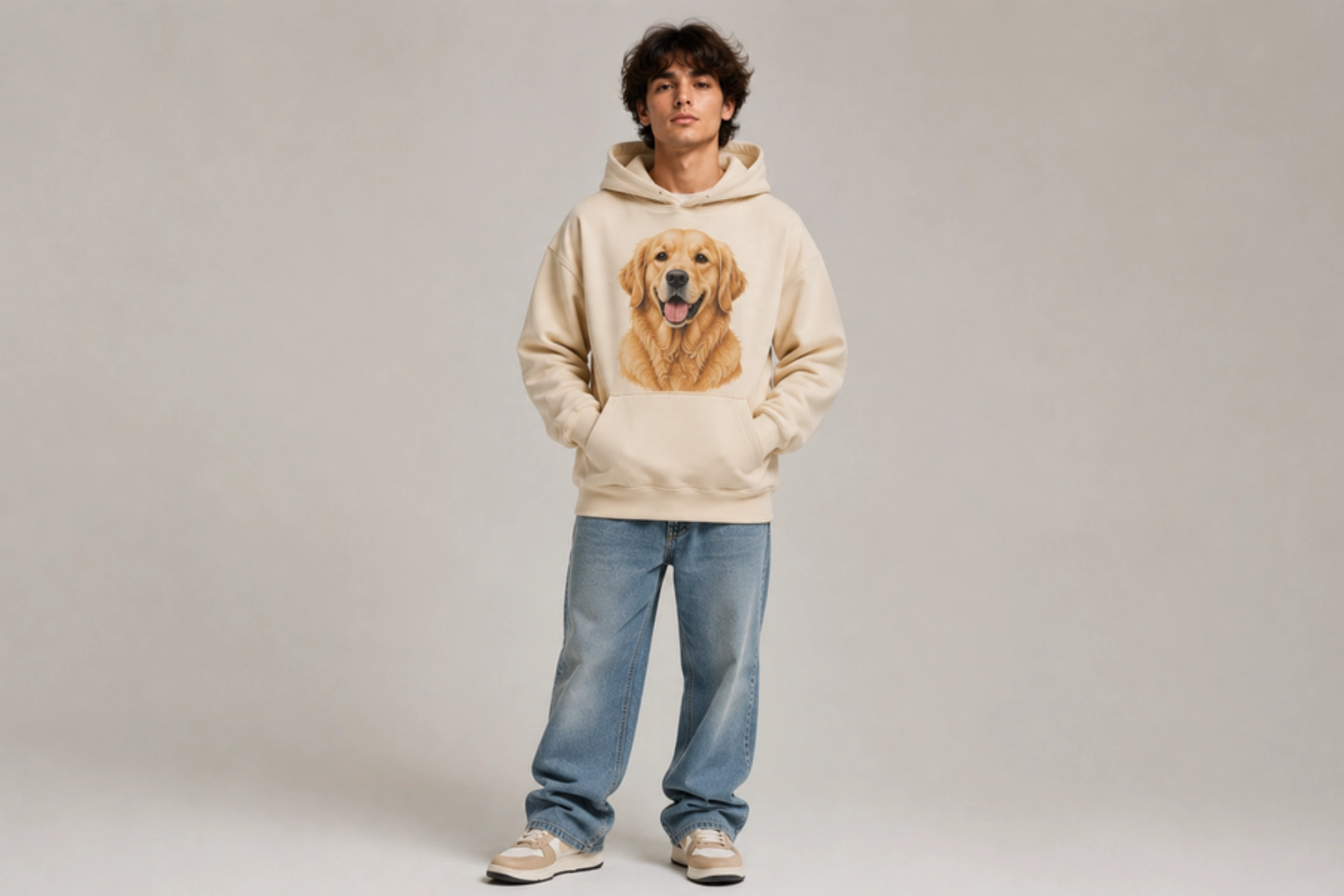
Best for: Pet owners, gifts, custom apparel
Few personalized hoodie designs carry as much emotional weight as a pet portrait, which turns illustrated or digitally rendered artwork of dogs, cats, or other beloved pets into a wearable celebration of the bond between owner and pet. A realistic portrait centered on the chest treats the subject with the same seriousness as any fine-art commission, while a stylized or cartoonish rendering adds personality and humor to the same concept. The quality of the source photo determines how much facial detail survives into the final artwork.
Best placement: Center chest
Recommended print method: DTG
Recommended hoodie: Light or neutral-colored heavyweight hoodie
Pro tip: Start with a high-resolution pet photo to preserve facial details in the final artwork.
- Birthday Hoodie Design Ideas
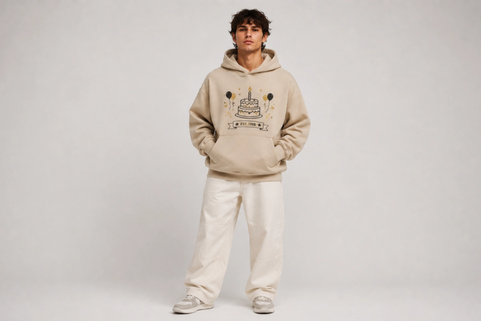
Best for: Birthday celebrations, milestone events, personalized gifts
Marking a milestone with a wearable keepsake is where birthday hoodie designs find their strongest purpose, combining names, birth years, custom graphics, and celebratory typography into apparel that works for individual occasions and matching group outfits alike. A hoodie marking a 30th birthday with the birth year rendered in large type across the back, or a matching set for a group birthday trip with a shared graphic on the chest, gives the occasion a tangible identity beyond the event itself.
Best placement: Center chest or full back
Recommended print method: DTF or Screen Printing
Recommended hoodie: Classic pullover hoodie
Pro tip: Include the birth year or milestone age as a subtle design element instead of making it the entire focus.
- Holiday Hoodie Design Ideas
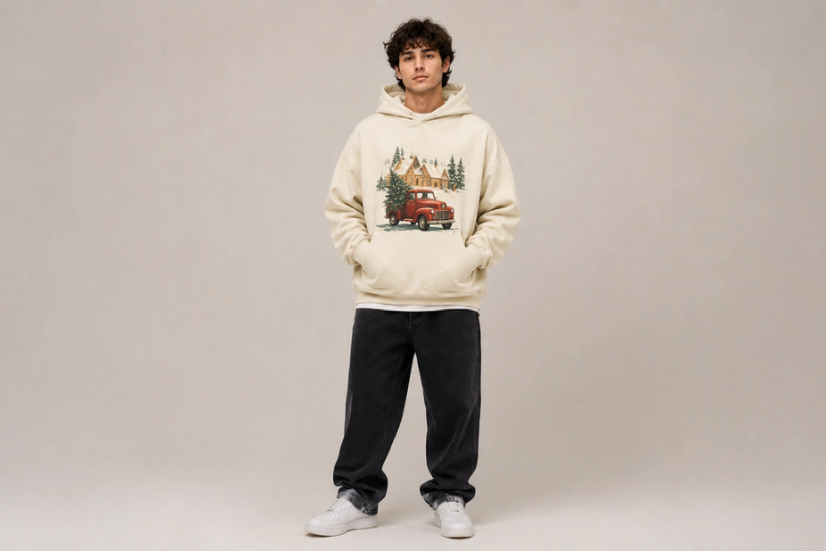
Best for: Christmas, Halloween, Thanksgiving, festive events
Holiday hoodies capture the spirit of a seasonal celebration through themed illustrations, festive typography, and color palettes that feel specific to the occasion without being disposable. A minimalist embroidered Christmas tree on a forest-green heavyweight pullover reads differently from a bold Halloween graphic screen-printed across the full front, but both succeed when the design feels considered rather than novelty-driven. Artwork built around timeless seasonal imagery rather than year-specific references extends the hoodie’s wearable life across multiple seasons.
Best placement: Center chest or full front
Recommended print method: Screen Printing or DTG
Recommended hoodie: Midweight fleece hoodie
Pro tip: Focus on timeless seasonal artwork rather than year-specific designs so the hoodie can be worn again in future seasons.
Community & Organization Hoodie Design Ideas
Community and organization hoodie designs strengthen group identity by creating a consistent look across teams, workplaces, schools, and events. Whether used for brand visibility, team recognition, or a shared sense of belonging, these hoodies combine practical apparel with designs that represent a common purpose and make members instantly recognizable.
- Company Hoodie Design Ideas
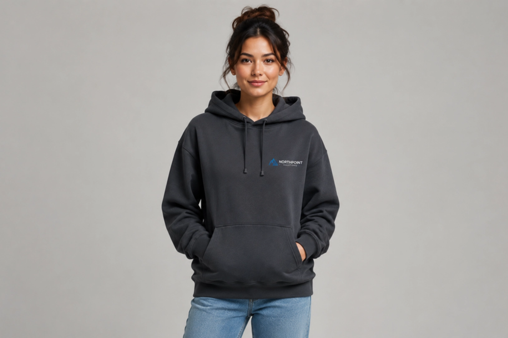
Best for: Businesses, corporate teams, employee merchandise
A well-designed company hoodie serves as both branded apparel and everyday wear, setting it apart from standard promotional merchandise. Clean logo placement, a restrained color palette, and a quality base garment create a professional appearance that employees are more likely to wear outside the workplace, extending brand visibility beyond internal events. The less the design feels like a uniform, the more it gets worn.
Best placement: Left chest with optional full-back logo
Recommended print method: Embroidery or Screen Printing
Recommended hoodie: Midweight or heavyweight pullover
Pro tip: Keep branding subtle to encourage employees to wear the hoodie beyond work events.
- Startup Brand Hoodie Design Ideas
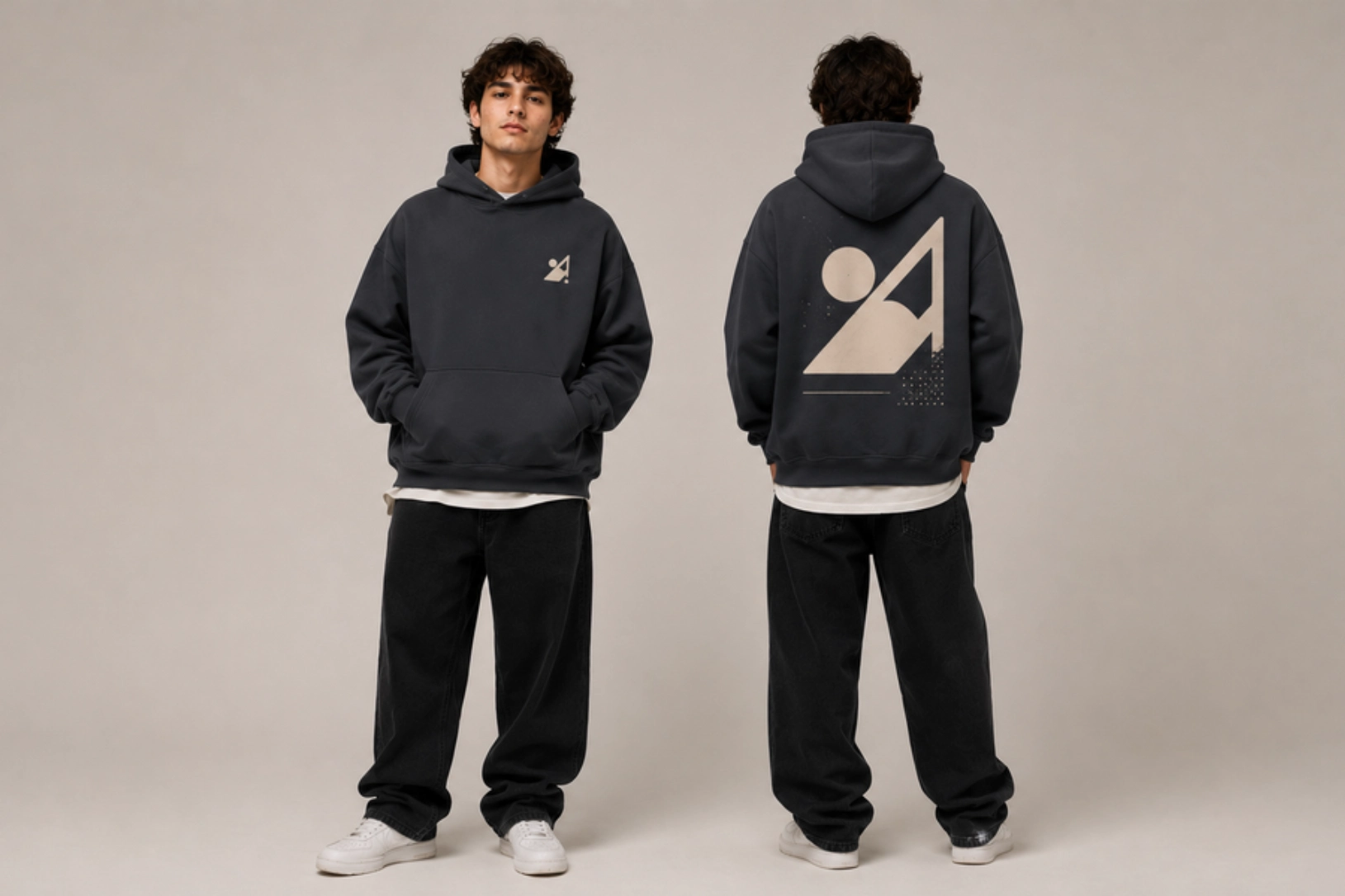
Best for: Startups, creators, product launches, brand merchandise
Startup hoodies carry more creative pressure than corporate apparel because they serve as both a brand statement and merchandise. A minimalist wordmark on an oversized heavyweight pullover, or a signature graphic that references the company’s personality without spelling out its pitch, creates apparel that builds awareness organically through wear rather than promotion. Consistency in typography, color, and graphic style turns a single hoodie into the foundation of a recognizable merchandise identity.
Best placement: Left chest with oversized back graphic
Recommended print method: Screen Printing or DTF
Recommended hoodie: Heavyweight oversized hoodie
Pro tip: Build a consistent visual identity by using the same typography, colors, and graphic style across your merchandise collection.
- College Club Hoodie Design Ideas
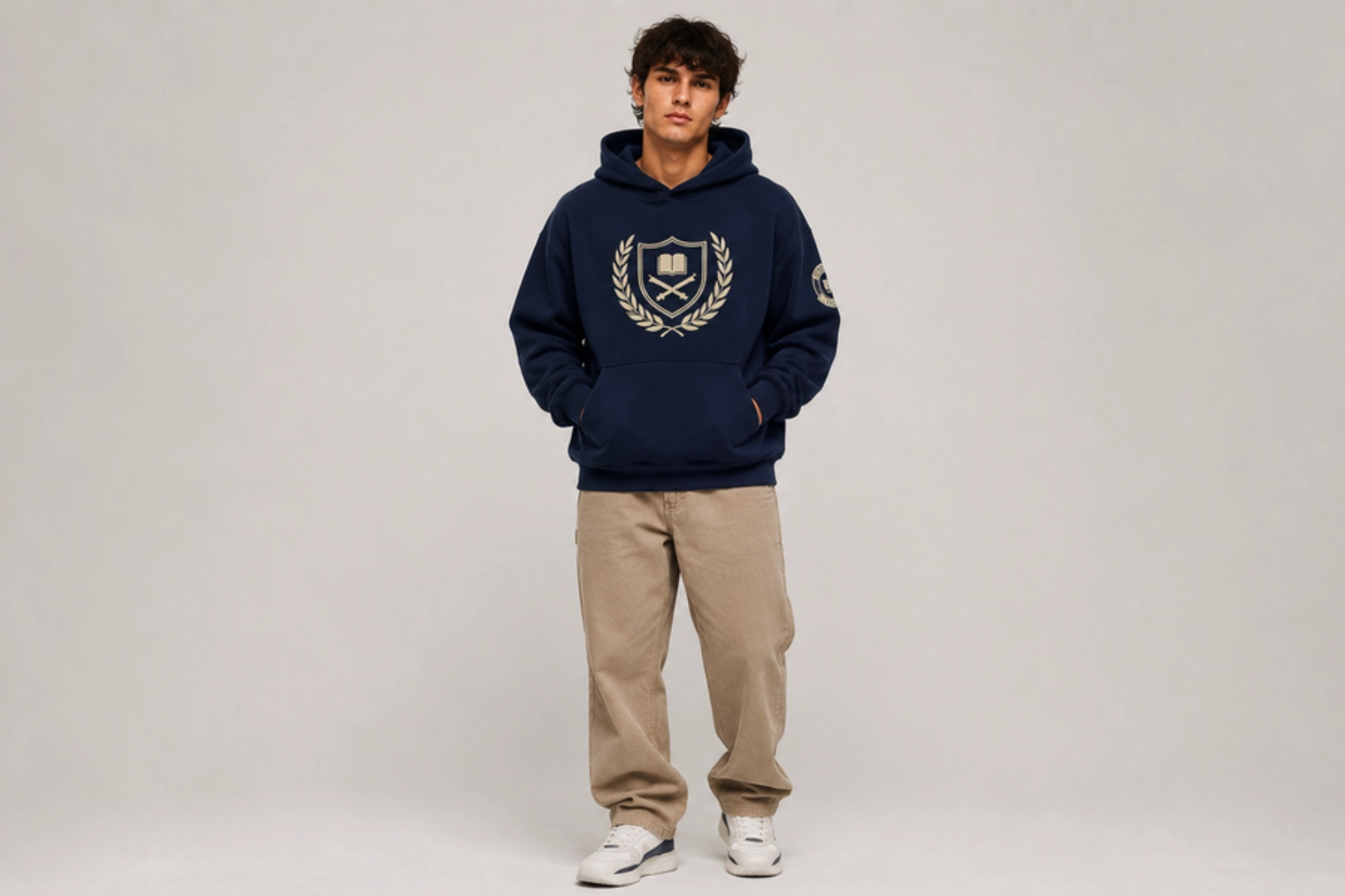
Best for: Student organizations, academic clubs, university events
Club names, founding years, mascots, and custom graphics give college club hoodies a visual identity that members can wear with genuine pride rather than obligation. A center-chest design featuring the club name in bold type above a custom illustration, or a full back graphic with individual members’ names listed below, gives the garment a sense of history and belonging that extends beyond campus events.
Best placement: Center chest with optional sleeve logo
Recommended print method: Screen Printing
Recommended hoodie: Midweight pullover hoodie
Pro tip: Include the club name prominently while keeping supporting graphics simple and easy to recognize.
- High School Club Hoodie Design Ideas
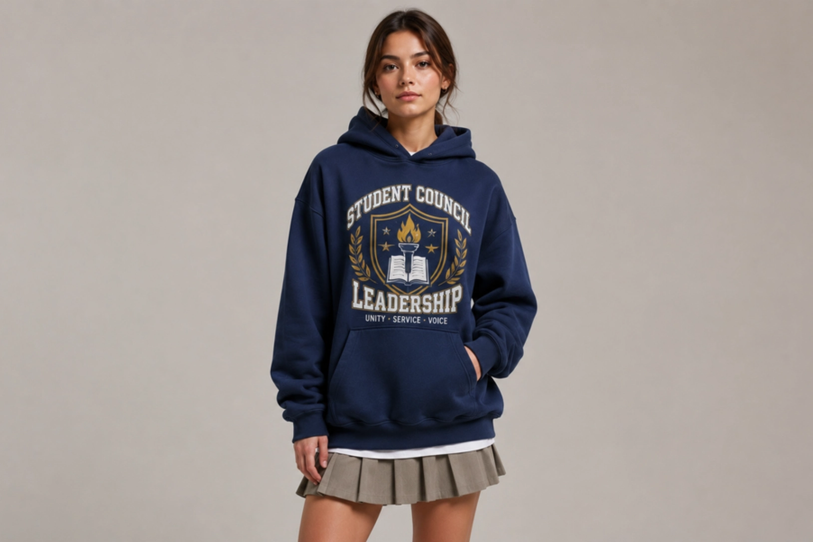
Best for: School clubs, student councils, performing arts, academic teams
Designed to represent involvement and create a unified look across meetings, competitions, and school activities, high school club hoodies work best when the design feels specific to the organization rather than generic school merchandise. School colors anchoring a custom mascot illustration, or a performing arts hoodie with the production name and year on the back, give members something worth wearing rather than something they feel obligated to own. Consistency with the existing school visual identity strengthens recognition across campus.
Best placement: Center chest or full back
Recommended print method: Screen Printing
Recommended hoodie: Classic fleece hoodie
Pro tip: Use school colors and club symbols consistently to strengthen recognition across campus.
- Sports Team Hoodie Design Ideas
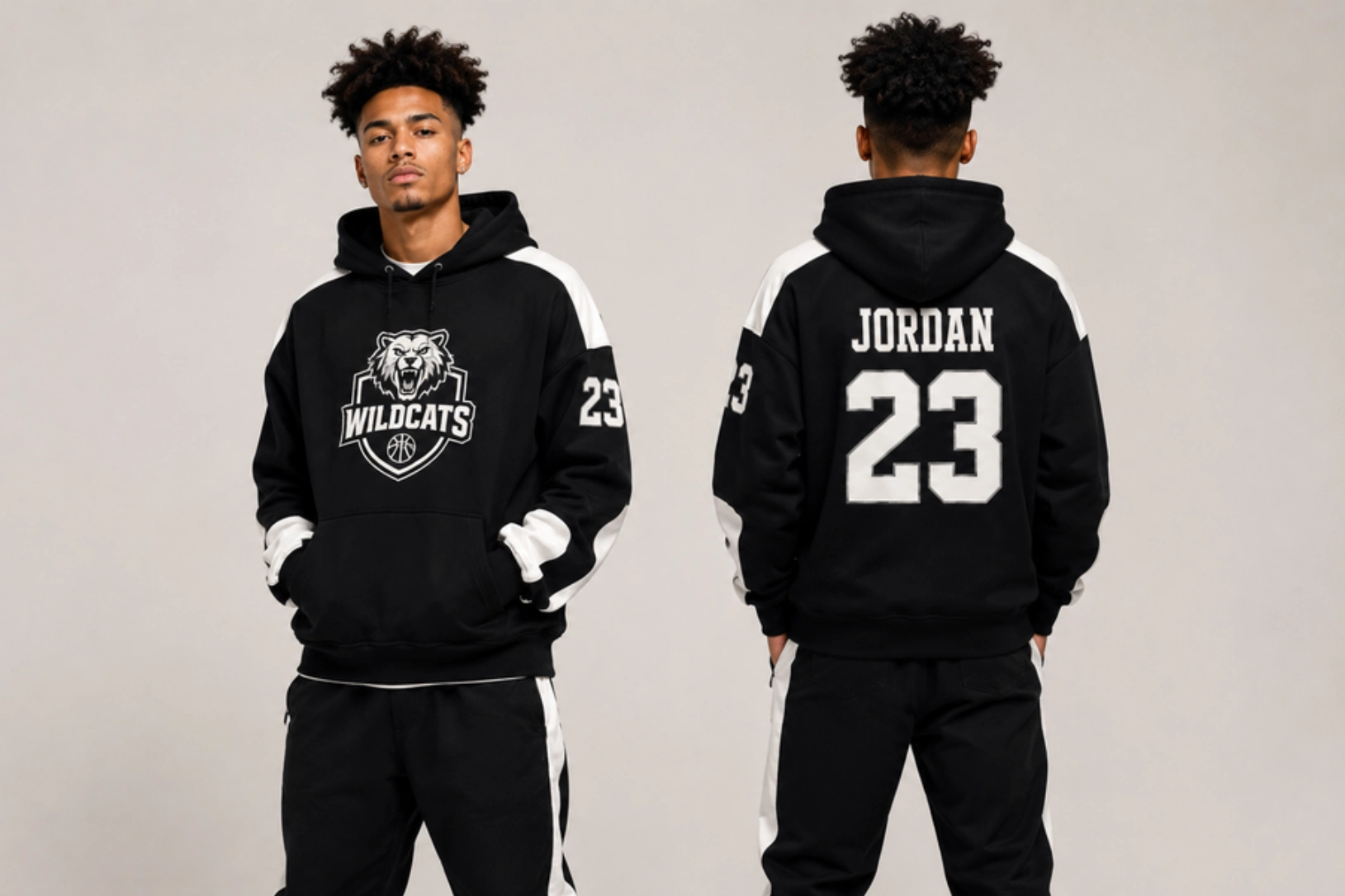
Best for: Athletic teams, coaches, supporters, tournaments
Sports team hoodies combine logos, player numbers, mascots, and season details into apparel that holds up through regular use and stays visually sharp throughout the season. A front logo paired with a player name and number on the back gives each hoodie both collective and individual identity, making it meaningful beyond the team context. Bold graphics and durable print methods keep the design intact through an active season.
Best placement: Front logo with player name or number on the back
Recommended print method: Screen Printing or DTF
Recommended hoodie: Heavyweight performance hoodie
Pro tip: Personalize each hoodie with player names or numbers while keeping the overall team branding consistent.
Lifestyle Hoodie Design Ideas
Designed for everyday comfort and versatility, lifestyle hoodie designs combine wearable graphics with functional hoodie styles to create apparel suited for daily routines and outdoor experiences. Whether inspired by fitness, winter fashion, hiking, or travel, these hoodies balance comfort, practicality, and personal style, making them easy to wear long after seasonal trends have changed.
- Gym Pump Cover Hoodie Design Ideas
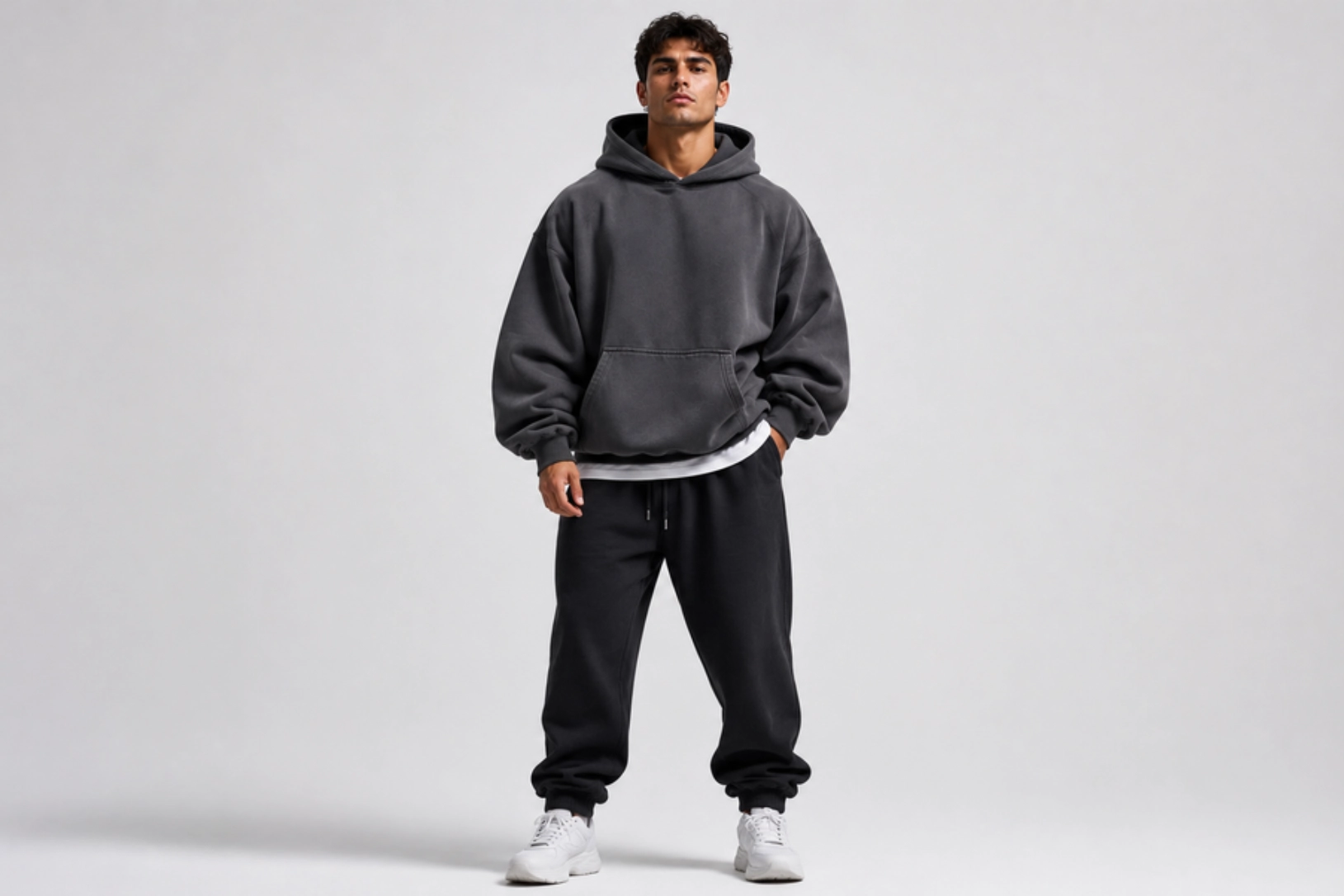
Best for: Fitness brands, gym apparel, activewear collections
Pump cover hoodies have carved out their own category in fitness apparel, built around oversized fits and bold design choices that work as hard in the gym as they do outside it. Motivational typography, a minimalist brand mark on a heavyweight pullover, or an oversized back graphic all translate training culture into wearable form. The relaxed silhouette does as much design work as the print, making fit and fabric weight as important as the artwork.
Best placement: Center chest or oversized back graphic
Recommended print method: Screen Printing or DTF
Recommended hoodie: Heavyweight oversized hoodie (400+ GSM)
Pro tip: Pair bold typography with neutral hoodie colors like black, grey, or olive for a clean athletic look.
- Winter Hoodie Design Ideas
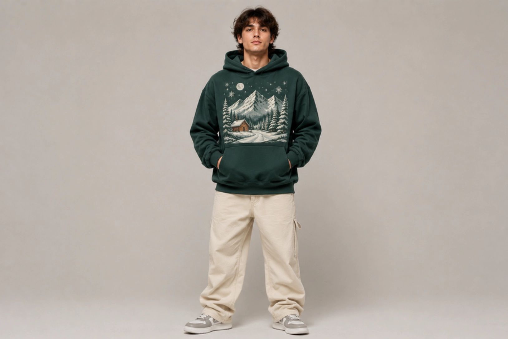
Best for: Seasonal collections, outdoor apparel, holiday merchandise
Seasonal collections give hoodie design a natural creative anchor, and winter hoodies use that brief well through mountain landscapes, snow-inspired graphics, evergreen elements, and warm color palettes specific to the colder months. A full-back illustration on a deep navy fleece or a minimal embroidered pine tree on a burgundy pullover creates apparel that feels seasonal without being disposable. Timeless cold-weather imagery extends wearable life across multiple seasons.
Best placement: Center chest or full back
Recommended print method: Screen Printing or DTG
Recommended hoodie: Heavyweight fleece hoodie
Pro tip: Use earthy neutrals, deep blues, forest greens, and burgundy to complement winter-inspired artwork.
- Outdoor Adventure Hoodie Design Ideas
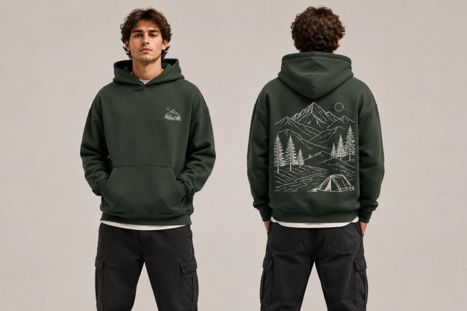
Best for: Hiking brands, camping enthusiasts, travel merchandise
Nature-inspired hoodie designs have a built-in audience in hiking, camping, and travel communities, where apparel that reflects the outdoor lifestyle is worn as much as a badge of identity as a garment. Mountain ranges, forest canopies, wildlife illustrations, and topographic map graphics communicate that identity clearly when rendered in clean linework that holds up across different hoodie colors and fabric weights. Simple illustrations age better than complex artwork in this format.
Best placement: Full back with a small front logo
Recommended print method: Screen Printing or DTG
Recommended hoodie: Heavyweight cotton or performance blend hoodie
Pro tip: Simple line-art illustrations often age better than highly detailed graphics and remain easier to reproduce across different hoodie colors.
What Makes a Great Hoodie Design?
A great hoodie design combines simplicity, visual balance, readability, originality, and production-ready artwork to create apparel that looks appealing and prints consistently. While every hoodie serves a different purpose, the following principles help create designs that remain effective across different styles, fabrics, and printing methods.
- Simplicity
Focus on one primary design element instead of combining multiple graphics, fonts, or colors. A single bold graphic on the chest or one strong typographic element on the back will always outperform a layout that tries to include a logo, tagline, illustration, and supporting text simultaneously. Clean compositions are easier to recognize, print, and wear repeatedly without losing their appeal.
- Strong visual hierarchy
Arrange text, graphics, and supporting elements so the viewer’s attention naturally moves to the most important part of the design first. A brand name in large type above a smaller supporting illustration, or a central graphic flanked by secondary text, creates a reading order that guides the eye rather than leaving it to wander across competing elements.
- Contrast
Use colors that clearly separate the artwork from the hoodie fabric. A white or light graphic on a black or charcoal hoodie is the most reliable combination, but contrast also applies to embroidery, where the thread color relative to the fabric weight determines how clearly the stitch reads. Low contrast can make even well-executed artwork disappear against certain colorways or fabric textures.
- Readability
Choose legible fonts, appropriate text sizes, and sufficient spacing so quotes, slogans, and brand names remain easy to read at the sizes they will actually appear on the garment. For screen printing, text below 1/4 inch in height risks losing definition. For embroidery, overly thin serif fonts and tight letter spacing become indistinguishable at small scales.
- Theme consistency
Keep typography, colors, illustrations, and graphic styles aligned with the intended aesthetic, whether minimalist, vintage, streetwear, or corporate. A distressed vintage font paired with a clean sans-serif tagline, or a botanical illustration placed next to bold puff-print lettering, creates visual tension that runs counter to the overall impression the hoodie is trying to make.
- Originality
Create artwork that reflects your own concept or brand identity instead of relying on generic templates or overused design trends. A custom illustration, a distinctive typographic treatment, or a concept rooted in a specific cultural reference will always produce more memorable merchandise than a stock graphic with a name dropped in.
- Quality artwork
Use high-resolution vector files at 300 DPI or above, or professional graphics prepared specifically for the intended print method. DTG and DTF printing handle raster files well when resolution is sufficient, but screen printing and embroidery require clean vector artwork or properly digitized stitch files to reproduce sharp, accurate results at any size.
Where Should You Place Your Design on a Hoodie?
The best place to put a hoodie design depends on the artwork, its purpose, and how prominently you want it to be seen. Front placements work well for logos and typography, while the back offers more space for large graphics. Sleeves, hoods, and pockets create subtle branding opportunities that add character without dominating the garment.
| Placement | Best For | Visibility | Typical Print Area* | Most Suitable Print Method |
| Left Chest | Logos | Medium | 3–4 inches | Embroidery, Screen Print |
| Center Chest | Typography | High | 8–12 inches | DTG, Screen Print |
| Full Front | Large graphics | Very High | 10–12 inches | DTG, DTF |
| Full Back | Oversized artwork | Very High | 10–14 inches | Screen Print, DTF |
| Sleeve | Text, icons | Medium | 10–16 inches | Screen Print, Embroidery |
| Hood | Small branding | Low–Medium | 2–4 inches | Embroidery |
| Logos, badges | Low | 2–3 inches | Embroidery |
*Approximate print dimensions. The available print area varies by hoodie size, style, and printing method.
Front Placement Ideas
The front is the most visible area of a hoodie, making it the default choice for logos, typography, and medium-sized graphics that need to be seen immediately. A left chest logo kept between 3 and 4 inches wide creates a clean, professional appearance suited to corporate apparel and premium branding, while a centered chest design at 5 to 7 inches works well for bold statements, illustrations, and brand graphics that need more visual presence. For pullover styles, the front panel offers an uninterrupted canvas, but zip-up hoodies require the design to either sit on one side of the zipper or be intentionally split across both panels.
Best for: Brand logos, quotes, monograms, minimalist artwork
Back Placement Ideas
The back provides the largest printable area on any hoodie, with standard back graphics ranging from 8 to 12 inches wide on adult sizes, making it the preferred choice for oversized graphics, detailed illustrations, and statement typography. The upper-back placement just below the hood keeps the design centered and easy to read, while a full-back graphic extending toward the hem suits streetwear and artist merchandise, where maximum visual impact is the priority. Many brands pair a large back design with a small left chest logo to give each side a clear role.
Best for: Oversized graphics, streetwear artwork, event merchandise
Sleeve Placement Ideas
Sleeves are ideal for secondary branding and decorative details that complement the main design without competing with it. Vertical typography running down the outer forearm, a small horizontal icon or wordmark near the cuff, and repeating patterns along the sleeve length all create visual interest from angles the chest and back placements do not reach. The standard sleeve print area runs 2 to 3 inches wide, making bold, simple shapes and short text far more reliable than detailed illustrations at this scale.
Best for: Brand names, slogans, icons, decorative graphics
Hood Placement Ideas
The hood offers one of the most distinctive and underused branding locations on a hoodie, visible from behind when worn down and from above when worn up. Small logos, initials, short words, or simple symbols work best because the curved and segmented surface of most hoods limits the size and complexity of artwork that can sit cleanly without distortion. A small embroidered logo on the back of the hood or a single word stitched along the hood edge adds a premium detail that rewards closer inspection.
Best for: Brand names, initials, small graphics
Pocket Placement Ideas
Pocket placement integrates branding directly into one of the hoodie’s most functional features, creating a subtle and considered detail that stands out precisely because it is unexpected. A small embroidered logo centered on a kangaroo pocket, a badge stitched just above the pocket opening, or a minimal icon placed at the pocket corner all add character without disrupting the overall design. The print area here is limited, typically no larger than 3 inches wide, so simple shapes and clean typography perform far better than detailed artwork.
Best for: Minimal branding, embroidered logos, badges
What Print Methods Work Best for Hoodie Designs?
The best print method for a hoodie depends on the artwork, fabric, order quantity, and the finish you want to achieve. Screen printing is ideal for bold graphics and bulk orders, DTG produces high-detail artwork, DTF works across multiple fabric types, embroidery creates a premium stitched finish, and puff print adds textured dimension to modern streetwear. Choosing the right technique ensures your design looks its best while maintaining durability and print quality across the garment’s lifespan.
| Print Method | Best For | Durability | Detail Level | Best Order Size |
| Screen Printing | Bold graphics, bulk orders | ★★★★★ | ★★★☆☆ | Medium to Large |
| DTG | Detailed artwork, photos | ★★★★☆ | ★★★★★ | Small |
| DTF | Multi-color graphics, mixed fabrics | ★★★★☆ | ★★★★☆ | Small to Medium |
| Embroidery | Logos, monograms, premium branding | ★★★★★ | ★★★☆☆ | Small to Large |
| Puff Print | Streetwear typography, bold graphics | ★★★★☆ | ★★☆☆☆ | Medium to Large |
Screen Printing
Screen printing pushes ink through a mesh stencil to create bold, durable prints with strong color vibrancy that hold up through repeated washing. Each color requires a separate screen, making setup costs higher for multi-color artwork but increasingly cost-effective as order quantities grow. It performs best on cotton and cotton-blend hoodies and remains the most reliable method for large-scale production runs.
Best for: Logos, typography, large graphics, bulk production
Pros:
- Long-lasting prints
- Vibrant colors
- Cost-effective for large orders
Limitations:
- Less economical for small quantities
- Additional setup cost for each color
Embroidery
Embroidery stitches the design directly into the hoodie fabric using thread, producing a raised, textured finish that stays sharp through hundreds of washes without fading or cracking. It works best for logos, monograms, and simple graphics, with a standard left-chest area of 4 by 4 inches and up to 10 by 6 inches for larger center placements. Intricate fine lines and gradients require simplification before they can be accurately reproduced in stitch.
Best for: Logos, monograms, crests, premium branding
Pros:
- Premium appearance
- Highly durable
- Resistant to fading
Limitations:
- Limited detail for complex artwork
- Higher cost for large stitched designs
Direct-to-Garment (DTG)
DTG printing applies water-based ink directly onto the fabric using a modified inkjet process, making it the strongest option for detailed artwork, gradients, and photo-quality images that screen printing cannot reproduce. The print sits into the fabric rather than on top of it, producing a soft hand feel with no setup fees or minimum order requirements. Results are most consistent on fabrics with 80% or more cotton content.
Best for: Multi-color graphics, custom apparel, mixed fabric blends
Pros:
- High-detail printing
- No minimum order quantity
- Soft feel on fabric
Limitations:
- Slower for large production runs
- Best results on cotton-rich fabrics
Direct-to-Film (DTF)
DTF printing transfers a design from printed film onto the hoodie using heat and adhesive powder, delivering sharp detail and vibrant color across a wider range of fabrics than DTG, including polyester and blended materials. It handles multi-color designs without per-color setup costs, making it a strong option for small and medium runs where fabric type or artwork complexity rules out other methods.
Best for: Multi-color graphics, custom apparel, mixed fabric blends
Pros:
- Suitable for cotton and polyester
- Excellent color accuracy
- Durable under regular wear
Limitations:
- Slightly thicker print feel than DTG
- Less premium appearance than embroidery
Puff Print
Puff print uses expanding ink that rises from the fabric surface during heat-curing to create a raised, three-dimensional finish that adds texture and visual weight to the design. It works best with bold typography and simple high-contrast graphics, since fine lines lose definition as the ink expands outward. On heavyweight oversized hoodies, it has become a defining technique in modern streetwear, where tactile quality matters as much as visual design.
Best for: Streetwear, bold typography, oversized graphics
Pros:
- Raised 3D effect
- Distinctive texture
- Trend-driven appearance
Limitations:
- Not suitable for intricate details
- Limited to simple artwork and bold shapes
What Style, Fabric, and Fit Should You Choose for Hoodies?
The best hoodie combines a style that complements your design, a fabric that matches its intended use, and a fit that aligns with your audience and aesthetic. Pullovers provide uninterrupted space for graphics, heavyweight fabrics create a premium feel, and oversized fits suit modern streetwear, while lighter fabrics and classic fits work well for everyday apparel and corporate merchandise.
Pullover vs Zip-Up
The choice between a pullover and a zip-up hoodie affects both design possibilities and intended use. Pullovers provide an uninterrupted front-and-back canvas that suits large graphics, oversized typography, and full-back artwork without a zipper line breaking the composition. Zip-up hoodies work better for smaller logos and embroidered branding placed on one side of the chest, where the open front creates a natural frame rather than an interruption.
| Style | Best For | Works Best With |
| Pullover | Streetwear, merchandise, casual wear | Large graphics, typography, oversized artwork |
| Zip-Up | Corporate apparel, uniforms, layering | Left chest logos, embroidery, minimalist designs |
Fabric Guide
The fabric affects print quality, comfort, durability, and how the hoodie fits over time. Choosing the right material ensures your design performs well while matching its intended purpose.
- Cotton
Cotton is soft, breathable, and the most reliable base fabric for DTG printing because it absorbs water-based ink well and produces accurate, vibrant color. Ring-spun cotton produces a smoother surface than standard cotton, which further improves print clarity and overall garment quality.
Best for: Everyday hoodies, DTG printing, premium comfort
- Cotton-Poly Blend
Cotton-poly blends combine the softness and ink absorption of cotton with the structure and wrinkle resistance of polyester, producing a hoodie that holds its shape well through repeated washing. A typical 80/20 or 60/40 cotton-to-polyester ratio keeps the fabric print-friendly while adding durability that pure cotton lacks.
Best for: Corporate apparel, team hoodies, merchandise
- French Terry
French Terry is a lightweight knit fabric with a smooth outer surface and looped interior that provides breathability without the bulk of standard fleece. Its lighter construction makes it better suited to transitional weather and casual layering than heavier cotton hoodies.
Best for: Spring collections, lightweight hoodies, everyday wear
- Performance Fabrics
Performance fabrics use moisture-wicking synthetic fibers, typically polyester or nylon blends, to improve breathability and comfort during physical activity. DTF printing is the most reliable method for performance fabrics because water-based DTG inks struggle to bond effectively with high-polyester fabrics.
Best for: Activewear, fitness brands, sports apparel
GSM Guide
GSM measures fabric weight in grams per square meter and directly influences the hoodie’s thickness, structure, warmth, and drape. Higher GSM creates a heavier, more structured garment suited to premium apparel and oversized silhouettes, while lower GSM produces a lighter, more breathable hoodie better suited to everyday and warm-weather wear.
- Lightweight: 250–300 GSM
Breathability and comfort take priority over structure in this weight range, making lightweight hoodies well-suited to warmer climates, promotional apparel, and everyday casual wear where fabric bulk would feel excessive.
Best for: Daily wear, spring collections, promotional apparel
- Midweight: 300–350 GSM
Sitting between casual comfort and premium structure, midweight hoodies strike the most versatile balance for custom merchandise, branded apparel, and club or team hoodies that need to perform well across most climates and wear contexts.
Best for: Company hoodies, clubs, merchandise
- Heavyweight: 350-400 GSM
The added fabric density at this weight range gives embroidery a clean, stable surface to stitch into and provides oversized graphics with the surface weight they need to read well. The structured fit also improves warmth and perceived garment quality.
Best for: Premium apparel, embroidery, fashion brands
- Premium Streetwear: 400+ GSM
Ultra-heavyweight fabrics above 400 GSM are what give premium streetwear hoodies their defining characteristics, including oversized silhouettes, substantial drape, and a luxury hand feel that lighter fabrics cannot replicate. The added weight pairs naturally with puff print, large back graphics, and tonal embroidery where the garment itself is as much a design statement as the artwork on it.
Best for: Streetwear brands, luxury collections, oversized hoodies
Hoodie Design Ideas by Purpose
The best hoodie design depends on how and where it will be used. A clothing brand may prioritize originality and trend-driven graphics, while a company focuses on professional branding, a school emphasizes group identity, and a personal hoodie reflects individual style. Matching the design to its purpose helps create apparel that is both visually effective and practical to wear.
Clothing Brands
Standing out in a saturated apparel market is what makes hoodie design so critical for clothing brands, where original graphics, signature typography, and premium print finishes like puff ink or tonal embroidery separate considered designs from generic ones. The strongest brand hoodies treat every decision as part of a consistent identity system that builds recognition across multiple releases.
Design tips:
- Build a consistent visual identity
- Prioritize original artwork over generic graphics
- Use premium printing techniques like embroidery or puff print
- Design with future collections in mind
Merchandise
Merchandise hoodies succeed when the design functions as genuine fashion rather than promotional apparel, representing a brand, creator, or community while remaining stylish enough to compete with apparel people would buy on their own. An oversized back graphic paired with a subtle chest logo, or a signature phrase in a distinctive custom typeface, creates merchandise that sells on aesthetic merit rather than brand loyalty alone.
Design tips:
- Keep branding subtle
- Use memorable graphics or slogans
- Choose comfortable, versatile hoodie colors
- Design for repeat wear, not just promotion
Clubs & Schools
Club and school hoodies need to create immediate recognition while remaining wearable enough for daily use beyond organized events. A center-chest design with the club name above a custom mascot, or a full back graphic with the founding year and member names, gives the garment a collective identity that generic school merchandise rarely achieves.
Design Tips:
- Include club or school branding
- Use official colors where appropriate
- Add founding years or mascots for uniqueness
- Personalize with member names when possible
Corporate Teams
Corporate hoodies walk a narrow line between professional branding and apparel people actually want to wear outside the office. A small embroidered logo on the left chest of a premium pullover in a neutral colorway creates a refined appearance that does not read as promotional, making employees far more likely to wear it in everyday settings.
Design Tips:
- Choose subtle logo placement
- Use embroidery for a premium finish
- Avoid oversized promotional graphics
- Prioritize comfort for regular wear
Events & Giveaways
The most effective event hoodies create a lasting connection to the occasion rather than simply listing sponsors or dates. A custom illustration referencing the event’s theme or commemorative artwork that captures the spirit of the occasion gives recipients a reason to keep wearing the hoodie long after the event.
Design Tips:
- Include the event name or year
- Create memorable artwork instead of sponsor-heavy layouts
- Keep the design timeless
- Choose colors that suit different audiences
Personal Wear
Personal hoodies remove every constraint imposed by brand or corporate design, leaving room for artwork that reflects hobbies, relationships, or individual style without compromise. A custom pet portrait, a meaningful date in large type across the back, or a hand-drawn illustration of a favorite place creates apparel that carries genuine personal significance.
Design Tips:
- Design around your interests or lifestyle
- Personalize with names, dates, or illustrations
- Keep the artwork authentic to your style
- Choose colors you will enjoy wearing regularly
Preview Your Hoodie Before Printing
A realistic mockup is one of the most practical steps in the hoodie design process, helping you catch placement issues, proportion errors, and contrast problems before they become costly production mistakes. It lets you evaluate artwork size, color contrast against the fabric, typography readability, and overall visual balance across front, back, sleeve, and pocket placements before committing to an order.
Before approving your design, check:
- Artwork size and proportions
- Front, back, sleeve, and pocket placement
- Color contrast against the hoodie
- Typography readability
- Graphic alignment
- Print method compatibility
Using a hoodie mockup generator lets you test different styles, colorways, and design placements in minutes without needing physical samples for every variation. Running through multiple configurations before finalizing artwork reduces the risk of reprints and gives you a production-ready file with greater confidence.
What Are Common Mistakes to Avoid in Hoodie Design?
The most common hoodie design mistakes include overcrowded artwork, poor placement, low-resolution graphics, weak color contrast, choosing the wrong print method, and ignoring how the design interacts with the garment. Identifying these issues before printing helps improve readability, print quality, and the overall appearance of the finished hoodie.
- Overcrowded artwork
Combining multiple graphics, fonts, and decorative elements in a single design creates visual noise that competes for attention rather than communicating a clear concept. A single primary graphic with generous negative space around it will always read more clearly on a garment than a layout that tries to include everything at once.
- Poor placement
A well-executed graphic loses its impact when positioned too high toward the neckline, too low near the kangaroo pocket, or off-center on the chest panel. Placement decisions should account for the hoodie’s seams, pockets, and silhouette so the artwork sits where the eye naturally falls.
- Low-resolution graphics
Artwork that looks sharp on screen can print blurry, pixelated, or soft-edged when scaled to garment size, particularly for back graphics that need to reach 8 to 12 inches wide. Use vector files for screen printing and embroidery, and ensure raster artwork is prepared at 300 DPI or above at the intended print size.
- Weak color contrast
Artwork that closely matches the hoodie color becomes difficult to read from a distance, reducing the design’s visual impact regardless of how well it is executed. Light graphics on dark hoodies and dark graphics on light hoodies provide the strongest contrast, while tonal designs should be reserved for intentional embroidery effects rather than printed artwork.
- Wrong print method
Choosing the wrong technique for the artwork type is one of the most common and costly production mistakes. Complex illustrations with fine linework lose definition in embroidery, while puff print expands outward and distorts intricate detail. Matching the artwork’s complexity and scale to the right print method before finalizing the design prevents reprints and quality issues.
- Ignoring garment folds
Hood seams, kangaroo pockets, zipper lines, and natural fabric folds can interrupt or distort key design elements in ways that are not visible in a flat digital file. Previewing the artwork on a three-dimensional hoodie mockup before approving the design ensures that nothing critical falls across a seam or gets obscured when the garment is worn.
Hoodie Design Mistakes vs Better Alternatives
| Common Mistake | Better Alternative |
| Overcrowded layout | Focus on one primary graphic or message |
| Poor artwork placement | Position the design based on the hoodie style and print area |
| Low-resolution graphics | Use high-resolution or vector artwork |
| Weak color contrast | Choose colors that clearly stand out against the fabric |
| Wrong print method | Match the artwork to the most suitable printing technique |
| Ignoring garment folds | Review the design on a realistic hoodie mockup before printing |
Frequently Asked Questions
What are the best hoodie design ideas?
The best hoodie design ideas include minimalist logos, oversized streetwear graphics, vintage-inspired artwork, typography, embroidery, botanical illustrations, and personalized designs because they balance visual appeal with everyday wearability. Choose a style that matches your audience, brand identity, and intended use to create a hoodie people will want to wear repeatedly.
What hoodie designs are trending in 2026?
The biggest hoodie design trends in 2026 include puff print graphics, heavyweight oversized hoodies, minimalist embroidery, vintage-inspired artwork, Y2K typography, washed finishes, and nature-inspired illustrations. These styles combine premium materials with bold yet wearable designs that continue to influence modern streetwear and casual fashion.
Where should a hoodie logo be placed?
The best placement for a hoodie logo depends on its purpose, with the left chest being ideal for subtle branding, the center chest for bold visibility, and the back for oversized brand graphics. Sleeves, pockets, and hoods are also effective for secondary branding or decorative details.
Which print method lasts the longest?
Embroidery and screen printing are generally the most durable print methods because they resist fading, cracking, and repeated washing. Embroidery works best for logos and monograms, while screen printing is better suited for bold graphics and larger production runs.
DTF vs DTG: Which is better for hoodies?
DTF is better for vibrant graphics on different fabric types, while DTG is better for highly detailed artwork and cotton-rich hoodies. Choose DTF for versatility and durability across materials, and DTG when you want soft-feel, high-resolution prints with fine details.
What fabric is best for custom hoodies?
Cotton is the best fabric for custom hoodies when comfort and print quality are the priority, while cotton-poly blends offer greater durability and shape retention. Your choice should depend on how the hoodie will be worn and the printing method being used.
What GSM is best for streetwear hoodies?
Heavyweight hoodies between 350 and 500 GSM are generally the best choice for streetwear because they provide a structured fit, premium feel, and support oversized silhouettes. Many premium streetwear brands prefer 400+ GSM fabrics for their substantial weight and durability.
Should I choose a pullover or a zip-up hoodie?
Yes, you should choose the hoodie style based on your design and intended use rather than personal preference alone. Pullovers provide uninterrupted space for large graphics and typography, while zip-up hoodies are better suited for minimalist logos, embroidery, and layered everyday wear.
How can I preview my hoodie before printing?
You can preview your hoodie before printing by placing your artwork on a realistic digital mockup that shows the design on different hoodie styles, colors, and placements. Reviewing a mockup helps identify sizing, alignment, and color issues before production begins.
Can I design my own hoodie online?
Yes, you can design your own hoodie online using a mockup generator or design tool that lets you upload artwork, customize placement, and preview the finished product before printing. This makes it easier to refine your design, compare different options, and prepare production-ready artwork with confidence.

 Trusted By Thousands Of Designers
  Cancel Your Subscription Anytime
  30 Day Money Back Guarantee