
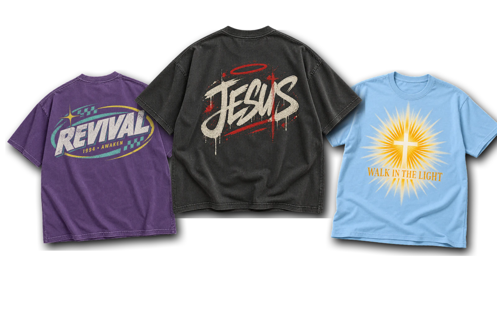
Church T-shirt design ideas range from modern typography, scripture references, and minimalist faith symbols to youth graphics, volunteer shirts, worship team artwork, and milestone designs. These concepts can communicate a Christian message, identify a ministry or team, or commemorate a church event such as a baptism, camp, or VBS. Typography, symbols, logos, and illustrations provide different ways to turn each message into a wearable church shirt design.
Placement, color, and printing method help turn church t-shirt design Ideas into artwork that works effectively on the garment. Left-chest areas suit small faith marks and church logos, while center-chest and back placements provide more room for phrases, team identification, and event graphics. Screen printing works well for bold and limited-color artwork, DTF supports detailed or multicolor graphics, and embroidery suits simplified logos and compact symbols.
30 Church T-Shirt Design Ideas are:
- Be the Church Typography Design
- Scripture Coordinates Design
- Stacked Grace Typography Design
- Interlocking Faith Typography Design
- Church Has Left the Building Design
- Left-Chest Faith Design
- He > I Minimalist Design
- Not Perfect, Just Forgiven Design
- 90s Revival Design
- Outdoor Camp Badge Design
- Graffiti Jesus Design
- World Changer Map Design
- Y2K Tech Grid Design
- Sun-Reveal Design
- Holy Culture Varsity Design
- Here to Serve Design
- How Can I Pray for You Design
- Welcome Team Collegiate Design
- Vertical Message Design
- Love My Church Crew Design
- Made to Worship Design
- Praise and Presence Seal Design
- Thy Rod and Thy Staff Design
- Media Booth Icon Design
- Raised to Life Baptism Design
- Made New Baptism Design
- I Have Decided Baptism Design
- Equipping the Future Ministry Design
- Stronger Together Church Design
- VBS Theme Design
Modern Church T-Shirt Design Ideas
Modern church T-shirt design ideas combine typography, scripture references, faith symbols, and compact graphics with clean, wearable layouts. Centered statements suit larger messages, while stacked lettering, interlocking forms, and left-chest marks create more restrained compositions. Clear hierarchy, limited colors, and readable placement help each concept translate from artwork to a printed church shirt.
Be the Church Typography Design
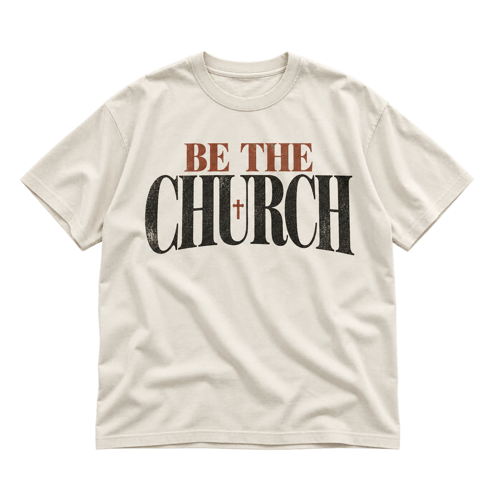
The Be the Church concept is a typography-led option for church T-shirt design ideas that makes the phrase the primary visual element. A centered chest layout gives the message prominence, while contrasting ink separates the type from the shirt color. Screen printing suits larger lettering, while embroidery requires a smaller, simplified treatment.
Key Features: Bold typography, clear hierarchy, centered placement, readable lettering, faith-based message, and contrasting ink.
Best For: Congregation apparel, outreach shirts, ministry groups, service events, church merchandise, and typography-led Christian shirts.
Popular directions:
- Bold statement: Set “Be the Church” in large lettering without competing graphics.
- Text hierarchy: Enlarge “Church” while keeping the supporting words smaller.
- Centered layout: Position the complete phrase across the main chest area.
- Church identity: Add a small church name or logo beneath the primary message.
- One-color print: Apply a contrasting ink for a clean screen-printed treatment.
Scripture Coordinates Design
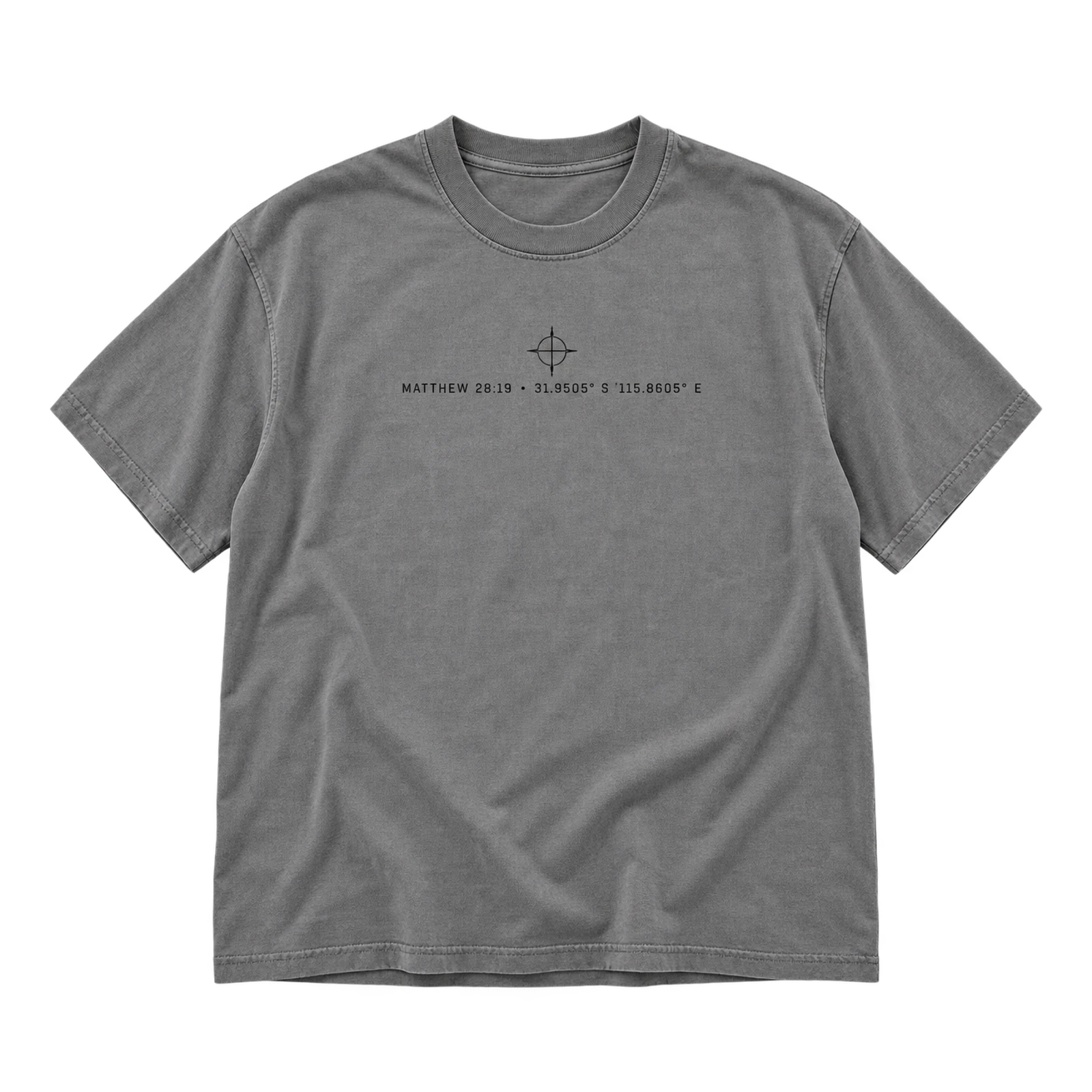
Scripture-based church T-shirt design ideas can use a Coordinates concept to pair a Bible reference with coordinate-style numbers in a compact composition. Small center-chest or left-chest placement supports the restrained scale, while clear spacing keeps the numeric elements distinct. High-contrast ink also helps smaller details reproduce cleanly.
Key Features: Scripture reference, coordinate numbers, compact typography, restrained scale, clear spacing, and high contrast.
Best For: Bible study groups, youth ministries, retreats, church merchandise, Christian apparel, and scripture-focused shirts.
Popular directions:
- Reference and coordinates: Pair a short Bible reference with latitude-and-longitude style numbers.
- Left-chest mark: Reduce the composition for a subtle upper-front placement.
- Centered block: Align the numbers and scripture reference within a compact chest graphic.
- Numeric focus: Give the coordinates more visual weight while keeping the reference readable.
- Monochrome artwork: Print the complete treatment with one contrasting ink.
Stacked Grace Typography Design
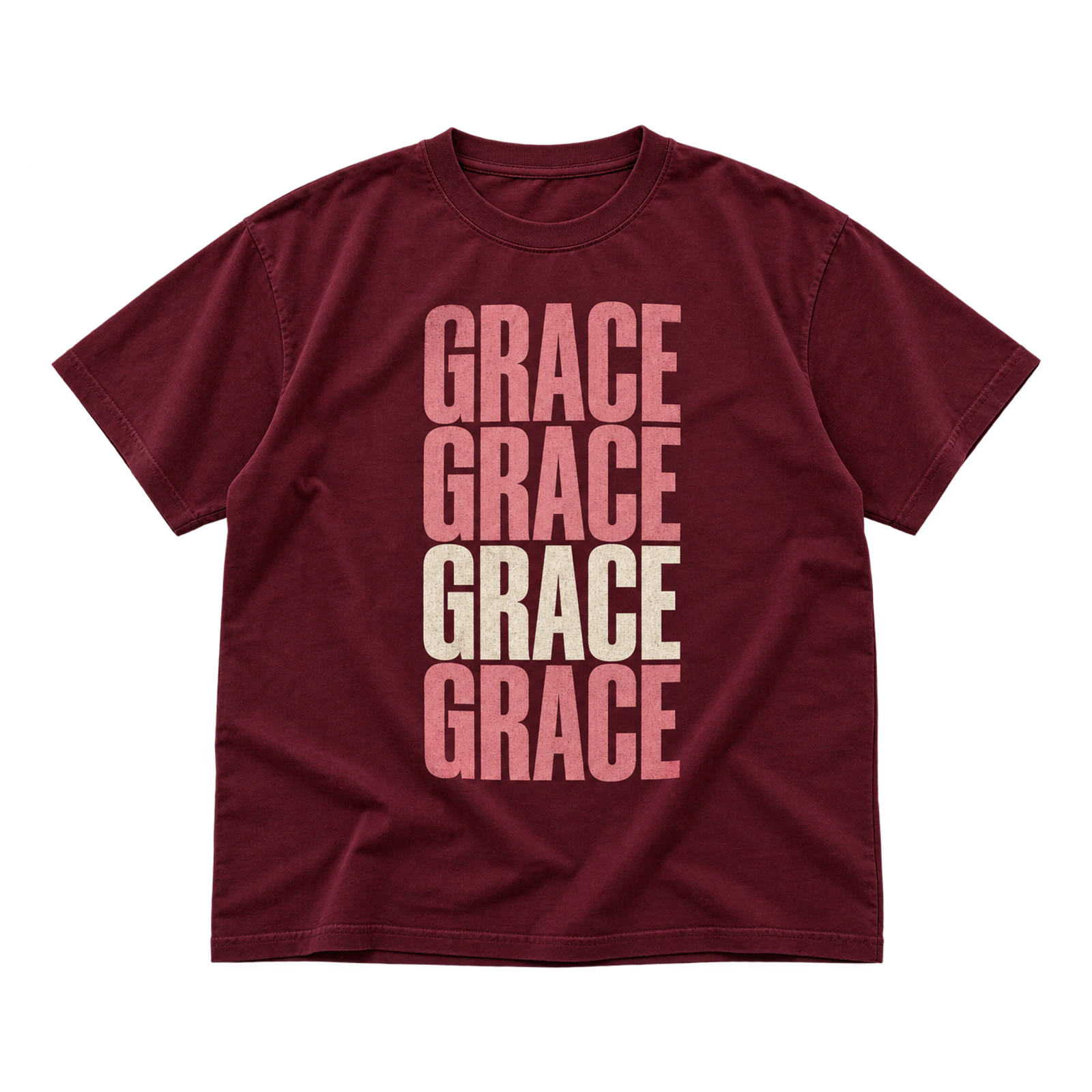
Stacked Grace brings a vertical typographic direction to church T-shirt design ideas by arranging “Grace” and supporting text as the graphic itself. Differences in scale and spacing establish hierarchy within the stack, while centered placement keeps the composition balanced. One or two ink colors provide separation without distracting from the lettering.
Key Features: Stacked lettering, vertical composition, text hierarchy, centered layout, limited colors, and readable typography.
Best For: Worship apparel, church merchandise, youth groups, ministry shirts, faith-based events, and typography-focused designs.
Popular directions:
- Repeated Grace: Stack the word several times and emphasize one line.
- Supporting phrase: Add a short Christian message above or below “Grace.”
- Scale variation: Alternate larger and smaller lettering within the composition.
- Centered stack: Align the typography vertically through the chest.
- Two-color type: Separate the main word from supporting text with a second ink.
Interlocking Faith Typography Design
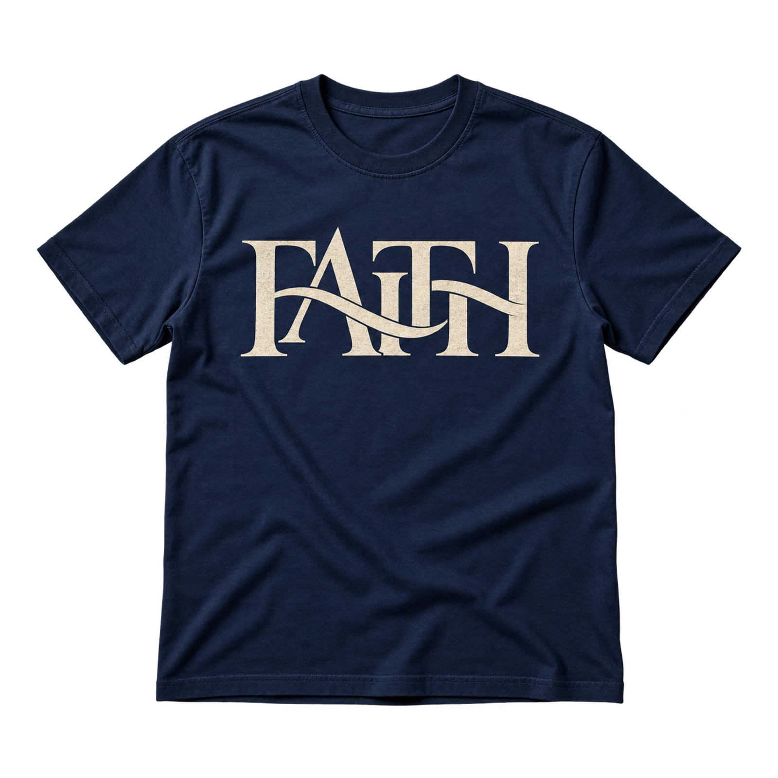
Interlocking letterforms give church T-shirt design ideas such as the Faith concept a distinctive typography-based treatment. Selected characters connect or overlap so the word functions as both the message and graphic. Sufficient spacing preserves legibility, while a medium centered layout gives the letterforms enough room to interact.
Key Features: Interlocking letters, connected forms, controlled overlap, negative space, readable typography, and centered placement.
Best For: Church merchandise, youth ministries, Christian apparel, faith-based groups, modern ministry shirts, and typography-led concepts.
Popular directions:
- Linked letters: Connect neighboring characters through selected strokes.
- Controlled overlap: Cross specific letterforms without obscuring the complete word.
- Faith monogram: Develop a compact mark from the initial letter and connected forms.
- Centered wordmark: Let the typography occupy the main chest area without extra graphics.
- Single-color print: Keep the connected forms distinct with one contrasting ink.
Church Has Left the Building Design
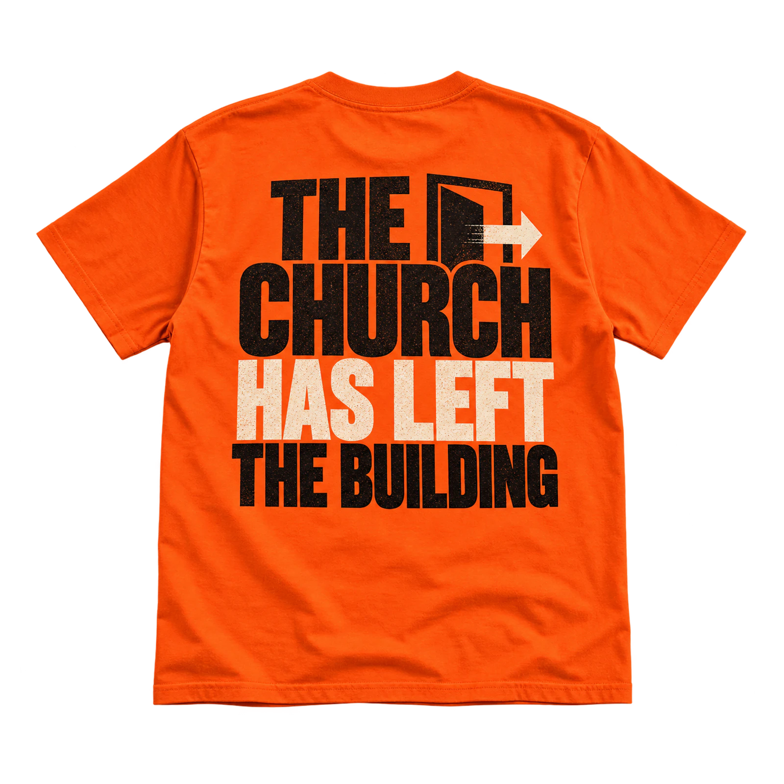
Outreach-oriented church T-shirt design ideas can use the Church Has Left the Building phrase to communicate service beyond the congregation’s physical space. Large front or back typography makes the statement visible, while a smaller church mark identifies the congregation. Strong contrast and restrained supporting artwork keep attention on the primary message.
Key Features: Outreach message, large typography, front or back placement, church identification, strong contrast, and clear hierarchy.
Best For: Community outreach, service days, mission activities, volunteer groups, congregation events, and ministry shirts.
Popular directions:
- Large back message: Fill the main rear area with the complete phrase.
- Small front logo: Pair the statement with a compact church mark on the chest.
- Word emphasis: Increase the scale of “Church” or “Left the Building.”
- Ministry identifier: Add a small outreach or service team name below the phrase.
- Limited-color artwork: Use one or two inks to maintain a clear composition.
Left-Chest Faith Design
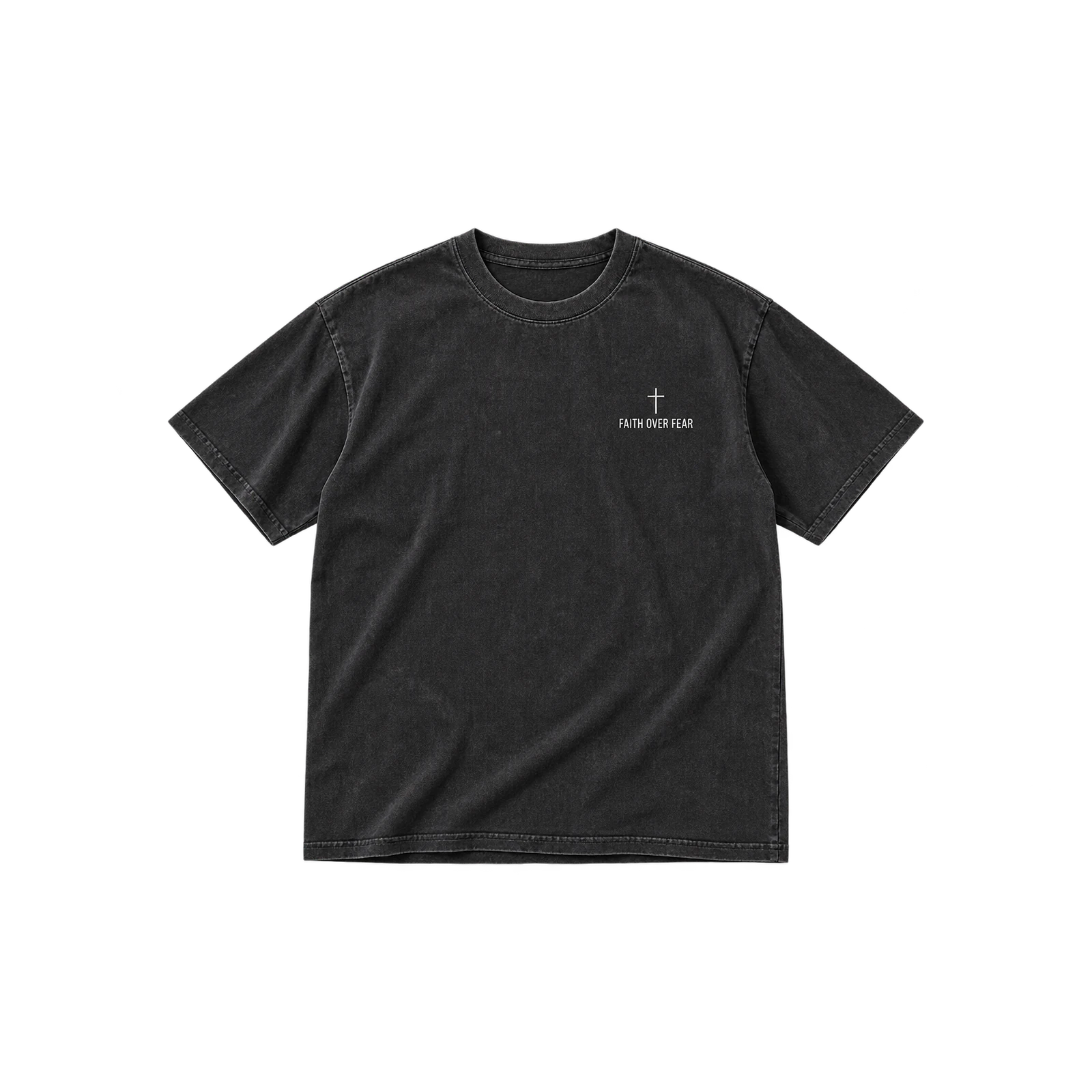
A compact left-chest treatment gives church T-shirt design ideas a more restrained option for displaying a faith phrase, church mark, or Christian symbol. Keeping the artwork within roughly 2 to 4 inches preserves open space across the shirt. Simple graphics suit screen printing, while reduced-detail logos and symbols can work with embroidery.
Key Features: Left-chest placement, compact artwork, simple faith symbol, restrained scale, open space, and flexible production.
Best For: Church staff apparel, volunteer shirts, ministry clothing, Christian merchandise, congregation shirts, and subtle faith designs.
Popular directions:
- Small cross: Place a simplified cross within the left-chest area.
- Church mark: Use a compact church logo without larger supporting artwork.
- Short phrase: Add a brief faith message that remains readable at a small size.
- Simple symbol: Apply an anchor, crown, light, or another relevant Christian mark.
- Embroidered detail: Convert a simplified logo or symbol into a stitched treatment.
He > I Minimalist Design
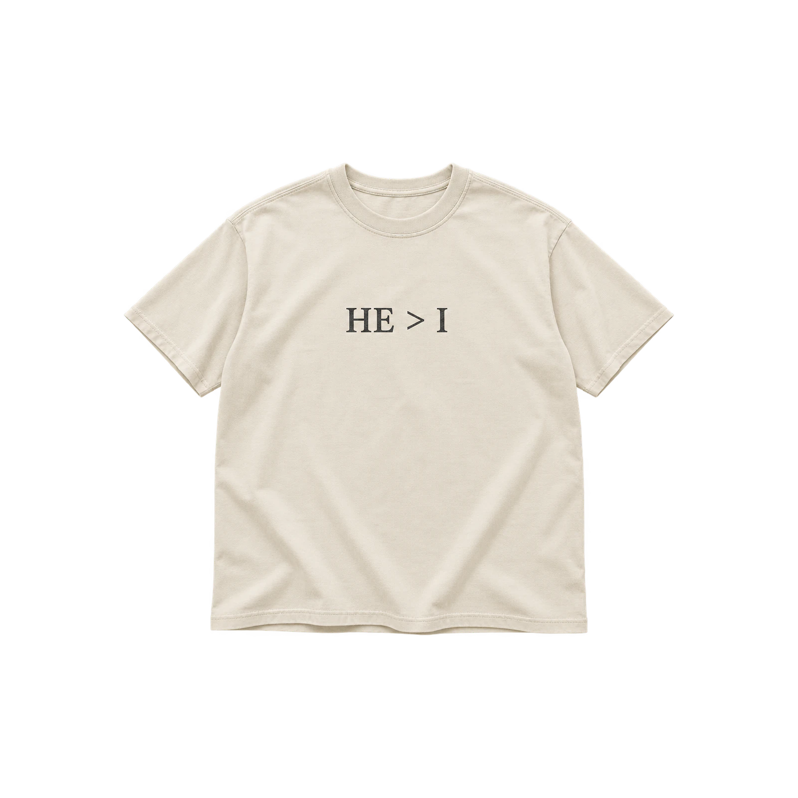
Minimal church T-shirt design ideas can use the He > I statement as the complete focal point without relying on additional graphics. Simple typography and generous negative space keep the symbolic message distinct, while center or left-chest placement supports a small-to-medium scale. High-contrast ink separates each character clearly from the garment.
Key Features: Symbolic message, minimal typography, negative space, compact scale, high contrast, and simple composition.
Best For: Minimal Christian apparel, youth ministry shirts, church merchandise, small groups, faith-based gifts, and understated designs.
Popular directions:
- Center-chest symbol: Position “He > I” alone on the main front area.
- Left-chest treatment: Reduce the statement into a compact faith mark.
- Bold characters: Increase type weight without adding other graphic elements.
- Spaced layout: Separate the characters with visible negative space.
- One-color print: Use a single contrasting ink for the complete composition.
Not Perfect, Just Forgiven Design
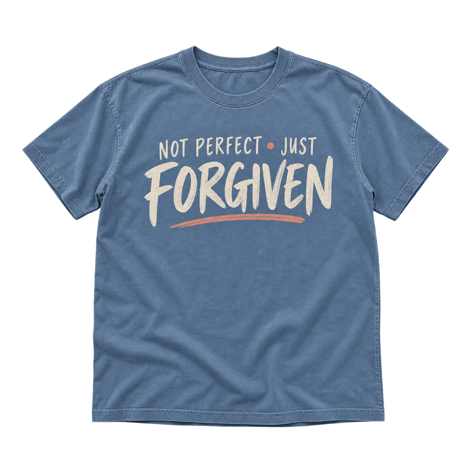
Message-led church T-shirt design ideas can use Not Perfect, Just Forgiven to communicate a forgiveness theme through typographic hierarchy. Giving “Forgiven” greater scale or weight establishes emphasis, while the remaining words complete the statement. A medium-to-large chest or back layout provides enough room for readable lettering without requiring lengthy supporting copy.
Key Features: Forgiveness message, phrase hierarchy, emphasized lettering, readable typography, larger placement, and limited supporting text.
Best For: Christian apparel, testimony shirts, church merchandise, youth groups, ministry events, and forgiveness-focused designs.
Popular directions:
- Emphasized Forgiven: Give “Forgiven” greater scale or typographic weight.
- Two-part message: Separate “Not Perfect” and “Just Forgiven” through positioning.
- Centered typography: Arrange the complete phrase across the chest.
- Back statement: Increase the scale for a larger rear composition.
- Two-color lettering: Distinguish the emphasized word with a second ink color.
Youth Ministry Church T-Shirt Design Ideas
Youth ministry church T-shirt design ideas combine expressive graphics, larger artwork, and recognizable event themes for student groups, camps, and ministry activities. Retro lettering, outdoor badges, graffiti graphics, maps, and digital treatments can give each shirt a distinct visual identity while keeping the Christian message readable. Placement and print method should match the artwork scale and level of detail.
90s Revival Design
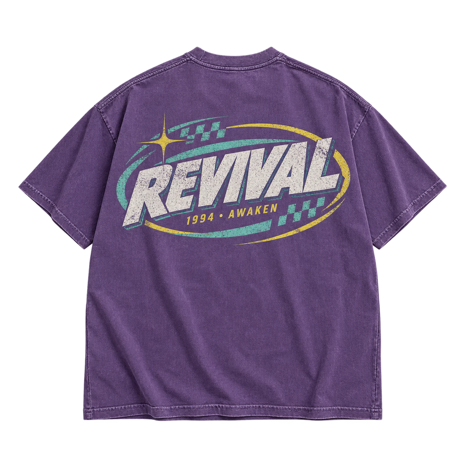
A 90s Revival concept gives youth ministry church T-shirt design ideas a retro direction through period-inspired typography and simplified vintage graphics. Faded colors, distressed details, and medium-to-large chest or back artwork reinforce the visual treatment without obscuring the ministry message. Screen printing works well with controlled colors and defined graphic shapes.
Key Features: Retro typography, vintage graphics, faded colors, distressed details, larger artwork, and readable messaging.
Best For: Youth ministries, student groups, church retreats, youth conferences, camps, and Christian shirts with retro styling.
Popular directions:
- Retro wordmark: Style the ministry or event name with 90s-inspired lettering.
- Distressed typography: Add controlled wear to bold text for a printed vintage effect.
- Vintage emblem: Combine a short faith message with simplified shapes or symbols.
- Faded palette: Use a restrained set of printed colors rather than a broad multicolor composition.
- Large back graphic: Place the main artwork across the back with a smaller identifier on the front.
Outdoor Camp Badge Design
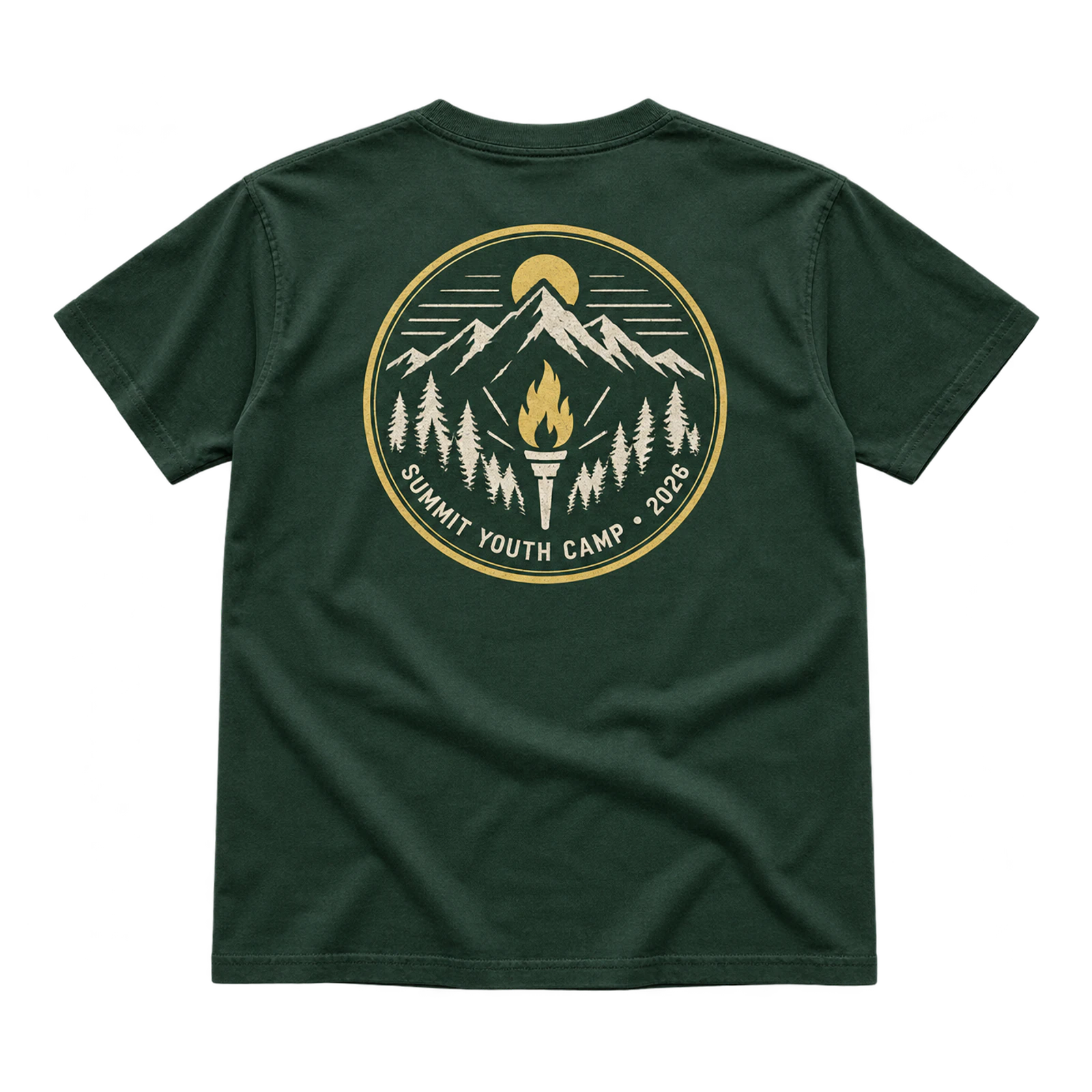
Camp-focused church T-shirt design ideas use a badge composition to organize the event name, ministry identifier, and faith-based message within one graphic. Circular or crest-shaped layouts work at a medium chest scale or as larger back artwork. Limited colors and simplified outdoor symbols also support clean screen printing.
Key Features: Badge composition, camp identity, circular or crest shape, limited colors, clear lettering, and simplified graphics.
Best For: Church camps, youth retreats, outdoor ministries, student groups, mission trips, and event-specific church shirts.
Popular directions:
- Circular badge: Arrange the camp name and ministry wording around a central symbol.
- Crest layout: Place text and simple graphics inside a shield-shaped composition.
- Outdoor symbol: Add a mountain, torch, light, or another simple element connected to the camp theme.
- Event identifier: Include the camp name or year as supporting information.
- Back emblem: Enlarge the badge on the rear panel and pair it with a compact front mark.
Graffiti Jesus Design
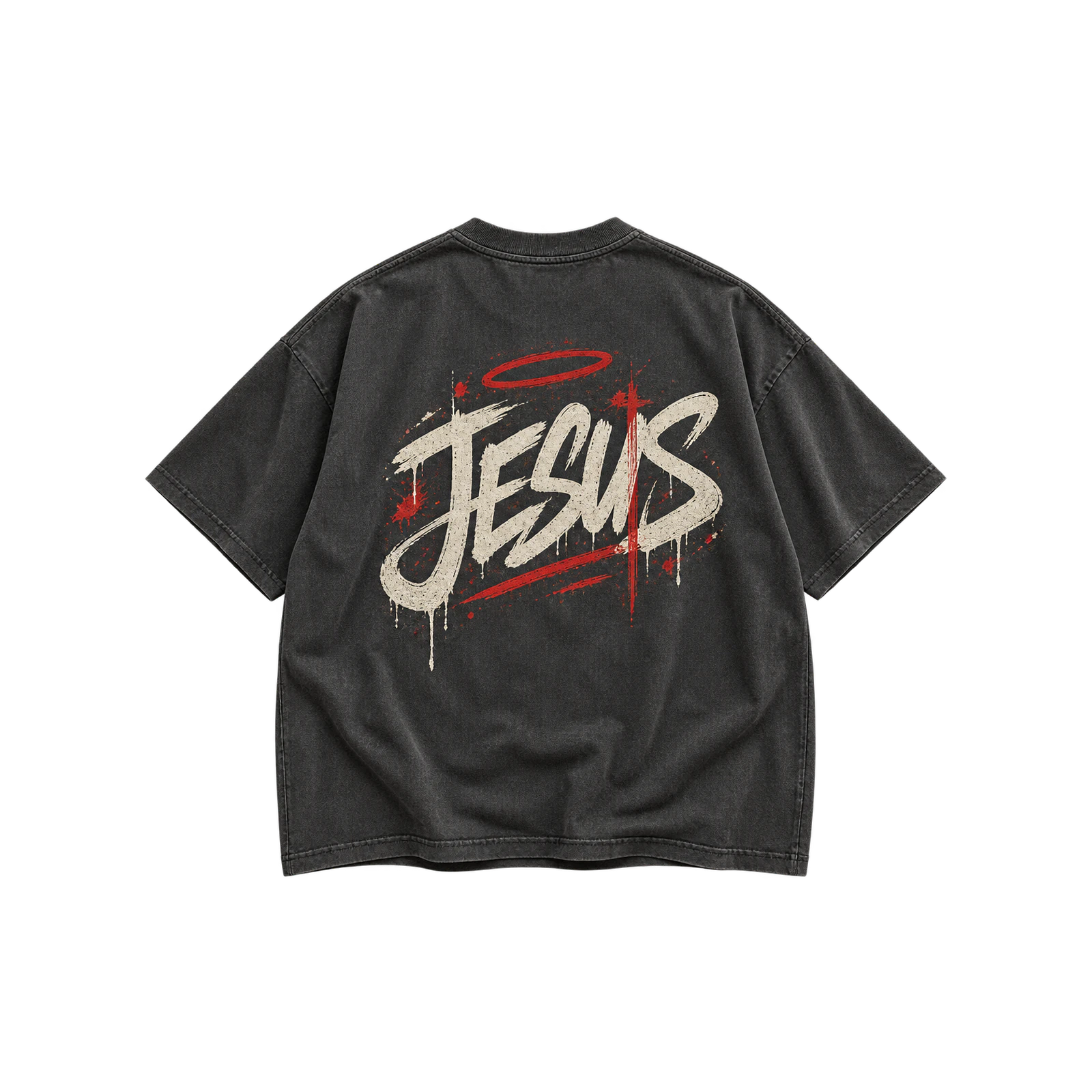
Graffiti styling gives youth-oriented church T-shirt design ideas an expressive way to present a Jesus-centered message through energetic lettering or illustration. Larger front or back placement provides room for the linework, while clear hierarchy keeps the faith message readable. Screen printing suits simplified artwork, while DTF supports finer details and multiple colors.
Key Features: Graffiti lettering, Jesus-centered message, expressive linework, larger placement, strong contrast, and detailed graphics.
Best For: Youth groups, student ministries, Christian events, retreats, ministry merchandise, and expressive church T-shirt designs.
Popular directions:
- Graffiti wordmark: Render “Jesus” as the dominant lettering across the composition.
- Outlined lettering: Build the phrase from defined strokes and surrounding graphic marks.
- Back artwork: Use the larger rear area for an expanded graffiti composition.
- Small front mark: Pair a large back graphic with a restrained faith symbol on the chest.
- Multicolor treatment: Apply selected contrasting colors without allowing them to overpower the message.
World Changer Map Design
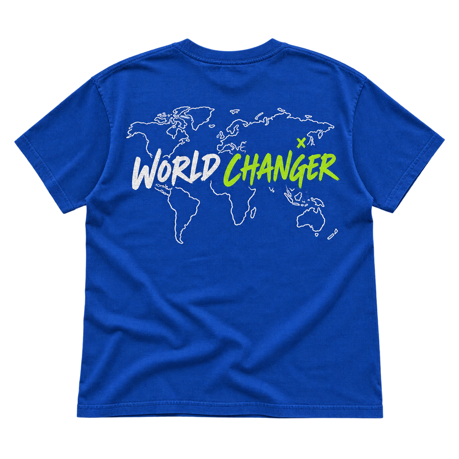
Mission-focused church T-shirt design ideas can pair a World Changer message with a simplified map or globe to represent outreach and service. Medium-to-large centered or back placement keeps geographic forms recognizable, while the wording establishes the primary hierarchy. Simplified landforms reproduce more clearly than detailed cartography and leave room for ministry identification.
Key Features: Map or globe graphic, mission-focused message, geographic shapes, larger composition, clear hierarchy, and simplified detail.
Best For: Mission trips, youth ministries, outreach groups, student conferences, church camps, and mission-focused Christian shirts.
Popular directions:
- World map: Place a simplified map behind or below the main ministry phrase.
- Globe symbol: Reduce the geographic element to a circular globe graphic.
- World Changer statement: Make the phrase dominant and use the map as supporting artwork.
- Mission identifier: Add the ministry name or event detail at a smaller scale.
- Back composition: Give the map more space on the back while keeping the front restrained.
Y2K Tech Grid Design
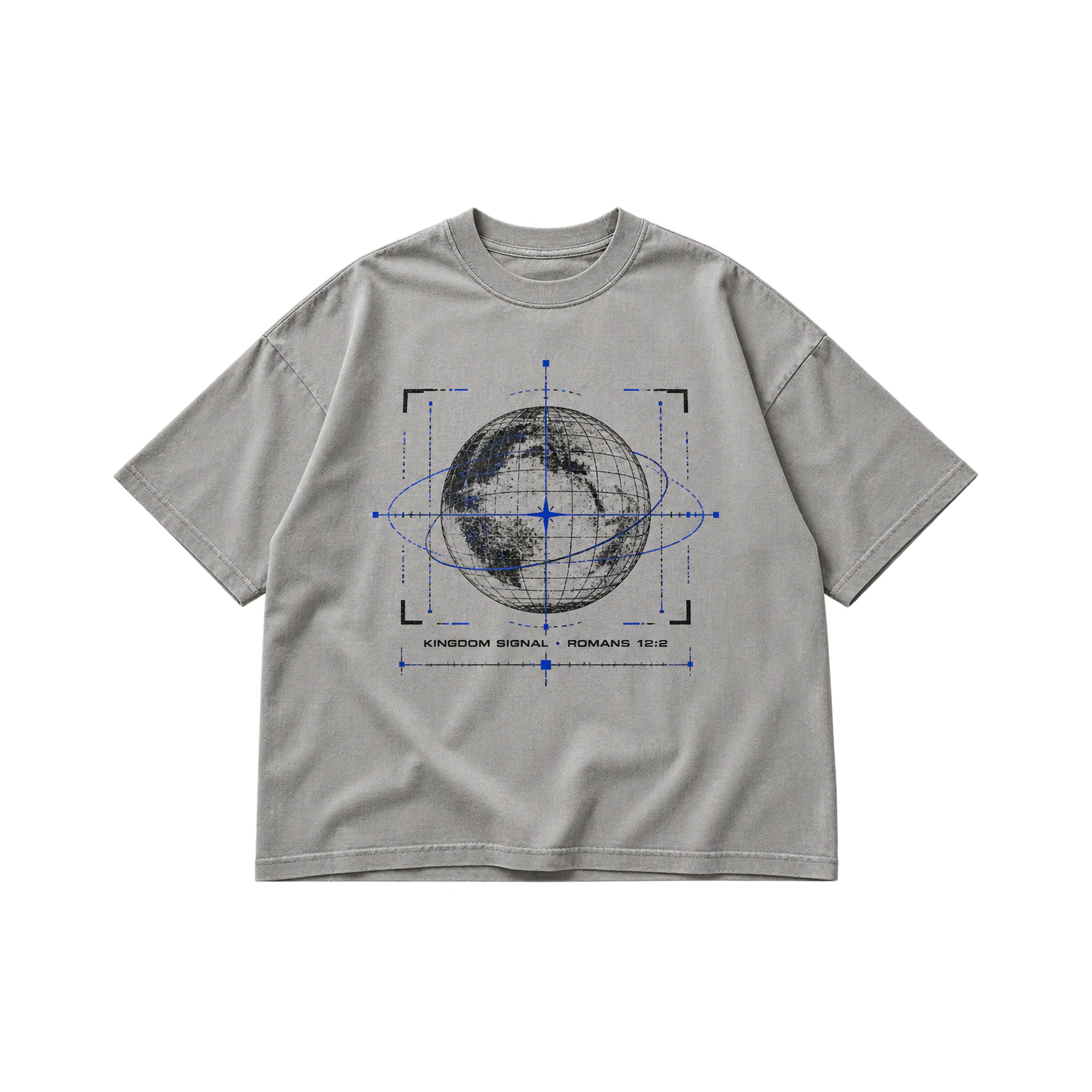
A Y2K Tech Grid treatment brings digital styling to church T-shirt design ideas created for youth ministries and student events. Grid lines, technical framing, interface shapes, and digital typography can surround the Christian message without replacing it as the focal point. Screen printing suits simplified elements, while DTF supports more detailed multicolor compositions.
Key Features: Digital typography, grid lines, interface shapes, technical framing, contrasting ink, and structured composition.
Best For: Student ministries, youth conferences, Christian merchandise, church events, technology-themed programs, and Y2K-inspired shirts.
Popular directions:
- Grid background: Place a controlled technical grid behind the main faith message.
- Digital wordmark: Style the ministry or event name with technology-inspired typography.
- Interface frame: Surround the wording with boxes, lines, numbers, or simple technical marks.
- Large back layout: Combine the grid and typography within a broader rear composition.
- Limited tech details: Select a few interface elements rather than filling every open area.
Sun-Reveal Design
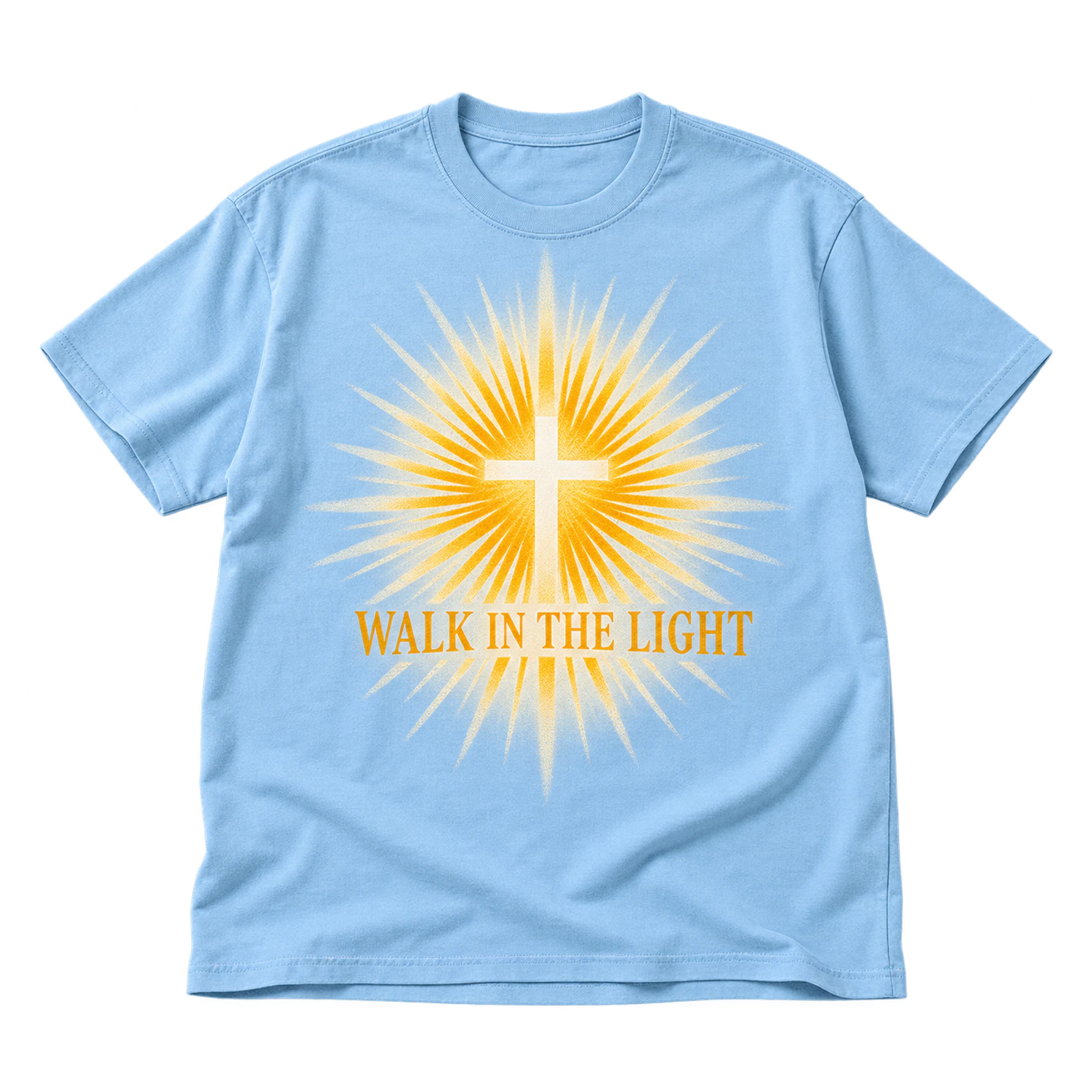
Interactive church T-shirt design ideas can use a Sun-Reveal concept in which reactive artwork changes appearance under its intended light conditions. The graphic should remain understandable in both visible states, with enough scale for the changing element to be recognized. Garment color, placement, and specialty-print requirements should support the reveal effect together.
Key Features: Reactive artwork, changing visual state, specialty printing, visible placement, garment interaction, and controlled graphic scale.
Best For: Youth camps, outdoor church events, student ministries, retreats, summer programs, and interactive Christian shirts.
Popular directions:
- Hidden message: Reveal a short faith phrase when the reactive element changes.
- Symbol reveal: Use the effect to expose a cross, light, or other simple Christian symbol.
- Two-state graphic: Design the artwork so both its inactive and active versions remain intentional.
- Outdoor placement: Position the reactive element across an area that receives clear light exposure.
- Supporting typography: Keep permanent text readable while the changing graphic provides the visual effect.
Holy Culture Varsity Design
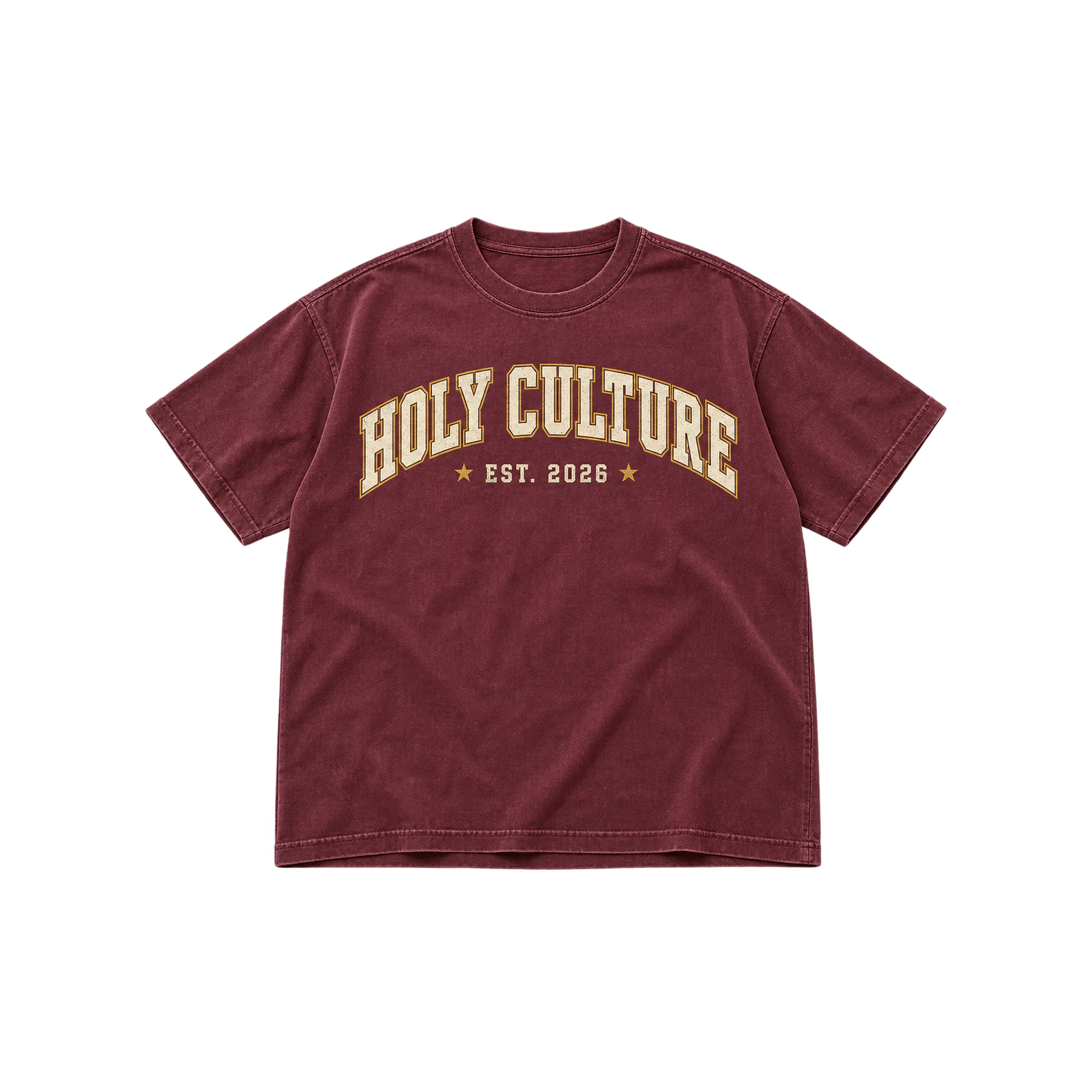
Varsity styling gives youth ministry church T-shirt design ideas a collegiate direction through arched or stacked Holy Culture lettering. Medium-to-large center-chest placement gives the phrase a familiar school-apparel structure, while limited colors keep the wording distinct. Screen printing suits larger lettering, and simplified versions can also translate into embroidery.
Key Features: Collegiate typography, arched lettering, stacked composition, limited colors, centered placement, and bold text.
Best For: Youth ministries, student groups, Christian clubs, church camps, ministry merchandise, and varsity-inspired church shirts.
Popular directions:
- Arched lettering: Curve “Holy Culture” across the upper chest in collegiate type.
- Stacked varsity: Arrange the two words on separate lines with a defined hierarchy.
- Ministry identifier: Add a church or youth group name beneath the main phrase.
- School-style palette: Use one or two contrasting colors to reinforce the collegiate treatment.
- Embroidered version: Simplify the lettering into a compact chest mark for stitched production.
Church Volunteer T-Shirt Design Ideas
Church volunteer T-shirt design ideas prioritize clear team identification, readable service messages, and practical layouts for people working throughout a church or event. Bold wording can identify welcome, prayer, and service roles, while front and back placements provide different levels of visibility. Simple graphics, church colors, and durable print treatments also make these shirts suitable for repeat wear.
Here to Serve Design
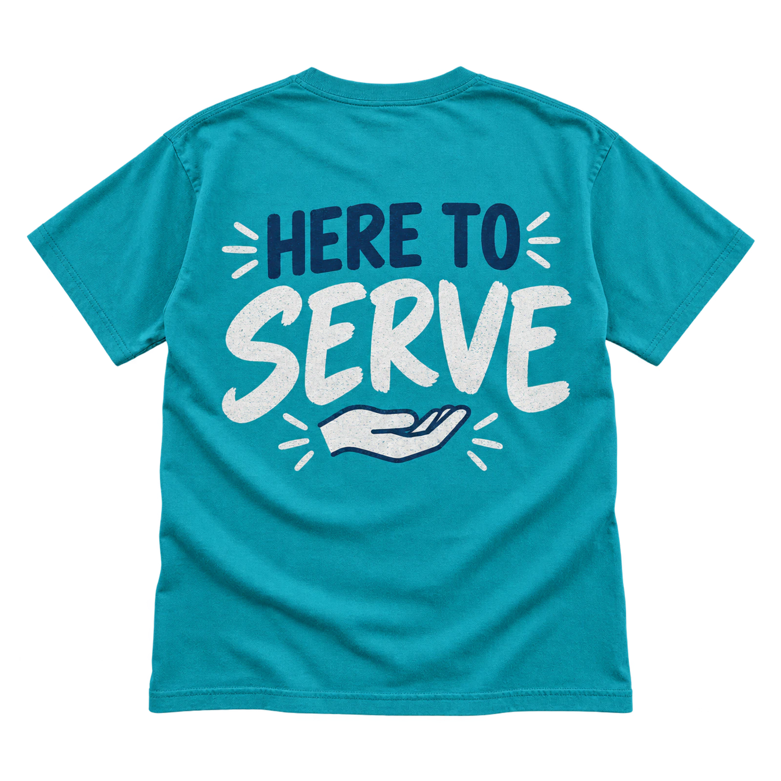
Volunteer-focused church T-shirt design ideas can feature a Here to Serve message that identifies people assisting during services and events. Bold front or back lettering supports quick recognition, while a smaller church name or logo provides ministry identification. Screen printing also provides a practical production method for shirts intended for repeated volunteer use.
Key Features: Service message, bold typography, clear identification, front or back placement, church branding, and readable scale.
Best For: Service teams, church volunteers, outreach groups, ministry events, hospitality teams, and congregation service days.
Popular directions:
- Large back message: Place “Here to Serve” across the back for clear volunteer identification.
- Chest statement: Center the phrase on the front with enough scale for quick recognition.
- Small church mark: Add the church logo beneath or above the main service message.
- Two-level hierarchy: Give “Serve” greater typographic weight than the supporting words.
- One-color print: Use a contrasting ink to maintain readability and simplify repeat production.
How Can I Pray for You Design
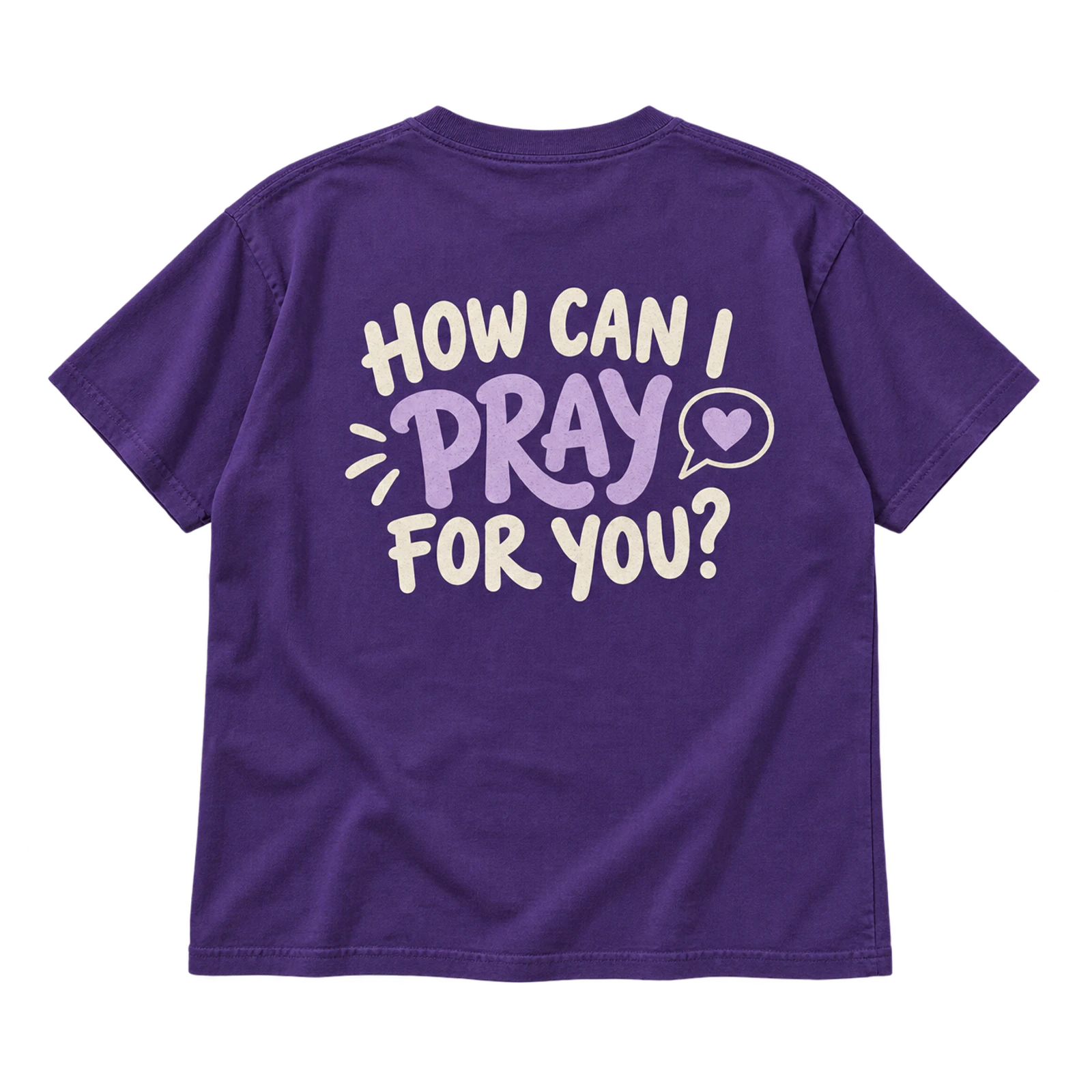
Prayer-centered church T-shirt design ideas can turn How Can I Pray for You into a visible invitation for conversation and ministry. Large lettering on the back or center front allows the question to be recognized from several feet away. Strong garment-to-ink contrast supports readability, while prayer ministry branding can remain secondary.
Key Features: Prayer message, conversation prompt, large lettering, strong contrast, visible placement, and secondary branding.
Best For: Prayer teams, ministry volunteers, outreach events, church gatherings, community service, and prayer-focused apparel.
Popular directions:
- Large back question: Display the complete phrase across the rear panel for greater visibility.
- Centered front text: Arrange the question over several readable lines on the chest.
- Emphasized Prayer: Give “Pray” greater size or weight within the typography.
- Prayer team identifier: Add the ministry name below the main question at a smaller scale.
- Front and back pairing: Use a compact church mark on the front with the prayer invitation on the back.
Welcome Team Collegiate Design
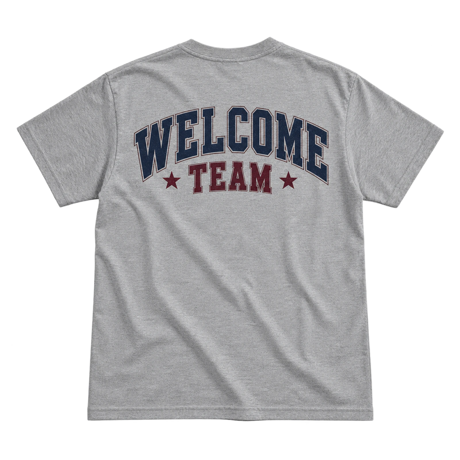
Collegiate typography gives volunteer church T-shirt design ideas a structured way to identify welcome and hospitality teams. “Welcome” or the team name can receive the greatest visual weight, with the church name supporting the composition. Medium-to-large chest or back lettering works with screen printing, while simplified chest marks can suit embroidery.
Key Features: Welcome team identity, collegiate typography, bold lettering, church colors, clear hierarchy, and prominent placement.
Best For: Greeters, welcome teams, hospitality ministries, church events, volunteer crews, and guest service groups.
Popular directions:
- Arched Welcome text: Curve “Welcome” across the chest using collegiate lettering.
- Stacked team name: Arrange “Welcome Team” on separate lines for stronger hierarchy.
- Large back identifier: Place the team wording across the back for visibility while volunteers move.
- Church-color treatment: Apply established church colors to connect the shirt with its visual identity.
- Small embroidered mark: Reduce the team wording or church logo for a compact stitched chest application.
Vertical Message Design
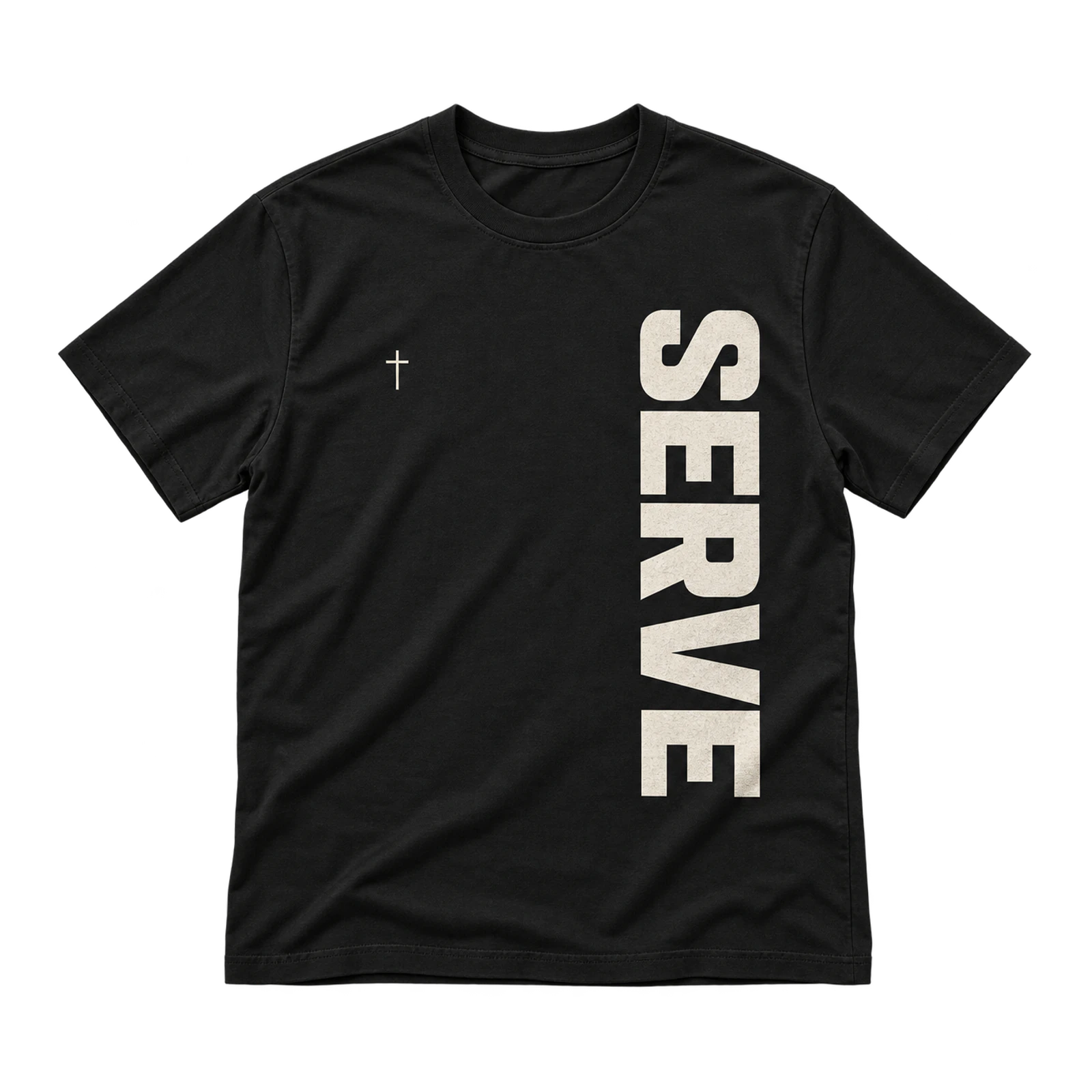
A vertical layout offers church T-shirt design ideas for volunteer teams an alternative to conventional horizontal typography. Short service or ministry phrases can run along the front, back, or side when the reading direction remains clear. Sufficient letter scale and negative space keep the message distinct as volunteers move throughout the church.
Key Features: Vertical typography, short message, directional layout, readable lettering, negative space, and flexible placement.
Best For: Volunteer teams, ministry crews, youth volunteers, church events, service groups, and typography-led team shirts.
Popular directions:
- Vertical back text: Run a short service phrase down one area of the rear panel.
- Side-front message: Position the typography away from the center for an asymmetric treatment.
- Single-word layout: Use a concise word such as “Serve” when a longer phrase would reduce readability.
- Spaced lettering: Increase separation between characters or words to clarify the reading direction.
- Supporting chest mark: Pair the vertical message with a small church logo on the opposite side.
Love My Church Crew Design
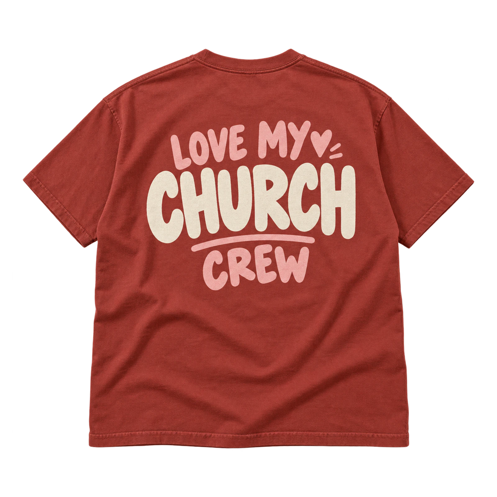
Crew-based church T-shirt design ideas can use Love My Church wording to combine a positive congregation message with volunteer identification. Bold typography works across the center chest or a larger back area, while the church logo remains secondary. Limited ink colors and simple shapes support clear screen printing and repeated wear.
Key Features: Church message, crew identification, bold typography, limited colors, clear hierarchy, and repeat-wear layout.
Best For: Church volunteers, service crews, ministry teams, congregation events, hospitality groups, and church-wide volunteer programs.
Popular directions:
- Centered crew phrase: Place “Love My Church Crew” across the main chest area.
- Large back treatment: Increase the wording scale for easier team recognition from behind.
- Emphasized Church: Give “Church” greater size or weight within the phrase.
- Small logo pairing: Add the church mark as a secondary chest or back element.
- Two-color typography: Separate the church message and crew identifier with two contrasting inks.
Worship and Production Church T-Shirt Design Ideas
Worship and production church T-shirt design ideas combine expressive faith messages with recognizable team identity for worship and technical ministries. Typography and seal-based artwork can represent praise and scripture, while media icons can identify production roles such as audio, camera, and lighting. Clear layouts and practical placements allow these shirts to function during church services while remaining wearable outside team duties.
Made to Worship Design
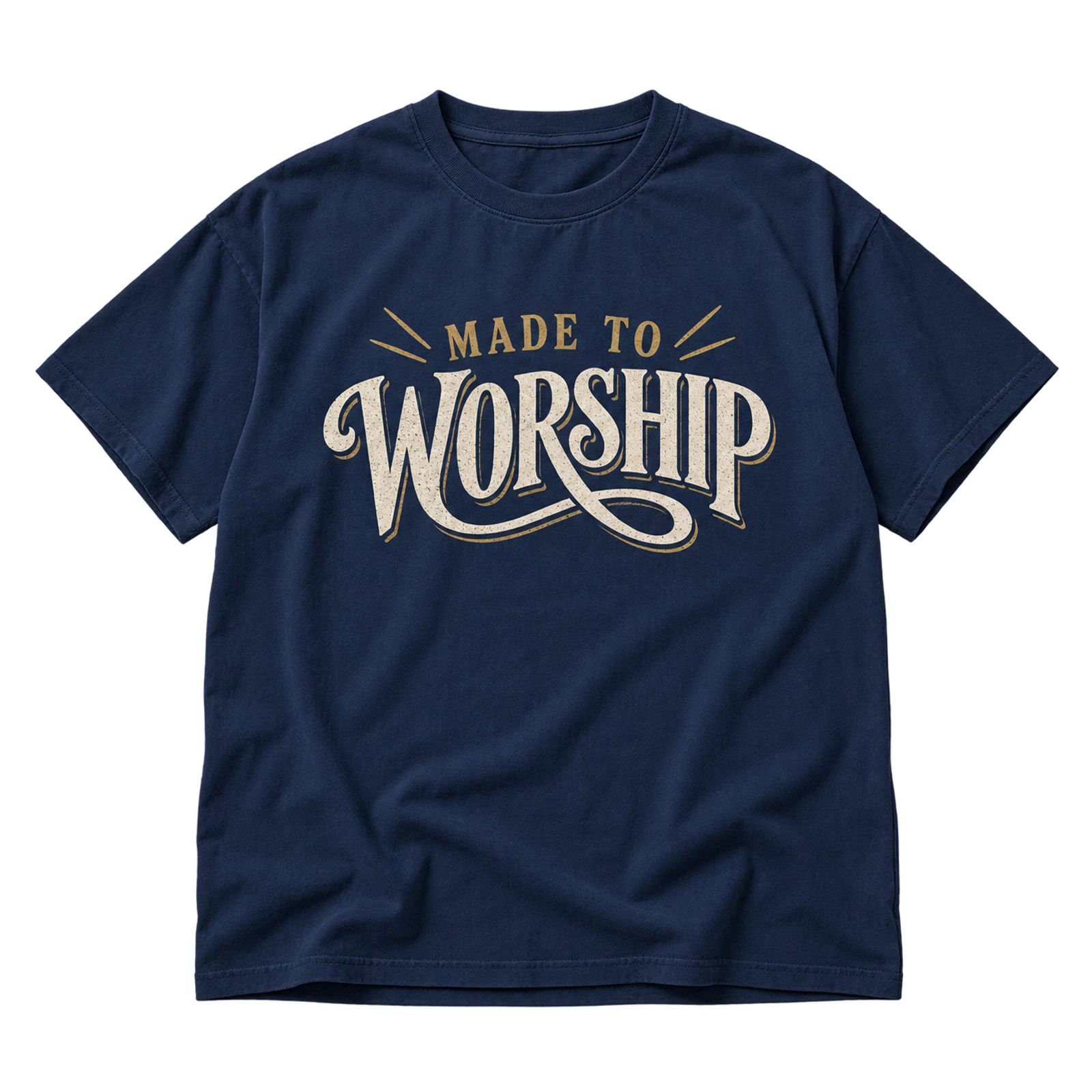
The Made to Worship concept gives worship-oriented church T-shirt design ideas a clear faith message through expressive, readable typography. Medium-to-large front or back placement provides enough space for the phrase, while strong contrast supports visibility. Keeping supporting graphics restrained allows the worship statement to remain the primary element.
Key Features: Worship message, expressive typography, readable lettering, prominent placement, clear contrast, and limited supporting graphics.
Best For: Worship teams, praise ministries, church musicians, worship events, ministry merchandise, and faith-based church shirts.
Popular directions:
- Centered statement: Position “Made to Worship” across the main chest area.
- Large back message: Increase the phrase scale for a more visible rear treatment.
- Word emphasis: Give “Worship” greater size or weight than the supporting words.
- Small church mark: Add a church or worship ministry logo as a secondary identifier.
- One-color typography: Print the phrase in a contrasting ink for a clear typographic composition.
Praise and Presence Seal Design
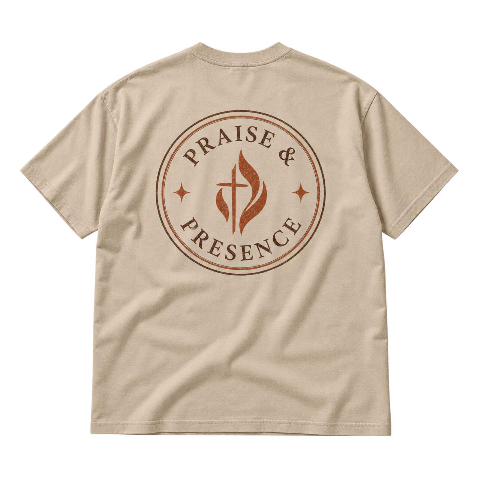
Seal-based church T-shirt design ideas can organize a Praise and Presence message within a circular emblem made from perimeter text and a central symbol. Medium chest or back placement provides enough room for readable lettering without crowding the seal. Limited detail supports screen printing, while simplified artwork can translate into embroidery.
Key Features: Circular seal, perimeter lettering, central symbol, worship message, limited detail, and structured composition.
Best For: Worship ministries, praise teams, church merchandise, worship gatherings, ministry groups, and emblem-based Christian apparel.
Popular directions:
- Circular typography: Arrange “Praise and Presence” around the outer edge of the seal.
- Central faith symbol: Place a simple cross, crown, light, or relevant mark within the center.
- Ministry identifier: Add the worship team or church name as secondary perimeter text.
- Large back seal: Scale the complete emblem across the rear panel for greater visibility.
- Simplified embroidery: Reduce fine lettering and linework for a compact stitched chest mark.
Thy Rod and Thy Staff Design
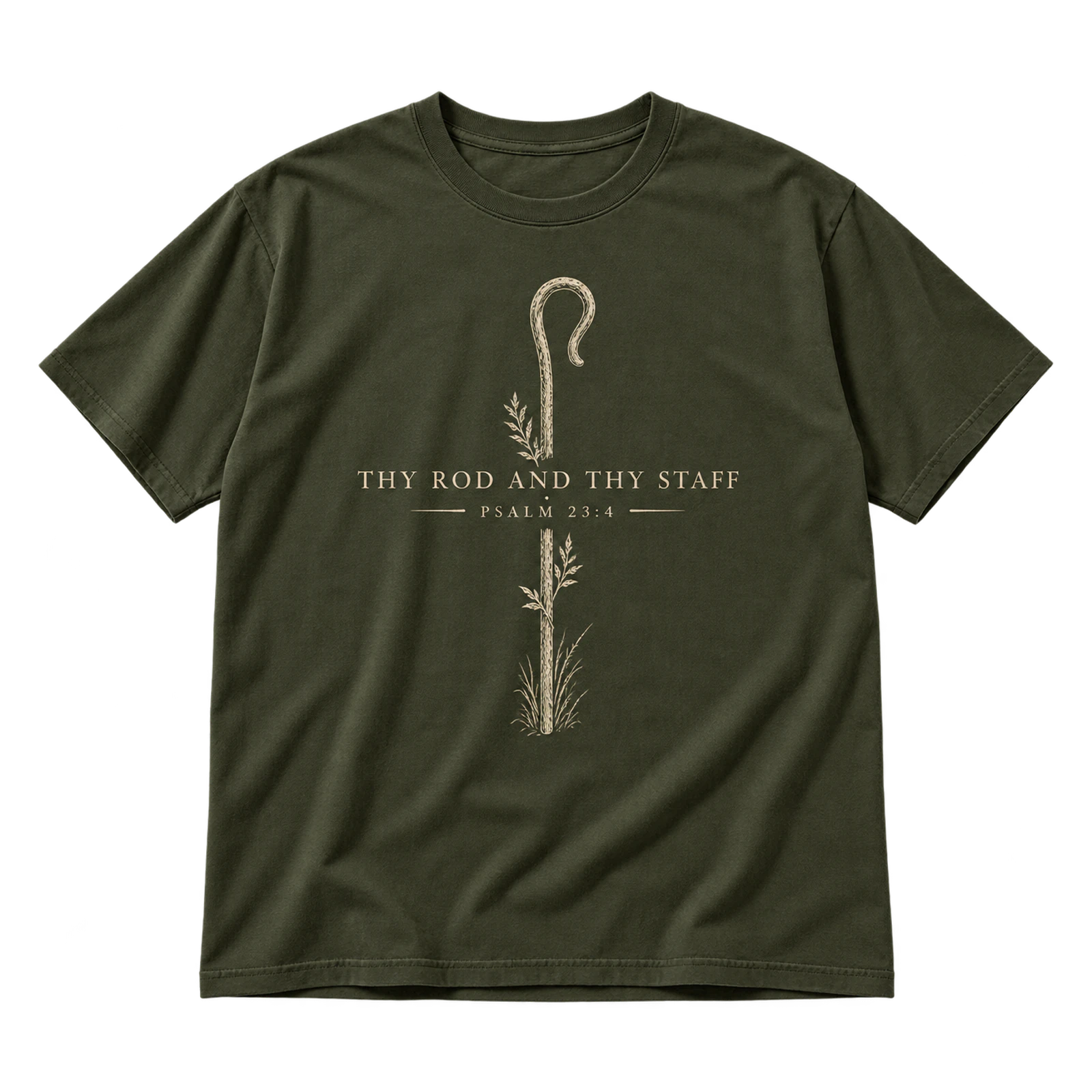
Scripture-inspired church T-shirt design ideas can use Thy Rod and Thy Staff as the primary phrase with restrained symbolic artwork. A simple rod or staff can reinforce the biblical reference without turning the composition into a detailed scene. Medium centered placement and limited colors keep the wording readable and visually dominant.
Key Features: Scripture-inspired phrase, restrained symbolism, clear hierarchy, centered placement, limited colors, and readable typography.
Best For: Worship apparel, Bible study groups, church merchandise, ministry events, Christian groups, and scripture-inspired shirts.
Popular directions:
- Typography-led layout: Let “Thy Rod and Thy Staff” form the main visual element.
- Simple staff symbol: Pair the phrase with a restrained line-based staff graphic.
- Centered chest treatment: Arrange the wording and symbol within the main front area.
- Back statement: Increase the phrase scale while keeping supporting artwork minimal.
- Two-color composition: Separate the scripture wording and symbol with controlled ink contrast.
Media Booth Icon Design
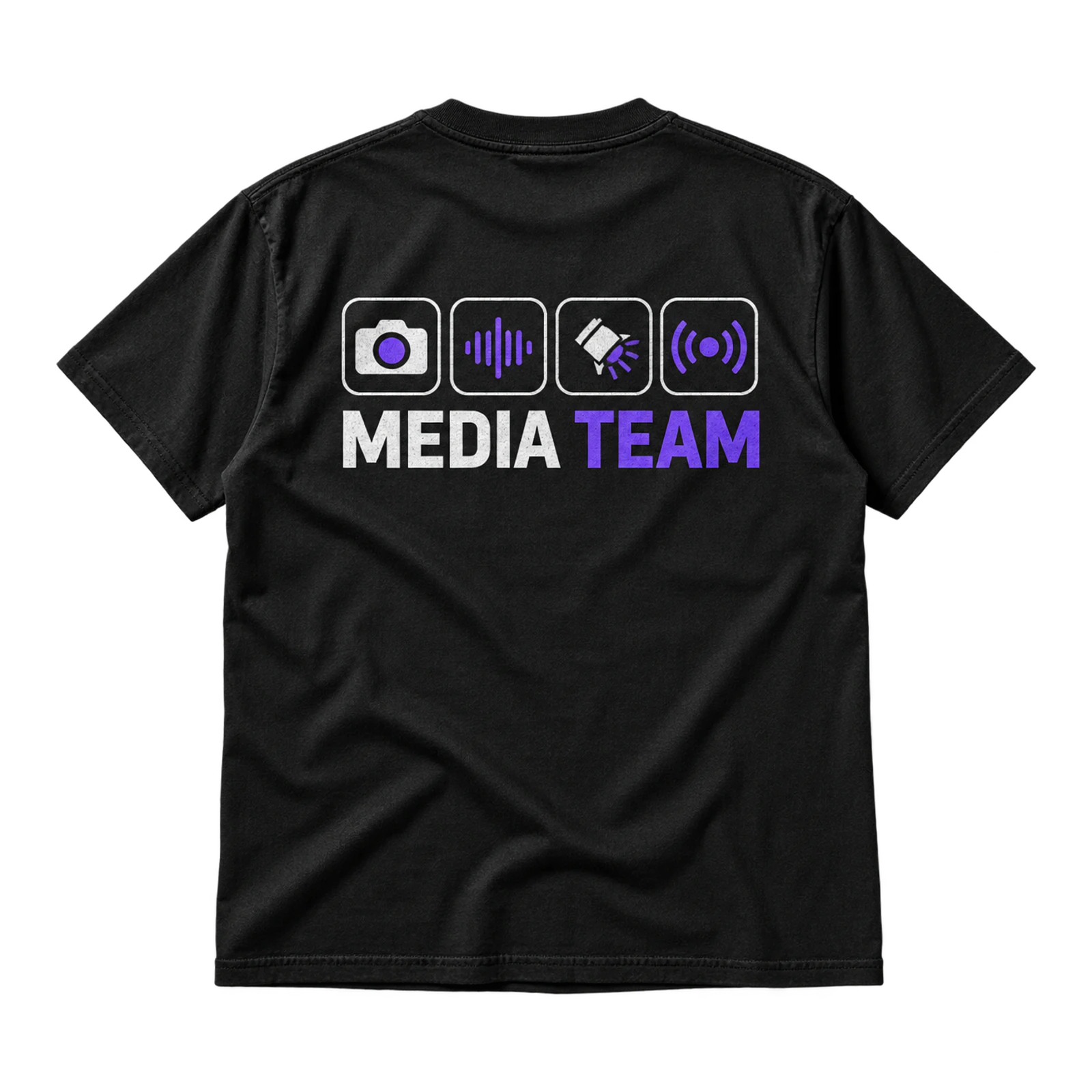
Production-focused church T-shirt design ideas can use coordinated media icons to identify technical ministry roles such as camera, audio, lighting, and livestream. Consistent icon shapes create a unified visual system, while a clear media or production label explains the team function. Small chest marks or larger back graphics can support role recognition.
Key Features: Media icons, production-team identity, consistent symbols, clear team label, flexible placement, and simplified shapes.
Best For: Media teams, production volunteers, camera operators, audio teams, lighting crews, livestream teams, and technical ministries.
Popular directions:
- Camera icon: Pair a simplified camera symbol with the church media team name.
- Audio mark: Use a microphone, waveform, or mixer-inspired symbol for sound volunteers.
- Lighting symbol: Create a compact light or fixture icon for production identification.
- Icon system: Combine a limited set of matching media symbols with one team label.
- Front and back pairing: Place a small icon on the chest and a larger production identifier across the back.
Church Milestone T-Shirt Design Ideas
Church milestone T-shirt design ideas commemorate baptisms, ministry programs, church gatherings, and VBS events through occasion-specific messages and graphics. The milestone or event theme should lead the composition, while dates, ministry names, and church identifiers provide supporting context. Typography, symbolic artwork, and event graphics can then shape a shirt that connects clearly to the moment being celebrated.
Raised to Life Baptism Design
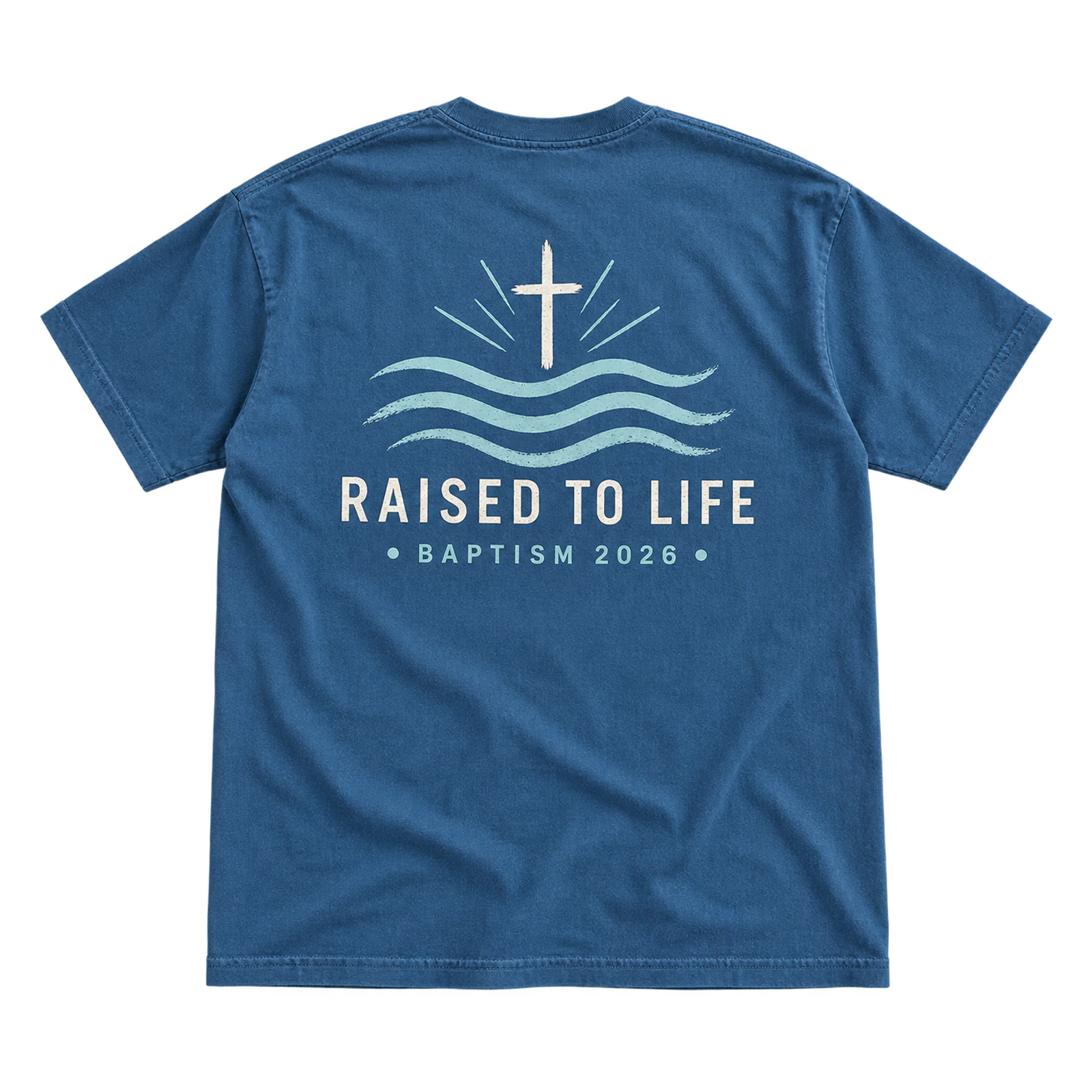
Baptism provides a clear milestone context for church T-shirt design ideas such as the Raised to Life concept. The renewal-focused phrase can lead the composition while restrained water or faith-based imagery supports its meaning. Medium-to-large placement provides room for readable typography, with the baptism date or church name serving as secondary information.
Key Features: Baptism message, renewal theme, restrained water imagery, clear hierarchy, larger placement, and simple print treatment.
Best For: Baptism services, church baptism events, baptism groups, Christian apparel, ministry merchandise, and commemorative church shirts.
Popular directions:
- Raised to Life statement: Make the phrase the largest typographic element in the composition.
- Water symbol: Add simplified waves or water lines beneath the main wording.
- Baptism date: Include the event date as a smaller commemorative detail.
- Large back layout: Place the main message on the back with a compact church mark on the front.
- One-color artwork: Combine typography and simple imagery in a single contrasting ink.
Made New Baptism Design
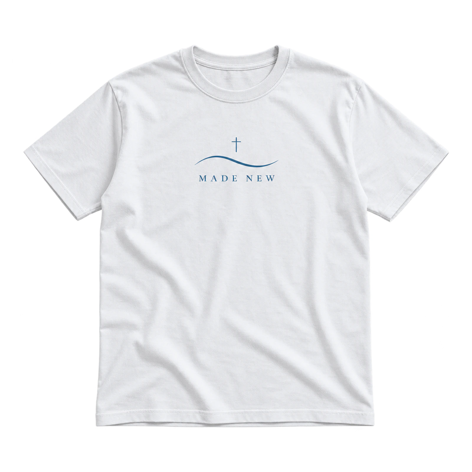
Made New offers church T-shirt design ideas for baptism events a minimalist way to communicate renewal through a short faith-based phrase. Simple typography or a restrained Christian symbol can support the message without competing with it. A centered medium-scale layout and one or two contrasting colors keep the composition clear and readable.
Key Features: Renewal message, minimal typography, simple symbolism, centered composition, open space, and limited colors.
Best For: Baptism candidates, baptism services, church groups, Christian merchandise, youth baptisms, and minimalist milestone shirts.
Popular directions:
- Minimal statement: Place “Made New” alone across the center chest.
- Simple cross: Pair the phrase with a compact cross above or below the typography.
- Water detail: Add a restrained wave element to establish the baptism context.
- Event identifier: Include the church name or baptism date beneath the main message.
- Two-color treatment: Use a second ink to distinguish the supporting symbol or event information.
I Have Decided Baptism Design
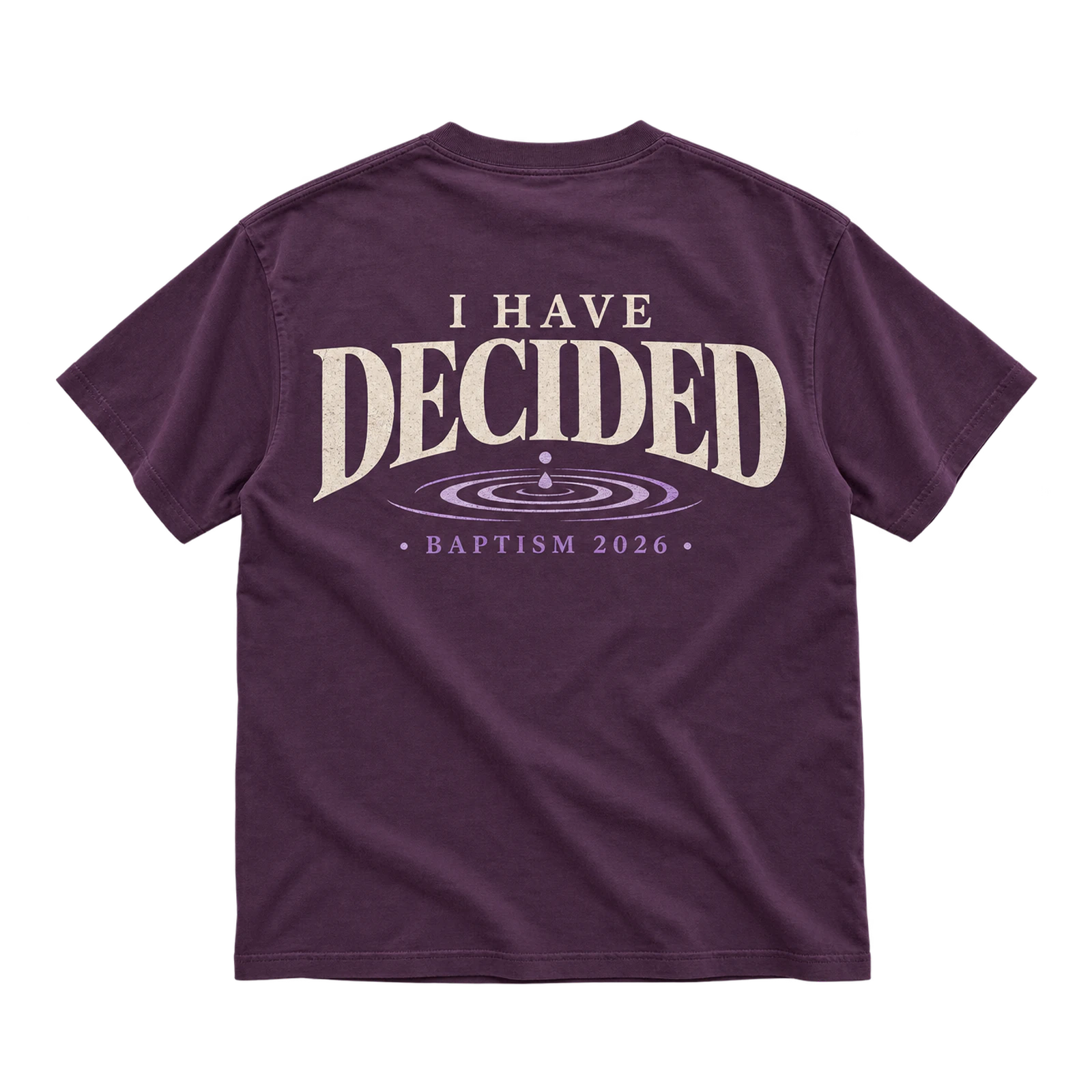
Personal faith statements can shape church T-shirt design ideas for baptism, with I Have Decided serving as the dominant message. Medium-to-large front or back typography gives the wording enough scale to establish hierarchy, while baptism details remain secondary. Limiting additional scripture or supporting copy prevents the central statement from losing focus.
Key Features: Personal faith statement, baptism context, prominent typography, clear hierarchy, supporting event details, and readable scale.
Best For: Baptism services, baptism candidates, youth ministries, church events, Christian apparel, and faith-decision shirts.
Popular directions:
- Large statement: Make “I Have Decided” the dominant front or back wording.
- Word emphasis: Increase the scale or weight of “Decided” within the phrase.
- Baptism identifier: Add “Baptism” with the event date beneath the main statement.
- Front and back pairing: Use a compact church mark on the chest and the complete phrase on the back.
- Limited typography: Keep secondary wording short rather than adding a full scripture passage.
Equipping the Future Ministry Design
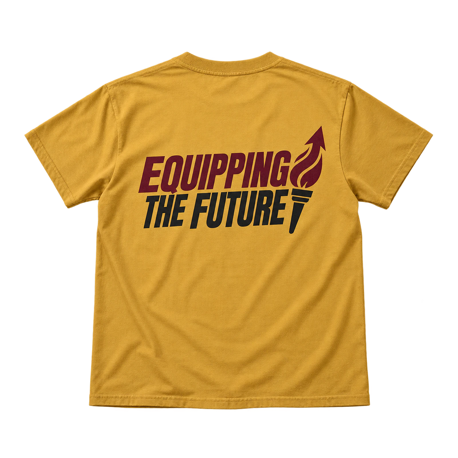
Next-generation ministry programs can use church T-shirt design ideas such as Equipping the Future to communicate leadership and ministry development. Clear typography should lead the composition, while a restrained graphic reinforces the theme without overpowering it. Medium front or back placement paired with established church colors connects the shirt to the congregation.
Key Features: Ministry development message, next-generation theme, typography hierarchy, restrained graphic, church colors, and ministry identification.
Best For: Leadership programs, youth ministries, ministry training, church conferences, next-generation programs, and ministry development events.
Popular directions:
- Typography-led message: Make “Equipping the Future” the main visual statement.
- Ministry identifier: Add the program or ministry name beneath the primary wording.
- Simple symbol: Pair the phrase with a restrained torch, light, or relevant faith-based mark.
- Church-color palette: Apply established church colors to connect the shirt with its identity.
- Large back treatment: Use the rear area for the message and keep front branding compact.
Stronger Together Church Design
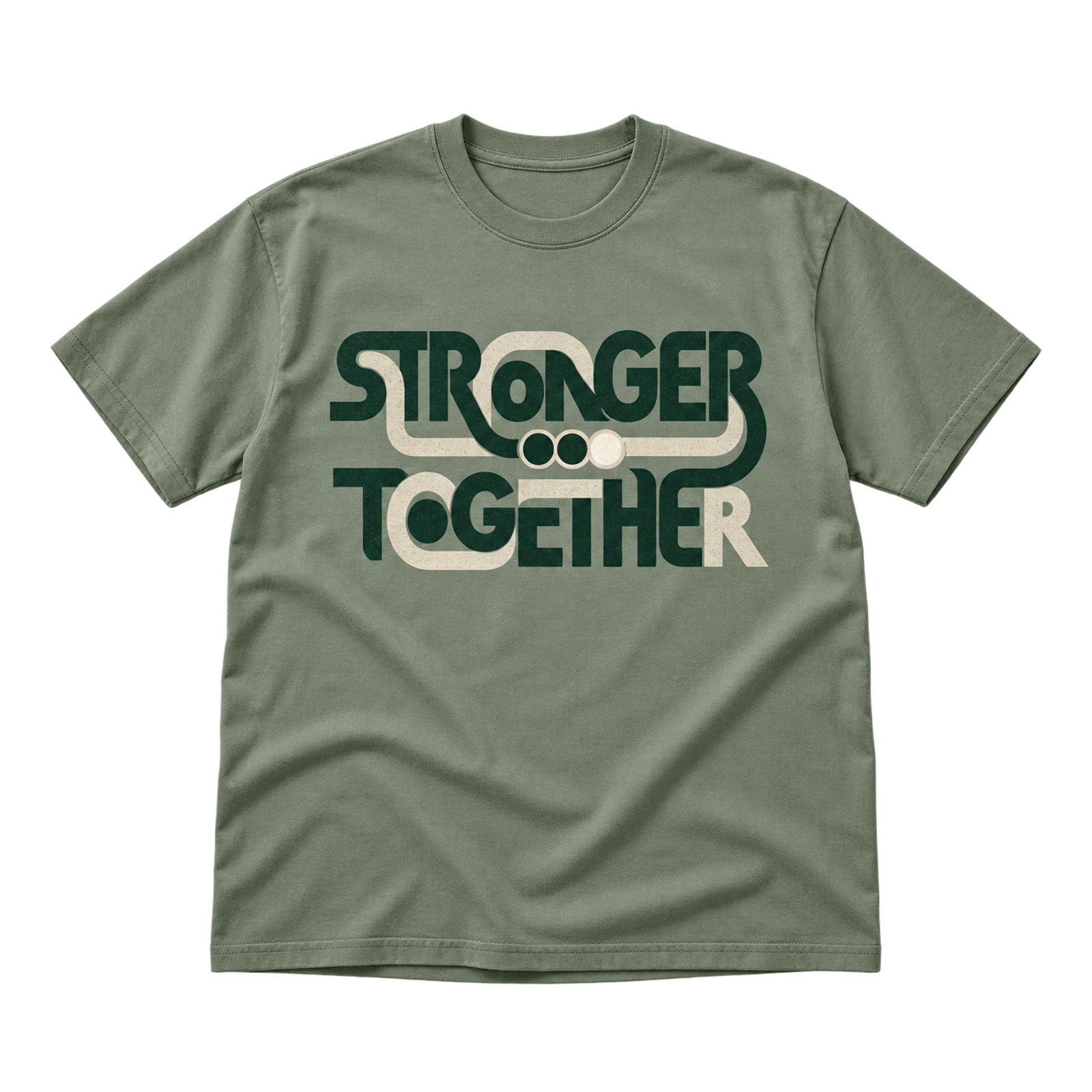
Unity-focused church T-shirt design ideas can use Stronger Together as a bold phrase supported by connected or grouped visual elements. Medium-to-large centered placement gives the message enough room to remain prominent, while a church name or faith-based symbol establishes congregation context. Limited colors help keep the complete composition visually organized.
Key Features: Unity message, connected graphics, bold typography, centered layout, church identity, and limited colors.
Best For: Church anniversaries, congregation events, ministry gatherings, small groups, church conferences, and unity-focused apparel.
Popular directions:
- Connected lettering: Link selected letters or words to reinforce the unity theme.
- Grouped symbols: Arrange simple faith-based elements as one connected visual.
- Centered statement: Place “Stronger Together” prominently across the chest.
- Church identifier: Add the congregation name beneath the main phrase.
- Large back graphic: Combine the unity message and supporting elements across the rear panel.
VBS Theme Design
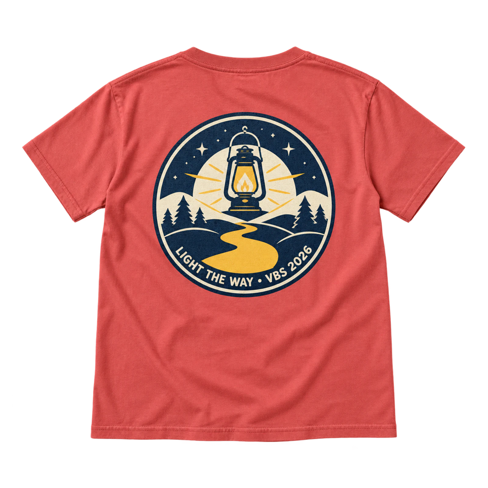
Vacation Bible School creates a flexible context for church T-shirt design ideas built around a yearly theme, event title, and supporting illustration. Larger front or back artwork gives the theme enough room to be recognizable to children and volunteers. Church names and event details can remain secondary, with the print method selected according to graphic complexity.
Key Features: VBS theme, event title, child-readable artwork, supporting illustration, larger graphic area, and event identification.
Best For: Vacation Bible School, children’s ministries, VBS volunteers, church summer programs, student groups, and event-specific church shirts.
Popular directions:
- Theme title: Make the yearly VBS name the dominant typographic element.
- Theme illustration: Add a graphic that directly represents the selected VBS concept.
- Child-readable typography: Use clear lettering that remains recognizable within the illustrated composition.
- Church and event details: Position the church name, year, or ministry identifier below the primary artwork.
- Large back artwork: Expand the theme illustration across the back and use a smaller coordinating mark on the front.
What Are Some Church T-Shirt Design Tips?
Church T-shirt design tips include choosing one clear message, defining the audience, selecting the shirt color and placement, using readable typography and contrasting ink, matching the church identity, choosing a suitable printing method, and reviewing the artwork on a T-shirt mockup. Following these decisions in sequence helps keep the message, visual style, and production requirements aligned before printing.
Here are some church t-shirt design tips:
- Step 1: Choose One Clear Message or Theme
Choose one main message, scripture reference, ministry phrase, or event theme to establish a clear focal point for the church T-shirt design. Decide what someone should understand at a glance, then make that idea the largest or most prominent element. Keep the church logo, date, supporting text, and graphics secondary so they reinforce the message rather than compete with it.
- Step 2: Choose Who the Shirt Is For
Define the intended wearer before selecting the visual direction because different church groups need different types of communication. Youth ministry shirts can support expressive graphics, volunteer shirts need visible team identification, and worship apparel can place more emphasis on faith-based typography. Match the tone, artwork, and message to how that specific group will wear the shirt.
- Step 3: Choose the Shirt Color First
Select the shirt color before finalizing the artwork because the garment acts as the background for every printed element. Test the planned ink colors against the actual fabric color to confirm that text, symbols, and fine details remain visible. A dark garment may require lighter ink for separation, while a light shirt gives darker lettering and graphics stronger definition.
- Step 4: Choose the Design Placement
Match the design placement to the message length, artwork scale, and required visibility. A roughly 2 to 4-inch left-chest area suits compact logos and faith symbols, while the center chest or full front provides more space for primary messages and graphics. Use the back for larger artwork or volunteer identification, and reserve sleeves or neck areas for short supporting details.
- Step 5: Use Bold and Readable Typography
Choose bold, readable typography that keeps the church message recognizable at the intended viewing distance. Give the primary phrase greater size or weight, then reduce church names, dates, scripture references, and other supporting text to create hierarchy. Avoid thin strokes, excessive font variation, and tight spacing that can reduce readability after printing.
- Step 6: Use High-Contrast Ink and One to Three Colors
Use ink colors that create clear separation from the garment and keep the palette to one to three colors when the artwork permits. Assign colors according to hierarchy, such as one for the primary message and another for a symbol or supporting text, rather than applying several colors without a clear purpose. Check smaller lettering and fine graphic details carefully because weak contrast becomes more noticeable at reduced sizes.
- Step 7: Match Colors and Fonts to the Church Identity
Connect the shirt with the church identity by carrying established colors, typography, logo treatments, or other recognizable visual elements into the artwork. A youth ministry, worship team, or church event can have its own design character while still sharing enough visual cues with the congregation’s identity. Keep the church logo subordinate when the ministry phrase or event theme needs to remain the main message.
- Step 8: Choose the Right Printing Method
Match the printing method to the artwork detail, number of colors, order size, placement, and required finish. Screen printing suits bold typography, solid shapes, and simpler designs produced in larger quantities, while DTF can reproduce detailed and multicolor graphics. Embroidery works better for compact logos and simple symbols, so remove tiny lettering and intricate lines when preparing artwork for stitching.
- Step 9: Preview the Final Design on a T-Shirt Mockup
Preview the finished artwork on a realistic T-shirt mockup to check scale, placement, balance, and interaction with the garment color before production. Review front, back, and secondary placements together on a T-shirt mockup, and check whether the artwork sits too close to the neckline, sleeves, or other garment boundaries. Correct graphics that appear too small, crowded, misplaced, or disproportionate before approving the final design.
What Mistakes Affect a Church T-Shirt Design?
Church T-shirt design mistakes include overcrowding the artwork, choosing poor color contrast, using low-resolution files, selecting unsuitable typography, and skipping the proofing stage. These issues can reduce message clarity, print quality, readability, and the final appearance of the shirt, so each element should be checked before production.
Common mistakes that affect a church t-shirt design are:
- Overcrowded Design
Too many visual elements make the main church message harder to identify and weaken the overall design hierarchy. Combining a Bible verse, church logo, ministry name, event date, slogan, and graphic can force several elements to compete for attention. Choose one primary message, give it the most visual emphasis, and reduce secondary information through smaller sizing or separate placement. For example, an event shirt can feature the event theme on the front while placing the church name and date in a smaller supporting position.
- Poor Color Contrast
Insufficient separation between the ink and garment color makes text, symbols, and graphics difficult to see. A dark gray message on a black shirt or pale yellow lettering on a white shirt can lose definition, especially when viewed from a distance. Compare every ink color against the actual garment color and adjust lightness, darkness, or color selection until the main elements remain clearly visible.
- Low-Resolution Artwork
Artwork without enough image data can appear pixelated, blurry, or jagged when enlarged to the required print dimensions. A small raster logo that looks sharp on a computer screen may lose edge definition when expanded across the front or back of a T-shirt. Prepare raster graphics at the intended production size with sufficient resolution, or use vector artwork for church logos, typography, symbols, and other scalable graphic elements.
- Poor Typography
Hard-to-read font choices can prevent people from understanding the shirt’s message quickly and accurately. Thin strokes, decorative lettering, tight spacing, small text, and several competing typefaces can reduce readability after the design is printed on fabric. Give the main phrase greater size and weight, maintain sufficient letter and line spacing, and keep scripture references, dates, or ministry names visually secondary.
- Skipping Proofing
Approving artwork without a final review can allow spelling, sizing, color, alignment, and placement errors to reach production. A design that appears balanced on a flat canvas may look too small on the back, sit too close to the neckline, or place supporting text where it is difficult to read. Review a digital mockup or physical proof at realistic garment proportions and verify the wording, dimensions, colors, alignment, and print position before approving the shirts.



 Trusted By Thousands Of Designers
 Cancel Your Subscription Anytime
 30 Day Money Back Guarantee