
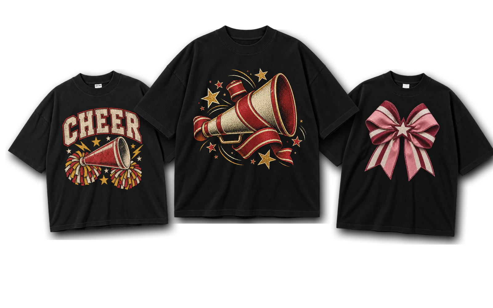
Cheer T-shirt design ideas range from retro, vintage, seventies, and eighties graphics to collegiate, varsity, script, arched, 3D, and slogan-based typography. Team-focused options include mascot, school spirit, squad, team name, roster, name-and-number, and front-and-back designs, while bows, pom-poms, megaphones, pennants, stars, lightning bolts, sunbursts, flowers, and roses provide graphic-led directions. Cute, coquette, simple, funny, and loud-and-proud styles add further variation through different combinations of typography, team colors, symbols, personalization, and layout.
A cheer T-shirt also adapts to different wearers and occasions through ideas for camps, competitions, Nationals, game days, practices, senior seasons, coaches, cheer moms, and cheer dads, along with glitter, metallic, puff print, and glow treatments for specialty finishes. Creating these designs also involves practical choices such as establishing a clear theme, using readable typography, maintaining strong color contrast, simplifying graphics, selecting suitable print methods, and checking final size and placement. Avoiding mistakes such as poor graphic placement, improper sizing, hard-to-read fonts, weak contrast, overcrowded layouts, unsuitable fabrics, and mismatched printing methods helps keep the finished cheer shirt readable, balanced, and suitable for production.
Here are 45 cheer T-shirt design ideas:
- Retro Cheer Graphic
- Vintage Cheer Graphic
- Retro Seventies Cheer Design
- Eighties Cheer Design
- Arched Cheer Typography
- Collegiate Cheer Typography
- Varsity Cheer Typography
- Cheer Script Typography
- Loud and Proud Cheer Typography
- Cheer Team Name Design
- Cheer Mascot Design
- School Spirit Cheer Design
- High School Cheer Design
- Cheer Name and Number Design
- Cheer Squad Roster Design
- Front and Back Cheer Design
- Megaphone Cheer Graphic
- Pom-Pom Cheer Graphic
- Cheer Bow Design
- Coquette Cheer Design
- Cheer Pennant Design
- Cheer Sunburst Design
- Cheer Star and Lightning Graphic
- Floral Cheer Design
- Roses Cheer Design
- 3D Cheer Typography
- Cheer Game Day Design
- Cheer Camp Design
- Cheer Competition Design
- Cheer Nationals Design
- Cheer Practice Shirt Design
- Senior Cheer Design
- Cheer Mom Design
- Cheer Dad Design
- Cheer Coach Design
- Cheer Squad Design
- Cute Cheer Graphic
- Simple Cheer Design
- Funny Cheer Typography
- Cheer Slogan Design
- Cheer Era Design
- Glitter Cheer Design
- Metallic Cheer Design
- Puff Print Cheer Typography
- Glow Cheer Graphic
Retro Cheer Graphic
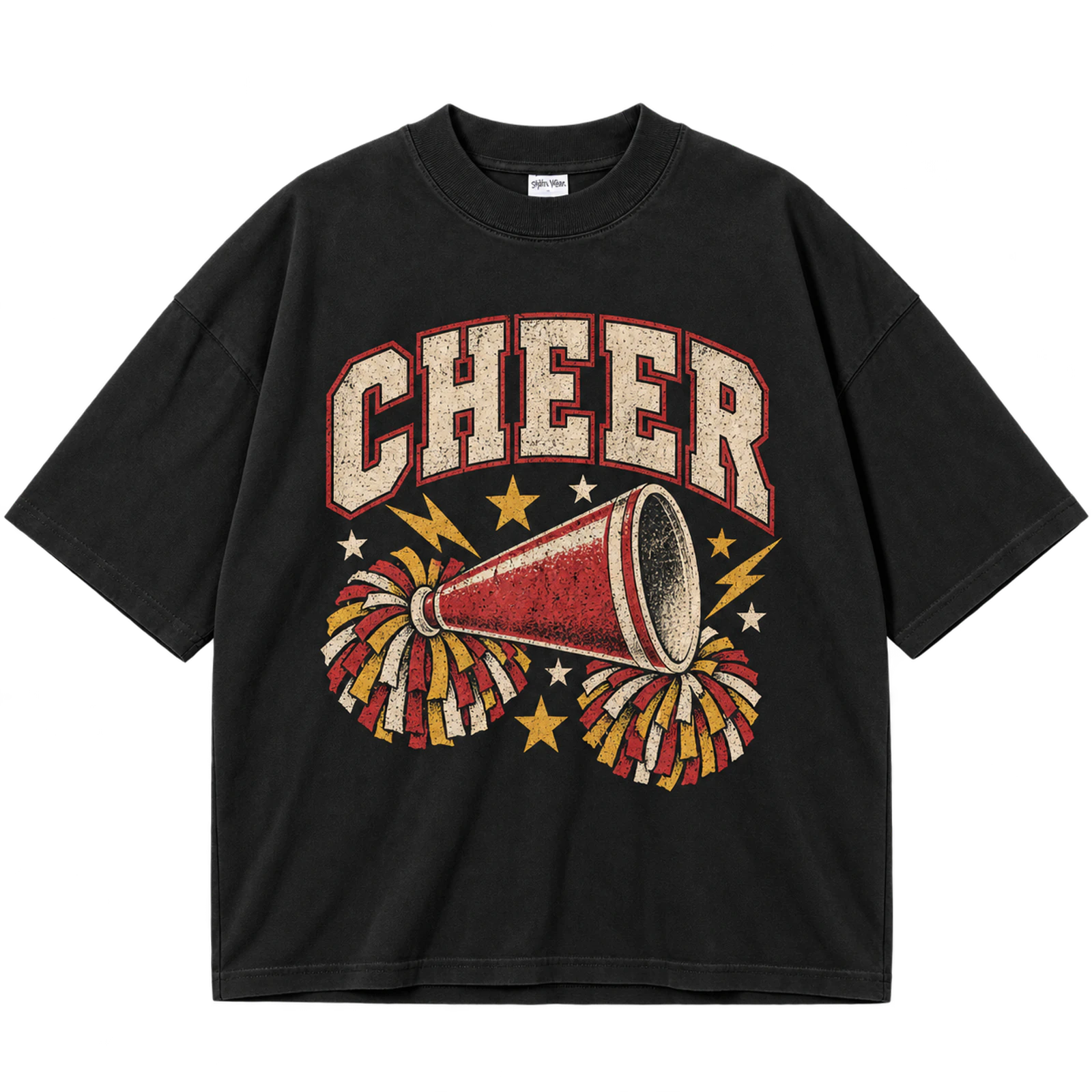
A retro cheer graphic combines distressed lettering, cheer symbols, and team colors to create a vintage-inspired T-shirt design. Megaphones, pom-poms, stars, lightning bolts, or mascot graphics can frame the main cheer lettering while keeping the layout balanced. A limited palette keeps the retro cheer design recognizable, while distressed texture adds an aged graphic effect. Screen print or DTG fits an 8 to 12-inch chest graphic or a larger back design, while embroidery works better with simplified lettering or a small cheer emblem.
Key Features: Retro cheer typography, distressed lettering, cheer symbols, team colors, vintage texture, balanced layout, and recognizable graphics.
Best For: Cheer teams, cheerleading shirts, school spirit shirts, cheer camps, game day apparel, team merchandise, and retro cheer shirt designs.
Popular directions:
- Retro megaphone: Pair a megaphone with distressed cheer lettering, stars, or the team name.
- Pom-pom graphic: Combine pom-poms with retro typography and coordinated team colors.
- Cheer collage: Layer a megaphone, stars, lightning bolts, and cheer lettering into one balanced graphic.
- Mascot design: Feature the school mascot with retro cheer text and a limited color palette.
- Distressed wordmark: Style CHEER or the team name with aged texture and bold lettering.
- Retro team colors: Match vintage-style graphics with coordinated school or squad colors.
Vintage Cheer Graphic
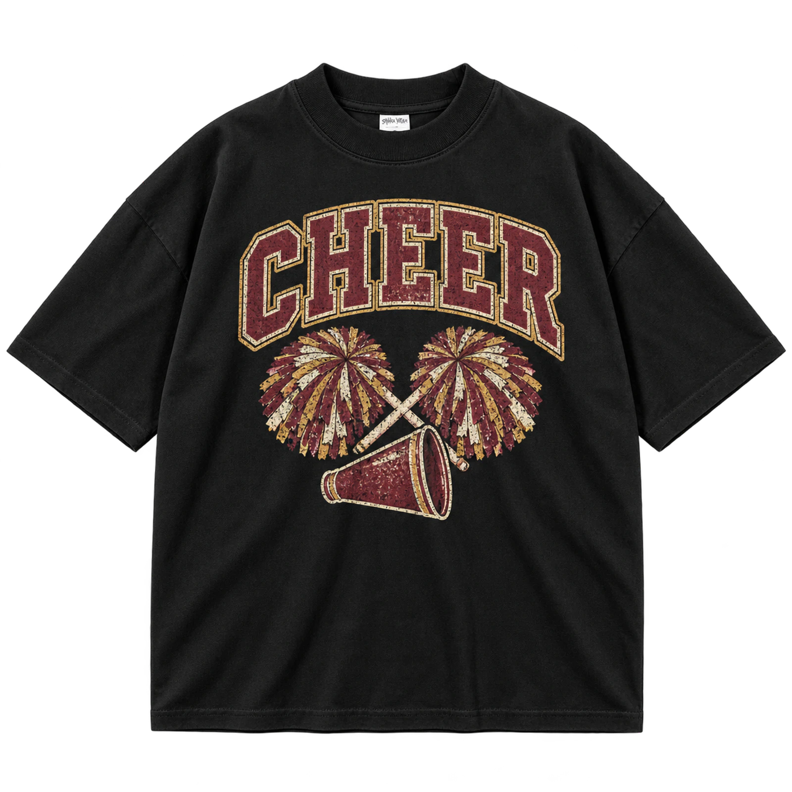
Faded school colors, aged typography, and worn textures establish the visual character of a vintage cheer T-shirt design. A mascot, megaphone, star, or pom-pom can accompany the school or squad name while the typography carries most of the visual weight. Keeping the palette limited helps the distressed treatment remain readable rather than visually crowded. An 8 to 12-inch center-chest graphic works with screen print or DTG, while stitched versions should use simple lettering or one compact emblem.
Key Features: Vintage cheer typography, faded school colors, distressed texture, cheer symbols, school identity, and balanced layout.
Best For: Cheer teams, school spirit shirts, cheerleading shirts, game day apparel, vintage cheer shirts, and team merchandise.
Popular directions:
- Vintage megaphone: Pair an aged megaphone graphic with the team name and distressed lettering.
- Faded mascot: Feature a school mascot with faded team colors and simple cheer typography.
- Distressed wordmark: Style CHEER or the school name with worn lettering and a vintage texture.
- Pom-pom graphic: Combine pom-poms with aged typography and coordinated school colors.
- Vintage emblem: Place the team initials, year, and cheer symbol inside a simple badge layout.
- School spirit graphic: Combine the school name, mascot, and faded colors in one centered composition.
Retro Seventies Cheer Design
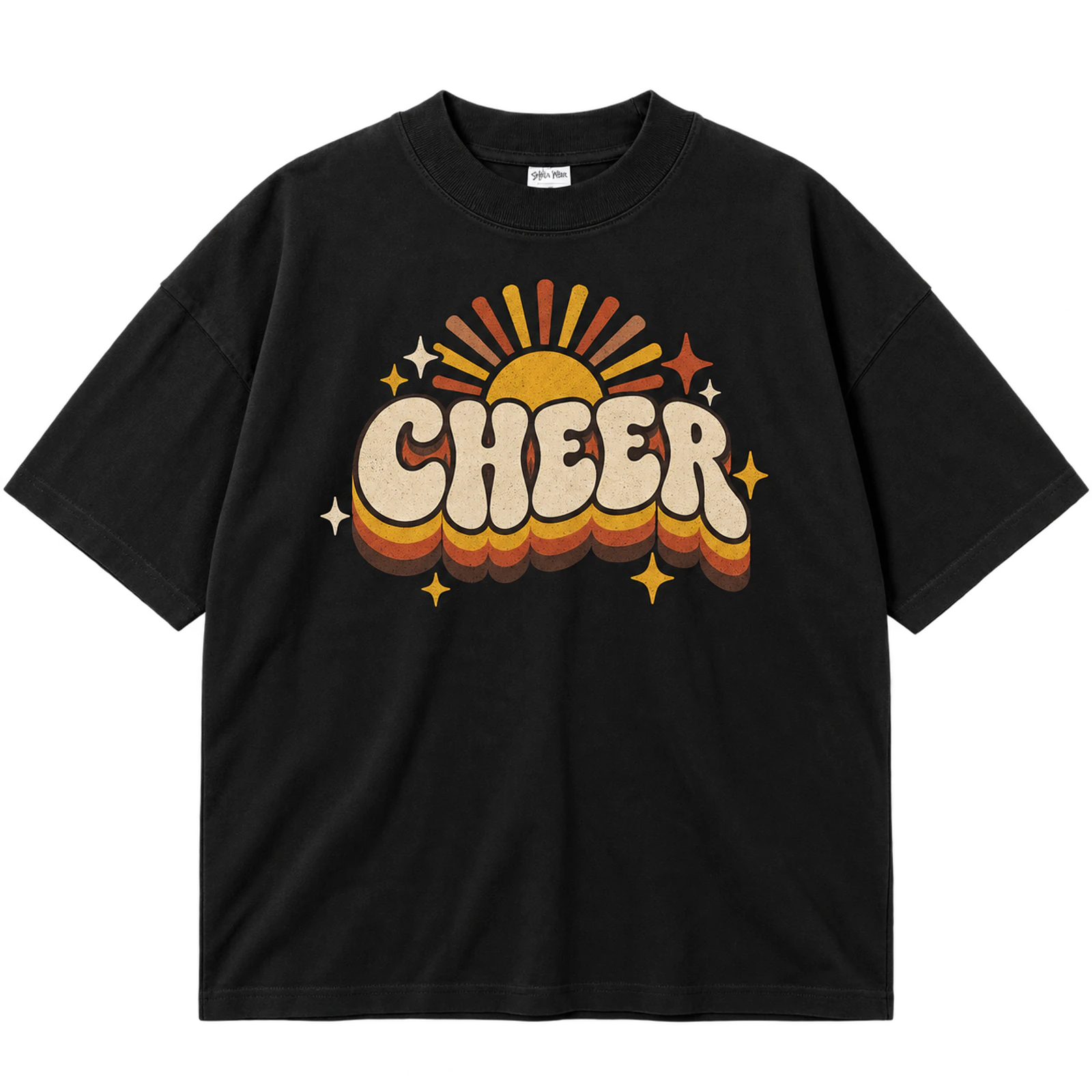
A retro seventies cheer T-shirt design uses rounded lettering with warm retro colors, stripes, stars, and sunburst graphics. CHEER, the school name, or squad wording can anchor the center while decorative elements create the seventies-inspired appearance. A balanced composition keeps the typography readable and gives each supporting graphic enough space. Screen print or DTF suits layered color treatments, while complex gradients and textures should remain limited.
Key Features: Rounded lettering, warm retro colors, stripes, stars, sunburst graphics, and centered composition.
Best For: Retro cheer shirts, cheer teams, school spirit apparel, cheer camps, game day shirts, and cheerleading T-shirt designs.
Popular directions:
- Rounded wordmark: Set CHEER in curved retro lettering with coordinated colors.
- Sunburst graphic: Position the team name or mascot inside simple radiating lines.
- Striped design: Add seventies-style stripes behind a clear cheer wordmark.
- Retro stars: Frame the central lettering with large, simple star shapes.
- Mascot layout: Pair a school mascot with rounded typography and warm colors.
- Team-name graphic: Build the composition around the squad name and one retro symbol.
Eighties Cheer Design
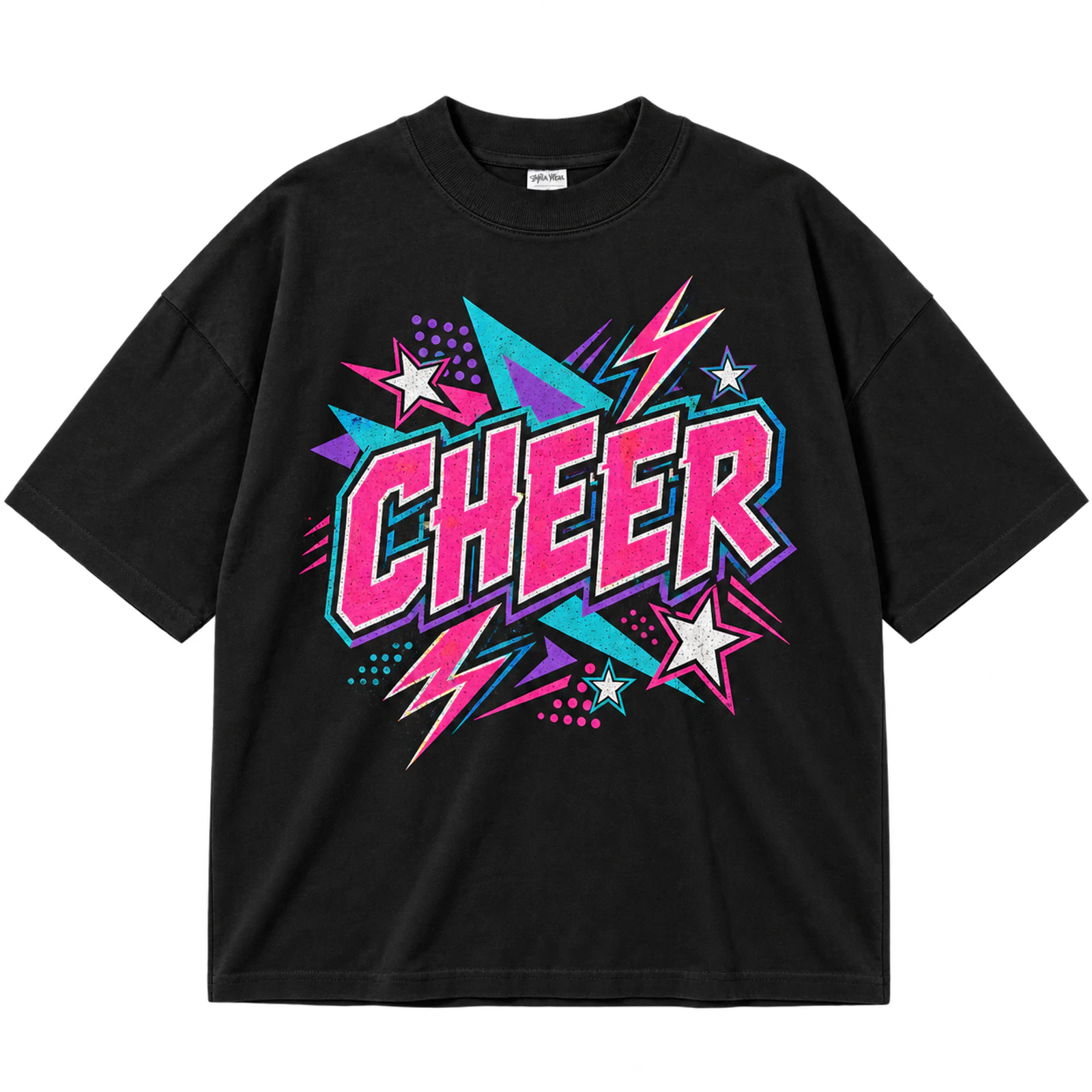
An eighties cheer T-shirt design brings together bright colors, geometric forms, outlined lettering, and energetic cheer graphics. Stars and lightning bolts can create movement around a team name, mascot, or CHEER wordmark while strong contrast separates each element. An 8 to 12-inch chest area provides enough room for layered outlines without pushing artwork toward the seams. Screen print, DTF, or DTG suits the graphic style, while embroidery works better for a simplified logo or wordmark.
Key Features: Bright colors, geometric shapes, outlined lettering, high contrast, energetic graphics, and cheer symbols.
Best For: Retro cheer shirts, cheer teams, cheer camps, spirit wear, game day apparel, and school merchandise.
Popular directions:
- Outlined CHEER: Build multiple outlines around bold cheer lettering.
- Lightning graphic: Place bright lightning bolts beside the main team wording.
- Geometric layout: Use angular shapes to frame the central wordmark.
- Star treatment: Add bold stars without covering the primary typography.
- Megaphone graphic: Combine an outlined megaphone with bright school colors.
- Mascot design: Surround the mascot with simple eighties-inspired shapes.
Arched Cheer Typography
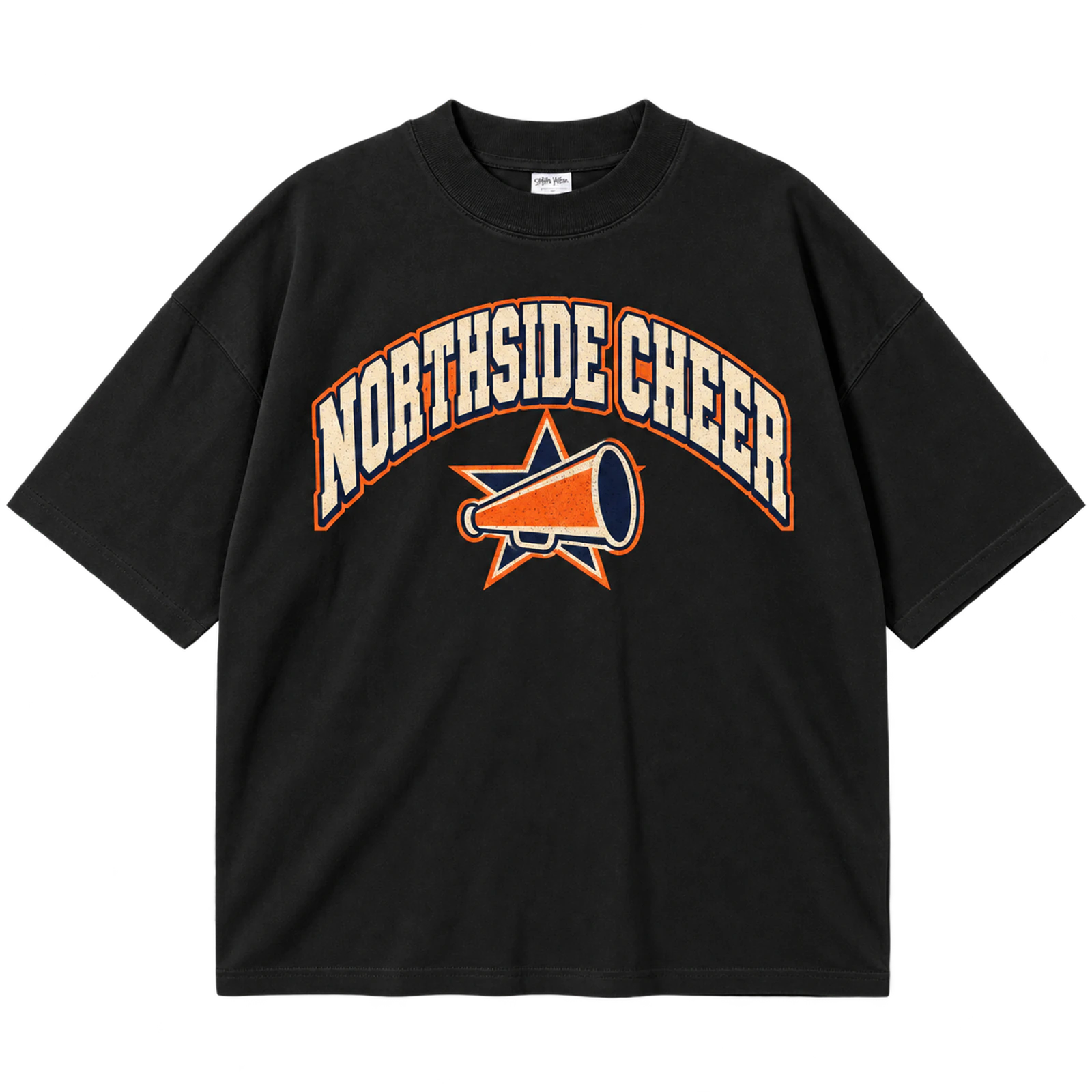
Arched typography gives a cheer T-shirt design a structured frame by curving the team, school, or CHEER wording around a central graphic. A mascot, bow, megaphone, or supporting line of text can occupy the open area beneath the lettering. Thick characters and even spacing help the wording remain readable across an 8 to 12-inch chest width. Screen print and puff print suit larger arches, while simplified curved lettering can also work with embroidery.
Key Features: Arched lettering, symmetrical curve, team name, cheer symbols, bold typography, and readable spacing.
Best For: Cheer team shirts, varsity apparel, school spirit wear, competition shirts, cheer camps, and personalized cheer designs.
Popular directions:
- Arched CHEER: Curve the main word above a compact cheer symbol.
- Team-name arch: Frame a bow or megaphone with the squad name.
- Mascot layout: Position the school mascot beneath curved lettering.
- Double arch: Use separate curves for the school and squad names.
- Year detail: Add a season or graduation year below the central graphic.
- Puff lettering: Give thick arched text a raised surface with puff print.
Collegiate Cheer Typography
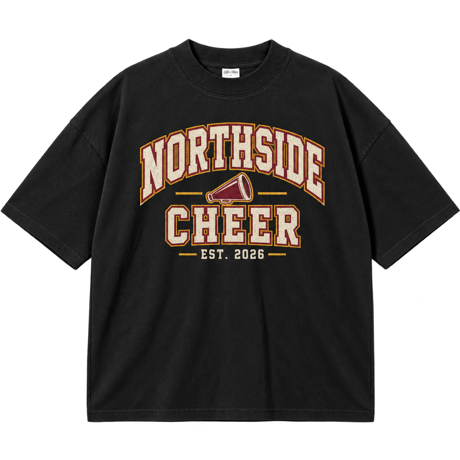
A collegiate cheer T-shirt design uses block lettering, school names, established years, mascots, and athletic marks to emphasize school identity. Structured spacing keeps the primary school name recognizable while smaller elements identify the cheer program. Established school colors can coordinate the typography and graphics without introducing unnecessary visual variation. Screen print and puff print suit larger lettering, while patches or embroidery work for simplified collegiate marks.
Key Features: Collegiate lettering, school identity, block typography, athletic marks, school colors, and structured layout.
Best For: School cheer teams, collegiate spirit wear, high school cheer shirts, game day apparel, cheer camps, and team merchandise.
Popular directions:
- School wordmark: Run the school name across the chest in collegiate lettering.
- Established year: Place a year beneath the primary school typography.
- Mascot mark: Pair a recognizable mascot with structured block text.
- School initials: Enlarge the initials and keep CHEER as secondary wording.
- Athletic badge: Arrange the school name and cheer identity inside an emblem.
- Patch treatment: Convert a simplified collegiate mark into a stitched patch.
Varsity Cheer Typography
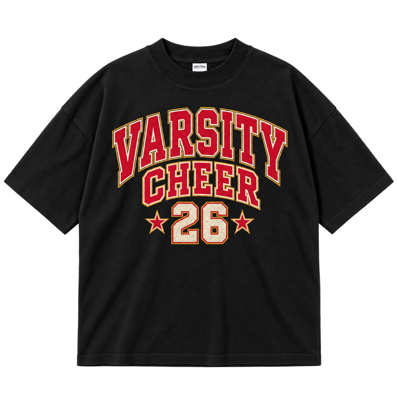
Thick athletic lettering gives a varsity cheer T-shirt design strong visibility and a clear connection to team apparel. CHEER, a school name, or squad name can dominate the layout while outlines, numbers, and stars provide secondary detail. Substantial letter strokes also provide enough surface area for screen print or raised puff ink. A smaller version can reduce the concept to a 2 to 4-inch embroidered wordmark or initial.
Key Features: Varsity lettering, thick strokes, athletic styling, outlined text, team identity, and distance readability.
Best For: Varsity cheer teams, high school cheer shirts, practice apparel, school spirit wear, game day shirts, and team merchandise.
Popular directions:
- Varsity CHEER: Use large athletic letters as the central graphic.
- Squad wordmark: Outline the team name for stronger separation.
- Number graphic: Pair the lettering with a team or graduation number.
- School initials: Make bold initials the focal point of a compact design.
- Star accents: Position a few stars around the varsity typography.
- Raised lettering: Apply puff ink to selected words for a textured finish.
Cheer Script Typography
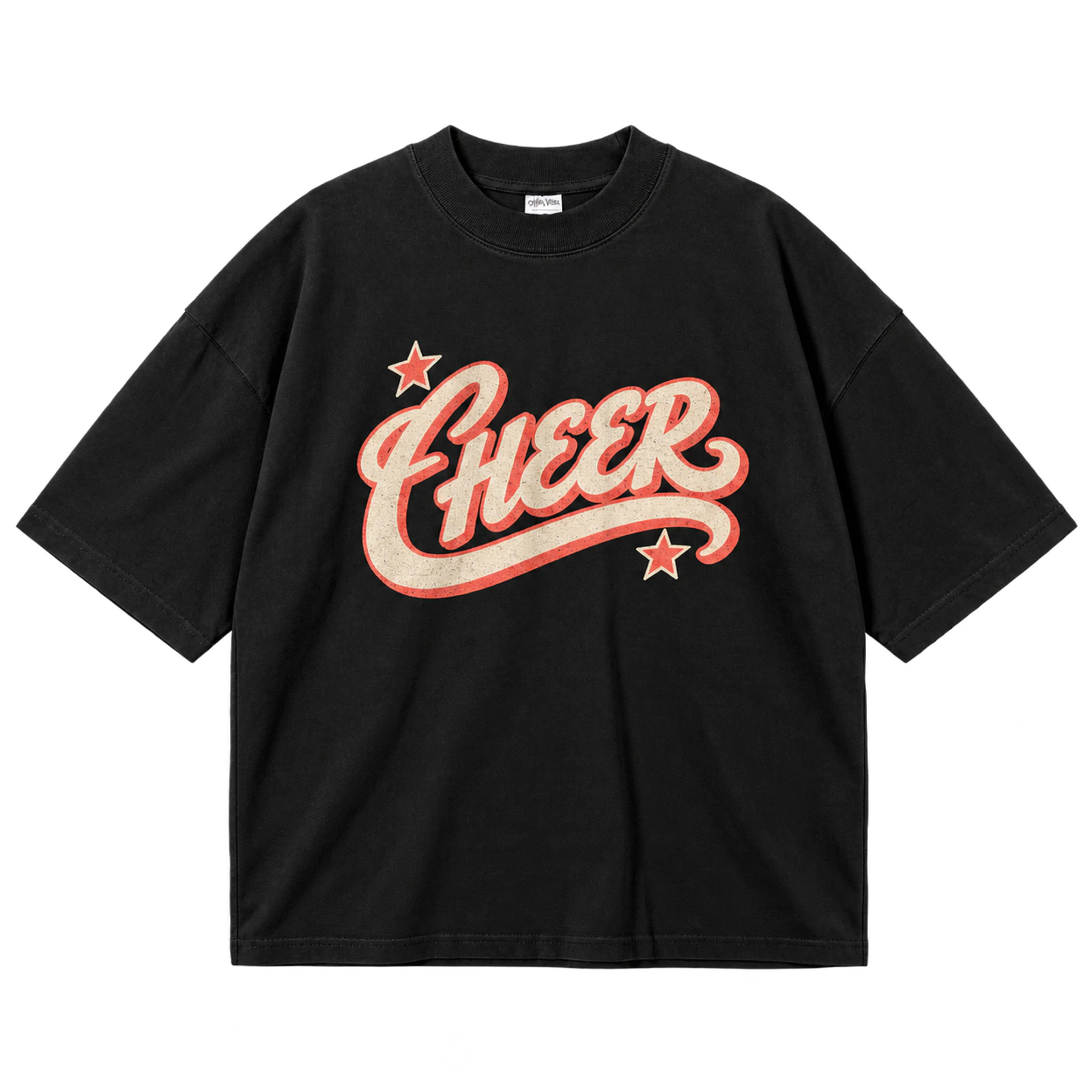
Flowing script adds a decorative typographic layer to a cheer T-shirt design while block lettering can preserve the main team identity. Use script for one focal word, such as CHEER or the squad name, then reserve a stronger typeface for school names, years, or supporting information. A 6 to 10-inch chest width gives curved letterforms enough room to remain open and legible. DTF or screen print can retain finer shapes, while embroidery needs thicker strokes and simpler connections.
Key Features: Script lettering, flowing typography, block-font pairing, clear hierarchy, open spacing, and decorative styling.
Best For: Cheerleader shirts, cute cheer shirts, senior cheer apparel, personalized designs, cheer moms, and spirit wear.
Popular directions:
- Script CHEER: Let one flowing word carry the main visual emphasis.
- Team script: Write the squad name in script above simple school lettering.
- Mixed typography: Combine decorative script with a strong block font.
- Name design: Personalize the layout with a cheerleader name or initials.
- Bow accent: Place a single bow beside the script wordmark.
- Senior script: Combine decorative lettering with a graduation year.
Loud and Proud Cheer Typography
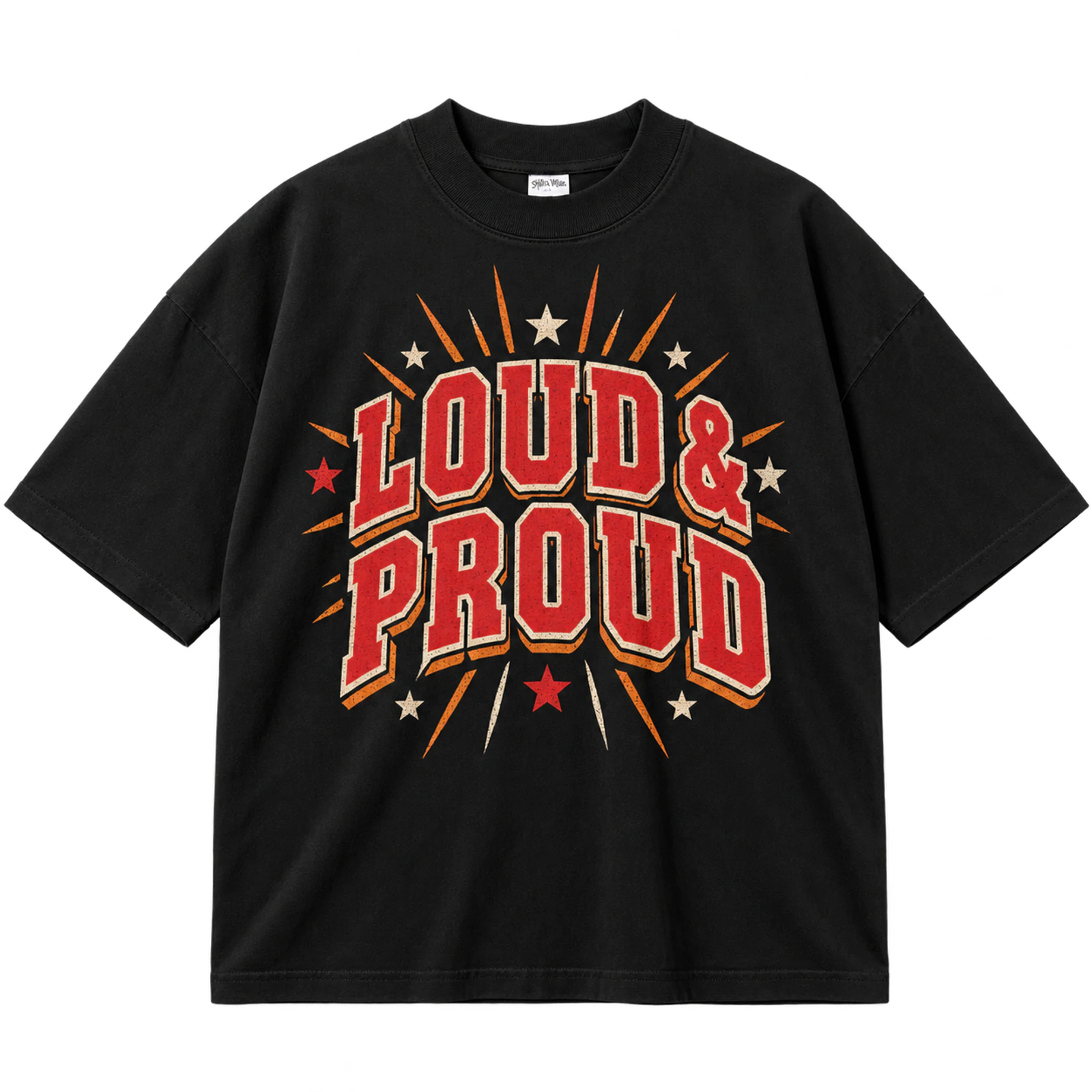
A Loud and Proud cheer T-shirt design relies on bold scale and clear text hierarchy to make the message immediately visible. The phrase can fill most of the front while a small mascot, megaphone, or star establishes the team context. Strong contrast between the shirt and lettering keeps the wording readable from a distance. Screen print, DTF, or puff print suits an 8 to 12-inch composition, while embroidery works better for shortened wording.
Key Features: Statement typography, bold scale, strong hierarchy, high contrast, minimal graphics, and team identity.
Best For: Cheer teams, spirit shirts, cheer camps, competition apparel, game day shirts, and cheer slogan designs.
Popular directions:
- Statement phrase: Give LOUD AND PROUD most of the available print area.
- Team message: Add the squad name beneath the primary wording.
- Megaphone accent: Use one small megaphone as supporting artwork.
- Mascot pairing: Position the mascot below the statement phrase.
- Star frame: Use limited stars to balance the outer edges.
- Puff emphasis: Raise one or two key words instead of the entire design.
Cheer Team Name Design
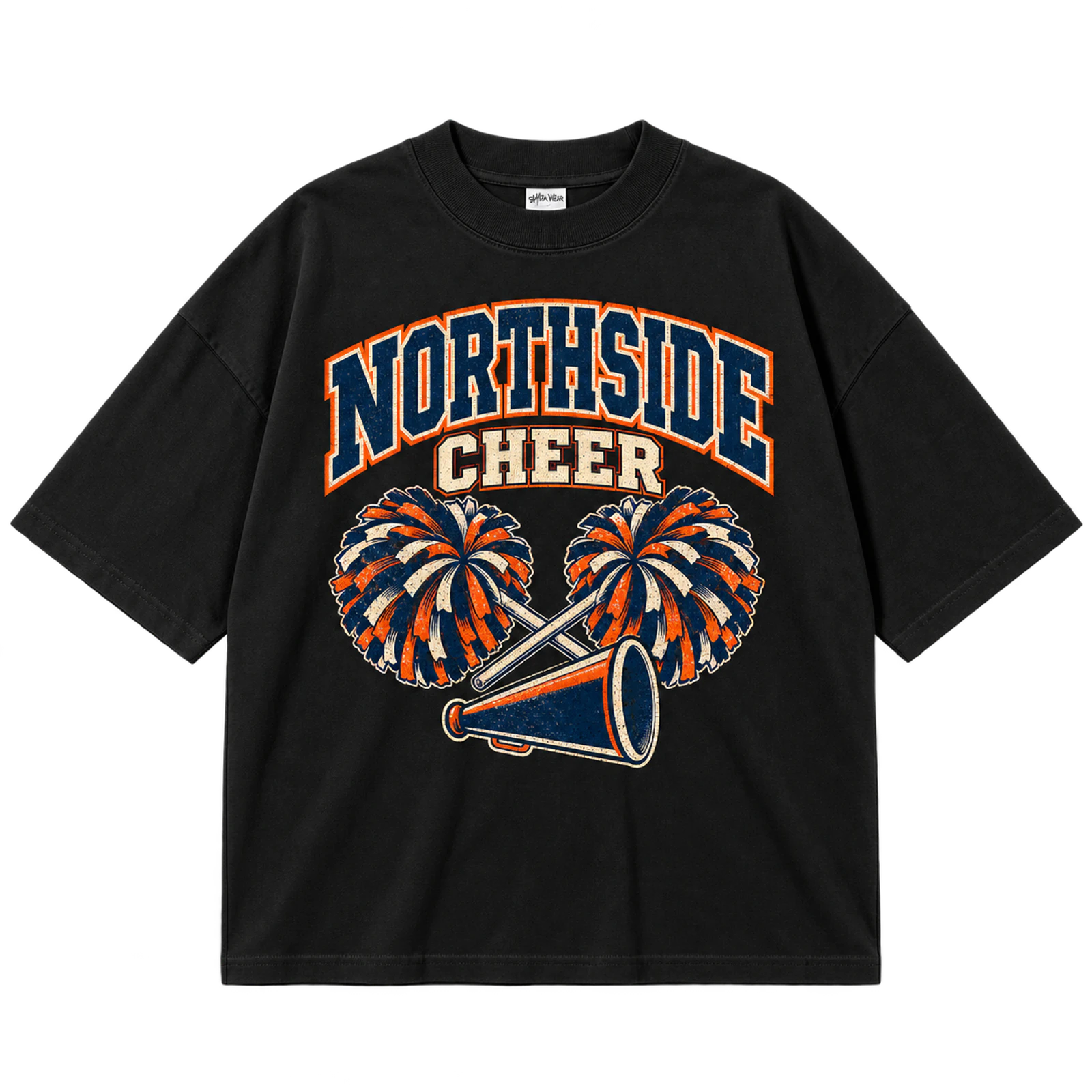
A team-name cheer T-shirt design places the squad or team name at the center of the visual hierarchy. School initials, a mascot, or a compact cheer symbol can reinforce the name while remaining secondary. Consistent typography and team colors help matching shirts maintain a coordinated appearance at games, camps, and competitions. Larger layouts suit screen or puff printing, while a simplified team mark can become an embroidered chest logo.
Key Features: Squad name, team colors, matching typography, school identity, supporting graphics, and coordinated design.
Best For: Cheer squads, competition teams, cheer camps, practice shirts, school teams, and matching cheer apparel.
Popular directions:
- Centered team name: Give the squad name the largest type size.
- Mascot pairing: Add the school mascot beneath the primary wording.
- School identifier: Include the school name as a secondary line.
- Initial mark: Combine team initials with smaller cheer text.
- Star frame: Use simple stars to balance the composition.
- Compact logo: Reduce the full concept to an embroidered team mark.
Cheer Mascot Design
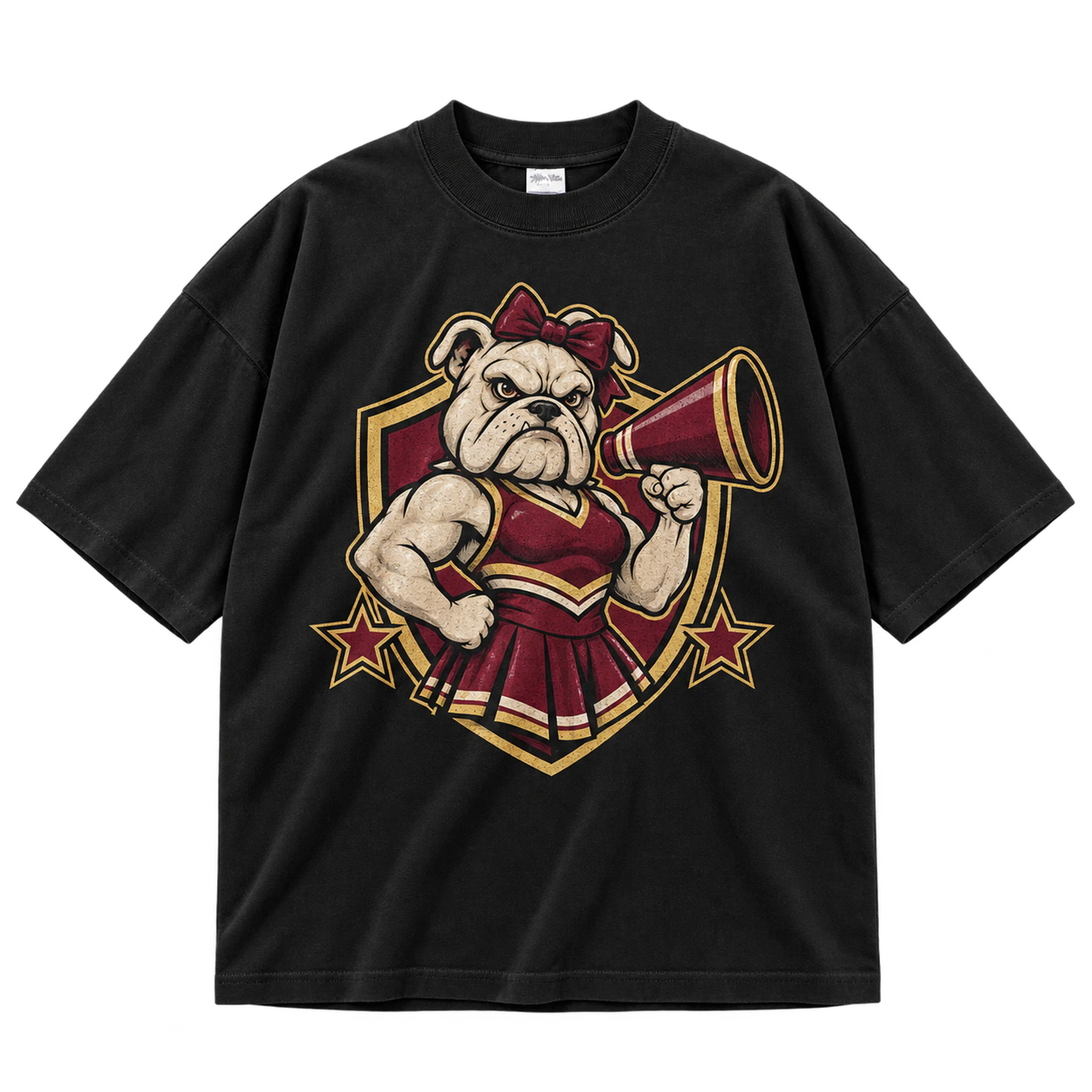
A mascot cheer T-shirt design builds school identity around one recognizable character or emblem. The school or team name can frame the mascot while coordinated colors connect the artwork with the existing team identity. An 8 to 12-inch front or back area gives detailed mascot artwork enough room to remain recognizable. DTF, DTG, or screen print handles fuller graphics, while embroidery requires fewer lines and broader shapes.
Key Features: Recognizable mascot, school colors, team wording, clear focal point, balanced composition, and school identity.
Best For: School cheer teams, mascot merchandise, high school cheer shirts, spirit wear, game day apparel, and competition shirts.
Popular directions:
- Mascot portrait: Make the character the largest element in the composition.
- Arched school name: Curve school lettering around the mascot.
- Mascot badge: Enclose a simplified character inside an athletic emblem.
- Cheer accessories: Add a bow, pom-poms, or megaphone without hiding the mascot.
- Team-color artwork: Coordinate the illustration with established school colors.
- Back graphic: Pair a large rear mascot with a compact front wordmark.
School Spirit Cheer Design
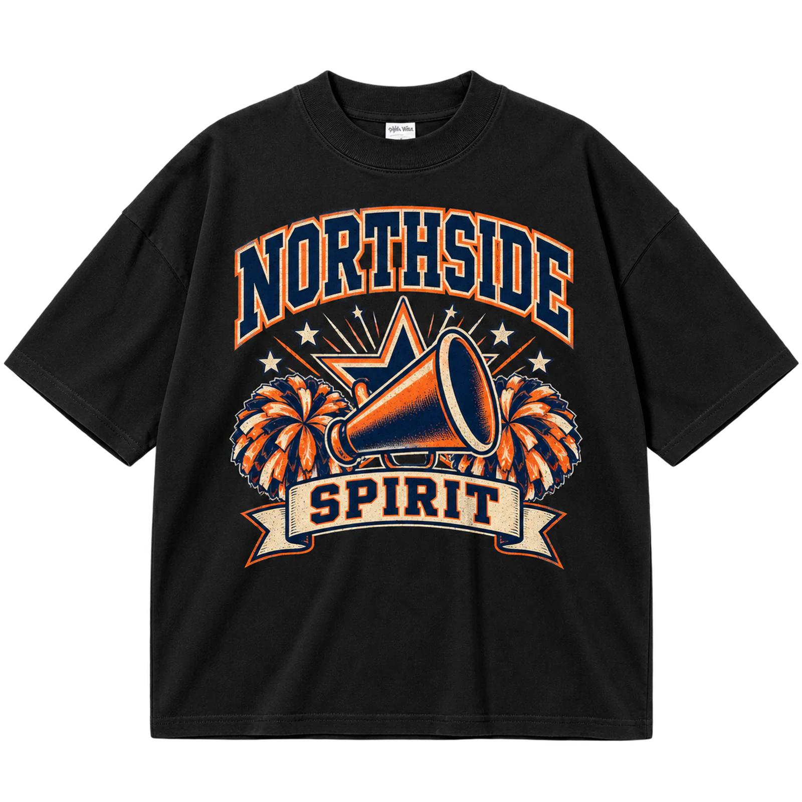
A school-spirit cheer T-shirt design combines the school name, mascot, initials, team colors, and cheer symbols into one recognizable identity. Decorative elements such as bows, megaphones, or stars should support the school branding rather than overpower it. Repeating established colors across lettering and graphics creates a coordinated appearance for games and school events. Screen print, patches, or embroidery can reproduce the design according to its level of detail.
Key Features: School name, mascot, school colors, cheer identity, coordinated graphics, and recognizable branding.
Best For: School cheer teams, pep rallies, game day apparel, students, families, school events, and spirit wear.
Popular directions:
- School-name design: Make the school name the strongest text element.
- Mascot spirit: Combine the mascot with compact CHEER lettering.
- Initial graphic: Enlarge school initials and add a small cheer identifier.
- Megaphone layout: Place school wording around a simple megaphone.
- Spirit phrase: Add one short slogan beneath the main identity.
- Color-led design: Build the graphic around established school colors.
High School Cheer Design
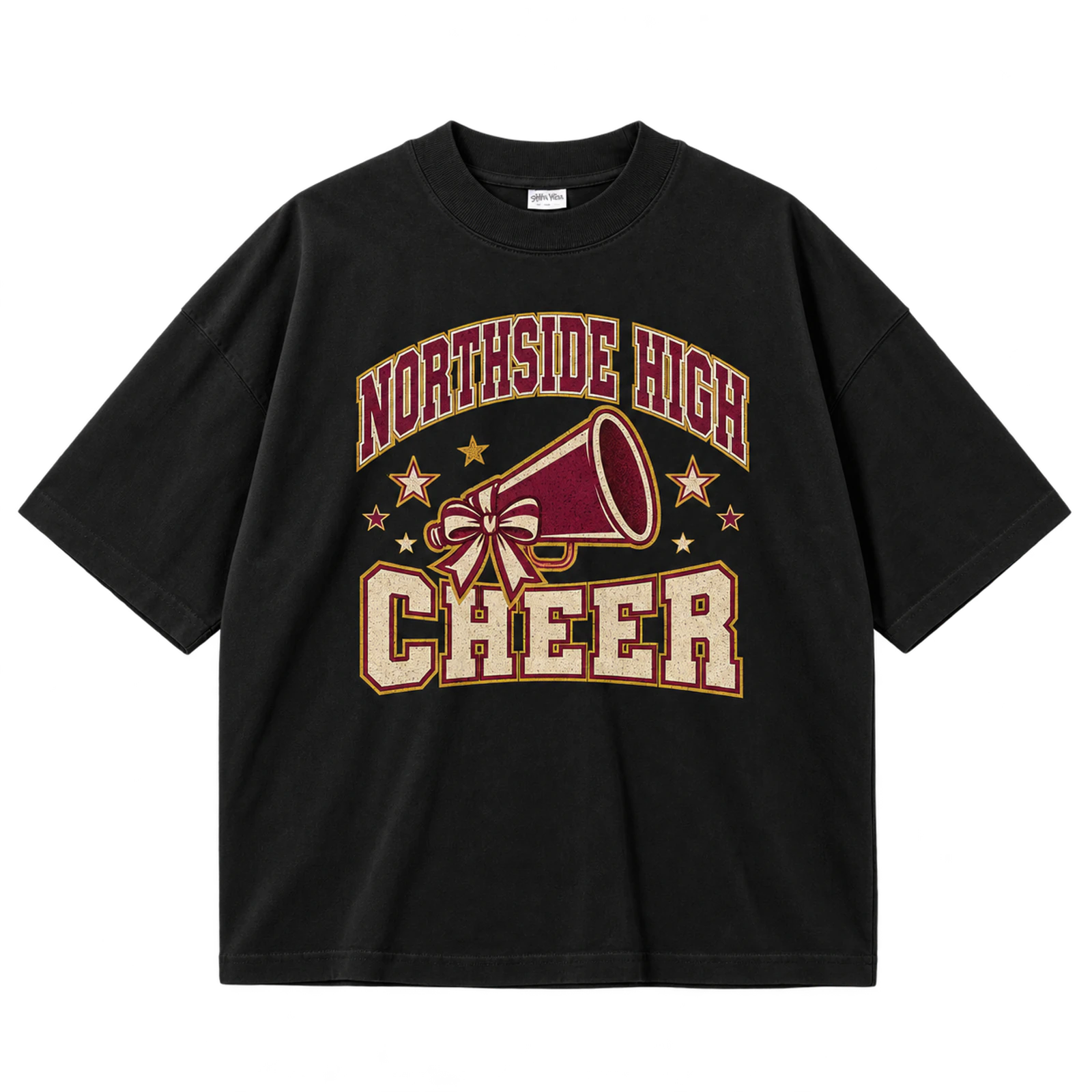
A high school cheer T-shirt design brings together the school name, mascot, varsity typography, squad identity, year, and established colors. The school identifier should receive visual priority, with cheer symbols and season details taking supporting positions. An 8 to 12-inch chest composition provides enough space for this hierarchy without crowding the seams. Screen print or DTF works for larger artwork, while compact embroidery suits simplified school marks.
Key Features: High school name, varsity lettering, mascot, school colors, squad identity, and readable hierarchy.
Best For: High school cheer teams, pep rallies, game day shirts, competitions, student apparel, and school spirit wear.
Popular directions:
- School wordmark: Lead with the high school name in athletic lettering.
- Mascot layout: Position the mascot beneath or between the primary text.
- Squad identifier: Add varsity, junior varsity, or another squad designation.
- Year detail: Include the school year without competing with the main name.
- Initial design: Build a compact graphic around school initials.
- Game day version: Add event wording while preserving the school identity.
Cheer Name and Number Design
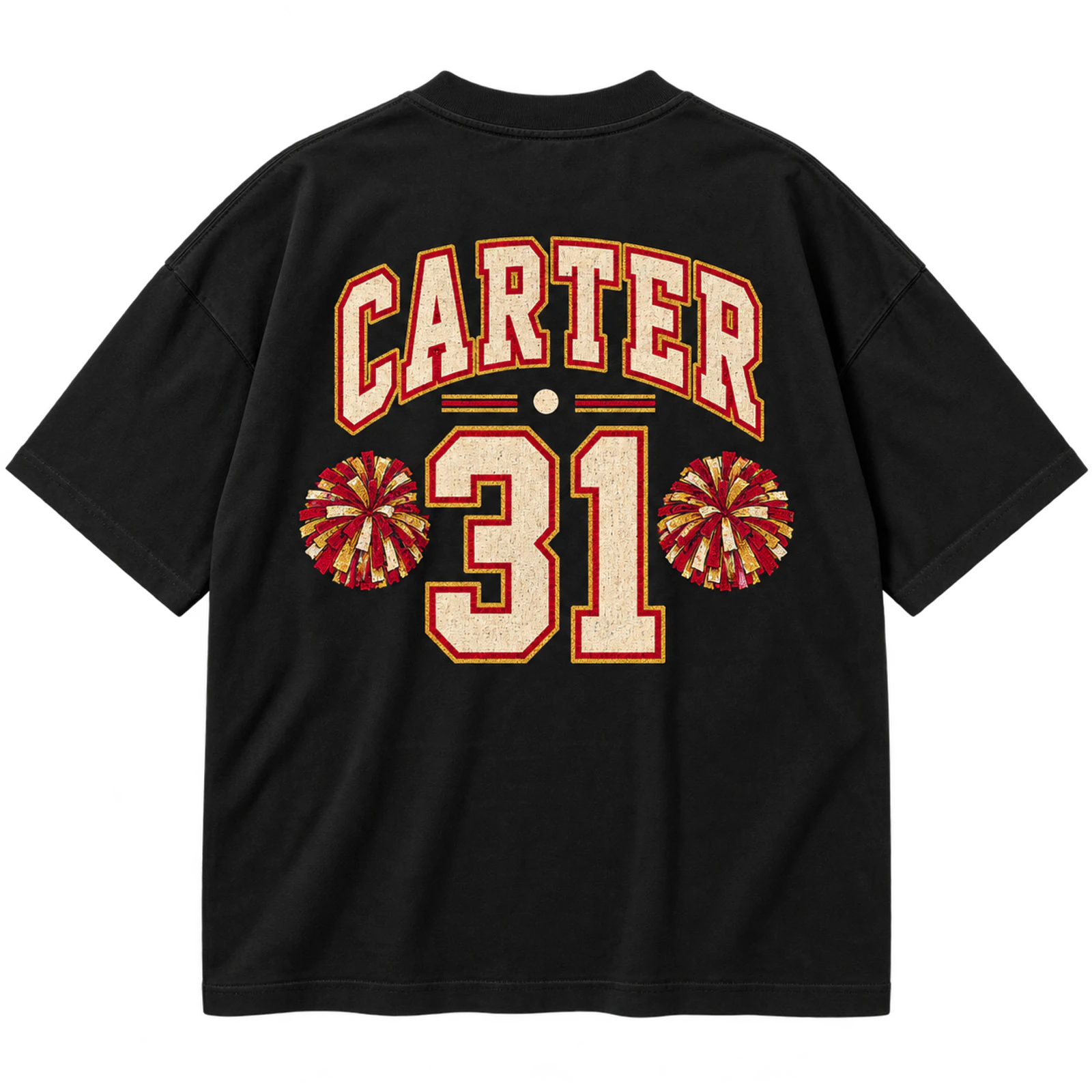
A personalized cheer T-shirt design uses a cheerleader name and number while preserving a consistent visual system across the squad. A large back number can pair with the name above or below it, while a smaller team identifier occupies the front. Matching typography, scale, and colors prevents individual personalization from disrupting the team appearance. Screen print, DTF, or heat transfer works for larger details, while small names or initials can be embroidered.
Key Features: Personalized name, large number, matching typography, team identity, front-back layout, and individual details.
Best For: Cheer teams, personalized shirts, practice apparel, competition shirts, senior designs, and squad merchandise.
Popular directions:
- Name above number: Use the cheerleader name as a header for a large number.
- Name below number: Keep the number dominant with smaller text underneath.
- Front team mark: Add the squad logo or initials to the chest.
- Varsity number: Style numbers with thick athletic strokes.
- Senior number: Substitute or pair the number with a graduation year.
- Initial detail: Use small initials when full-name personalization is unnecessary.
Cheer Squad Roster Design
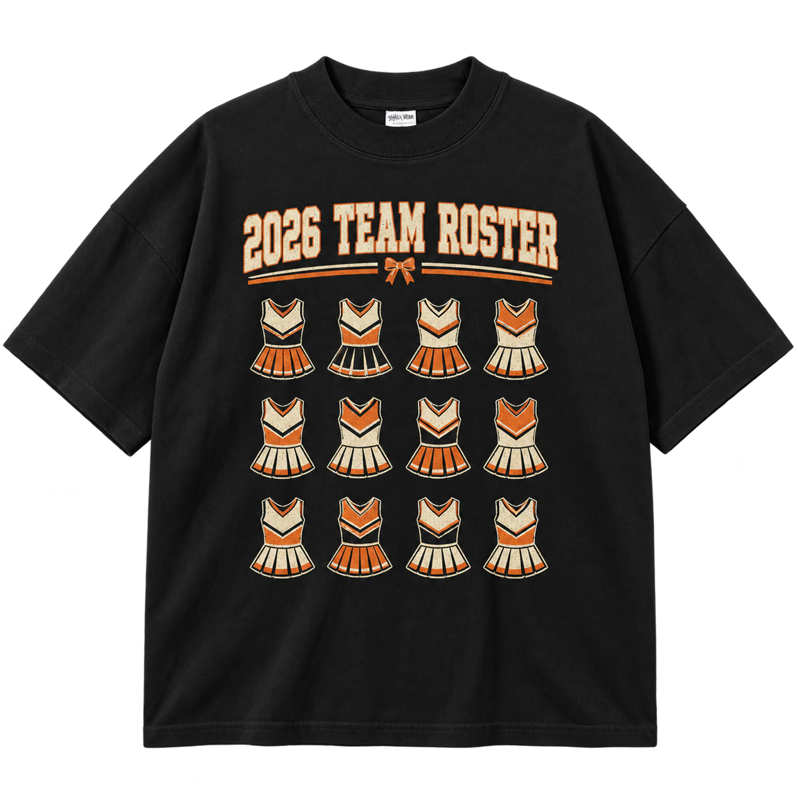
A squad-roster cheer T-shirt design turns the back of the shirt into a coordinated list of team members. Names can appear in rows, columns, stacked arrangements, or a simple shaped layout as long as spacing and typography remain consistent. A compact front identifier can leave the larger back area available for the roster, year, or cheer symbol. Screen print and DTF suit longer lists, while a full roster is generally too detailed for embroidery.
Key Features: Team roster, cheerleader names, consistent spacing, uniform typography, back print, and squad identity.
Best For: Cheer teams, camp shirts, competition apparel, senior night shirts, commemorative merchandise, and squad events.
Popular directions:
- Stacked names: Arrange the roster in evenly spaced horizontal lines.
- Column roster: Divide longer lists into balanced vertical columns.
- Shaped layout: Organize names around a star, megaphone, or initial.
- Season roster: Add the year or season above the team list.
- Front-back format: Pair a compact chest logo with the full roster behind.
- Senior treatment: Distinguish seniors through placement rather than extra fonts.
Front and Back Cheer Design
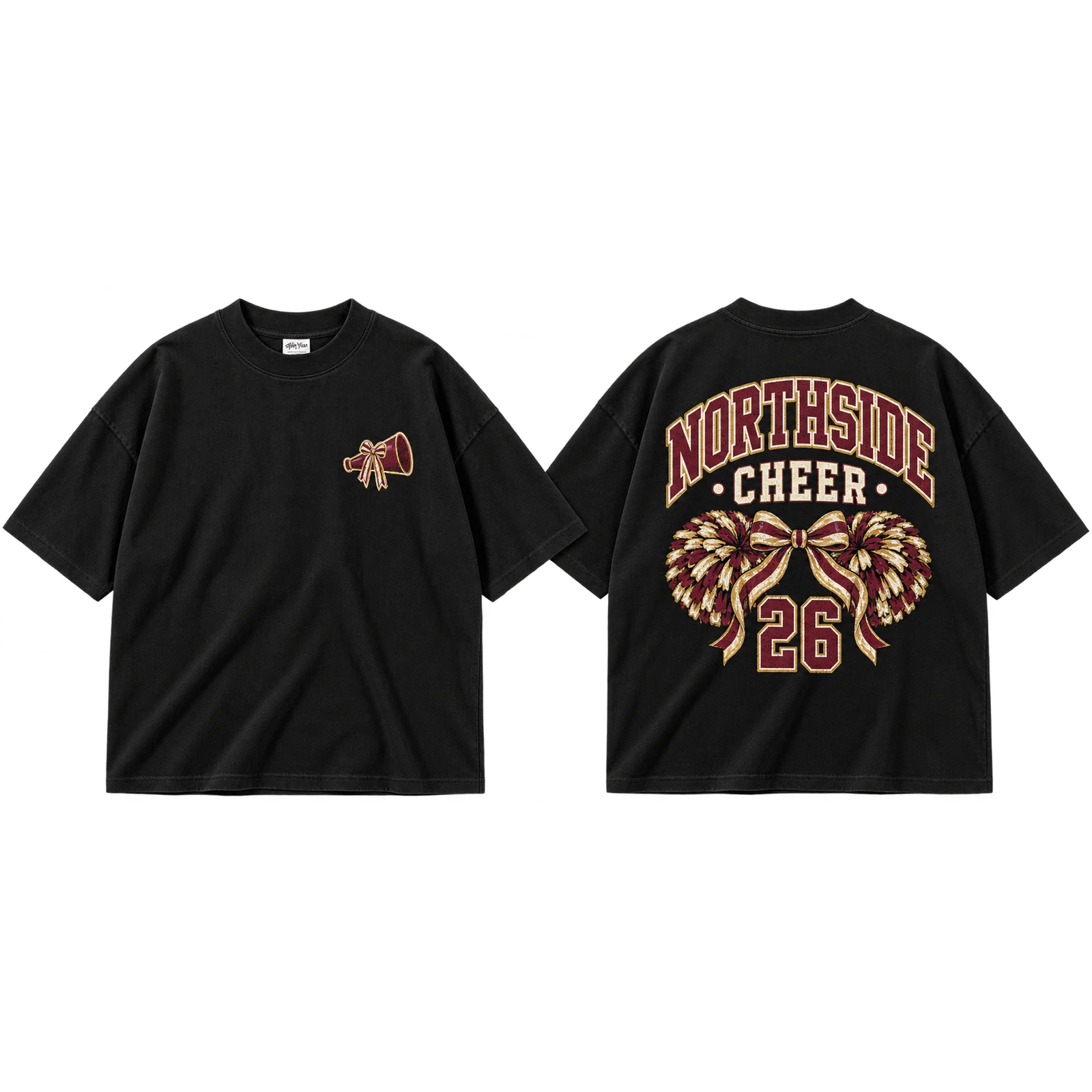
A front-and-back cheer T-shirt design separates compact team identification from larger supporting artwork across two print zones. A 2 to 4-inch chest mark can feature the mascot, initials, or team name, while the back carries a roster, slogan, event graphic, or personalized number. Repeating colors, typography, and symbols visually connects both sides of the garment. Screen print and DTF suit the coordinated format, with embroidery reserved for a simplified front mark.
Key Features: Two-sided layout, compact chest mark, large back graphic, repeated typography, team colors, and visual continuity.
Best For: Cheer teams, competition shirts, camp apparel, senior shirts, personalized uniforms, and team merchandise.
Popular directions:
- Logo and statement: Keep the front compact and use the back for larger wording.
- Mascot and slogan: Introduce the mascot in front and place the phrase behind.
- Team and roster: Separate the squad identity from the full name list.
- Name and number: Combine a team chest mark with personalized back details.
- Event layout: Put the event identifier in front and details on the back.
- Repeated symbol: Carry one star, bow, or team mark across both sides.
Megaphone Cheer Graphic
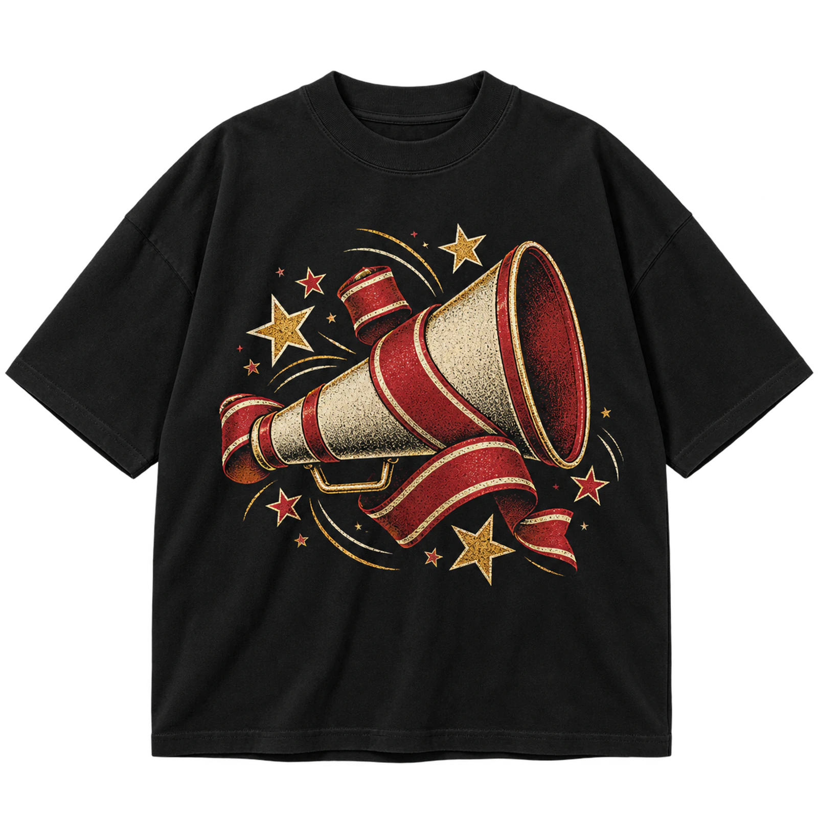
A megaphone gives a cheer T-shirt design an immediately recognizable cheer symbol without requiring a complex illustration. Team wording can appear inside, above, or beside the graphic while stars or lightning bolts add controlled movement. A 6 to 10-inch chest graphic provides enough space for school colors and readable lettering. Screen print and DTF reproduce fuller compositions, while a simplified megaphone outline can translate into embroidery.
Key Features: Megaphone symbol, team wording, school colors, supporting accents, recognizable shape, and compact composition.
Best For: Cheer teams, cheer camps, school spirit shirts, game day apparel, personalized cheer shirts, and team merchandise.
Popular directions:
- Team megaphone: Integrate the squad name into the primary symbol.
- School graphic: Pair the megaphone with school colors and initials.
- Star accents: Add a few stars around the outer edges.
- Lightning treatment: Use bolts to create movement around the icon.
- Retro version: Combine the megaphone with distressed lettering.
- Personalized mark: Add a name or number beneath the graphic.
Pom-Pom Cheer Graphic
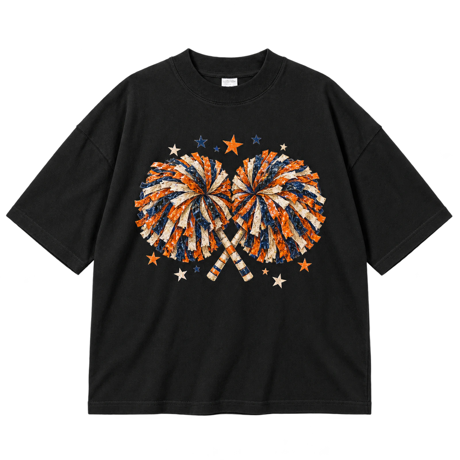
Pom-poms introduce movement and cheer identity into a cheer T-shirt design while leaving room for a team name or short phrase. Large, simplified strands reproduce more clearly than clusters of tiny lines at normal print dimensions. Positioning the pom-poms beside a wordmark or around a cheer pose keeps the composition energetic without obscuring the text. Screen print or DTF suits an 8 to 12-inch graphic, while embroidery needs broader, simpler shapes.
Key Features: Pom-poms, visual movement, team wording, simplified strands, school colors, and spirited composition.
Best For: Cheer teams, youth squads, cheer camps, cheerleader shirts, cute cheer apparel, and spirit wear.
Popular directions:
- Crossed pom-poms: Place two simplified graphics behind the team name.
- Team-color pair: Match each pom-pom to established squad colors.
- Cheer pose: Combine the graphics with a simple cheerleader silhouette.
- Star accents: Add a small number of stars around the composition.
- Central wordmark: Position CHEER between two pom-poms.
- Personalized layout: Add a name, number, or year beneath the main artwork.
Cheer Bow Design
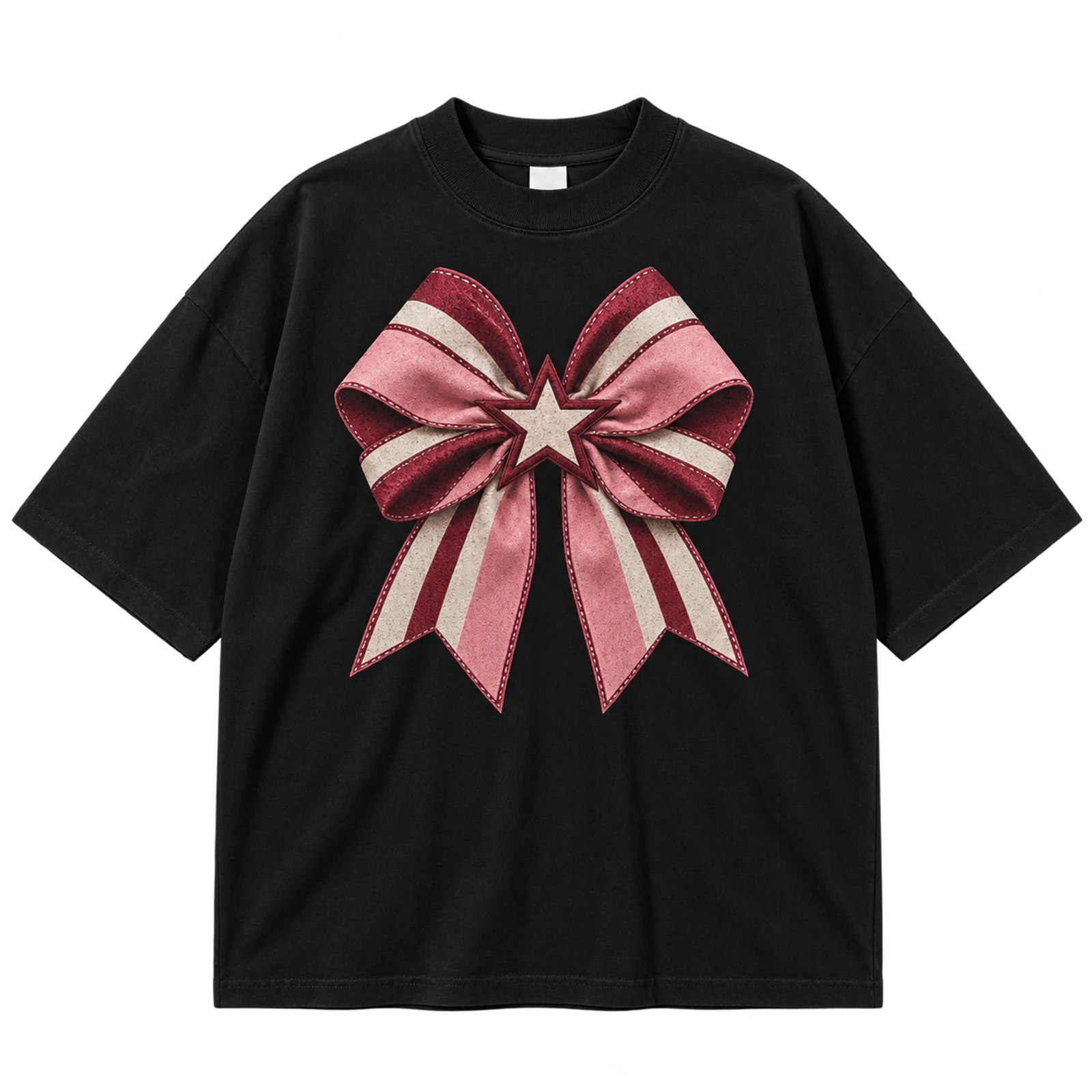
A bow can become the central decorative element of a cheer T-shirt design while still carrying recognizable team details. School colors, initials, a mascot mark, or small typography can appear within or around the bow without obscuring its shape. The concept can fill an 8 to 12-inch centered area or shrink into a compact chest emblem. DTF and screen print support patterned versions, while embroidery works better with a simplified bow silhouette.
Key Features: Cheer bow, team colors, decorative styling, initials, school identity, and flexible placement.
Best For: Cheerleader shirts, youth teams, cheer camps, personalized apparel, cute cheer shirts, and spirit wear.
Popular directions:
- Team-color bow: Build the graphic from established school colors.
- Initial bow: Place squad or school initials inside the center knot.
- Mascot accent: Add a small mascot mark without crowding the shape.
- Name treatment: Personalize the composition with a cheerleader name.
- Star details: Use limited stars around the bow for added decoration.
- Bow wordmark: Pair the symbol with CHEER or the squad name.
Coquette Cheer Design
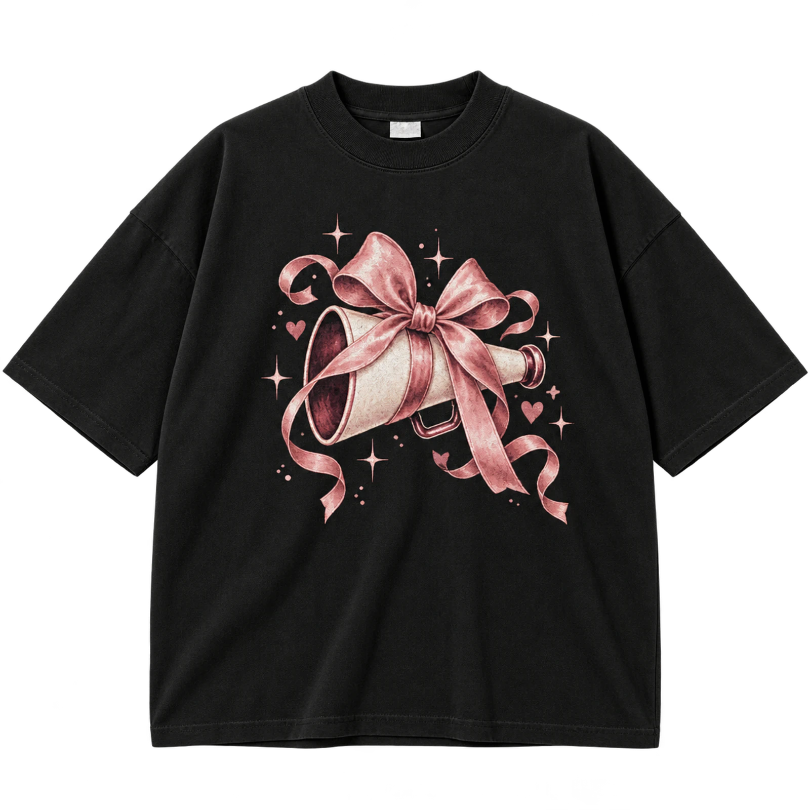
A coquette cheer T-shirt design combines bows, ribbons, hearts, soft script, and cheer symbols within a playful decorative style. Grouping these elements around one team wordmark or prominent bow prevents small details from spreading across the entire composition. Controlled spacing keeps the squad identity visible while preserving the softer visual treatment. DTF and DTG can reproduce detailed decorations, while embroidery should focus on one simplified bow or wordmark.
Key Features: Bows, ribbons, hearts, soft script, playful details, and clear cheer identity.
Best For: Cute cheer shirts, cheerleader apparel, senior designs, personalized shirts, cheer moms, and decorative spirit wear.
Popular directions:
- Bow and script: Combine one prominent bow with flowing cheer lettering.
- Ribbon frame: Use ribbons to surround the team name.
- Heart accents: Position small hearts around a clear focal word.
- School-color styling: Adapt the decorative palette to the team colors.
- Personalized bow: Add a name or initials below the main graphic.
- Mascot detail: Include one small school mark within the decorative layout.
Cheer Pennant Design
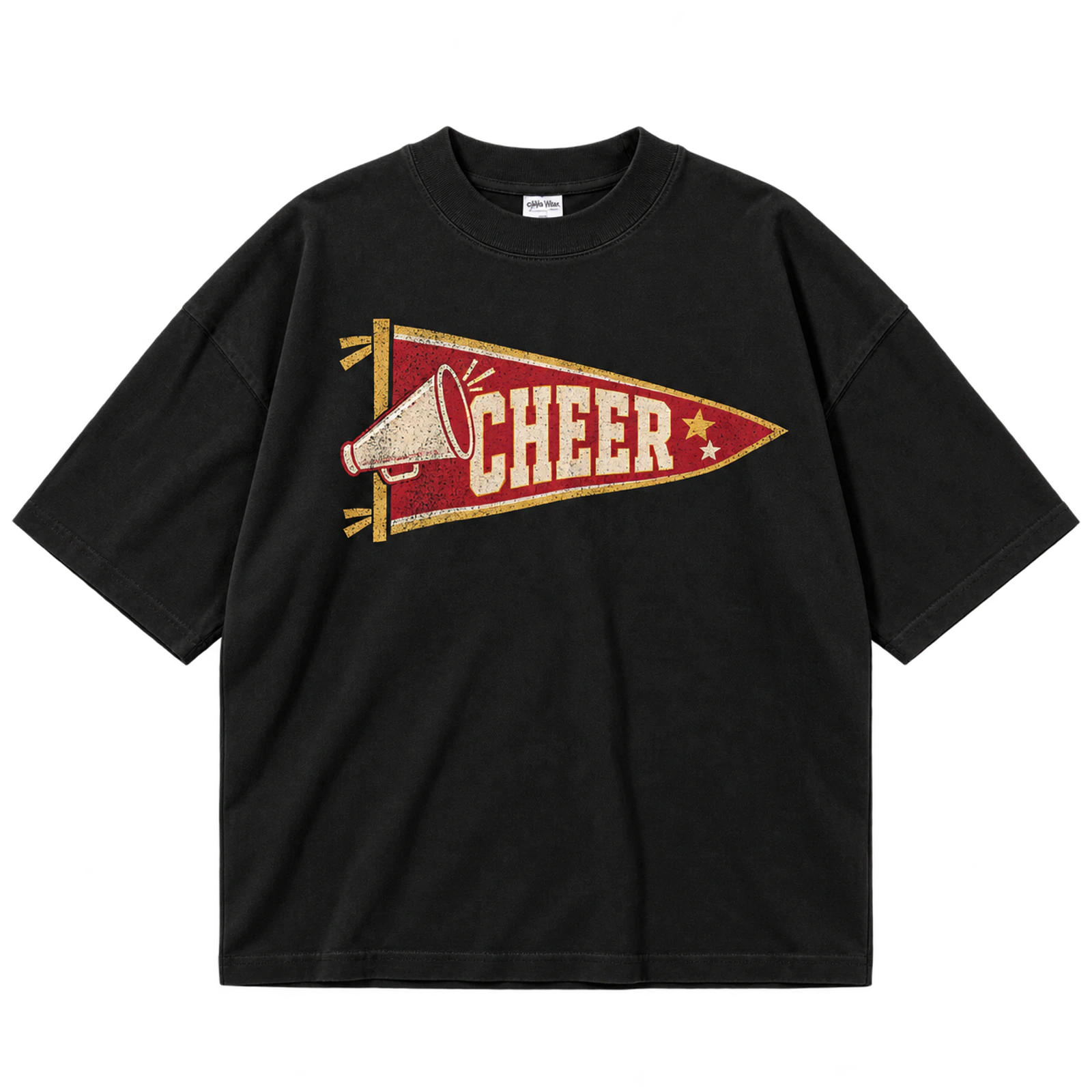
A pennant gives a cheer T-shirt design a contained graphic area for the team name, school initials, mascot, or CHEER wording. Its tapered shape creates a structured connection with traditional school-spirit graphics. Keeping the lettering large prevents the narrow end of the pennant from reducing readability. Screen print suits a 6 to 10-inch version, while patches or embroidery can reproduce a simplified pennant mark.
Key Features: Pennant shape, contained typography, school initials, team colors, structured layout, and spirit-wear styling.
Best For: Cheer teams, school spirit shirts, game day apparel, varsity designs, cheer camps, and team merchandise.
Popular directions:
- Team pennant: Fit the squad name inside the main shape.
- School pennant: Use the school name and established colors.
- Mascot mark: Pair a compact mascot with readable lettering.
- Initial design: Give large school initials most of the pennant space.
- Vintage treatment: Add restrained distressing to the typography.
- Cheer pennant: Combine CHEER with a small star or megaphone.
Cheer Sunburst Design
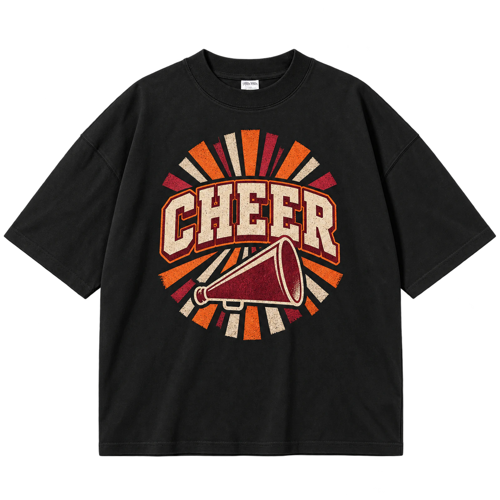
A sunburst cheer T-shirt design uses radiating lines to create movement around a central wordmark, mascot, or megaphone. The rays should remain secondary so they guide attention toward the main cheer identity rather than competing with it. Simple spacing between the lines also preserves negative space around the focal element. Screen print or DTF suits an 8 to 12-inch composition better than detailed embroidery.
Key Features: Sunburst rays, central focal point, visual movement, cheer typography, balanced spacing, and team colors.
Best For: Retro cheer shirts, school spirit apparel, cheer teams, camp shirts, game day designs, and team merchandise.
Popular directions:
- CHEER burst: Place the main word directly at the center.
- Mascot burst: Build the rays around a school mascot.
- Megaphone center: Use the cheer symbol as the focal mark.
- Retro palette: Combine the rays with warm vintage-inspired colors.
- Team-name burst: Give the squad name priority over the surrounding lines.
- Star details: Insert a few stars between selected rays.
Cheer Star and Lightning Graphic
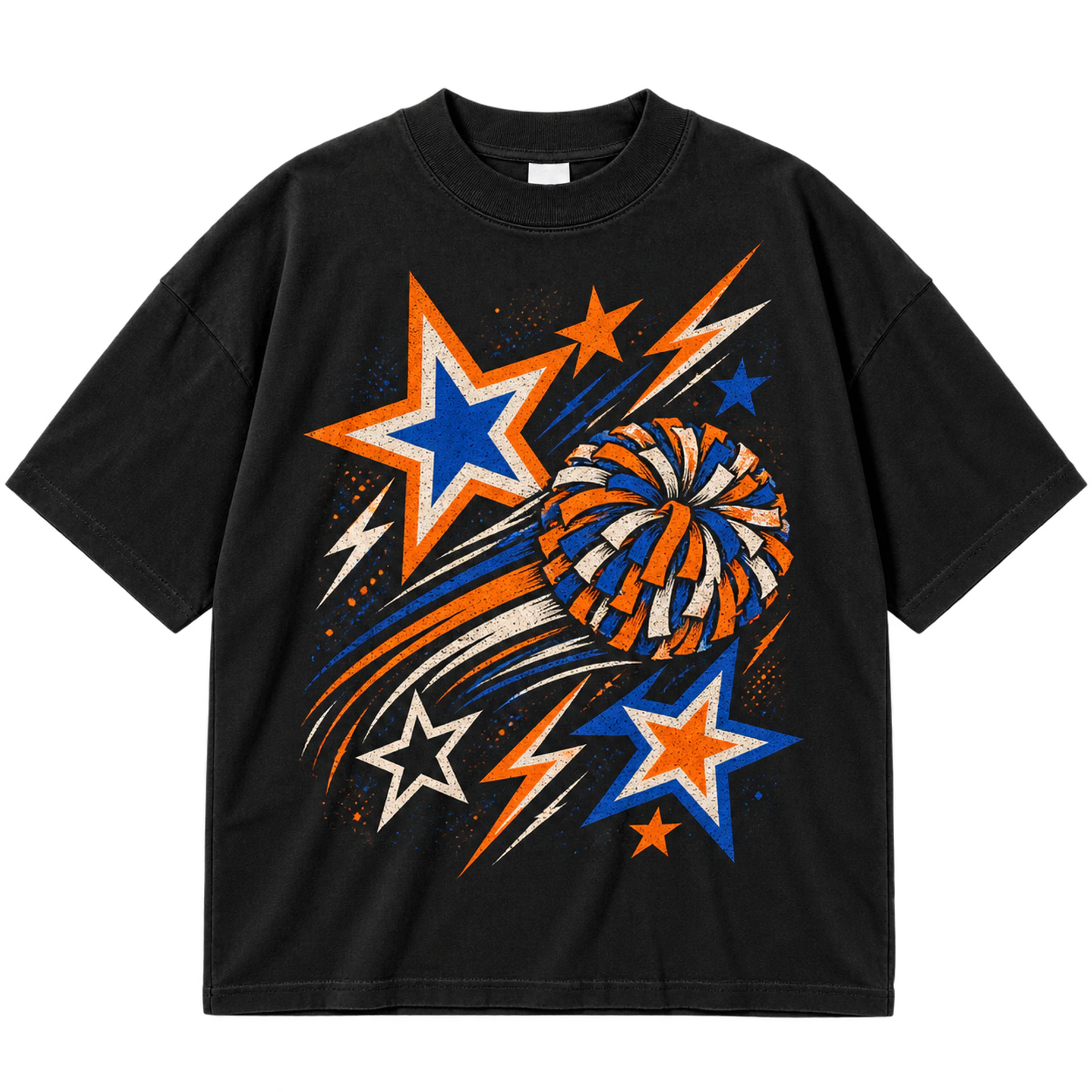
Stars and lightning bolts give a cheer T-shirt design energetic supporting shapes around one primary team identifier. The symbols can frame CHEER, a mascot, or the squad name while filling open areas without requiring another major illustration. Coordinated school colors and controlled scale keep the composition readable and balanced. Screen print, DTF, or selective puff print works well across an 8 to 12-inch chest area.
Key Features: Stars, lightning bolts, motion elements, bold typography, school colors, and single focal point.
Best For: Cheer teams, competition shirts, cheer camps, game day apparel, spirit wear, and bold cheer designs.
Popular directions:
- Lightning wordmark: Place bolts around the primary cheer wording.
- Star typography: Use stars to frame the squad name.
- Mascot graphic: Combine both symbols around a recognizable mascot.
- Team-color accents: Coordinate the shapes with established school colors.
- Retro treatment: Add distressed lettering for a vintage variation.
- Puff details: Raise selected stars or letters rather than the full composition.
Floral Cheer Design
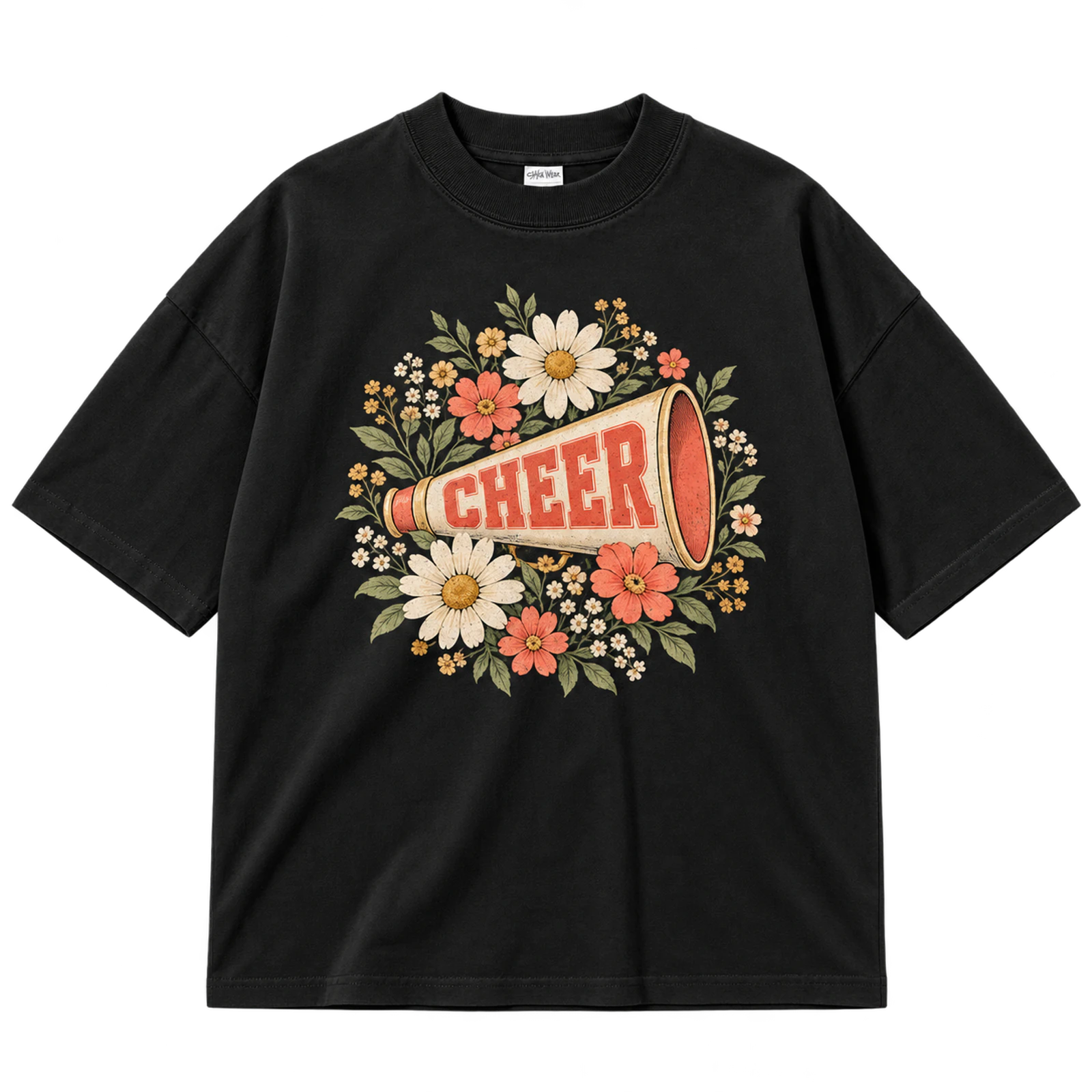
A floral cheer T-shirt design uses flowers to frame a team wordmark, mascot, bow, or megaphone without replacing the cheer identity as the focal point. Petals and stems can follow the outer edges of the composition while team colors connect the decorative treatment with the squad. Keeping floral details secondary preserves readable typography and recognizable cheer symbols. DTF or DTG suits detailed artwork, while embroidery requires thicker petals and simplified stems.
Key Features: Floral framing, cheer typography, team symbols, coordinated colors, decorative detail, and clear hierarchy.
Best For: Cheerleader shirts, senior apparel, personalized designs, cute cheer shirts, cheer moms, and spirit wear.
Popular directions:
- Floral wordmark: Surround CHEER or the team name with simple flowers.
- Bow and flowers: Use floral details to frame a team-color bow.
- Mascot floral: Keep the mascot central and flowers secondary.
- Megaphone frame: Arrange flowers around a recognizable cheer symbol.
- Personalized floral: Incorporate a name within the composition.
- School-color flowers: Coordinate selected petals with the team palette.
Roses Cheer Design
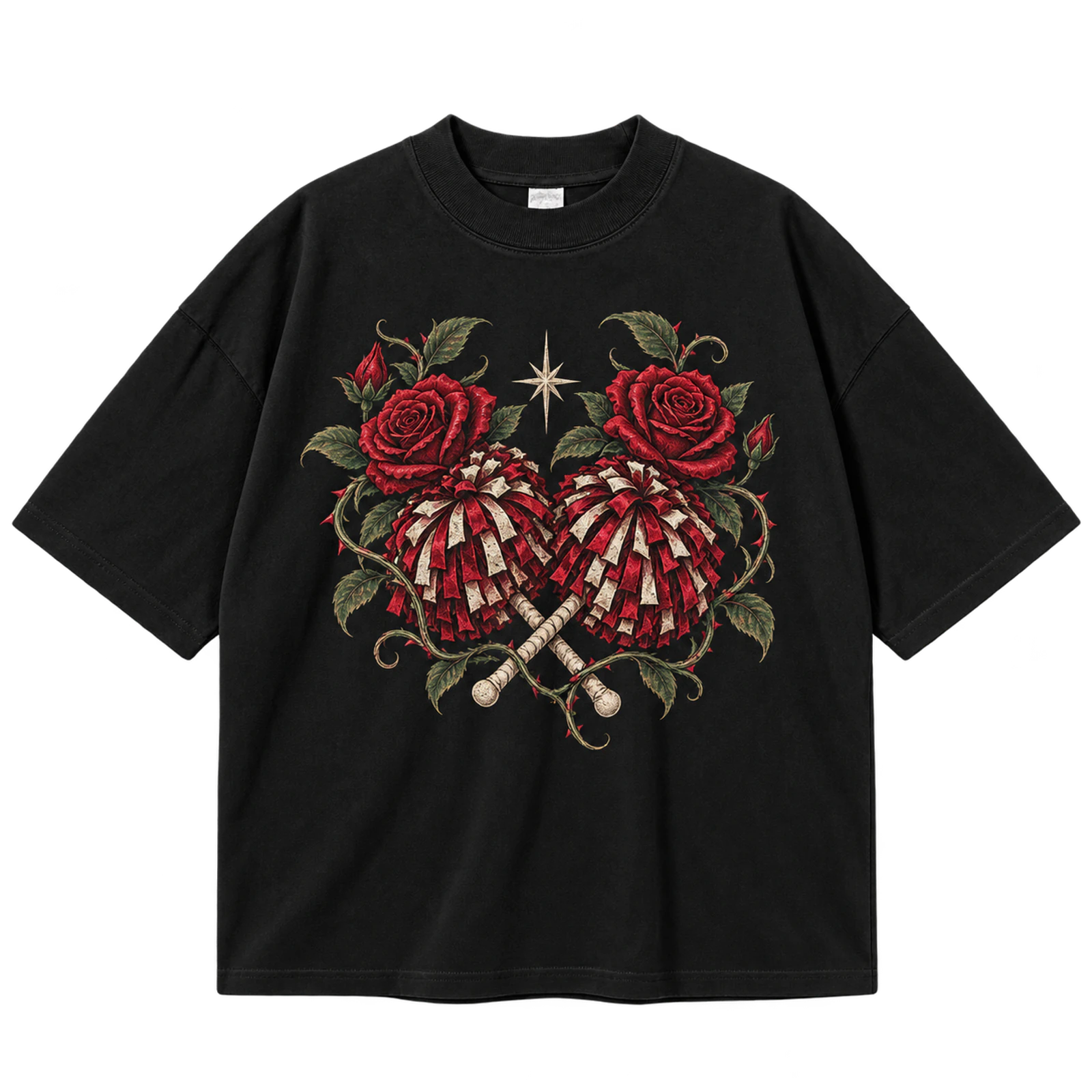
Roses give a floral cheer T-shirt design a defined decorative frame around a wordmark, mascot, bow, or megaphone. Placing the flowers around the outer edges keeps the central cheer element unobstructed. An 8 to 12-inch area gives petals and outlines enough scale to remain distinct after printing. DTG, DTF, or screen print can retain fuller artwork, while embroidery needs thicker shapes and reduced detail.
Key Features: Rose graphics, cheer focal point, decorative framing, team colors, readable composition, and floral detail.
Best For: Senior cheer shirts, cheerleader apparel, personalized designs, cute cheer shirts, team merchandise, and spirit wear.
Popular directions:
- Rose wordmark: Place roses around the main cheer lettering.
- Mascot roses: Frame the mascot without covering recognizable features.
- Bow and roses: Combine a large bow with limited floral details.
- Megaphone roses: Use flowers to surround a simple cheer icon.
- Personalized layout: Add a name or graduation year beneath the artwork.
- Team-color roses: Adapt the floral palette to the squad identity.
3D Cheer Typography
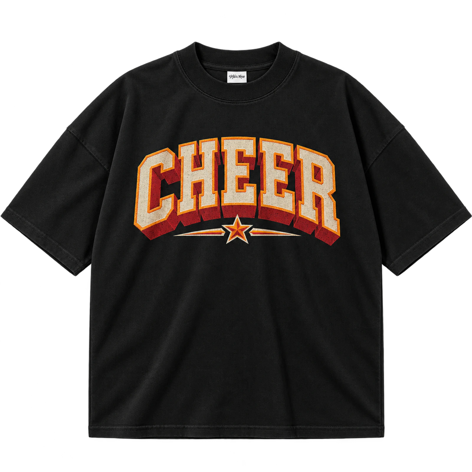
A 3D cheer T-shirt design uses shadows, extrusions, and layered outlines to create visual depth around bold cheer typography. CHEER, the school name, or squad name should remain readable before dimensional effects are added around each letter. Limiting the number of layers prevents the artwork from becoming dense at an 8 to 12-inch print size. DTF, DTG, or screen print can reproduce the effect more accurately than detailed embroidery.
Key Features: Dimensional lettering, shadows, extrusion, layered outlines, bold wordmark, and visual depth.
Best For: Cheer teams, competition shirts, camp apparel, game day designs, school spirit wear, and bold cheer graphics.
Popular directions:
- Extruded CHEER: Extend letter shapes backward to simulate depth.
- Offset shadow: Place a strong shadow behind the primary wording.
- Layered outline: Build controlled borders around thick lettering.
- Team-color depth: Assign coordinated colors to separate dimensional layers.
- Arched 3D text: Apply the effect to a curved squad name.
- Mascot pairing: Keep a small mascot secondary to the dimensional typography.
Cheer Game Day Design
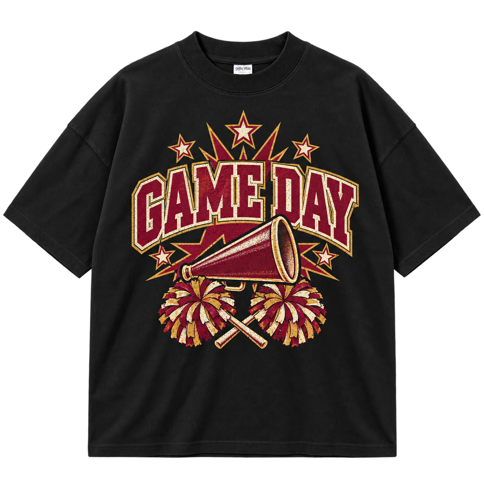
A game day cheer T-shirt design combines event wording with a team name, mascot, bow, megaphone, or established school colors. GAME DAY can lead the hierarchy while the team identifier clarifies who the wearer supports. Limiting supporting graphics keeps the shirt useful across games, pep rallies, and school events. Screen print, DTF, or puff print suits larger compositions, while embroidery works for a compact team mark.
Key Features: Game Day wording, event context, team identity, school colors, cheer symbols, and bold hierarchy.
Best For: Cheer teams, school games, pep rallies, families, student spirit wear, and game day apparel.
Popular directions:
- Game Day wordmark: Give the event phrase the largest type size.
- Mascot version: Add the school mascot beneath the main wording.
- Megaphone layout: Use one cheer symbol to reinforce the theme.
- Bow accent: Pair the phrase with a team-color bow.
- School identifier: Add the school or squad name as supporting text.
- Puff treatment: Raise GAME DAY while leaving secondary text flat.
Cheer Camp Design
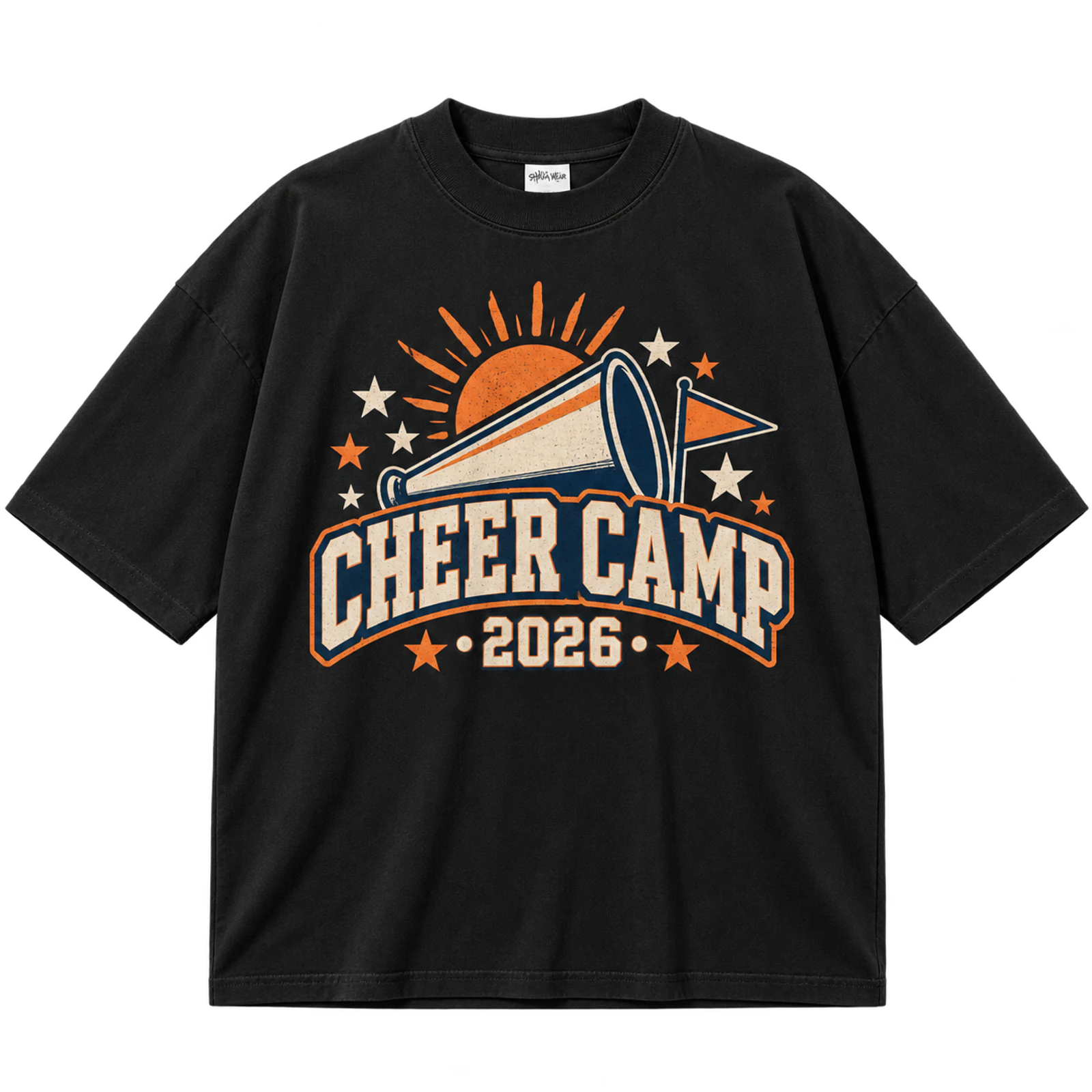
A camp cheer T-shirt design identifies the event through a camp name, year, squad, mascot, or short cheer phrase. Consistent colors and typography help participants from the same team or camp group wear a coordinated design throughout repeated activities. An 8 to 12-inch front print provides enough visibility without requiring a complex commemorative composition. Screen printing suits larger quantities, while compact embroidery can identify coaches or staff.
Key Features: Camp name, event year, squad identity, matching layout, practical graphics, and group apparel.
Best For: Cheer camps, youth squads, team camps, coaches, staff members, and matching group shirts.
Popular directions:
- Camp wordmark: Make the event name the primary identifier.
- Year design: Add the camp year beneath the main lettering.
- Squad variation: Replace one line of text for different camp groups.
- Mascot version: Pair the event name with a team mascot.
- Short slogan: Include one concise cheer phrase as secondary wording.
- Staff mark: Add a compact coach or staff identifier.
Cheer Competition Design
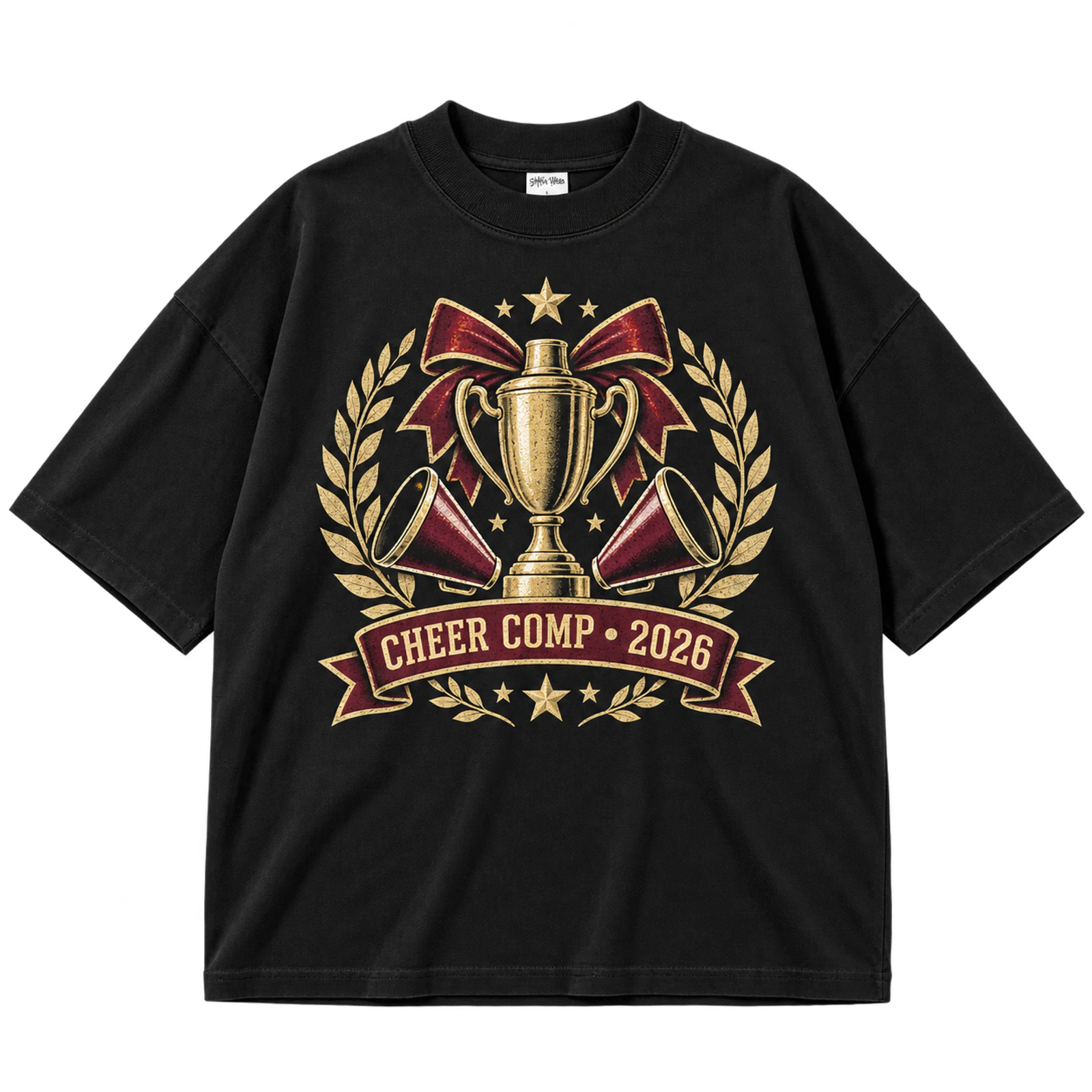
Competition cheer T-shirt designs feature the squad name alongside event details such as the competition name, year, trophy, and stars. Keeping the team name dominant prevents commemorative information from crowding the composition. An 8 to 12-inch print area gives the text and symbols enough room for a clear hierarchy. Screen print or DTF suits the primary artwork, while metallic details can accent selected words or graphics.
Key Features: Competition identity, squad name, event year, trophy, stars, and coordinated colors.
Best For: Cheer competitions, competing squads, coaches, families, event merchandise, and matching team shirts.
Popular directions:
- Competition title: Pair the event name with a larger squad identifier.
- Trophy graphic: Use one trophy as the primary supporting symbol.
- Star frame: Arrange stars around the team and event wording.
- Year detail: Add the competition year beneath the main graphic.
- Mascot version: Include the team mascot without reducing name visibility.
- Metallic accent: Apply reflective treatment to selected details only.
Cheer Nationals Design
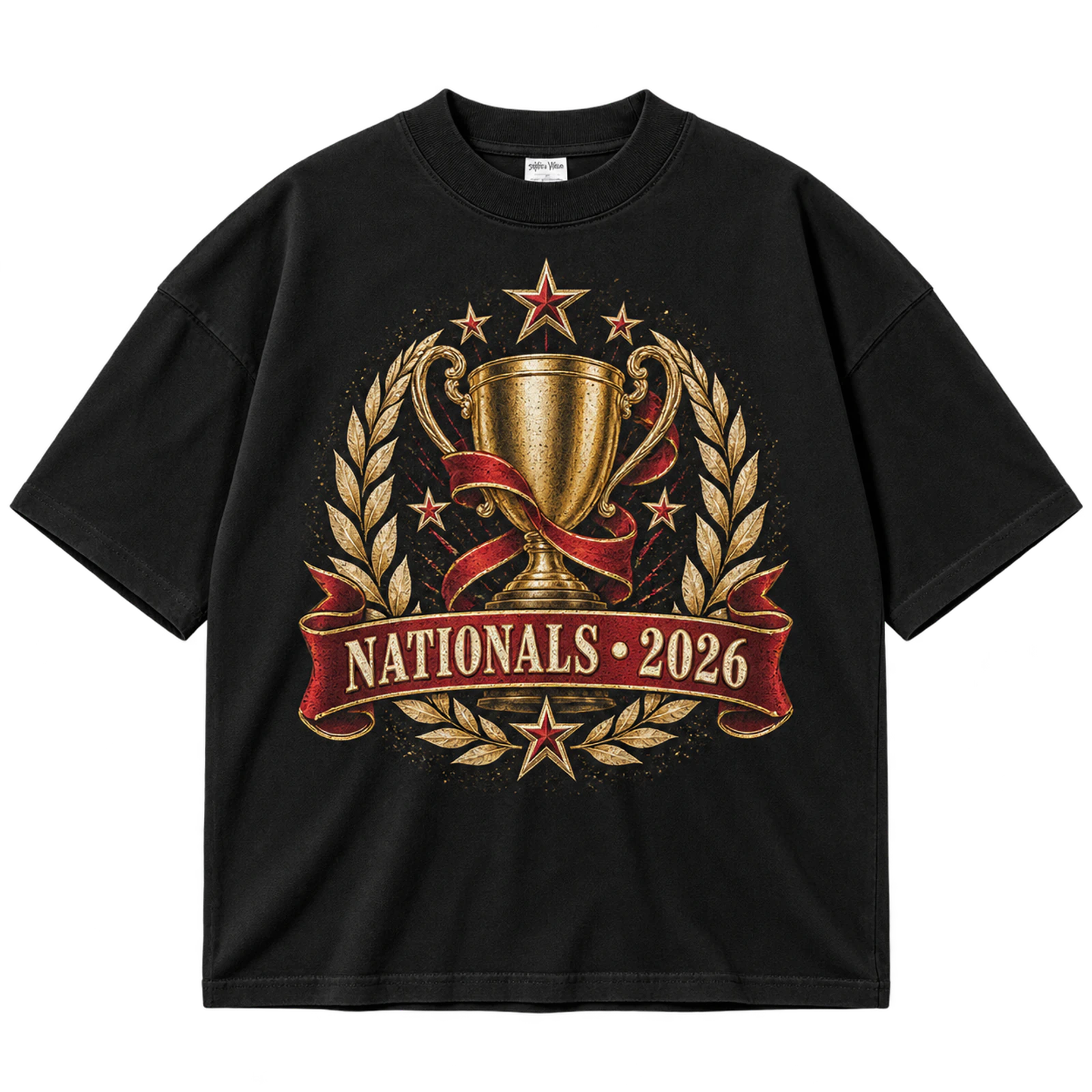
A Nationals cheer T-shirt design combines the team identity with commemorative details such as the event name, year, location, trophy, or stars. The squad name should remain prominent while event information occupies smaller supporting positions. A large chest or back graphic provides enough space to separate these elements clearly. Screen print and DTF suit the main artwork, while foil or metallic accents can emphasize selected details.
Key Features: Nationals wording, team name, year, location, competition graphics, and commemorative layout.
Best For: Nationals teams, competition squads, coaches, families, senior cheerleaders, and event merchandise.
Popular directions:
- Nationals title: Combine the event wording with a prominent squad name.
- Location detail: Add the host city beneath the primary typography.
- Year mark: Include the competition year as a secondary identifier.
- Trophy design: Position a simple trophy between event and team wording.
- Star layout: Use stars to balance the composition.
- Metallic treatment: Highlight one word, outline, or symbol with reflective detail.
Cheer Practice Shirt Design
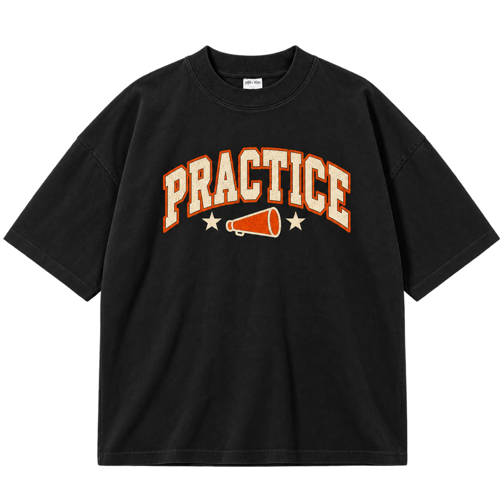
A practice cheer T-shirt design favors simple team identification, readable typography, and practical placement for repeated wear. Team initials, a mascot, squad name, or short phrase can occupy a compact chest area or a 6 to 10-inch centered graphic. Limited colors and uncomplicated artwork keep matching practice shirts visually consistent. Screen print and DTF suit everyday versions, while embroidery works for a small team mark.
Key Features: Practical design, team initials, simple graphics, readable wording, compact placement, and squad identity.
Best For: Cheer practice, training sessions, team workouts, cheer camps, coaches, and matching practice shirts.
Popular directions:
- Team initials: Keep the front graphic compact and recognizable.
- Simple wordmark: Use the squad name without extra decoration.
- Mascot mark: Reduce the school mascot to a clear emblem.
- Short phrase: Pair a concise cheer message with the team name.
- Left-chest design: Position a small identifier on the upper front.
- Matching system: Keep placement and typography consistent across the squad.
Senior Cheer Design
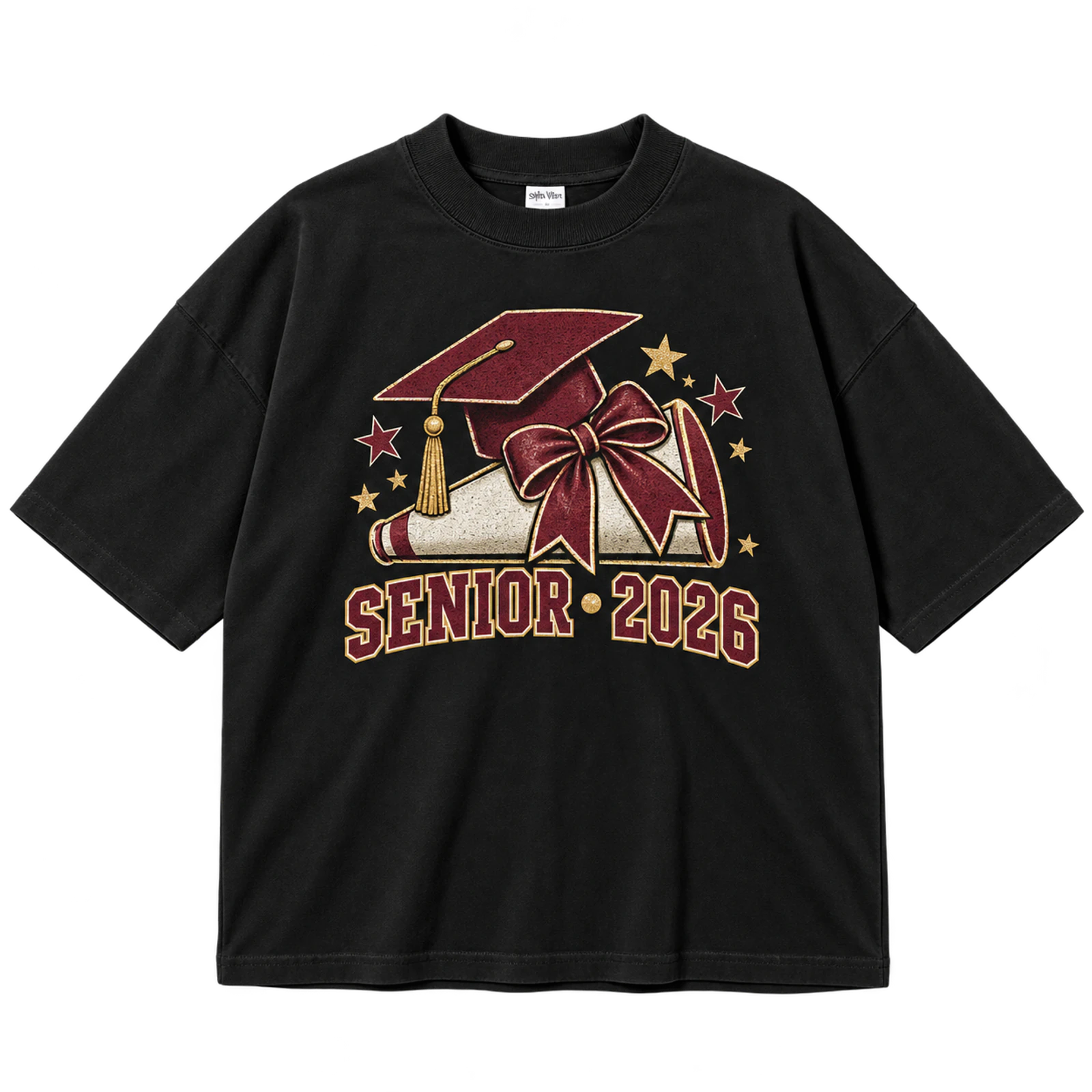
A senior cheer T-shirt design commemorates graduation status through SENIOR wording, a class year, cheerleader name, or squad identity. A bow, mascot, or star can support the main message without competing with the personalized information. Matching typography and team colors across individual shirts keeps the senior group coordinated. DTF or screen print suits an 8 to 12-inch composition, while small names and years can also be embroidered.
Key Features: Senior status, graduation year, personalized name, squad identity, commemorative details, and team colors.
Best For: Senior cheerleaders, senior night, graduation season, cheer teams, families, and commemorative apparel.
Popular directions:
- Senior wordmark: Make SENIOR the main visual identifier.
- Graduation year: Give the class year a prominent supporting position.
- Name personalization: Add each cheerleader name without changing the core layout.
- Bow detail: Pair senior wording with one team-color bow.
- Mascot version: Include the school mascot beside the year.
- Two-sided layout: Keep the team mark in front and senior details on the back.
Cheer Mom Design
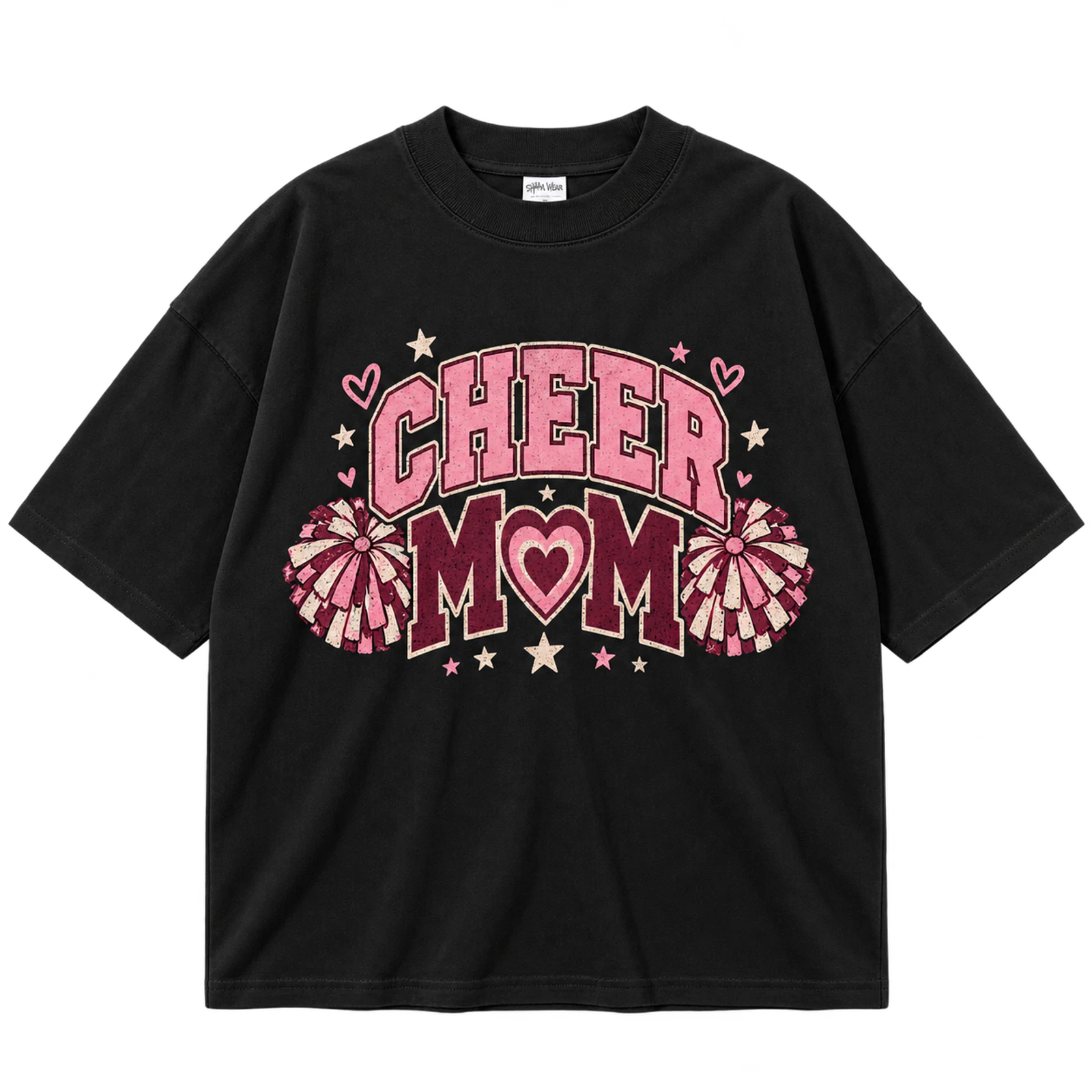
A Cheer Mom cheer T-shirt design makes the supporter identity prominent while using team graphics to connect the wearer with the squad. A bow, mascot, heart, or game day symbol can accompany the wording, and school colors can coordinate the shirt with other spirit wear. Keeping CHEER MOM large prevents decorative elements from overtaking the main message. Screen print, DTF, puff print, or simplified embroidery can support the concept.
Key Features: Cheer Mom wording, supporter identity, school colors, cheer graphics, readable typography, and team connection.
Best For: Cheer moms, competition families, game day supporters, senior night, school spirit wear, and team events.
Popular directions:
- Bold Cheer Mom: Use the supporter phrase as the main wordmark.
- Bow graphic: Add one bow in established team colors.
- Mascot version: Pair the wording with the school mascot.
- Heart accent: Use limited hearts around the main phrase.
- Game day treatment: Add the team or event name below Cheer Mom.
- Personalized design: Include the cheerleader name or number as secondary text.
Cheer Dad Design
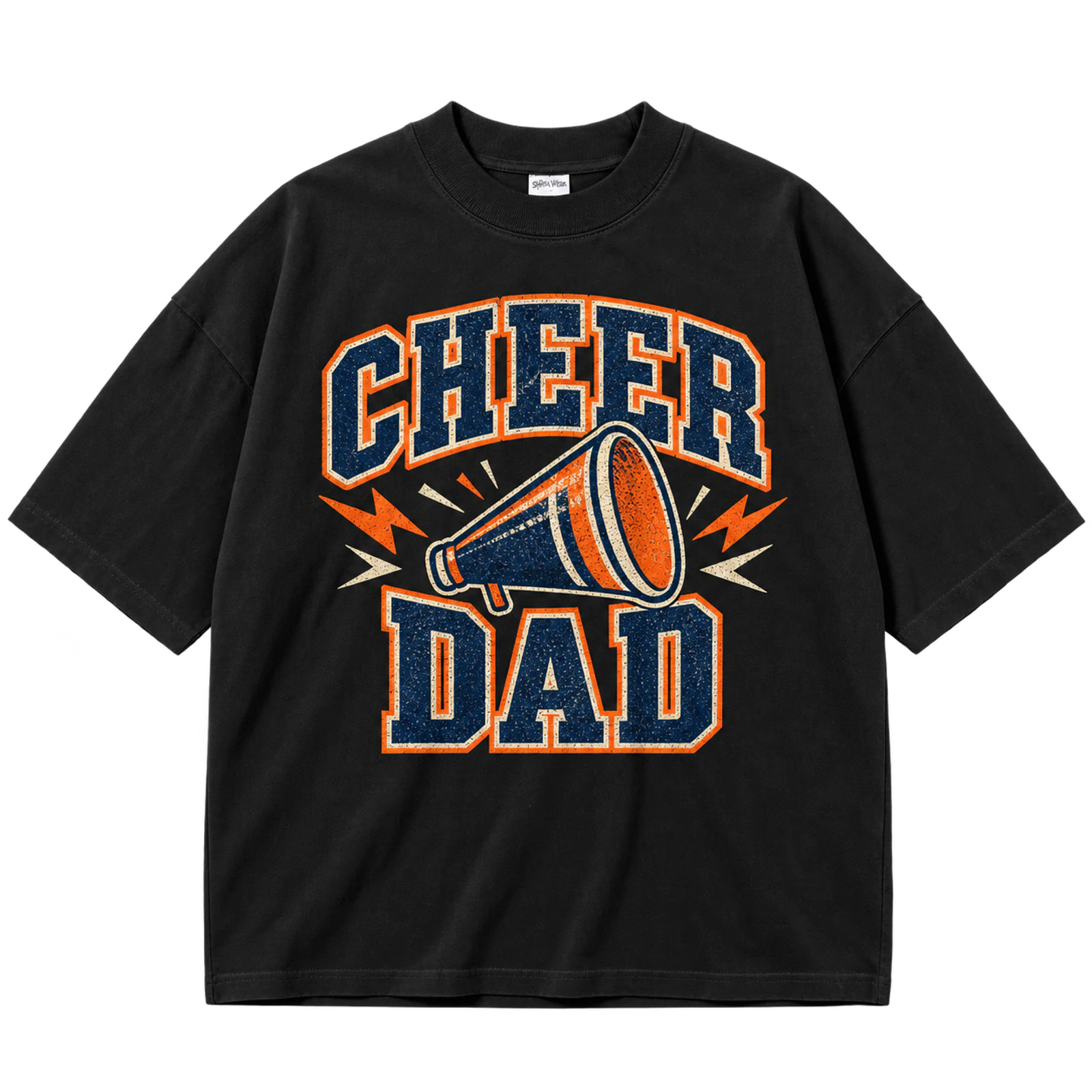
A Cheer Dad cheer T-shirt design uses athletic typography, team colors, and school identifiers to create a straightforward supporter shirt. The main phrase can pair with a mascot, school name, or initials while decorative elements remain limited. A 6 to 10-inch chest print provides enough room for readable wording and a compact team graphic. Screen print and DTF suit larger versions, while a smaller wordmark can be embroidered.
Key Features: Cheer Dad wording, athletic typography, school colors, team name, mascot, and supporter identity.
Best For: Cheer dads, competition families, game day supporters, school events, senior night, and spirit wear.
Popular directions:
- Varsity Cheer Dad: Set the phrase in thick athletic lettering.
- Team identifier: Add the squad or school name beneath it.
- Mascot pairing: Position the school mascot beside the wording.
- Initial graphic: Combine school initials with a smaller supporter label.
- Game day version: Add event wording without changing the main identity.
- Embroidered mark: Reduce the design to a compact chest treatment.
Cheer Coach Design
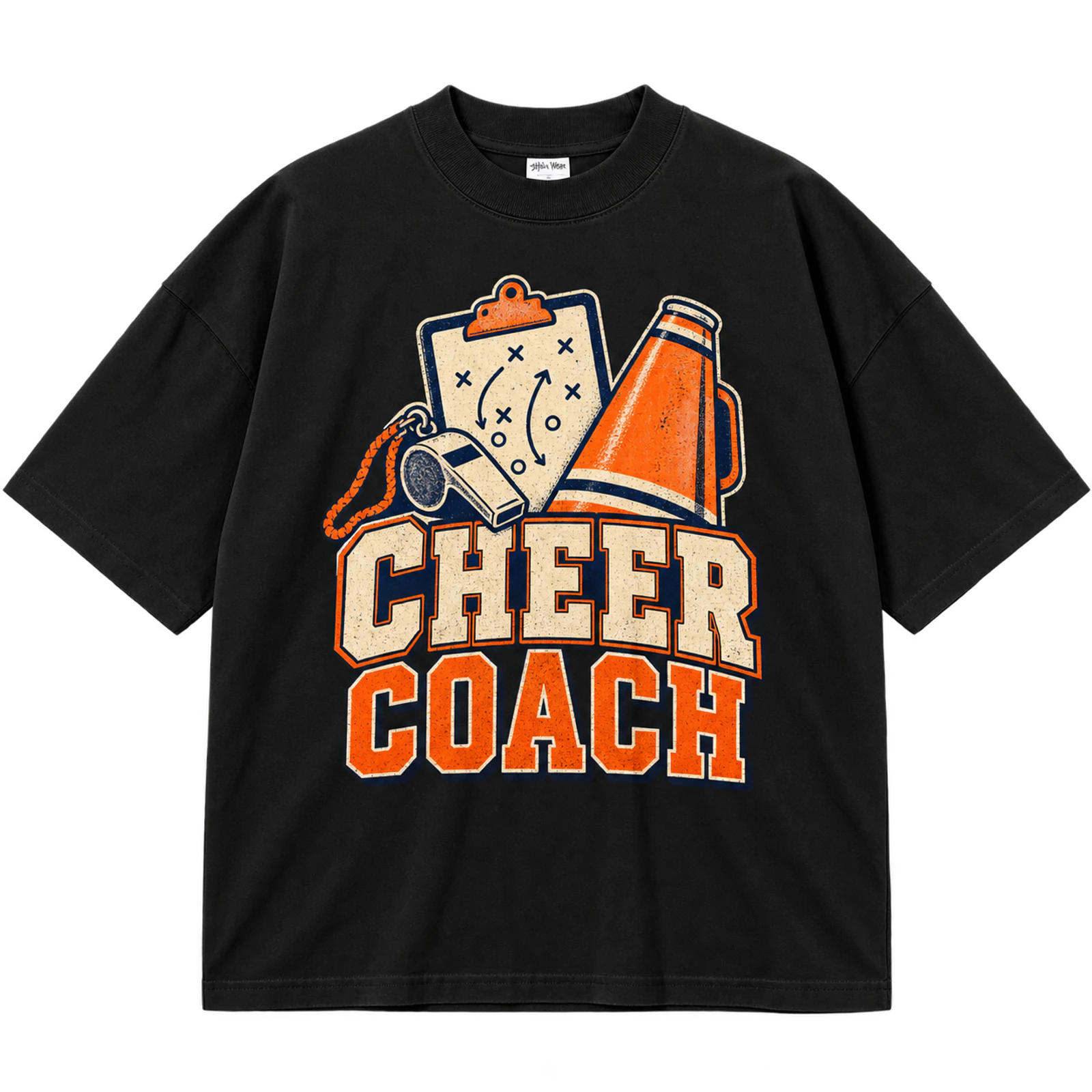
A coach cheer T-shirt identifies the wearer’s role and team affiliation by pairing COACH wording with the team name, school initials, mascot, or squad logo. A smaller chest placement creates a restrained staff look, while centered wording gives the role greater visibility at practices, camps, and competitions. Keeping the artwork simple also makes the shirt easy to coordinate with other team apparel. Screen print and embroidery both suit the simplified lettering and graphics.
Key Features: Coach identifier, team name, compact graphic, practical layout, school identity, and readable typography.
Best For: Head coaches, assistant coaches, cheer camps, practices, competitions, school events, and staff apparel.
Popular directions:
- Coach wordmark: Keep the role clear with straightforward typography.
- Team coach: Pair COACH with the squad name.
- Mascot mark: Add one simplified mascot below the wording.
- School initials: Use compact initials as the primary team identifier.
- Left-chest treatment: Embroider a small staff or team mark.
- Back identifier: Place COACH on the back with a restrained front logo.
Cheer Squad Design
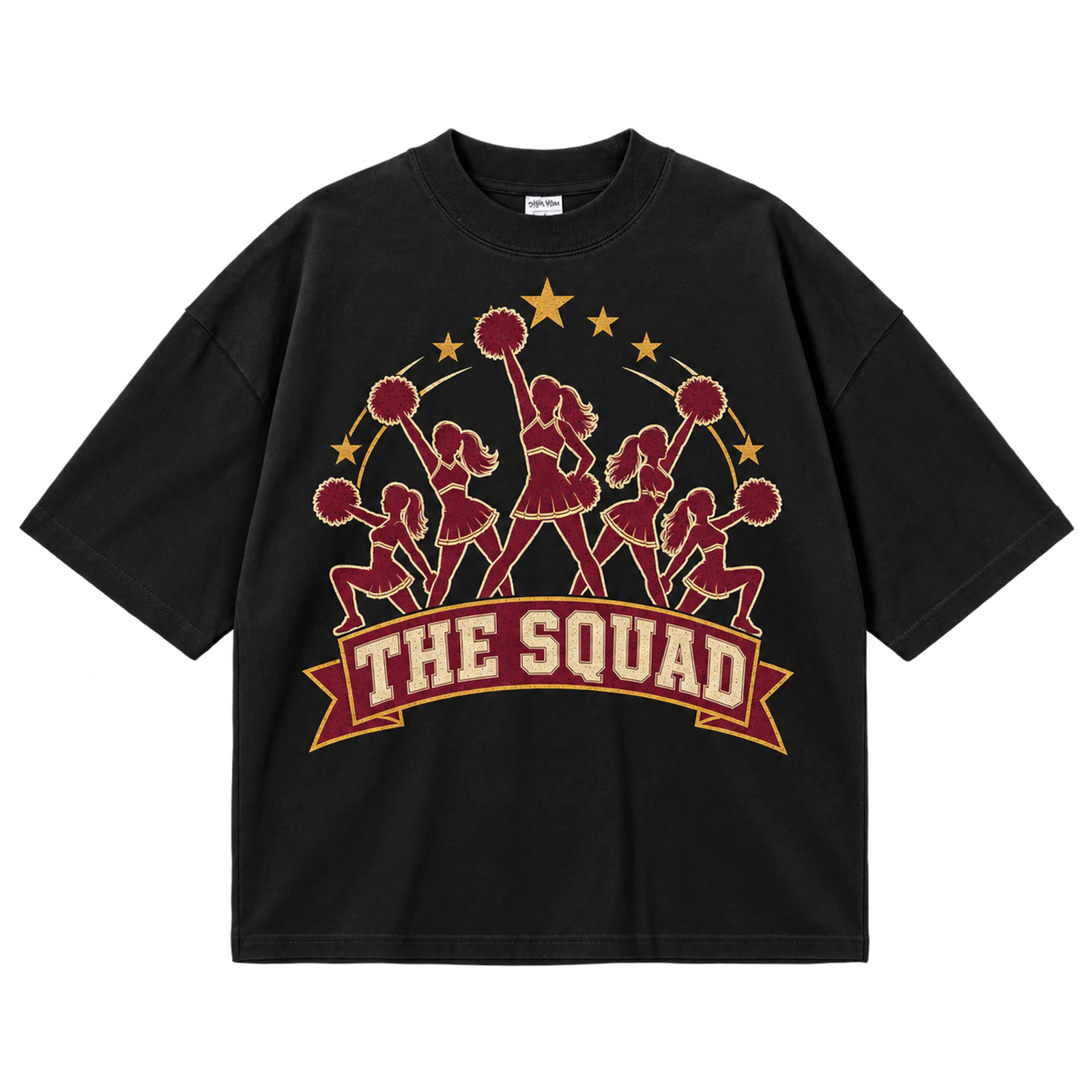
A squad cheer T-shirt design creates a shared group identity through matching typography, team colors, mascots, and consistent placement. The squad name can lead the composition while a school identifier or roster provides secondary information. Keeping scale and styling consistent across every shirt produces a coordinated appearance at practices, camps, and competitions. Screen print or DTF suits an 8 to 12-inch front graphic or coordinated front-and-back format.
Key Features: Squad name, matching design, team colors, consistent typography, mascot, and group identity.
Best For: Cheer squads, competition teams, cheer camps, practice groups, school teams, and matching apparel.
Popular directions:
- Squad wordmark: Make the team name the central element.
- Mascot version: Pair matching typography with a school mascot.
- Color system: Use the same established colors across every shirt.
- Front-back format: Split the identity between a small front and larger back.
- Roster variation: Add team names to the back while preserving the base design.
- Matching set: Keep scale, fonts, and placement identical across the group.
Cute Cheer Graphic
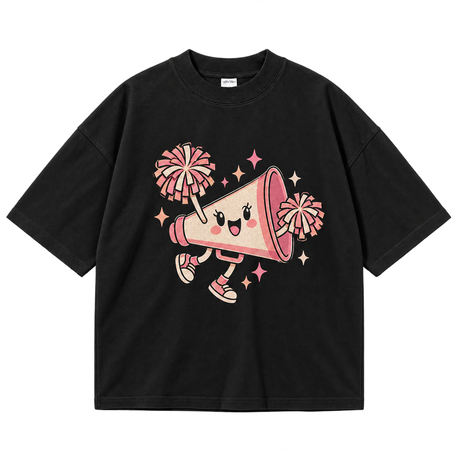
A cute cheer T-shirt design combines playful graphics such as bows, hearts, stars, smiley faces, or pom-poms with a clear cheer identifier. These small elements can frame a team name or CHEER wordmark rather than competing for equal attention. Generous spacing keeps the composition recognizable instead of cluttered. DTF or screen print can reproduce an 8 to 12-inch centered graphic with simple decorative shapes.
Key Features: Playful graphics, bows, hearts, stars, soft lettering, and recognizable cheer theme.
Best For: Youth cheer teams, cheerleader shirts, cheer camps, personalized apparel, cute cheer shirts, and spirit wear.
Popular directions:
- Smiley graphic: Pair a simple face with compact cheer wording.
- Bow design: Use one decorative bow as the focal icon.
- Heart layout: Frame the team name with a few heart shapes.
- Pom-pom version: Add paired pom-poms below playful lettering.
- Star accents: Scatter limited stars around the main wordmark.
- Personalized graphic: Place a name or initials beneath the central design.
Simple Cheer Design
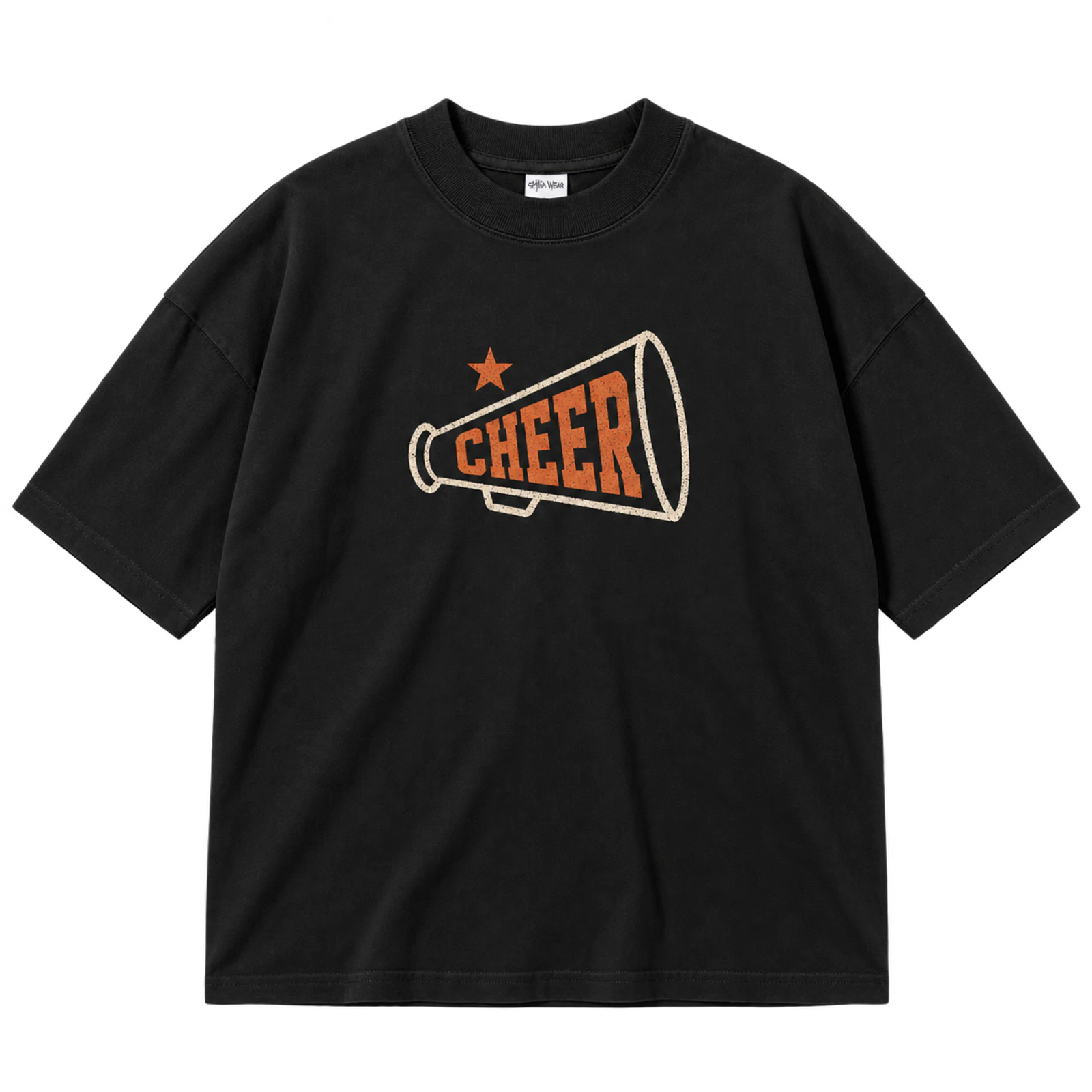
A simple cheer T-shirt design relies on negative space and one recognizable wordmark, mascot, bow, megaphone, or team symbol. Restrained colors and uncomplicated typography allow the central identity to remain clear without patterns or multiple effects. The artwork can occupy a compact 2 to 4-inch chest area or a 6 to 8-inch centered placement. Screen print and embroidery both suit the reduced amount of detail.
Key Features: Negative space, single focal element, simple typography, limited colors, compact placement, and clear identity.
Best For: Practice shirts, cheer teams, coaches, school spirit apparel, cheer camps, and minimalist cheer designs.
Popular directions:
- Simple CHEER: Use one bold word with no secondary illustration.
- Team initials: Create a compact mark from school or squad letters.
- Mascot emblem: Reduce the mascot to one recognizable graphic.
- Megaphone mark: Pair a small icon with short team wording.
- Bow mark: Use one team-color bow as the main visual.
- Left-chest logo: Keep the artwork compact with generous surrounding space.
Funny Cheer Typography
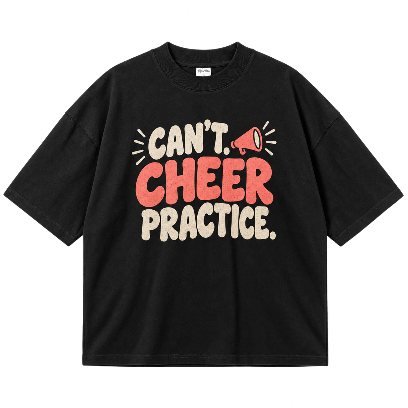
A funny cheer T-shirt design uses one short joke, cheer phrase, or piece of wordplay as its main focal point. A megaphone, pom-pom, or star can support the wording, but additional slogans and graphics should remain limited. Large typography keeps the humor readable at normal viewing distance. Screen print or DTF suits an 8 to 12-inch phrase-based layout, while long text is less suitable for embroidery.
Key Features: Cheer wordplay, short phrase, readable typography, single supporting graphic, clear hierarchy, and simple layout.
Best For: Cheer teams, camp shirts, practice apparel, cheer moms, cheer dads, coaches, and casual spirit wear.
Popular directions:
- Cheer wordplay: Center one short joke across the chest.
- Megaphone phrase: Add a single icon beneath the main wording.
- Pom-pom joke: Use paired pom-poms as restrained supporting graphics.
- Team humor: Adapt the phrase to the squad or school identity.
- Practice phrase: Base the joke on training or team routines.
- Parent version: Tailor the wording for Cheer Mom or Cheer Dad shirts.
Cheer Slogan Design
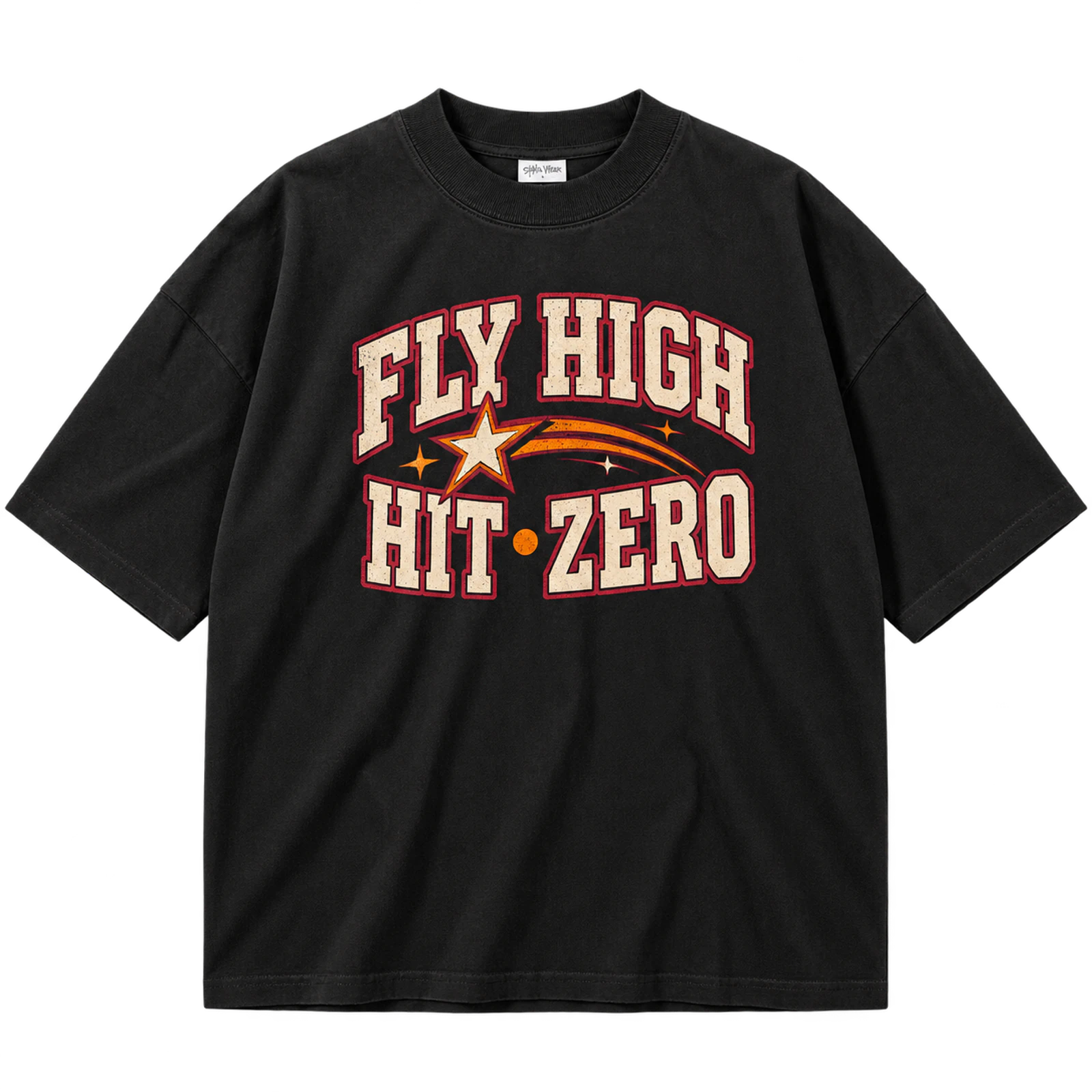
A slogan cheer T-shirt design makes a short cheer message the dominant element while team symbols provide secondary context. Clear line breaks can separate the slogan from a school name, squad name, mascot, bow, star, or megaphone. Team colors can emphasize selected words without introducing unnecessary font styles. Screen print, puff print, or DTF suits an 8 to 12-inch typography-led composition.
Key Features: Cheer slogan, text hierarchy, bold typography, team colors, supporting symbols, and clear line breaks.
Best For: Cheer teams, camp shirts, competition apparel, practice shirts, school events, and spirit wear.
Popular directions:
- Team slogan: Give the established squad phrase the largest text size.
- School message: Pair a short quote with the school name.
- Mascot support: Position one mascot beneath the wording.
- Bow accent: Add a small bow without interrupting the text.
- Star frame: Use stars to balance the edges of the composition.
- Puff emphasis: Raise only the most important word or phrase.
Cheer Era Design
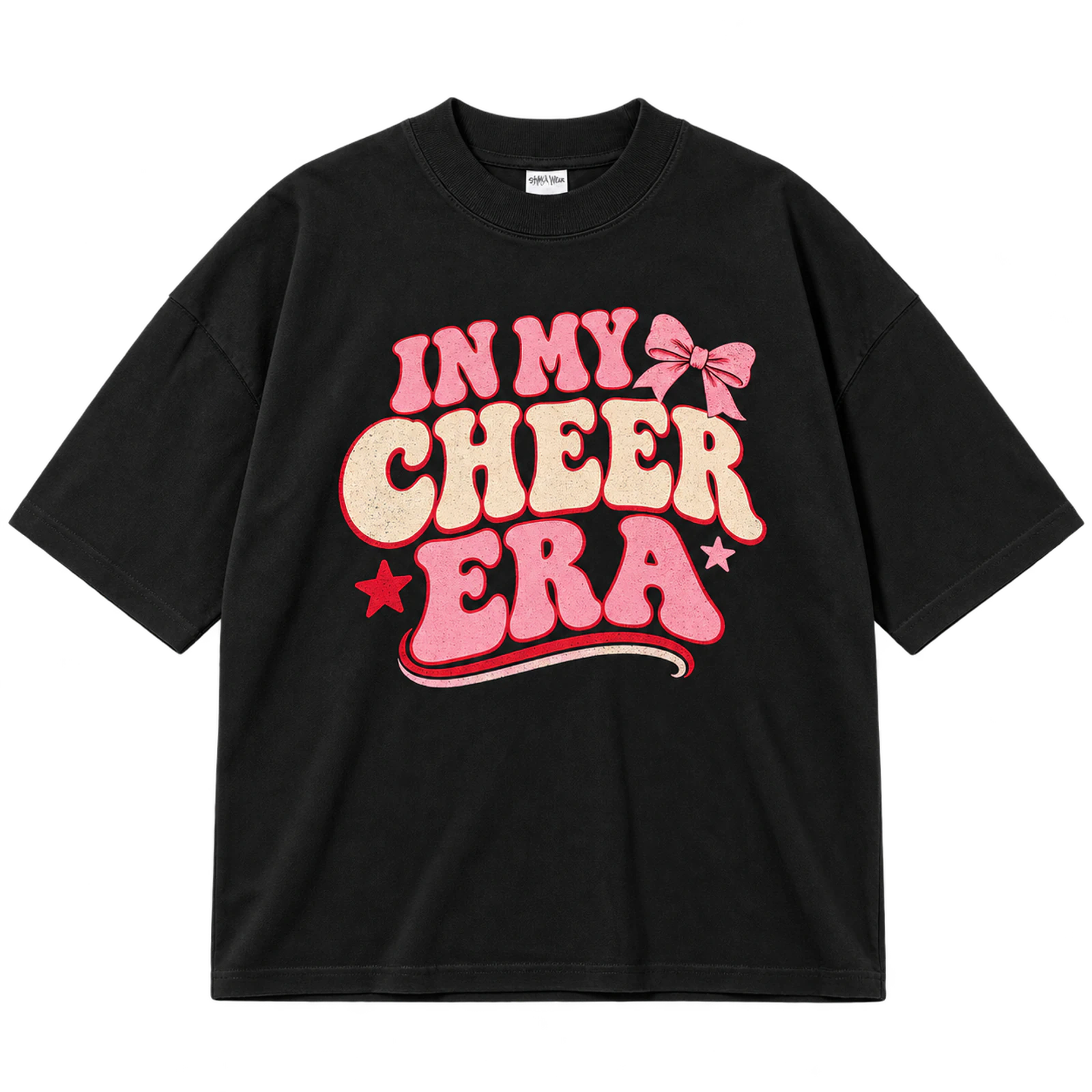
An Era-style cheer T-shirt design adapts contemporary phrase-based wording to a team, senior class, or school identity. Bows, stars, team colors, or the squad name can surround the phrase while the Era wording remains the visual anchor. Limiting decorative elements gives the typography enough space to stay readable. DTF, screen print, or puff print can reproduce an 8 to 12-inch version.
Key Features: Era-style phrase, cheer typography, team colors, bows, stars, and strong visual anchor.
Best For: Cheerleader shirts, senior cheer apparel, team shirts, cheer camps, personalized designs, and spirit wear.
Popular directions:
- Cheer Era: Make the phrase the largest element on the shirt.
- Team Era: Replace supporting text with the squad or school name.
- Bow treatment: Pair the phrase with one coordinated bow.
- Star details: Use a few stars to fill open areas.
- Senior Era: Add a graduation year beneath the wording.
- Puff version: Raise the focal phrase while keeping other details flat.
Glitter Cheer Design
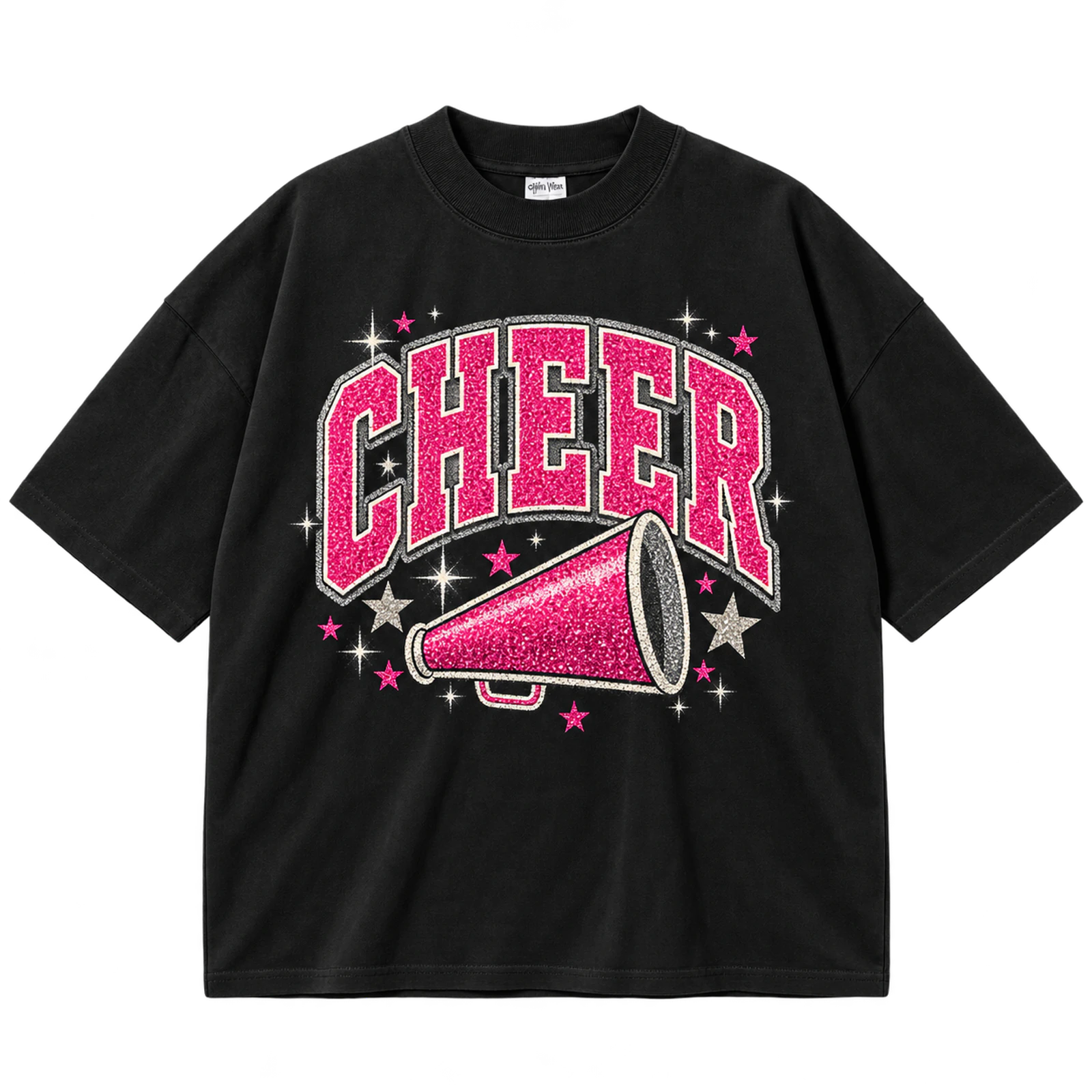
Glitter adds selective reflective detail to a cheer T-shirt design when it highlights focal words, bows, stars, numbers, or mascot accents. The underlying typography should remain readable without relying on the glitter effect for visibility. Limiting reflective coverage also preserves contrast between the main team identity and decorative elements. Glitter ink or vinyl can support this treatment across an 8 to 12-inch composition.
Key Features: Glitter accents, reflective texture, focal wording, cheer symbols, controlled coverage, and readable typography.
Best For: Competition shirts, cheer teams, cheerleader apparel, cheer moms, game day shirts, and decorative spirit wear.
Popular directions:
- Glitter wordmark: Apply the effect to CHEER or the squad name.
- Glitter bow: Give one bow a reflective finish.
- Star highlights: Use glitter on selected stars rather than every graphic.
- Mascot accent: Highlight one outline or recognizable mascot detail.
- Team-color glitter: Coordinate the reflective material with squad colors.
- Personalized number: Apply glitter to a name, number, or graduation year.
Metallic Cheer Design
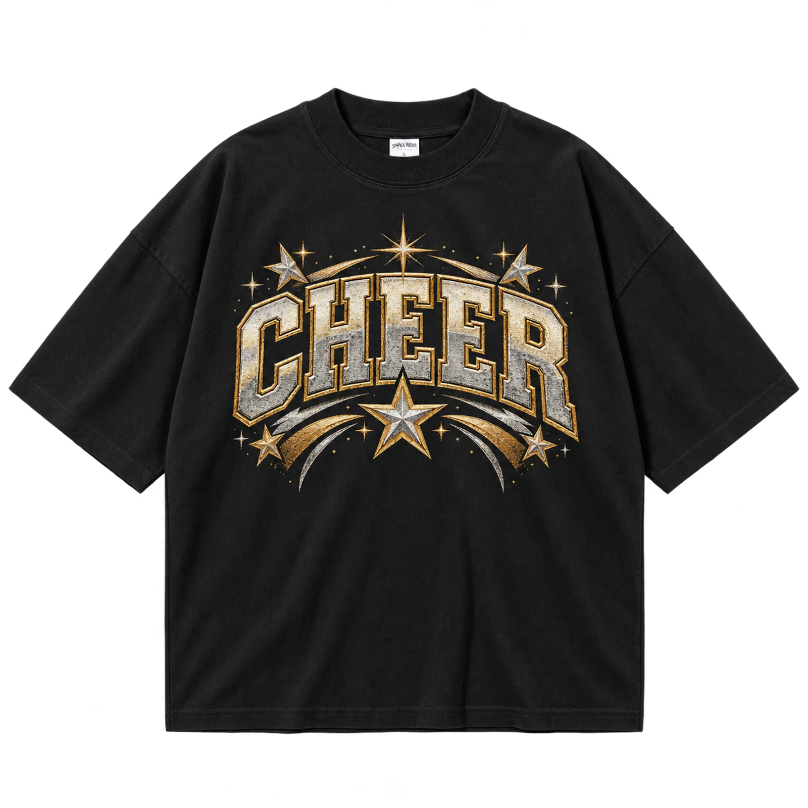
Metallic or foil detail gives a cheer T-shirt design reflective accents around selected typography, stars, outlines, or cheer symbols. The team name or primary wording should remain visually dominant while metallic areas create controlled emphasis. Limited reflective coverage preserves readability under different lighting conditions. Metallic ink, foil, or compatible DTF effects can support an 8 to 12-inch front composition.
Key Features: Metallic accents, reflective finish, team typography, cheer symbols, controlled contrast, and decorative detail.
Best For: Competition shirts, nationals apparel, senior cheer designs, game day shirts, cheer teams, and spirit wear.
Popular directions:
- Metallic wordmark: Give the team name a reflective treatment.
- Foil stars: Highlight selected stars around the primary wording.
- Reflective outline: Add metallic detail around thick letters.
- Megaphone accent: Apply foil or metallic ink to one cheer symbol.
- Team-color pairing: Combine reflective areas with established school colors.
- Event design: Use metallic details around competition or Nationals wording.
Puff Print Cheer Typography
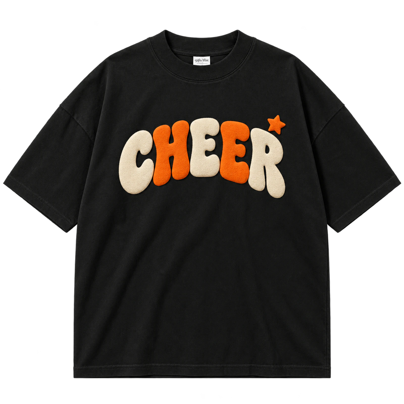
Puff print gives a typography-led cheer T-shirt design a raised surface through thick block or varsity lettering. Open spacing provides room for the ink to expand while keeping CHEER, the school name, or squad name readable. A 6 to 10-inch chest area offers enough scale for the tactile treatment without requiring dense supporting artwork. Tiny details and narrow strokes should remain outside the puff-printed portions of the design.
Key Features: Raised lettering, thick strokes, open spacing, varsity typography, tactile texture, and simple composition.
Best For: Cheer teams, varsity shirts, school spirit apparel, camp shirts, game day designs, and textured team merchandise.
Popular directions:
- Puff CHEER: Raise the primary cheer word across the chest.
- Squad wordmark: Apply the effect to thick team lettering.
- Varsity treatment: Use athletic characters with generous spacing.
- Arched puff text: Curve the raised team name above a small symbol.
- Outline combination: Pair flat outlines with a raised central word.
- School initials: Enlarge collegiate initials for a compact puff design.
Glow Cheer Graphic
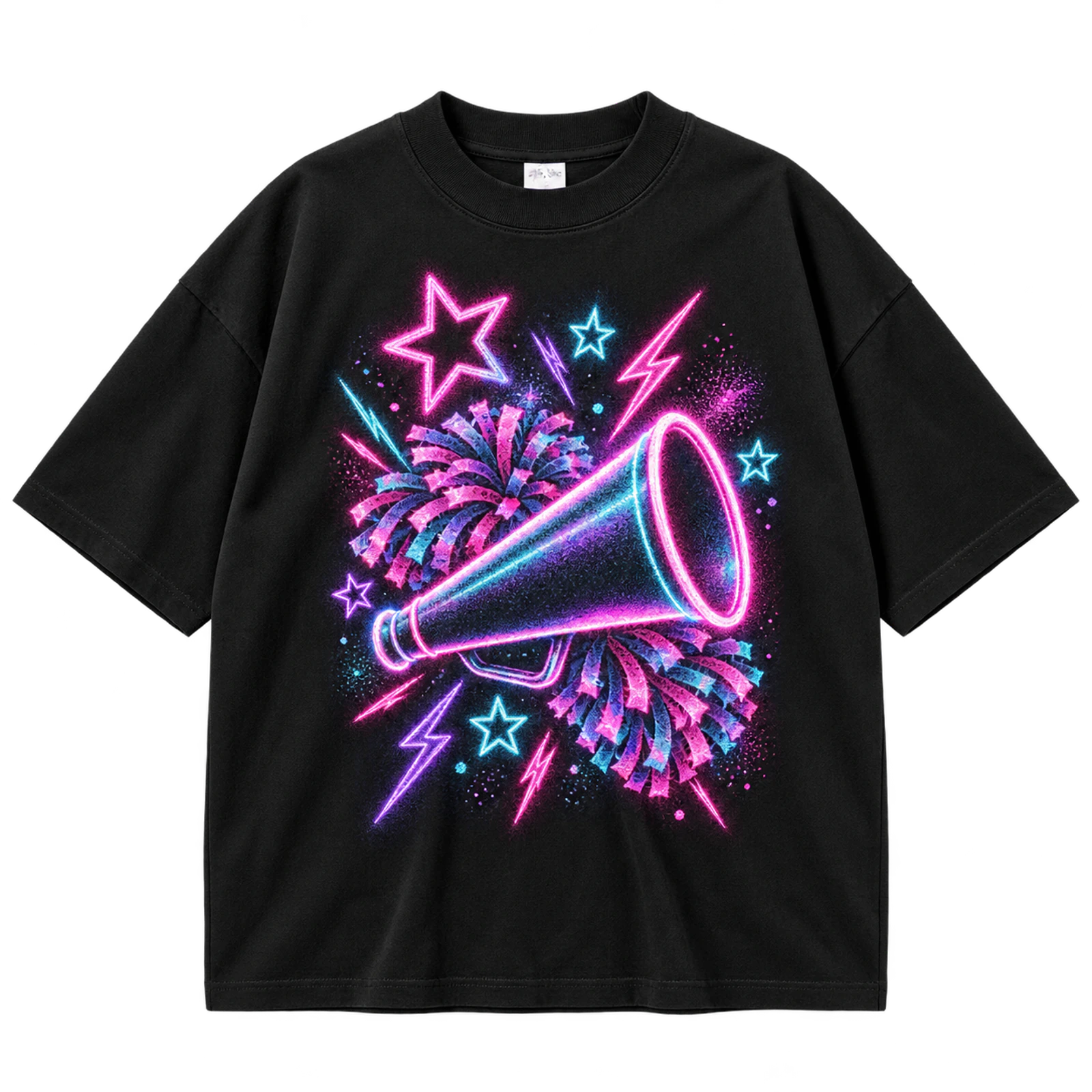
Fluorescent or glow printing adds bright specialty accents to a cheer T-shirt design while the base artwork remains readable under normal lighting. Stars, lightning bolts, megaphones, or selected letters can carry the effect instead of covering the entire graphic. Strong contrast between the garment and standard print areas preserves the team identity when the glow treatment is inactive. An 8 to 12-inch composition suits specialty screen printing, while embroidery does not reproduce the same effect.
Key Features: Fluorescent effects, glow accents, cheer typography, simple symbols, high contrast, and normal-light readability.
Best For: Cheer competitions, pep rallies, cheer camps, team events, bold spirit wear, and specialty cheer shirts.
Popular directions:
- Glow CHEER: Apply the bright effect to the primary wordmark.
- Lightning accents: Highlight simple bolts around the main typography.
- Fluorescent stars: Use bright stars as secondary visual elements.
- Team-name graphic: Keep the squad name readable with selected glow details.
- Megaphone accent: Add fluorescent treatment to one recognizable icon.
- Competition version: Highlight event or team wording with specialty ink.
What Are Some Cheer T-Shirt Design Tips?
Cheer T-shirt design tips include choosing a clear theme, using readable typography, creating a structured text hierarchy, maintaining strong color contrast, simplifying cheer graphics, selecting specialty effects carefully, matching the printing method to the garment, and reviewing the final size and placement. These choices work together to keep the team, school, or event identity clear while supporting readability and production suitability. A realistic T-shirt mockup can then confirm that the typography, colors, graphics, scale, and placement work together before printing.
10 steps to build a clear cheer shirt design:
- Step 1: Choose a Clear Team, School, or Event Theme
Define one dominant context, such as school spirit, game day, cheer camp, competition, senior night, or supporter wear. Use that context to guide the team colors, typography, slogans, and cheer graphics throughout the design. For example, a competition shirt can prioritize the squad name and event year, while a school spirit shirt can emphasize the school name and mascot. Keeping these choices connected prevents unrelated visual elements from competing for attention.
- Step 2: Use Bold and Readable Block Typography
Choose thick varsity, collegiate, or block lettering for team names and other primary wording that needs to remain visible from a distance. Decorative script can provide contrast for a short secondary phrase, but narrow strokes and excessive curls can become difficult to read at print size. Test the typography at its intended dimensions rather than judging it only while enlarged on a design canvas. Strong letterforms also reproduce more reliably across screen print, puff print, and simplified embroidery.
- Step 3: Use Arched or Curved Text for Team Names
Curve a team name, school name, or CHEER wording around a mascot, megaphone, bow, or secondary line of text to create a structured focal area. Keep the arc symmetrical so letters maintain consistent spacing across the entire word. Excessive curvature can compress characters near the center or create awkward gaps at the ends. A controlled arch frames the central graphic while keeping the team identifier easy to scan.
- Step 4: Limit the Design to Two Font Styles
Pair one dominant display font with one supporting font to create contrast without fragmenting the layout. For example, bold varsity lettering can identify the team while a thicker script handles a short secondary phrase. Repeating these two styles across names, years, and slogans creates visual consistency. Introducing extra typefaces for minor details can weaken hierarchy and make individual text elements appear unrelated.
- Step 5: Use a Clear Stacked Text Hierarchy
Arrange the school name, squad name, year, slogan, or event details according to their importance. Give the primary identifier the largest type size, then progressively reduce supporting information so readers know what to notice next. For example, the team name might occupy the main line, with CHEER and the season year placed below at smaller sizes. Consistent spacing between these levels keeps the stacked layout organized instead of visually dense.
- Step 6: Use High-Contrast Shirt and Print Colors
Test the exact school or team colors against the garment rather than evaluating the print palette separately. Dark lettering can disappear on a dark shirt, while light pastel artwork may lose definition on a similar-value garment. Use sufficient contrast around important elements such as team names, mascots, and numbers so they remain recognizable from a normal viewing distance. Outlines can also separate school colors when the required palette contains similar tones.
- Step 7: Keep Cheer Graphics Simple and Recognizable
Use clear bows, pom-poms, megaphones, mascots, stars, or lightning bolts that remain recognizable after the design is reduced to its final print dimensions. Tiny strands, narrow outlines, and excessive interior decoration can disappear during printing or become difficult to reproduce with embroidery. Simplifying secondary graphics also leaves more visual space for the team name or primary wording. One strong cheer symbol usually supports the identity more clearly than several competing illustrations.
- Step 8: Use Glitter, Metallic, Foil, or Specialty Ink Selectively
Reserve specialty finishes for focal words, outlines, stars, bows, or other details that deserve visual emphasis. For example, metallic ink can highlight a team name, while glitter can accent a bow or selected stars without covering the entire composition. The base artwork should still communicate the cheer identity when viewed without the reflective or raised effect. Controlled application also keeps specialty decoration from reducing text contrast or overwhelming smaller details.
- Step 9: Match the Design to the Garment and Printing Method
Choose the production method according to the artwork detail, garment fabric, quantity, and intended use. Detailed full-color mascot graphics can suit DTF or DTG, bold limited-color team designs can use screen print, and compact logos can work with embroidery. Thick varsity typography can also support puff print when strokes and spacing provide room for the ink to expand. Cotton, polyester, stretch blends, and performance fabrics require separate consideration because heat, ink adhesion, flexibility, and garment movement can affect the final result.
- Step 10: Preview the Final Size and Placement Before Printing

Review the artwork at its intended dimensions on a realistic T-shirt mockup instead of relying only on the design canvas. Using T-shirt mockups can help check chest height, distance from the collar, graphic width, front-back balance, color contrast, spelling, and alignment before printing. A cheer T-shirt design that appears balanced on a blank canvas may look too small, too low, or too wide once placed on a garment. Final-size proofing helps identify these placement and scaling problems before the artwork moves into production.
What Mistakes Affect a Cheer T-Shirt Design?
Common cheer T-shirt design mistakes include incorrect graphic placement, improper sizing, hard-to-read fonts, poor color contrast, over complicated layouts, excessive font styles, unsuitable fabric choices, mismatched printing methods, skipped full-size proofing, and spelling or alignment errors. These mistakes can reduce readability, weaken the visual hierarchy, or create production problems when the artwork is applied to the garment. Reviewing the design at full size helps identify issues with placement, scale, typography, contrast, fabric compatibility, and print suitability before production.
Watch for these 10 common mistakes:
- Incorrect Graphic Placement
Artwork positioned too high crowds the collar, while a low placement makes the graphic appear disconnected from the upper body. Designs placed too close to side seams also become visually distorted when the shirt is worn. Check the complete garment rather than measuring placement from the artwork alone. A realistic mockup makes it easier to judge how the graphic sits relative to the collar, chest, sleeves, and seams.
- Improper Design Sizing
A graphic that is too small loses visibility, especially when it contains a team name, mascot, or slogan intended to be read from a distance. An oversized design extends toward seams, wrap across the torso, or make individual elements difficult to view as one composition. Scale should reflect both the shirt size and the purpose of the artwork. A compact practice logo and a competition back graphic, for example, require different dimensions.
- Hard-to-Read Fonts
Thin scripts, excessive curls, narrow strokes, and tight letter spacing makes team names and cheer slogans difficult to recognize. The problem becomes more noticeable when decorative lettering is reduced to its final print size or viewed from several feet away. Reserve complex type for short secondary wording and use stronger letterforms for the primary identifier. Increasing stroke thickness and spacing can also make script more suitable for printing or embroidery.
- Low-Contrast or Clashing Colors
Similar-value ink and garment colors causes important text or graphics to blend into the shirt. A navy wordmark on a dark shirt, for example, needs a lighter outline to separate the letters from the fabric. Too many competing bright colors creates a different problem by weakening the focal hierarchy. Test the exact garment, ink, transfer, or specialty colors together so the team name and cheer graphics remain distinct.
- Overcomplicated Layouts
Combining several slogans, mascots, patterns, symbols, fonts, and specialty effects leave the viewer without a clear focal point. Decide whether the team name, event, mascot, or slogan carries the primary message, then make other elements visually secondary. Negative space separates these components and improve recognition. Removing unnecessary decoration often makes the remaining cheer identity easier to understand.
- Too Many Font Styles
Several unrelated typefaces make school names, squad names, slogans, and years appear as separate designs rather than one composition. Limit the typography to one primary display style and one supporting font. Repeat those styles consistently when additional information is required. This approach creates a clearer relationship between the main team identifier and smaller supporting details.
- Ignoring Fabric and Performance Requirements
Cotton, polyester, stretch blends, and performance fabrics do not respond identically to ink, heat, or garment movement. A decoration method that works on a standard cotton shirt may require different production settings or materials on a lightweight performance garment. Stretch and repeated movement also matter for cheer practice apparel because the printed area needs to move with the fabric. Consider the garment construction before finalizing both the artwork and printing method.
- Using the Wrong Printing Method
The artwork should match the strengths and limitations of the selected production process. DTF or DTG can reproduce detailed full-color graphics, screen print suits bold limited-color designs, embroidery works better for simplified marks, and puff print requires thick typography with sufficient spacing. Forcing fine mascot details into a small embroidered area can remove definition, while using complex puff treatment on narrow lettering can reduce clarity. Choose the method after evaluating artwork detail, scale, fabric, and quantity.
- Skipping Full-Size Proofing
A small on-screen preview hides spacing, stroke-width, placement, and readability problems that become obvious at actual print dimensions. Review the design at final size and check the relationship between text, graphics, and surrounding negative space. For front and back designs, inspect both sides together to confirm that their scale and visual weight feel connected. This review should occur before the production file is exported.
- Spelling and Alignment Errors
Incorrect school names, squad names, slogans, years, cheerleader names, or numbers make a finished batch unusable. Alignment problems also appear between arched text, center graphics, personalized numbers, or coordinated front and back artwork. Verify every text element against the approved information and inspect guides or center points before export. Personalized team shirts require extra review because individual names and numbers introduce more opportunities for errors.

 Trusted By Thousands Of Designers
 Cancel Your Subscription Anytime
 30 Day Money Back Guarantee