
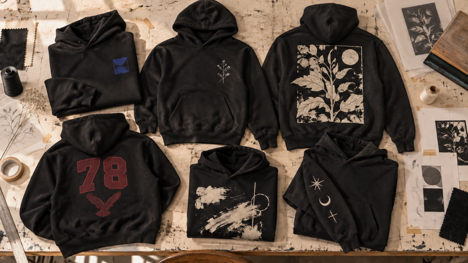
Black hoodie design ideas include minimalist logos, line art, embroidery, monograms, large graphics, character illustrations, bold typography, vintage and retro styles, streetwear graphics, abstract artwork, personalized concepts, and branded designs. Each concept combines artwork, typography, color contrast, graphic scale, and placement to create a distinct visual direction. These 45 creative black hoodie design ideas inspire personal apparel, brands, businesses, creators, teams, clubs, universities, events, and merchandise.
Choosing and creating a black hoodie design involves matching the style to the audience, purpose, garment type, artwork, color contrast, graphic size, placement, typography, and decoration method. Oversized, pullover, zip-up, quarter-zip, heavyweight fleece, and premium cotton hoodies support different design approaches, while chest, back, sleeve, pocket, hood, and all-over placements provide different visual opportunities. Avoid low contrast, overly fine details, poor placement, unsuitable printing methods, incorrect sizing, and designs that ignore fabric texture. Preview the finished concept on a realistic hoodie mockup to check scale, alignment, readability, garment interaction, and overall visual balance before production.
Below are the 45 black hoodie design ideas:
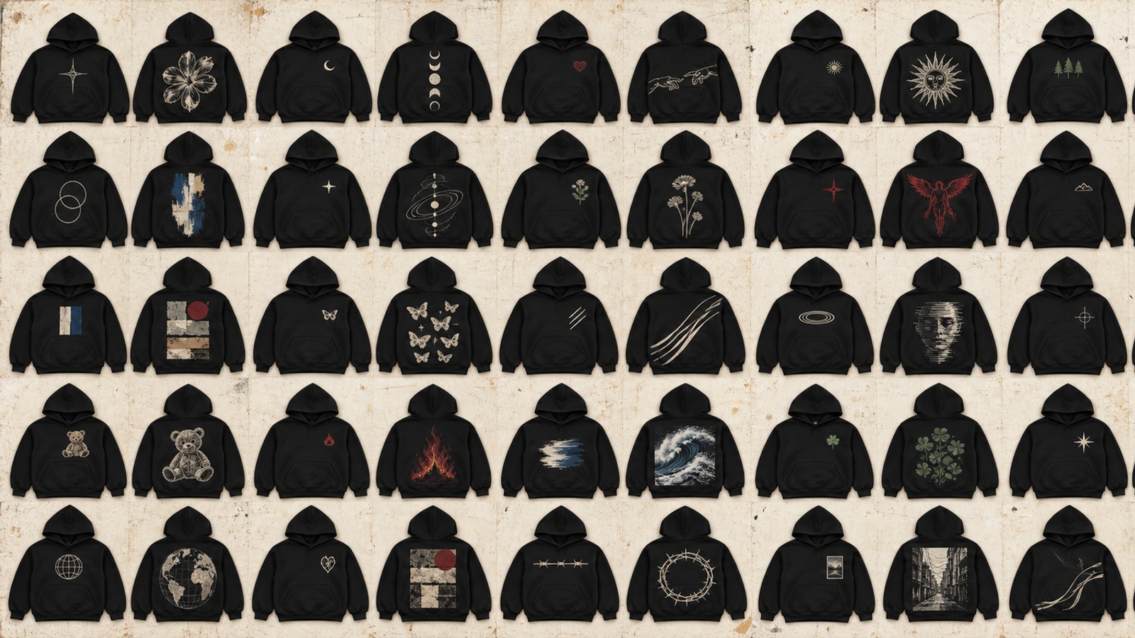
- Single Line Art Black Hoodie Design
- Minimal Logo Black Hoodie Design
- Small Chest Embroidery Black Hoodie Design
- Monogram Initial Black Hoodie Design
- Large Back Graphic Black Hoodie Design
- Oversized Front Graphic Black Hoodie Design
- Character Illustration Black Hoodie Design
- Hand Drawn Artwork Black Hoodie Design
- Mascot Graphic Black Hoodie Design
- Bold Statement Typography Black Hoodie Design
- Oversized Word Typography Black Hoodie Design
- Vintage Typography Black Hoodie Design
- Distressed Typography Black Hoodie Design
- Retro Typography Black Hoodie Design
- Motivational Quote Black Hoodie Design
- Distressed Logo Black Hoodie Design
- Retro College Black Hoodie Design
- Vintage Sports Black Hoodie Design
- Retro Badge Black Hoodie Design
- Washed Vintage Black Hoodie Design
- Oversized Streetwear Black Hoodie Design
- Graffiti Style Black Hoodie Design
- Urban Illustration Black Hoodie Design
- Cyberpunk Black Hoodie Design
- Glitch Effect Black Hoodie Design
- Techwear Inspired Black Hoodie Design
- Brutalist Graphic Black Hoodie Design
- Abstract Art Black Hoodie Design
- Geometric Pattern Black Hoodie Design
- Nature-Inspired Black Hoodie Design
- Watercolor Artwork Black Hoodie Design
- Collage Art Black Hoodie Design
- Photography-Based Black Hoodie Design
- Name and Initial Black Hoodie Design
- Birth Year Black Hoodie Design
- Family Custom Black Hoodie Design
- Friendship Group Black Hoodie Design
- Event Memory Black Hoodie Design
- Custom Artwork Black Hoodie Design
- Company Logo Black Hoodie Design
- Creator Merchandise Black Hoodie Design
- Sports Team Black Hoodie Design
- University Black Hoodie Design
- Club Identity Black Hoodie Design
- Brand Slogan Black Hoodie Design
Single Line Art Black Hoodie Design
A single line art black hoodie design features a continuous or minimal line illustration that creates a clean visual against dark fabric. Simple subjects such as faces, hands, flowers, animals, or abstract forms work well because recognizable outlines keep the artwork clear without requiring intricate detail. White, neutral, or contrasting line colors separate the graphic from the black hoodie while preserving the minimal style.
Defining elements: continuous line artwork, simple subject, clean outline, negative space, limited colors, and clear placement.
Popular directions:
- Face illustration: feature a minimal portrait on the chest or back.
- Botanical line art: showcase flowers or leaves through clean outlines.
- Abstract drawing: combine flowing lines into a distinctive graphic.
- Small chest artwork: position compact line art with generous negative space for a subtle custom hoodie design.
Minimal Logo Black Hoodie Design
A minimal logo black hoodie design features a compact brand mark, emblem, or wordmark with controlled spacing and limited colors. Small chest placement keeps the logo recognizable while preserving negative space across the black fabric. White, neutral, tonal, or brand colors can create clear contrast without adding unnecessary graphics, making this custom hoodie design suitable for brands, businesses, teams, and understated merchandise.
Defining elements: small logo, compact scale, clear spacing, limited colors, negative space, and consistent brand identity.
Popular directions:
- Left-chest logo: position a small emblem or wordmark for subtle branding.
- Tonal logo: match closely related dark shades for an understated appearance.
- Centered mark: place a compact logo at the upper center chest.
- Logo-only design: keep the front, back, and sleeves free from competing artwork for a clean hoodie design.
Small Chest Embroidery Black Hoodie Design
Small chest embroidery gives a black hoodie a subtle, premium visual through compact stitched artwork placed near the upper chest. Icons, initials, emblems, or simple logos suit this hoodie design because their controlled shapes remain recognizable at a smaller scale. Contrasting thread makes the artwork more prominent against black fabric, while tonal stitching creates an understated effect with generous negative space around the design.
Defining elements: compact embroidery, small artwork, chest placement, thread contrast, simple shapes, negative space, and premium styling.
Popular directions:
- Icon embroidery: feature a recognizable symbol with limited stitched detail.
- Initial design: personalize the chest with clean initials or a monogram.
- Tonal stitching: combine dark thread shades for a subtle custom hoodie design.
- Contrast emblem: position a light or colorful emblem against the black fabric for stronger visibility.
Monogram Initial Black Hoodie Design
A monogram initial black hoodie design centers on one or more initials arranged as a compact symbol for a personalized, refined appearance. Letterform style, spacing, and arrangement shape the monogram, while chest, sleeve, or center placement determines its visual prominence. Clean typography and contrasting or tonal colors keep the initials recognizable against black fabric. This custom hoodie design works well for personal apparel, clothing brands, clubs, and group identity.
Defining elements: initials, monogram arrangement, typography, controlled spacing, compact placement, personalization, and color contrast.
Popular directions:
- Interlocking initials: combine letters into one distinctive emblem.
- Single initial: highlight one prominent letter for a simple hoodie design.
- Chest monogram: position compact initials on the upper chest.
- Sleeve initials: place a small monogram on the sleeve for understated personalization.
Large Back Graphic Black Hoodie Design
A large back graphic black hoodie design places oversized artwork across the rear of the garment for strong visual impact and long-range visibility. Illustrations, symbols, typography, or branded artwork can occupy a broad print area, with scale and composition determining how well the graphic fits the hoodie proportions. Clear contrast against black fabric keeps major details recognizable, making this direction suitable for streetwear, creator merchandise, and statement-focused custom apparel.
Defining elements: large back graphic, oversized artwork, broad placement, strong contrast, balanced composition, and high visibility.
Popular directions:
- Illustrated artwork: position a large illustration across the central back.
- Graphic and text: combine artwork with supporting typography for visual hierarchy.
- Streetwear graphic: apply bold artwork with a large-scale composition.
- Branded back design: showcase distinctive brand artwork for recognizable merchandise.
Oversized Front Graphic Black Hoodie Design
An oversized front graphic black hoodie design centers large artwork across the front to create an immediate visual focal point. Illustrations, typography, symbols, or abstract graphics can extend across the chest and torso, but the composition should account for the kangaroo pocket, zipper, and garment proportions. Strong contrast against black fabric keeps major details recognizable, making this direction suitable for streetwear, merchandise, and statement-focused hoodie designs.
Defining elements: oversized front artwork, dominant focal point, broad graphic scale, pocket interaction, strong contrast, and balanced composition.
Popular directions:
- Center illustration: position large artwork across the chest and torso.
- Oversized typography: build the composition around prominent lettering or a short phrase.
- Abstract graphic: combine bold shapes or expressive artwork for a creative hoodie design.
- Streetwear layout: arrange large-scale graphics while keeping the pocket and garment structure visually balanced.
Character Illustration Black Hoodie Design
A character illustration black hoodie design builds its visual identity around an original figure, mascot-like character, or illustrated personality. Character style, facial details, pose, color palette, and artwork scale determine how expressive and recognizable the graphic appears against black fabric. Front or back placement can change the illustration’s prominence, making this direction suitable for creative hoodie designs, merchandise, brands, and communities. Existing copyrighted characters require appropriate permission for commercial use.
Defining elements: character artwork, recognizable features, illustration style, expressive pose, color contrast, artwork scale, and clear placement.
Popular directions:
- Original character: develop a distinctive illustrated figure with recognizable visual traits.
- Cartoon artwork: combine playful shapes and expressive character details.
- Back illustration: showcase detailed character artwork across a larger design area.
- Character and typography: pair the illustration with a name, phrase, or supporting text.
Hand-Drawn Artwork Black Hoodie Design
A hand-drawn artwork black hoodie design brings sketches, doodles, expressive lines, or original artistic marks onto black fabric for a distinctive handmade appearance. Uneven strokes, visible textures, and individual drawing styles can give the artwork an authentic character that differs from polished digital graphics. Front, back, or sleeve placement changes the illustration’s prominence, while clear contrast helps detailed marks stay visible against the dark garment.
Defining elements: hand-drawn artwork, sketches, doodles, expressive lines, original marks, visible texture, and clear contrast.
Popular directions:
- Sketch illustration: showcase loose pencil-style or ink-inspired artwork.
- Doodle composition: combine small drawings into one organized graphic.
- Expressive linework: highlight irregular strokes and artistic textures.
- Original artwork: adapt a personal drawing into a unique custom hoodie design.
Mascot Graphic Black Hoodie Design
A mascot graphic black hoodie design builds recognition around a distinctive character or emblem that represents a team, brand, school, or community. Expressive character details, supporting typography, and coordinated colors help establish the mascot as the main visual element. Chest placement works for compact marks, while larger front or back artwork gives detailed mascots more visual prominence against black fabric. Official mascot artwork requires appropriate rights or authorization for commercial use.
Defining elements: mascot identity, recognizable character, supporting text, coordinated colors, graphic scale, and clear placement.
Popular directions:
- Team mascot: combine a recognizable character with team colors or typography.
- Mascot emblem: arrange the character within a badge or compact graphic.
- Large back mascot: showcase detailed mascot artwork across the back.
- Community design: pair an original mascot with a group name or shared identity.
Bold Statement Typography Black Hoodie Design
Bold statement typography turns a black hoodie into a message-focused design through prominent words, short phrases, or slogans. Heavy font weights, strong letterforms, and controlled spacing improve readability, while high-contrast text creates clear visual emphasis against black fabric. Center-chest, oversized front, or large back arrangements suit statement-driven hoodie designs where the wording serves as the primary graphic element.
Defining elements: bold typography, short statement, heavy font weight, readable lettering, strong contrast, visual hierarchy, and prominent placement.
Popular directions:
- Short phrase: highlight a concise message in large, readable lettering.
- Centered statement: organize bold text around the middle of the chest.
- Stacked typography: arrange words across multiple lines for stronger visual hierarchy.
- Back statement: display oversized lettering across the back for greater visibility.
Oversized Word Typography Black Hoodie Design
Oversized word typography uses one dominant word to create an immediate focal point, communicate a clear message, and give a black hoodie a strong graphic identity. Large lettering increases visual prominence, while font choice, spacing, alignment, and scale shape the design’s overall character. High-contrast text improves visibility against black fabric, and restrained supporting graphics keep attention on the chosen word. This approach suits modern hoodie designs, streetwear, branded apparel, and message-focused merchandise.
Defining elements: single-word focus, oversized lettering, strong font style, controlled spacing, clear alignment, high contrast, and minimal supporting artwork.
Popular directions:
- Full-width word: stretch bold lettering across the chest for maximum prominence.
- Vertical typography: arrange the word vertically for an unconventional layout.
- Condensed lettering: select narrow letterforms to create a structured graphic.
- Back wordmark: display one large word across the back for strong visual recognition.
Vintage Typography Black Hoodie Design
Vintage typography combines heritage-inspired letterforms, aged styling, and classic layouts to give a black hoodie the character of apparel from an earlier era. Serif fonts, script lettering, curved text, and lightly weathered details can establish the retro identity, while a limited color palette keeps the composition cohesive against black fabric. Dates, locations, brand names, or short phrases can support the main lettering without overcrowding the hoodie design.
Defining elements: heritage typography, classic letterforms, curved text, aged details, limited colors, balanced spacing, and retro styling.
Popular directions:
- Curved lettering: arrange text in an arch for a classic apparel layout.
- Heritage wordmark: combine traditional lettering with a date or location.
- Script typography: apply flowing letterforms for a distinctive vintage character.
- Framed text: organize typography within borders, lines, or simple decorative elements.
Distressed Typography Black Hoodie Design
Distressed typography combines intentionally worn lettering with faded, cracked, or roughened textures to give a black hoodie an aged graphic character without sacrificing message clarity. The effect works best when the underlying letterforms stay readable and the distressed details support, rather than obscure, the text. Light-colored lettering creates strong contrast against black fabric, while muted tones create a softer, vintage-inspired look suitable for streetwear, merchandise, and casual hoodie designs.
Defining elements: worn lettering, distressed texture, faded details, readable typography, controlled contrast, aged appearance, and balanced composition.
Popular directions:
- Cracked lettering: introduce irregular breaks that imitate naturally aged print.
- Faded wordmark: soften selected areas of the text for a worn appearance.
- Rough-edged type: apply imperfect letter edges for a rugged graphic style.
- Distressed slogan: combine a short phrase with weathered typography for a statement-focused design.
Retro Typography Black Hoodie Design
Retro typography draws on era-specific fonts, nostalgic color combinations, and decorative shapes to give a black hoodie a recognizable throwback identity. Rounded letterforms, outlined text, shadows, arches, and period-inspired layouts can reference past-decade styles while keeping the wording easy to read. Warm or vibrant colors create strong contrast against black fabric, while restrained palettes support a subtler retro hoodie design.
Defining elements: era-inspired fonts, nostalgic colors, outlined lettering, decorative shapes, text effects, balanced spacing, and retro styling.
Popular directions:
- 70s-inspired lettering: combine rounded fonts with curved or wavy arrangements.
- 80s graphic type: pair angular lettering with geometric shapes and layered effects.
- Outlined typography: build depth through borders, shadows, or offset letterforms.
- Retro wordmark: organize a name or phrase into a compact period-inspired composition.
Motivational Quote Black Hoodie Design
Motivational quote designs turn meaningful words into the central visual message of a black hoodie, combining personal expression with wearable typography. Short quotes such as “Keep Going,” “Stay Focused,” “Trust Yourself,” “Never Settle,” or “Make It Happen” support clear text hierarchy, while font style, scale, spacing, and placement shape their visual impact. High-contrast lettering creates stronger visibility on black fabric, while smaller tonal text supports a subtle, personalized hoodie design.
Defining elements: meaningful quote, text hierarchy, readable typography, intentional spacing, message visibility, balanced placement, and color contrast.
Popular directions:
- Center-chest quote: organize a concise message into a clear front composition.
- Large back quote: expand the wording across the back for greater prominence.
- Minimal phrase: pair a short motivational statement with understated typography.
- Quote and symbol: combine the message with a relevant icon, emblem, or simple illustration.
Distressed Logo Black Hoodie Design
Distressed logo styling gives a clean brand an intentionally aged character on a black hoodie by combining recognizable logo forms with worn, faded, or weathered textures. Controlled imperfections can soften sharp edges and solid areas while preserving the shapes, letters, or symbols that make the identity recognizable. On black fabric, lighter distressed marks create pronounced contrast, while muted tones support a subtle vintage appearance suited to streetwear, merchandise, and retro-inspired hoodie designs.
Defining elements: recognizable logo, worn texture, faded details, weathered edges, controlled distressing, clear contrast, and balanced placement.
Popular directions:
- Faded wordmark: apply uneven wear across brand lettering while maintaining readability.
- Weathered emblem: add aged texture to a compact badge or symbol.
- Cracked logo: introduce selective breaks within solid graphic areas for a worn effect.
- Vintage chest mark: combine a distressed logo with compact chest placement for understated branding.
Retro College Black Hoodie Design
Retro college styling combines collegiate typography, prominent initials, establishment years, and heritage-inspired layouts to give a black hoodie a classic campus identity. Arched lettering, block fonts, badges, and restrained color combinations help recreate the character of traditional university apparel while maintaining clear visual hierarchy. The format also adapts well to fictional schools, clubs, brands, and community merchandise without relying on an existing institution’s protected identity.
Defining elements: collegiate typography, school-style initials, establishment year, arched lettering, heritage layout, badge graphics, and limited colors.
Popular directions:
- Arched name: curve bold collegiate lettering above smaller supporting text.
- Initial and year: combine prominent initials with an establishment date.
- College badge: organize letters, numbers, and symbols within a heritage-style emblem.
- Varsity layout: pair block typography with structured lines and contrasting details for a classic hoodie design.
Vintage Sports Black Hoodie Design
Vintage sports styling combines athletic imagery, classic numbers, team-inspired lettering, and aged graphic details to recreate the character of older sports apparel on a black hoodie. Large jersey numbers, retro badges, mascots, and curved typography can establish the athletic identity, while restrained colors and distressed textures strengthen the vintage appearance. These hoodie designs suit recreational teams, sports communities, themed merchandise, or original athletic brands. Official team logos and protected marks require appropriate authorization for commercial use.
Defining elements: sports graphics, jersey numbers, team-style typography, retro badges, aged textures, athletic symbols, and a limited color palette.
Popular directions:
- Jersey number: make a large number the focal point with supporting text.
- Retro team badge: combine an original emblem with classic sports lettering.
- Mascot layout: pair an athletic character with a name, year, or number.
- Heritage sports graphic: arrange typography and symbols into an aged, team-inspired composition.
Retro Badge Black Hoodie Design
Retro badge styling organizes icons, typography, dates, and decorative borders into a compact emblem that gives a black hoodie a structured heritage identity. Circular, shield, oval, or crest-like shapes create clear visual boundaries, while central symbols and supporting text establish hierarchy within the artwork. Limited colors and strong contrast keep smaller badge details visible against black fabric, making this concept suitable for brands, clubs, events, and vintage-inspired custom hoodie designs.
Defining elements: badge shape, central icon, decorative border, supporting text, dates, emblem layout, and limited colors.
Popular directions:
- Circular emblem: arrange a central symbol with text around the outer border.
- Heritage crest: combine initials, dates, and simple icons within a structured shape.
- Outdoor badge: pair nature-inspired imagery with compact retro typography.
- Brand emblem: integrate a wordmark and recognizable symbol into a cohesive vintage-style badge.
Washed Vintage Black Hoodie Design
Washed vintage styling combines a faded black garment appearance with muted graphics and aged textures to create the character of naturally worn apparel. Softened artwork, weathered typography, and low-intensity colors reinforce the retro aesthetic without making the composition visually heavy. The effect works particularly well with heritage logos, old-school illustrations, music-inspired graphics, and classic typography, giving creative hoodie designs a relaxed, lived-in identity.
Defining elements: faded appearance, muted graphics, aged textures, softened colors, weathered typography, retro artwork, and worn styling.
Popular directions:
- Faded graphic: combine softened artwork with restrained colors for an aged visual.
- Washed wordmark: pair vintage lettering with a worn garment aesthetic.
- Heritage artwork: organize classic symbols, dates, and typography into a nostalgic composition.
- Muted illustration: use subdued artwork to complement the faded character of the black hoodie.
Oversized Streetwear Black Hoodie Design
Oversized streetwear styling combines a relaxed hoodie silhouette with large-scale graphics to create a bold, contemporary visual identity. Broad back prints, expansive front artwork, statement typography, or sleeve graphics complement the garment’s proportions and add visual presence. Balanced placement keeps large artwork connected to the hoodie structure, while strong contrast against black fabric helps key graphics remain distinct. This direction works well for streetwear brands, creator merchandise, and fashion-focused custom hoodie designs.
Defining elements: oversized silhouette, large graphics, bold typography, broad print areas, strong contrast, balanced placement, and streetwear styling.
Popular directions:
- Full-back artwork: extend a prominent graphic across the rear print area.
- Statement front: combine oversized typography with a supporting illustration.
- Multi-placement design: coordinate graphics across the chest, back, and sleeves.
- Minimal streetwear mark: contrast the oversized silhouette with a small emblem or wordmark.
Graffiti Style Black Hoodie Design
Graffiti-inspired artwork brings expressive lettering, hand-drawn marks, and urban visual language to a black hoodie, creating a bold streetwear identity with an intentionally raw character. Spray-paint effects, outlined letters, tags, abstract symbols, and layered textures can shape the composition, while contrasting colors separate intricate details from the dark fabric. Original lettering and artwork also give brands, artists, and creators room to develop a distinctive graphic hoodie design instead of imitating an existing graffiti style.
Defining elements: graffiti lettering, urban textures, expressive marks, layered composition, bold outlines, contrasting colors, and original artwork.
Popular directions:
- Tag lettering: transform a name or word into expressive hand-drawn typography.
- Spray-paint graphic: recreate overspray, paint marks, and irregular edges visually.
- Layered graffiti: combine lettering, symbols, and textures into a dense composition.
- Minimal graffiti mark: reduce the style to a compact tag or original symbol for a cleaner streetwear look.
Urban Illustration Black Hoodie Design
Urban illustration turns city environments, architecture, street scenes, and everyday metropolitan details into visual storytelling for a black hoodie. Buildings, skylines, roads, signs, transit elements, or neighborhood landmarks can establish a clear sense of place, while linework and contrast determine how distinctly the artwork appears on dark fabric. Detailed scenes suit large back graphics, whereas simplified city motifs work well on the chest or sleeves.
Defining elements: city imagery, architectural forms, street details, storytelling artwork, strong linework, visual depth, and clear contrast.
Popular directions:
- City skyline: illustrate recognizable building silhouettes across the chest or back.
- Street scene: capture roads, storefronts, signs, or neighborhood details.
- Architectural sketch: translate buildings into expressive line-based artwork.
- City collage: combine landmarks, typography, and urban symbols into one graphic composition.
Cyberpunk Black Hoodie Design
Cyberpunk artwork combines futuristic city imagery, technology motifs, and high-contrast graphics to create a dark, digitally influenced hoodie aesthetic. Neon-inspired accents, mechanical details, circuit patterns, futuristic typography, and dystopian architecture stand out effectively against black fabric. Layering these elements around one dominant focal point keeps the composition readable while preserving the dense visual character associated with cyberpunk design.
Defining elements: futuristic graphics, technology motifs, neon-style contrast, digital typography, mechanical details, dark imagery, and layered composition.
Popular directions:
- Futuristic cityscape: build a large graphic around illuminated buildings and urban technology.
- Cyber character: combine a futuristic figure with mechanical or digital details.
- Tech symbols: organize codes, grids, icons, and interface-inspired graphics.
- Neon typography: pair sharp lettering with luminous-looking outlines and geometric accents.
Glitch Effect Black Hoodie Design
Glitch effect artwork recreates digital errors through distorted imagery, displaced pixels, fragmented typography, and offset visual layers, giving a black hoodie an experimental digital identity. RGB-style separation, broken lines, scan effects, and repeated fragments can make otherwise simple graphics appear disrupted and dynamic. Keeping one recognizable image, word, or symbol beneath the distortion prevents the design from becoming visually unclear.
Defining elements: digital distortion, pixel effects, fragmented imagery, offset layers, disrupted typography, scan lines, and controlled visual noise.
Popular directions:
- Glitched wordmark: distort selected sections of a readable name or phrase.
- Fragmented portrait: break an illustrated face into shifted digital sections.
- Pixel displacement: extend blocks or lines outward from the primary graphic.
- Distorted symbol: transform a simple emblem with controlled digital interference.
Techwear-Inspired Black Hoodie Design
Techwear-inspired graphics draw on utility systems, technical interfaces, and functional visual language to give a black hoodie a precise futuristic character. Grids, coordinates, schematic lines, identification codes, geometric symbols, and compact typography can create a structured composition without relying on elaborate illustration. Monochrome or limited-color graphics complement black fabric well, while chest, sleeve, and back placements let separate elements form one coordinated hoodie design.
Defining elements: technical graphics, grids, symbols, utility-inspired details, compact typography, structured layouts, and limited colors.
Popular directions:
- Schematic graphic: arrange diagrams, lines, and labels into a technical composition.
- Coordinate typography: integrate numbers or location-inspired data with compact lettering.
- Utility symbols: combine original icons and geometric marks across selected print areas.
- Multi-area system: coordinate small chest, sleeve, and back graphics as one visual identity.
Brutalist Graphic Black Hoodie Design
Brutalist graphic design relies on heavy typography, rigid geometry, raw composition, and deliberate visual tension to give a black hoodie a stark, unconventional identity. Oversized letterforms, hard-edged shapes, uneven alignment, and monochrome graphics create impact through structure rather than decorative detail. Black fabric provides a strong foundation for white or high-contrast artwork, while controlled spacing prevents intentionally aggressive layouts from losing their visual hierarchy.
Defining elements: heavy typography, geometric forms, raw composition, rigid layouts, monochrome styling, uneven alignment, and strong contrast.
Popular directions:
- Oversized type: dominate the composition with large, tightly arranged lettering.
- Geometric layout: combine blocks, lines, grids, and angular forms.
- Raw typography: use unconventional spacing and alignment to create deliberate tension.
- Monochrome poster: organize typography and graphic shapes into a poster-inspired hoodie design.
Abstract Art Black Hoodie Design
Abstract art transforms a black hoodie into an expressive visual piece through nonrepresentational shapes, brush strokes, lines, and color relationships rather than recognizable subjects. Compositional balance shapes how these elements interact, while contrasting tones help selected forms stand out against the dark fabric. Large front or back areas support expansive artwork, whereas smaller abstract marks create a more understated creative hoodie design.
Defining elements: abstract shapes, expressive brushwork, contrasting colors, visual balance, layered forms, fluid lines, and artistic composition.
Popular directions:
- Brush-stroke artwork: combine expressive painted marks with open negative space.
- Organic shapes: arrange irregular forms into a fluid composition.
- Color-block abstraction: build visual contrast through defined areas of color.
- Minimal abstraction: reduce the artwork to a few lines, shapes, or artistic marks.
Geometric Pattern Black Hoodie Design
Geometric patterns create a structured visual identity by organizing shapes, lines, grids, and repeated forms across a black hoodie. Symmetry can produce an orderly appearance, while asymmetrical arrangements introduce movement without abandoning the underlying geometric structure. High-contrast shapes stand out against black fabric, and repeating motifs can connect multiple garment areas, such as the chest, back, and sleeves.
Defining elements: geometric shapes, symmetry, repetition, grids, structured lines, pattern rhythm, and controlled contrast.
Popular directions:
- Repeating pattern: organize triangles, circles, or polygons into a consistent sequence.
- Symmetrical graphic: mirror shapes around a central axis for visual balance.
- Grid composition: combine lines and geometric forms within a structured framework.
- Sleeve pattern: extend repeating shapes along one or both sleeves for a coordinated design.
Nature-Inspired Black Hoodie Design
Nature-inspired artwork uses plants, animals, landscapes, and environmental imagery to connect a black hoodie with recognizable elements from the natural world. Botanical illustrations, mountain silhouettes, wildlife graphics, and celestial scenes offer distinct visual directions, while artwork style determines whether the result feels minimal, detailed, or expressive. Black fabric can provide a dramatic background for light linework, earthy tones, or vibrant natural imagery.
Defining elements: botanical artwork, wildlife imagery, landscapes, organic forms, natural symbols, environmental themes, and contrasting details.
Popular directions:
- Botanical illustration: arrange flowers, leaves, or branches into detailed artwork.
- Mountain landscape: combine peaks, forests, and sky elements in a scenic composition.
- Wildlife graphic: make an animal or bird the primary visual subject.
- Celestial nature: pair natural scenery with stars, moons, or other sky-inspired elements.
Watercolor Artwork Black Hoodie Design
Watercolor artwork brings soft gradients, irregular edges, translucent-looking layers, and painterly textures to a black hoodie for an expressive, art-led appearance. Florals, landscapes, abstract forms, and illustrated subjects work particularly well with this aesthetic because blended colors create depth and visual movement. Stronger highlights and deliberate contrast help the painted effect remain distinct against dark fabric, especially when the original artwork contains subtle tonal variations.
Defining elements: blended colors, painterly texture, soft transitions, irregular edges, layered tones, artistic imagery, and intentional contrast.
Popular directions:
- Watercolor florals: combine flowing botanical forms with layered color transitions.
- Painted landscape: translate natural scenery into soft, expressive artwork.
- Abstract watercolor: blend irregular color fields into a free-form composition.
- Watercolor illustration: apply a painted treatment to an animal, object, or original character.
Collage Art Black Hoodie Design
Collage art combines multiple images, textures, illustrations, and typography into a layered composition that gives a black hoodie a complex visual narrative. Cropping, scale, overlap, and hierarchy determine how individual elements connect without making the artwork feel disorganized. Photographs can sit beside hand-drawn marks, paper-like textures, or bold lettering to create unique hoodie designs with editorial, artistic, or streetwear influences. Commercial designs should use original or appropriately licensed source imagery.
Defining elements: mixed imagery, layered textures, overlapping elements, typography, varied scale, visual hierarchy, and cohesive composition.
Popular directions:
- Photo collage: arrange multiple photographs around one central theme.
- Mixed-media artwork: combine photography, illustration, texture, and drawn marks.
- Editorial collage: integrate cropped imagery with bold typography and structured spacing.
- Vintage collage: layer retro images, aged textures, and period-inspired graphic elements.
Photography-Based Black Hoodie Design
Photography-based artwork turns a black hoodie into a wearable image composition by using a photograph as the main source of visual detail, atmosphere, and storytelling. Portraits, landscapes, architecture, street scenes, or original editorial photography can create distinct hoodie design concepts, while thoughtful cropping and tonal contrast keep the subject visually clear against dark fabric. Front placement creates an immediate focal point, while a large back image provides more room for detailed photographic artwork. Use original or properly licensed photographs for commercial designs.
Defining elements: photographic artwork, clear focal subject, image quality, intentional cropping, tonal contrast, composition, and suitable placement.
Popular directions:
- Portrait photography: center the composition around a distinctive person or character.
- Urban photography: capture architecture, streets, or city environments.
- Monochrome image: coordinate black-and-white photography with the hoodie fabric.
- Photo with text: combine imagery with a date, location, title, or short message.
Name and Initial Black Hoodie Design
Name and initial artwork creates a personal identity system by combining an individual’s name, initials, or monogram with intentional typography and placement. Letterform choice can shift the design from minimal and professional to expressive or vintage, while size and spacing determine how prominently the personalization appears. Compact chest initials support subtle styling, whereas larger names or monograms create stronger visual recognition across the front or back.
Defining elements: personal name, initials, monogram, typography, letter spacing, personalization, scale, and placement.
Popular directions:
- Initial monogram: combine two or more initials into a compact emblem.
- Full-name wordmark: develop the name into a distinctive typographic identity.
- Initial and name: pair one prominent letter with smaller supporting text.
- Sleeve name: arrange personalized lettering vertically along the sleeve.
Birth Year Black Hoodie Design
A birth year concept turns a personally significant date into the main graphic, giving a black hoodie meaning without complex artwork. Large numerals create immediate recognition, while names, initials, “Est.” text, or short supporting phrases can provide context around the year. Minimal, collegiate, and vintage typography offer different visual styles, making personalized hoodie designs suitable for birthdays, milestone gifts, matching apparel, and individual merchandise.
Defining elements: birth year, prominent numerals, supporting text, personal context, number styling, typography, and visual hierarchy.
Popular directions:
- Oversized year: make four large numerals the dominant front or back graphic.
- Established design: combine “Est.” styling with a year and personal name.
- Collegiate numbers: apply varsity-inspired typography for a classic apparel look.
- Minimal year: keep the date compact with clean lettering and generous negative space.
Family Custom Black Hoodie Design
Family custom hoodies create a shared visual identity while letting each garment represent an individual member through names, initials, roles, or numbers. A consistent surname, emblem, typography system, or graphic connects the collection, while personalized details distinguish one hoodie from another. This balance between shared and individual elements works well for reunions, family trips, celebrations, gifts, and coordinated group apparel.
Defining elements: family name, shared emblem, coordinated artwork, member personalization, consistent typography, matching layout, and group identity.
Popular directions:
- Surname design: make the family name the shared focal element.
- Family emblem: develop an original symbol or monogram for the group.
- Member-specific version: retain one layout while changing names, initials, or numbers.
- Family occasion: pair the shared identity with a reunion, trip, anniversary, or celebration date.
Friendship Group Black Hoodie Design
Friendship group designs translate shared experiences, inside references, names, and symbols into coordinated hoodies that represent both collective and individual identity. One recurring graphic, phrase, or emblem visually connects the group, while nicknames, initials, numbers, or member-specific details personalize each garment. Original references tied to a memorable place, date, activity, or shared story can make these custom hoodie designs more distinctive than generic matching apparel.
Defining elements: shared identity, group name, original symbols, inside references, coordinated graphics, member variations, and consistent styling.
Popular directions:
- Group identity: develop a shared name, phrase, or emblem as the central graphic.
- Matching symbol: repeat one recognizable icon across every hoodie.
- Personalized versions: change nicknames, initials, or numbers while retaining the core layout.
- Shared-memory graphic: represent a meaningful trip, date, location, activity, or group experience.
Event Memory Black Hoodie Design
Event memory designs preserve a meaningful occasion by combining its date, location, theme, and original visual details into a wearable reminder. Concerts, reunions, trips, festivals, tournaments, and milestone celebrations can inspire the artwork, while typography and symbolic graphics establish a clear connection to the experience. A focused composition keeps personal details readable without overcrowding the black hoodie, making the design suitable for participants, groups, or commemorative merchandise.
Defining elements: event date, location, theme, memorable symbols, typography, personal details, and cohesive composition.
Popular directions:
- Date and location: pair key event details with clean typography.
- Memory symbol: represent the occasion through a meaningful original icon or illustration.
- Event timeline: organize a date, place, and short description into one graphic.
- Group keepsake: coordinate matching designs for attendees while personalizing names or roles.
Custom Artwork Black Hoodie Design
Custom artwork converts an original illustration, drawing, painting, or digital composition into a personalized hoodie graphic with a distinct creative identity. The artwork should retain clear focal details, intentional contrast, and balanced proportions when adapted to the garment. Chest placement suits compact illustrations, while larger front or back areas provide more room for detailed compositions. Clean, high-quality artwork also helps preserve key lines, shapes, and textures during production.
Defining elements: original artwork, personal illustration, clear focal point, balanced scale, strong contrast, artwork quality, and intentional placement.
Popular directions:
- Personal illustration: adapt an original drawing into the central hoodie graphic.
- Digital artwork: translate a polished digital composition into wearable apparel.
- Artwork and signature: pair the visual with an artist name or personal mark.
- Large back artwork: give intricate custom artwork more space for visual detail.
Company Logo Black Hoodie Design
Company logo hoodies extend a business identity into wearable apparel by applying recognizable brand marks with consistent sizing, colors, and placement. A compact chest logo supports professional employee apparel, while larger back graphics provide stronger visibility for events, crews, or branded merchandise. Keeping surrounding artwork restrained helps the logo remain identifiable and maintains consistency with the company’s broader visual identity.
Defining elements: company logo, brand colors, consistent sizing, recognizable identity, controlled spacing, professional placement, and visual consistency.
Popular directions:
- Left-chest logo: apply a compact brand mark for understated company apparel.
- Front and back branding: pair a small front logo with a larger rear identity.
- Logo and company name: combine the symbol and wordmark in a balanced arrangement.
- Employee hoodie: maintain one branded layout across staff apparel for visual consistency.
Creator Merchandise Black Hoodie Design
Creator merchandise translates a creator’s recognizable identity into apparel through original symbols, artwork, phrases, and visual references connected to their content. Strong merch concepts give an audience something identifiable beyond a simple name or logo, such as recurring illustrations, signature motifs, or community references. Coordinated typography, artwork, and placement help the hoodie feel like a complete design rather than promotional material alone. Commercial merchandise should respect third-party copyright and trademark rights.
Defining elements: creator identity, original artwork, signature symbols, audience recognition, typography, recurring motifs, and cohesive branding.
Popular directions:
- Signature graphic: develop artwork around a recognizable creator motif.
- Community reference: turn an original audience reference into a distinctive visual.
- Creator wordmark: style a name or original phrase as the primary graphic.
- Merch illustration: combine branded details with original character or graphic artwork.
Sports Team Black Hoodie Design
Sports team hoodies build collective identity through coordinated colors, numbers, mascots, names, and athletic-style graphics associated with a team. A strong visual hierarchy helps the team name or emblem remain dominant while player numbers, initials, or supporting typography add individual detail. Chest, back, and sleeve areas can distribute these elements across the garment without crowding one location. Official professional, collegiate, or organizational team marks require appropriate authorization for commercial use.
Defining elements: team identity, athletic typography, team colors, numbers, mascot graphics, player details, and coordinated placement.
Popular directions:
- Team emblem: make an authorized or original team symbol the central graphic.
- Player number: pair a prominent number with a name or team identifier.
- Athletic wordmark: arrange the team name in bold sports-inspired typography.
- Coordinated layout: distribute team graphics across the chest, back, and sleeves for a unified design.
University Black Hoodie Design
University hoodie designs translate academic identity into recognizable apparel through institution names, initials, campus symbols, establishment years, and collegiate typography. Arched lettering and block-style initials create a traditional university aesthetic, while campus-inspired illustrations or academic symbols offer more distinctive hoodie design concepts. A clear hierarchy among the institution name, emblem, and supporting text keeps the composition from feeling crowded. Official university names, logos, seals, and other protected marks require appropriate authorization for commercial use.
Defining elements: university name, academic initials, collegiate typography, campus imagery, establishment year, emblem, and structured layout.
Popular directions:
- University initials: emphasize large letters with smaller supporting text.
- Campus illustration: depict recognizable architecture or original academic imagery.
- Collegiate wordmark: arrange the institution name in curved or block typography.
- Academic emblem: combine initials, a year, and educational symbols within a badge-style composition.
Club Identity Black Hoodie Design
Club identity hoodies create a shared visual system that helps members represent their organization through consistent names, symbols, colors, and typography. Sports clubs, hobby groups, student societies, and community organizations can adapt the concept around an original emblem or recognizable graphic connected to their purpose. Member names, roles, chapters, or establishment dates can add personalization while a consistent core layout keeps the apparel visually connected.
Defining elements: club name, shared emblem, group colors, member identity, consistent typography, organizational symbols, and coordinated styling.
Popular directions:
- Club emblem: develop an original symbol that represents the group’s purpose or identity.
- Name and year: combine the club name with its establishment date.
- Member variation: retain the core graphic while changing names, roles, or chapters.
- Front-back identity: pair a compact chest mark with a larger club graphic on the back.
Brand Slogan Black Hoodie Design
Brand slogan designs turn a concise, recognizable message into a central part of a black hoodie’s visual identity, helping connect the garment with the brand’s positioning or personality. Font style, scale, spacing, and placement affect how quickly people read the slogan, while its relationship to the logo shapes the overall visual hierarchy. A slogan can stand alone as oversized typography or support a smaller brand mark for a more structured custom hoodie design. Commercial use should account for existing trademark rights.
Defining elements: brand slogan, message clarity, readable typography, logo relationship, visual hierarchy, intentional spacing, and prominent placement.
Popular directions:
- Slogan-only front: make the brand message the dominant chest graphic.
- Logo and slogan: pair the brand mark with supporting text in a unified layout.
- Large back message: extend the slogan across the back for stronger visibility.
- Minimal slogan: apply compact typography with generous negative space for understated branded apparel.
What Hoodie Styles Work Best for Black Hoodie Design Ideas?
Oversized, pullover, zip-up, quarter-zip, heavyweight fleece, and premium cotton hoodies provide strong foundations for black hoodie design ideas. Each style offers different print areas, garment structures, fabric characteristics, and visual proportions that influence artwork placement. Oversized hoodies favor large graphics, pullovers provide uninterrupted front and back areas, zip styles require split-front planning, and premium or heavyweight garments complement designs intended to feel more substantial and refined.
6 hoodie styles that work best for black hoodie design ideas:
1. Oversized Black Hoodie Design Ideas
Oversized black hoodies work especially well with large back graphics, bold typography, streetwear artwork, and multi-placement designs. Their broader silhouette gives expansive graphics more visual space and supports compositions that might feel crowded on smaller garments. Large illustrations can dominate the back, while chest and sleeve graphics create coordinated visual systems. Minimal logos also provide an effective contrast when paired with the relaxed proportions of an oversized hoodie.
2. Pullover Black Hoodie Design Ideas
Pullover black hoodies provide uninterrupted back and upper-front areas, making them versatile for graphic, typographic, illustrated, and personalized hoodie designs. Large back artwork has ample visual space, while chest graphics can sit above or around the kangaroo pocket. Minimal embroidery, monograms, slogans, and character illustrations also adapt naturally to this familiar silhouette. The continuous garment structure supports both restrained designs and more complex front-to-back artwork combinations.
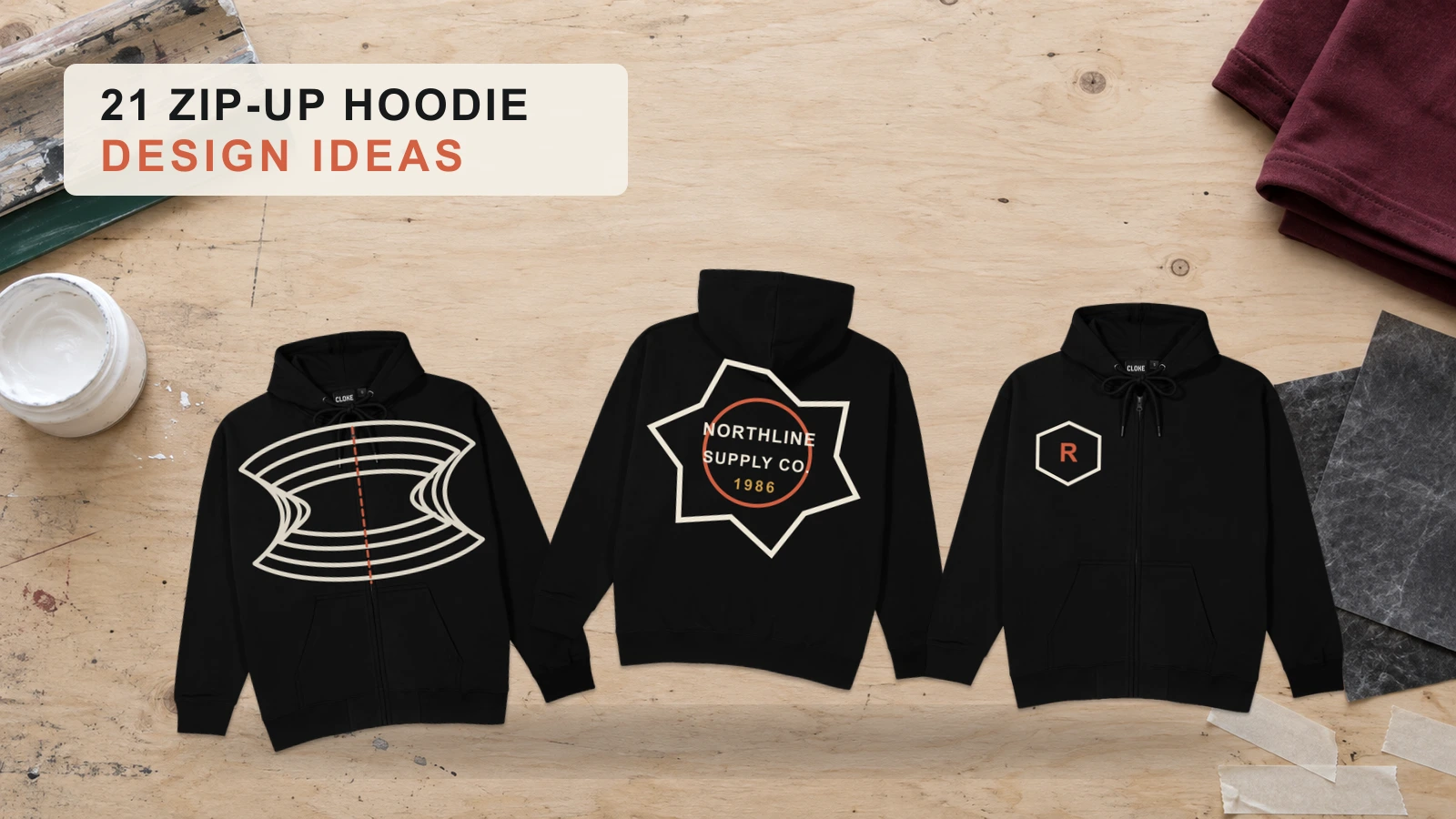
3. Zip-Up Black Hoodie Design Ideas
Zip-up black hoodies suit designs that account for the center zipper rather than treating the front as one continuous print area. Small chest logos, split graphics, sleeve artwork, embroidery, and large back illustrations fit the structure particularly well. Designers can use the zipper as a natural dividing line for symmetrical or two-part concepts. Keeping detailed artwork away from zipper hardware also helps maintain a cleaner, more coherent front composition.
4. Quarter-Zip Black Hoodie Design Ideas
Quarter-zip black hoodies favor structured designs that work around the upper-center zipper and emphasize the chest, sleeves, or back. Small emblems, monograms, technical graphics, club identities, and restrained typography complement the style without competing with its neckline construction. Larger illustrations can shift to the back for greater visual freedom. Sleeve symbols or compact chest marks also suit modern, branded, and techwear-inspired hoodie design concepts.
5. Heavyweight Fleece Black Hoodie Design Ideas
Heavyweight fleece black hoodies complement bold graphics, embroidery, vintage concepts, and streetwear designs that benefit from a substantial garment appearance. Large back illustrations, collegiate lettering, distressed logos, and compact embroidered marks can align naturally with the heavier silhouette. Still consider fabric and garment construction when selecting a decoration method, especially for intricate artwork. Visually, restrained graphics can also contrast effectively with the hoodie’s substantial proportions.
6. Premium Cotton Black Hoodie Design Ideas
Premium cotton black hoodies pair well with refined logos, minimal typography, custom artwork, brand slogans, and polished merchandise concepts. Clean layouts and controlled spacing let the garment and artwork contribute equally to the finished look, rather than letting the graphic dominate. Small chest marks support understated branding, while carefully composed back artwork creates a stronger statement. Check fabric construction and decoration compatibility before selecting a specific printing or embroidery method.
What Black Hoodie Design Placement Ideas Create Better Designs?
Front chest, left chest, back, sleeve, pocket, hood, and all-over placements create different focal points and determine how artwork interacts with a black hoodie’s structure. Front and back areas support prominent graphics, while the chest, sleeve, pocket, and hood suit smaller supporting details. Effective placement considers artwork scale, visibility, seams, zippers, pockets, and garment proportions so each element feels connected to the hoodie rather than added without purpose.
Below are the placement areas that work well for different black hoodie designs:
- Front Chest Black Hoodie Design Placement
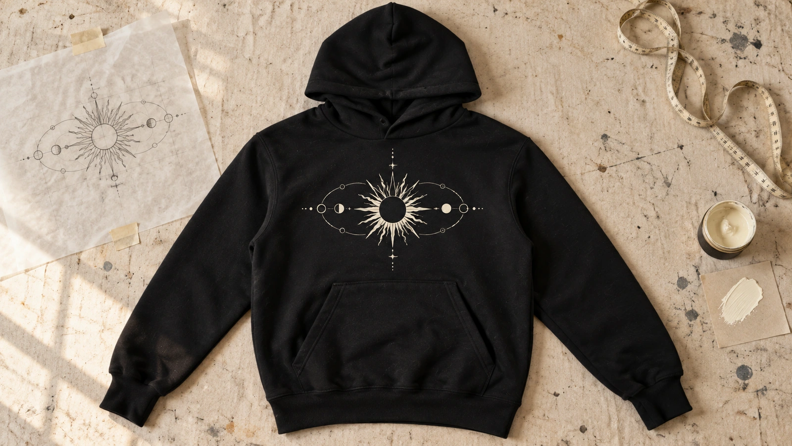
The upper torso provides a prominent focal area for typography, illustrations, logos, symbols, and medium-to-large graphics. Centered artwork creates immediate visibility and works particularly well for statement-driven hoodie designs. Keep graphic scale proportional to the garment, and for pullover designs, account for the kangaroo pocket so artwork does not appear unintentionally interrupted.
- Left Chest Black Hoodie Design Placement
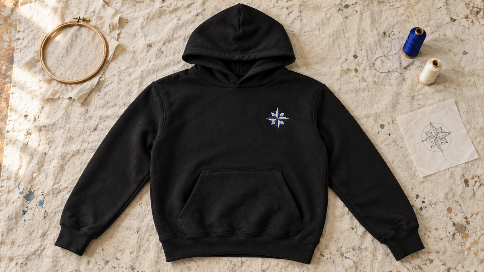
Compact artwork positioned near the upper-left torso creates subtle branding without dominating the garment. Logos, monograms, embroidered icons, initials, and small emblems fit naturally within this limited area. Generous negative space reinforces a minimalist appearance, while a small chest mark can also complement larger back artwork to create a coordinated front-and-back design.
- Back Graphic Black Hoodie Design Placement
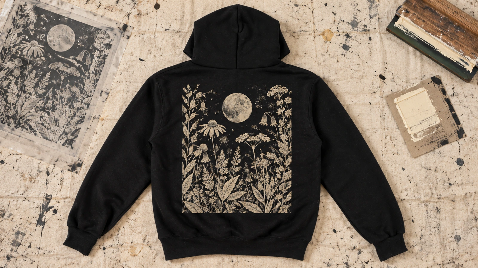
The broad rear surface gives illustrations, oversized typography, photography, characters, and branded graphics more room to develop visual detail. Large artwork can stay centered for balance or extend vertically to emphasize the garment’s proportions. This area is especially useful for streetwear, creator merchandise, and graphic hoodie designs that require greater scale or viewing distance.
- Sleeve Black Hoodie Design Placement
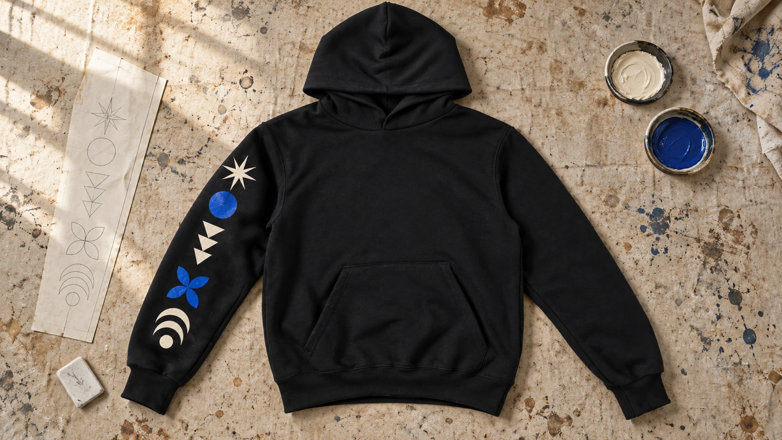
Running artwork along the arm introduces a secondary visual area for vertical typography, symbols, repeating patterns, dates, coordinates, or supporting brand details. A single decorated sleeve creates asymmetry, while graphics across both sleeves establish a more coordinated appearance. This location can also connect front and back artwork without competing with either primary focal area.
- Pocket Black Hoodie Design Placement
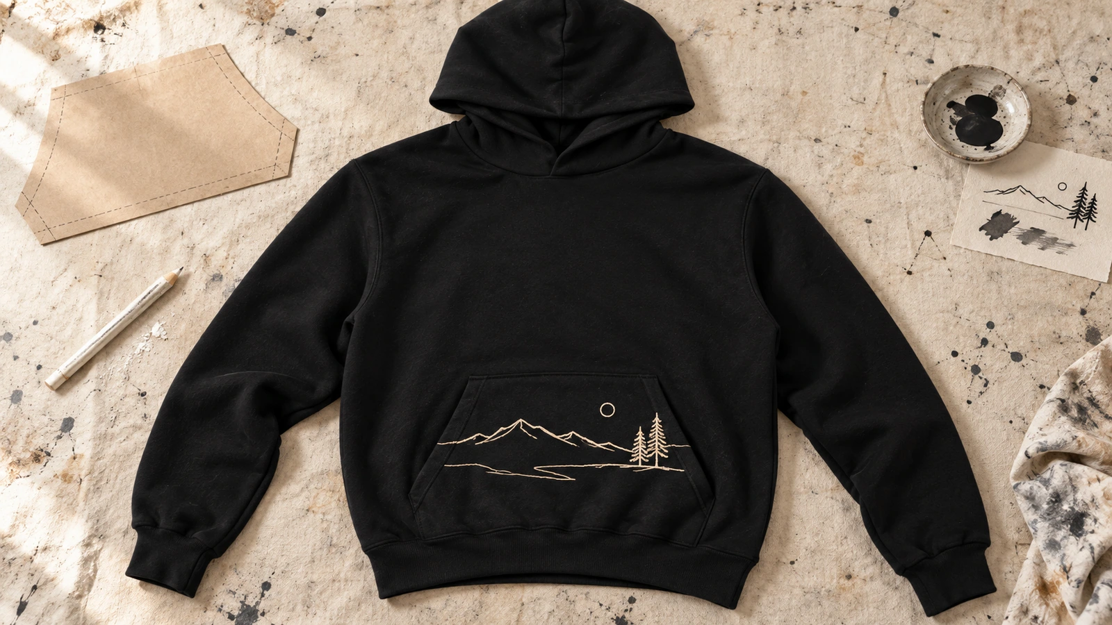
Using the kangaroo pocket as part of the composition creates an unconventional area for small symbols, line art, typography, or graphics that interact with the pocket shape. Artwork may sit directly above it, align with its edges, or incorporate its outline into the concept. This approach preserves more open space across the upper chest while giving the lower front a deliberate visual purpose.
- Hood Black Hoodie Design Placement
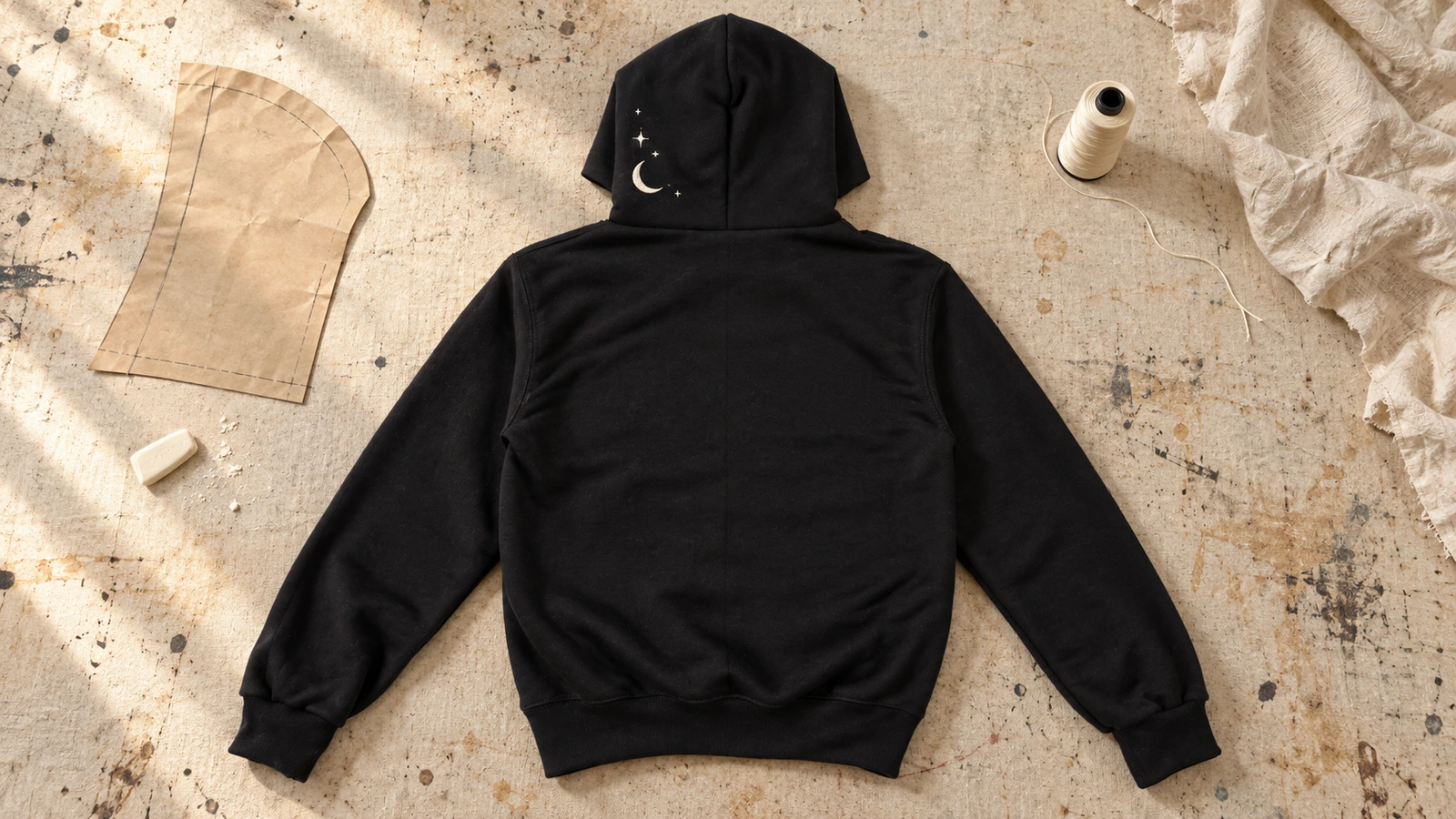
Graphics applied around the hood introduce visual detail that becomes more noticeable from side and rear viewing angles. Compact typography, symbols, logos, patterns, or repeating motifs can follow the center, edge, or individual hood panels. Because seams and natural folds can interrupt artwork, simpler compositions adapt better than intricate graphics that rely on continuous detail.
- All Over Print Black Hoodie Design Placement
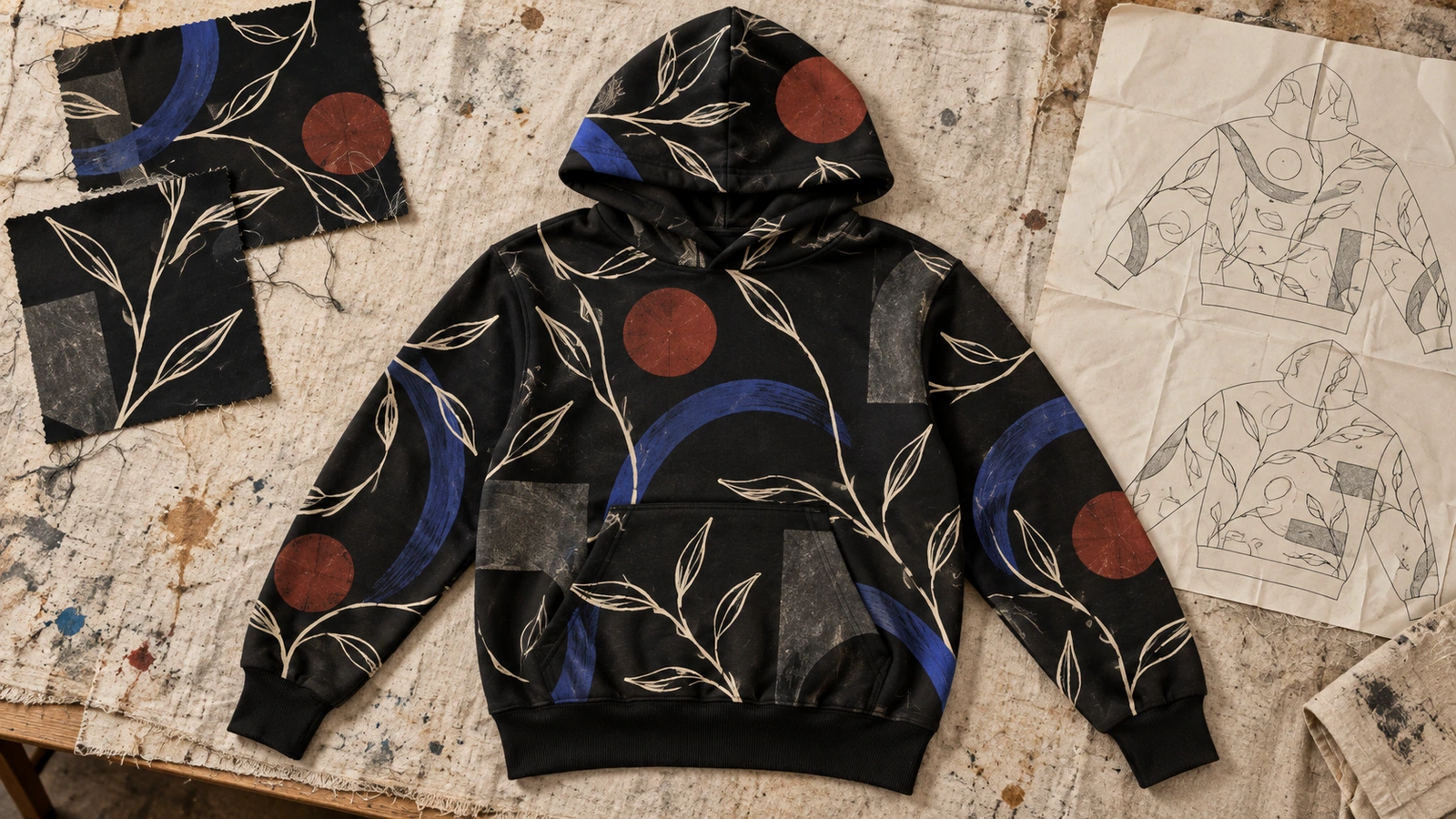
Treating multiple garment panels as one composition allows patterns, abstract artwork, geometric forms, or illustrated motifs to extend beyond conventional print areas. Graphics can continue across the torso, sleeves, back, and hood to create an immersive design style. Consider seam positions, pockets, panel boundaries, and garment construction so important subjects or text aren’t unintentionally split.
How Do You Choose the Right Design Style for a Black Hoodie?
Choose a black hoodie design by matching the audience and brand first, then evaluate the visual style, color contrast, graphic size, placement, typography, printing method, and final mockup. These factors should work as one system rather than separate decisions. A streetwear audience may respond to oversized graphics, for example, while company apparel may benefit from restrained branding, compact placement, and highly readable typography.
Consider these factors before choosing your black hoodie design style:
- Audience and brand
Start with the people who will wear the hoodie and the identity it needs to represent. Streetwear customers, employees, sports teams, university groups, creators, and event attendees have different visual expectations. Match the artwork, message, and level of detail to that context so the design feels intentional rather than generic.
- Design style
Select an aesthetic that supports the intended message and use case, such as minimalist, vintage, streetwear, illustrated, typographic, or personalized. A clean logo treatment suits understated branded apparel, while graffiti, cyberpunk, collage, or oversized artwork creates a more expressive direction. Keep one dominant visual language so unrelated styles do not compete within the same composition.
- Color contrast
Use the black fabric as part of the color strategy, not just a neutral background. White, bright, or lighter artwork creates pronounced separation, while gray, charcoal, or other dark tones produce a subtler tonal effect. Choose colors based on the intended visibility and mood, and make sure important text, outlines, and small graphic details remain distinguishable.
- Graphic size
Match artwork dimensions to both its level of detail and the available garment area. Large illustrations and statement typography benefit from broader front or back spaces, while monograms, icons, and simple logos often work at smaller scales. Consider the overall hoodie proportions as well, since artwork that feels balanced on an oversized silhouette may appear dominant on a more fitted garment.
- Design placement
Decide where viewers should notice the artwork and how it should interact with the garment structure. Front and back areas provide stronger focal points, while the left chest, sleeves, pocket, and hood work well for secondary or understated details. Account for zippers, seams, pockets, and folds before finalizing the composition so important artwork is not unintentionally interrupted.
- Typography
Choose letterforms according to the message, design style, and required viewing distance. Heavy fonts suit bold statements and athletic graphics, while clean or compact type works well for minimal branding and supporting information. Maintain clear hierarchy between primary and secondary text, and control spacing carefully so names, slogans, dates, or quotes remain readable against the black garment.
- Printing method
Match the decoration technique to the artwork, fabric, quantity, and intended finish rather than selecting it after the design is complete. Screen printing commonly suits solid-color graphics and larger runs, while direct-to-garment and direct-to-film methods can accommodate different levels of graphic detail. Embroidery suits compact logos and symbols particularly well. Actual compatibility depends on the hoodie fabric, artwork, equipment, and production provider.
- Preview mockup
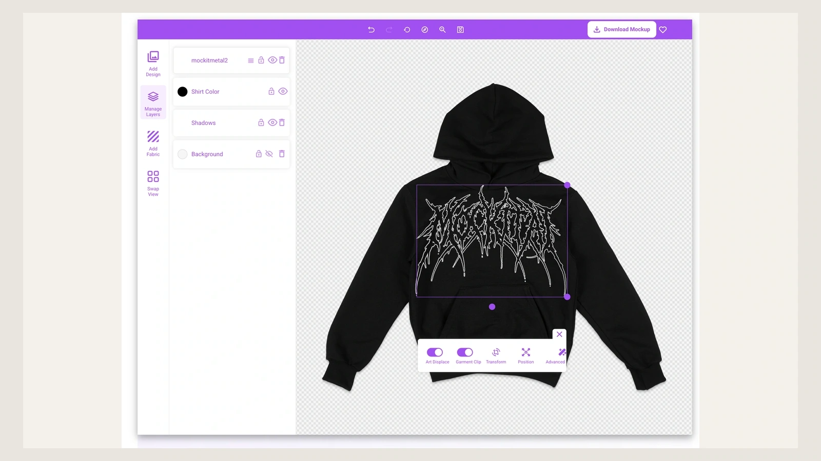
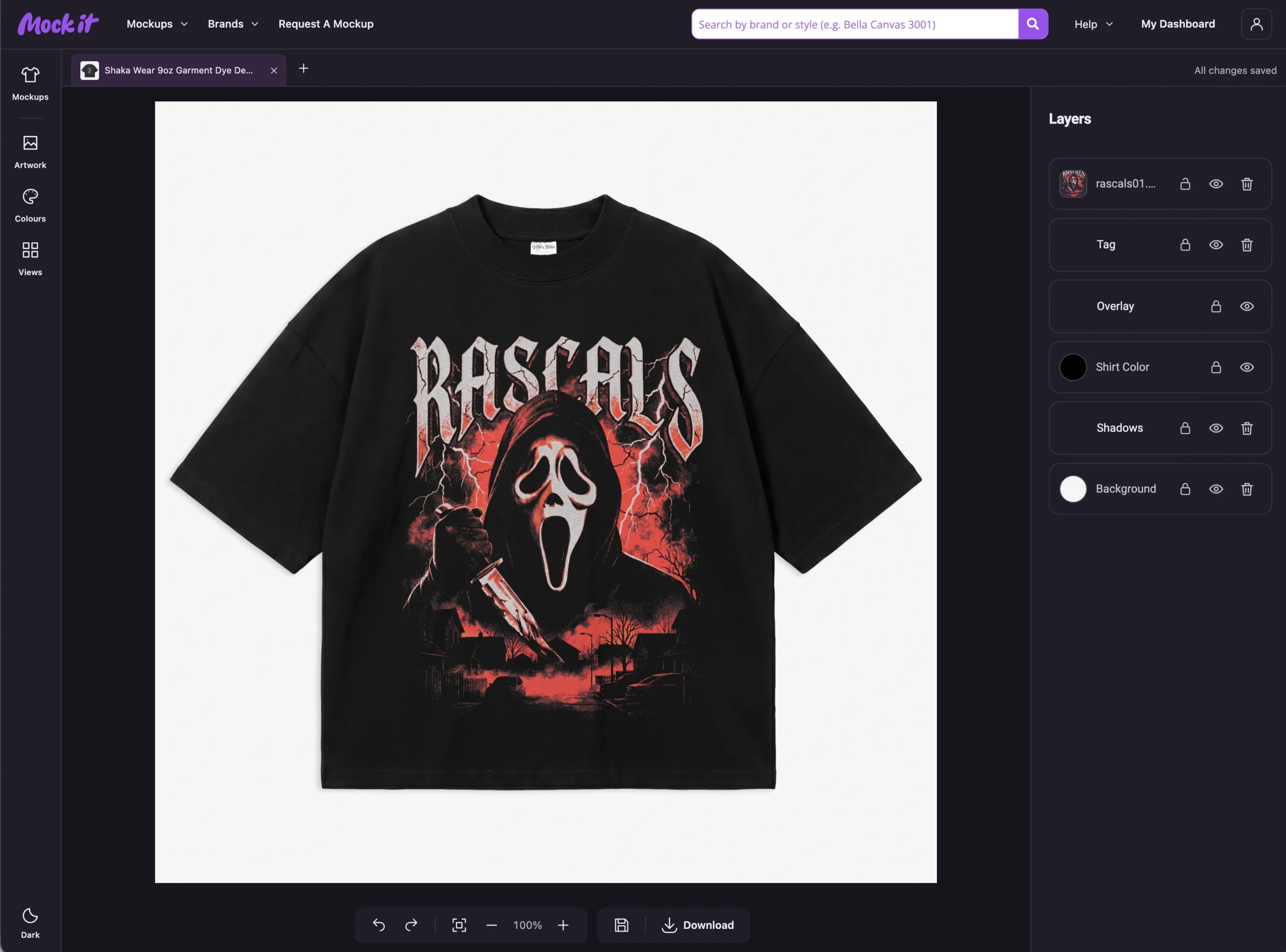
Review the complete design before production to confirm artwork scale, alignment, contrast, text readability, and how it interacts with pockets or zippers. After refining these details, use a hoodie mockup generator to preview how the artwork looks on the actual garment. Seeing the front, back, sleeves, and hood in context can reveal proportion and placement issues that are difficult to identify from the artwork file alone.
What Are Common Mistakes to Avoid When Choosing a Black Hoodie Design?
Avoid low-contrast graphics, overly fine details, poor placement, incorrect print sizing, unsuitable printing methods, and designs that ignore fabric texture when choosing a black hoodie design. These issues can reduce readability, disrupt visual balance, or affect how accurately the artwork appears on the finished garment. Check contrast, graphic dimensions, placement, fabric characteristics, and decoration compatibility before finalizing the design for production.
Keep these critical design pitfalls in mind before sending your black hoodie to production:
- Low-contrast graphics
Dark grays and muted shades blend directly into black fabric, causing text and key shapes to fade at a distance. Rely on high-value contrast like bright whites or vibrant colors to keep your artwork legible. For a subtle black-on-black look, intentionally adjust value levels or choose glossy specialty inks that reflect light.
- Thin lines and small text
Fine linework and tiny text that look clear on a monitor often bleed or disappear completely when printed on thick fleece. Simplify detailed illustrations and enlarge typography before finalizing your files. Always check your print provider’s minimum stroke weight requirements to ensure your text stays crisp and legible on the finished garment.
- Poor design placement
Positioning graphics too close to zippers, pouch pockets, or drawstrings creates uneven surfaces that distort ink and break visual flow. Keep primary artwork centered on flat, uninterrupted areas of the chest or back. Reserve compact icons or small logos for cleaner, smaller zones like the left chest, upper neck, or sleeves.
- Low-quality printing
The wrong printing method can ruin vibrant colors, obscure details, or cause early cracking. Match screen printing to bold vector art, use Direct-to-Film or DTG for complex multi-color illustrations, and save embroidery for small, textured chest logos. Ensure your provider applies a bright white underbase so colors don’t look dull on black.
- Wrong print size
A single graphic size can overwhelm a Small hoodie while looking tiny and lost on a 3XL frame. Measure your artwork against actual printable dimensions, leaving a healthy buffer from all seams. For production runs across various garment sizes, create two artwork scales so the visual weight stays consistent from smallest to largest.
- Ignoring fabric texture
Coarse fleece and synthetic blends absorb inks differently than smooth cotton, which can distort fine lines and reduce color vibrancy. Choose 100% cotton-faced hoodies when you need high-detail printing. For heavier or textured fabrics, lean toward bold graphic strokes, heavy underbases, or surface-mounted techniques like DTF transfers and embroidered patches.

 Trusted By Thousands Of Designers
 Cancel Your Subscription Anytime
 30 Day Money Back Guarantee