
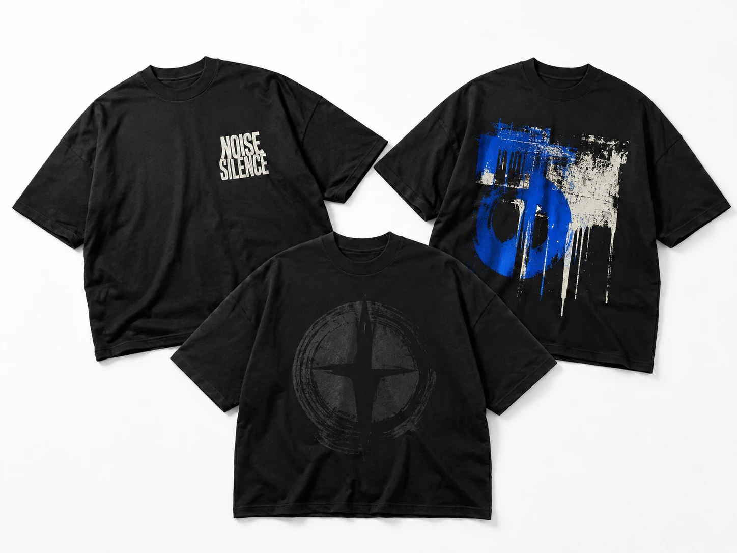
Black T-shirt design ideas range from minimalist typography, bold statements, and small chest graphics to oversized back prints, vintage artwork, retro graphics, streetwear, gothic designs, abstract compositions, and geometric patterns. Other approaches include line art, hand-drawn and artistic illustrations, logo-based graphics, monochrome designs, black-on-black effects, repeating patterns, cute graphics, and coordinated front-and-back layouts. Each black t-shirt style uses typography, illustration, scale, texture, spacing, or placement differently to create a distinct visual direction on black fabric.
The right black T-shirt design should balance visual style with practical design choices. Before finalizing the artwork, consider the target audience, graphic size, placement, typography, illustration style, level of detail, print finish, and shirt fit. Use contrast and negative space to maintain clarity, choose a focal point to establish hierarchy, and match graphic scale to the printable area. Previewing the finished black tee design on appropriate mockups can also reveal issues with sizing, placement, proportion, and composition before printing.
Below are the 19 t-shirt design ideas:
1.Minimalist Typography Design
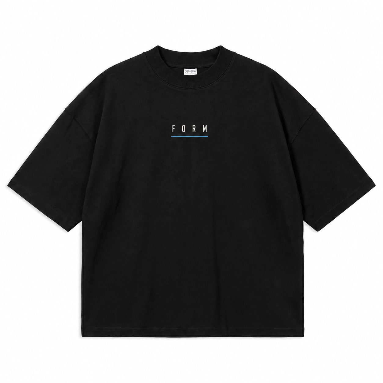
Minimalist typography is one of the simplest black T-shirt design ideas, using a single word, phrase, date, coordinates, initials, or a compact statement as the main visual element. Low visual complexity keeps the typography as the clear focal point, while controlled spacing and limited supporting elements maintain a minimal composition.
Defining elements: restrained font size, clear spacing, minimal typography, and subtle graphic elements such as a line, symbol, or logo.
Popular directions:
- Word or phrase: place compact text such as “Create,” “Focus,” “Stay Curious,” or “Less Is More” at the center chest with minimal supporting artwork.
- Date or coordinates: use controlled spacing for a subtle front or upper-back design.
- Initials or logo text: position a compact typographic mark on the left chest for a simple branded result.
2.Bold Statement Typography
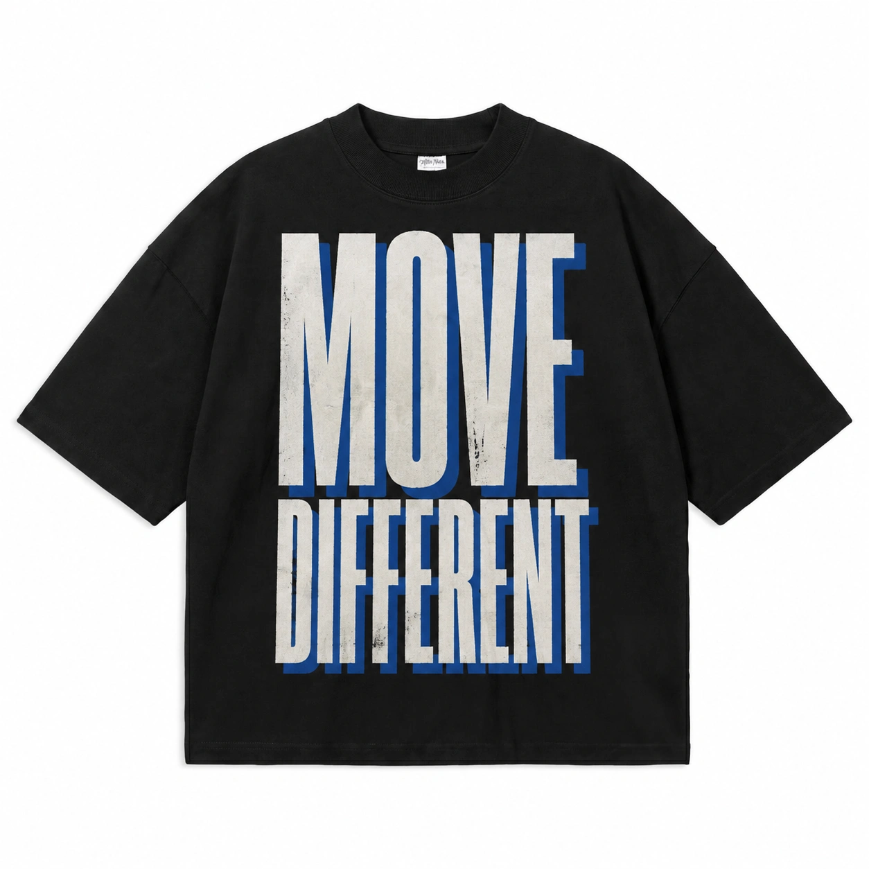
Among typography-focused black T-shirt design ideas, bold statement designs make large text the dominant visual element. The wording carries the main design concept, while font weight, capitalization, text width, line breaks, and alignment establish hierarchy without relying on a supporting illustration.
Defining elements: bold typography, large letterforms, controlled line breaks, strong alignment, and limited supporting graphic elements.
Popular directions:
- Single statement: place text such as “CREATE YOUR OWN” or “MAKE IT COUNT” across the front using bold capitalization.
- Stacked phrase: divide a phrase such as “STAY / TRUE / ALWAYS” across multiple lines to create vertical hierarchy.
- Wide typography: position a short statement across the shirt using increased text width and centered alignment for a bold visual result.
3.Small Chest Graphic
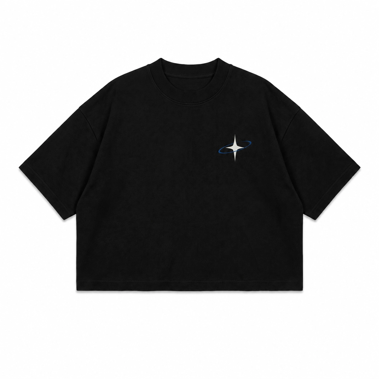
Small chest graphics provide black T-shirt design ideas for artwork that needs a compact placement rather than a dominant front print. Icons, symbols, badges, brand marks, and mini illustrations fit the chest area well when their shapes and details remain clear at a reduced scale.
Defining elements: compact size, simple shapes, clean linework, controlled detail, and clear spacing.
Popular directions:
- Icon or symbol: place a simple star, flame, flower, or geometric symbol on the left chest for a subtle visual detail.
- Badge graphic: combine a compact symbol with short typography inside a clean badge layout.
- Mini illustration: use a simple animal, object, or line-art graphic at the center chest with limited fine detail.
- Brand mark: place a logo or monogram on the left chest for a clean, branded look.
4.Oversized Back Graphic
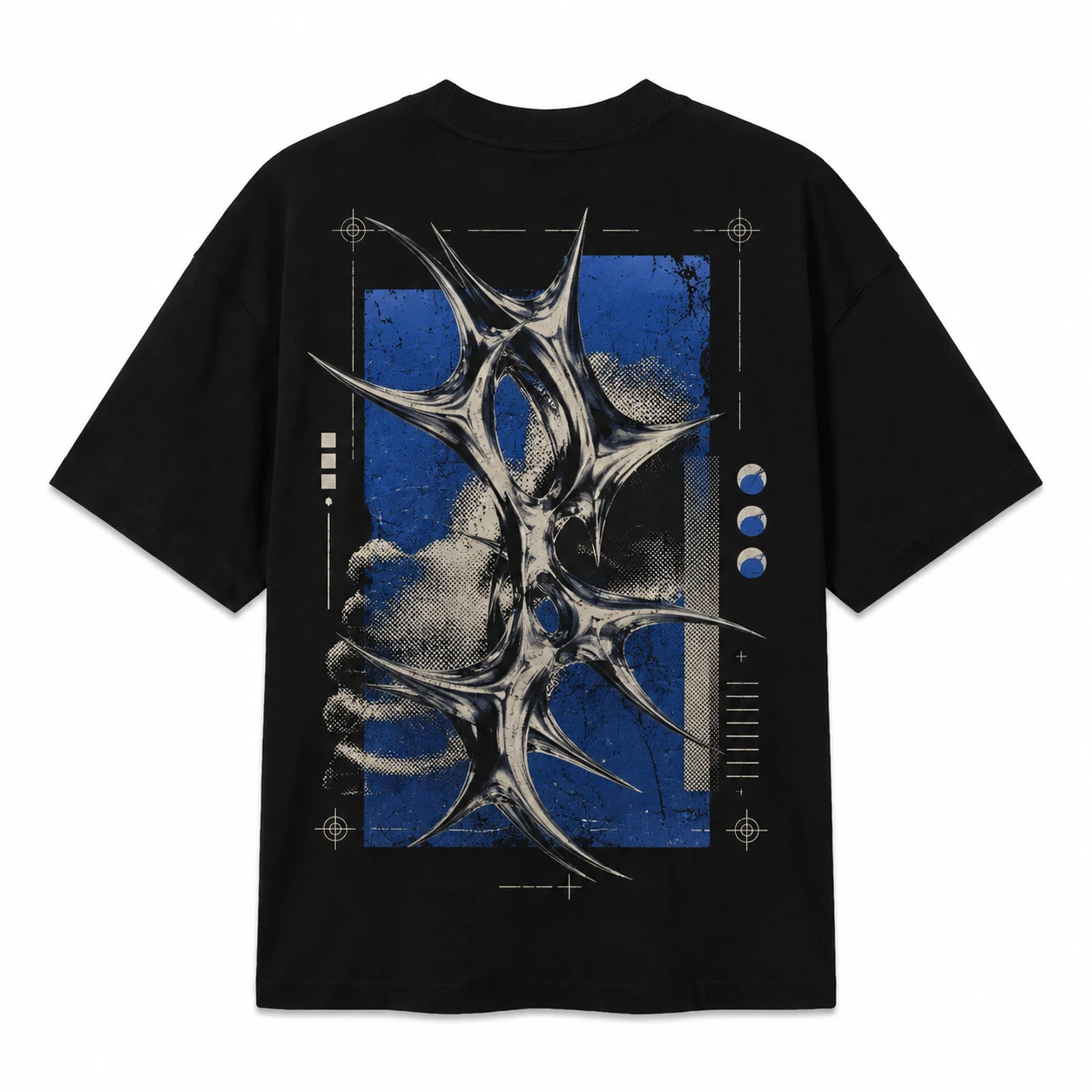
For black T-shirt design ideas that require more visual space, an oversized back graphic turns the broad back area into the primary design surface. Full illustrations, poster-style graphics, large symbols, or artwork with supporting text can use this area effectively, while a minimal front preserves the back design as the main focal point.
Defining elements: large graphic scale, clear focal artwork, balanced supporting text, and a composition designed for the full-back area.
Popular directions:
- Full illustration: display a large portrait, creature, object, or artistic scene across the back.
- Poster-style graphic: combine a dominant image with short typography in a structured layout.
- Large symbol: place an oversized emblem, icon, or logo at the center of the back.
- Small front + large back: pair a subtle chest mark with the main oversized back graphic.
5.Vintage Graphic Design
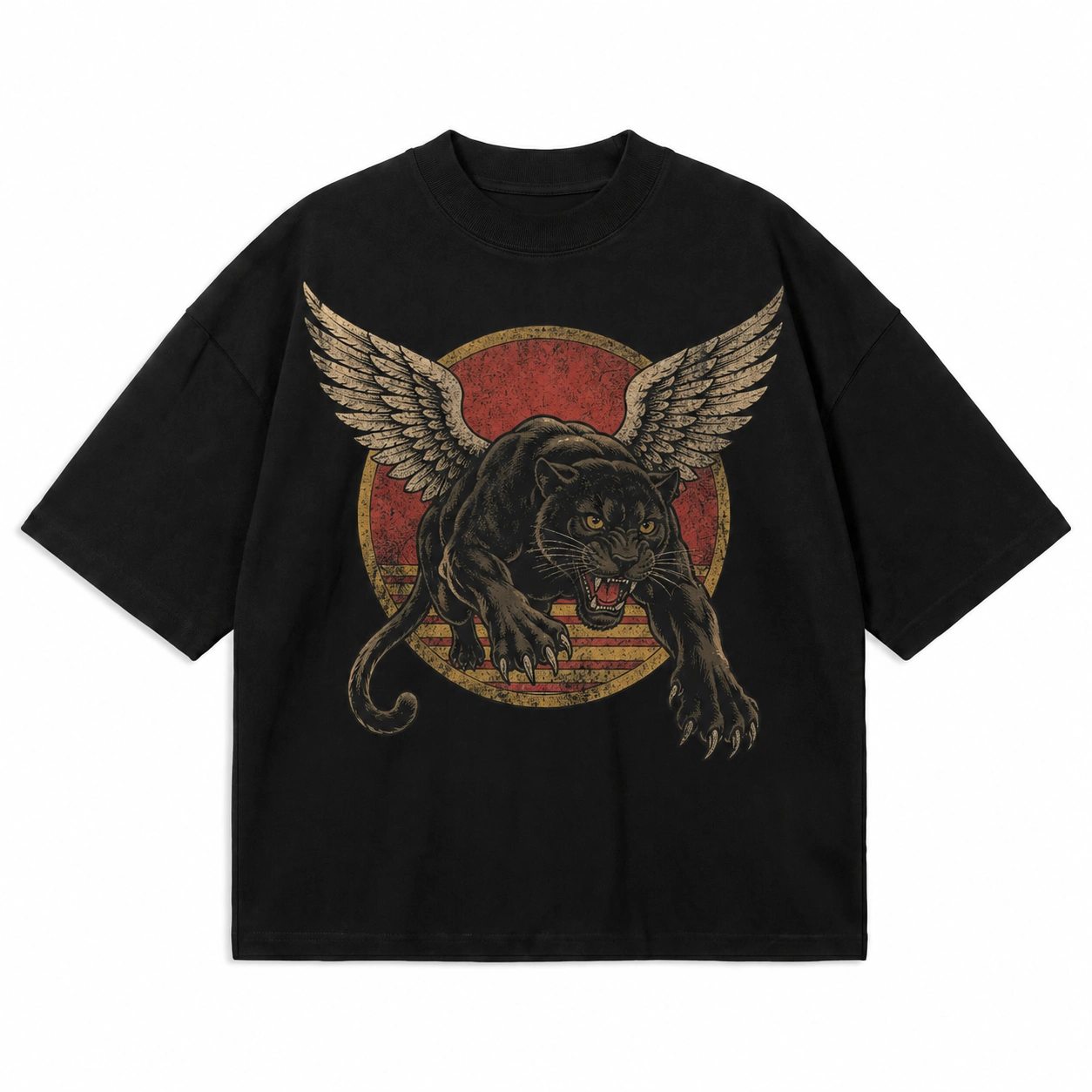
Vintage graphics bring an aged, heritage-inspired direction to black T-shirt design ideas through artwork that resembles prints from an earlier time. Distressed textures, worn lettering, badge layouts, and heritage-style illustrations create this appearance, making themes such as motorsport, music, workwear, or sports suitable visual subjects.
Defining elements: aged typography, distressed print effects, badge-style layouts, heritage illustrations, and controlled texture.
Popular directions:
- Motorsport graphic: combine a vehicle, racing number, and worn typography in a badge or poster-style layout.
- Music graphic: pair an instrument, symbol, or compact illustration with aged lettering and supporting text.
- Heritage badge: arrange a logo, date, and short phrase within a structured badge design.
- Workwear graphic: use simple tools, symbols, or brand-style artwork with a print-worn finish.
6.Retro Graphic Design
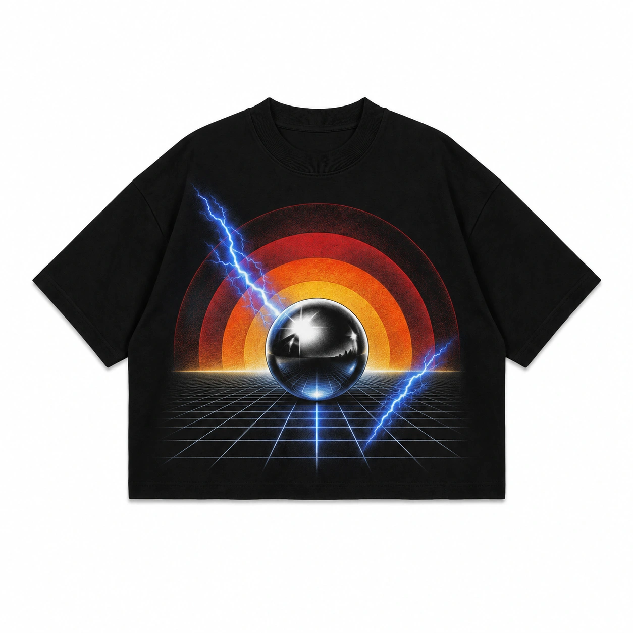
A black T-shirt takes on a distinctive, period-inspired aesthetic when retro graphic design elements draw from styles of past decades. Curved lettering and flowing forms can reference the 1970s, geometric shapes and structured graphics can reflect the 1980s, while expressive typography and graphic treatments can create a 1990s-style design.
Defining elements: period-inspired typography, recognizable shapes, structured layouts, geometric forms, and graphic treatments associated with a specific decade.
Popular directions:
- 1970s style: combine curved typography with flowing shapes and a simple graphic.
- 1980s style: use geometric forms, repeated lines, and bold typography in a structured layout.
- 1990s style: pair expressive lettering with graphic symbols and layered forms.
- Retro logo: style a logo or brand mark with typography and shapes associated with a selected period.
7.Streetwear Design
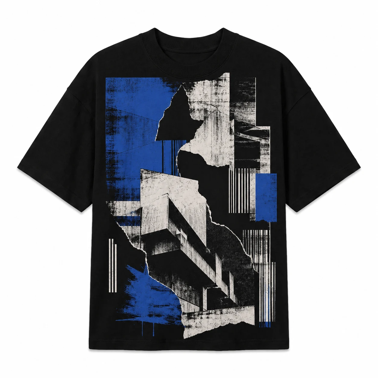
Streetwear provides black T-shirt design ideas built around strong visual hierarchy, oversized graphics, and coordinated front-and-back layouts. Bold typography, symbols, asymmetric placement, and large back prints define the visual treatment, with a small front mark and dominant back graphic forming a common composition.
Defining elements: oversized graphics, strong typography, prominent symbols, asymmetric placement, and coordinated front-and-back artwork.
Popular directions:
- Small front + large back: pair a compact chest symbol or logo with oversized back artwork.
- Oversized typography: use large text across the front or back as the primary design element.
- Graphic symbol: position a large emblem, icon, or abstract symbol as the focal point.
- Asymmetric layout: place typography and graphics at different positions to create a less uniform composition.
8.Gothic Design
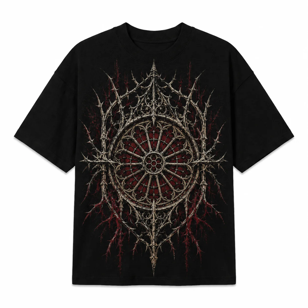
Gothic black T-shirt design ideas use the dark garment as part of the composition, allowing dense linework and dramatic forms to integrate with the black fabric. Medieval-inspired lettering, thorns, crosses, flames, creatures, and architectural motifs can form detailed arrangements without reducing Gothic design to dark-colored artwork alone.
Defining elements: ornamental typography, dramatic forms, symbolic illustration, dense linework, and structured details.
Popular directions:
- Ornamental typography: combine medieval-inspired lettering with thorns, lines, or compact symbols.
- Creature illustration: use a serpent, raven, or similar creature as the main graphic with supporting details.
- Architectural graphic: illustrate arches, windows, or cathedral-inspired forms in a structured composition.
- Symbolic design: combine crosses, flames, thorns, or related motifs around one clear focal element.
9.Abstract Graphic Design
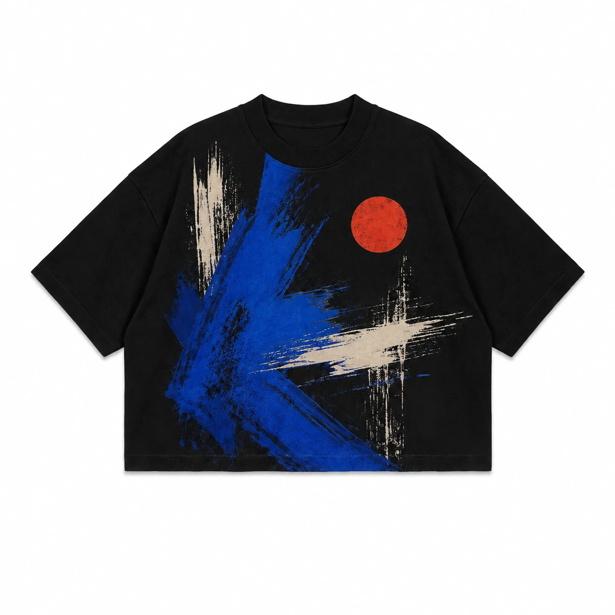
Abstract artwork expands black T-shirt design ideas beyond recognizable objects by using shapes, textures, brushwork, distortion, and irregular forms as the primary visual language. Scale, visual balance, and negative space organize these non-literal elements and establish a clear focal point against the black fabric.
Defining elements: non-literal shapes, irregular forms, controlled distortion, textures, brushwork, and balanced negative space.
Popular directions:
- Distorted forms: combine stretched, warped, or fragmented shapes within one graphic composition.
- Brushwork: arrange expressive strokes and textured marks around a clear focal area.
- Abstract shapes: combine irregular forms of different sizes to create visual hierarchy.
- Texture-based graphic: use repeated marks, rough surfaces, or layered forms to create depth without a literal subject.
10.Geometric Design
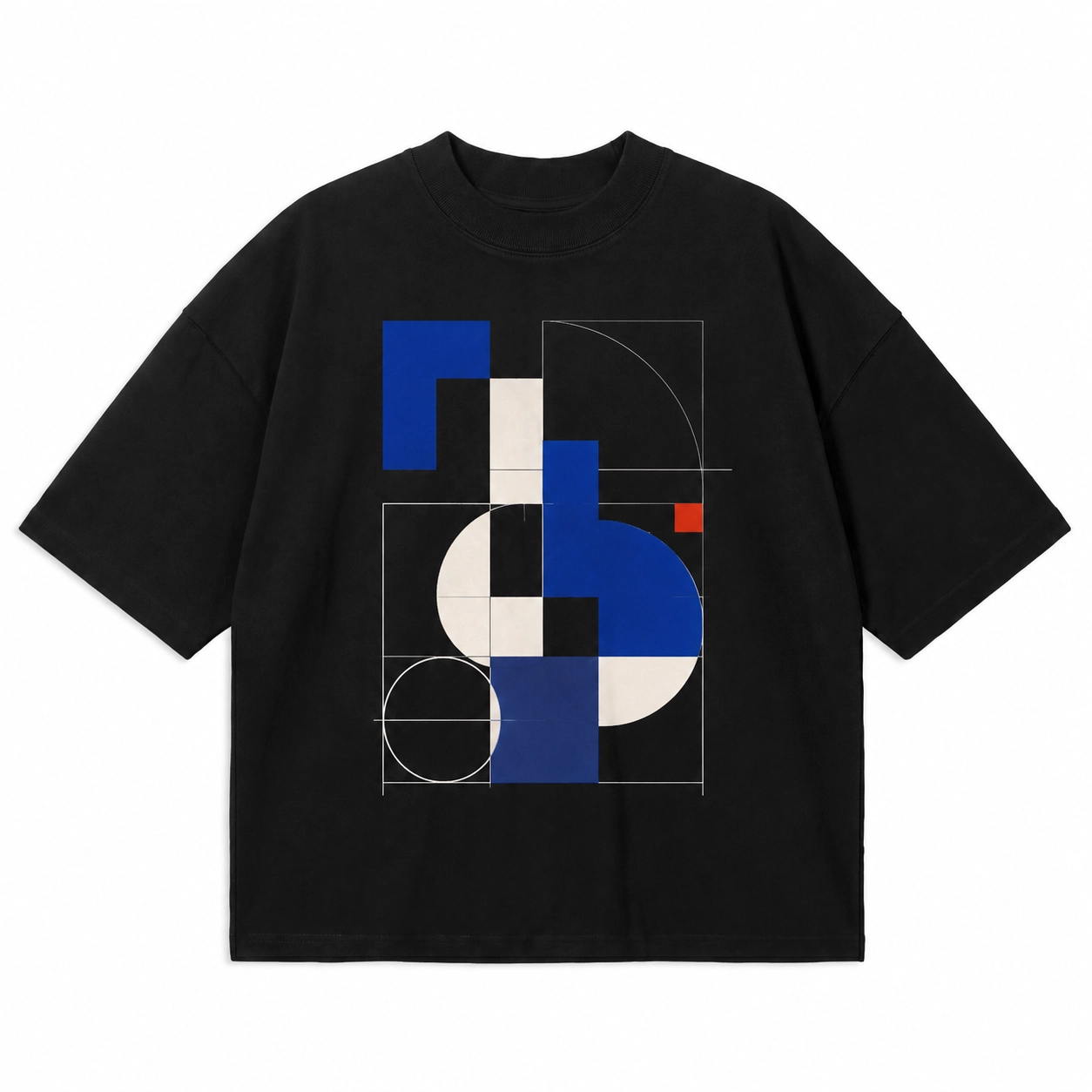
Geometric design builds the black T-shirt artwork around structured shapes and deliberate spatial relationships. Circles, polygons, grids, repeated lines, and symmetrical forms can create a clear visual system where proportion, repetition, and alignment provide the main graphic interest.
Defining elements: structured shapes, repeated forms, consistent spacing, symmetry, grids, and controlled line systems.
Popular directions:
- Grid composition: arrange lines, squares, or symbols within a structured grid with consistent spacing.
- Repeated shapes: use circles, triangles, or polygons in a repeated pattern to create visual rhythm.
- Symmetrical graphic: mirror geometric forms around a central axis for a balanced composition.
- Line system: combine parallel, intersecting, or connected lines to produce a clean geometric graphic.
11.Line Art Design
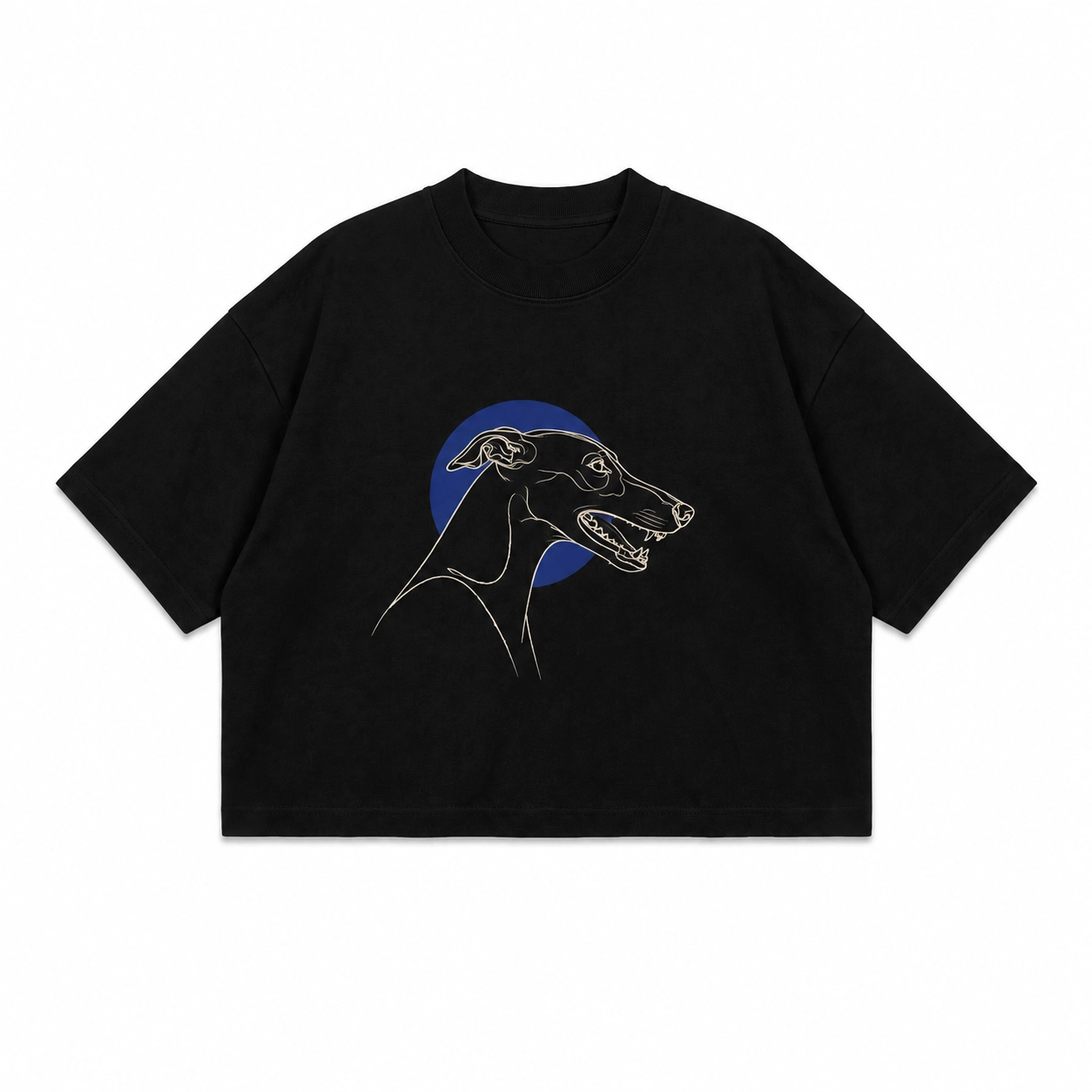
Line art turns outlines into the main visual structure of a black T-shirt design, creating recognizable artwork without relying on large filled areas. Faces, flowers, hands, animals, objects, or abstract contours can work well, provided the line thickness and spacing keep the illustration clear against the black fabric.
Defining elements: controlled outlines, consistent line thickness, clear spacing, limited filled areas, and recognizable contours.
Popular directions:
- Face outline: illustrate facial features with continuous or separated contour lines.
- Floral line art: use stems, leaves, and flower outlines to form a clean vertical composition.
- Animal outline: create a recognizable animal using controlled lines and limited internal detail.
- Abstract contour: combine flowing or intersecting outlines to produce a non-literal graphic.
12.Hand-Drawn Illustration
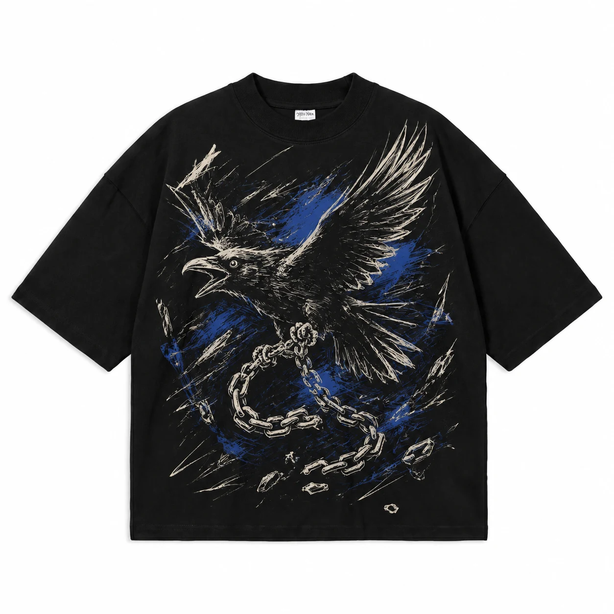
Among black T-shirt design ideas, hand-drawn illustration creates a distinct visual identity through visible sketch lines and intentionally imperfect marks. Ink strokes, brushwork, uneven outlines, and custom drawing details become part of the finished graphic, giving the artwork a different visual character from polished vector designs.
Defining elements: irregular linework, sketch details, ink or brush marks, imperfect outlines, and custom illustration.
Popular directions:
- Sketch illustration: use visible pencil-style or rough lines around an object, face, or figure.
- Ink drawing: create artwork with varied line thickness and expressive ink-style marks.
- Brush illustration: combine broad strokes with smaller details in one composition.
- Hand-drawn symbol: illustrate a flower, hand, eye, animal, or object with intentionally irregular outlines.
13.Artistic Illustration
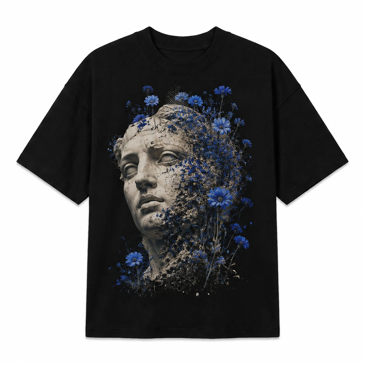
Detailed artwork can make a black T-shirt function as a canvas for a complete visual scene rather than a surface for simple typography or branding. Within black T-shirt design ideas, artistic illustrations can feature portraits, creatures, surreal scenes, objects, or conceptual art, using graphic scale and controlled composition to keep the main subject clear and visually dominant.
Defining elements: detailed illustration, clear focal artwork, controlled composition, visual depth, and supporting elements that do not compete with the main image.
Popular directions:
- Portrait illustration: use a face or figure as the central subject with controlled supporting details.
- Creature artwork: build the composition around an animal or imagined creature.
- Surreal scene: combine recognizable objects in an unusual illustrated composition.
- Conceptual artwork: use objects, symbols, and illustration to communicate one clear visual idea.
14.Logo-Based Design
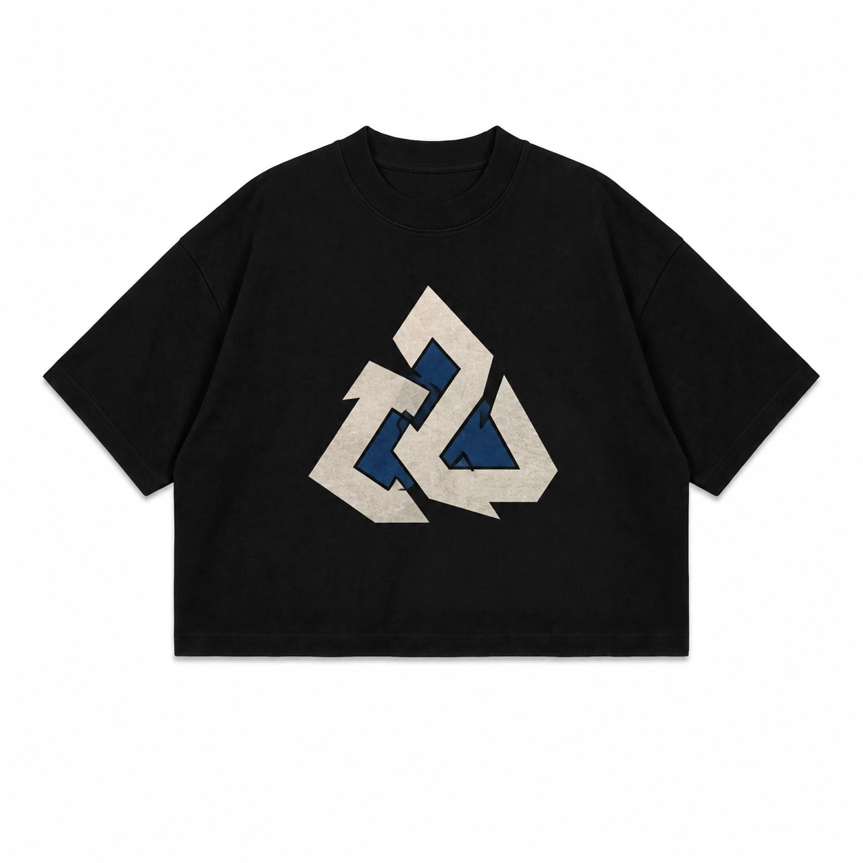
Logo-based black T-shirt design ideas use a logo, emblem, monogram, or brand mark as the primary visual element rather than as support for another graphic. Depending on its size and placement, the logo can create either a subtle branded look or a dominant visual statement.
Defining elements: clear logo shape, controlled scale, suitable placement, minimal supporting artwork, and enough surrounding space to keep the brand mark distinct.
Popular directions:
- Small chest logo: position a compact logo or monogram on the left chest for a subtle branded layout.
- Center logo: place the brand mark at the center chest for greater visual prominence.
- Oversized logo: increase the logo scale across the front to make branding the main graphic.
- Back logo: display a larger emblem or brand mark on the back with a minimal front element.
15.Monochrome Design
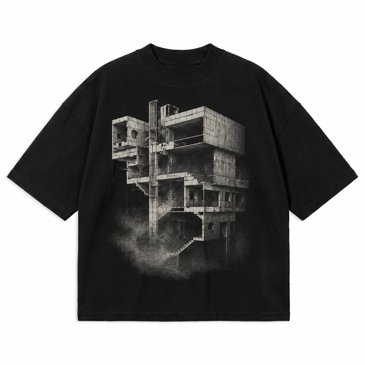
A limited tonal palette gives monochrome black T-shirt design ideas their distinct visual character, allowing the artwork to create depth without using several colors. Typography, illustrations, logos, or graphic forms can rely on differences in tone, shape, texture, and density to separate individual elements while maintaining a consistent visual composition.
Defining elements: limited tonal variation, controlled contrast, clear shapes, balanced texture, and consistent visual treatment.
Popular directions:
- Tonal typography: combine text with subtle tonal variation to establish a clear hierarchy.
- Monochrome illustration: separate the main subject from supporting details through tonal differences and texture.
- Graphic composition: combine shapes, symbols, and patterns within one tonal family.
- Monochrome logo: use limited tonal variation for a clean, branded design.
16.Black-on-Black Design
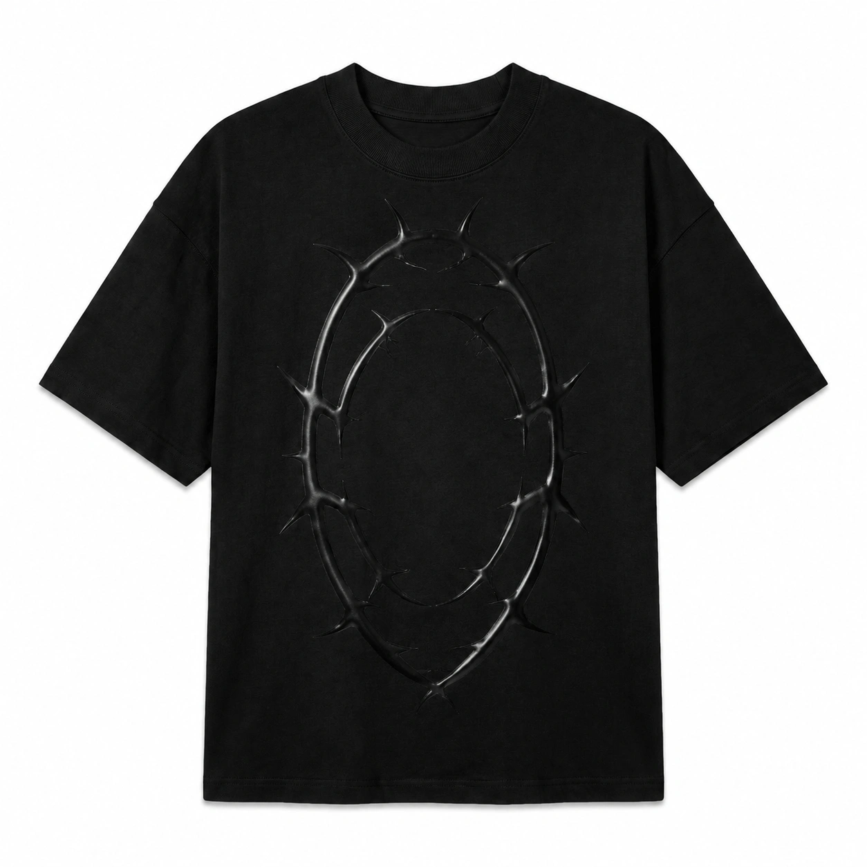
Black-on-black T-shirt design ideas create visual interest by keeping the artwork within the same black appearance as the garment. Matte, gloss, raised, stitched, or textured treatments change how the graphic reflects light and interacts with the fabric, allowing logos, typography, and illustrations to become visible without relying on color contrast.
Defining elements: tonal black ink, matte or gloss finishes, raised surfaces, embroidery, and textured details.
Popular directions:
- Matte and gloss: place a glossy black graphic over a matte black surface to create contrast through reflected light.
- Raised graphic: use a raised logo, symbol, or typography to add visible depth.
- Black embroidery: apply stitched black artwork to create separation through texture.
- Tonal graphic: display a black logo, pattern, or illustration using subtle differences in surface finish.
17.Pattern-Based Design
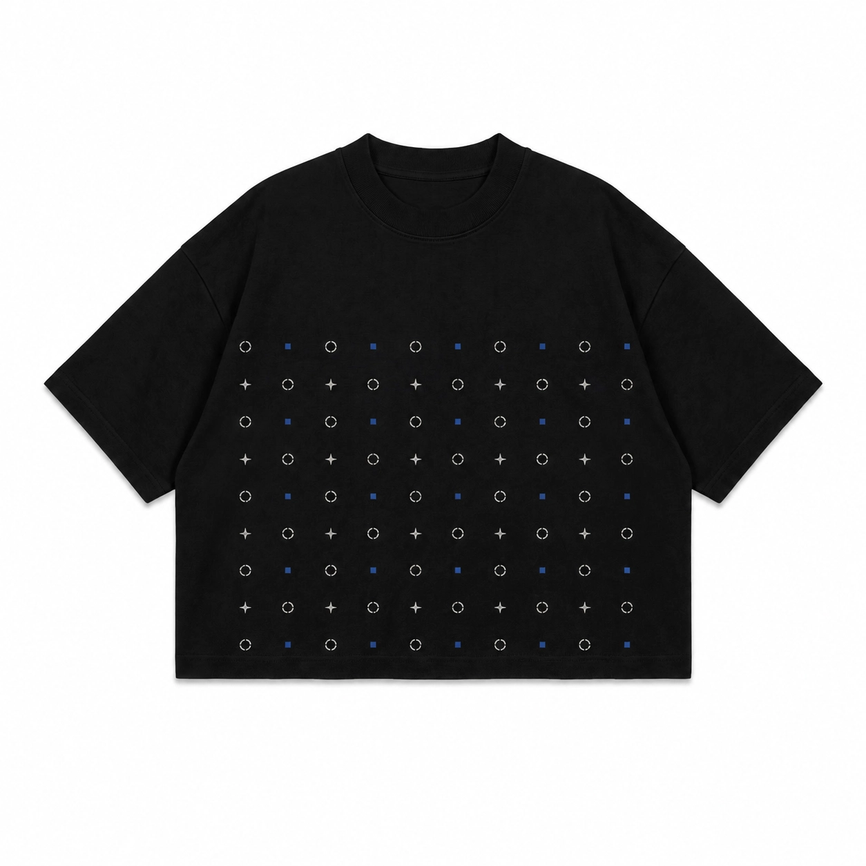
A pattern can turn individual graphic elements into a unified black T-shirt design through controlled repetition. Repeated symbols, icons, lines, textures, or decorative forms create visual rhythm across the fabric, with wider spacing producing a subtle result and denser repetition adding visual weight.
Defining elements: repeated motifs, consistent spacing, controlled pattern density, clear visual rhythm, and balanced placement. Patterns can form a compact chest panel, support a larger graphic, or extend across the front or back of the black T-shirt.
Popular directions:
- Symbol pattern: repeat stars, crosses, icons, or simple symbols within a structured area.
- Line pattern: arrange repeated lines or geometric forms to create visual rhythm.
- Decorative pattern: combine small motifs into a larger organized composition.
- Texture pattern: repeat marks or graphic textures at different densities to control visual weight.
18.Cute Graphic Design
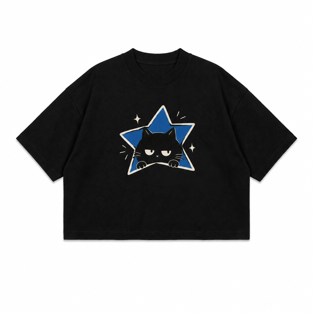
Playful characters and expressive illustrations can create cute black T-shirt design ideas without relying on the garment color for the effect. Simple animals, mascots, doodles, and expressive objects establish the style through rounded shapes, facial expressions, controlled linework, and compact compositions.
Defining elements: simple characters, expressive faces, soft illustration forms, clean linework, and playful graphic details.
Popular directions:
- Animal character: illustrate a cat, bear, rabbit, or frog with a simple expression and controlled details.
- Mascot graphic: create a recognizable character with a clear silhouette and compact supporting elements.
- Expressive object: add a face or expression to an object such as a flower, star, or cup.
- Doodle illustration: combine simple hand-drawn characters, symbols, or objects within one playful composition.
19.Front-and-Back Design
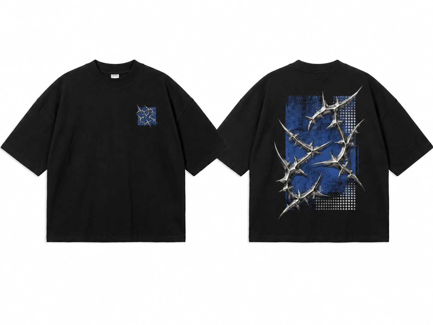
Using both sides of the garment gives front-and-back black T-shirt design ideas more space to distribute visual hierarchy without crowding one surface. A compact front element can introduce the design, while larger artwork, typography, or a statement on the back carries the primary visual focus. Both sides should use related graphic elements so they appear as one coordinated design.
Defining elements: coordinated artwork, consistent typography, related symbols, controlled graphic scale, and clear front-to-back hierarchy.
Popular directions:
- Front mark + back artwork: pair a small chest symbol or logo with a large illustration on the back.
- Front text + back illustration: introduce a short phrase on the front and connect it to related artwork on the back.
- Front symbol + back statement: use a compact symbol in front with larger typography across the back.
- Repeated branding: place a small logo on the chest and a larger version on the back, keeping spacing and style consistent.
How Do You Choose the Right Black T-Shirt Design Idea?
Choose the right black T-shirt design idea by evaluating design style, target audience, graphic size, placement, detail, typography, illustration style, print effect, and shirt fit. Match the artwork’s complexity and scale to the available garment area, then select typography or illustration that supports the intended visual direction. Consider how print texture interacts with black fabric and confirm that the final black T-shirt design remains clear across the chosen shirt silhouette.
Below are the steps to follow while choosing the right black T-shirt design idea:
- Design Style
Choose a style that defines how the black T-shirt design should look against the dark garment surface. Minimal designs use restrained typography and space, streetwear designs favor oversized graphics, gothic artwork uses ornamental forms, and retro graphics reference past visual periods. Compare typography, graphic density, shapes, and composition so the selected style creates a consistent visual direction for the black tee.
- Target Audience
Match the black tee design to its intended wearer and purpose before choosing the artwork. Brand merchandise may use a recognizable logo, event shirts can combine dates with typography, creator merchandise may feature custom illustrations, and personal designs can focus on specific symbols or statements. Use the intended application to determine subject matter, visual density, typography, and overall graphic direction.
- Graphic Size
Set the graphic size according to the complexity of the black T-shirt design and the space needed to keep its elements visible. Detailed illustrations require a larger printable area, while simple logos, symbols, and short phrases can remain clear at smaller sizes. Consider scale together with placement because increasing artwork size also increases its visual dominance across the black shirt.
- Design Placement
Choose placement based on where the black T-shirt design needs to attract attention and how much garment space the artwork requires. Use the left chest for compact logos, center chest for balanced graphics, full front for larger artwork, upper back for supporting elements, and full back for oversized illustrations. Each position changes the design’s visibility, scale, and relationship with the black fabric.
- Level of Detail
Control detail according to the size and viewing distance of the black shirt design. Fine lines, tiny text, dense textures, and compact illustration details can lose clarity when reduced, especially when visual separation from the black fabric is subtle. Preserve the main silhouette and focal element, then simplify secondary details so the artwork remains readable at its intended print size.
- Typography Style
Select typography that supports the message and hierarchy of the black T-shirt design. Compare typeface category, weight, width, capitalization, letter spacing, and line arrangement before finalizing the layout. Heavy typography can create a dominant statement across a black tee, while restrained lettering suits minimal compositions. Keep decorative text readable by controlling stroke thickness, spacing, and print scale.
- Illustration Style
Match the illustration style to the visual character and available area of the T-shirt design. Line art suits outline-based subjects, hand-drawn artwork uses irregular sketch characteristics, geometric graphics rely on structured forms, and abstract artwork uses non-literal compositions. Detailed illustrations need more printable space, while simple symbols and compact graphics stay recognizable in smaller areas of the black T-shirt.
- Print Effect
Select a print effect according to how the black T-shirt design should interact visually with the black fabric. Matte, gloss, raised, embroidered, textured, and tonal treatments change light reflection, surface depth, and graphic visibility. A simple logo can rely on texture or tonal separation, while detailed artwork needs enough edge definition to keep individual lines and shapes visually distinct.
- Shirt Fit and Style
Match the proportions of the black T-shirt design to the actual black tee silhouette because garment fit changes usable width, vertical space, sleeve area, and surrounding negative space. Oversized shirts provide more room for broad back graphics, fitted shirts require narrower compositions, and long-sleeve shirts provide secondary placement areas. Judge graphic scale using the intended garment shape before printing.
Where Should You Place a Design on a Black T-Shirt?
Place a design on the center chest, left chest, full front, small front, upper back, full back, front and back, or sleeve based on the black T-shirt design’s scale and purpose. Chest areas suit logos and compact graphics, full surfaces support detailed illustrations, while upper-back and sleeve placements work well for supporting text, symbols, coordinates, or secondary branding.
Consider these placement options based on the design’s scale and purpose:
- Center Chest
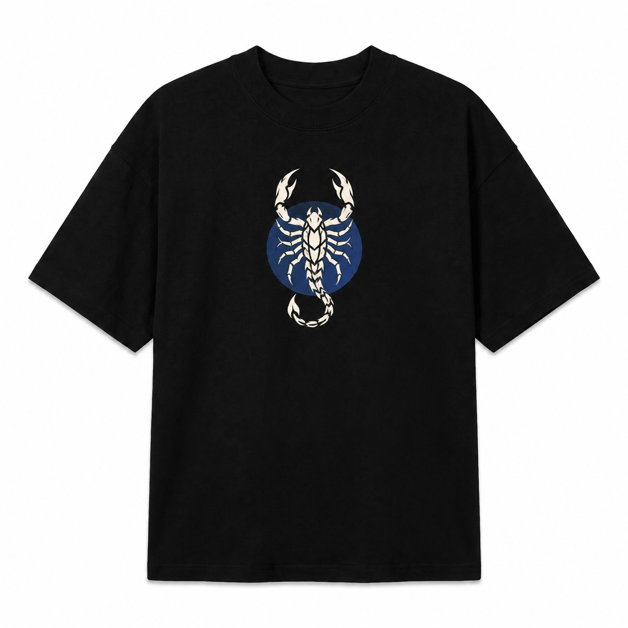
For artwork that needs to become the immediate focal point from the front, the center chest provides a balanced position with black fabric framing both sides of the graphic. Medium-sized logos, short statements, symbols, and balanced graphics work well here. Control the artwork width and vertical position so the black T-shirt design stays prominent without filling the entire front.
- Left Chest
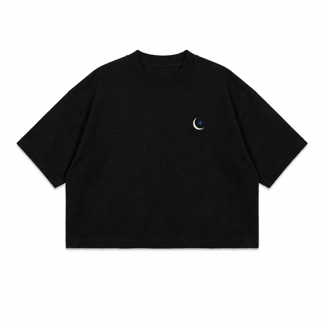
A restrained brand presence works particularly well on the left chest because the small placement keeps most of the black tee visually open. Use this area for logos, monograms, icons, badges, or simple symbols that remain recognizable at reduced scale. A black tee design with fine illustration or long text generally needs more space because small details can lose clarity here.
- Full Front
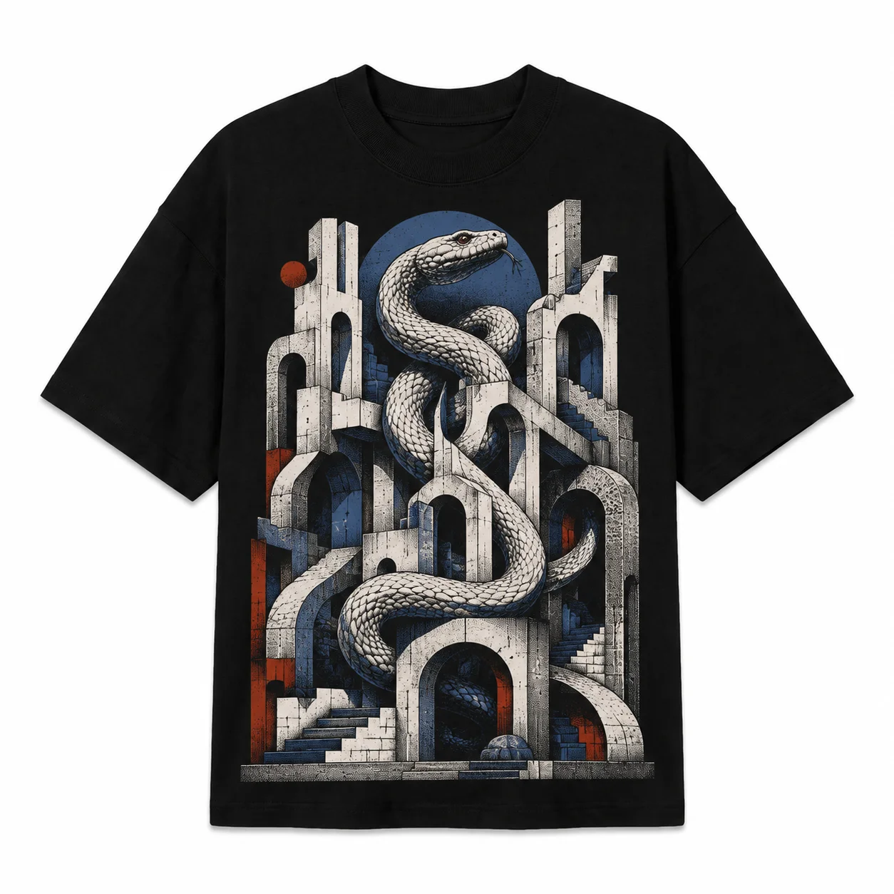
Detailed artwork benefits from a full-front placement because the larger surface gives illustrations, typography, and supporting elements enough room to form one readable composition. Use this area for poster-style graphics, large illustrations, or statement-led black T-shirt design ideas. Balance graphic width, vertical scale, and surrounding black fabric so the artwork feels intentional, not crowded.
- Small Front
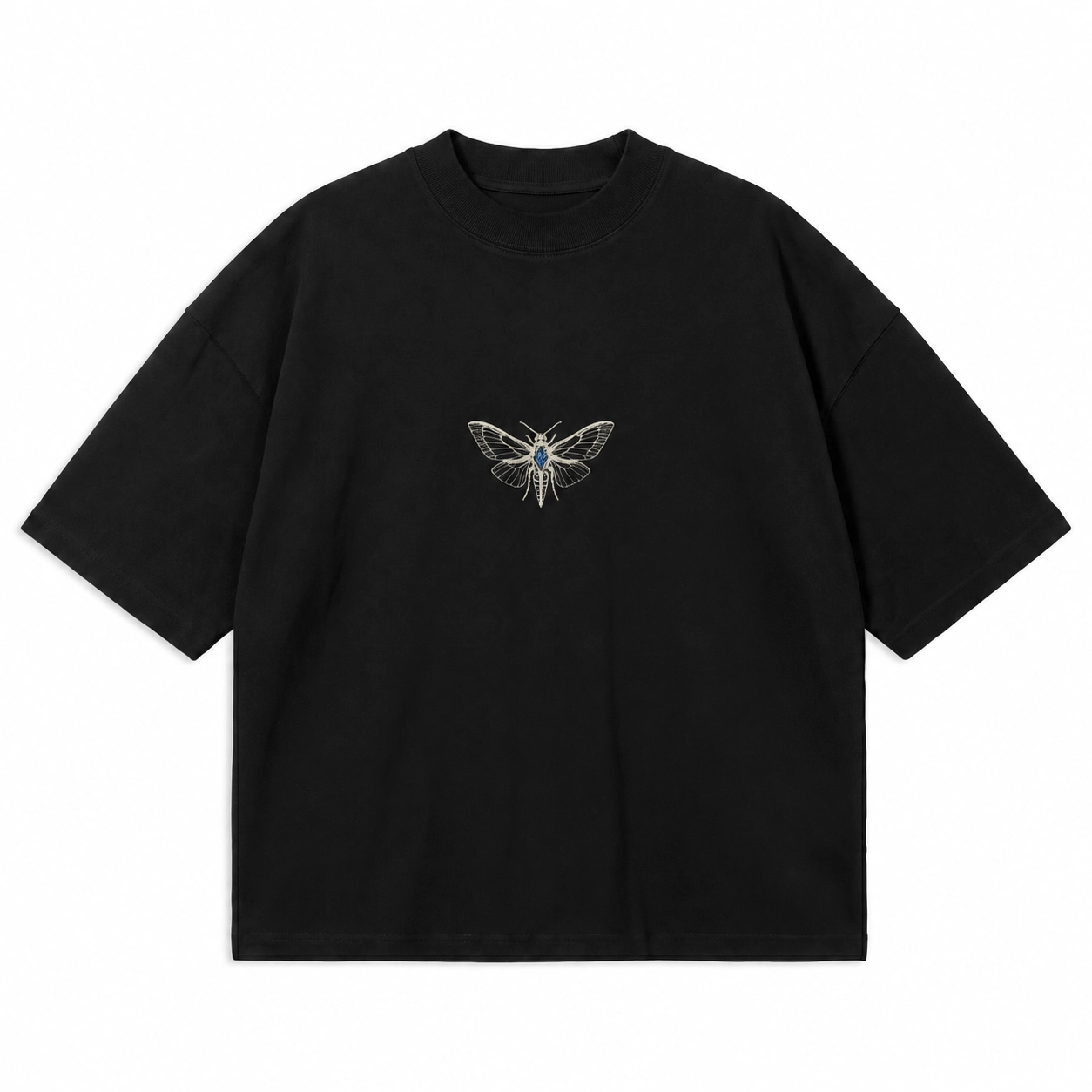
Leaving substantial black fabric visible around a compact graphic can make a small-front placement feel intentional without limiting the artwork to conventional left-chest branding. Position a symbol, short phrase, mini illustration, or compact shirt design centrally or slightly off-center. Use controlled scale and clear spacing to make the smaller composition noticeable while preserving negative space across the front.
- Upper Back
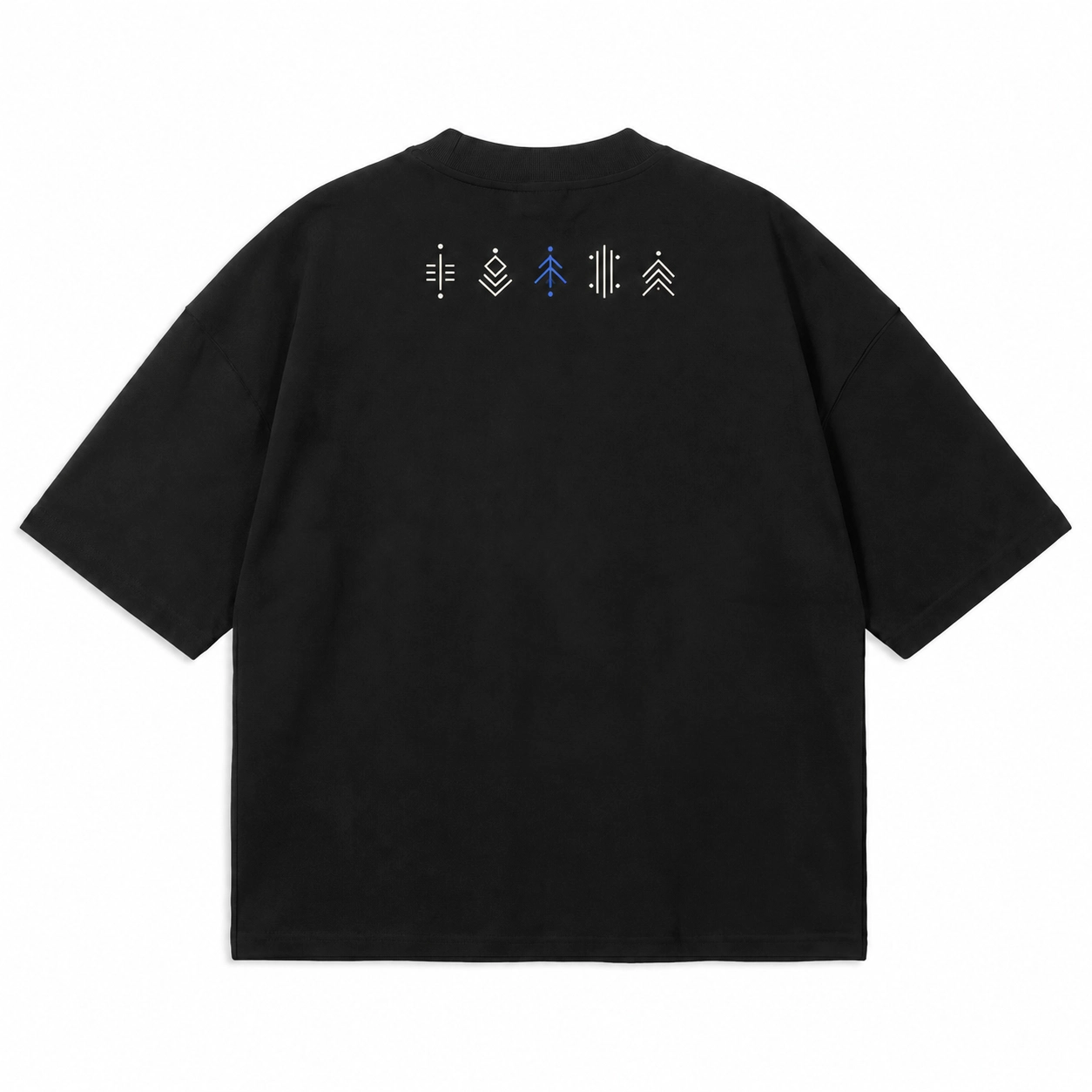
When a design needs secondary information rather than another dominant focal point, the upper back provides a useful supporting area. Dates, coordinates, short typography, compact branding, and symbols can complement a front black T-shirt design without competing with it. Keep the element visually contained and position it as supporting information, especially when another graphic already carries the main hierarchy.
- Full Back
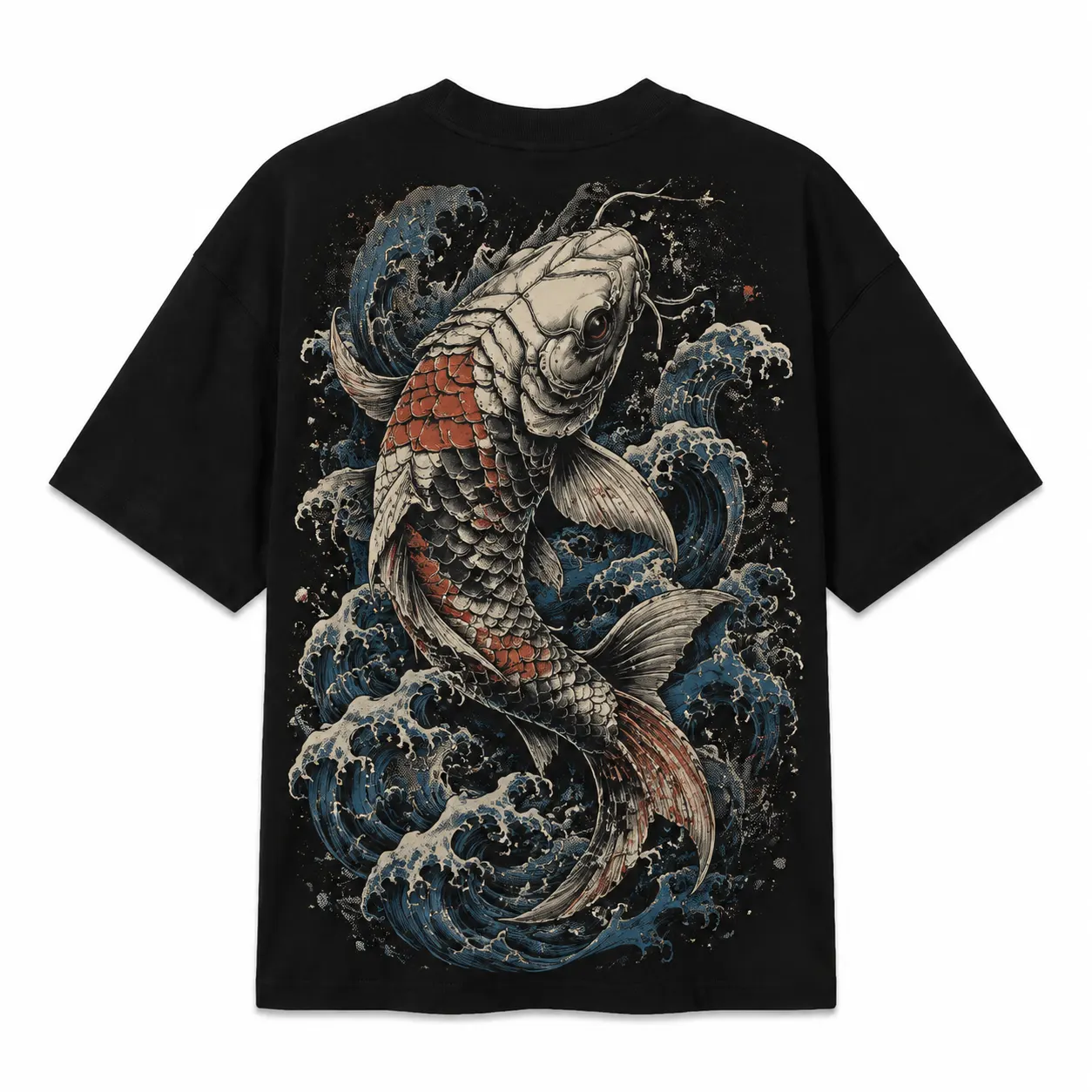
Large illustrations and detailed compositions gain more usable visual space on the full back, making this placement suitable when the artwork should dominate the black tee design. Poster-style graphics, oversized symbols, detailed scenes, and large statements can use the broader area effectively. Pair the back artwork with a small front mark when you want clear front-to-back hierarchy and visual continuity.
- Front and Back
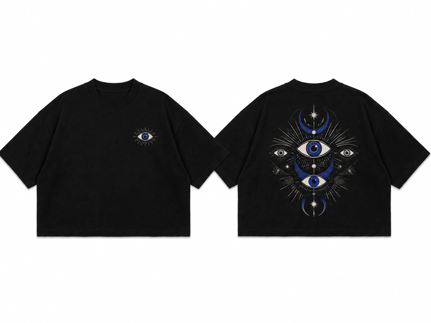
Dividing the design between two surfaces lets each side perform a different visual role instead of forcing branding, typography, and artwork into one crowded area. A black T-shirt design might place a compact logo or symbol on the front and reserve the back for a larger illustration or statement. Repeat related typography, symbols, or graphic treatment to connect both compositions.
- Sleeve
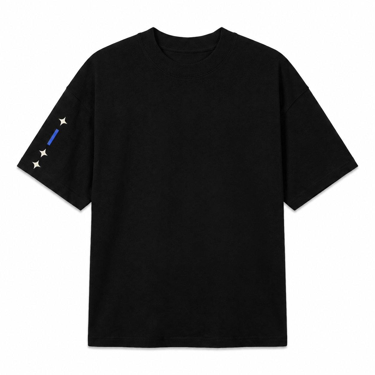
Secondary details can use the sleeve to add another visual layer without taking space from the main front or back black shirt design. Compact logos, coordinates, short text, icons, or repeated symbols fit the narrow sleeve area better than detailed illustrations. Pair the sleeve element with related artwork elsewhere on the black tee so it functions as part of the same visual system.
How Can You Make a Black T-Shirt Design Stand Out?
You can make a black T-shirt design stand out by controlling contrast, focal point, negative space, composition, graphic scale, typography, detail, tonal effects, and print finish. Treat the black fabric as part of the composition, not just a background. Each element should improve artwork visibility and hierarchy without making the shirt visually crowded.
The following techniques can help strengthen the visibility and impact of the design:
- Strong Visual Contrast
Create contrast by separating the artwork from the black fabric through defined edges, tonal differences, texture, scale, or surface finish. Do not rely only on lighter artwork for visibility. A black tee design can use glossy details against matte fabric, dense graphics beside open areas, or defined outlines to make important shapes easier to distinguish.
- Clear Focal Point
Decide which element should attract attention before arranging the remaining artwork. Make a logo, illustration, symbol, or statement dominant through its size, position, detail, or visual density. Keep supporting elements less prominent so they guide attention toward the main black T-shirt graphic rather than creating several competing focal points within the same composition.
- Negative Space
Leave enough uncovered black fabric around typography and graphics to separate individual elements and improve readability. Treat this negative space as an active part of the black T-shirt design, especially around compact chest graphics or detailed artwork. Controlled margins prevent nearby elements from merging visually and give the primary graphic enough room to establish a recognizable silhouette.
- Balanced Composition
Distribute text, illustrations, and supporting graphics by visual weight instead of filling every available area. Check alignment, spacing, center of mass, and the relationship between typography and artwork. A black shirt design can use symmetrical balance for a structured result or controlled asymmetry when one side intentionally carries more visual weight.
- Suitable Graphic Scale
Set the graphic scale based on artwork complexity, placement, and the proportions of the black tee. Increase the size of detailed illustrations so fine elements remain visible, but keep simple logos or symbols compact when they don’t need extra space. The black T-shirt design should occupy enough fabric to remain readable without overwhelming the garment.
- Clear Typography
Keep the main message readable by controlling font size, stroke thickness, letter spacing, line breaks, and text hierarchy. Use wider spacing or stronger letterforms when thin or tightly arranged text becomes difficult to distinguish against black fabric. Decorative typography can support a black tee design, but its styling should not obscure the words carrying the primary message.
- Controlled Level of Detail
Remove secondary details that become unclear at the intended print size. Fine lines, tiny text, dense textures, and closely packed forms can weaken the main silhouette of a black T-shirt graphic. Preserve the focal illustration or symbol, then simplify smaller elements until each important part remains visually distinguishable.
- Tonal Print Effects
Use tonal effects when the black T-shirt design should remain subtle without relying on strong color separation. Matte and gloss treatments, raised surfaces, tonal ink, or embroidery can make black artwork visible through differences in reflection and depth. Keep the primary shapes clear because subtle tonal separation provides less visual distinction than strongly contrasting artwork.
- Texture and Print Finish
Select a finish according to the depth and surface character the artwork needs. Flat treatments keep a black tee design visually restrained, glossy surfaces reflect more light, raised graphics create physical depth, and stitched or textured finishes add surface variation. Match the finish to the graphic rather than applying several treatments that compete with the artwork itself.
How Can You Preview a Black T-Shirt Design Before Printing?
Preview a black T-shirt design using front, back, front-and-back, flat-lay, model, and oversized mockups to check scale, placement, proportions, and visual balance. A T-shirt mockup generator can show finished artwork on a realistic shirt before printing, helping you catch misplaced graphics, inconsistent sizing, unclear details, or fit-related proportion issues that artwork alone may not reveal.
Use the following mockup types to review different aspects of the design:
- Front T-Shirt Mockup
Use a front T-shirt mockup to check center-chest, left-chest, small-front, and full-front artwork. Compare the graphic width and vertical position with the neckline and torso, then confirm that the black T-shirt design appears balanced at its intended scale.
- Back T-Shirt Mockup
Review upper-back and full-back artwork on a back T-shirt mockup to judge its position across the available surface. Check whether oversized illustrations sit too high or too low, and whether supporting typography stays proportional to the primary graphic rather than competing with it.
- Front-and-Back T-Shirt Mockup
View the front and back together to check hierarchy and visual continuity across the complete black tee design. Compare graphic scale, repeated branding, typography, and artwork to confirm that neither side unintentionally dominates or makes repeated elements feel unnecessary.
- Flat-Lay T-Shirt Mockup
Use a flat-lay mockup to evaluate artwork without body contours changing the garment shape. Check how the graphic relates to the neckline, sleeves, margins, and overall printable area, making this view useful for assessing spacing and composition across the black T-shirt.
- Model T-Shirt Mockup
Choose a model mockup to see how a black T-shirt design appears across body contours, fabric folds, and a worn garment shape. Review apparent graphic size and placement to understand its real-world visual impact rather than judging the artwork from a flat surface alone.
- Oversized T-Shirt Mockup
Preview oversized black T-shirt design ideas on an oversized mockup rather than a regular-fit shirt. The broader garment changes graphic width, vertical spacing, sleeve relationships, and surrounding negative space, so using matching proportions provides a more representative view of the final composition.


 Trusted By Thousands Of Designers
  Cancel Your Subscription Anytime
  30 Day Money Back Guarantee