Want your t-shirt designs to look professional and balanced? Here’s what you need to know:
- Key Dimensions: Center-chest prints work best at 6–10 inches wide by 6–8 inches tall. Full-front prints should be 10–12 inches wide by 10–14 inches tall.
- Placement Matters: Position center-chest designs 4–5 inches below the collar. Oversized designs? Start 2–3 inches below the collar.
- Scaling for Sizes: Designs must adjust for youth and adult sizes. For example, full-front prints for youth should be 9×9 inches compared to 11×11 inches for adults.
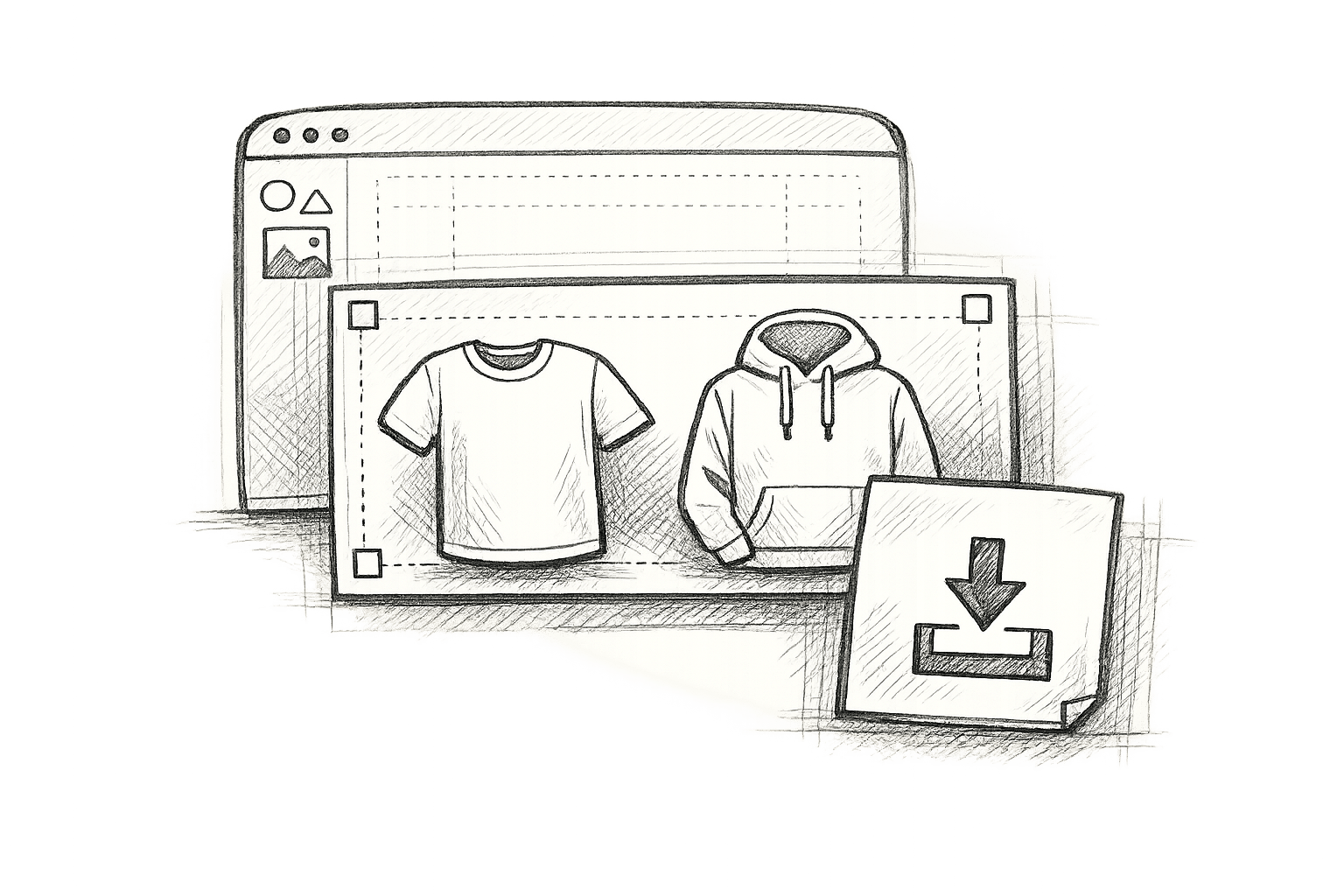
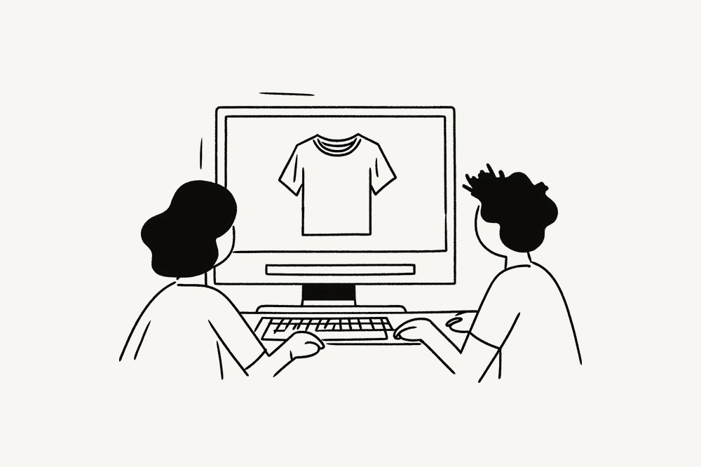
- Use Mockups: Mockups help you preview designs on shirts, ensuring proper proportions and placement.
- Negative Space: Use empty areas creatively to enhance focus and reduce clutter.
Quick Tip: Always test your designs on mockups to avoid costly mistakes. Proper sizing and placement can make or break your t-shirt design.

Let’s dive deeper into the principles, tools, and techniques for balanced and visually appealing t-shirt designs.
How To Size Your T-Shirt Designs and Accurately Place Your Screen
Basic Principles of Design Proportions
Getting a handle on the basics of proportional design is key when creating t-shirts that look polished and visually compelling. These principles shape how people view and interact with your design, making them essential for any designer.
Aspect Ratios and Visual Hierarchy
Visual hierarchy is all about guiding the viewer’s eyes through your design in a deliberate order. When done right, it ensures people notice the most important elements first, followed by supporting details.
To create a strong visual hierarchy, focus on size, color, position, contrast, proximity, and whitespace. For t-shirt designs, this could mean making your primary graphic the largest feature, using bold or contrasting colors to highlight critical details, and placing key elements in prominent positions – like the center or upper part of the shirt.
"Visual hierarchy controls the delivery of the experience. If you have a hard time figuring out where to look on a page, it’s more than likely that its layout is missing a clear visual hierarchy." – The Nielsen Norman Group
Think about natural scanning patterns when laying out your design. For example, placing the most important element in the top-left corner can guide the viewer’s eye through the rest of the design in a logical flow, ending with secondary details like logos or taglines.
Typography also plays a big role in hierarchy, especially for text-heavy designs. Use bold, large fonts for your main message, medium-sized text for subheadings, and smaller fonts for details like URLs or taglines. Once the hierarchy is in place, negative space can help refine the overall balance.
Using Negative Space
Negative space (the empty areas around design elements) is a powerful way to emphasize key features, create depth, and keep the design clean. It draws attention to your main elements while reducing clutter.
One clever way to use negative space in t-shirt design is to incorporate the shirt’s color into your artwork. This technique can create the illusion of an extra color, which not only enhances the design but can also cut down on printing costs.
A great example comes from Siser North America‘s August 2019 showcase. They featured a flamingo design on a neon pink racerback tank top. The shirt’s pink fabric served as the negative space, filling in the flamingo’s feathers and making the design feel seamlessly integrated with the garment.
When using negative space, keep in mind that even the smallest areas should be at least 1.3 points wide to ensure they print correctly. If your design includes intricate details, adding textures can help prevent elements from closing up during printing. Beyond aesthetics, it’s also important to consider how your design fits the physical dimensions of the garment.

Garment Dimensions and Scalability
To ensure your design works across different sizes, you need to align it with the dimensions of the t-shirt. Every garment has specific proportions, and your artwork needs to account for these to maintain its impact.
Using t-shirt mockups early in the process can be incredibly helpful. These mockups act as visual guides, allowing you to see how your design will look on an actual shirt. They also help you avoid common pitfalls, like designs that are too tall or wide, which can leave awkward gaps of empty space.
"The important takeaway is that t-shirt mockups inform design decision, liberating our creative instincts and paving the way for flawless, branded design." – workerbee, Author
Another factor to consider is scalability. A design that looks perfect on a medium-sized shirt might not translate well to a youth size or an extra-large garment without adjustments. Maintaining a consistent proportional relationship across all sizes ensures your design looks great no matter who’s wearing it.
Design Placement and Sizing Standards
Getting the placement and sizing right is key to creating a professional-looking t-shirt. Sticking to established guidelines ensures your design looks polished and balanced, no matter the garment. Below, we’ll break down the specifics for front, back, sleeve, and hemline placements, along with tips for adjusting designs for youth sizes.
Front and Back Graphic Placement
The front of a t-shirt offers several design possibilities, each with its own size and positioning rules.
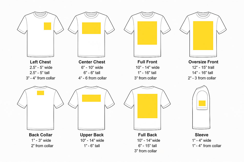
- Center chest designs: Ideal for most graphics, these typically measure 6-10 inches wide and 6-8 inches tall. Position them 4-5 inches below the collar, but taller designs can start as close as 3 inches down.
- Full front prints: These bold designs range from 10-12 inches wide and 10-14 inches tall. Place them 3 inches below the collar. For shorter designs (under 6 inches tall), start 4 inches down for better spacing.
- Left chest placements: Popular for logos and branding, these should measure 2.5-5 inches in both width and height. Position them 3-4 inches from the collar and center them over the far edge of the collar line. The center of the design should sit about 3.5 inches from the shirt’s center.
- Oversized front designs: These larger prints, measuring 12-15 inches wide by 14-16 inches tall, should sit 2-3 inches below the collar. Similarly, oversized back designs should be placed 3.5 inches below the collar.
For back designs:
- Full back prints: Make sure these have at least 6 inches of clearance from the bottom hem.
- Upper back designs: Perfect for horizontal text or smaller graphics, while back collar designs are great for subtle branding. Larger back collar designs (1-3 inches square) should sit 2 inches below the collar, while smaller ones can be placed just 1 inch down.
| Print Location | Width | Height | Placement |
|---|---|---|---|
| Left Chest | 2.5″-5″ | 2.5″-5″ | 3″-4″ from collar, centered over far edge |
| Center Chest | 6″-10″ | 6″-8″ | 4″-5″ from collar, centered |
| Full Front | 10″-12″ | 10″-14″ | 3″ from collar, centered |
| Oversized Front | 12″-15″ | 14″-16″ | 2″-3″ from collar, centered |
| Upper Back | 10″-14″ | 1″-6″ | 3″-4″ from collar, centered |
| Full Back | 10″-14″ | 6″-15″ | 3″-4″ from collar, centered |
Sleeve and Hemline Design Placement
Sleeve designs have become a popular way to add subtle branding without overshadowing the main design.
- Standard sleeve prints: These typically measure 1-4 inches in both width and height. Position them 1-4 inches from the hem and center them on the shoulder seam. Most sleeve designs work best at 2-4 inches wide, placed 1 inch from the hem or 2 inches from the sleeve edge.
- Long-sleeve prints: These run vertically along the arm, with maximum dimensions of 15 inches long and 5 inches wide. For wrist prints, stick to 1-3 inches square, positioned 1 inch from the wrist seam or 4 inches from the sleeve edge.
For a balanced look, consider the overall composition when combining sleeve designs with other elements. For instance, if you have a left chest design, place the sleeve design on the right sleeve to avoid visual competition.
Other sleeve options include:
- Shoulder placements: These bold designs are slightly larger, measuring 3-5 inches wide and positioned about 2 inches down from the shoulder seam.
- Armband designs: Horizontal designs across the bicep, typically 1-3 inches high and up to 5 inches wide. These are placed 6 inches below the shoulder seam.
Adjustments for Youth vs. Adult Sizes
When designing for youth-sized garments, scaling down the dimensions is essential to maintain visual balance.
- Left chest designs: Scale down to 3 inches wide by 1.5 inches tall for youth, compared to 4×2 inches for adults.
- Center chest designs: Reduce to 6 inches wide by 3 inches tall for youth, compared to 8×4 inches for adults.
- Full front prints: Shrink to 9×9 inches for youth, compared to 11×11 inches for adults.
Back designs also require similar adjustments:
- Upper back designs: Scale down from 12×4 inches for adults to 10×2.5 inches for youth.
- Full back prints: Adjust from 12×14 inches to 10×12 inches for youth.
Some print providers automatically scale designs down for smaller sizes, but they typically won’t scale up for larger garments. This means your design size remains the same, even if printed on a bigger shirt. It’s important to check your provider’s specific scaling policies to ensure your design fits as intended.
Lastly, remember that measurements can vary depending on the garment manufacturer and printing method. Always double-check guidelines before finalizing your design to ensure it looks just right.
sbb-itb-1e8f9ab
Scaling Designs for Multiple Sizes
Creating designs that work across all t-shirt sizes involves more than just resizing; it’s about maintaining proportions to ensure your prints don’t end up looking awkward, stretched, or distorted.
Mathematical Scaling and Aspect Ratio Lock
Scaling designs requires precision. When resizing, both the width and height must increase by the same percentage to preserve the original proportions and avoid distortion.
"Scale up the logo by the Chest (width) measure, which will lead to its keeping the same proportion of the width." – Jacob Bugge, Community Expert
To prevent distortion, lock the aspect ratio in your design software. This ensures that when one dimension is adjusted, the other is automatically scaled to match, keeping your design balanced across all sizes.
A good approach is to start with the largest design size and then scale down for smaller sizes using the same ratio. This method minimizes errors that can accumulate when scaling up or down repeatedly.
| Shirt Size | Recommended Design Width |
|---|---|
| Small – Medium | 9–10.5 inches |
| Large – XL | 10–11.5 inches |
| 2XL – 3XL | 11–13 inches |
| 4XL | 12–14.5 inches |
For best results, use vector graphics, as they can be resized without losing quality. Programs like Adobe Illustrator are ideal for this. If you’re working with raster graphics, use bicubic resampling to reduce distortion, but be aware that fine details may not translate well when scaled down significantly.
Also, keep in mind the print area limits: approximately 13"×15" for adults, 9"×12" for youth, and 6"×8" for toddlers. These guidelines ensure your design is appropriately sized for different garments while adhering to placement standards.
Once your design is mathematically scaled, preview it in realistic settings to confirm the proportions look right.

Mockup Validation for Proportions
While mathematical scaling is essential, practical testing ensures your designs look great on actual garments.
Mockups are a valuable tool for spotting potential issues with proportions, such as how fabric folds or contours might distort your design. They also help identify alignment problems, color inconsistencies, and other flaws early in the process, saving time and money by preventing costly reprints.
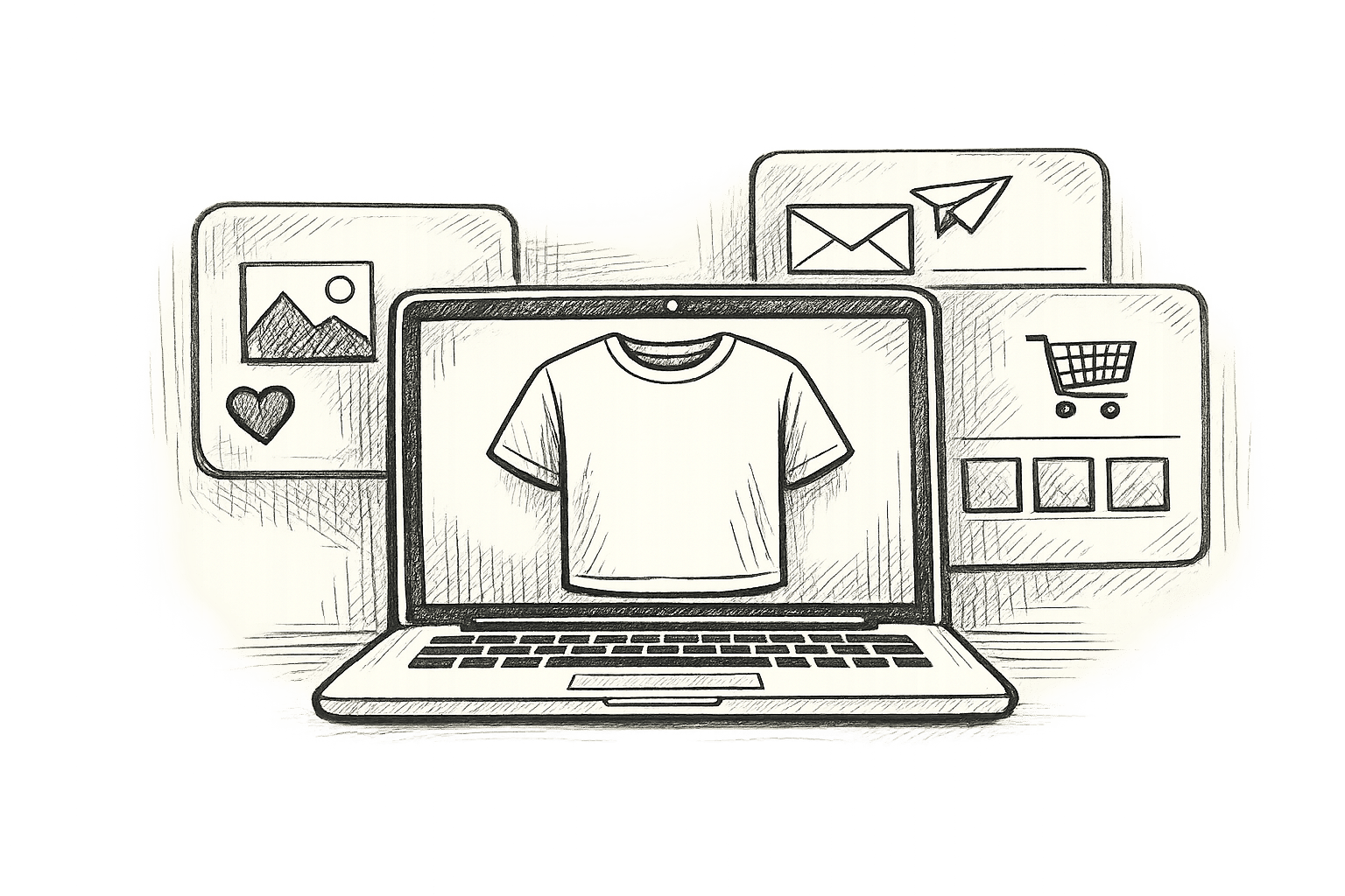
Platforms like Mock It offer over 5,000 clothing mockup templates that let you test your designs across a range of shirt styles and sizes. Their customizable templates and scene creator allow you to see how your design will appear on everything from casual tees to more fitted styles.
Testing your design on mockups for the full size range is crucial. A design that looks well-proportioned on a medium shirt might appear too cramped on a small size or get lost on a 3XL. By validating your design at this stage, you can make adjustments before production begins.
For an even more thorough validation, print your designs at their intended sizes on paper and place them on actual shirts. This lets you see how the design looks in real-world contexts. Tools like t-shirt rulers can help ensure consistent placement across all sizes.
Mockups not only streamline the design process but also provide clients and stakeholders with a clear preview of the final product. This transparency reduces the likelihood of surprises or returns.
Finally, remember that different printing methods can affect your scaling strategy. For instance, DTF printing allows for easier adjustments to design sizes, while screen printing or DTG often requires a fixed size for all garments. Understanding these limitations will help you plan your scaling approach effectively.
Tools and Techniques for Proportional Balance
Creating balanced t-shirt designs requires a mix of time-tested principles and modern tools that help refine your artwork. These resources build upon foundational scaling methods to ensure your designs are visually appealing and well-proportioned.
Golden Ratio and Rule of Thirds
To achieve visual harmony, you can rely on mathematical principles like the Golden Ratio and the Rule of Thirds. The Golden Ratio (1:1.618), often referred to as Phi, is a timeless concept found in nature and widely used by artists and designers to create pleasing compositions. Many major brands incorporate it into their logos for this reason.
"Fashion is architecture; it is a matter of proportions." – Coco Chanel
Applying the Golden Ratio to t-shirt designs is straightforward. For instance, if your main graphic is 6 inches wide, a complementary text element should measure around 3.7 inches wide (6 ÷ 1.618) to maintain this proportional relationship. You can also use the Golden Spiral overlay to pinpoint focal areas, guiding the placement of images and text. A great example of this is Green in Blue’s logo for "The Hungry Gnome". When working with typography, the ratio helps establish a clear hierarchy – for example, a 24-point headline pairs well with supporting text sized at approximately 15 points (24 ÷ 1.618).
The Rule of Thirds offers a simpler way to balance your designs. Divide your workspace into nine equal sections using two horizontal and two vertical lines. Place key elements along these lines or at their intersections for a naturally balanced composition. This technique creates a pleasing 2:1 visual ratio by positioning design elements strategically within the thirds of your layout.
Design Layering and Optical Adjustments
When working with multi-element designs, layering is key to maintaining clarity. Ensure consistent spacing between text, logos, and graphics to avoid a cluttered look. It’s also important to consider how the design will interact with the garment. A layout that looks perfect on a flat t-shirt might get partially obscured when worn. While symmetry often ensures balance, asymmetry can also work if the visual weight is distributed thoughtfully.
Optical adjustments are especially important for t-shirt designs. Designs created on flat templates may need tweaks to account for fabric drape and fit. For example, a design that works well on a medium-sized shirt might require adjustments for smaller or larger sizes to maintain proportional harmony.
Using Mock It‘s AI Tools for Proportional Alignment
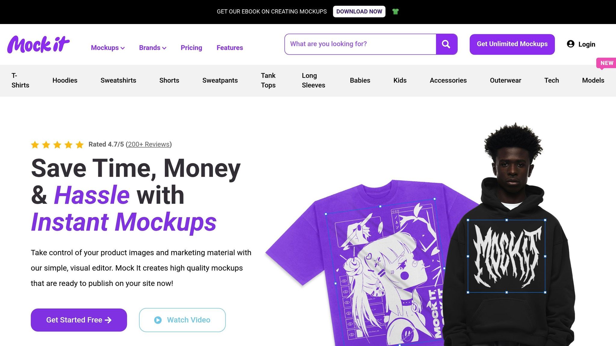
Mock It’s AI-powered tools make it easier to align proportions across different t-shirt styles and sizes. With over 5,000 high-quality templates, you can test your designs on various layouts and visualize how they interact with the shirt’s form. The AI text-to-image generator helps create complementary design elements that maintain proper proportions, while the background remover ensures you see how your design looks on different shirt colors. Additionally, a comprehensive color library allows you to assess balance across various color schemes.
These tools work seamlessly with traditional scaling strategies, helping you refine your designs from concept to final mockup. Whether you’re designing for fitted tees or oversized cuts, Mock It’s features ensure your artwork is proportional and visually cohesive. Quarterly updates also keep your designs aligned with current fashion trends, giving you an edge in the ever-evolving world of t-shirt design.
Conclusion and Key Takeaways
From understanding aspect ratios to leveraging scalable mockups, this guide underscores the importance of maintaining proportional balance in t-shirt design. Getting the proportions right is what transforms a design from just "good" to truly professional and visually striking. These principles ensure your artwork moves seamlessly from a digital idea to a wearable garment. Let’s break down the essential takeaways into actionable insights.
At the heart of it all is balance. As Valentino Garavani aptly said, "Proportion is the dance of shapes, the balance of volumes – it unlocks the door to a world where fashion transcends trends and becomes timeless art". Achieving harmony through proper sizing, placement, and spacing is what makes a design feel polished and intentional.
Frameworks like the Golden Ratio and the Rule of Thirds provide tried-and-true guides for creating visually appealing designs. These principles help ensure that your artwork enhances the garment instead of overpowering it – or worse, disappearing into the fabric. A design that feels too cramped on a small shirt or too sparse on an oversized tee simply misses the mark.
Mockup testing is a game-changer. It allows you to validate proportions early in the process, saving time and avoiding expensive production errors. This step ensures that your final product aligns with professional standards and looks as great in reality as it does on screen.
Tools like Mock It’s extensive toolkit – featuring over 5,000 high-quality templates, AI-powered features, a background remover, and comprehensive color libraries – make this process even easier. These resources work hand-in-hand with traditional design principles, helping you fine-tune spacing, alignment, and proportion across a variety of shirt styles.
Bringing it all together, success in t-shirt design lies in blending foundational design principles with modern tools for validation. This combination ensures your designs are cohesive, visually appealing, and ready to make an impact – whether on a single garment or an entire collection.
FAQs
How do I keep my t-shirt design proportional when resizing for different shirt sizes?
To keep your t-shirt design looking balanced across various sizes, it’s crucial to preserve the original aspect ratio of your graphic. When resizing, make sure to adjust both the width and height simultaneously to prevent any distortion. For larger shirt sizes, consider increasing the design size by around 10–15% to ensure it remains visually proportional.
Design placement matters just as much as sizing. A good rule of thumb is to position the design roughly 3 inches below the collar on all sizes. This ensures a consistent, polished appearance across every shirt.
How does negative space improve the look of a t-shirt design?
Negative space plays a crucial role in crafting balanced and visually striking t-shirt designs. By intentionally leaving empty areas around key elements, it naturally draws the viewer’s eye to the main design, preventing the layout from feeling cluttered or overwhelming. This approach not only improves clarity but also gives the design a polished, professional appearance.
What’s more, negative space can be used in creative ways to add depth and even incorporate the shirt’s color into the artwork itself. This technique not only enhances the visual appeal but can also help cut down on printing costs by using the fabric color as part of the design. Thoughtfully integrating negative space is a straightforward yet impactful way to take your t-shirt designs to the next level.
Why should I use mockups when designing t-shirts, and how can they help avoid common mistakes?
Using mockups plays a key role in the t-shirt design process because they offer a real-world preview of how your design will appear on an actual shirt. This allows you to identify any problems with placement, size, or alignment before moving to production, which can save both time and money.
Mockups are also a great way to try out different styles and layouts without the need to create physical samples. They’re especially useful when presenting designs to clients, as they provide a polished, professional visual that simplifies the approval process and builds trust in your work. Tools like Mock It make it easy to customize mockups, helping you fine-tune your designs and create high-quality visuals for your apparel projects.