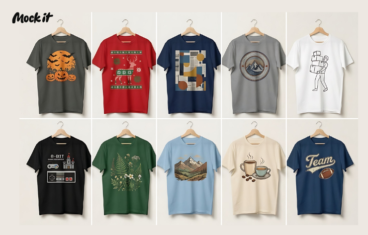
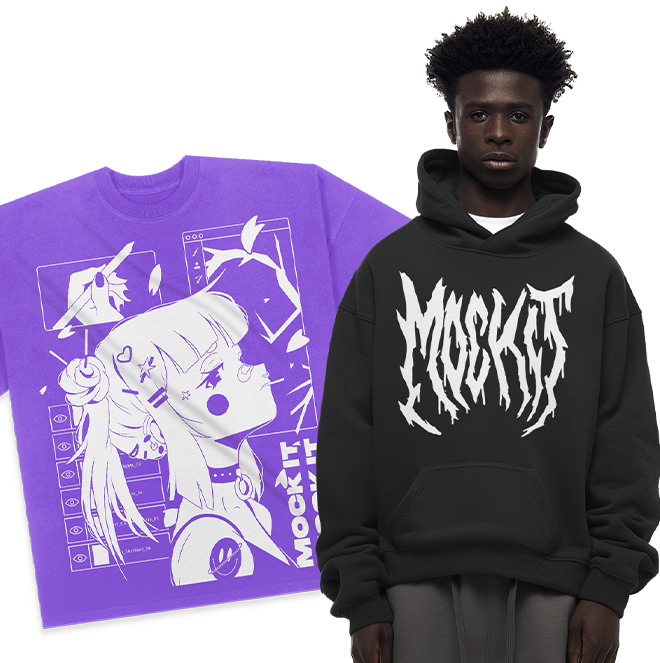
When it comes to designing apparel, one element holds the power to captivate, evoke emotions, and leave a lasting impression: color. The right color scheme can transform a simple garment into a work of art, attracting attention and conveying a brand’s identity. If you’re an apparel designer seeking to take your creations to new heights, understanding how to choose the perfect color scheme is essential.
In this article, we’ll delve into the world of color schemes and provide you with expert guidance on selecting the right hues for your designs. Whether you’re aiming for a bold, eye-catching statement or a subtle, sophisticated palette, we’ve got you covered.
Colors have a profound impact on our emotions and perceptions. They have the ability to evoke feelings of excitement, tranquility, or even nostalgia. By harnessing the psychology of color, you can create designs that resonate with your target audience on a deep level. Imagine the power of a vibrant red to convey passion, a calming blue to evoke trust, or a sunny yellow to inspire happiness.
Throughout this article, we’ll explore practical tips for choosing the right color scheme. From drawing inspiration from your brand’s essence to understanding color harmonies and complementary combinations, we’ll equip you with the knowledge you need to make informed decisions.
Are you ready to elevate your apparel designs through the transformative power of color? Let’s dive in and unlock the secrets of choosing the perfect color scheme for your creations.
Table of Contents
- Understanding Color Psychology
- Tips for Choosing the Right Color Scheme
- Resources for Finding Color Schemes
- The Mock It Advantage
- Conclusion
Understanding Color Psychology
Colors have a profound impact on our emotions and perceptions. They hold the ability to convey specific moods and messages, making them a powerful tool for apparel designers. Before diving into the process of choosing the right color scheme, let’s briefly explore the psychology behind colors.
Different colors evoke different emotions and associations. For example, warm colors like red, orange, and yellow tend to evoke feelings of energy, passion, and warmth. On the other hand, cool colors like blue, green, and purple often elicit a sense of calmness, tranquility, and trust. By understanding these basic associations, you can strategically select colors that align with the message or vibe you want to convey through your designs.
Tips for Choosing the Right Color Scheme
Now that we have a grasp of the psychology behind colors, let’s dive into some practical tips to help you choose the right color scheme for your apparel designs:
- Start with Inspiration: Begin by drawing inspiration from your brand or design concept. Consider your brand values, target audience, and the emotions you want your designs to evoke. This will serve as a foundation for your color scheme.
- Know Your Audience: Understand your target audience and their preferences. Are they drawn to vibrant and bold colors, or do they resonate more with softer, muted tones? Consider their age, culture, and the context in which they will interact with your apparel.
- Explore Color Harmonies: Familiarize yourself with color harmonies, such as complementary, analogous, and triadic color schemes. Complementary colors sit opposite each other on the color wheel and create a striking contrast, while analogous colors are adjacent to each other and offer a harmonious blend. Triadic colors are evenly spaced on the color wheel and provide a balanced and vibrant combination.
- Leverage Color Psychology: Delve deeper into the psychology of colors and their associations. Research how specific hues can evoke particular emotions or symbolize certain qualities. Use this knowledge to align your color choices with the desired message or vibe of your designs.
- Embrace Contrast and Balance: Pay attention to contrast and balance within your color scheme. Contrast creates visual interest and helps elements stand out, while balance ensures a cohesive and harmonious overall design. Experiment with different shades, tones, and saturation levels to find the right balance for your apparel.

Resources for Finding Color Schemes
Feeling inspired but not sure where to start? Thankfully, there are online resources available to help you explore and discover stunning color schemes. Two notable platforms to consider are coolors and Color Hunt.
Coolors is an intuitive and user-friendly platform that generates beautiful color palettes with just a click. You can explore countless combinations, lock in specific colors you love, and let coolors suggest complementary shades. It’s a valuable tool for finding inspiration and fine-tuning your color choices.
Color Hunt is another fantastic resource for curated color schemes. It features a collection of hand-picked palettes created by designers worldwide. You can browse through various categories, save your favorite palettes, and even contribute your own creations. With Color Hunt, you’ll never run out of color inspiration.

The Mock It Advantage
Now that you have a solid understanding of color schemes and have explored helpful resources, it’s time to bring your apparel designs to life. That’s where Mock It comes in.
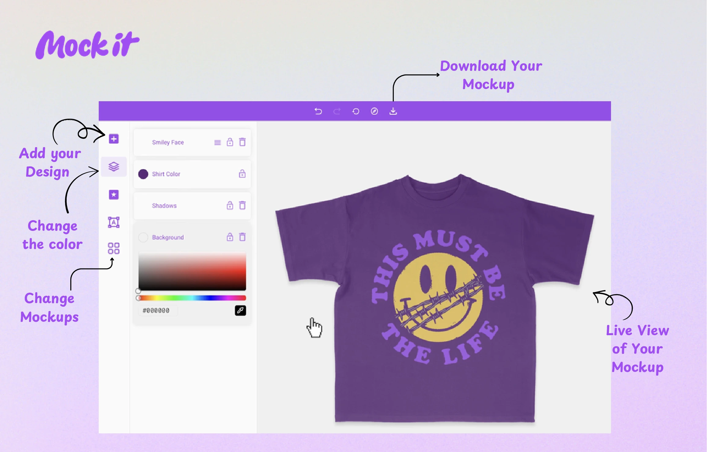
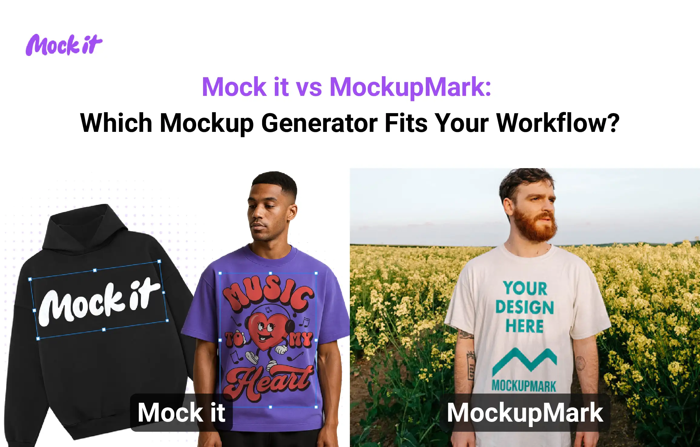
Mock It is a free mockup generator that allows you to create high-quality t-shirt mockups quickly and easily. With Mock It, you can choose from a wide range of t-shirt templates and customize them with your designs in just a few clicks. You don’t need any design skills or software to use Mock It, making it a convenient option for anyone looking to create t-shirt mockups.
One of the great things about Mock It is that it is user-friendly and intuitive. The interface is easy to navigate, and all the tools and features are clearly labeled and organized. Whether you’re a seasoned designer or a beginner, you’ll find Mock It easy to use and navigate.
So once you have your color schemes perfected with your designs, it’s time to head over to Mock It and get them onto some clothing mockups to see how they will turn out without having to print them.

Choosing the right color scheme is an essential aspect of apparel design. By understanding the psychology behind colors, implementing practical tips, and leveraging resources like “coolors” and “Color Hunt,” you can elevate your designs to new levels of visual impact. And with Mock It, you can bring your creations to life, ensuring the perfect blend of design and color.
So, take the plunge and unleash your creativity with the power of color. Sign up for a 14 day trial with Mock It today and let your apparel designs shine like never before. Remember, the right color scheme has the potential to leave a lasting impression and set your designs apart from the crowd. Embrace the world of color and watch your creations flourish. Happy designing!
View featured image for How To Pick Better Colors For Your Designs

