Sleek, modern, or rustic – there are many styles of design out there to choose from. With the popularity of retro design resurgence in recent years, there’s a style for everyone!
Apparel design and graphic designers are constantly tasked with creating designs and mocking up clothes that are appealing to a wide range of customers. To do this, it’s important to understand the different styles of design, how to use them to your advantage and how to use a mockup generator to sell those items.
You can now take your own design concepts and style them in a way that’s uniquely yours and we’ll show you how.
70s Aesthetic
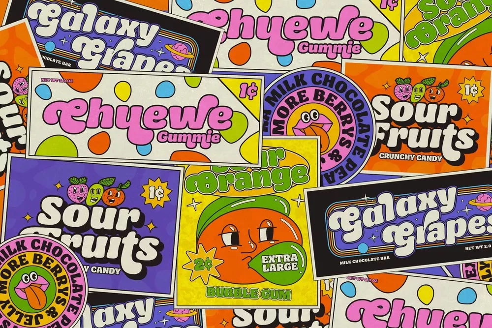
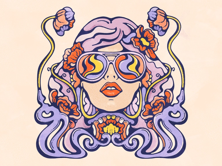
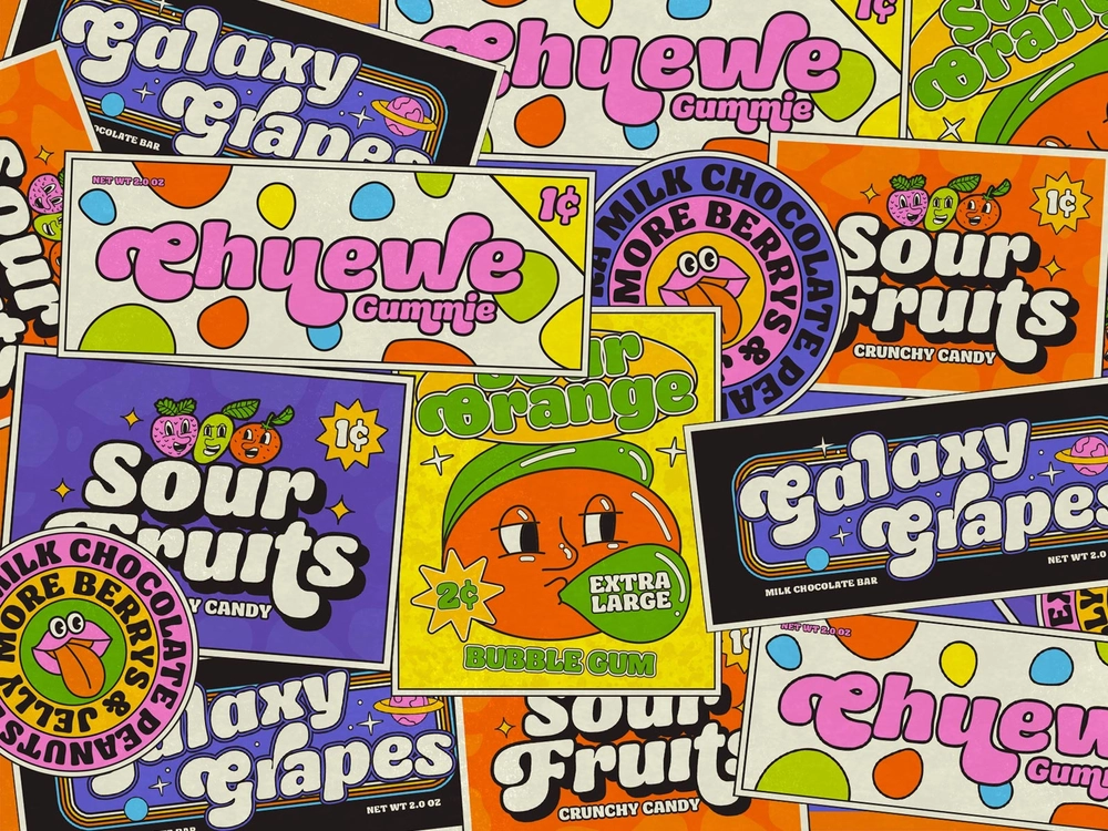
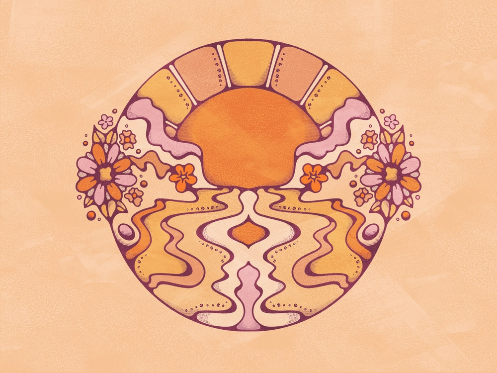
Welcome back to the 70s! This decade was a time of change and exploration for fashion. Bold colors, geometric shapes, and organic patterns were all popular during the 70s. As we already know, things were different in the 1970s when we didn’t have any advanced technologies, such as smartphones and social media. However, we do know that it was an era when technology started to grow. Innovations and cultural change were all around the world; as a result, we see a lot of “experiment” in designs, which is popular until today.
The 70s aesthetic is characterized by a mix of modern and traditional elements. Modern design trends like industrial design were combined with traditional elements like lace and floral prints. The 70s iconic design was all about pushing its limits to create a strong and bold design.
Picking the Right Font
The typeface, weight, and style of a font can make or break a design. And as we’ve already mentioned before, the 70s was an era of innovation which also means that the 70s era also covered a lot of new design innovations. The 70s was famous for its eccentric and bold styles, where we can see a lot of different font types depending on the approach. For example, if you’re designing a t-shirt for a retro style brand, you might choose a retro font like Pacifica or Charcuterie. If you want to emphasize a good vibe where your design stands out, you can pick some swirling fonts. You can try to create a free-form font by creating a curved shape that feels groovy!

Choosing the Right Color Scheme
Ah, colors. They can be so beautiful and soothing, or they can be jarring and intense. When starting out, it’s a good idea to use a basic color scheme. Retro designers often use a few key colors to anchor their designs, like blue, green, and pink. Brown, black, and white can also be used as a base, but they’re less common.
People tend to have different color schemes which depend on their mood. Some prefer to stand out by combining some clashing colors between reds, oranges, and greens. Some of the 70s colors developed from the 60s by improving the bright colors design similar to a rainbow. However, the most popular color was a natural based color like green, gold, yellow, orange, and brown as a symbol of calm and nature. This design trend reflected the crisis during the 70s to create an awareness for our environment. It’s always better to set up the mood before choosing your colors to produce the best result.
Choosing and Placement of Other Elements
As we’ve already mentioned, the 70s was an era of innovation, which also means we covered a lot of new design approaches. Did you know that this also applies to the other elements? Once you’ve chosen your main colours, it’s time to add in other elements. Will the clothing be tight or loose? Should it be cropped or long-sleeved? Should we add other geometric or floral patterns? Once you’ve figured out the look you’re going for, it’s time to put everything together.
Adding Texture
Now is a good time to add some texture. You can use a variety of textures, from subtle to bold. Subtle textures can be used to add interest and depth, while bold textures can be used to create a more pronounced look. You can even try to use some grainy textures to create a vintage look for your design!
Mocking Up Your Design
Okay, so you’ve got your design concept down, but you want to make sure it looks good in real life. To do this, you can use a mockup generator like Mock-It, which allows you to create a virtual version of your design. This will help you to see how the final product will look, and make any necessary adjustments.
And there you have it – the top tips with some of the most popular 70s design styles for you to take inspirational design ideas from for you to do it yourself!


