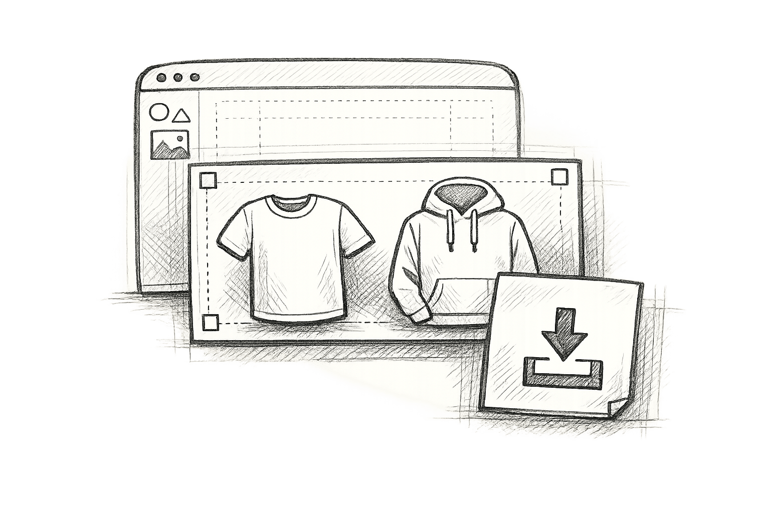
Creating professional apparel mockups can be tricky, but avoiding common mistakes can save time and improve your results. Here’s a quick summary of the top issues and how to fix them:
- Low Resolution Images: Always use high-quality source files and work at 300 DPI for sharp visuals.
- Wrong Size and Scale: Ensure designs are scaled accurately for all garment sizes using proper tools like Photoshop‘s Transform features.
- Bad Lighting and Shadows: Use consistent lighting and shadow techniques to make your designs look realistic.
- Design Placement Errors: Align designs carefully using templates and quality checks to avoid crooked or off-center visuals.
- Fake-Looking Fabrics: Use smart objects and displacement maps to maintain natural fabric textures.
- Wrong Colors: Calibrate your monitor and use correct color profiles (e.g., sRGB) for accurate print results.
- Missing Product Features: Include stitching, labels, and other garment details for authenticity.
- Poor Background Choices: Choose simple, high-resolution backgrounds that don’t distract from your design.
- Brand Inconsistencies: Stick to consistent logos, colors, fonts, and design styles across all mockups.
- Device Display Issues: Test your mockups on multiple devices to ensure they look good everywhere.
1. Low Resolution Images
How Poor Resolution Affects Designs
Using low-resolution images in your apparel mockups can make your designs look unprofessional. When customers or clients see blurry or pixelated images, it creates the impression that little care was taken, which can hurt your brand’s reputation. This problem becomes even more obvious on high-resolution screens or when someone zooms in to check the finer details.
Pixelation can ruin the look of design elements, distort fabric textures, and misrepresent product details. This misrepresentation might lead to unrealistic expectations about the final product.
"Make sure your image is high resolution, sharp, and free of any pixelation or blurriness." – Pixel Sauce
These challenges highlight the importance of managing image quality carefully during the mockup process.
Creating Sharp, Clear Images
To produce polished, professional mockups, start with the right tools and settings. For example, when working in Adobe Photoshop, use a 300 DPI canvas. This resolution ensures your designs look crisp both on screen and in print.
Here are some tips to maintain image quality during mockup creation:
- Use high-quality source files: Always start with high-resolution images or vector-based graphics.
- Leverage smart object layers: These allow you to resize or modify elements without losing image quality.
- Check for issues early: Review your designs for pixelation or blurriness before finalizing them.
In apparel design, sticking to these practices ensures your designs remain true to the fabric textures and the final product’s presentation.
For the best results, follow these technical guidelines when creating apparel mockups:
| Element | Recommended Resolution | Purpose |
|---|---|---|
| Canvas Size | 300 DPI | Ensures print-quality sharpness |
| Texture Files | High-resolution | Adds realistic fabric details |
| Design Elements | Vector-based | Maintains quality during scaling |
2. Wrong Size and Scale
Getting Sizes Right
Image quality is crucial, but getting the size and scale right is just as important for creating realistic mockups. If designs aren’t scaled correctly, they may look fine in the mockup but won’t translate well to the final product.
For Direct-to-Garment (DTG) products, designs automatically scale down for sizes smaller than L, while the L-size specifications determine the print area – even for larger sizes. Most mockups display apparel in L-size, with a consistent print area reflecting this standard.
Here are some key rules for print areas:
- The aspect ratio stays the same across all sizes.
- Print dimensions adjust based on the garment’s width.
- Sleeve prints remain the same size, regardless of the garment size.
- Print areas can differ between providers due to varying pallet sizes.
To ensure accuracy, use precise tools to adjust sizes as needed.
Size Adjustment Methods
Scaling errors can be fixed using professional tools and techniques. For instance, Photoshop’s Transform tools, like the Warp Tool (Edit > Transform > Warp), are especially useful for adjusting designs to fit the contours and folds of clothing.
Here’s a quick guide for size adjustments:
| Garment Size | Design Scaling | Print Area Details |
|---|---|---|
| XS–M | Scaled down from L | Keeps aspect ratio intact |
| L | Standard reference size | Base print area |
| XL–3XL | No scaling up | Uses L-size print area |
To check print dimensions for a specific size:
- Select the size you want to verify in your product creator.
- Choose a single color option for the garment.
- Check the recommended print dimensions (measured in pixels).
When creating custom mockups, compare the aspect ratio of the L-size print area to smaller sizes. This ensures your scaling remains accurate and delivers a professional look across all size variations, meeting customer expectations.
3. Bad Lighting and Shadows
How Lighting Impacts Mockups
Lighting can make or break your mockups. When done poorly, it makes designs look fake and unappealing. But with the right lighting, you can highlight key details like:
- Texture visibility: Shows off the fabric’s weave and surface.
- Depth perception: Shadows give flat designs a more three-dimensional feel.
- Color accuracy: Proper lighting ensures colors are displayed as intended.
- Design integration: Natural lighting helps the design blend seamlessly with the garment.
These basics are crucial for creating shadows that make your mockups feel realistic and polished.
Adding Realistic Shadows
Good lighting is only half the story – natural shadows are the finishing touch for a convincing mockup.
Here’s how to create different shadow effects:
| Shadow Type | Purpose | How to Apply |
|---|---|---|
| Cast Shadows | Adds depth beneath fabric folds | Use shadow overlays with 30–40% opacity. |
| Highlight Areas | Makes fabric texture stand out | Add semi-transparent white along lit edges. |
| Inner Shadows | Defines garment contours | Use consistent global light settings. |
![]()
Photoshop Tips for Shadow Creation
To achieve professional results, try these techniques in Photoshop:
- Set Global Lighting
- Align all shadows to a single light source for consistency.
- Ensure the light direction is the same across the entire mockup.
- Layer Shadows for Depth
- Use separate layers for shadows so you can tweak them easily.
- Add gradients to mimic how light naturally fades.
- Zoom in to fine-tune highlights and shadow edges.
Pro tips for natural-looking shadows:
- Use shadow-only lights by setting the light color to black and adjusting opacity.
- Darken areas like corners or underarms with negative lighting.
- Create shadow objects for realistic cast shadows.
- Keep shadow opacity between 20% and 50% for a subtle, natural effect.
Mistakes you’re making when using mockups
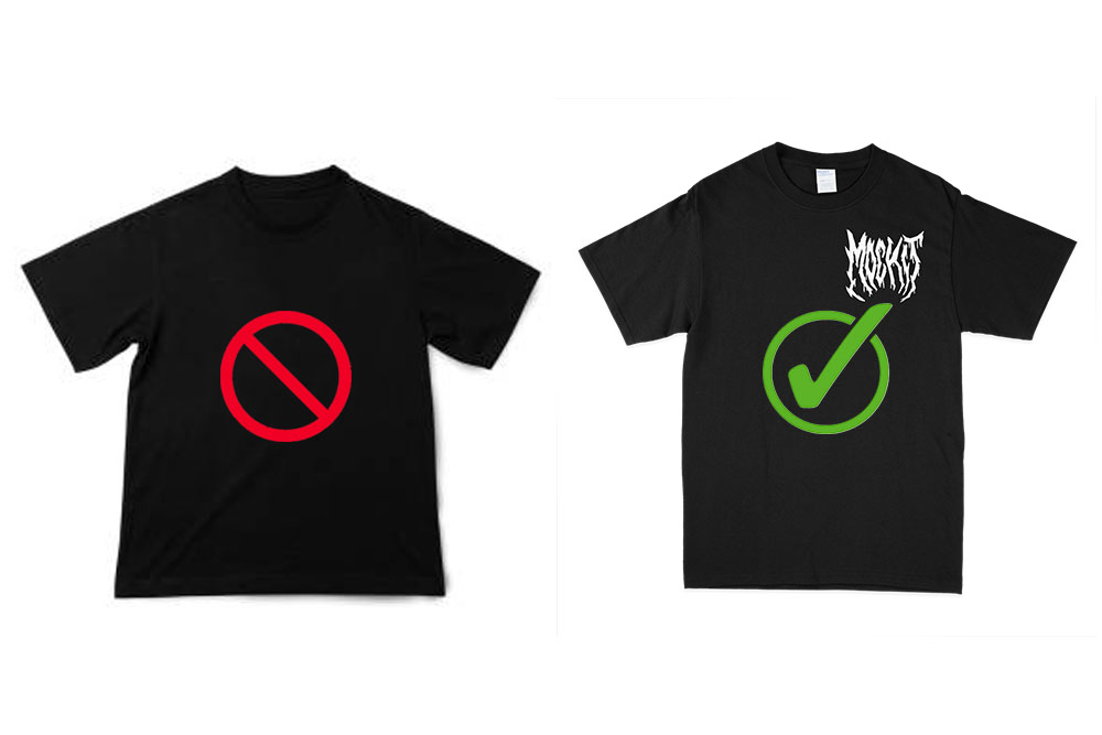
4. Design Placement Errors
Once you’ve tackled image quality and scaling, the next step is ensuring your design placement is spot-on. This is crucial for producing professional-looking mockups.
Why Designs Look Off
Misplaced designs can ruin even the most polished mockup. If a design appears crooked or off-center, it can raise red flags about quality for potential customers.
Here’s why design placement often goes wrong:
- Lack of clear alignment standards leads to uneven positioning.
- Artwork fails to account for how it interacts with fabric contours.
How to Get Design Placement Right
Proper placement ties everything together. Use these methods to ensure your designs look professional:
- Create Alignment Templates
Use standardized templates with 2-inch margin guides. According to Pixelz‘s 2014 guidelines, this approach boosts alignment accuracy and helps teams stay consistent. - Implement Quality Checks
Double-check the alignment, scaling, and spacing of your designs against your established guidelines.
"Consistency is key in product photography."
Pro Tip: If you’re handling multiple products, create an infographic that visually explains your alignment standards. Sharing this guide with both your in-house team and any outsourced editors ensures consistency across all mockups.
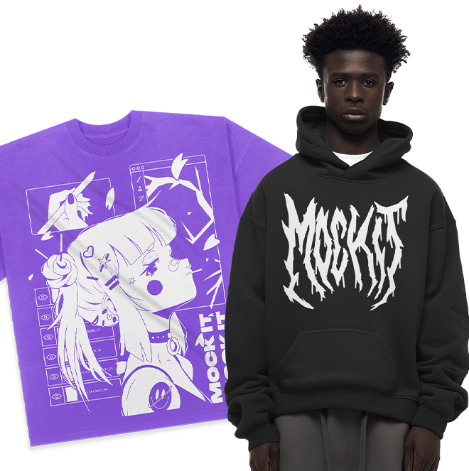
5. Fake-Looking Fabrics
Realistic fabric textures can make or break your mockup.
Getting the Fabric Look Right
Creating a natural fabric appearance relies on a few key factors:
- High-resolution textures: These capture the finer details of fabric structure.
- Proper lighting: Natural light enhances shadows and highlights, bringing the texture to life.
- Material-specific draping: Different fabrics, like cotton and polyester, fold and drape in unique ways.
Let’s dive into how to apply these techniques for more lifelike results.
Finding Good Textures
Achieving realistic fabric effects requires the right tools and methods. Two essential techniques are smart objects and displacement maps, which help maintain texture and mimic natural fabric folds.
- Smart Objects: Using smart objects in Photoshop allows you to place designs without damaging the fabric’s texture. This non-destructive approach ensures the material retains its natural look while giving you flexibility to tweak the design.
- Displacement Maps: These maps take realism a step further by simulating:
- Wrinkles and folds in the fabric
- Surface texture variations
- How light interacts with the material
"Smart layers and displacement maps in PSD files aid in realistic visualization, allowing users to easily place flat artwork and control light intensity within the PSD file." [Source: Unblast, 2024]
For instance, Unblast’s ‘Textured T-shirt Mockup‘ (February 2024) showcases professional fabric representation with these features:
| Feature | Specification |
|---|---|
| Resolution | 5000 x 3333 pixels |
| File Size | 71.1 MB |
| Usage Rights | Personal and Commercial |
| Key Components | Smart Layers, Displacement Map |
Pro Tip: Adjust lighting intensity based on your design’s colors. Lighter designs often need softer lighting, while darker ones may benefit from stronger light to maintain contrast and depth.
sbb-itb-1e8f9ab
6. Wrong Colors
Getting colors right in your mockups can make all the difference in presenting a professional design and earning client trust.
Why Colors Look Different
There are a few reasons why the colors in your mockups might not match expectations:
- Device Color Spaces
Screens use RGB, which handles a broader range of colors, while printers rely on CMYK, which can make vibrant colors like neon tones appear muted or dull. - Fabric Types
Fabric plays a big role in how colors come out. For example, 100% cotton often produces brighter colors, while polyester blends can make them look faded. Dark fabrics may need more opacity, while lighter fabrics tend to show colors more accurately.
How to Fix Color Problems
Here are some practical tips to help you get accurate colors in your mockups:
- Calibrate Your Monitor
Adjust your monitor settings to ensure it displays true colors and neutral gray tones. - Manage Color Profiles
- Use the sRGB IEC61966-2.1 profile for your files.
- Preview how your design will look in print using color proofing tools.
- Work in RGB mode during design, then convert to CMYK for final print files.
Pro Tips for Better Color Accuracy
- Build custom swatches for your brand’s key colors.
- Test your designs on various devices to see how they appear.
- Order physical samples to confirm colors before large-scale production.
- Use the HSB (Hue-Saturation-Brightness) mixer for simpler color adjustments.
- Avoid neon shades – they often fall outside the CMYK range.
"For the best possible color accuracy for your design, convert the file to an sRGB color profile, sRGB IEC61966-2.1 to be exact." – Printful
It’s worth noting that digital screens usually display more vibrant colors than printers can reproduce, which is why your designs might look brighter on your device than they do in print.
7. Missing Product Features
When designing apparel mockups, skipping key garment details can make your work look unrealistic and unpolished. It’s important to identify and include all necessary features.
Commonly Missed Details
Here are some garment details that are often overlooked but can affect your design’s authenticity:
- Stitching Details: Include visible seam lines, hems, and topstitching to match the real garment.
- Hardware Elements: Add zippers, buttons, snaps, or other closures that are part of the product.
- Fabric Texture: Ensure the material’s weave, knit, or texture aligns with the garment type.
- Label Placement: Position care labels, size tags, and brand labels correctly.
- Structural Components: Incorporate elements like collar stays or interfacing that shape the garment.
Quick Checklist for Details
Use this table to review important features before finalizing your mockup:
| Feature Category | Key Elements to Check |
|---|---|
| Construction Details | • Seam allowances • Stitch patterns • Hem finishes |
| Hardware & Trim | • Button placement • Zipper types • Drawstring details |
| Branding Elements | • Main labels • Size tags • Care instructions |
| Fabric Properties | • Material texture • Drape characteristics • Weight appearance |
| Structural Features | • Collar construction • Cuff details • Pocket placement |
Tips for Ensuring Accuracy
1. Reference Real Garments
Keep actual samples of similar clothing on hand while working on your designs. This makes it easier to capture all necessary details.
2. Use Standardized Templates
Develop templates tailored to different garment types. These templates can help you stay consistent across multiple mockups and speed up your workflow.
3. Perform Quality Checks
Before finalizing, go through these steps:
- Confirm hardware and stitching match the product specs.
- Check that fabric texture and drape look natural.
- Ensure all labels and tags are correctly placed.
- Verify size-specific elements are properly scaled.
Paying attention to these small details can elevate the quality of your mockups significantly.
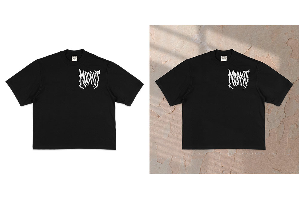
8. Poor Background Choices
Once you’ve fine-tuned your design, the backdrop is the next crucial element that can either elevate or undermine your presentation. Just like alignment and texture, the background plays a critical role in making your design stand out.
Why Backgrounds Matter
Visual Hierarchy: A well-chosen background sets the tone for your design. If it competes with the main product, it creates confusion and weakens the overall impact.
Professional Credibility: Using low-quality or irrelevant backgrounds can make your presentation feel unpolished. For instance, showcasing beachwear with a busy office setting feels out of place and might confuse your audience.
Brand Perception: Backgrounds contribute to how customers view your brand. Clean, professional backdrops suggest quality and attention to detail, while chaotic ones can give the opposite impression.
How to Choose the Right Background
Here are some practical tips to ensure your mockups look polished and professional:
1. Keep It Simple
Simple backgrounds let your designs shine. Here’s a quick guide:
| Background Type | Best Used For | When to Avoid |
|---|---|---|
| Solid Colors | Product-focused presentations | When scale or context is essential |
| Subtle Gradients | Adding depth without distraction | High-contrast or overly busy transitions |
| Minimal Settings | Lifestyle or contextual mockups | Cluttered or overly detailed scenes |
2. Match the Context
Choose a background that aligns with your product’s purpose and audience. For example, athletic wear looks great in a clean gym setting, while formal attire might suit a neutral, elegant background.
3. Pay Attention to Technical Details
- Use high-resolution images to avoid pixelation.
- Test backgrounds on various devices to ensure consistency.
- Make sure there’s enough contrast between the product and the background.
- Align the lighting direction of the product and background for a cohesive look.
4. Coordinate Colors
Balance your product and background colors to create harmony:
- Opt for complementary colors that enhance your design.
- Stick to your brand’s color scheme.
- Avoid backgrounds that clash with your product’s palette.
5. Fine-Tune for Professional Results
Take your presentation up a notch with these steps:
- Remove distracting elements using background editing tools.
- Adjust background opacity to minimize visual competition.
- Use consistent backgrounds across your product line for a unified appearance.
The best background is one that enhances your product without stealing the spotlight. When in doubt, simpler is better – let your design take center stage while the background quietly supports it.
9. Brand Inconsistencies
Consistency in branding is key to building trust and recognition. When your logos, colors, fonts, or design styles vary across materials, it can make your brand look unprofessional and hurt its credibility.
Common Branding Mistakes
Here are some frequent issues that can disrupt your branding:
- Logo Problems: Poor scaling or placement can throw off your design.
- Color Mismatches: Using inconsistent shades weakens your brand’s visual identity.
- Typography Issues: Mixing font families disrupts the visual flow.
- Design Style Variations: Inconsistent aesthetics dilute your brand’s impact.
| Element | Error | Impact |
|---|---|---|
| Logo | Improper scaling | Looks unprofessional |
| Colors | Incorrect shade matching | Weakens brand recognition |
| Typography | Mixed font families | Confuses visual hierarchy |
| Design Style | Inconsistent aesthetic | Reduces brand credibility |
How to Maintain Brand Consistency
To avoid these pitfalls, try the following:
- Create a Brand Checklist
Document approved logo variations, color codes, fonts, and overall design styles. This ensures everyone on your team is on the same page. - Implement Quality Controls
"Consistency is crucial for brand recognition. Establish a core set of fonts and stick to them across all your mockups, from website design to social media graphics. This creates a cohesive visual language that people will come to associate with your brand." – Muhammad Faisal, Founder of GDJ
- Monitor Visual Alignment
Regularly review designs to ensure they follow brand guidelines. This attention to detail helps maintain a polished and professional appearance.
10. Device Display Issues
Getting your mockups to look great on every device is just as important as nailing image resolution and color accuracy. If your designs don’t display correctly, they can lose their impact and even confuse clients. That’s why testing across devices is a must to ensure your mockups remain consistent and accurate.
Screen Display Problems
Different devices can create unique challenges for displaying mockups. For instance, a 1,920-pixel canvas might look flawless on a desktop but could fall short on a smaller mobile screen.
| Display Issue | Impact | Solution |
|---|---|---|
| Barrel Distortion | Straight lines bend outward | Use lens correction tools |
| Perspective Skewing | Objects appear smaller at a distance | Apply perspective adjustments |
| Resolution Mismatch | Blurry or pixelated images | Create mockups in multiple sizes |
| Content Wrap Issues | Poorly scaled layouts | Adjust layouts to a 1,360px width |
For example, wide-angle lenses can distort apparel designs, especially on mobile screens, causing straight patterns to appear curved.
Testing on Different Screens
Here’s how to tackle these display challenges effectively:
- Create Multiple Size Variants
Design mockups for various screen sizes, such as desktop, tablet, and mobile, to ensure they display well across devices. - Use Correction Tools
Tools like Snapseed’s "content-aware fill" or Adobe Lightroom Mobile can help fix perspective issues and lens distortions. - Have a Clear Sizing Strategy
Plan for desktop (1,920px), tablet (1,360px), and responsive mobile scaling to ensure your designs adapt seamlessly.
Static mockups only show one screen size at a time. When sharing designs with clients, include versions that illustrate how the mockups will look on different devices. This helps set clear expectations and avoids surprises later.
Conclusion
Creating professional mockups requires attention to detail and a clear process. Tackling potential issues early helps save time and avoid expensive revisions.
"The goal of a mockup design is to communicate design ideas clearly and efficiently and to gather valuable feedback from stakeholders and users".
Key elements of successful mockup creation include:
| Design Phase | Key Focus Areas | Why It Matters |
|---|---|---|
| Planning | Researching your audience, choosing materials | Reduces the risk of costly mistakes |
| Execution | Using professional tools, testing colors | Ensures the design aligns with your vision |
| Review | Checking proofs, testing across devices | Keeps quality consistent |
This breakdown highlights where mistakes often happen and how to avoid them. Skipping essential steps or rushing through the process can lead to poor results. As noted, "Mistakes in custom apparel design often arise from neglecting audience needs, poor design choices, and overlooking essential production details. By addressing these errors upfront, you can save time, reduce costs, and create designs that stand out".
Make it a habit to test and refine your mockups regularly. Keep designs simple, focus on the core message, and ensure they work well across various devices and screen sizes. By following these steps and maintaining clear communication with stakeholders, you’ll consistently produce outstanding mockups that meet both creative and practical goals.