Getting your t-shirt design placement right makes the difference between a professional look and something that feels off. Here’s what you need to know:
- Main Placement Areas:
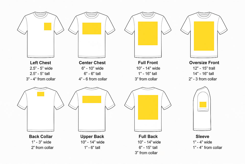
- Center Chest: Bold and versatile; place 3–3.5 inches below the neckline.
- Left Chest: Subtle and professional; ideal for logos (3–4 inches wide).
- Full Front: Eye-catching; perfect for large designs (up to 12×16 inches).
- Back: Great for secondary designs or team branding.
- Sleeves: Trendy and modern; best for small logos or narrow designs.
- Key Guidelines:
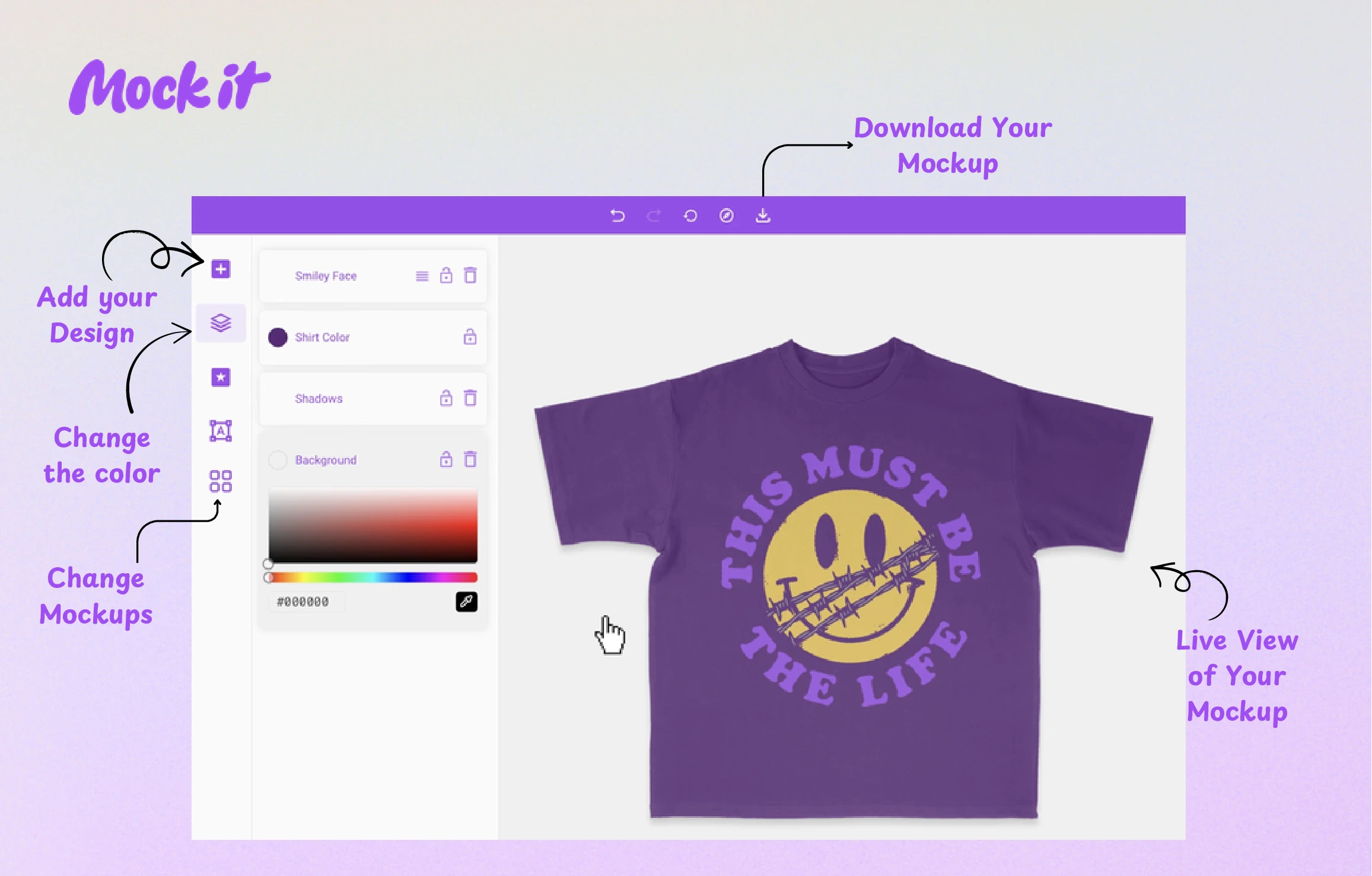
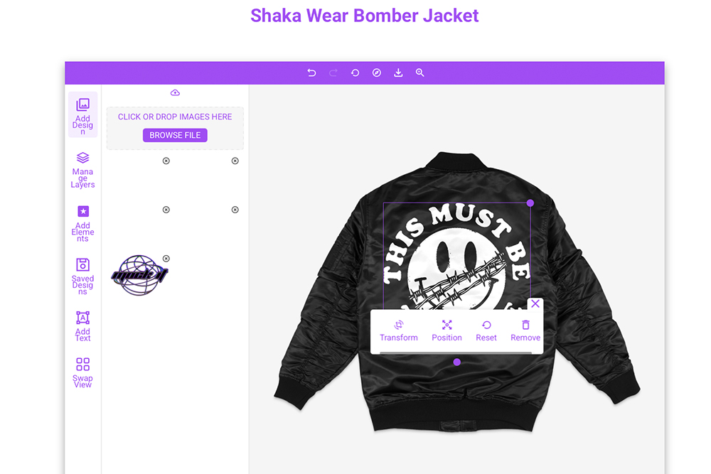
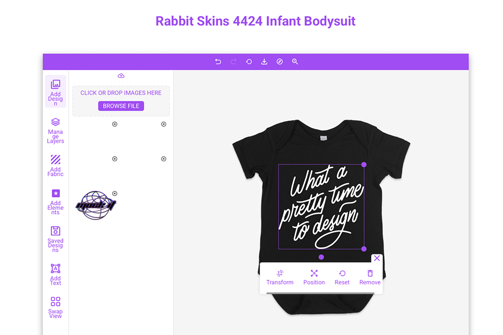
- Use tools like digital mockups (e.g., Mock It) to preview designs.
- Measure carefully: 3–4 inches below the neckline for most placements.
- Adjust sizing for different shirt sizes to maintain balance.
- Tools & Techniques:
- Digital mockup platforms for visualization.
- Alignment tools like rulers or centerlines for precision.
- Design Balance:
- Align with shirt features like seams and necklines.
- Scale designs proportionally for different shirt sizes.
Proper placement ensures your design stands out, looks polished, and communicates your message effectively. Use these tips to create professional t-shirts that leave a lasting impression.

T-Shirt Design Placement Guide & Tools to Help!
Main Placement Areas for T-Shirt Designs
Knowing where to position your design on a t-shirt can make all the difference in creating a polished and visually appealing final product. Each placement option offers a unique style and purpose, so let’s break down the most common areas to help you decide what works best.
Center Chest Placement
The center chest area is a classic choice for t-shirt designs, offering both versatility and impact. It’s perfect for logos, slogans, or images that need to stand out without dominating the entire shirt [2, 10]. For best results, position your design 3 to 3.5 inches below the collar, ensuring it’s centered. Common sizes for center chest designs range from 6×6 inches to 10×8 inches, with 8×8 inches being a popular middle ground. Generally, designs in this area are about 6–8 inches wide. A quick tip: fold the t-shirt lengthwise to create a center crease, then align your design along this line for perfect placement.
Left Chest Placement
If you’re aiming for a subtle and professional look, the left chest placement is a go-to option. It’s commonly used for corporate logos, team uniforms, or understated branding [2, 10]. Ideal sizes for this area range from 2.5×2.5 inches to 5×5 inches, with most designs measuring around 3–4 inches wide [2, 11]. To position it correctly, place the design about 3 inches below the neckline and 2 inches from the armpit, centering it between the collar and sleeve [11, 12]. This placement is great when you want to keep the branding visible without overpowering the overall aesthetic of the shirt.
Full Front Placement
For a bold and attention-grabbing look, full front placement is the way to go. This style is ideal for event merchandise, promotional t-shirts, or other designs where the graphic takes center stage [2, 10]. Position the design 3–4 inches below the collar. The available space for printing in this area typically measures up to 12×16 inches, with designs often reaching a width of 12 inches [2, 11]. This larger canvas is perfect for detailed artwork, intricate graphics, or text-heavy designs that require room to shine.
Back and Sleeve Placements
The back of a t-shirt provides a great opportunity for creative designs, especially for branding or messages meant to grab attention as the wearer moves. Upper back designs usually start 3 inches below the collar and are often used for secondary elements like URLs or brand names. Full back designs can range from 10×12 inches to 12×16 inches, depending on the shirt size and style.
Sleeve placement, on the other hand, adds a trendy, streetwear-inspired vibe. It’s an excellent spot for small logos, flags, or text that runs along the length of the sleeve. The maximum size for sleeve designs is typically around 4×3.5 inches, positioned a few inches above the sleeve hem [2, 11]. This placement works well for long, narrow designs and adds a subtle yet stylish touch to the overall look.
In February 2025, Screen Print Direct shared detailed guidelines for their T-shirt Alignment Ruler pack, which includes tools for adult scoop neck, adult V-neck, youth, and infant t-shirts. Their method involves folding the shirt to find the center, placing the ruler along the crease just under the neck seam, and ensuring the design is perfectly aligned and positioned at the correct distance from the neckline.
Tools and Techniques for Accurate Placement
Building on the importance of proper placement, the right tools and techniques ensure your design fits perfectly with the t-shirt’s contours. Whether digital or physical, these methods can transform an ordinary t-shirt into a polished, professional product.
Using Mockup Templates
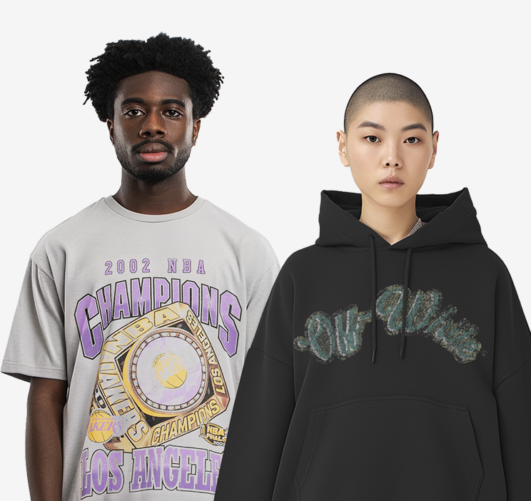
Digital mockup platforms have completely changed how designers refine and visualize their t-shirt designs before production. A standout option is Mock It, offering over 5,000 high-quality clothing mockup templates from 45+ brands. These templates provide realistic renderings that simulate texture, shadows, and proportions, giving a clear preview of how the design will look.
Mock It also includes features like a scene creator and background remover, allowing you to experiment with placement, sizing, rotation, and color variations across the front, back, and sides of the t-shirt. These tools make it easier to achieve a flawless design.
“Mock It has been an incredible tool for my business. The mockups are extremely high quality, and I love how easy it is to customize them to fit my brand.” – Madhyn, Verified User
In February 2025, Printful emphasized the importance of reviewing mockups carefully, noting that design positioning can vary depending on the t-shirt size. Their Design Maker tool allows users to preview custom t-shirts from multiple angles, underscoring how vital this step is for meeting expectations.
When working with mockup generators, always upload high-resolution artwork and leverage customization options to fine-tune placement, size, and colors. Pay close attention to details like accurate sizing, realistic lighting, and precise placement to ensure the final product matches your vision.
Now, let’s dive into the physical and digital techniques that help achieve perfect alignment.
Physical and Digital Alignment Techniques
In addition to mockup templates, design software provides powerful alignment tools. Features like digital guides, centerlines, and anchor points help ensure symmetry and balance, even for more complex or asymmetrical designs. Always verify your image resolution (DPI) to maintain clarity, checking these properties directly in your operating system viewer.
For physical alignment, precision measuring is key. Here are some general guidelines:
- Front placements: Measure 3-4 inches from the collar for smaller designs and 5-6 inches for larger ones.
- Back placements: Measure 1-2 inches from the collar for small designs and 4-6 inches for full-back designs.
T-shirt ruler guides are excellent for maintaining consistency. In May 2025, a user named Birdie praised the Tshirt Ruler Guide, saying it included everything needed to position iron-on vinyl designs accurately. These tools help ensure balanced spacing and prevent clutter.
For adult t-shirts, keep designs between 9-12 inches wide for full-front or back placements. Also, remember that fabric type plays a role in how designs adhere and wear over time. Cotton, polyester blends, performance fabrics, and stretch materials all react differently during application.
sbb-itb-1e8f9ab
How to Achieve Visual Balance and Composition
When it comes to t-shirt design, visual balance is key to making your work look polished and professional. A well-balanced composition ensures your design works across different placements and garment styles, creating a cohesive and appealing look.
Align Designs with Shirt Features
Use the natural features of the shirt to guide your design placement. For vertical alignment, the collar serves as a reliable anchor point, while shoulder seams help with horizontal centering. This approach keeps your design from looking off-center or uneven.
- Keep graphics positioned about 0.5–1 inch away from shoulder seams or stress points to avoid distortion.
- Sleeve designs should start 0.5–1 inch below the shoulder seam for a clean, balanced look.
- For pocket shirts, either place your design above the pocket or incorporate the pocket into the overall layout for a seamless appearance.
If you’re working with stretchy fabrics, test how the material affects your design early on. Adjust the print size or choose a fabric that maintains the design’s integrity. For hoodies and zip-up garments, placement becomes even more critical. Position designs on the upper chest or above the pocket to ensure visibility, and for zip-up styles, take extra care to align split designs for a smooth, continuous look.
Once your design is aligned with the garment’s features, ensure it works across different shirt sizes.
Adjust for Size Variations
Shirt sizes can drastically impact how a design appears, so scaling your artwork proportionally is essential. A design that looks perfect on a medium shirt might overwhelm a small size or seem too sparse on an extra-large.
ShirtSpace, in January 2025, offered specific guidance for left chest designs: measure 4–6 inches down from the neckline seam at the shoulder – closer to 4 inches for smaller sizes and closer to 6 inches for larger ones. Center the design about 4–5 inches from the shirt’s centerline, with standard designs measuring around 3–4 inches wide.
For youth or petite sizes, slightly shrink your design to avoid overpowering the smaller canvas. On the other hand, larger shirts, like oversized or plus-size options, benefit from scaled-up graphics. For example, a design that’s 10 inches wide on a medium might need to be 11–12 inches wide on an extra-large to maintain the same visual impact.
Consistent spacing between text, logos, and graphics is equally important. This prevents smaller shirts from looking cluttered and ensures larger shirts don’t feel empty or incomplete. Digital mockups are a helpful tool here – they allow you to preview how your scaled designs will look across different sizes, ensuring clarity and impact.
Maintain Proportionality
Proportionality is about balancing individual design elements with the overall garment. You can aim for symmetry or experiment with intentional asymmetry, as long as the offset feels deliberate and not accidental.
For example, V-neck shirts often require higher placement of graphics compared to crew necks. Designs for V-necks typically sit 1–1.5 inches below the neckline, while crew necks usually need graphics positioned 3–4 inches below. Tank tops, especially those with racerback cuts, require extra attention to how back designs interact with the garment’s structure.
Digital mockups are invaluable for spotting and fixing proportional issues before printing. Mock It’s template library lets you test your designs across various shirt styles and sizes, helping you identify and resolve potential problems. This step not only saves time and materials but also ensures that your final product looks polished and professional.
Pros and Cons of Common Placement Methods
When deciding where to place your design, the key is aligning the placement with your overall goals. Each method brings its own perks and challenges, so understanding these can help you make a more informed choice. Here’s a breakdown of common placement methods, their strengths, and their limitations.
Comparison Table of Placement Methods
| Placement Method | Pros | Cons | Best For |
|---|---|---|---|
| Center Chest | • Grabs attention right away • Great for bold branding and simple designs • Offers a balanced, symmetrical look • Perfect for dramatic, standout visuals |
• Fine details can get lost from a distance • Risk of overpowering the design if too large • Can cause discomfort if placed poorly |
Bold logos, simple graphics, brand statements |
| Left Chest | • Subtle and classic style • Professional and polished for corporate wear • Balances visibility with discretion • Works for both casual and formal outfits |
• Limited space (around 3–4 inches wide) • Not ideal for large or detailed designs |
Company logos, staff uniforms, professional branding |
| Full Front | • High visual impact for bold statements • Large canvas (up to 12″ wide, 14″ tall) • Suitable for intricate designs and strong slogans • Becomes the centerpiece of the garment |
• May overwhelm smaller shirt sizes • Not ideal for subtle branding |
Event merchandise, artistic designs, statement pieces |
| Back Placement | • Creative space for unique designs • Full back works well for detailed artwork • Popular for team or event shirts • Upper back is great for secondary logos |
• Limited visibility when facing others • Often requires a complementary front design |
Team jerseys, event shirts, artistic statements |
| Sleeve Placement | • Modern, trendy streetwear vibe • Eye-catching without being overpowering • Complements main design elements • Less commonly used, making it stand out |
• Small space (2–3 inches) limits detail • Needs bold designs to be effective • May not work with all garment types |
Logos, symbols, complementary text |
Detailed Insights on Placement Options
Center chest and left chest placements cater to different needs. The center chest grabs attention and works well for bold, simple designs, but it can feel overwhelming if overdone. On the other hand, the left chest offers a more subtle, professional look, making it ideal for corporate branding or uniforms.
Full front placement is a go-to for maximum creative freedom – it’s perfect for large, detailed designs or bold messages. However, scaling the design properly is key to avoid it looking awkward on smaller or larger shirts.
Back placement is a favorite for team shirts or event merchandise. It creates a unique space for storytelling but often requires a front design to balance visibility. Sleeve designs, meanwhile, are gaining popularity in streetwear. They offer a modern, edgy touch and are great for adding small logos or text, though their size constraints demand simplicity.
Choosing the Right Placement
Your choice should depend on what you want to achieve. If grabbing attention is the goal, center chest or full front placements are excellent. For a polished, professional vibe, the left chest is a safe bet. Back and sleeve placements are ideal for adding creative flair or complementing primary designs.
Mock It’s template library is a helpful tool for testing different placements. It allows you to visualize how your design will look on various garment styles before committing to production, ensuring your choice aligns with your vision and audience expectations.
Conclusion: Perfecting T-Shirt Design Placement
Getting the placement of a t-shirt design just right is about crafting pieces that connect with people and clearly convey your message. Whether you’re working on corporate uniforms, event merchandise, or trendy streetwear, the placement you choose plays a big role in how your design is perceived and interacted with. Our look at center chest, left chest, full front, and back placements demonstrates how each option can shape the overall impact of your design.
The principles we’ve covered – understanding placement areas, achieving visual balance, and selecting the right positioning method – are the foundation of successful t-shirt designs. These elements work together to ensure your design stands out while maintaining a professional finish. As the Pluralsight Content Team puts it:
“Balance is a vital principle in design. If you don’t have a sense of balance with your designs, then the viewer’s eye won’t know where to look and what you’re trying to communicate may not get across because areas of less interest can easily go unnoticed.” – Pluralsight Content Team
Alignment is another critical aspect, guiding the viewer’s attention and creating a sense of order that makes designs more readable and visually appealing. This is especially important when you consider that people form quick impressions about a business in just seconds.
To bring these concepts into practice, mockup tools like Mock It are game-changers. They take the guesswork out of the process by allowing you to visualize your designs on actual products before moving to production. This not only saves money by avoiding unnecessary photoshoots but also provides a straightforward way to refine your work. For print-on-demand businesses, mockup tools offer a smart way to test ideas and gauge their potential profitability before committing to inventory.
Great t-shirt design placement blends technical precision with creative flair. Use the methods we’ve discussed to align your goals with the right placement strategy. Test your designs on various shirt sizes and styles to ensure they remain effective and easy to read, and always preview your work using high-quality mockup tools to catch any issues early.
What separates amateur designs from professional ones often comes down to mastering these placement fundamentals. By applying these strategies, you’ll create t-shirt designs that not only look fantastic but also serve their purpose effectively. With these skills in your toolkit, your designs will consistently deliver a polished, professional look that stands out.
FAQs
How do I properly position my t-shirt design to ensure it looks balanced on all sizes and styles?
When designing t-shirts, getting the placement just right is key to creating a balanced and polished look across various sizes and styles. A good rule of thumb is to position the design 2–3 inches below the neckline and make sure it’s centered horizontally. This approach works well for most t-shirt types, keeping the design proportional and visually appealing.
For larger designs, like full-front graphics, consider the chest area as your alignment guide. On the other hand, smaller designs – such as logos – look best when placed on the upper chest or pocket area. By maintaining consistent proportions and alignment, you can ensure your designs look sharp and cohesive, no matter the shirt size or style.
What are the best ways to position and preview t-shirt designs before production?
To get your t-shirt designs looking just right, start with professional tools like Mock It. This platform offers thousands of customizable mockup templates, making it easy to visualize exactly how your design will look once printed. These templates ensure you can position your artwork with precision and confidence.
When it comes to alignment, stick to some tried-and-true guidelines. A good rule is to center your design 3 to 3.5 inches below the collar and make sure it’s perfectly aligned with the shirt’s center. For top placement, measuring 7.5 to 9 inches from the shoulder works well. To fine-tune your layout even further, use design software like Adobe Photoshop or Canva. These tools provide grids and alignment features that make achieving a professional, balanced look much easier before you move on to production.
How does the type of t-shirt fabric affect design placement and durability?
The fabric you choose for a t-shirt plays a huge role in how well the design holds up and how long it stays looking great. Blends like cotton-polyester or pure polyester are excellent options for prints that last because they handle wear, fading, and cracking better over time. In contrast, fabrics with a lot of stretch or heavy texture can affect how the design appears – stretchy materials might distort the print, and textured surfaces often work best with simpler designs.
When selecting a fabric, think about how it complements your design. Smooth, stable fabrics work perfectly for intricate details, while stretchable or textured materials may need extra attention to ensure the design stays clear and visually balanced.