To make your mockups stand out, realistic shadows are essential. Shadows add depth, dimension, and a lifelike feel to designs, especially for apparel mockups. This guide explains how to master shadow techniques, from understanding light sources to blending shadows seamlessly with fabric textures. Here’s a quick summary:
- Light Source: Shadows depend on the direction and intensity of light. Adjusting these can create soft or hard shadows.
- Shadow Types: Use soft shadows for casual designs and hard shadows for bold, textured garments.
- Fabric Interaction: Different materials (e.g., denim vs. cotton) affect shadow appearance. Tailor shadows to the fabric’s texture.
- Layer Management: Keep shadow layers separate for flexibility. Use Smart Objects for non-destructive editing.
- Blending Modes: Multiply mode integrates shadows naturally, while Overlay adds more contrast.
- Refinement: Apply Gaussian Blur for softer edges and clipping masks to confine shadows to the garment.
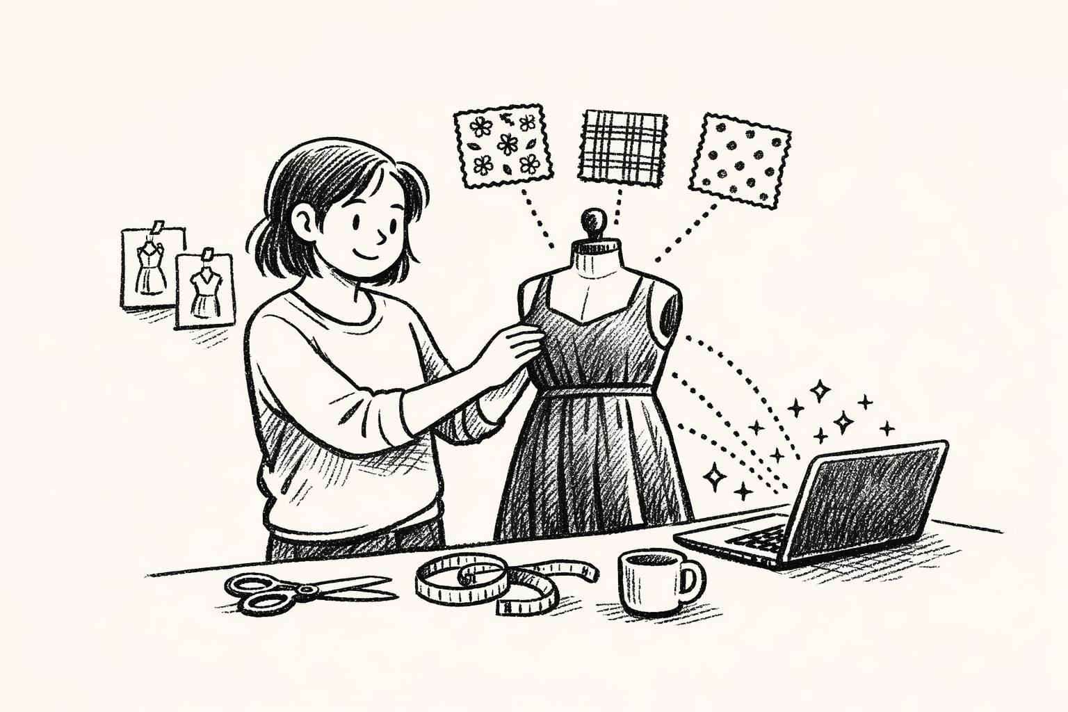
For faster results, tools like Mock It offer pre-designed templates and advanced shadow customization features, making the process easier for beginners and pros alike. Whether you’re creating mockups for e-commerce or presentations, these techniques ensure your designs look polished and professional.
Tips for Creating Realistic Shadows in Photoshop Tutorial #Nucly

Understanding Shadow Basics in Apparel Mockups
Creating realistic shadows in apparel mockups starts with understanding how light interacts with objects. The three main elements to focus on are the position of the light source, the type of shadow it creates, and how the material of the clothing affects the shadow. Together, these factors determine whether your mockup feels lifelike or artificial. Let’s break down how light direction, shadow styles, and fabric characteristics work together to create realism.
Light Source and Shadow Direction
The placement of your light source is the backbone of believable shadow creation. Shadows form in direct response to the light’s direction and intensity. For instance, if light shines on a garment from the upper left, shadows will naturally fall to the lower right, adding depth and consistency to your design.
The distance between the light source and the object also impacts the shadow’s appearance. Items close to the light cast larger, sharper shadows, while those farther away create smaller, softer ones. Similarly, when apparel is positioned near a surface, shadows become more defined and compact. Moving the garment away results in shadows that are blurrier and spread out. Bright, direct light produces strong, crisp shadows, while softer, diffused lighting creates subtler effects. Adjusting the light’s direction, intensity, and even its color temperature helps blend the mockup seamlessly into its intended environment.
Shadow Types: Soft vs. Hard
Choosing between soft and hard shadows can dramatically affect the mood and realism of your mockup. Hard shadows have sharp, defined edges and strong contrasts, emphasizing texture and detail. These shadows are typically created by small, direct light sources. On the other hand, soft shadows have smoother, blurred edges with gentle transitions, offering a more understated and natural look.
| Shadow Type | Edge Quality | Light Source | Best Use Cases | Mood Created |
|---|---|---|---|---|
| Hard | Crisp, defined edges | Small, direct light | Bold designs, athletic wear | Dramatic, intense |
| Soft | Blurred, gradual edges | Large, diffused light | Casual wear, lifestyle shots | Relaxed, inviting |
Hard shadows work well for showcasing technical or athletic apparel, where bold lines and textures need to stand out. In contrast, soft shadows are ideal for casual or luxury items, creating a more approachable and elegant presentation.
Fabric Texture and Shadow Interaction
The type of fabric plays a significant role in how shadows appear. Opaque materials like denim or canvas typically cast dark, well-defined shadows, while translucent fabrics create softer, more diffused shadows as light passes through or reflects off them.
High-resolution textures, such as those mimicking cotton or polyester, add depth by interacting with light to form micro-shadows that highlight surface details. The angle and strength of the light can enhance a garment’s natural contours, while incorporating subtle folds and wrinkles can amplify the realism. For example, heavyweight fabrics like denim may require firm, pronounced shadows, while lightweight materials like a tank top might benefit from softer, more gradual shading. Tailoring the shadow technique to the fabric ensures each garment looks authentic and visually compelling.
Preparing Your Mockup for Shadow Application
Before diving into shadow work, it’s crucial to set up your mockup file for detailed adjustments. A well-prepped file not only saves time but also ensures that your shadows enhance the design without disrupting the original elements. To get started, focus on organizing layers, using Smart Objects, and working at the right zoom level for precision.
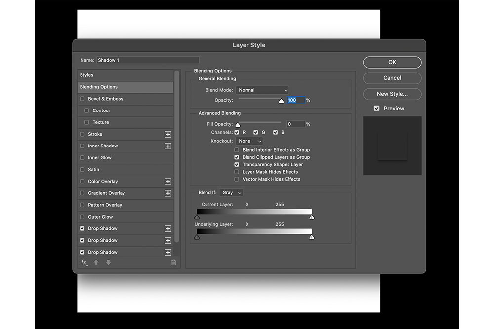
Layer Management and Organization
Organizing layers effectively can turn a messy file into a smooth, efficient workspace. Start by grouping related elements and giving them clear, descriptive names. For instance, separate your mockup into groups like "Garment Base", "Design Elements", "Shadows", and "Background."
"Organizing layers in Photoshop simplifies your workflow and saves time… so it is important to organize the layers in Photoshop." – Abdallah Kamal
For apparel mockups, layer order matters. Place the garment base at the bottom, followed by design elements, shadow layers, and any overlay effects. Avoid generic names like "Layer 1" or "Copy" – instead, use specific labels such as "T-Shirt Base", "Logo Design", "Drop Shadow", or "Fabric Texture." This clarity makes it easier to navigate your file and tweak individual elements without confusion.
Keeping shadow layers separate from the garment and design layers is especially helpful. It allows you to refine shadows independently, which is a game-changer when dealing with client feedback or experimenting with multiple shadow types. This separation ensures maximum flexibility, so you can adjust shadows without altering the core design.
Once your layers are organized, convert key elements into Smart Objects for non-destructive editing.
Using Smart Objects
Smart Objects are like protective shields for your original content. They let you edit, transform, and apply effects without permanently altering the source image. This feature is particularly useful when working with shadows, as it preserves quality while allowing unlimited adjustments.
"Smart Objects are layers that contain image data from raster or vector images, such as Photoshop or Illustrator files. Smart Objects preserve an image’s source content with all its original characteristics, enabling you to perform nondestructive editing to the layer." – Nausherwan Adil, Works at Adobe Systems
To use Smart Objects effectively, convert your garment and design layers into them. Then, double-click the Smart Object thumbnail to open it in a separate document. Here, you can tweak shadow placement, opacity, or blending modes without affecting the primary canvas. Once you save your changes, the main file updates automatically – keeping all effects intact.
This method is invaluable for experimenting with shadow techniques. For example, if you apply a Gaussian blur to soften shadows, you can revisit and adjust the blur radius without losing your original work. Smart Objects also make it easy to scale, rotate, or distort shadow layers while maintaining their quality for future edits.
Zooming for Precision
Once your layers and Smart Objects are set, proper zooming is key to achieving precise shadow placement. Working at 100% zoom lets you see every detail, ensuring shadows blend seamlessly with the garment and interact naturally with textures.
At this level of magnification, you can fine-tune shadow edges, adjust opacity gradients, and catch subtle imperfections like harsh edges or unwanted artifacts. This attention to detail is especially important when dealing with textured fabrics, where shadows need to adapt to surface variations.
Zooming also helps you spot issues with noise or sharpness in shadow areas early on, avoiding unpleasant surprises later. To navigate efficiently, use keyboard shortcuts to zoom in and out without disrupting your workflow. The Hand tool is also a lifesaver, letting you move around the canvas smoothly at high zoom levels. Together, these techniques create the perfect environment for meticulous shadow application.
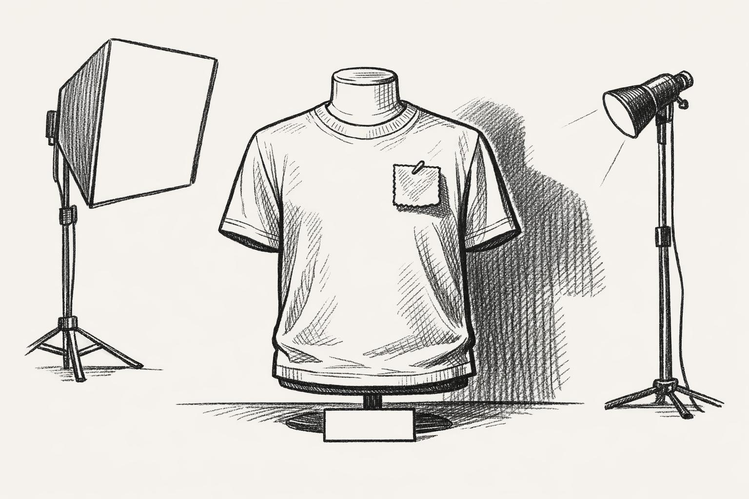
Step-by-Step Guide to Adding Realistic Shadows
Shadows can make your apparel designs pop, giving them depth and dimension. To create realistic shadows, it’s all about understanding how light interacts with fabric and translating that into your mockups. This process breaks down into three main steps: building the shadow layers, blending them naturally with the garment, and fine-tuning for a lifelike finish.
Creating Shadow Layers
Start by adding a new shadow layer above the base garment layer but beneath any design elements. Name it something clear like "Primary Shadows" to keep your layers organized.
Use a soft brush with 0% hardness for smooth, diffused edges. Instead of pure black, opt for a mid-tone gray – black can look too harsh, while gray blends better with different fabric colors and textures.
Focus on areas where shadows naturally occur, like under the arms, around the neckline, or where sleeves meet the torso. For example, on a t-shirt mockup, shadows often appear under the collar, along side seams, and in folds of the fabric. Start with a medium-sized brush to block in general shadow areas, then switch to smaller brushes for detailed work around seams or texture variations.
Shadows aren’t uniform – they vary in depth and intensity. Deeper folds or overlapping fabric need darker shadows, while gentler curves require lighter shading. Build your shadows gradually, layering them for more control rather than trying to perfect them in one go.
Blending Modes and Shadow Integration
Once your shadow shapes are in place, it’s time to blend them into the garment. Set the shadow layer’s blending mode to Multiply – this darkens the fabric without hiding its texture or color. Multiply mode works well because it mimics how shadows naturally interact with fabric, enhancing depth without overpowering the material’s details.
If you want a more dramatic effect, try Overlay mode. This intensifies both shadows and highlights, making them interact dynamically with the fabric’s texture. For garments with pronounced weaves or patterns, Overlay can help shadows follow those surface details more convincingly.
Adjust the shadow layer’s opacity to control how strong the shadows appear. Start around 30-40% opacity and tweak as needed. The goal is to enhance the garment’s three-dimensional look without making the shadows too heavy or muddy.
For garments with multiple textures, like a hoodie with ribbed cuffs and a smooth body, create separate shadow layers for each area. This way, you can tailor the shadows to match the specific characteristics of each fabric type.
Refining Shadows for Realism
After blending, refine your shadows for a polished, realistic look. Apply a Gaussian Blur to soften any harsh edges, but don’t overdo it – you still want definition. A blur radius of 1-3 pixels usually works well, but adjust based on your image resolution and how soft you want the shadows to appear.
To keep shadows confined to the garment, use clipping masks. Hold Alt (or Option on Mac) and click between your shadow layer and the garment layer in the Layers panel. This keeps shadows from spilling onto backgrounds or other design elements.
For even more realism, incorporate the fabric’s texture into the shadow layer. Duplicate the fabric texture, set its blending mode to Overlay, and align it with your shadow layer. This makes the shadows appear to follow the weave or knit of the material, giving the illusion that they’re part of the fabric rather than sitting on top of it.
Different fabrics require different approaches. For example:
- Linen benefits from irregular, rough-edged shadows due to its coarse texture.
- Cotton needs softer, more uniform shadows.
- Denim works best with shadows that follow its directional weave pattern.
Use gradient tools with midpoint sliders to create smooth transitions between shadows and highlights. This is especially useful for curved areas like shoulders or chest sections, where shadows need to blend seamlessly across the surface.
Finally, fine-tune the shadow intensity by adjusting the layer opacity in small 5-10% increments. Subtle adjustments often make the biggest difference. The most convincing shadows are the ones viewers don’t consciously notice but that make the garment feel three-dimensional and professional.
sbb-itb-1e8f9ab
Finalizing and Exporting Your Mockup
The final steps in creating a polished mockup involve a thorough review and organized file management. This stage ensures your work looks professional and is ready for its intended use, whether for client presentations, online stores, or promotional materials.
Reviewing Shadow Placement and Consistency
Start by examining your mockup at 100% resolution to catch fine details. Zoom out to check the overall composition, then zoom back in to inspect how shadows align with design elements. Pay close attention to edges, transitions, and whether shadows match the direction of a consistent light source.
For example, if you’ve placed a graphic on the chest of a garment, it should cast a subtle shadow that blends naturally with the garment’s existing shadows. Avoid situations where shadows cut awkwardly through your design, as this can disrupt the three-dimensional effect. Shadows should enhance the depth and realism of both the garment and the applied design.
Next, view the mockup from a regular viewing distance – this simulates how customers will see it online or in print. Sometimes, what looks perfect up close may seem unbalanced when viewed at a normal distance. Adjust accordingly to ensure the design feels harmonious in its intended context.
"Use spacing, placement and color to make the design effective before adding the final layer of polish. If you focus on making your designs work without these tricks, you may find that you don’t need them as often, and that they are more effective when you do use them." – Nate Eagle, Author
Think about where the mockup will be displayed. For example, an Instagram post might benefit from dramatic shadows to grab attention, while an e-commerce product image should prioritize accuracy over artistic effects. Once you’re happy with the shadows, it’s time to save and export your work.
Saving Editable Files and Exporting Formats
Always save your working file in a layered format like PSD or XCF. This preserves your shadow layers and smart objects, allowing for future tweaks without starting over. Keeping shadow layers intact ensures flexibility for adjustments down the road.
When exporting, choose formats based on the mockup’s purpose:
- For web use: Export as JPEG for detailed product photos with complex shadows and textures. This format balances quality with a smaller file size. Use PNG when transparency or preserving fine shadow details is important.
- For print: Opt for TIFF to maintain high resolution and color accuracy. This format is ideal for catalogs or large-format displays, as it avoids compression that could compromise shadow detail.
Here’s a quick reference table for export formats:
| Use Case | Recommended Format | Key Benefits |
|---|---|---|
| E-commerce websites | JPEG (RGB, 72-150 DPI) | Small file size, fast loading |
| Social media | PNG (RGB, 72 DPI) | Transparent backgrounds, sharp details |
| Print catalogs | TIFF (CMYK, 300 DPI) | High resolution, accurate colors |
| Client presentations | Universal compatibility, vector elements preserved |
When exporting, optimize for the medium. Web images should load quickly without losing shadow quality, while print files require minimal compression to preserve subtle gradients.
Set your color profile early in the process: use RGB for digital formats and CMYK for print. Switching color spaces after shadow work can alter their appearance, so make sure to set this correctly from the start.
Organizing Files for Workflow Efficiency
Adopt a clear naming convention to keep your files organized. Avoid vague names like "mockup_final_v2_FINAL.psd." Instead, use descriptive names such as "hoodie_logo_front_v03.psd" or "tshirt_vintage_design_black_v01.psd." This makes it easier to locate specific files later.
Separate your files into folders based on their purpose. For instance:
- Working Files: Layered files with editable elements.
- Web Images: Optimized JPEG or PNG exports.
- Print Ready: High-resolution TIFF files.
Use version control to manage multiple design iterations. Save new versions instead of overwriting old ones. This allows you to compare different shadow techniques or revert to a previous version if needed. Keep a record of key shadow settings to maintain consistency across projects.
For repetitive tasks, create template files with pre-set shadow layers, blending modes, and placeholder smart objects. This speeds up future projects and ensures consistent quality. For example, if you’re designing a series of t-shirt mockups, a template can save time while maintaining uniformity.
Finally, back up your work regularly. Use cloud storage or external drives to protect your files and ensure access from different devices or locations. This is especially important for master files that include all shadow layers and design elements.
Using Mock It for Efficient Shadow Creation
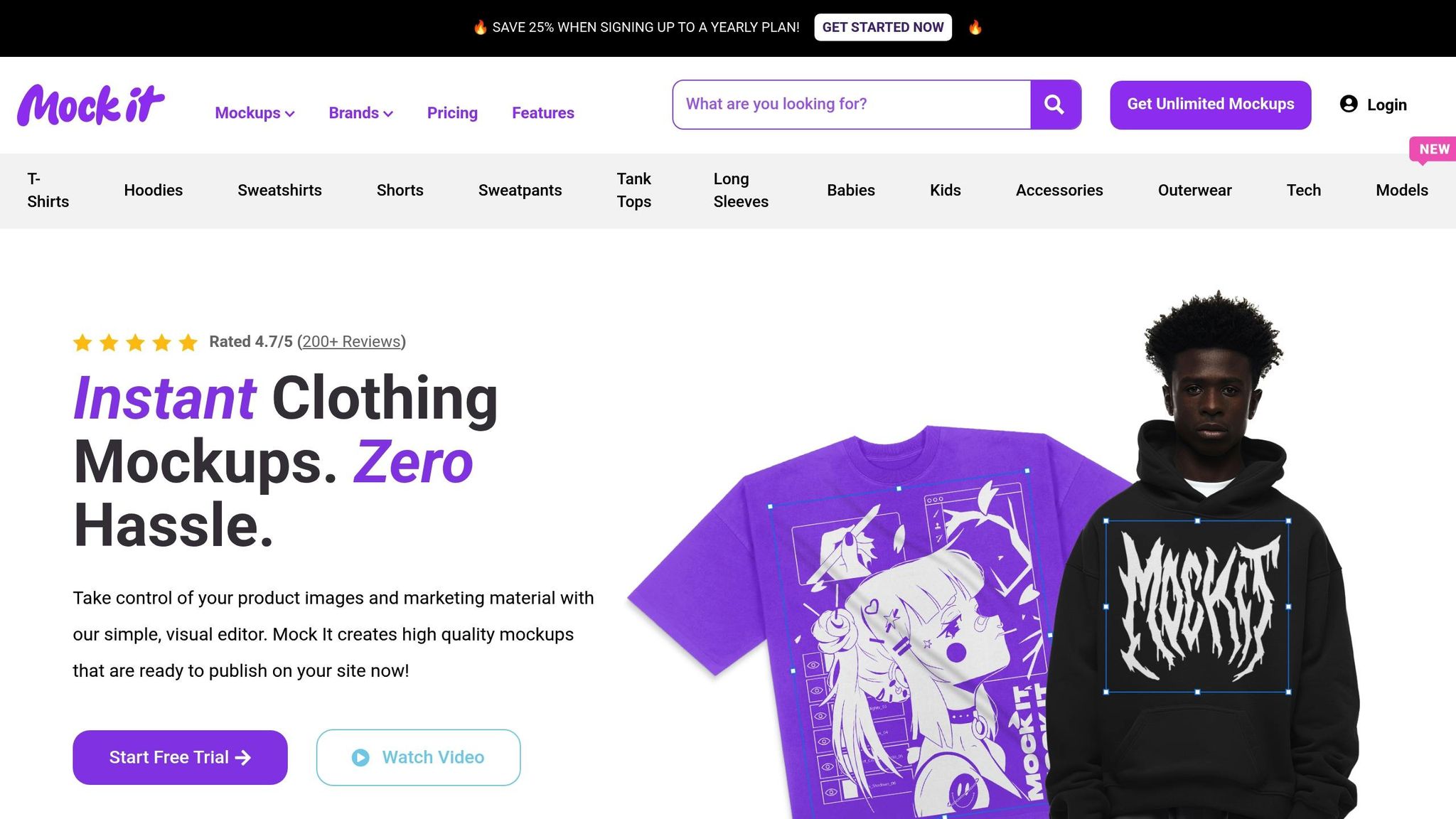
Creating shadows manually in Photoshop can be a tedious and complex process. Mock It simplifies this task with a platform designed to deliver professional-grade results, saving you time and effort. It’s a game-changer for modern mockup production.
High-Quality Mockup Templates
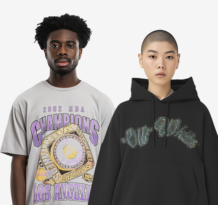
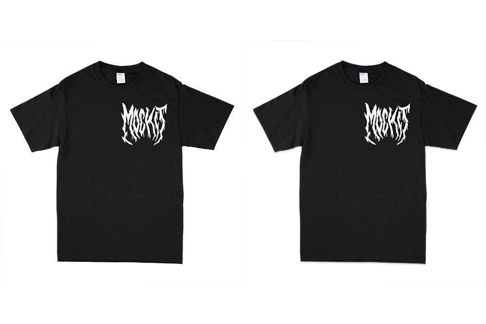
Mock It boasts a library of over 5,000 mockup templates, providing a strong starting point for realistic shadow work. These templates are crafted in high resolution – 1,500×1,500 pixels for standard use and 2,400×2,400 pixels for premium quality – ensuring every shadow detail remains sharp and defined. Each template includes natural folds and wrinkles that enhance the appearance of your designs. What sets Mock It apart is its focus on authenticity, featuring actual apparel brands and styles with accurate tags and details.
"The quality of the mockups from Mock It is exceptional. My product images look professional and polished. The platform is user-friendly, and I’ve been able to create stunning images in no time." – Montrell, Verified User
These high-resolution templates, combined with precise shadow techniques, make it easy to achieve a polished, professional look. Designers can add elements with minimal adjustments, making this platform especially helpful for those without advanced Photoshop skills.
Advanced Tools for Shadow and Lighting Adjustments
Mock It goes beyond templates by offering advanced tools for customizing lighting and shadows without the hassle of managing complex layers. Its intuitive scene creator allows you to tweak light direction, intensity, and color temperature to match your brand’s aesthetic or specific product needs. With an extensive color library, the platform ensures accurate representation of various fabric tones. Adjusting shadow positioning and opacity is straightforward, with Mock It handling the technical details behind the scenes.
Streamlined Workflow and Unlimited Downloads
One standout feature of Mock It is its unlimited downloads, which significantly speeds up the design process. Instead of spending hours perfecting shadows for a single mockup, you can quickly experiment with multiple templates to find the one that best suits your design. Quarterly updates keep the template library fresh and aligned with modern lighting trends, eliminating the need for extra manual adjustments.
The pricing is straightforward: the Standard plan costs $7.99/month (billed yearly) and provides access to over 4,000 mockups with unlimited downloads. The Pro plan, at $14.99/month (billed yearly), includes advanced features like an AI image generator and background remover.
"Pretty surprised by how good this is. The mockups are super clean, and my product images for my brand look so much better now. For the price and the huge number of mockups, I’m really happy with it. Definitely a good find." – Salih, Verified User
For unique shadow scenarios, Mock It’s request-a-mockup feature allows you to have custom lighting setups created, ensuring even unusual product angles look flawless. With its organized template system and unlimited access, Mock It is an ideal solution for designers juggling multiple clients or product lines. It simplifies shadow creation while maintaining consistent realism across projects, minimizing the need for manual adjustments and giving you more time to focus on creativity.
Conclusion: Perfecting Realistic Shadows for Professional Mockups
Mastering the art of creating realistic shadows can take your apparel mockups to the next level, turning basic designs into polished visuals that grab attention and help boost sales. These techniques are the backbone of crafting product presentations that stand out.
Consistency is key when applying shadow techniques. Make sure the shadows align with the background and complement the fabric’s texture. Using blurring methods can add a natural sense of depth, while keeping the shadow direction aligned with your light source ensures your designs maintain a cohesive and professional look.
Take inspiration from observing shadows in real-world lighting. Pay attention to how shadows change with different light conditions, and experiment with their length and placement to create various moods and effects. Every small adjustment can make your fabric textures appear more lifelike and engaging.
For those looking for a streamlined approach, Mock It offers a powerful solution. With over 5,000 high-resolution templates (2,400×2,400 pixels) and advanced tools for shadow customization, this platform makes it easy to create professional-grade mockups in no time. Its 4.7/5 rating from 200+ reviews highlights how effective it is at simplifying the mockup creation process.
The ultimate aim is to produce mockups that not only highlight your designs but also enhance your brand’s image. By applying these shadow techniques, you can transform your mockups into compelling marketing tools that truly do your work justice.
FAQs
How can I create realistic shadows that match the texture and folds of fabric in my apparel mockups?
To make shadows look natural, align them with the fabric’s texture and natural folds. Start by ensuring the shadow’s direction, opacity, and blur correspond to the light source in your design. Blending modes like Multiply or Overlay can help the shadows blend smoothly with the fabric’s surface. For a more realistic effect, shape the shadows to follow the fabric’s contours, like wrinkles or seams.
You can also use textured brushes or overlays to replicate the material’s weave or grain. Adjust the shadow’s intensity and softness based on the fabric’s thickness and the angle of the light source. These techniques will give your mockups a polished, lifelike appearance, making your designs truly stand out.
What’s the difference between Multiply and Overlay blending modes for creating shadows in apparel mockups?
The Multiply blending mode is great for creating realistic, deep shadows by darkening colors through the multiplication of the base and blend layers. This makes it a go-to choice when you want shadows to look natural and merge smoothly into your design.
On the other hand, the Overlay blending mode blends the qualities of Multiply and Screen, enhancing contrast and brightness. It’s perfect for adding softer, more dynamic shadows or subtle depth without overwhelming the design. This mode works best when you want your shadows to subtly boost the overall energy and richness of your mockup.
How does Mock It make it easier to add realistic shadows to apparel mockups?
Mock It makes adding realistic shadows to your apparel mockups a breeze. Its intuitive tools automatically apply and adjust shadows, perfectly matching your designs. This means you can skip the hassle of manually tweaking layers or struggling with blending techniques.
Thanks to Mock It’s customizable templates, you can easily create polished, professional-looking designs that maintain a consistent and visually striking appearance.