Lighting can make or break your apparel mockups. Without proper lighting, designs look flat and unprofessional. But with the right techniques, you can create visuals that feel lifelike and polished. Here’s a quick summary of five essential lighting tips:
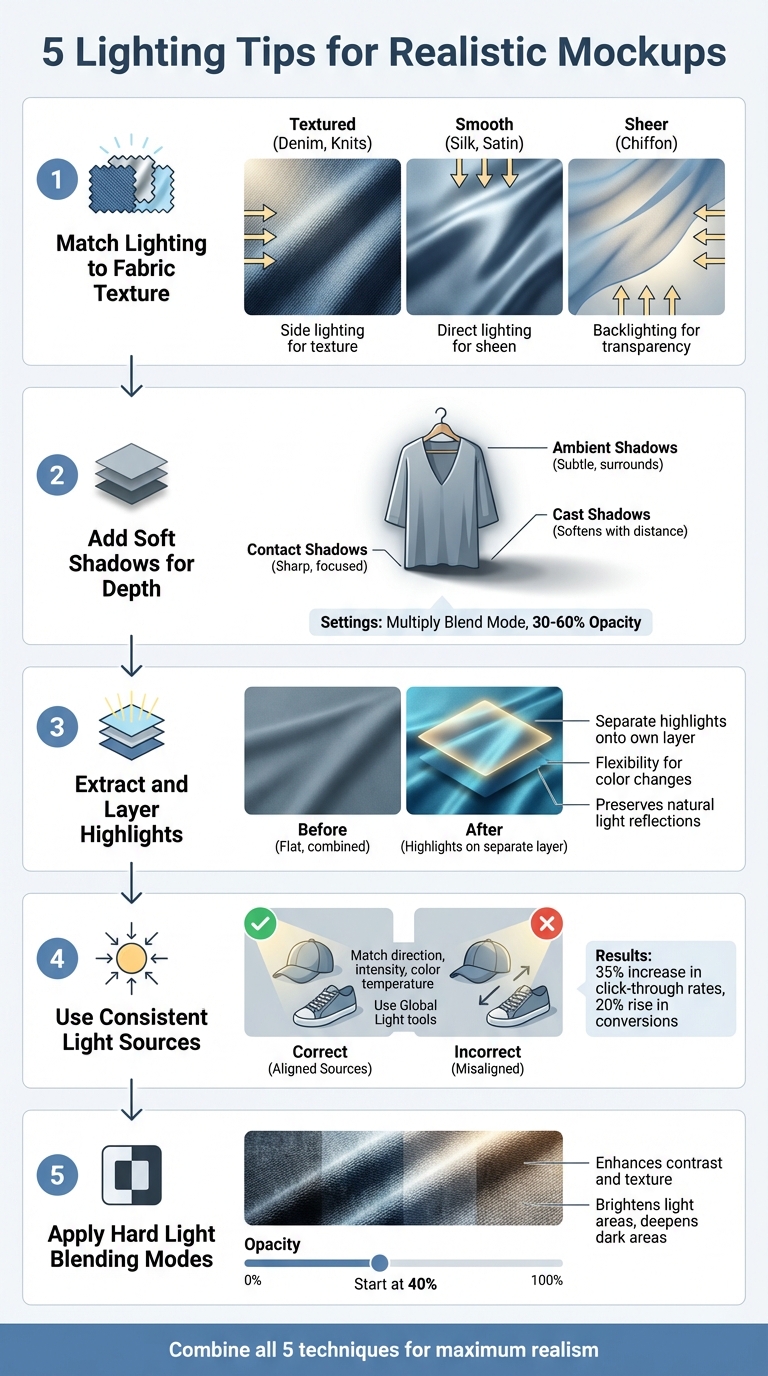
- Match lighting to fabric texture: Different fabrics (silk, velvet, cotton) interact with light uniquely. Use side lighting for textured materials, direct lighting for smooth ones, and backlighting for sheer fabrics.
- Add soft shadows: Combine contact, cast, and ambient shadows to create depth and anchor your designs naturally.
- Extract and layer highlights: Separate highlights onto their own layer for flexibility in editing and a realistic finish.
- Use consistent light sources: Align lighting direction, intensity, and color temperature for a cohesive mockup.
- Apply Hard Light blending modes: Boost contrast and texture for bold, sharp visuals.
These techniques, when combined, enhance depth and realism in your mockups, improving their overall quality and appeal.
5 Essential Lighting Techniques for Realistic Apparel Mockups
Understanding Highlights and Shadows on Mockups – Graphic Design
sbb-itb-1e8f9ab
1. Match Lighting to Fabric Texture
Fabrics interact with light in unique ways, and understanding these nuances is key to creating realistic mockups. For instance, silk reflects light with bright highlights and a smooth finish, while velvet absorbs light, resulting in rich shadows and a matte appearance. Cotton, on the other hand, offers a more neutral look. Fabrics with a tight weave appear smoother, while loose weaves create more pronounced shadows. Tailoring the lighting to each fabric’s qualities is essential for achieving polished apparel visuals.
"The most important thing to think about when photographing any fabric is texture. No matter what type of fabric you’re shooting, you’re either trying to overcome the texture or showcase it." – Cameron Knight, Photographer
For textured fabrics like denim or knits, side lighting emphasizes their folds and grain. Smooth materials like silk or satin benefit from direct lighting, which enhances their natural shine while minimizing flaws. Lightweight, sheer fabrics such as chiffon look best with backlighting, which creates a soft, glowing effect.
To maintain accurate colors and blend shadows seamlessly, use soft, diffused lighting – softboxes or umbrellas work well for this. Mixing light temperatures can disrupt the consistency of your results, so stick to a single light temperature.
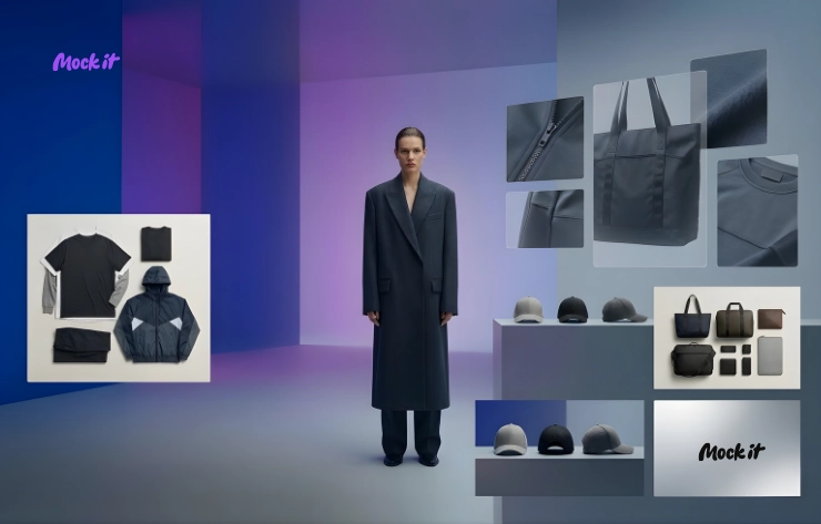
If you’re looking for a tool to simplify the process, Mock It offers over 5,000 templates with pre-adjusted lighting for different fabrics. Its customizable shadow overlays and scene creator make precise lighting adjustments easy, saving time compared to alternatives like Placeit or Smartmockups.
2. Add Soft Shadows for Depth
Once you’ve nailed fabric-specific lighting, shadows become the next crucial step in making your designs feel grounded and lifelike. Shadows don’t just add visual interest – they anchor your mockups, making them look like they belong in their environment. Without them, your designs can feel flat and disconnected. The right shadowing technique can mean the difference between a polished, professional mockup and one that feels incomplete.
"Shadows play a pivotal role in this. They add depth, context, and a sense of authenticity that flat images simply can’t achieve." – Abel B., Contributor, Mock It
Professional mockups often rely on three types of shadows working in harmony:
- Contact shadows: These appear right where the garment touches the surface. They’re sharp, small, and highly focused.
- Cast shadows: These extend outward from the object, softening and fading as they stretch further away.
- Ambient shadows: These surround the entire piece with a subtle, low-opacity effect, mimicking the way indirect light interacts with the design.
By layering these shadows, you can create a sense of depth that feels natural and convincing.
For the most realistic results, set your shadow layers to the Multiply blend mode with an opacity of 30–60%. This ensures the shadows blend seamlessly with the background while retaining texture. Avoid using pure black for your shadows – it can look harsh and unnatural. Instead, choose a darker version of your background color. For instance, if your background is light blue, opt for a deep midnight blue shadow rather than black. To soften the edges, feather the shadows by about two pixels, which helps avoid any harsh or artificial lines.
If you’re looking to save time, Mock It provides pre-made shadow overlays that are ready to use. Unlike tools like Placeit or Smartmockups, Mock It’s shadow layers come pre-configured with ideal blend modes and opacity settings, so you can achieve professional results without the extra effort.
3. Extract and Layer Highlights
Highlights are the finishing touch that brings depth and realism to your mockups. They define folds, textures, and the way light interacts with the fabric. Without them, even the best shadow work can leave your design looking flat and lifeless. Just like shadows, well-placed highlights add that professional polish your mockups need.
"Shadows and highlights are the whispers of fabric, the play of light and darkness, breathing life into your designs." – Abel B., Contributor, Mock It
Separating highlights onto their own layer is key to flexibility. Why? Because it allows you to adjust colors without losing the natural light reflections. For example, you can switch a garment from red to blue and still keep the original lighting intact. This saves you from having to recreate highlights every time you tweak the base color. It’s a simple step that makes a big difference in both realism and efficiency.
Here’s how you can manually extract highlights in Photoshop:
- First, isolate the garment (Ctrl + Shift + J).
- Use the Channels panel to select the brightest areas (Ctrl + Left Click on the RGB Channel).
- Refine the selection with Levels (Ctrl + L).
- Finally, duplicate the selection as a new layer, fill it with white, and place it on top of your stack. Adjust the opacity until the highlights look natural against the fabric.
If you want to skip the manual work, Mock It has you covered. Their pre-configured highlight overlays are optimized for different fabric types, making the process as simple as drag-and-drop. Unlike other tools, Mock It’s overlays come with ideal settings already applied, saving you time and effort. For Photoshop users, the Bulk Mockup Action Pack ($5.00) automates the extraction process, though it does require a bit more technical know-how compared to Mock It’s user-friendly interface.
4. Use Consistent Light Sources
Lighting can make or break the realism of a mockup. When light and shadows don’t align, the design ends up looking slapped on instead of part of the product. On the flip side, consistent lighting can transform a flat graphic into something that feels real – something customers can easily imagine owning.
"Pay attention to the direction, intensity, and color temperature of the light source to achieve a harmonious integration between the design and its environment." – Abel B., Contributor, Mock It
To achieve this, keep the light properties uniform across all elements. For example, if your mockup template uses lighting from the upper-right, make sure your design’s highlights and shadows follow that same direction. This small step adds depth and makes your mockup feel cohesive and lifelike. Tools like Photoshop’s "Global Light" setting can help align layer styles automatically. And platforms like Mock It offer pre-configured lighting setups, so you can just drop in your design and maintain consistency effortlessly.
The payoff is real: one Etsy seller reported a 35% increase in click-through rates and a 20% rise in conversions within three months of switching to mockups with accurate lighting and shadows. When every product in your catalog follows the same lighting rules, your visuals not only look realistic but also create a more dynamic e-commerce storefront that builds trust with potential buyers.
5. Apply Hard Light Blending Modes
This technique takes your designs to the next level by using Hard Light blending for a bold, striking finish. Hard Light enhances contrast by keeping whites bright and blacks deep, making fabric textures and folds pop with clarity.
Here’s how it works: Hard Light removes 50% gray from the blend layer. Lighter areas are brightened (screened), while darker areas are intensified (multiplied). The result? Sharp shadows and vivid highlights that mimic the effect of direct, intense lighting on your apparel design.
"Hard Light is supposed to look like a diffused spotlight being shown onto the base color." – Kirk Nelson, Visual Information Specialist
Since this effect can be quite strong, it’s usually best to reduce the opacity – start at around 40% – to keep the look natural. If you’re using Mock It, you can easily apply this effect to custom layers and fine-tune the intensity to match your mockup’s lighting.
Hard Light is perfect for replicating harsh lighting conditions, like bright sunlight or strong studio key lights. For a softer, more subtle effect, you might opt for Soft Light instead. When maximum definition is the goal, though, Hard Light delivers a polished, professional result. Combined with the earlier techniques, it’s a powerful tool for creating stunning clothing mockups that stand out.
Conclusion
Mastering these five lighting techniques can take your mockups to a whole new level, adding realistic fabric interactions and professional depth. Each method focuses on how light interacts with fabric, and when used together, they create visuals that stand out.
Lighting is what separates great mockups from average ones. Soft shadows and reflections reveal the garment’s shape and fabric weight, while consistent light sources tie the design together. Even small tweaks to lighting can make a big difference in realism.
These techniques improve with practice. Start with basics like soft shadows and maintaining consistent light sources. Once you’re comfortable, try more advanced methods like hard light blending modes. Experiment with different effects to see how they work with various textures and colors.
If you’re looking for tools to help, Mock It is a great resource. With over 5,000 customizable mockup templates from 45+ brands, a full range of color options, and an intuitive interface, it makes learning and applying these techniques straightforward. Whether you’re designing for t-shirts, hoodies, or sweatshirts, Mock It helps you create visuals that feel real and immersive – offering a clear edge over competitors like Placeit or Smartmockups.
With these techniques in hand, you’re ready to bring your mockups to life. Add depth, dimension, and a touch of realism to your designs, and watch them transform into visuals that demand attention.
FAQs
What lighting setup works best for my fabric type?
The right lighting setup varies based on your fabric’s texture, color, and the mood you’re aiming to create. Soft, diffused lighting works great for showcasing details without creating harsh shadows. If you’re working with shiny fabrics, controlled direct lighting paired with reflectors can bring out their luster beautifully. For casual fabrics like cotton or linen, natural light often does the trick. On the other hand, synthetic or satin materials tend to look more dynamic under studio lighting with carefully controlled shadows to add depth.
How do I match shadow direction across all layers?
To keep shadows consistent across all layers in Photoshop, you can set a global lighting angle. This ensures all shadows align in the same direction, giving your design a more realistic appearance.
If you’d rather tweak shadows manually, focus on a single light source as your reference. Use tools like Transform or Warp to fine-tune the shadow placement and shape for added precision.
For an easier approach, platforms like Mock It offer built-in tools that automatically ensure lighting and shadow consistency, saving you time and effort.
When should I use Hard Light vs Soft Light?
Hard light produces sharp shadows and strong contrast, making it perfect for emphasizing textures or creating a dramatic vibe – think fashion shoots with bold, striking visuals. On the other hand, soft light offers a diffused glow and gentle shadows, ideal for achieving a natural and flattering appearance. This makes it especially useful for showcasing fabrics and fit in mockups. Whether you go for hard light or soft light depends on your mockup’s style and purpose: hard light for bold, edgy effects, and soft light for a polished, realistic finish.