When creating mockups for your brand, maintaining consistent colors is essential for recognition and trust. Here’s a quick summary of the 5 steps to integrate your brand colors seamlessly:
- Choose a High-Quality Mockup Template
Select templates with a resolution of 300 DPI or higher. Use platforms like Mock It for access to over 5,000 templates with editable layers. - Gather Accurate Brand Color Codes
Use HEX, RGB, or CMYK codes from your brand guidelines to ensure consistency across digital and print formats. - Apply Colors to Mockup Layers
Edit the appropriate layers, such as garment color, using tools like Photoshop or Mock It’s intuitive editor. Use blending modes like "Multiply" for realistic results. - Refine for Realism
Adjust shadows, highlights, and lighting to make your mockup look natural and polished. Test across devices to ensure color accuracy. - Export and Save Properly
Save in formats like PNG for transparency or PSD for future edits. Organize files and document color codes for easy reuse.
Why it matters: Consistent brand colors in mockups enhance professionalism, build trust, and improve engagement. Tools like Mock It simplify the process, making it easier to create polished visuals that resonate with your audience.
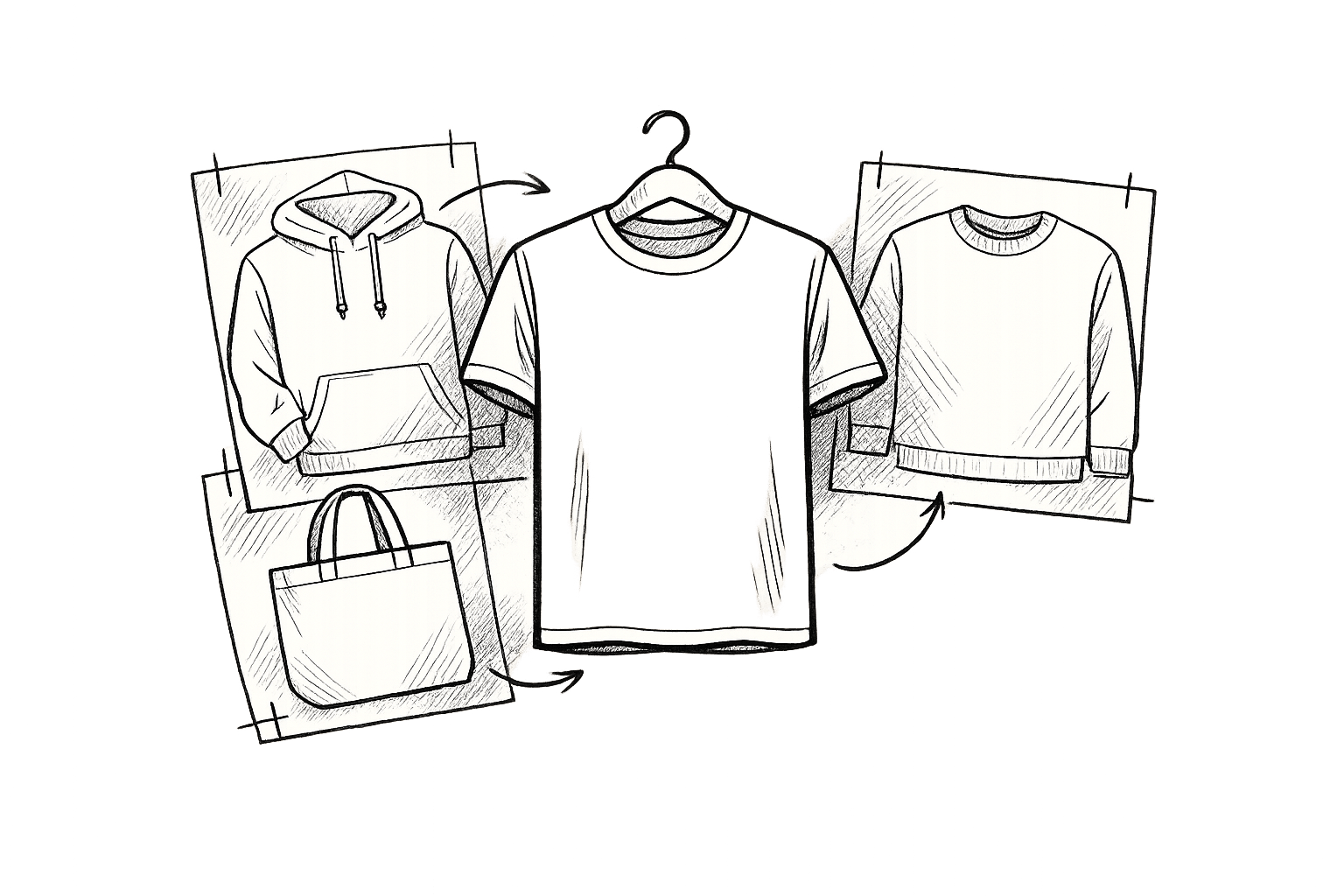
Matching Fabric Colors with T-Shirt Mockup Templates
Step 1: Choose Your Mockup Template
Getting your brand colors to pop starts with picking the right mockup template. The quality and features of the template you choose play a big role in how sharp your colors look and how polished your final design appears.
Find the Right Template
When selecting a mockup template, focus on high resolution – aim for 300 DPI or higher to ensure crisp, detailed designs. Look for templates that include smart objects, which make it much easier to adjust colors in programs like Photoshop.
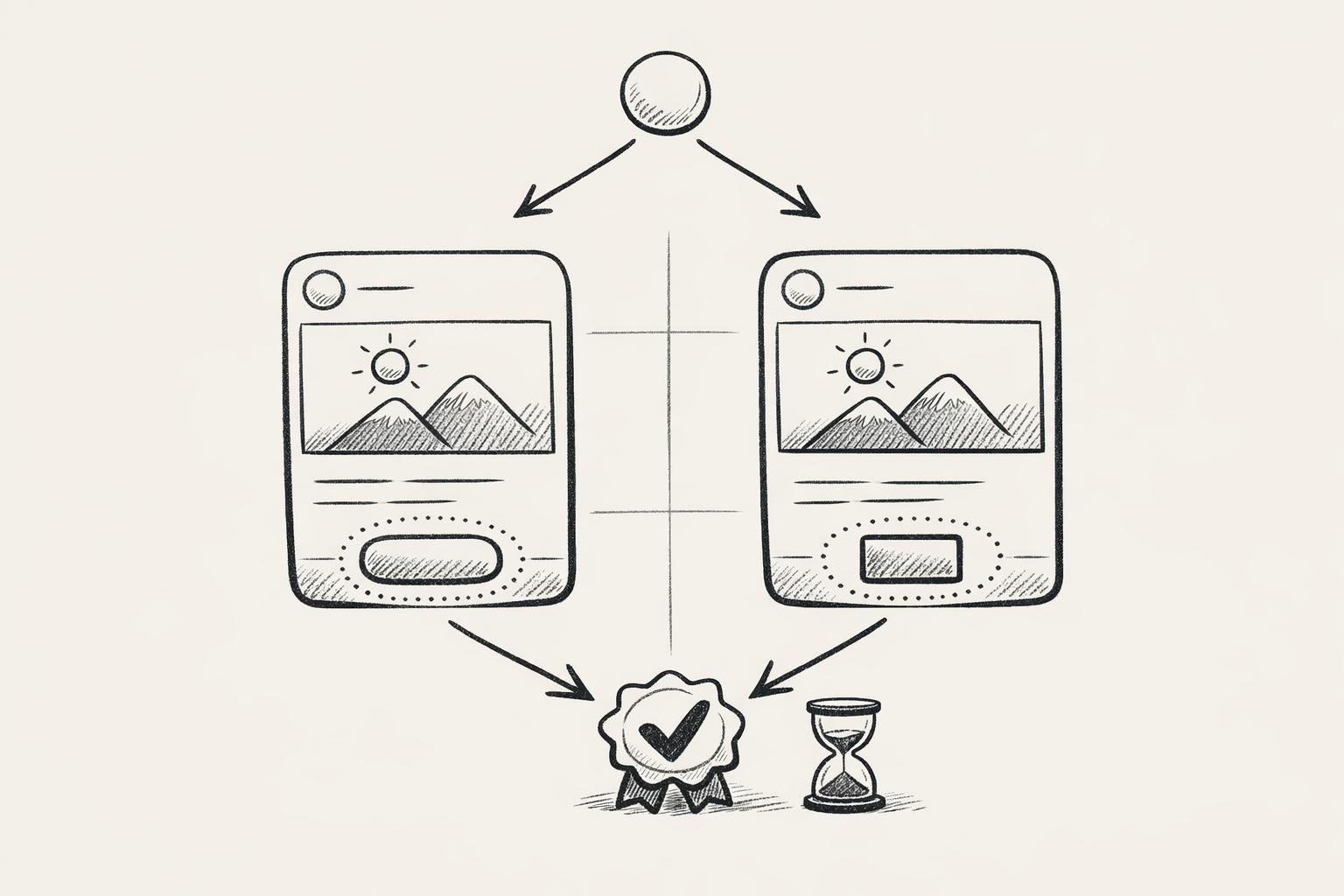
Your mockup’s style should complement your brand identity. For example, a front-facing view works great for chest designs, while a back view is ideal for showcasing full prints. Side views? Perfect for highlighting sleeve details. Also, don’t forget to check the license terms to confirm the template fits your project’s usage rights.
If combing through random sources feels overwhelming, consider using specialized libraries to save time and effort.
Use Template Libraries
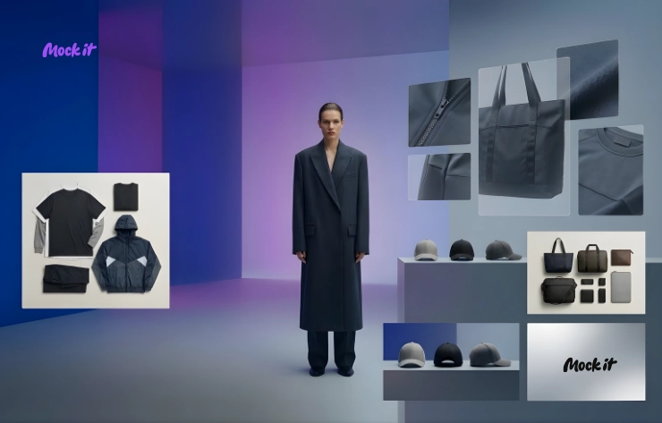
Dedicated libraries can simplify your search for the perfect mockup. Platforms like Mock It offer a treasure trove of over 5,000 high-quality clothing mockup templates from more than 45 brands. With these templates, you’ll find complete color libraries, so applying your brand colors is a breeze.
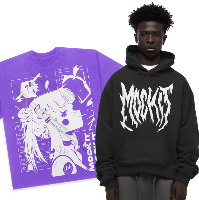
Mock It provides professional-grade mockups for a wide range of apparel, including t-shirts, hoodies, sweatshirts, and tank tops. It’s a great option for businesses of all sizes, offering both quality and affordability.
"Mock It has been an incredible tool for my business. The mockups are extremely high quality, and I love how easy it is to customize them to fit my brand." – Madhyn, Verified User
"The quality of the mockups from Mock It is exceptional. My product images look professional and polished. The platform is user-friendly, and I’ve been able to create stunning images in no time." – Montrell, Verified User
Step 2: Gather Brand Color Information
Once you’ve selected your template, the next step is to collect accurate brand color details. This ensures your mockups remain visually consistent and aligned with your brand’s identity.
Get Brand Color Codes
Start by reviewing your brand guidelines to find the exact HEX, RGB, and CMYK codes for your colors. These codes are essential for maintaining a cohesive look across all platforms. If you don’t have access to brand guidelines, reach out to your marketing or design team for assistance.
Here’s a quick rundown of how these color formats are used:
- HEX: Ideal for digital and print references.
- RGB: Best for screens and digital media.
- CMYK: Specifically for print materials.
- Pantone: For precise color matching across systems.
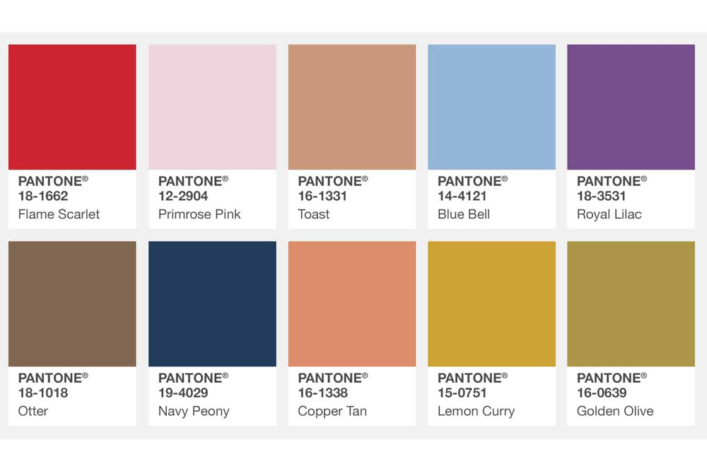
Keep in mind that colors can appear differently depending on the system used. For example, a single Pantone color might have slightly different approximations in CMYK and RGB. If you’re unsure about the accuracy, consult a professional designer or request test prints to see how the colors appear in real life.
Once you have your color codes, the next step is to set up color profiles to ensure consistency across your design tools.
Set Up Color Profiles
Color profiles are essential for keeping your brand colors consistent, whether you’re working on digital or print projects. The International Color Consortium (ICC) profiles are widely used for this purpose, providing a standard for color consistency across different outputs.
Choose the correct color mode based on your project:
- RGB: Perfect for digital designs.
- CMYK: Best for print projects.
Before diving into your design work, double-check the color mode in your software to avoid unexpected shifts in appearance.
"You want your audience to recognize you, and that means you need to ensure color accuracy for any customer-facing part of your brand."
– Lauren Carlstrom, COO of Oxygen Plus
If you’re creating print materials, define your colors in CMYK from the start. Converting from RGB to CMYK later can lead to discrepancies. Whenever possible, specify Pantone colors for the most accurate reproduction, but remember that results may still depend on your printer’s capabilities.
With your profiles set, you can now create and save swatches to make your workflow more efficient.
Save Colors as Swatches
Saving your brand colors as swatches is a simple way to maintain consistency across multiple projects. Swatches let you quickly apply your color scheme without manually adjusting each element.
Most design tools allow you to save swatches in various formats, such as:
- Spot colors
- Process colors
- RGB
- Gradients
- Tints
For example, you can save your swatches as Adobe Swatch Exchange files, making it easier to transfer and use your brand colors across different design tools.
"Swatches make it easier to modify color schemes without having to locate and adjust each individual object."
– Adobe InDesign User Guide
To stay organized, sort your swatches by name or color values. You might also want to create variations of your primary brand colors, such as warmer or cooler tones, to adapt your designs to different mockup styles or lighting conditions – all while staying true to your brand identity.
Step 3: Add Brand Colors to Mockup Layers
Now that you’ve organized your swatches in Step 2, it’s time to apply those colors to your mockup layers. This step helps bring your design to life, ensuring it looks polished and consistent. Start by reviewing the structure of your layered mockup to identify where your brand colors will have the most impact.
Work with Layered Mockups
Professional mockup templates are typically made up of multiple layers, each serving a specific purpose. To achieve the best results, you’ll need to identify and work with the correct editable layers.
Most high-quality mockups include these key layers: the base garment layer, shadow layers, highlight layers, and areas designated for design placement. The garment color layer is the one you’ll modify to reflect your brand colors. Be sure to leave shadow and highlight layers untouched – they’re essential for keeping the mockup looking realistic.
If you’re using Photoshop, look for layers labeled with names like "Color", "Shirt Color", or "Base Color." These are usually the layers you’ll edit. To keep things organized and make adjustments easier, use smart objects whenever possible.
Since the layer structure can vary depending on the mockup creator, take a moment to explore the layer panel before making changes. Familiarizing yourself with the setup will save you time and help you avoid errors.
"Mockups are a way of visualizing what a design will look like in its physical form."
Don’t forget to save version iterations of your file before applying significant changes. This way, you can always revert to an earlier version if needed.
Once you’ve identified the correct layers, use your design tools to apply your brand colors.
Apply Colors Using Design Tools
The process for adding brand colors will vary depending on your design platform, but the core principles remain the same.
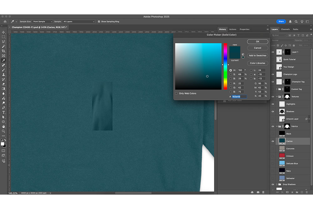
In Photoshop, one of the best methods involves using adjustment layers with solid color fills. Here’s how to do it:
- Add a new adjustment layer above the garment layer.
- Use the exact HEX or RGB values of your brand color to ensure accuracy.
- Change the adjustment layer’s blending mode to "Multiply." This technique darkens the base color while keeping the garment’s texture and shadows intact.
You can experiment with other blending modes like "Color" or "Soft Light" to see which one works best for your design. If the color feels too intense, adjust the layer’s opacity to around 85–95% for a more natural look.
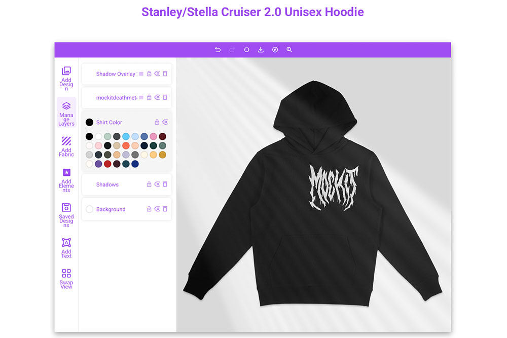
Using Mock It? This platform simplifies things even further. Open the layers window, click the color tile next to the shirt color layer, and input your brand’s HEX or RGB codes directly. Mock It organizes colors alphabetically, making it easy to find your desired shade. Plus, you can preview changes in real time, which speeds up the entire process.
For designs that include transparent elements or logos, place those above the color layers to maintain clarity. If you’re using Photoshop, apply clipping masks to ensure precision and avoid color bleeding.
"Brand elements such as typography, imagery, and color really come into play to make sure that you are creating a really strongly branded cohesive experience." – Sara Mote, Cofounder, Mote web design agency
Finally, test your mockup on different devices, like desktops and mobile phones, to confirm that your colors look consistent across platforms. If your brand color appears overly intense or artificial, reducing the opacity slightly can help create a more natural effect while staying true to your brand’s identity.
sbb-itb-1e8f9ab
Step 4: Adjust Color Accuracy and Realism
Once you’ve applied your brand colors, the next step is to refine them for a natural, realistic look. This involves carefully tweaking lighting, shadows, and other elements to avoid a digital or artificial feel. Achieving accurate color representation requires both technical adjustments and a sharp eye for detail.
Modify Lighting and Shadows
After applying your brand colors, focus on enhancing the realism of your mockup. Start by examining the lighting layers in your template to ensure they mimic natural light effectively.
- For darker shades, reduce the opacity of shadows to maintain depth without overpowering the design.
- For lighter tones, increase the intensity of shadows or duplicate the shadow layer at a lower opacity to add definition.
- Adjust the opacity of highlight layers to avoid a flat or overly artificial appearance. A slight increase in highlight opacity can bring back a natural, polished look.
Environmental lighting also plays a big role. Mockups photographed in natural daylight will display colors differently than those shot under studio lights. Choose templates with lighting conditions that match how your customers are likely to view your products for the most accurate representation.
Maintain High-Resolution Quality
High-resolution mockups are essential for presenting your brand in a professional and polished way. Always work with files set at a high resolution, such as 300 DPI, to ensure that colors remain sharp and accurate, no matter the screen size or output.
Color accuracy is especially crucial because what looks perfect on one screen might appear completely different on another – or in print. Test your mockups across multiple devices to identify any color inconsistencies.
"Color accuracy is the foundation for all professional photography and design projects."
Testing in different environments is another key step. Aim for a Delta E value of 2 or less when working with color values to ensure precise color reproduction. Save your files in uncompressed formats like PNG or TIFF to maintain color integrity, and only convert to compressed formats like JPEG for final delivery, using the highest quality settings.
As Ray Weiss, vice president of eLearning and certifications at PRINTING United Alliance, points out:
"If they don’t reject the order, they say, ‘Look, we’re going to live with it, but never call them again because they can’t match the color,’ … And you’ve just lost a customer and you don’t even know it."
To avoid such issues, review your mockups under various lighting conditions. Adjust your screen’s brightness to simulate different environments and observe how your brand colors hold up. Using high-quality, layered templates from Mock It (https://mock-it.co) can help ensure your adjustments look realistic and professional.
When you’re satisfied with the results, export your mockups using optimized settings to finish the design process.
Step 5: Export and Save Your Mockups
Once your mockup is polished and ready, it’s time to export high-quality files and organize everything for future use. Here’s how you can wrap up your project efficiently while keeping your work accessible for later.
Export in the Right Formats
Picking the right file format is crucial for how your mockups will look across different platforms. Here’s a quick breakdown:
- JPEG: Great for web use and social media, thanks to smaller file sizes. Just keep in mind that compression might slightly affect color accuracy.
- PNG: Perfect for preserving transparency and exact color details.
- PSD: Essential for keeping all layers and edits intact. Always save an editable version in PSD format before exporting to other file types.
To ensure your mockups look sharp, export them at a high resolution. For print, prioritize the highest resolution available, while for digital displays, adjust settings to balance quality and file size.
Review and Finalize Designs
Before you call it done, review your mockup on different devices to check for consistent color and detail. Test it under various screen types and lighting conditions to ensure your colors look as intended. Use a hardware calibrator to fine-tune your monitor and double-check your brand’s color codes to avoid any mismatches. This final review step ensures that all your earlier adjustments pay off with a flawless result.
Organize Files for Future Use
To streamline future projects, save your brand colors as swatches or color profiles, and document your color codes and export settings in a reference file. Keep editable files separate from final exports for easy updates down the line. Mock It’s extensive template library can also help you stay organized across multiple mockup types. These habits not only save time but also ensure your presentations remain professional and consistent.
Conclusion
To effectively integrate your brand colors, follow these key steps: choose the right template, gather precise color codes, apply them to mockup layers, fine-tune for a realistic look, and export with a professional finish.
Every detail matters. From accurate color codes to the final export, these steps shape how your brand is perceived. With 70% of consumers forming opinions about a brand based solely on product design, nailing these details can make a lasting impact.
Spending time on precise color application is worth it. Platforms like Mock It streamline the process with over 5,000 premium templates, extensive color libraries, and fully editable layers. Their drag-and-drop interface and customization tools take the guesswork out of the equation.
Visual consistency is the cornerstone of brand trust. Accurate mockups not only enhance your brand’s credibility but also help convert casual browsers into loyal customers. A polished, professional presentation sets the stage for stronger relationships and long-term success.
FAQs
What are the advantages of using high-quality mockup templates to showcase brand colors?
Using well-designed mockup templates simplifies the process of presenting your brand colors in a polished and professional manner. These templates ensure precise color accuracy, making your designs appear realistic and well-executed.
They also help maintain brand consistency by offering customizable options that align seamlessly with your branding guidelines. This consistency strengthens your brand’s credibility and enhances how it’s perceived. Plus, mockup templates save you time by providing ready-to-use, editable scenes – letting you focus on the creative aspects instead of building everything from the ground up.
How can I keep my brand colors consistent across devices and formats?
To keep your brand colors looking consistent across different devices and formats, start by sticking to precise color codes like HEX, RGB, or CMYK in your designs. Make sure to create a brand style guide that clearly lists these codes. This ensures that anyone working on your visuals has the same reference point.
For digital platforms, use standardized color spaces such as sRGB or Adobe RGB. When it comes to print, switch to CMYK for better accuracy. Regularly calibrating your screens and printers is another important step to prevent color mismatches. These practices will help maintain a polished and consistent look for your brand colors, regardless of where they’re displayed.
How can I ensure brand colors look realistic on apparel mockups?
To ensure your brand colors look natural on apparel mockups, start by selecting high-quality templates that highlight fine details like fabric textures, wrinkles, and folds. These details add realism and make the design feel more tangible. Pay close attention to lighting and shadows – they play a key role in creating depth and making colors appear as they would in real-life settings. Adjust the tones thoughtfully to account for how colors might shift under various lighting conditions.
To refine your mockups further, test them against different backgrounds. This helps maintain consistency and ensures the colors remain true across diverse settings. Opt for tools that offer customizable, professional-grade mockup options to simplify the process and elevate the overall presentation.