
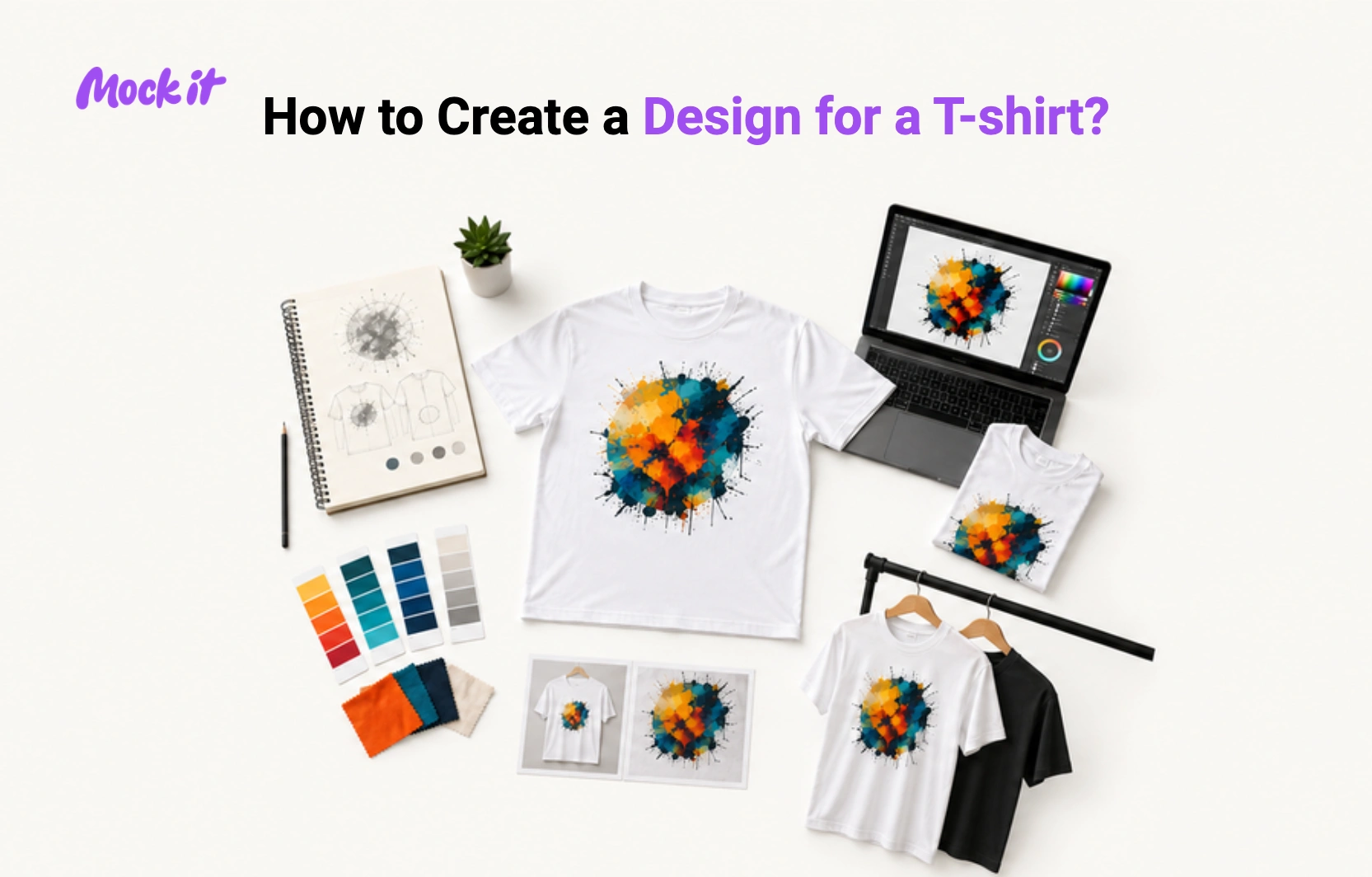
So you’ve got your design, you’re super happy with it, it looks awesome. But now you need to pick a color shirt to put it on! This seems like it should be an easy thing to do right? Wrong! Picking the wrong color can totally kill an awesome design. Clashing colors can make the shirt look dull, unappealing and honestly, pretty ugly.
So how do you choose the right color for your new design? That’s a good question and in this post we’re going to cover
- Color theory (what colors compliment each other)
- Applying that to your design
- Using mockups to help choose
- Keeping it simple
So what’s color theory? Color theory is a logical structure for color to help with creating harmony, contrast and complimentary color palettes. A harmonious palette would include colors that are next to each other on the color wheel.
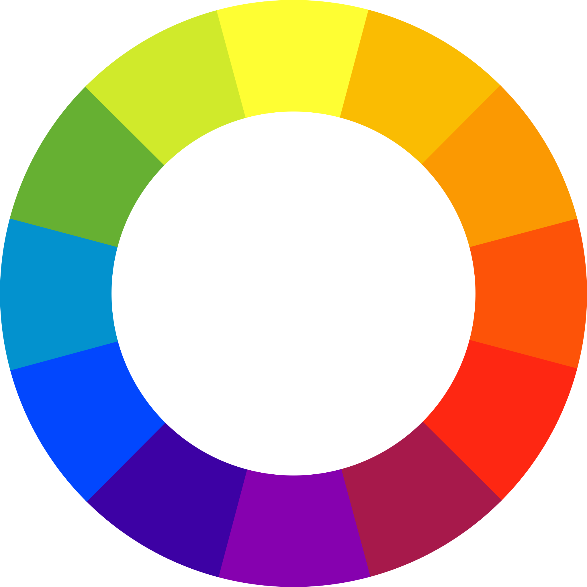
A complementary color palette would include colors that are opposite each other on the color wheel.
A contrasting color palette would include colors that clash with each other creating a stark visual that isn’t always appealing.
So what does this mean for your designs and t-shirts? All three options can work depending on what your design is trying to convey so sometimes you need to experiment to see what will and won’t work with your design.
This is where using a t-shirt mockup generator can be a huge help. You don’t want to spend hundreds/thousands of dollars printing a shirt only to find out that the colors don’t work it looks horrible. Using a t-shirt mockup will save you loads of time and money and will also help you truly narrow down exactly what your design is going to look like once it’s printed.
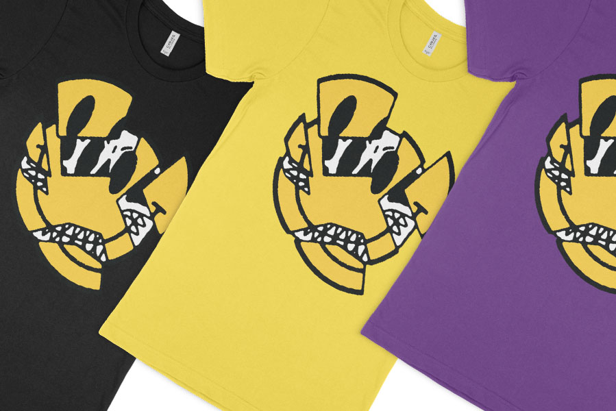
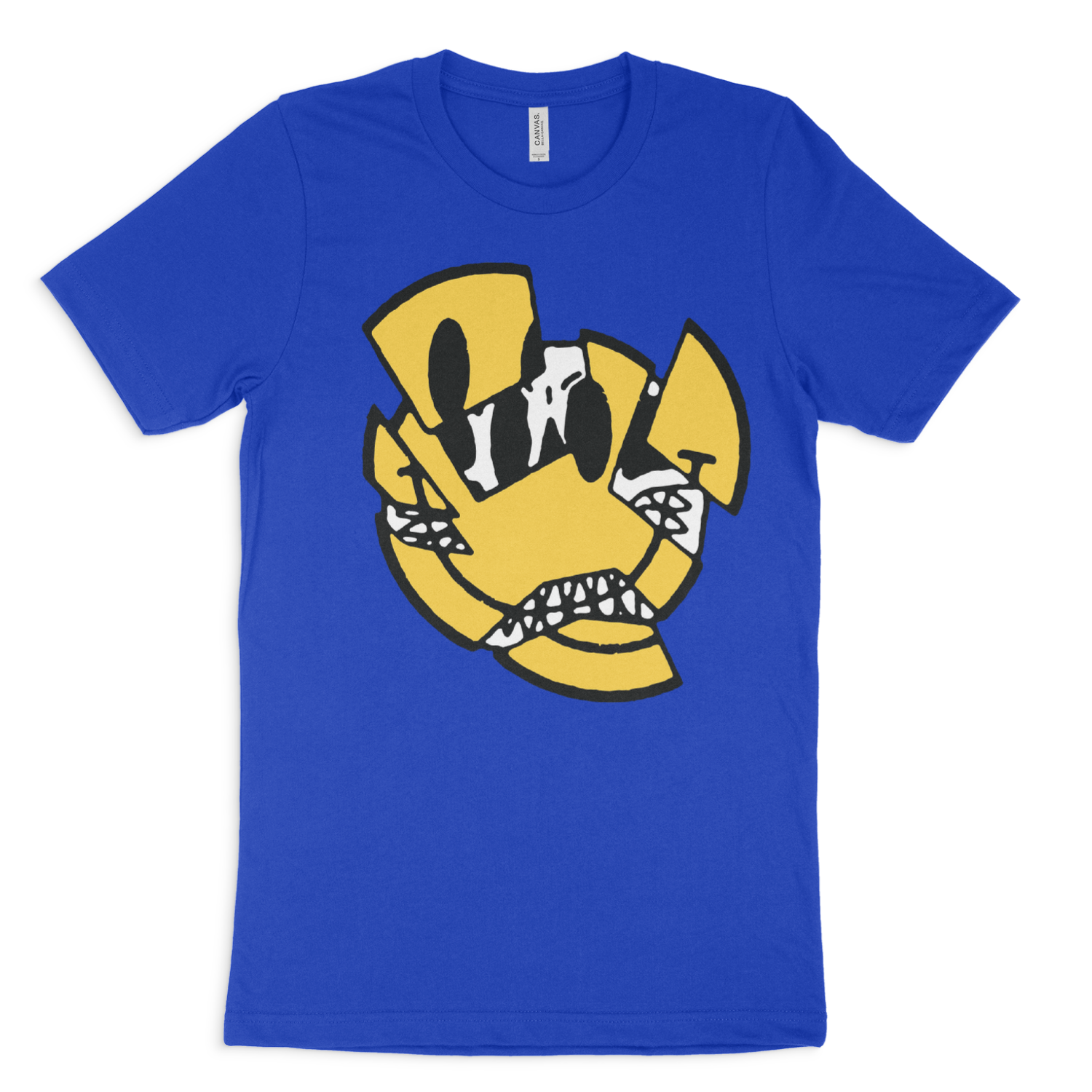
Here’s a design we have and we’re going to see how simply changing the shirt color makes a huge different to the look and vibe of the shirt.
First up is a harmonious color.
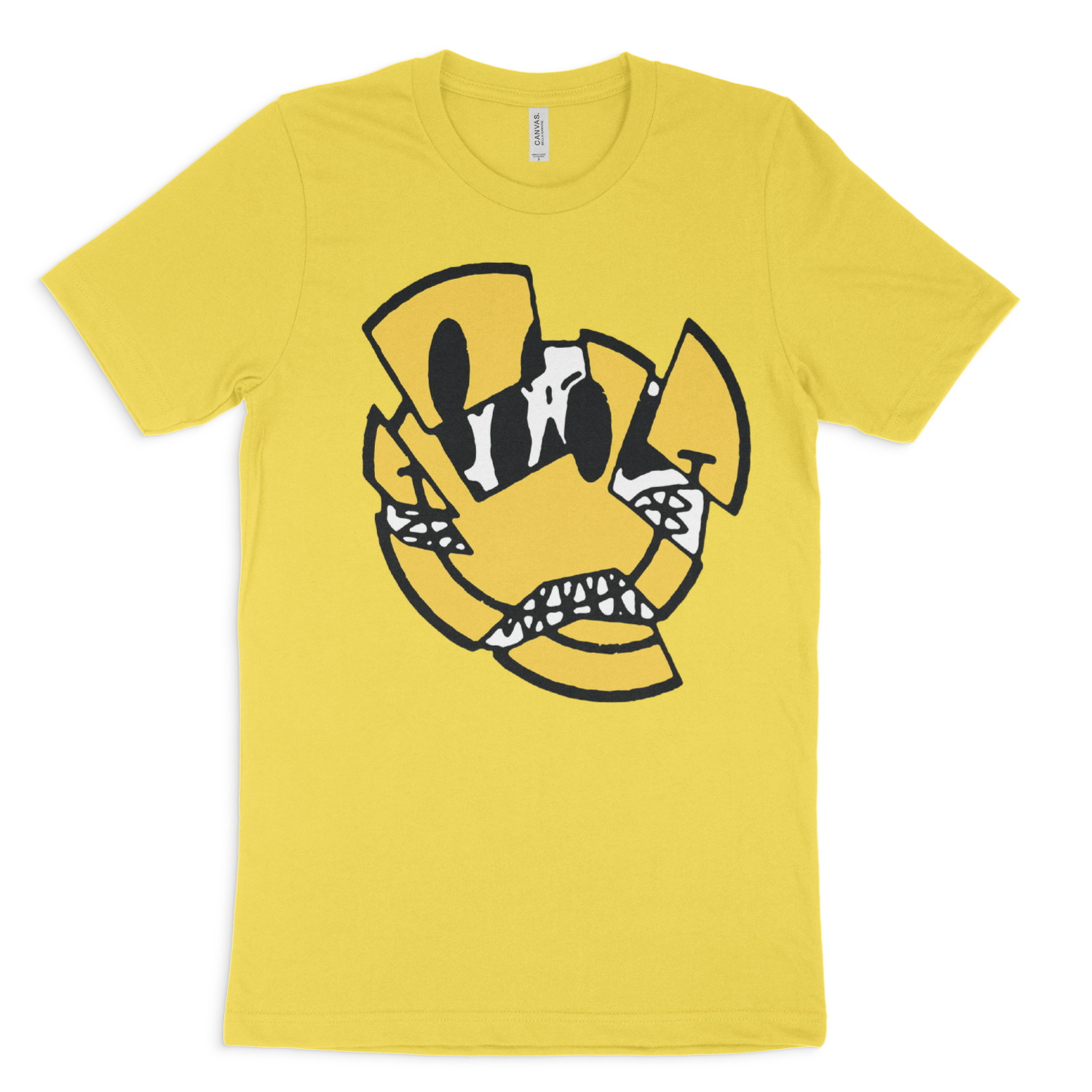
This colorway looks fine. But when using a complimentary color, you can lose some of the spark the design has because it all seems to blend together.
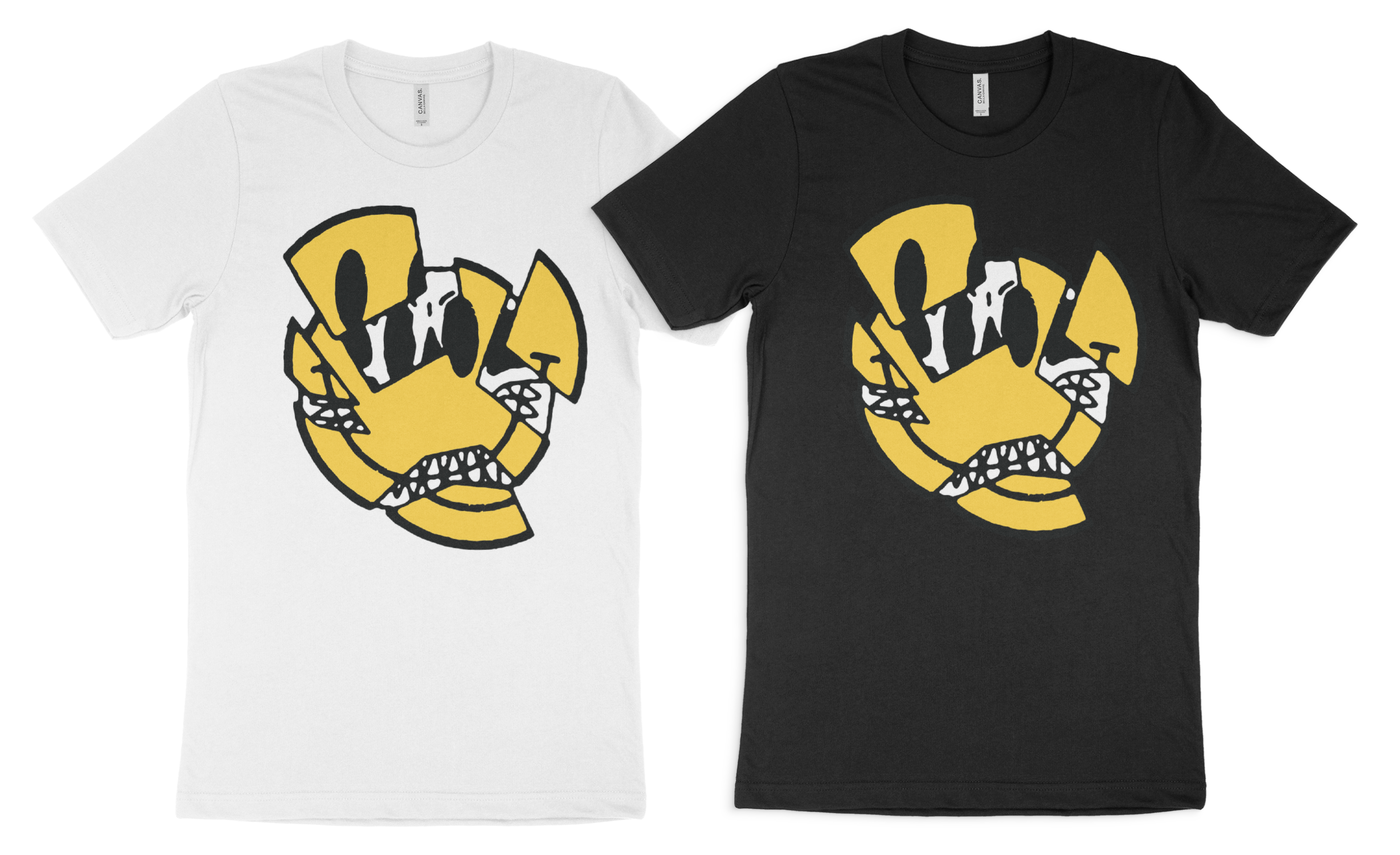
Next up is a complimentary color.
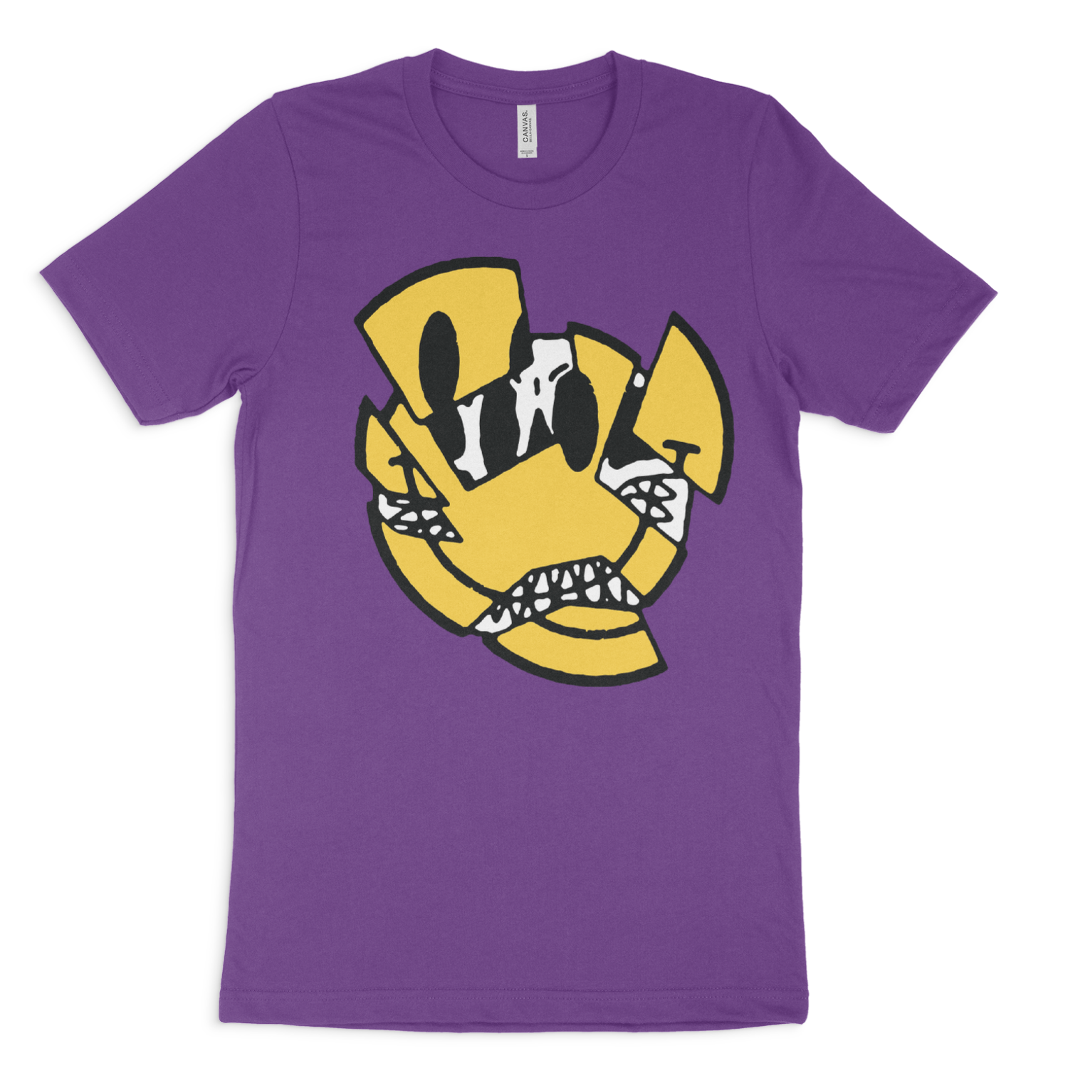
Using a shirt color that’s the opposite of your design’s color will shift the focus straight to the design. This is a midway point between a harmonious color and a contrasting color. The colors aren’t clashing, but they’re working together to create an appealing visual.
Finally is a contrasting color.
Sometimes this works and can definitely be a great option. With this design though? I don’t think so! The contrast is just too aggressive and it’s tough to look at. Sometimes as a designer that’s what you want though, an eye grabbing, loud t-shirt. But I don’t think that works for this design.
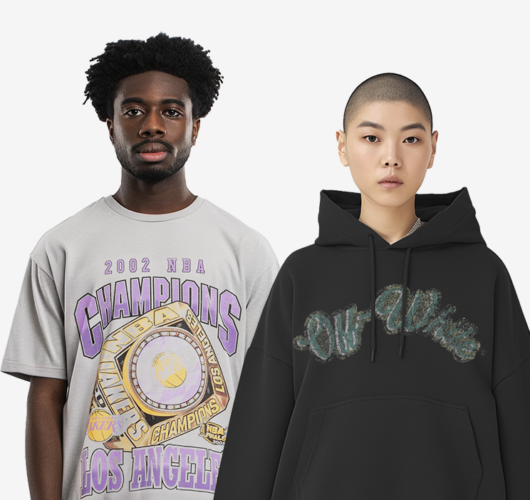
If choosing a color to go along with your design is too much, the easiest option is just go with a white or black shirt. It’s a safe way to make sure that your design looks great and everyone can wear a black or white t-shirt.
Experiment! You can create as many color combinations as you want to find the exact one that works! With our mockup generator we include all the colors from the manufacturer with each mockup set so you can play around and get creative to make sure you end up with the best shirts possible!

View featured image for Choosing the Right T-Shirt Color for your Design
 Trusted By Thousands Of Designers
  Cancel Your Subscription Anytime
  30 Day Money Back Guarantee