Negative space is the empty area around your apparel design. It’s not just “blank space” – it’s a design tool that helps your product stand out. Here’s why it matters:
- Draw Focus: Guides attention to the apparel design.
- Clean Look: Makes your mockups look professional and uncluttered.
- Balance: Creates harmony between the design and its surroundings.
To use negative space effectively:
- Balance Space: Avoid too much (feels empty) or too little (feels crowded).
- Use Contrast: Light garments? Neutral backgrounds. Dark garments? High-contrast backgrounds.
- Follow the Rule of Thirds: Position designs along grid intersections for natural focus points.
- Consistency Matters: Keep space uniform across all mockup views.
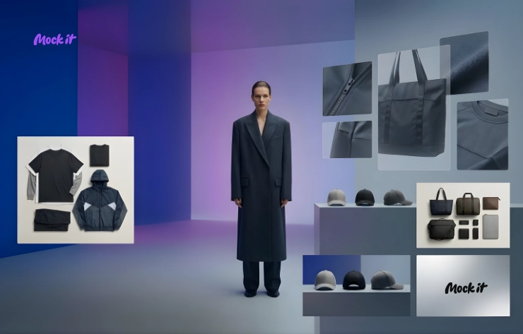
Tools like Mock It simplify this process with templates and customization options, ensuring your designs always look polished and professional.
Basic Rules of Negative Space in Mockups
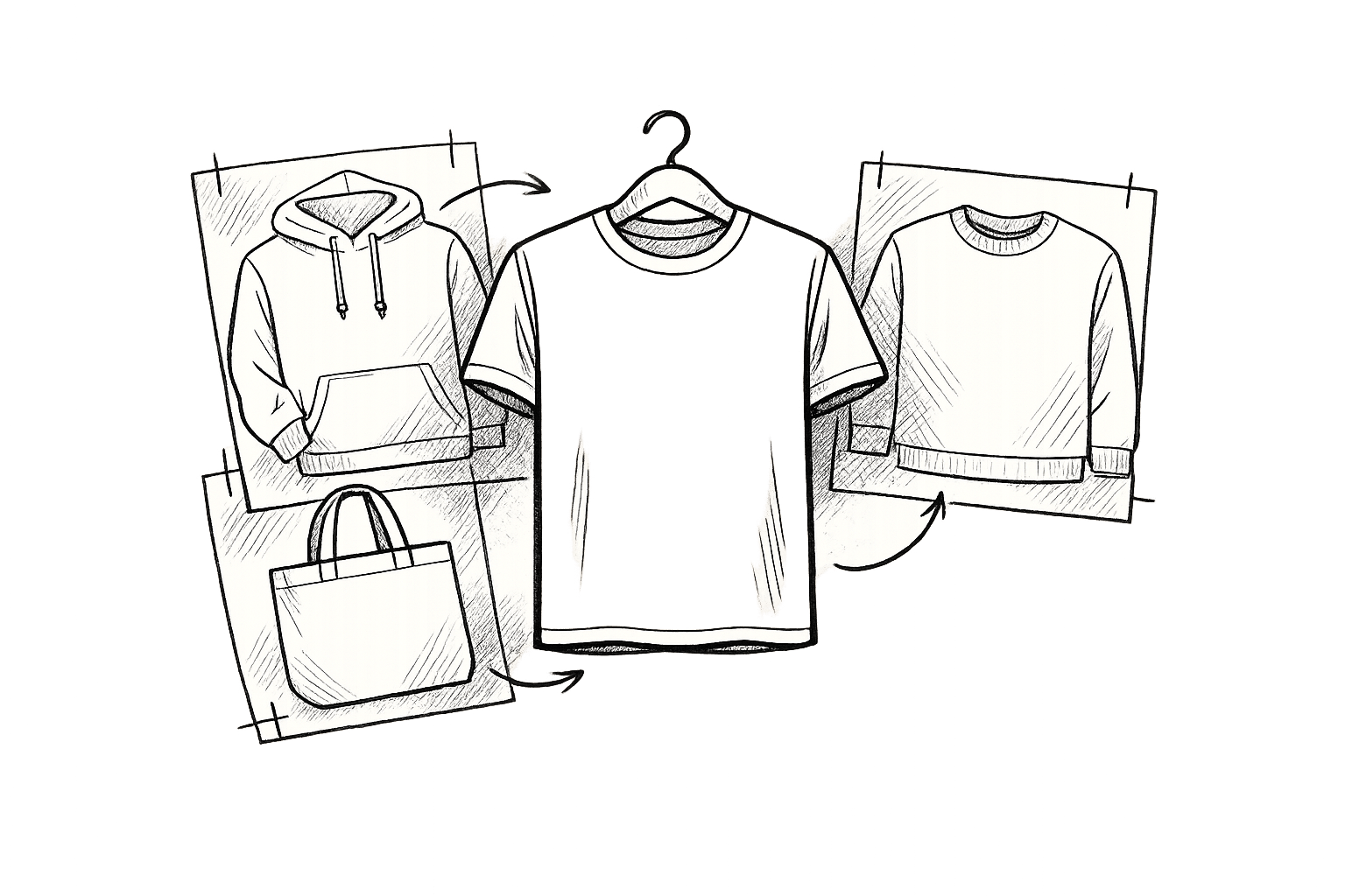
What Counts as Negative Space
Negative space refers to the empty areas that surround the main design elements, such as the background of a garment, the spaces between design features, or even the natural folds in fabric. In t-shirt or hoodie mockups, this space plays a crucial role in emphasizing the shape and key details of the design. Additionally, the size and distribution of negative space can significantly influence the overall balance of the mockup.
Large vs. Small Space Distribution
Striking the right balance between negative space and design elements is essential. Too much empty space can make the design feel sparse, while too little can create a cluttered appearance. The size and placement of design elements should work in harmony with the surrounding empty areas. This ensures that the design remains the central focus without overwhelming the mockup.
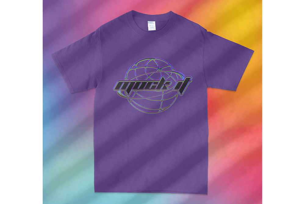
Color Contrast in Empty Spaces
The use of color contrast can enhance the effect of negative space, drawing attention to the design. When choosing background colors for mockups, keep in mind the type of garment:
- For light-colored garments:
- Opt for neutral backgrounds that complement the design.
- Add soft shadows to create depth.
- Avoid overly textured backgrounds to maintain focus on the design.
- For dark-colored garments:
- Use high-contrast backgrounds to make the design stand out.
- Incorporate stronger shadows to add definition.
- Stick with solid colors that frame and highlight the design effectively.
![]()
How to Design with Negative Space
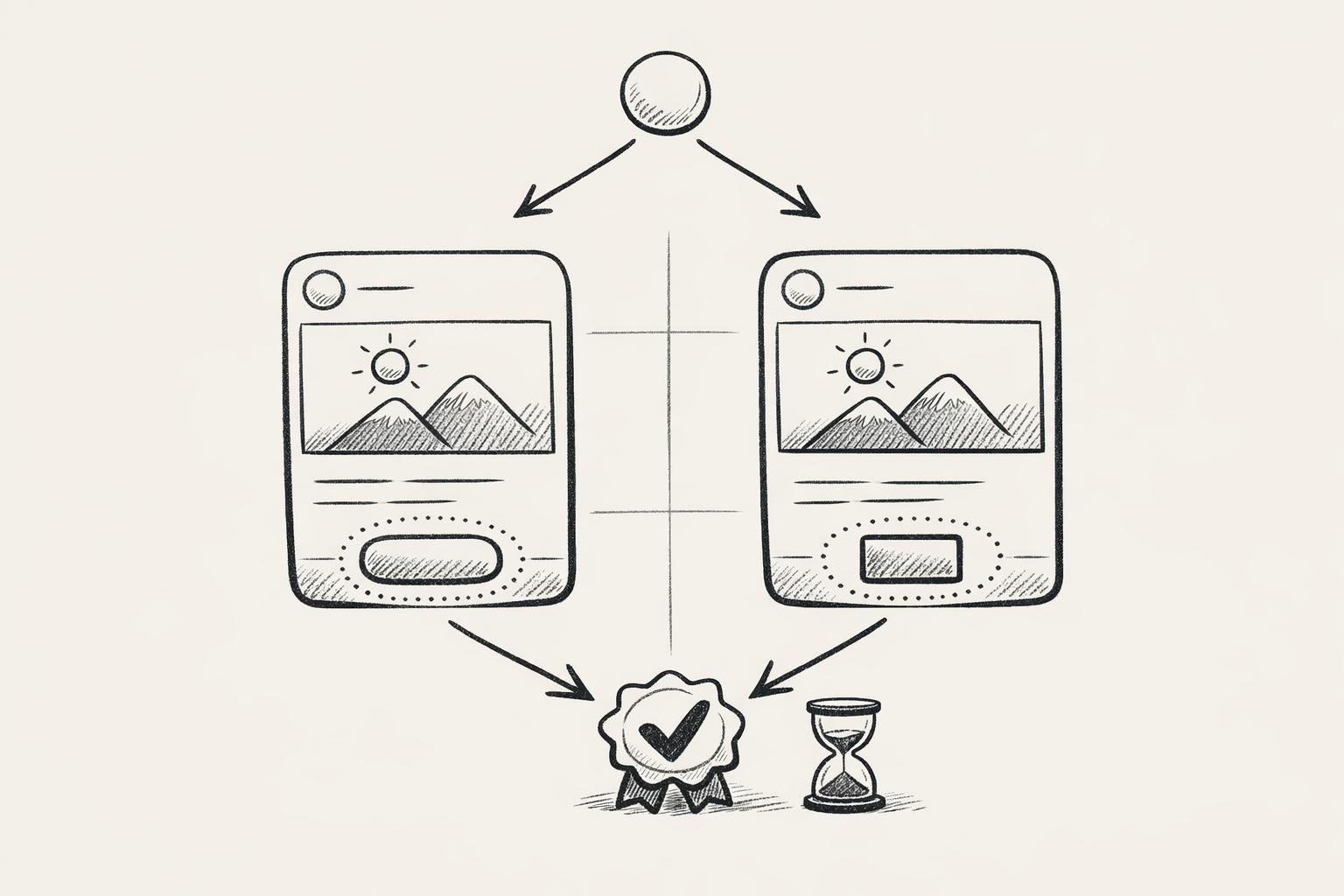
Using the Rule of Thirds in Mockup Design
Start by dividing your mockup into a 3×3 grid. This grid helps you position key design elements along the intersections, creating natural focal points and a sense of balance. For example, place chest designs in the upper third, full-front prints in the center, or smaller details in the lower third. Once you’ve aligned your elements with the grid, make sure to leave clear margins around the design to avoid a cluttered look.
Placing Empty Space for Product Focus
Negative space plays a vital role in drawing attention to your design. By keeping balanced margins, you ensure the product itself remains the star. For complex graphics, adjust the surrounding space so the design remains prominent without feeling overcrowded. This balance is key to creating a polished and professional appearance.
Maintaining Consistent Space Across Views
Consistency in negative space across different product angles is essential for a cohesive and professional presentation. Make sure the margins align across front, back, and side views, while accounting for fabric folds or other natural variations. Use scene creation tools to add subtle shadows or complementary backgrounds, and rely on high-quality templates to ensure your design looks well-balanced and polished from every angle. This attention to detail strengthens your overall brand presentation.
![]()
Common Mistakes with Negative Space
Balancing Space: Not Too Much, Not Too Little
Finding the right amount of negative space is crucial. Too much space can make your design feel disconnected, while too little can create a cramped, overwhelming appearance. For apparel artwork – whether it’s a chest design or a full-front print – make sure there’s enough clear space around the elements to avoid crowding or visual tension. A frequent mistake is cluttering a mockup with too many design components. Instead, aim for a single, strong focal point. For example, when showcasing a t-shirt logo, leave plenty of breathing room around it to let the design shine.
After getting the spacing right, take a closer look at your background choices to ensure they enhance, rather than detract from, your design.
Background and Theme Mismatches
The background plays a pivotal role in how your design is perceived. A poor choice can compete with or even overpower your artwork. Here are some common missteps:
- Using overly busy patterns that distract from the design
- Picking backgrounds with clashing color schemes
- Ignoring lighting consistency
- Adding elements that draw attention away from the product
To maintain visual harmony, follow these guidelines:
- Color Coordination: Select background colors that complement your design’s palette while offering enough contrast to make it stand out.
- Scene Consistency: Ensure that lighting, shadows, and perspective feel natural and cohesive.
- Theme Alignment: Match the background setting to the product’s intended use or the brand’s identity.
For lifestyle products, consider adding environmental elements that are relevant to the product’s context. However, keep these elements subtle to maintain the focus on the design. Clean, minimal backgrounds are especially effective for professional presentations, as they allow the product to take center stage.
sbb-itb-1e8f9ab
Easy Design Tutorial: NEGATIVE SPACE for Print-on-Demand Sales
Using Mock It Tools for Space Management
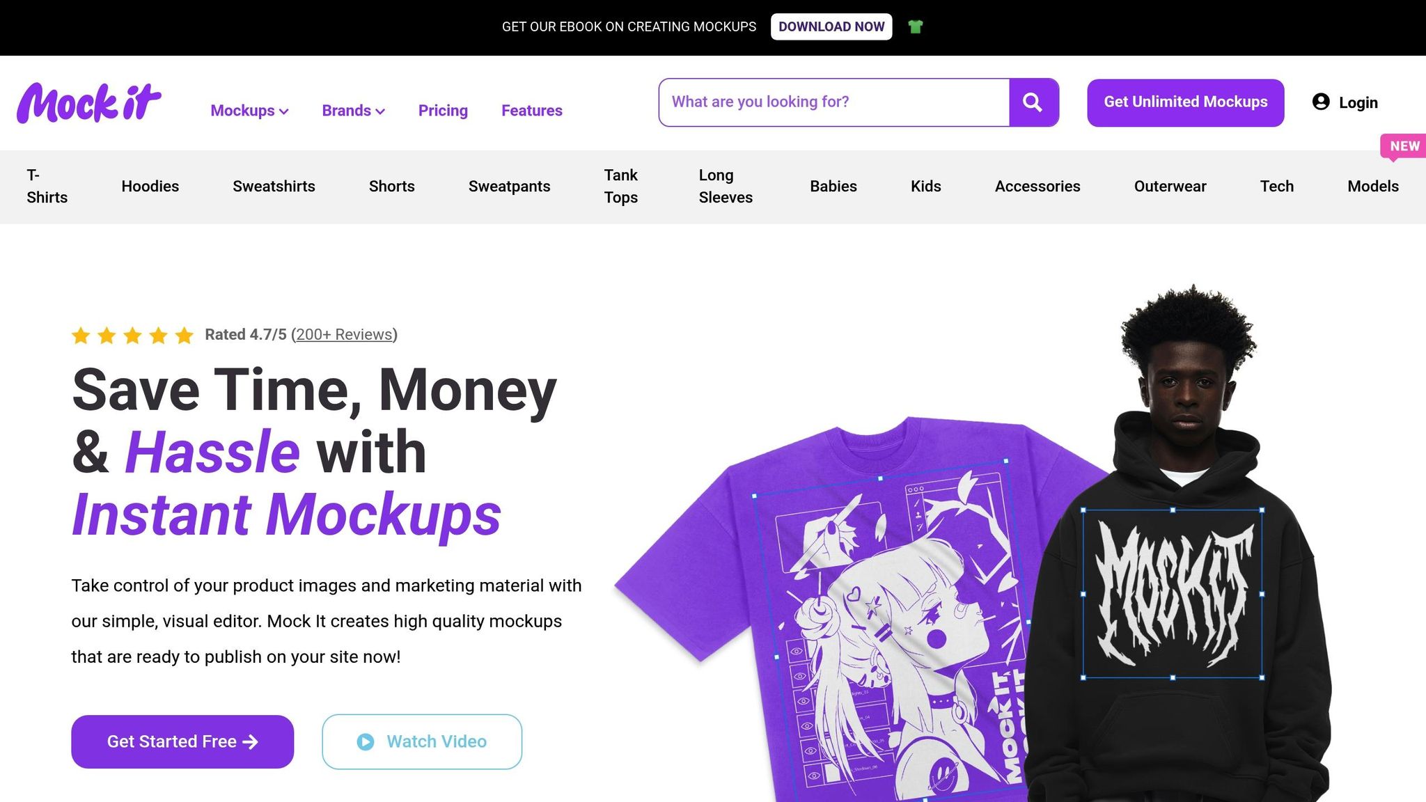
Managing negative space effectively can feel like a challenge, but specialized tools like Mock It make the process much easier. Here are three standout features that simplify space management and elevate your designs.
Bulk Space Adjustments
Mock It templates offer six views – three front and three back – ensuring your spacing stays consistent across all mockups. Using the scene creator, you can tweak backgrounds, shadows, and spacing effortlessly, maintaining a polished and cohesive look.
High-Quality Image Output
With high-resolution image outputs, Mock It ensures every detail of your negative space is captured with precision. This results in sharp, professional designs that leave a lasting impression.
Background Customization Options
Mock It provides precise control over backgrounds, allowing you to fine-tune shadows, colors, and overall composition. With access to over 5,000 mockups from 45+ brands, you can create a clear visual hierarchy between your products and their backgrounds. This ensures the negative space complements your designs rather than distracting from them.
Conclusion: Main Points About Negative Space
Using negative space effectively can transform your apparel mockups into polished, professional designs that leave a lasting impression. Research shows that well-crafted product images not only look more refined but also shape how customers perceive your brand.
Here are the core aspects of utilizing negative space in apparel mockups:
- Visual Balance: Thoughtful spacing ensures a clean, organized layout that draws the eye naturally.
- Professional Appeal: Proper use of empty space enhances your brand’s credibility and trustworthiness.
- Enhanced Focus: Empty areas guide attention to the most important elements, like your product.
Consistency is key – maintain uniform spacing across all mockup views to create a visually harmonious presentation that connects with your audience.
For an easier workflow, tools like Mock It can simplify the process. They offer high-resolution templates and precise background controls, making it easier to apply these principles seamlessly.
FAQs
How do I use negative space effectively in apparel mockups to create a balanced and visually appealing design?
Using negative space wisely in apparel mockups can make a world of difference in creating a polished and professional appearance. Start by ensuring your design elements are properly aligned and spaced evenly. Give your graphics and text enough room to “breathe” by avoiding overcrowding. This approach not only keeps things clean but also draws attention to the key elements of your design.
To strike the perfect balance, think about the overall composition and visual flow. Guide the viewer’s eye naturally through the design by carefully placing elements and using negative space to separate important sections. Don’t be afraid to experiment with layouts – often, a minimalist approach can deliver the most striking and effective results.
What are the most common mistakes to avoid when selecting background colors for light or dark garments in apparel mockups?
When picking background colors for apparel mockups, it’s crucial to avoid shades that clash with the garment’s tone. For lighter garments, steer clear of bright or overly light backgrounds – they can make the design look faded or washed out. On the flip side, dark garments don’t pair well with dark or muted backgrounds, as they diminish contrast and make the product blend into the background.
Another common pitfall is ignoring the overall composition and visual balance. Background colors should work with the design, not against it. The goal is to keep the garment as the focal point. Neutral or subtle tones often work best, as they enhance the product without drawing attention away from it.
Lastly, always check how your chosen colors appear across different screens and in various lighting conditions. This step helps maintain consistency and ensures your mockups look polished and professional.
How can the rule of thirds improve the design of apparel mockups, and what are some practical tips for applying it?
The rule of thirds is a straightforward yet impactful design principle that can elevate the balance and visual appeal of apparel mockups. By dividing your canvas into a 3×3 grid, you can place key elements – like logos, patterns, or text – along the grid lines or at their intersections to create a more visually engaging layout.
To use the rule of thirds effectively, position the main focus of your design, such as a logo or graphic, at one of the grid’s intersection points. This naturally guides the viewer’s attention and avoids the overly centered, static feel. For apparel mockups, think about how the design interacts with the garment’s natural shape, like the chest or sleeve, to keep it both functional and visually pleasing. Also, make use of negative space to ensure the layout feels clean and polished, allowing your design to stand out without overpowering the composition.