Did you know that up to 90% of consumer decisions are influenced by color within seconds? For apparel designers, this makes color accuracy a top priority. Whether you’re creating mockups for digital stores or preparing for production, consistent colors can boost brand recognition by 80% and prevent costly mistakes. Here’s how to master it:
- Use the Right Color Systems: Start with Pantone for precise brand colors, CMYK for print, and RGB for digital.
- Calibrate Your Tools: Adjust your monitor and design software for accurate color representation.
- Work with Brand Color Libraries: Use tools like Mock It to match manufacturer-approved palettes.
- Test Across Devices and Lighting: Ensure colors remain consistent on screens and in varied lighting conditions.
- Verify Pre-Production Colors: Check physical samples and use color analysis tools to avoid errors.
Quick Comparison of Color Systems
| Color System | Best For | Key Features | Limitations |
|---|---|---|---|
| Pantone (PMS) | Brand-specific colors | Pre-mixed inks, high precision | Higher production costs |
| CMYK | Printing multi-color art | Standard for print | Limited color range |
| RGB | Digital displays | Vibrant screen colors | Not suitable for print |
Realistic Color Mockups from Printify & Printful – CMYK Mockups
Step 1: Color Systems in Apparel Design
Getting a handle on color systems is a must when creating accurate apparel mockups. Each color model has its own role, and knowing which one to use – and when – can make all the difference in the final product.
Using Pantone and Manufacturer Color Standards
In apparel design, the Pantone Color Matching System (PMS) is widely regarded as the standard for ensuring color accuracy. Mock It’s color libraries are aligned with manufacturer specifications, helping you match your mockups to the finished product.
"The main function of color should be to serve expression." – Henri Matisse
Pantone offers key advantages for apparel design:
- It can produce metallic and fluorescent shades that CMYK simply can’t replicate.
- It ensures precision for brand-specific colors, making it ideal for maintaining consistency.
Take Coca-Cola, for example. Its signature red is instantly recognizable, thanks to strict adherence to Pantone standards. To achieve this level of consistency, it’s essential to know how to convert and apply these standards effectively across different systems.
Color System Conversion Guidelines
Converting between color systems is essential to ensure your mockups look the same on the final garments. Here’s a quick comparison of when to use each system:
| Color System | Best Used For | Key Characteristics | Limitations |
|---|---|---|---|
| Pantone (PMS) | Brand colors, corporate uniforms | Pre-mixed inks, highest consistency | Higher production costs |
| CMYK | Multi-color designs, gradients | Standard printing process | Limited color range |
| RGB | Digital displays, online stores | Vibrant screen colors | Not suitable for printing |
To manage these conversions effectively, follow these steps:
- Start with the End in Mind: Begin your design in the final production color mode to reduce conversion issues later.
- Watch for Conversion Gaps: Converting from RGB to CMYK can often alter colors. If you’re designing for both digital and print, it’s safer to work in CMYK from the start.
- Confirm with Physical Samples: Before committing to a large production run, request physical samples to verify color accuracy. Even calibrated monitors can misrepresent colors.
Consistent brand colors can increase recognition by up to 80%, making color accuracy more than just a design choice – it’s a smart business move. By choosing the right color system for the right purpose, you’ll ensure your mockups translate seamlessly into finished garments.
Step 2: Setting Up Color-Accurate Tools
Getting your tools properly calibrated is essential – without it, the colors you see on your screen might not match the final printed results.
Monitor Color Calibration Steps
The accuracy of your monitor plays a huge role in ensuring your mockups look just right. Relying on default monitor settings might seem convenient, but it can lead to expensive errors down the line.
For precise color accuracy, here’s how to calibrate your monitor:
- Hardware Calibration
Use hardware calibration tools to measure your screen’s colors and generate an accurate color profile. - Software Calibration
If you’re on macOS, follow these steps for basic calibration:- Go to System Preferences > Displays > Color
- Hold the Option key and click Calibrate
- Enable Expert Mode
- Create 3–4 profiles and choose the one that’s the most consistent
Set your white point to 5500K to avoid unwanted yellow tones. Keep your workspace lighting consistent to ensure your screen colors remain accurate.
Color Settings in Design Software
Once your monitor is calibrated, make sure your design software is set up to maintain this accuracy throughout your workflow. Adjust the software’s color settings to align with industry standards and pre-configured color profiles.
| Setting Type | Recommended Configuration | Purpose |
|---|---|---|
| Working Space | sRGB IEC61966-2.1 | Standard for digital design |
| Color Management | Preserve Embedded Profiles | Keeps colors consistent across files |
| Profile Handling | Ask when Mismatched/Missing | Prevents unintentional color changes |
Here are some tips for working with design software:
- Turn on color management to ensure colors look the same across different devices.
- Always embed ICC profiles when saving your files.
- Check and adjust document color profiles through Edit > Assign Profiles.
- Use custom profiles tailored to your specific devices for scanning or printing.
Step 3: Working with Brand Color Libraries
Once you’ve fine-tuned your tools and mastered color systems, the next step is to use brand color libraries to ensure your designs maintain production-accurate hues.
Brand color libraries play a critical role in achieving precise color consistency, especially in apparel mockups.
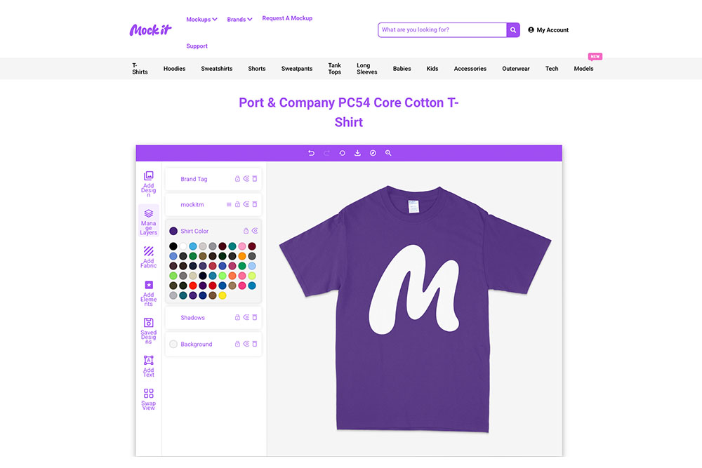
Quick Color Matching with Mock It
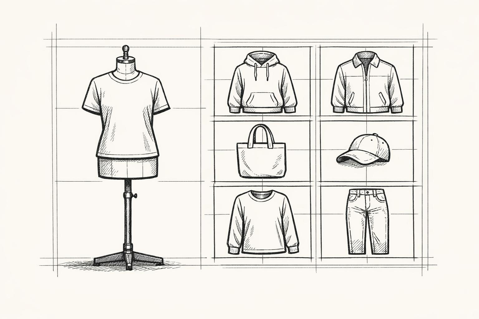
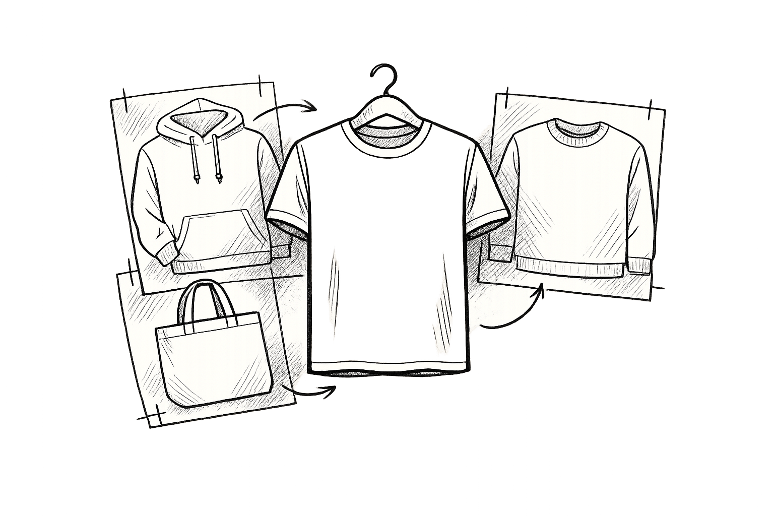
Mock It simplifies the process of matching colors by offering exact manufacturer-matched palettes for over 45 apparel brands. These libraries ensure that your mockups reflect the actual colors and fabrics used by manufacturers.
Here’s how to use Mock It for accurate color application:
- Access the Color Library: Open the layers window and click the color tile next to the shirt layer. This will reveal the specific palette for that garment.
- Select Brand Colors: Choose from a list of manufacturer colors, conveniently arranged in alphabetical order.
"A great designer will take Pantone, CMYK, RGB, greyscale, single color, and Hex all into consideration at the same time when doing identity work. This is because a color in one spectrum can display or print very differently in another." – BeeBladen
Multi-View Color Application
For professional presentations, maintaining consistent colors across all mockup angles is crucial. Mock It provides six templates per mockup set, which include three front views and three back views, all at a resolution of 1500×1500 pixels.
| View Type | Number of Templates | Purpose |
|---|---|---|
| Front Views | 3 | Highlight primary design elements |
| Back Views | 3 | Showcase rear design placements |
| Total Templates | 6 | Ensure complete product visualization |
To guarantee color consistency, use Mock It’s synchronized libraries across all templates. Test your mockups against different backgrounds, verify them under varied lighting conditions, and, when possible, cross-check with Pantone references.
The Pantone Matching System is an invaluable tool for maintaining color accuracy. Manufacturer-matched color libraries are especially helpful for creating mockups that capture intricate details like stitching, seams, labels, and tags.
sbb-itb-1e8f9ab
Step 4: Testing Colors Across Devices
Ensuring your mockups look consistent across various devices and lighting conditions is crucial for maintaining a polished and professional appearance.
Light Condition Testing
Lighting plays a huge role in how colors are perceived. Mock It’s Scene Creator makes it easier to simulate different lighting scenarios so you can:
- Test colors under varying light intensities.
- See how shadows influence color perception.
- Evaluate designs in a range of environments.
For the most accurate results, try these steps:
- Review your designs in the morning when natural light is softer.
- Check them under standard office lighting, like fluorescent or LED lights.
- Use Scene Creator to see how shadows might alter the look of your colors.
Once you’re satisfied with how your colors hold up under different lighting, it’s time to test them across devices.
Device Compatibility Checks
After setting up your calibrated workspace in Step 2, it’s important to confirm that your colors remain consistent on various screens and devices. Use the following guidelines:
| Test Phase | Key Actions | Frequency |
|---|---|---|
| Color Accuracy | Compare Delta E values with color charts | Before starting each project |
| Cross-device | Check your designs on multiple screens | During the final review |
To keep digital colors accurate:
- Position your monitor away from direct sunlight to avoid glare.
- Use a monitor hood to reduce the impact of ambient light.
- Always check your work on an sRGB-calibrated monitor to avoid mismatches between your mockups and the final product.
These steps will help ensure your designs look just as good on screen as they do in production.
Step 5: Pre-Production Color Verification
After completing device and lighting tests, the next essential step is pre-production verification to ensure color accuracy for the final product. This step is especially important since color can influence up to 85% of purchasing decisions. Confirming that mockup colors translate seamlessly to production is key to avoiding costly mistakes.
Thread and Print Color Matching
Precision is non-negotiable when selecting threads and matching colors. Mock It’s color libraries make this process easier by providing reliable manufacturer color standards. Here’s a straightforward way to confirm color matching:
| Verification Step | Action | Purpose |
|---|---|---|
| Visual Assessment | Inspect thread on fabric | Quick initial color check |
| Digital Comparison | Use spectrophotometer readings | Ensure precise color validation |
| Light Testing | Test under different light sources | Confirm consistency in all settings |
Once thread and print colors are matched, additional technical checks ensure these choices remain consistent during production.
Color Analysis Reports
Modern color verification goes beyond just visual checks – it combines both visual and technical methods to catch potential issues early. Mock It’s advanced color analysis tools are designed to identify discrepancies before they escalate into expensive production problems.
To maintain accurate color reproduction:
- Start Evaluations Early
Conduct color assessments early in the production process. This proactive step helps catch discrepancies that could disrupt the entire production run. - Utilize Multiple Verification Methods
Combine electronic measurements with physical evaluations. Testing both lab samples and bulk production items ensures greater reliability for color accuracy. - Document and Standardize
Create detailed color analysis reports that include:- Spectral reflectance data
- Delta E measurements (color difference values)
- Light booth evaluations under various conditions
- Side-by-side comparisons with pre-approved standards
“Effectively incorporating proper color measurement and management processes into the workflow helps reduce the amount of time spent on rework and resources.” – Adrián Fernández, Vice President and General Manager of Pantone
To achieve consistent results, evaluate samples in a controlled lighting environment. A light booth simulating various conditions – such as D65 daylight, D50, tungsten, and cool white fluorescent lighting – can help ensure accurate color reproduction.
Conclusion: Color Consistency Best Practices
Getting colors right in apparel mockups isn’t just about aesthetics – it impacts the bottom line. Accurate color representation can boost brand recognition by up to 80% and increase revenue by 23%. Mock It’s manufacturer-aligned color libraries make it easier to match hues across different materials and lighting conditions, ensuring a seamless transition from digital mockups to final products.
Here’s a quick overview of key practices for maintaining color consistency:
| Color Management Component | Best Practice | Impact |
|---|---|---|
| Color System Standards | Use Pantone-verified colors | Ensures consistency across global production |
| Digital Tools | Regular monitor calibration | Keeps color representation accurate |
| Testing Protocol | Multi-device and lighting checks | Reduces errors in production |
| Pre-Production | Physical sample verification | Prevents costly mistakes |
Testing colors under different lighting conditions is essential to ensure they look as intended, no matter the environment. This step becomes even more critical when considering how fabric textures and lighting can alter color perception.
As Adrián Fernández, Vice President and General Manager of Pantone, explains:
"Effectively incorporating proper color measurement and management processes into the workflow helps reduce the amount of time spent on rework and resources".
FAQs
How can I make sure the colors in my apparel mockups match the final printed garments?
To make sure the colors in your apparel mockups align with the final printed garments, start by choosing mockups that use accurate color libraries connected to your manufacturer or brand. Tools like Mock It offer branded mockups designed for precise color matching, making this process easier.
It’s also important to calibrate your monitor to display colors accurately and stick to standardized color profiles – use sRGB for digital designs and CMYK for print projects. For added confidence, always print a sample first to verify the colors before moving forward with full production.
How can I ensure consistent colors in apparel mockups across devices and lighting conditions?
To ensure consistent colors in apparel mockups, start with calibrating your devices. Adjust your monitor settings regularly to align with standard color profiles like sRGB. This helps maintain accurate color reproduction, reducing inconsistencies when viewing designs across different screens.
Next, stick to standardized color profiles throughout your workflow. Whether you’re using RGB or CMYK, consistency is key. This is particularly crucial for branded apparel mockups, where color accuracy directly impacts the final design’s appearance.
Lastly, pay attention to lighting conditions. Colors can shift depending on the lighting, so it’s a good idea to test your mockups in various environments. Making slight tweaks to your display settings can also help ensure colors stay true in different lighting setups.
By taking these steps, you can create mockups that present your designs with reliable and realistic color accuracy.
Why is using Pantone color standards important for apparel design and brand consistency?
Using Pantone color standards in apparel design is a reliable way to achieve consistent and precise color reproduction, no matter the material or production process. This consistency is vital for safeguarding a brand’s visual identity and ensuring that digital designs translate seamlessly into physical products.
Maintaining uniformity in color does more than just make your designs look good – it also enhances brand recognition and builds consumer trust. Studies indicate that using the right colors consistently can increase brand recognition by up to 87%. This makes color a powerful tool for leaving a lasting impression and solidifying your presence in the market.