
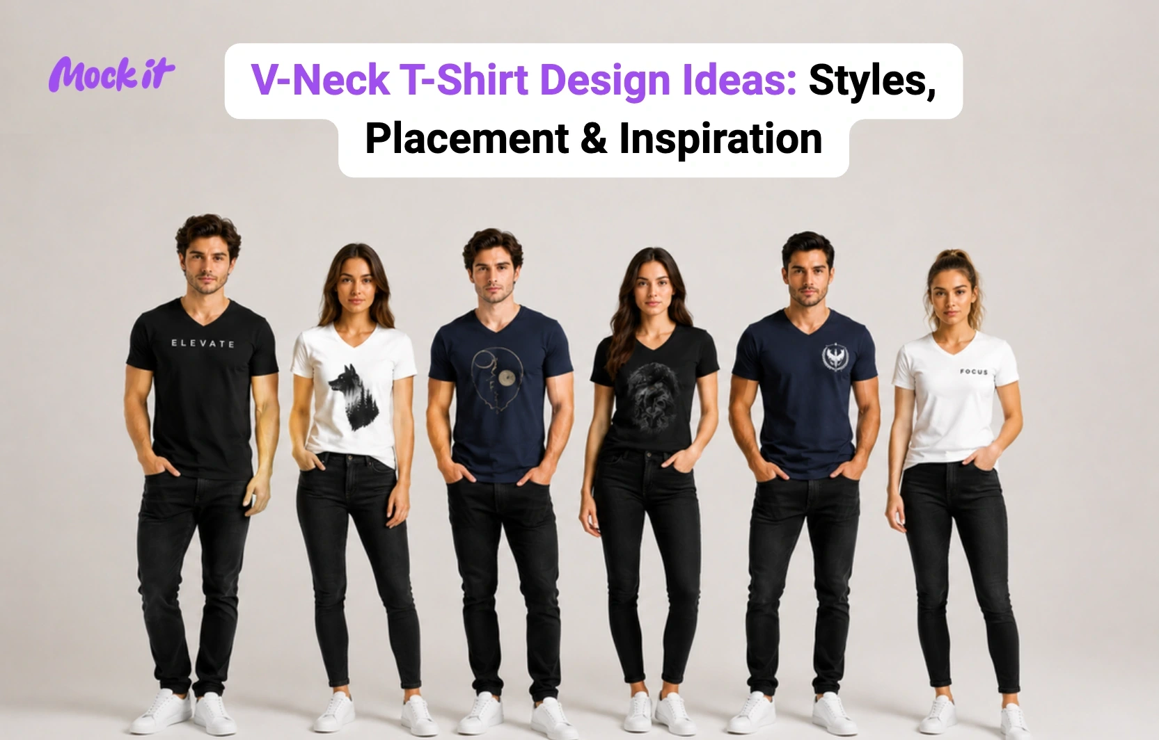
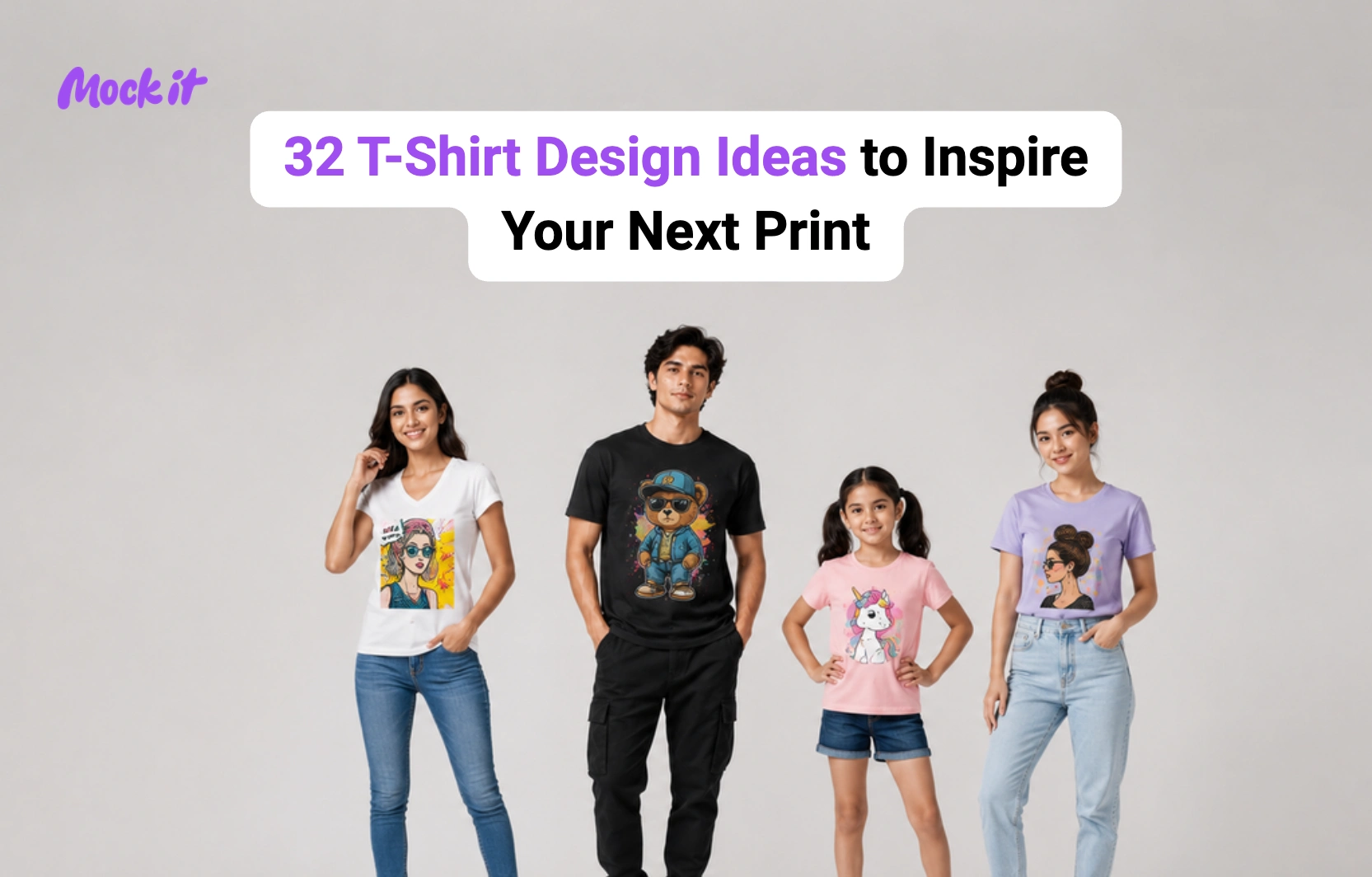
V-neck t-shirt designs combine visual creativity with strategic placement, as the neckline shapes how graphics, typography, and artwork appear on the garment. Unlike crew-neck shirts, V-necks draw attention to the center of the chest, making position, scale, and composition more important. Popular approaches include minimalist logos, single-word typography, line art, vintage graphics, abstract artwork, streetwear-inspired prints, statement slogans, nature-themed illustrations, and premium branded designs. Each style creates a different visual effect, but the most successful designs complement the V-shaped neckline rather than competing with it.
Creating an effective V-neck design involves more than selecting artwork. Designers must consider print placement, visual balance, negative space, and proportions to achieve a polished result. This guide explores the best V-neck design ideas, recommended front and back print locations, design elements that perform well, common mistakes to avoid, and ways to preview designs before printing, whether for a clothing brand, print-on-demand business, or personal use.
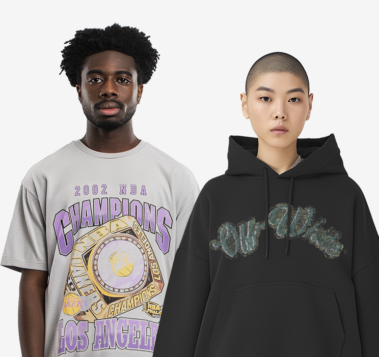
16 Best V-Neck T-Shirt Design Ideas
The best V-neck t-shirt designs range from minimalist logos and typography graphics to vintage artwork and streetwear-inspired prints. Popular styles also include line art, negative space designs, monochrome graphics, abstract illustrations, nature themes, dark art concepts, luxury branding, and custom team apparel. Each design idea complements the V-neck’s natural taper rather than competes with it. Since the V-shape reduces the available space around the neckline, fashion brands, print-on-demand stores, sports teams, and event merchandise collections often favor designs that maintain visual balance, strategic placement, and a strong connection to the shirt’s silhouette.
| Design Style | Best For | Difficulty | Recommended Placement |
| Minimalist Logo | Branding | Easy | Left Chest |
| Typography | Statements | Easy | Upper Center Chest |
| Line Art | Fashion Collections | Medium | Center Chest |
| Negative Space | Premium Designs | Medium | Upper Chest |
| Icon & Symbol | Casual Wear | Easy | Left Chest |
| Monochrome | Luxury Apparel | Easy | Upper Chest |
| Vintage Graphic | Lifestyle Brands | Medium | Center Chest |
| Streetwear Graphic | Urban Fashion | Medium | Large Front / Back |
| Abstract Art | Creative Brands | Medium | Center Chest |
| Statement Slogan | Promotional Wear | Easy | Upper Center Chest |
| Nature Inspired | Outdoor Brands | Medium | Center Chest |
| Dark Art | Alternative Fashion | Advanced | Center Chest |
| Luxury Minimalist | Premium Brands | Easy | Left Chest |
| Team & Event | Group Apparel | Easy | Front + Back |
| Back Print | Streetwear | Medium | Full Back |
| Custom Team | Sports & Organizations | Easy | Front + Back |
Minimalist Logo V-Neck T-Shirt Design Ideas
Best For: Clothing brands, corporate apparel, lifestyle collections
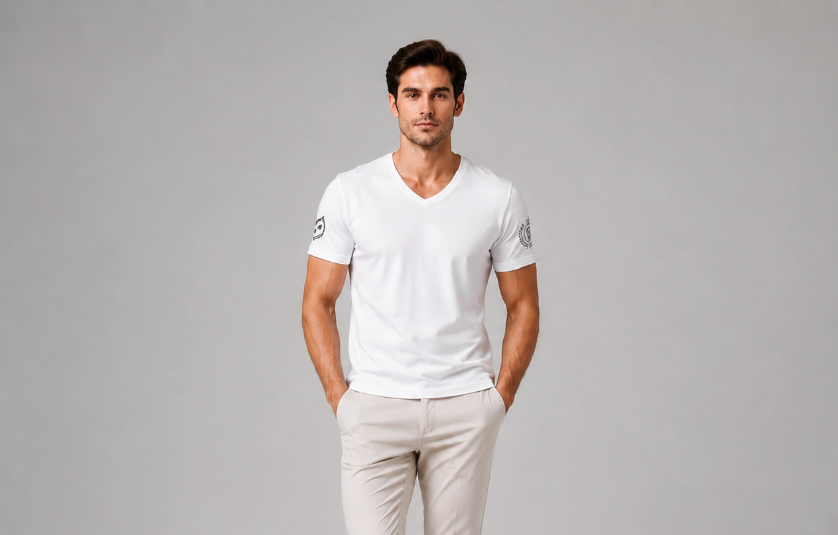
Minimalist logo designs use small branding elements to create a clean, professional appearance, often scaled to just an inch or two in width so the mark reads as a subtle detail rather than a focal point. Simple wordmarks, monograms, and geometric symbols complement the V-neck silhouette without overwhelming the garment, making them a popular choice for both premium and everyday apparel.
Design Tips
- Place logos on the upper or left chest.
- Keep designs compact and easy to recognize.
- Use monochrome or tonal color palettes.
- Leave sufficient negative space around the logo.
Popular Examples
- Embroidered logo
- Monogram branding
- Minimal wordmark
- Geometric brand icon
Single Word Typography V-Neck T-Shirt Design Ideas
Best For: Motivational apparel, personal brands, event merchandise
Typography designs use words and phrases as the primary visual element, often relying on a single bold word to carry the entire design without any supporting graphics. The V-neck naturally draws attention to text, as the eye follows the neckline’s angle straight down to the chest, making typography one of the most effective design styles for conveying messages and creating memorable apparel.
Design Tips
- Use bold and readable fonts.
- Keep messages concise.
- Position text slightly higher than standard center chest placement.
- Use a strong contrast between text and fabric color.
Popular Examples
- Focus
- Create
- Stay Curious
- Never Settle
Line Art V-Neck T-Shirt Design Ideas
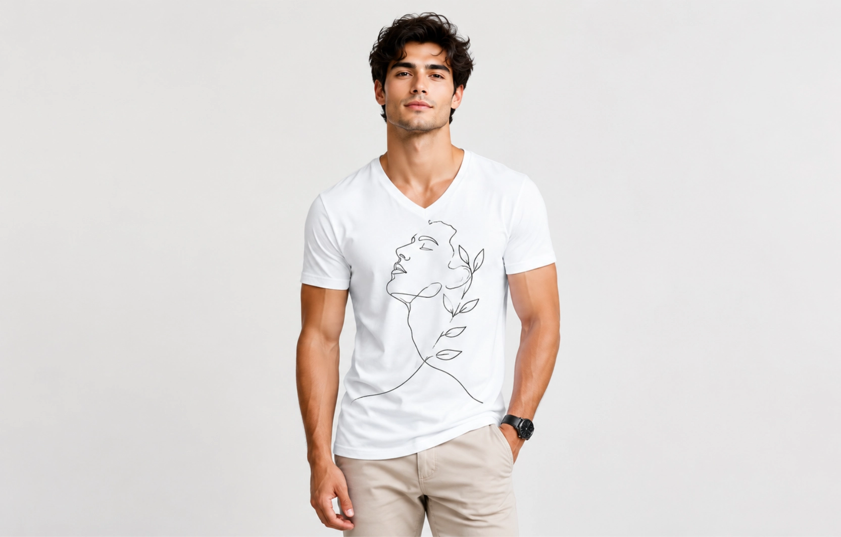
Best For: Modern fashion brands, artistic collections
Line art designs use clean outlines and minimal details to create visually appealing graphics without adding unnecessary complexity, often relying on a single continuous stroke to form the entire image. The lightweight nature of line art complements the V-neck shape and creates a modern aesthetic that works across various apparel styles, from streetwear to minimalist fashion lines.
Design Tips
- Use continuous line illustrations where possible.
- Keep artwork simple and uncluttered.
- Align vertical designs with the V-neck shape.
- Use thin to medium line weights for better print quality.
Popular Examples
- Abstract faces
- Mountain landscapes
- Animal illustrations
- Botanical artwork
- Geometric line compositions
Negative Space V-Neck T-Shirt Design Ideas
Best For: Designer apparel, artistic collections, premium fashion brands
Negative space designs intentionally use empty areas to create hidden shapes, visual contrast, and stronger composition, often revealing a second image or meaning only on closer inspection. This technique works especially well on V-neck t-shirts because the neckline itself becomes part of the overall visual structure, with the V-shape doubling as a design element rather than just a garment cut.
Design Tips
- Use simple shapes and silhouettes.
- Let spacing become part of the artwork.
- Avoid overcrowding the composition.
- Incorporate the neckline into the overall visual balance.
Popular Examples
- Hidden animal silhouettes
- Optical illusion graphics
- Dual-meaning logos
- Geometric negative space artwork
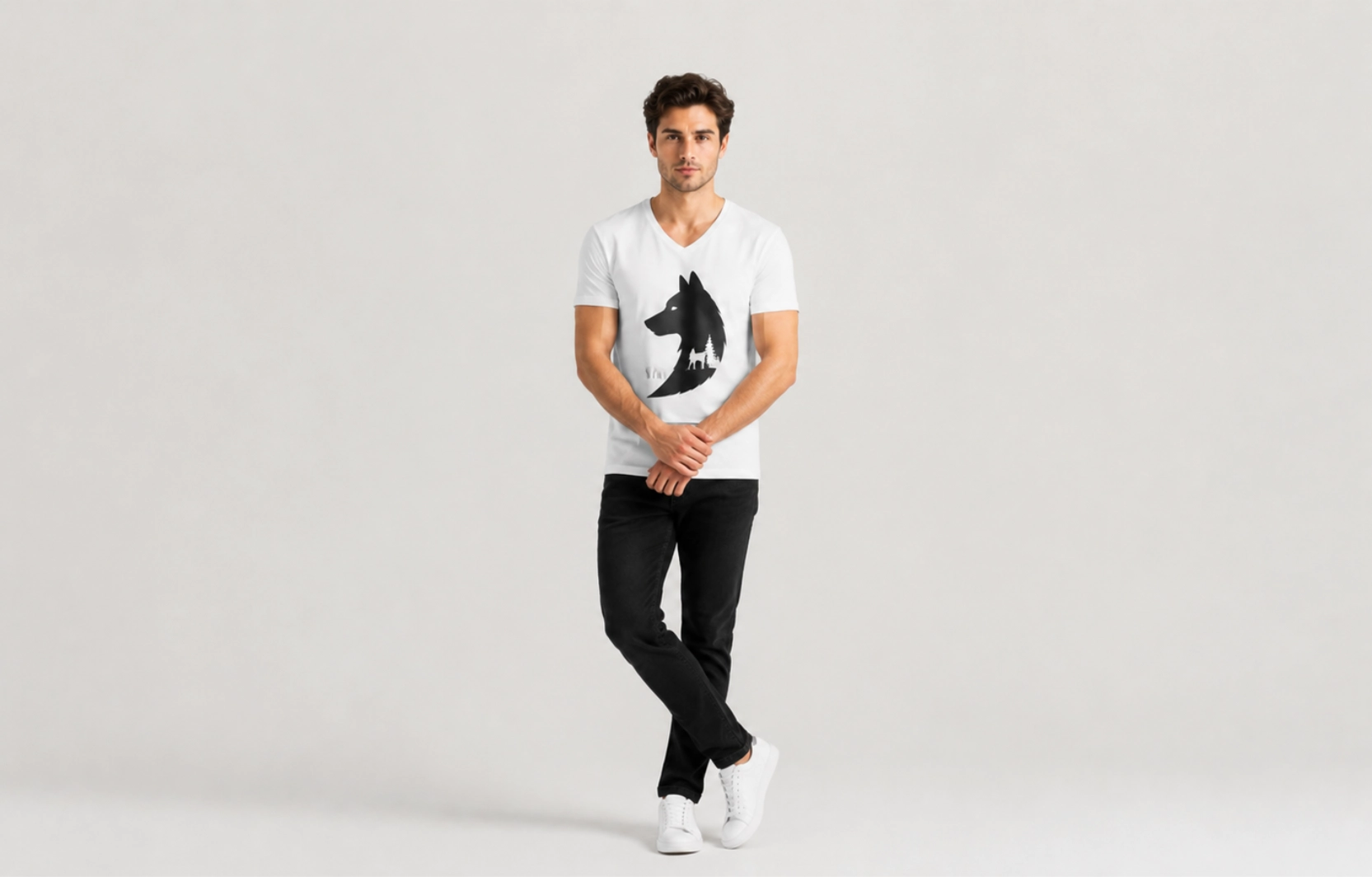
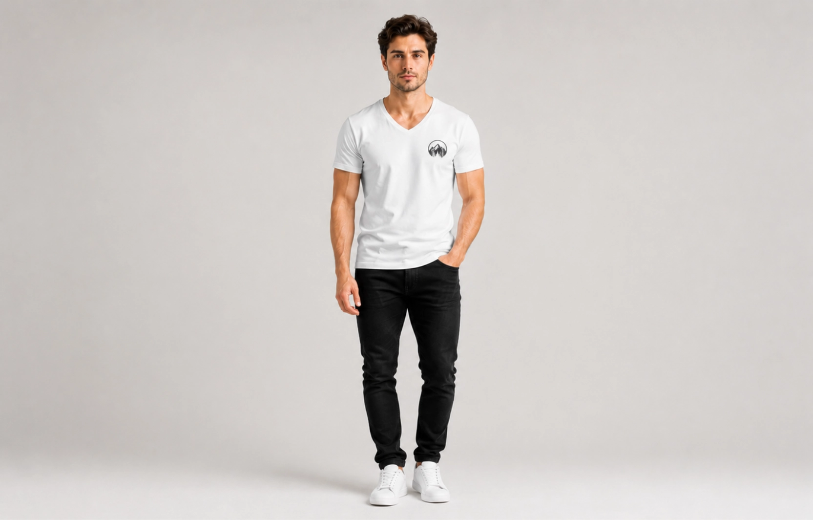
Icon and Symbol V-Neck T-Shirt Design Ideas
Best For: Lifestyle brands, outdoor apparel, casual collections
Icon-based designs rely on recognizable symbols rather than detailed illustrations, often built from a single shape that communicates an idea instantly without any accompanying text. Their compact size and universal appeal make them highly effective for V-neck t-shirts, since a small symbol fits naturally within the limited chest space without competing with the neckline.
Design Tips
- Use easily recognizable symbols
- Keep graphics simple
- Position designs close to the upper chest
- Avoid excessive decorative elements
Popular Examples
- Compass
- Palm tree
- Lightning bolt
- Anchor
- Crescent moon
Monochrome Design V-Neck T-Shirt Design Ideas
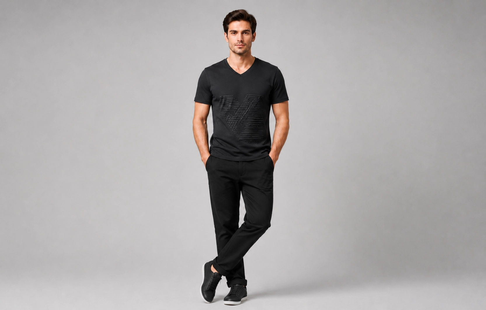
Best For: Contemporary fashion, luxury casualwear
Monochrome designs rely on a single color or tonal variations to create a refined aesthetic, often using subtle techniques like puff printing, embossing, or tonal ink shifts to add depth without introducing additional colors. This V-neck t-shirt style emphasizes composition, form, and texture over color complexity, making it a common choice for brands aiming for a quiet, premium look rather than a bold graphic statement.
Design Tips
- Use tonal printing techniques
- Focus on shape and texture
- Pair with premium fabric choices
- Avoid unnecessary design elements
Popular Examples
- Black-on-black graphics
- Tonal logos
- Single-color illustrations
- Minimal abstract artwork
Vintage Print V-Neck T-Shirt Design Ideas
Best For: Retro-inspired collections, lifestyle apparel
Vintage graphics bring nostalgic character through distressed textures, retro typography, and classic illustration styles, often drawing inspiration from decades like the 1970s and 1980s through faded color schemes and worn-in print effects. These V-neck t-shirt designs remain popular because they combine familiarity with strong visual appeal, giving even new apparel collections a lived-in, collectible feel that resonates across different age groups.
Design Tips
- Use aged textures carefully
- Incorporate retro fonts
- Choose muted color palettes
- Balance vintage elements with modern placement
Popular Examples
- Retro travel graphics
- Vintage automotive artwork
- Classic music-inspired prints
- Distressed logo designs
Streetwear Graphic V-Neck T-Shirt Design Ideas
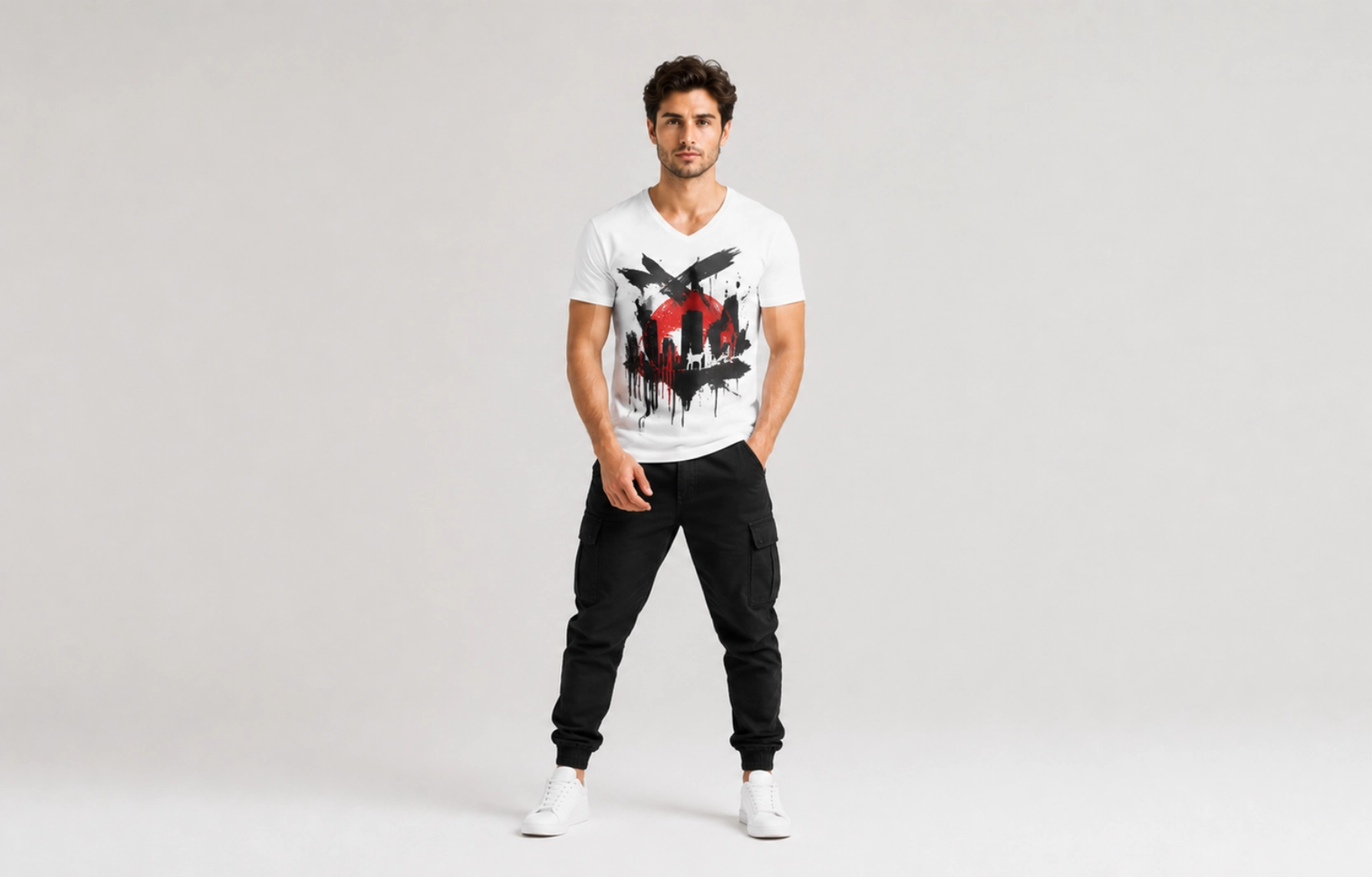
Best For: Urban fashion brands, youth-focused collections
Streetwear designs emphasize bold visuals, cultural references, and strong graphic impact, often pulling inspiration from skate culture, hip-hop, and urban art scenes. They typically use oversized artwork, expressive typography, and high-contrast layouts, though on a V-neck, these elements need careful scaling so the design doesn’t crowd or compete with the neckline’s natural taper.
Design Tips
- Use bold graphic elements
- Create a strong visual hierarchy
- Maintain readability
- Position large graphics slightly higher on V-necks
Popular Examples
- Graffiti-inspired artwork
- Oversized typography
- Urban illustrations
- Graphic collage designs
Abstract Artwork V-Neck T-Shirt Design Ideas
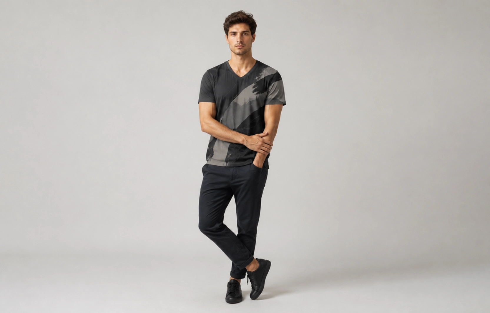
Best For: Creative brands, artistic apparel collections
Abstract designs focus on shapes, forms, and visual expression rather than literal subjects, drawing more on color theory and composition than recognizable imagery. This V-neck t-shirt style offers flexibility while creating a distinctive appearance, making it well-suited to brands that want apparel to feel like wearable art rather than a standard graphic tee.
Design Tips
- Use strong composition
- Balance shapes carefully
- Limit visual clutter
- Experiment with asymmetrical layouts
Popular Examples
- Geometric patterns
- Color-block artwork
- Brushstroke graphics
- Organic abstract forms
Statement Slogans V-Neck T-Shirt Design Ideas
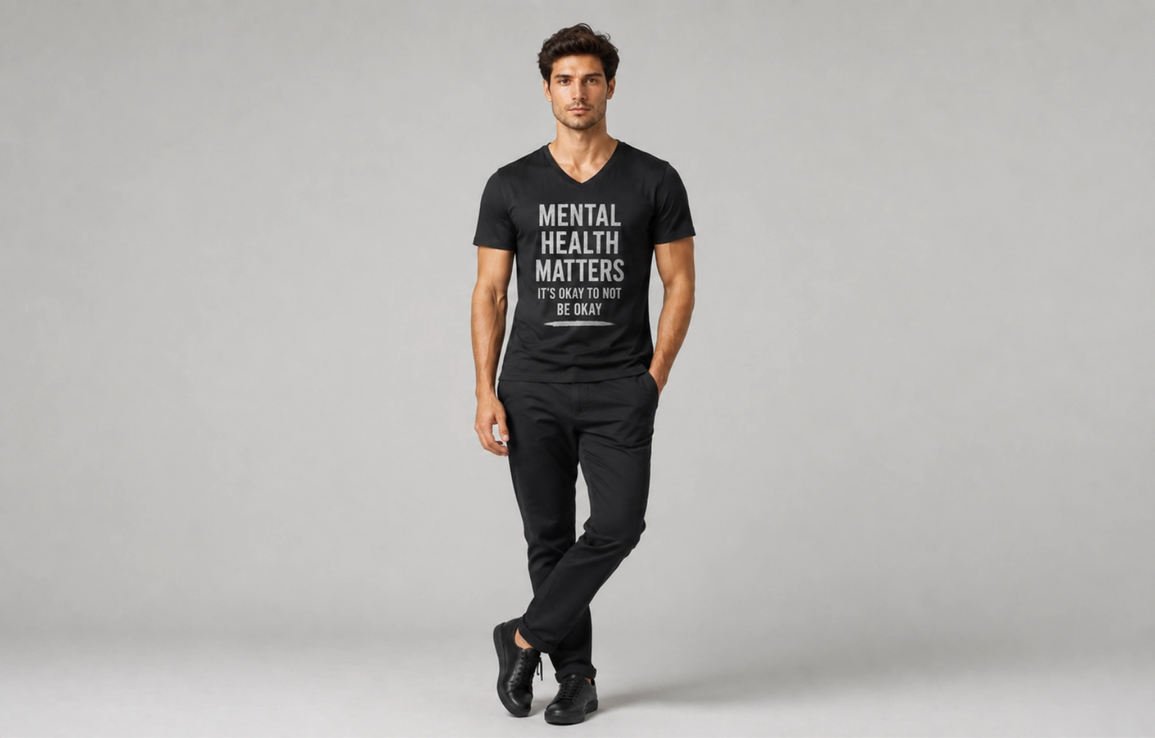
Best For: Personal brands, awareness campaigns, lifestyle merchandise
Statement slogans transform apparel into a communication tool by using memorable phrases that express values, humor, or identity, often working best when the message can be read and understood within a second or two. Short, punchy slogans tend to perform better than longer phrases since the limited chest space on a V-neck leaves little room for dense text without sacrificing readability.
Design Tips
- Keep messages concise
- Use impactful typography
- Focus on readability
- Avoid lengthy sentences
Popular Examples
- Progress Over Perfection
- Stay Curious
- Built Different
- Think Forward
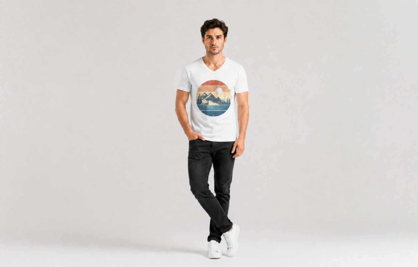
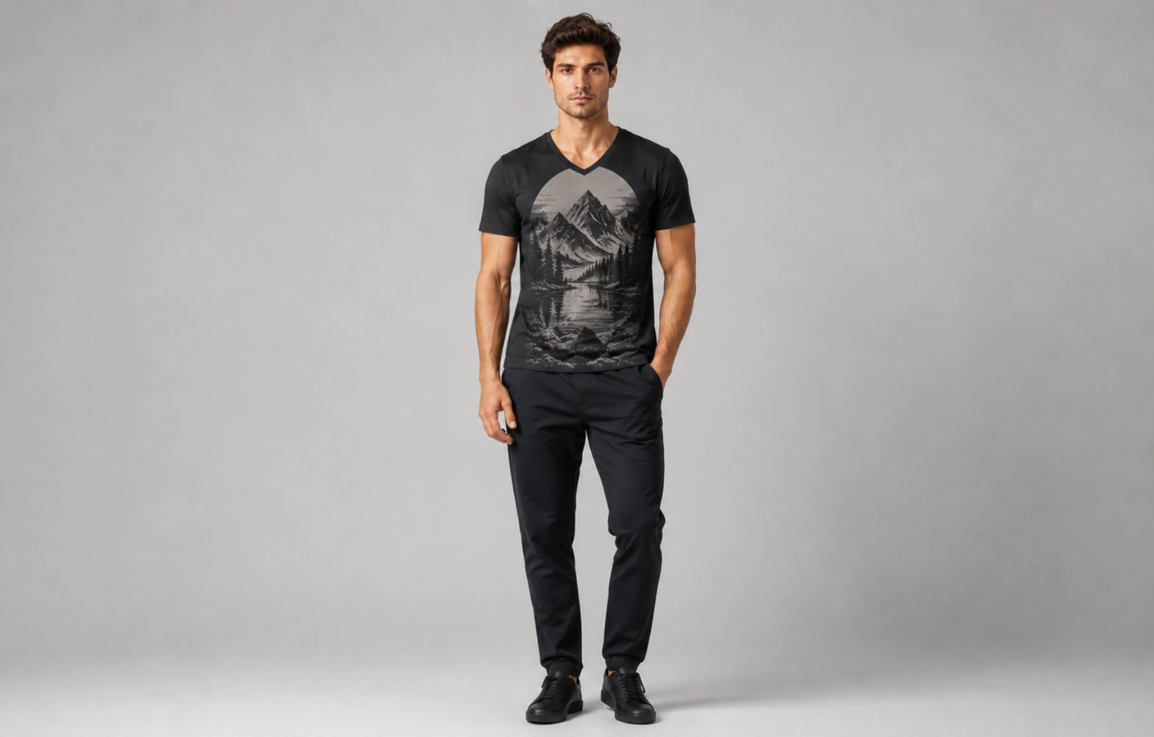
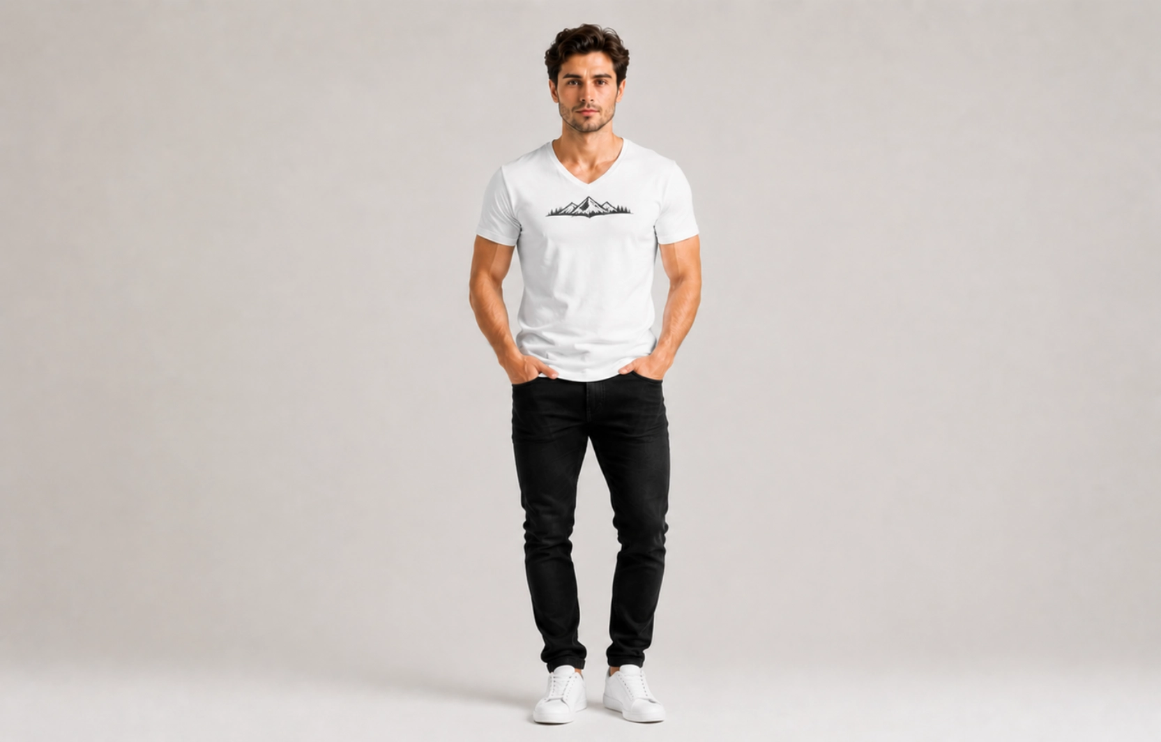
Nature-Inspired V-Neck T-Shirt Design Ideas
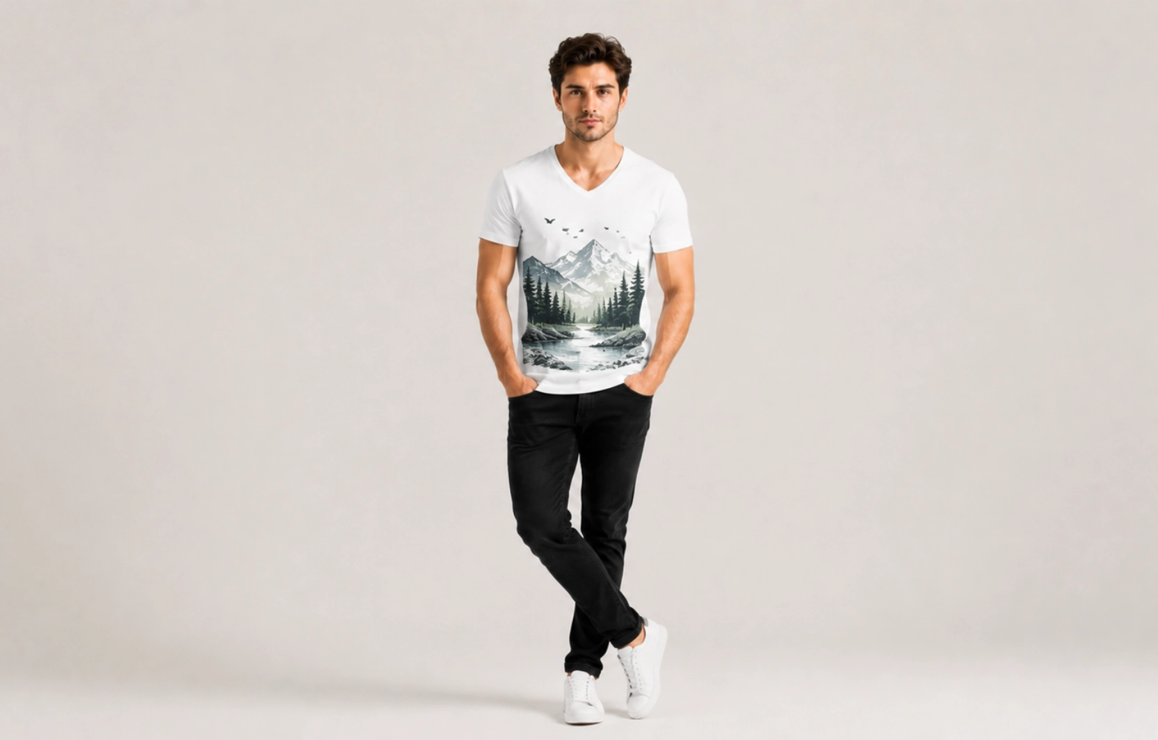
Best For: Outdoor brands, travel apparel, eco-conscious collections
Nature-inspired graphics connect apparel to landscapes, wildlife, and environmental themes, often appealing to brands that want their apparel to reflect outdoor activity or sustainability values. Their organic forms, like rolling mountain ridgelines or flowing wave patterns, often complement the V-neck silhouette naturally, following the same downward taper as the neckline itself.
Design Tips
- Use clean illustrations
- Focus on recognizable subjects
- Maintain balanced proportions
- Combine artwork with subtle typography when appropriate
Popular Examples
- Forest scenes
- Mountain ranges
- Ocean waves
- Wildlife illustrations
Dark Art V-Neck T-Shirt Design Ideas
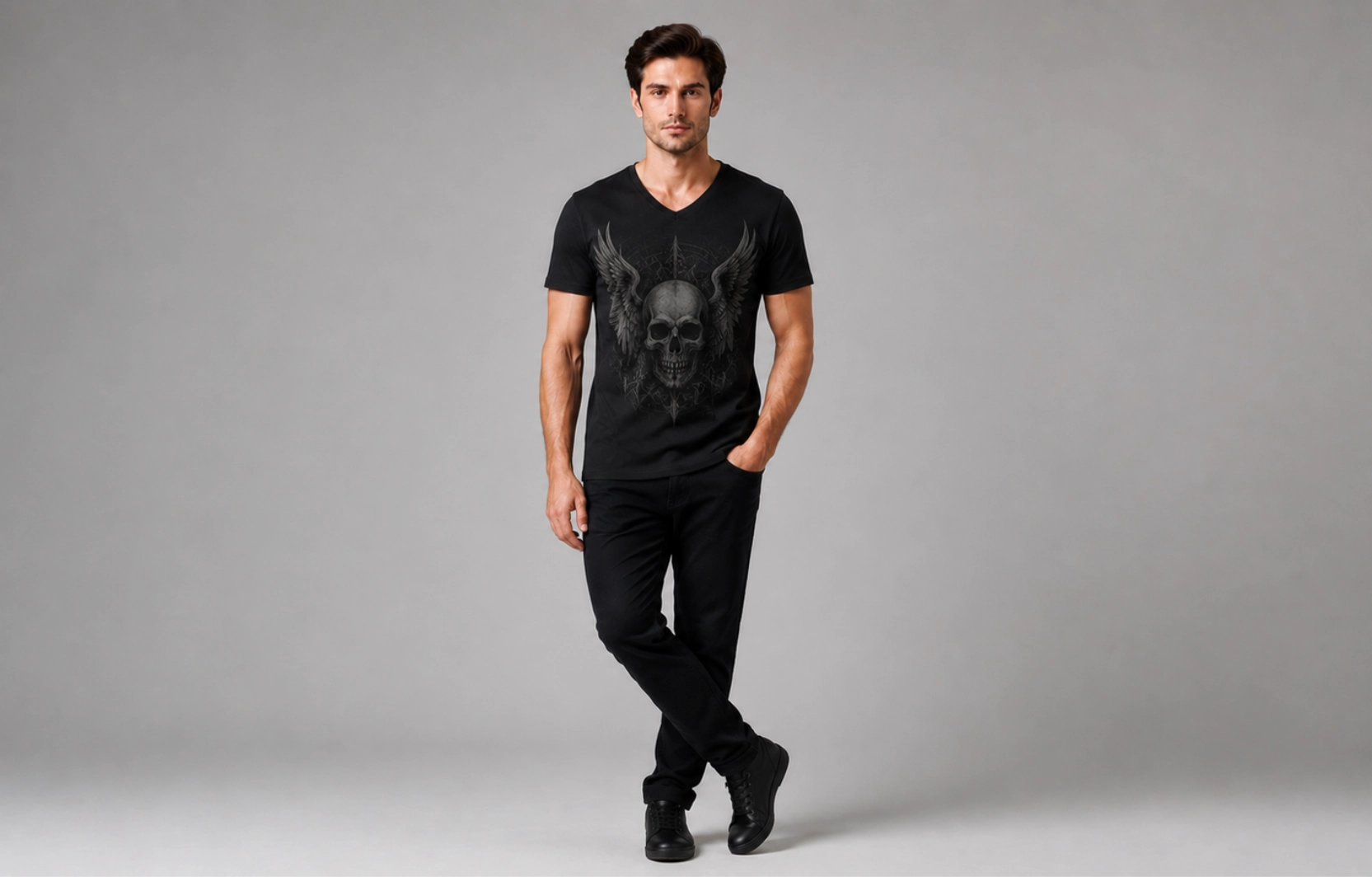
Best For: Alternative fashion, niche apparel collections
Dark art designs for V-neck t-shirts use gothic, mysterious, and dramatic imagery to create a distinctive visual identity, often drawing on themes such as the occult, mythology, and horror-inspired aesthetics. These graphics appeal to audiences seeking unconventional apparel, with the style finding a strong following in alternative, metal, and gothic subcultures.
Design Tips
- Maintain strong contrast
- Avoid excessive visual complexity
- Use detailed artwork selectively
- Balance dark themes with clean layouts
Popular Examples
- Gothic illustrations
- Skull artwork
- Raven imagery
- Celestial symbolism
Luxury Minimalist V-Neck T-Shirt Design Ideas
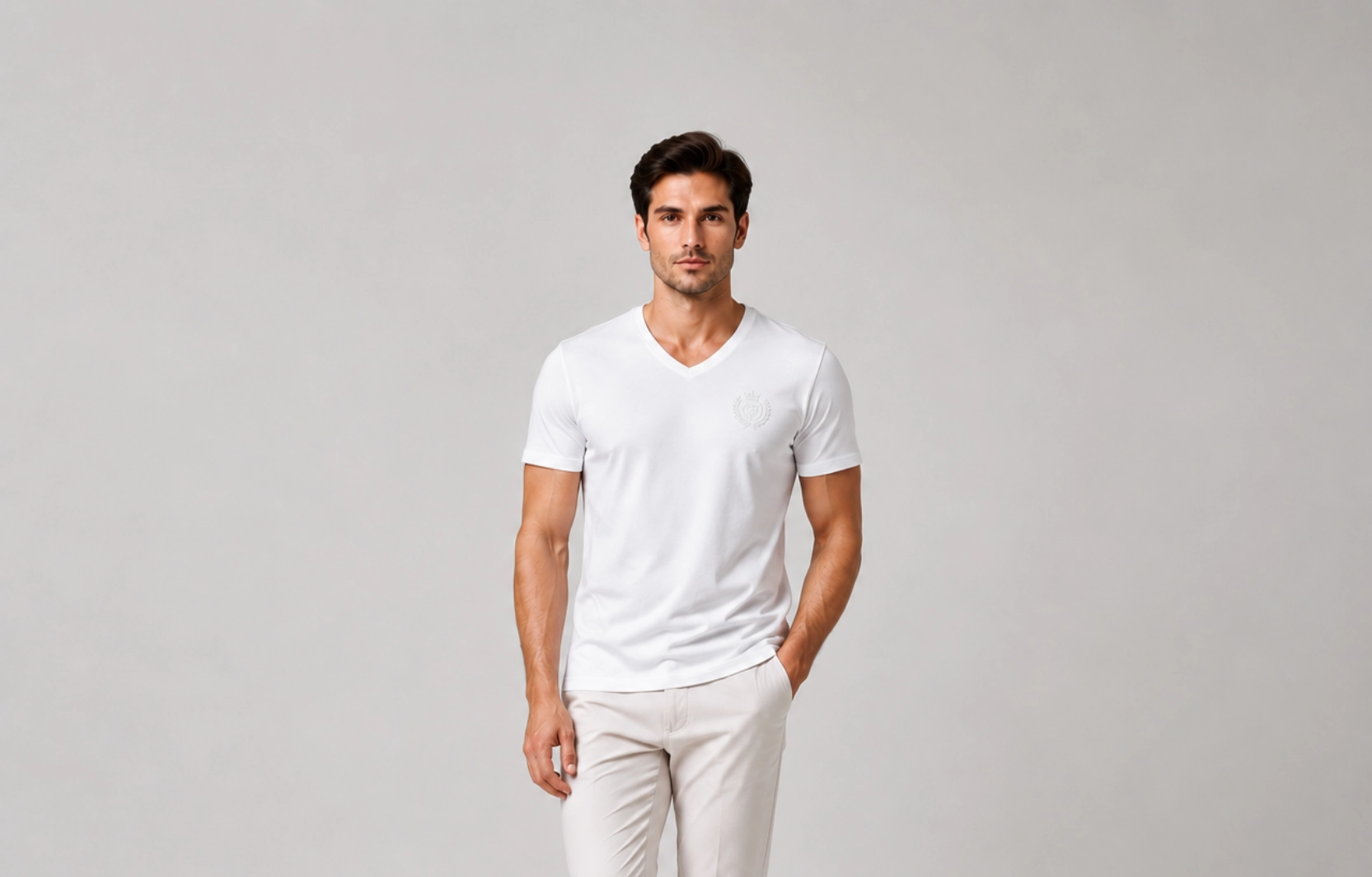
Best For: Premium fashion brands, upscale merchandise
Luxury minimalist designs prioritize craftsmanship, subtle branding, and visual restraint, often relying on techniques like embroidery or debossing rather than standard screen printing to signal a higher price point. The focus on this V-neck t-shirt design remains on quality, fit, and refined presentation, with the garment’s construction and fabric doing as much visual work as the design itself.
Design Tips
- Use premium printing or embroidery
- Limit design elements
- Focus on placement precision
- Select sophisticated color palettes
Popular Examples
- Tonal embroidery
- Minimal chest branding
- Debossed-style graphics
- Luxury monograms
Team and Event V-Neck T-Shirt Design Ideas
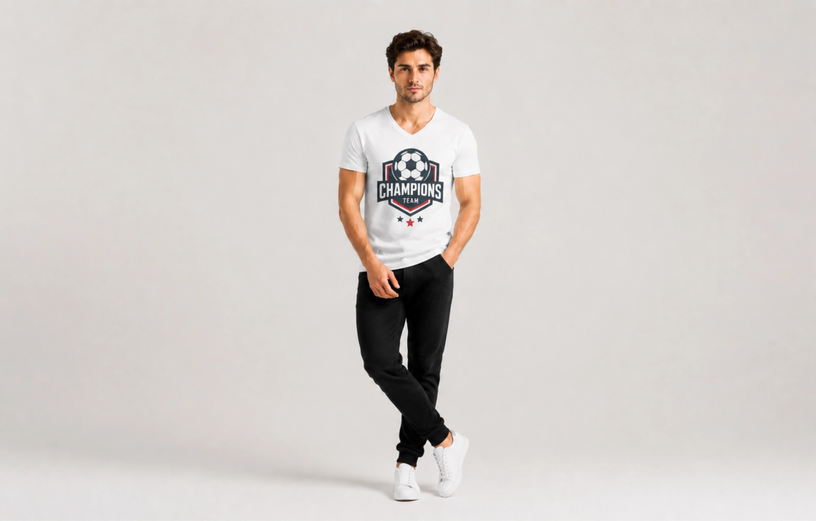
Best For: Sports teams, corporate events, fundraisers
Team and event designs combine branding with functionality, since these shirts typically need to work for an entire group rather than a single wearer. These V-neck t-shirt designs help create a unified visual identity while remaining practical for group use, often centered on a name, date, or logo that ties the design to a specific occasion rather than to general apparel.
Design Tips
- Prioritize readability
- Include event or team identifiers
- Use scalable graphics
- Ensure visibility from a distance
Popular Examples
- Sports team shirts
- Conference merchandise
- Charity event apparel
- Company team apparel
Back Print Designs V-Neck T-Shirt Design Ideas
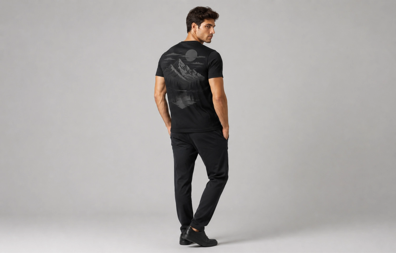
Best For: Streetwear, events, promotional apparel
Back print designs use the large rear print area to create a stronger visual impact than front-only designs, taking advantage of the extra space across the shoulder blades that a front V-neck layout doesn’t offer. They are often paired with small front logos for a balanced layout, keeping the V-neck’s chest area clean while the back carries the main visual statement.
Design Tips
- Use large-scale artwork
- Keep front branding minimal
- Maintain a strong visual hierarchy
- Ensure readability from a distance
Popular Examples
- Oversized graphics
- Large typography layouts
- Event branding
- Full-back illustrations
Custom Team V-Neck T-Shirt Design Ideas
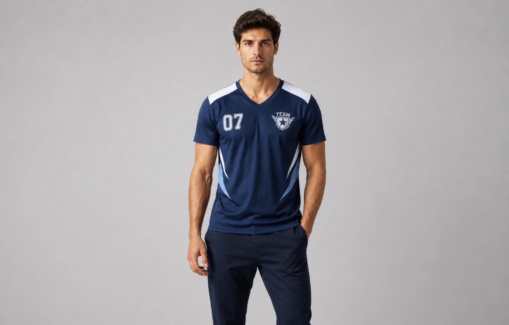
Best For: Sports teams, company departments, school groups, clubs, tournaments, community organizations
Custom team V-neck t-shirt designs help create a consistent visual identity while promoting unity and recognition among members. Unlike standard team apparel, V-neck shirts offer a more modern and versatile appearance that works well for competitive events, corporate gatherings, volunteer programs, and casual team activities. Effective team designs balance branding, readability, and functionality to ensure the shirt remains visually appealing both on and off the field.
Design Tips
- Place team names or logos on the upper chest for maximum visibility.
- Use bold typography that remains readable from a distance.
- Include player names, numbers, or department identifiers when applicable.
- Maintain consistent colors that align with team or brand identity.
- Avoid overcrowding the design with excessive graphics or text.
Popular Examples
- Sports team jerseys with custom player names
- Corporate team-building event shirts
- School club and student organization apparel
- Charity walk and fundraiser team shirts
- Tournament and competition merchandise
- Volunteer and community outreach uniforms
What Are Print Placement Ideas for V-Neck T-Shirts?
The best print placement ideas for V-neck t-shirts include positioning small logos near the left chest, typography in the upper center, and larger graphics slightly higher, with adjusted scaling to suit the V-shaped neckline. Since V-necks create a visual focal point near the upper chest, artwork placed too low can appear disconnected from the garment, whereas proper placement improves readability and keeps the design visually connected to the shirt’s structure.
| Placement Area | Distance From Neckline | Best Design Types |
| Center Chest | 2–3 inches | Typography, Graphics |
| Left Chest | Aligned with Upper Chest | Branding |
| Full Back | Upper Back Center | Team & Streetwear Designs |
| Sleeve | Mid Sleeve Area | Secondary Logos |
| Upper Chest | 1–2 inches | Logos, Icons |
Center Chest Placement
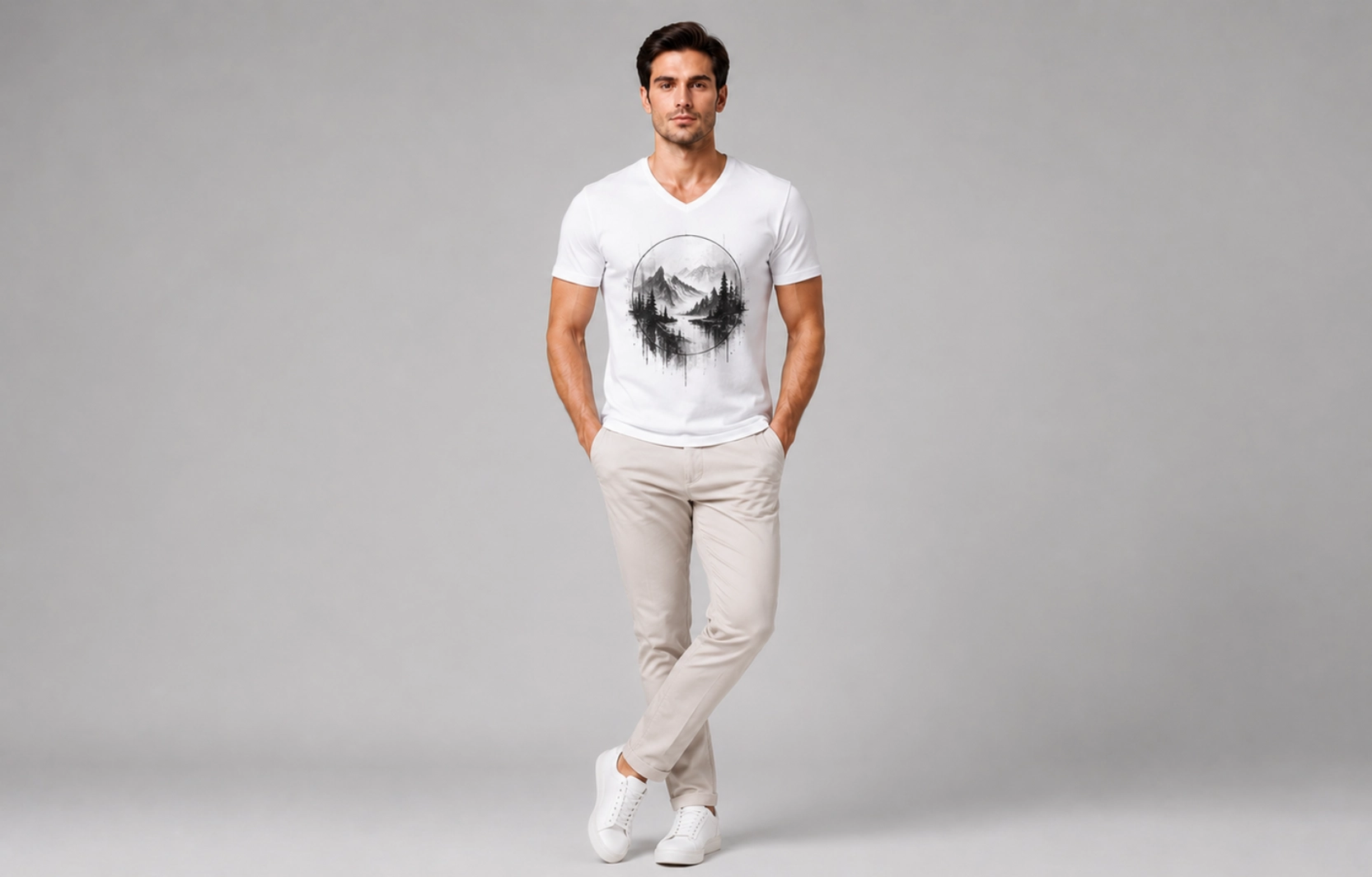
Positioning artwork at the center creates a balanced focal point that naturally aligns with the V-neck silhouette, since the neckline already draws attention to the upper torso. Artwork placed in this area feels visually connected to the shirt rather than floating independently, which works particularly well for typography, vintage graphics, and statement artwork that need enough space to stay prominent without competing with the neckline. On most V-neck t-shirts, positioning the artwork slightly higher than standard crew-neck placement produces the most balanced result.
Works Best For:
- Typography designs
- Vintage graphics
- Abstract artwork
- Statement slogans
- Event merchandise
Works Poorly For:
- Small minimalist logos
- Sleeve branding
- Highly detailed oversized artwork
Pro Tip: Keep the top edge of the design approximately 2 to 3 inches below the lowest point of the V-neck to maintain visual balance and improve readability.
Left Chest Placement
Branding-focused V-neck t-shirts benefit most from left chest placement because it complements the neckline without overwhelming the garment. The compact design area naturally suits logos, monograms, and symbols that need visibility without dominating the shirt. This placement also creates a cleaner, more premium appearance, which is why fashion brands, corporate apparel programs, and custom merchandise collections commonly use it.
Works Best For:
- Brand logos
- Monograms
- Icon designs
- Corporate apparel
- Team branding
Works Poorly For:
- Large graphics
- Detailed illustrations
- Long typography layouts
Pro Tip: Limit artwork width to 2–4 inches to maintain a professional appearance and prevent crowding around the neckline.
Full Back Chest Placement
Full back placement offers the largest printable area on a V-neck t-shirt and is ideal for designs that require a strong visual impact. Unlike front placements that must accommodate the neckline, the back provides a broad canvas for oversized graphics, event branding, and large typography. Many apparel brands combine a subtle front logo with a larger back print to create a balanced design system that delivers branding from multiple viewing angles.
Works Best For:
- Streetwear graphics
- Team apparel
- Promotional merchandise
- Event shirts
- Large typography
Works Poorly For:
- Minimalist branding
- Small icons
- Compact logo designs
Pro Tip: Pair a small front chest logo with a larger back graphic to create a professional front-to-back design hierarchy.
Sleeve Placement
Sleeve placement adds secondary branding without competing with the main artwork. Although the available space is limited, sleeves provide an excellent location for supporting design elements such as logos, symbols, event dates, or team identifiers. This placement is particularly popular in premium apparel because it introduces subtle branding while preserving the clean appearance of the front and back design areas.
Works Best For:
- Secondary logos
- Brand symbols
- Event dates
- Team identifiers
Works Poorly For:
- Detailed graphics
- Long text
- Primary artwork
Pro Tip: Use sleeve placement as a supporting design element rather than the primary visual focus of the V-neck t-shirt.
Upper Chest Placement
Artwork placed near the neckline around the upper chest takes advantage of the visual focus the V-neck already creates. Positioning artwork closer to the neckline creates a stronger connection between the design and the garment’s silhouette, making this placement highly effective for minimalist branding and compact graphics. This approach also improves visibility when the shirt is layered under jackets, overshirts, or cardigans because the design remains partially visible above the outer garment.
Works Best For:
- Single-word typography
- Minimalist branding
- Symbol graphics
- Luxury logo designs
Works Poorly For:
- Large illustrations
- Wide graphic layouts
- Full-width typography
Pro Tip: Maintain adequate negative space between the neckline stitching and the artwork to prevent the design from feeling crowded.
Front vs Back Placement Comparison
Front placement creates immediate visibility for branding or messaging, while back placement offers a larger canvas for detailed graphics, team identification, and statement designs. Understanding the strengths of each helps designers choose the right layout based on their goals and the type of design being printed.
| Factor | Front Placement | Back Placement |
| Visibility | Immediate | Secondary |
| Branding | Strong | Moderate |
| Graphic Size | Limited | Large |
| Streetwear Appeal | Medium | High |
| Team Apparel | Good | Excellent |
| Typography | Excellent | Good |
Design Elements That Work Best on V-Neck Shirts
The design elements that work best on V-neck shirts include vertical graphics, minimalist logos, single-word typography, line art, and compact icons, since these follow the neckline’s downward taper without excessive width. Not every graphic style translates well to a V-neck, as the neckline changes the garment’s visual balance. The right element improves readability and helps the artwork feel integrated with the garment rather than placed on top of it.
Typography
Text-based designs are among the most effective choices for V-neck shirts because the neckline naturally directs attention toward the chest, where words sit within a clear sightline. Single words like “Focus” or short slogans under five words create a strong focal point while staying within 4 to 5 inches of width. Bold sans-serif fonts like Helvetica or Futura, paired with high-contrast colors, read clearly from a distance and adapt well across minimalist branding, lifestyle merchandise, and event apparel.
Vertical Graphics
Designs that run top to bottom complement the V-neck’s shape by following the same downward direction as the neckline itself. Mountain illustrations, botanical stems, arrows, totem-style stacks, and single-line art guide the eye down the chest without disrupting the shirt’s proportions. Kept within a narrow 2- to 3-inch width and centered on the sternum line, this style creates a cohesive look in which the artwork feels built into the garment rather than added on top.
Minimalist Artwork
Simplicity tends to outperform detail in V-neck shirts, since clean, uncluttered graphics suit the limited chest space better than dense illustrations. Small icons, geometric shapes, monograms, and single-line graphics, typically under 3 inches and printed in one or two colors, create visual interest without crowding the design area. Relying on negative space rather than filled areas keeps the look refined across different shirt colors, from heathered greys to solid black.
Balanced Chest Designs
Distributing visual weight evenly across the upper torso is what separates an intentional composition from an accidental one. Pairing a small logo on the left chest with short text centered below, or scaling a medium graphic to roughly 4 inches wide, keeps the design connected to the neckline while preserving an inch or two of spacing on either side. This improves readability and visual hierarchy across both casual and branded collections.
Common Mistakes to Avoid in V-Neck T-Shirt Design
The most common mistakes in V-neck t-shirt design stem from incorrectly positioning or improperly scaling artwork, or from ignoring how the neckline affects visual balance. Even a well-designed graphic can look ineffective if it ignores the V-neck’s unique proportions. Avoiding these mistakes improves readability and helps the design feel naturally integrated with the garment.
| Mistake | Why It Creates Problems |
| Artwork Placed Too Low | Creates a visual disconnection from the neckline |
| Large Circular Graphics Near the Collar | Competes with the V-shape and disrupts balance |
| Oversized Artwork | Overwhelms the garment and reduces clarity |
| Poor Font Selection | Lowers readability and weakens message delivery |
| Lack of Negative Space | Makes the design appear crowded and unbalanced |
Placing Artwork Too Low
One of the most common V-neck design mistakes is positioning artwork too far down the chest. Because the V-neck naturally draws attention to the upper torso, designs placed below the visual focal point often appear disconnected from the garment. Raising the artwork slightly helps create a stronger relationship between the design and the neckline while improving visibility and overall balance.
Using Circular Designs Near the Neckline
Circular graphics positioned close to a V-neck often compete with the neckline’s angular shape. The contrast between a large circular design and the V-shaped collar can create visual tension, making the layout feel awkward. Designs with vertical alignment, geometric structures, or balanced proportions generally work more effectively because they complement the shirt’s natural silhouette.
Oversized Graphics That Clash With the V Shape
Large graphics can be effective on V-neck t-shirts, but they require careful scaling and placement. Oversized artwork that extends too close to the neckline can overwhelm the shirt and diminish the V-shape’s impact. Maintaining sufficient spacing between the neckline and the design helps preserve clarity while allowing both elements to contribute to the overall composition.
Poor Font Selection
Typography depends as much on readability as it does on aesthetics. Decorative fonts, condensed typefaces, or overly complex lettering can become difficult to read when viewed from a distance or printed at smaller sizes. Choosing clean, legible fonts helps ensure that slogans, brand messages, and typography-based designs remain visually effective across different shirt styles and print sizes.
Ignoring Negative Space
Negative space plays a significant role in creating balanced V-neck t-shirt designs. Crowding the design area with excessive graphics, text, or decorative elements can make the layout feel cluttered and reduce the artwork’s visual impact. Strategic spacing around design elements improves readability, creates a cleaner appearance, and helps the graphic work in harmony with the shirt’s silhouette.
How to Preview Your Design Before Printing?
Preview a V-neck t-shirt design before printing by uploading the artwork to a t-shirt mockup generator that simulates the garment’s shape, then checking placement, scale, and color against the neckline before sending the file to print.
- Choose a realistic V-neck mockup template (front view and side/angled view, if available).
- Upload the design file in its final resolution and format.
- Adjust placement so the design sits correctly relative to the V-neckline, not just the shirt’s center.
- Scale the design to fit the available print area without crowding the neckline edges.
- Check color accuracy against the chosen shirt color, especially for light or transparent elements.
- Preview multiple shirt colors to see if the design will be offered in more than one.
- Review at actual size or zoomed in to catch alignment or pixelation issues.
Why Mockups Matter
Mockups matter because they provide a realistic preview of spacing, artwork scale, color contrast, and placement before production, reducing the risk of costly printing errors. For clothing brands, print-on-demand sellers, and custom apparel businesses, mockups also serve as marketing assets, creating professional product images without the need for physical samples.
- Spacing and scale: shows how artwork sized for a flat file will actually look on a curved garment
- Color contrast: reveals how a design appears against different shirt colors before committing to print
- Placement accuracy: confirms whether the artwork sits correctly relative to the V-neck’s taper
- Marketing value: produces ready-to-use product photos for online listings without a physical sample run
Recommended Mockup Tools
Several mockup platforms allow designers to test V-neck t-shirt designs across different shirt styles, colors, and print placements. T-shirt mockup generators such as Mockit, Placeit, Smartmockups, and Canva provide customizable templates that help visualize designs before production. These platforms make it easier to compare multiple placement options and identify potential design adjustments early in the process.
What to Check Before Production
Before sending a V-neck t-shirt design to print, review the artwork for placement accuracy, overall scale, readability, and visual balance to catch issues while they’re still easy to fix. Taking a few minutes to verify these details can prevent costly revisions and help ensure the final product matches the intended design vision.
- Placement accuracy: confirm the artwork sits correctly relative to the V-neck’s taper, not just centered on a flat template
- Overall scale: check that the design is proportional to the shirt size, neither overwhelming the chest nor too small to notice
- Readability: make sure text and fine details remain legible at the intended print size, not just on a zoomed-in screen view
- Spacing from the neckline: leave enough negative space so the design doesn’t crowd or compete with the V-cut
- Visual balance: verify the design aligns with the shirt’s proportions and doesn’t pull the eye off-center
V-Neck Design Approval Checklist
- Artwork is positioned above the visual center
- Design does not touch the neckline stitching
- Typography remains readable at print size
- Negative space is preserved
- Design remains balanced on mockups
- Front and back graphics follow a consistent hierarchy
- Colors provide sufficient contrast
- Print dimensions match garment size
Designer Recommendation
If the goal is brand visibility, choose Minimalist Logo, Typography, or Luxury Minimalist designs with Left Chest or Upper Chest placement.
If the goal is visual impact, choose Vintage Graphics, Streetwear Graphics, Abstract Art, or Back Print Designs with Center Chest or Full Back placement.
If the goal is group identity, choose Team & Event Designs or Custom Team Designs with Front Logo + Full Back Branding.
Frequently Asked Questions
What design looks best on a V-neck t-shirt?
Minimalist logos, typography designs, line art, vintage graphics, and balanced chest layouts perform best on V-neck t-shirts. These styles complement the neckline’s shape while maintaining visual clarity and proper spacing around the design.
Where should a logo be placed on a V-neck shirt?
A logo is usually most effective when placed on the upper or left chest. This positioning keeps the branding visually connected to the neckline while preserving a clean and professional appearance.
Are V-neck shirts good for large graphics?
Yes, V-neck shirts can work well with large graphics, as long as the artwork stays clear of the neckline and keeps enough negative space to avoid overwhelming the shirt’s proportions. Careful placement and scaling are key, since the V-shape leaves less usable chest area than a crew neck once that buffer space is accounted for.
What print size works best for V-neck apparel?
The ideal print size depends on the design type, but most front graphics work best when sized proportionally to the upper chest area rather than extending across the entire torso. Compact and medium-sized designs often create the most balanced results.
How far below the neckline should a design start?
Most V-neck designs look balanced when positioned approximately 2 to 3 inches below the neckline’s lowest point. This placement helps maintain a visual connection between the artwork and the shirt’s silhouette.
Can you print on both the front and back of a V-neck shirt?
Yes, you can print on both the front and back of a V-neck t-shirt, and many apparel brands combine a small front logo or graphic with a larger back print to create visual balance and increase branding opportunities. This approach is commonly used for streetwear, event merchandise, team apparel, and promotional clothing.

View featured image for V-Neck T-Shirt Design Ideas: Styles, Placement & Inspiration
 Trusted By Thousands Of Designers
  Cancel Your Subscription Anytime
  30 Day Money Back Guarantee