
When designing t-shirts, font pairing is crucial for creating clear, eye-catching, and readable designs. The right combination of fonts enhances visual hierarchy, aligns with your design’s tone, and ensures readability from a distance. Poor font choices can make even the best ideas look unpolished. Here’s what you need to know:
- Stick to 2-3 fonts: Use one for headlines, another for supporting text, and optionally a third for small details.
- Focus on readability: Ensure fonts are clear and legible, even at a distance or on textured fabrics.
- Create contrast: Pair serif and sans-serif fonts or bold and light weights to add visual interest.
- Match the mood: Choose fonts that align with your design’s theme and audience.
- Test on mockups: Use tools like Mock It to preview how fonts appear on different garments and colors.
Font pairing isn’t just about looks – it’s about delivering your message effectively. Keep it simple, test your designs, and aim for a balance between contrast and harmony.
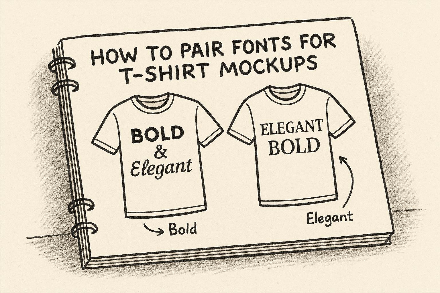
Pair fonts like a pro 🔥 8 Pairing Font Combos. Combinations I use to create designs for t-shirts.
Font Pairing Basics for T-Shirt Designs
Nailing the right font pairing is a game-changer for t-shirt designs. It’s all about combining style and functionality to create visuals that not only look polished but also deliver your message clearly.
Readability and Visual Order
Stick to two or three fonts in your design. This keeps things clean and establishes a clear visual hierarchy, with the most important text standing out the most. A well-thought-out hierarchy naturally guides the viewer’s eye, making it easy to follow the message. For example, use one font for the headline, another for supporting text, and possibly a third for smaller details like dates or URLs.
“Good typography, first, makes words readable. At its best, it does something more: it helps express the animating spirit of the ideas behind the words.” – Michael Bierut, Graphic Designer
Pay close attention to kerning, or the spacing between letters. Even the best fonts can look amateurish with poor kerning. Most design tools offer kerning adjustments, and fine-tuning this detail can elevate your design significantly.
Contrast and Balance
Contrast is your best friend when it comes to making text pop. Pair fonts from different families – like a serif with a sans-serif – for a design that feels dynamic and layered. You can also play with font weights: pair bold headlines with lighter supporting text, or add heavier accents to subtle main text for emphasis.
Color contrast is another crucial factor. High-contrast pairings, like white on dark shirts or black on light fabrics, ensure readability in different lighting conditions. Always test your designs on various shirt colors to see how they hold up.
Balance doesn’t mean everything should be the same size – it’s about creating harmony. Consider the weight, structure, and overall vibe of your fonts. Fonts with similar x-heights (the height of lowercase letters) often pair well, even if they come from different font families. This helps tie your design together visually.
Matching Fonts to Design Themes
Fonts carry emotional weight, so choose ones that match your design’s tone. Script fonts can feel romantic or elegant, while bold block fonts might exude strength and confidence. Your font choices should align with your message and your brand’s personality.
For example, a wellness brand might lean on soft serif fonts to convey trust and tradition, whereas a streetwear brand could use edgy, urban fonts to match its vibe. Similarly, a playful font might work perfectly for a kids’ t-shirt but would feel out of place on luxury apparel.
Also, think about your audience. A retro-inspired font fits vintage designs, while sleek sans-serif fonts might appeal to tech or fitness enthusiasts. The right font should enhance your design’s theme, not clash with it.
When pairing fonts, make sure they complement each other and reinforce the mood of your design. Whether your design feels fun, serious, casual, or bold, the fonts should amplify that energy. A mismatch between font style and message can weaken the overall impact.
Experiment with different pairings to find the perfect balance of hierarchy, contrast, and theme alignment. Up next, we’ll dive into how to select fonts that perfectly match your design goals.
How to Choose Fonts for T-Shirt Mockups
Selecting the right font for your t-shirt mockups isn’t just about aesthetics – it’s about capturing the essence of your design and conveying your brand’s personality. Let’s break down how your design goals, font quality, and technical considerations come together to guide your choice.
Picking Fonts Based on Design Goals
The purpose of your t-shirt should steer your font selection. For instance, event promotions call for fonts that grab attention instantly, while branded merchandise should align with your existing visual identity. Slogan tees? Those give you room to play with expressive and bold font choices.
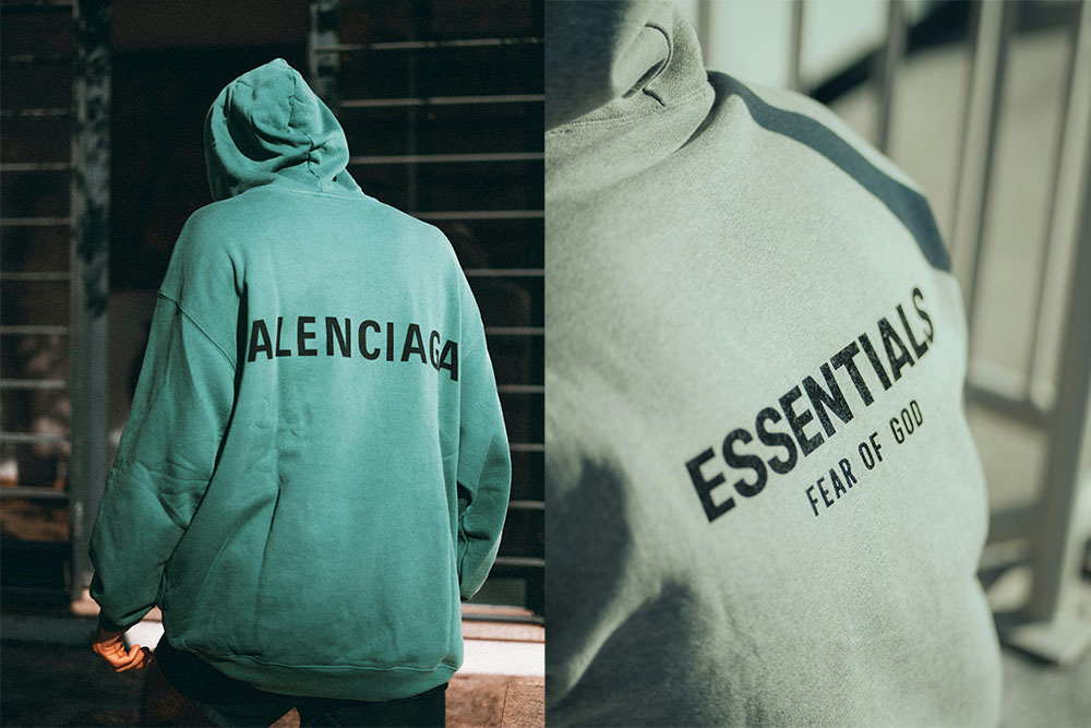
Think about the emotion you want your design to evoke. Sleek, refined fonts are perfect for premium or upscale designs, while playful fonts bring life to humorous or kid-friendly apparel. On the other hand, industrial fonts can give streetwear a rugged, vintage vibe, shaping how people perceive your message before they even read it .
Font weight is another key factor. Bold fonts pack a punch for short slogans or impactful statements, while thinner fonts lend a more elegant, understated feel. However, thinner fonts can be harder to read from a distance, so consider how and where your t-shirt will be worn. For example, gym shirts benefit from bold, readable fonts, while high-fashion designs might experiment with lighter weights for a more polished look.
Finding Quality Fonts
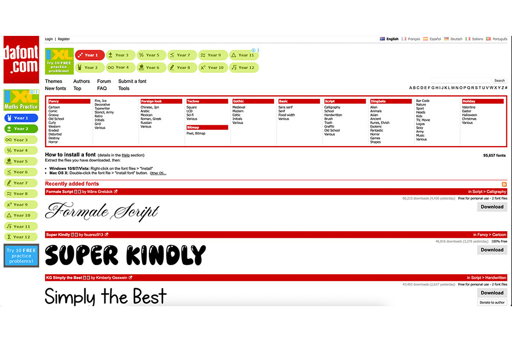
The quality of your font can make or break your design. Google Fonts offers a vast collection of free, commercially licensed fonts that are great for t-shirt designs. A standout example is Montserrat, a geometric sans-serif font by Julieta Ulanovsky. Its tall letters and spacious interiors ensure readability, even at smaller sizes.
For more premium options, Adobe Fonts provides access to high-quality typefaces through a Creative Cloud subscription, giving you unique choices to elevate your designs. Font Squirrel is another excellent resource, offering fonts clearly marked for commercial use, so you won’t run into licensing issues.
When browsing fonts, prioritize those with multiple weights and styles within the same family. This allows you to create emphasis without introducing too many different fonts, keeping your design cohesive. Also, check the character set – if your design includes special symbols, numbers, or accents, ensure the font supports them. Some decorative fonts might look great but lack the versatility you need.
Font Scaling and Licensing for Apparel
Scalability is essential for t-shirt designs. Your font needs to look sharp whether it’s printed small on a pocket or stretched across the entire front. Vector-based fonts are ideal because they retain quality at any size, whereas some decorative fonts might lose detail when scaled down or appear clunky when enlarged.
Always test your fonts at different sizes to ensure they’re clear and legible. A font that works beautifully in a small size might look too thin or weak when enlarged, and vice versa. Choose fonts that maintain their integrity across various sizes and printing methods.
Licensing is another critical factor if you plan to sell your t-shirts. Even free fonts can come with restrictions for commercial use or require attribution. Double-check that you have the proper license for your fonts, and keep records for legal protection and future design updates.
Finally, test how your fonts perform with your chosen printing method. Screen printing and direct-to-garment printing can handle fine details differently, so ensure your fonts remain readable and visually appealing. Consider how they’ll look against various color combinations and under different lighting conditions. Your font choice not only impacts the professional look of your mockups but also plays a big role in how your audience perceives your brand. The right font can make your message resonate and leave a lasting impression.
Font Pairing Methods That Work
After selecting high-quality fonts for your t-shirt design, the next challenge is combining them effectively. The right pairing can transform your design from amateur to polished, creating a look that feels intentional and complete. Let’s dive into some tried-and-true methods to combine fonts in a way that balances variety with consistency.
Using Fonts from the Same Family
One of the easiest ways to ensure your fonts work well together is by sticking to a single font family. Fonts within the same family are designed to complement each other, which takes the guesswork out of pairing and guarantees a cohesive look. Plus, many font families come with a variety of options – different weights, styles, italics, and even extended or condensed versions – giving you plenty of room to experiment without losing harmony.
For example, you can create contrast by using a bold version for your main headline and pairing it with a lighter or regular weight for supporting text. This approach works particularly well for designs that need a professional and unified appearance, such as corporate t-shirts or branded merchandise. If you want even more flexibility, consider using a superfamily. These font families include a wide range of styles, such as serif and sans-serif variations, as well as bold, italic, slab, or rounded options. This way, you can introduce variety while maintaining a consistent aesthetic.
Mixing Different Typeface Styles
Combining different typeface styles can add energy and visual interest to your design, but it requires a thoughtful approach. The key is to create deliberate contrast to establish a clear hierarchy – one font for the main message and another for secondary details. You can achieve this contrast through differences in style, size, weight, spacing, or even color.
To keep your design balanced, choose typefaces with similar proportions or x-heights. This ensures that, even with contrasting styles, the fonts don’t feel disjointed. The goal is to strike a balance between creative flair and readability, making your design both eye-catching and easy to understand.
Pairing Fonts with Similar Moods
While technical compatibility and contrast are important, aligning the “mood” of your fonts is what really ties your design together. Fonts convey emotion, and successful pairings share a similar tone that matches the purpose of your t-shirt and resonates with your audience. For instance, the fonts don’t need to have identical personalities, but they should complement each other rather than clash. This ensures your design feels cohesive and supports its overall message.
Think about the personality of each font. A bold, ornate typeface might need a simpler, cleaner partner to avoid overwhelming the design. This balance allows the decorative font to stand out while the simpler one ensures clarity. For example, pairing a vintage-inspired font with a modern sans-serif can create a stylish blend of old and new.
You can also use decade-inspired pairings to evoke nostalgia. Fonts that channel the vibes of the 70s disco era, 80s new wave, or 90s grunge can be paired with contemporary fonts for a design that feels both retro and fresh. The tone of your design matters too – whether it’s playful, serious, casual, or quirky. A bubbly, fun font might be perfect for a family reunion t-shirt, while a sleek, no-nonsense typeface would suit a marathon or fitness event.
When your fonts align in both technical compatibility and emotional tone, your design not only looks great but also delivers a message that connects with your audience on a deeper level.
sbb-itb-1e8f9ab
Common Font Pairings for T-Shirt Mockups
Here are some tried-and-true font combinations that consistently deliver great results for t-shirt designs. These examples build on the pairing techniques discussed earlier.
Font Pairing Examples and When to Use Them
Oswald & Merriweather is a versatile duo for t-shirt mockups. Oswald’s bold, condensed sans-serif design is ideal for headlines or main slogans, while Merriweather’s serif style adds a touch of readability and refinement for taglines or supporting text. This pairing shines in bold slogans, athletic designs, and vintage collegiate themes, making it a go-to for sports teams, university merchandise, or retro-inspired graphics.
Roboto & Lato combines two sans-serif fonts to create a modern and approachable look. Roboto’s geometric structure blends effortlessly with Lato’s softer, more humanistic curves. This pairing works well for tech-inspired designs, minimalist graphics, and casual wear where clean, easy-to-read text is essential.
For a modern and polished aesthetic, Montserrat & Lato is a reliable choice. Montserrat’s geometric style contrasts nicely with Lato’s warm, rounded edges. This combination is perfect for startup merchandise and contemporary brand apparel, giving off a professional yet friendly vibe.
When boldness and energy are the goals, Barlow Condensed & Bebas Neue delivers. Their contrasting weights and proportions create a dynamic visual impact that grabs attention. This pairing is ideal for athletic wear, streetwear, or designs featuring all-caps statements and bold declarations.
Montserrat & Libre Baskerville blends modern and classic elements by pairing a sleek sans-serif with an elegant serif. This combination is a favorite for vintage-inspired designs, band merchandise, and retro-themed apparel, offering a balance of contemporary style and timeless appeal.
| Font Pairing | Impact | Best Used For |
|---|---|---|
| Oswald & Merriweather | Bold, readable, vintage feel | Athletic designs, collegiate themes, retro slogans |
| Roboto & Lato | Contemporary, approachable | Tech designs, casual wear, minimalist graphics |
| Montserrat & Lato | Modern, clean, professional | Startup merchandise, contemporary brands |
| Barlow Condensed & Bebas Neue | High impact, energetic | Streetwear, athletic wear, bold statements |
| Montserrat & Libre Baskerville | Modern meets classic | Vintage designs, band merchandise, retro themes |
For the best results, use the bolder or more distinctive font for the primary message, while the supporting font handles secondary details like dates or locations. This creates a clear visual hierarchy and ensures your design is easy to read.
These pairings work because they strike a balance between contrast and harmony. The fonts are different enough to create visual interest but cohesive enough to feel unified. Whether you’re designing for a local business, a sports team, or a personal project, these combinations are a solid starting point. You can further customize them with various weights, sizes, and colors to fit your creative vision.
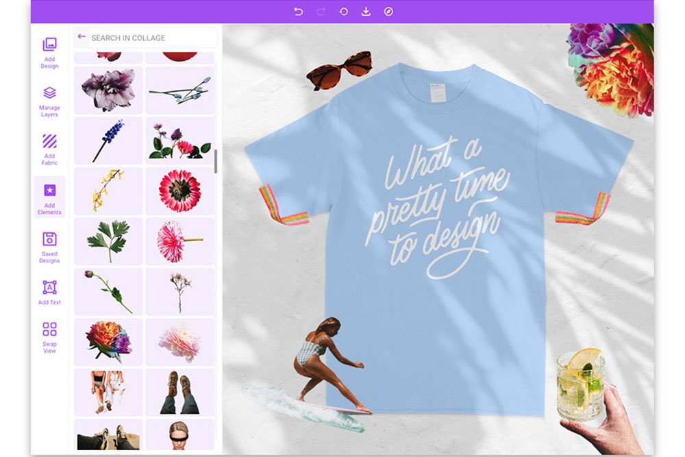
Try testing these pairings in Mock It‘s t-shirt templates to see how they look across different garment colors and styles. Use realistic mockups to refine your designs and ensure they hit the mark.
Testing Fonts with Mock It
After narrowing down your font pairing strategies, it’s time to put them to the test on realistic t-shirt mockups using Mock It. This tool bridges the gap between concept and reality by letting you see how your chosen fonts look on actual apparel. Instead of guessing, you can visualize your typography choices in a real-world context before committing to production.
Customizing Fonts in Realistic Mockups
Mock It’s design tools and scene creator let you experiment with font combinations across a variety of t-shirt styles, colors, and textures. With access to over 5,000 high-quality mockups from top apparel brands, you can see exactly how your fonts will appear on garments your customers might wear.
The platform’s editable layers and multiple viewing angles (front, back, and side) make it easy to tweak font sizes, colors, and positions. For example, you can test how Oswald & Merriweather look on a black unisex t-shirt versus a heather gray hoodie, or see if Montserrat & Lato retain their clean aesthetic across different fabric types. This level of customization ensures your font choices complement the garment, rather than existing in isolation.
Mock It also offers extensive color libraries, enabling you to preview typography on various backgrounds. High-resolution images ensure that even the smallest font details – like the fine strokes in serif or script fonts – are clearly visible. This attention to detail is crucial for maintaining the design’s impact, especially when working with intricate typefaces. The platform’s tools not only help refine your design but also streamline the workflow by making adjustments faster and more intuitive.
Making the Design Process Easier
Mock It simplifies the design process by providing realistic mockups that are client-ready, eliminating the need for physical samples. These mockups show your font pairings on actual models, giving both you and your clients a clear understanding of how the final product will look and fit in everyday scenarios.
The platform’s customization options allow you to test multiple variations of your design quickly. Adjust font sizes, colors, and placements directly within the interface and see the results instantly – no need to create separate design files for each variation. Whether you’re fine-tuning logo placements or experimenting with new color schemes, Mock It keeps the process efficient.
If you need a specific garment style or brand that isn’t currently available, Mock It’s request-a-mockup feature has you covered. You can request new templates and receive quarterly updates, ensuring the platform evolves alongside your needs.
Mock It also supports unlimited downloads, enabling you to create multiple mockups for presentations or A/B testing. Whether you’re comparing Barlow Condensed & Bebas Neue for a streetwear line or experimenting with vintage-inspired fonts for band merchandise, the platform allows for quick iterations. This flexibility helps you perfect your designs and deliver polished, professional visuals before moving into production.
Conclusion: Getting Font Pairing Right for T-Shirt Mockups
Nailing font pairing for t-shirt mockups comes down to a few key principles. Contrasting fonts add visual interest while keeping things clear. Playing with size and weight creates a visual hierarchy that naturally guides the viewer’s eye. And sticking to just two or three fonts ensures your design stays polished and professional. Once you’ve got these basics down, you can focus on matching fonts to your design’s mood and maintaining readability.
Think about the tone of your design: playful fonts are perfect for casual or fun events, while more formal typefaces work better for professional or athletic themes. This alignment can shape how your t-shirt design is received.
Always test your fonts in realistic settings to ensure they’re legible from any distance. Tools like Mock It make this process easier, offering over 5,000 high-quality clothing mockup templates. These tools help you see how your font choices actually look on apparel, bridging the gap between concept and reality.
With design trends constantly shifting, having a library of fonts is only useful if you know how to pair them wisely. Start with clear goals, use contrast effectively, and test your combinations in context.
Your journey doesn’t stop here. Keep analyzing successful designs, experiment with font pairings using mockup tools, and get feedback from others to fine-tune your skills. The strategies in this guide – from creating a visual hierarchy to matching fonts with your design’s mood – give you a solid starting point for crafting standout t-shirt mockups. Each step builds toward designs that not only look great but also make a lasting impression.
FAQs
How can I make sure my font choices look great and stay readable on all t-shirt designs?
When designing t-shirts, it’s essential to pick fonts that are both readable and visually striking. A key tip is to ensure there’s strong contrast between the font color and the shirt color. For instance, light-colored fonts pop on dark shirts, while dark fonts look crisp on lighter shirts. If you’re working with textured or patterned fabrics, bold or thicker fonts are your best bet – they hold their ground and remain easy to read.
Before diving into production, test your designs with t-shirt mockups. These tools give you a clear idea of how your text will look on different materials and colors. Stick with simple, clean fonts like sans-serif styles, as they’re easier to read and retain their sharpness across a variety of designs and shirt types.
How can I pair fonts to create the right mood for my t-shirt mockup designs?
When pairing fonts for your t-shirt mockups, aim to create contrast and evoke the right emotional tone. A great way to achieve this is by combining fonts with distinct characteristics – like a bold sans-serif for headlines paired with a lighter serif for supporting text. This approach not only makes your design visually engaging but also helps direct the viewer’s focus effectively.
Select fonts that match the mood you’re aiming to communicate. For instance, clean sans-serif fonts can project a modern, edgy feel, while refined serif fonts bring a sense of elegance and sophistication. The key is ensuring your chosen fonts work well together and align with the overall theme of your design.
If you’re working on mockups, tools like Mock It can help you see how your font choices look on professional templates. Use these tools to test and tweak different font combinations until you find the pair that perfectly enhances your design.
How can Mock It help with font pairing for t-shirt mockups?
Mock It provides a hassle-free way to try out font pairings using customizable t-shirt mockup templates. This lets you experiment with different font combinations in a realistic, wearable context, ensuring your design looks sharp and ready before production.
Their tools also allow you to preview how fonts work with colors, layouts, and other design elements, giving you the confidence to create eye-catching t-shirt designs that stand out.
Related Blog Posts

View featured image for How to Pair Fonts for T-Shirt Mockups
 Trusted By Thousands Of Designers
  Cancel Your Subscription Anytime
  30 Day Money Back Guarantee